PCE July 2025: Prices, Income and Outlays
Powell’s speech had demystified PCE inflation already, but the income and outlays numbers push back on downturn scenarios.
“Shave 300 bps! Do it!” vs. “Protect us from stagflation!”
The headline PCE price index at +0.2% MoM (2.6% YoY) and Core PCE of +0.3% (+2.9% YoY) were in line with well telegraphed expectations and the UST curve generally yawned.
The personal income (Disposable Personal Income or DPI) and Personal Consumption (PCE) numbers told a more constructive and balanced story on the consumer with current dollar PCE at +0.5% MoM, real PCE at +0.3%, current dollar income at +0.4% and real DPI at +0.2%.
The YoY DPI of +2.0% is right in line with the PCE YoY rate of +2.1%. Real goods consumption weighed in at +2.9% with Services still low at +1.7%. Total PCE inflation was +2.6% YoY. Goods was +0.5%, and the Services price index ticked up to 3.6%.
The net takeaway is that inflation is stubborn but not climbing quickly, and the consumer is steady and solid even if weaker in services.
A lot of lag effects and new tariff launches are ahead for a better read on tariff impacts, but the disinformation specialists will do what they do. Section 232 escalation lies ahead with areas such as pharma, semis, lumber, and furniture among other uncertainties. For now, we see the trade partners and Team Trump disagreeing on what they “agreed to.”
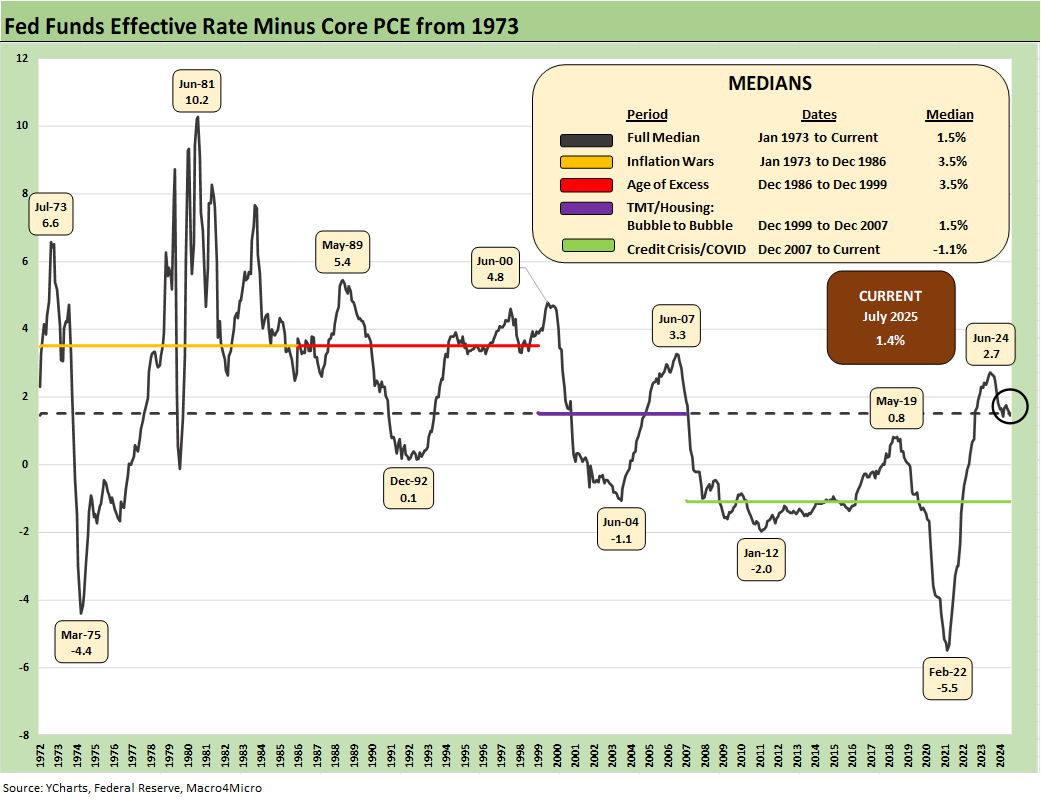
The above time series updates the “fed funds minus Core PCE” differential since 1973 for a read on “real fed funds” and to what extent the Fed is engaged in “real” tightening as opposed to the “closet accommodation” that we saw in much of 2H22 when tightening was moving into higher gear but badly lagging inflation. Trump is calling for meaningfully negative real fed funds.
The long-term differential is +1.5%, and the differential now is +1.4%. That leaves room for easing, but the final judgement on actions comes down to how you see the tariff threats, the supply vs. demand side of the equation for goods, payroll economics and inflation expectations, and what that might mean for stagflation risk.
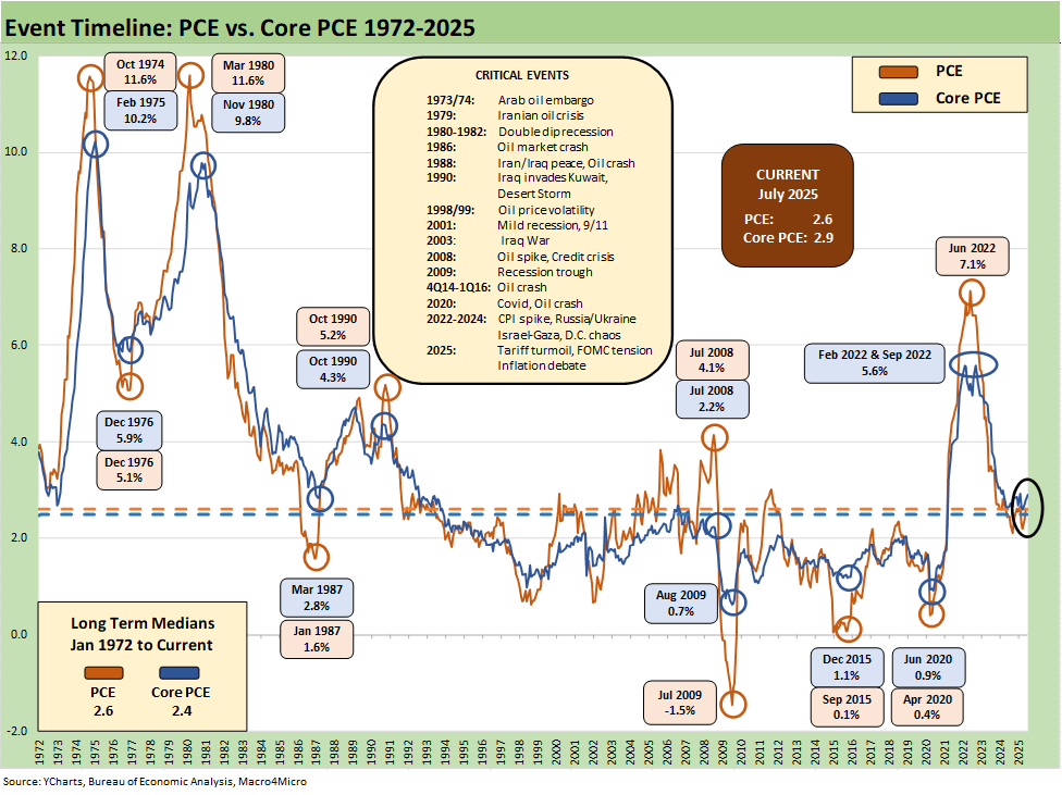
The above chart updates the long-term time series from 1972 for PCE vs. Core PCE across the decades and cycles. We see the 2.6% headline PCE long term median in the lower left (flat to the current 2.6%) and the 2.4% core PCE median (vs. current 2.9%). That is dramatically better than where we came from in 2022 but still well above the 2.0% target.
The July 2025 PCE numbers are good levels in long term context, but they just moved in the wrong direction again at a time when the FOMC is in a state of political turmoil and Fed leaders are under attack. The last SEP report continued to increase PCE forecasts for 2025, so the September dot plot will have high stakes. The dot plot and forecasts in June were not favorable (see FOMC Day: PCE Outlook Negative, GDP Expectations Grim 6-18-25). The next set of numbers comes against a backdrop of attacks on macro statistics (see Happiness is Doing Your Own Report Card 8-1-25).
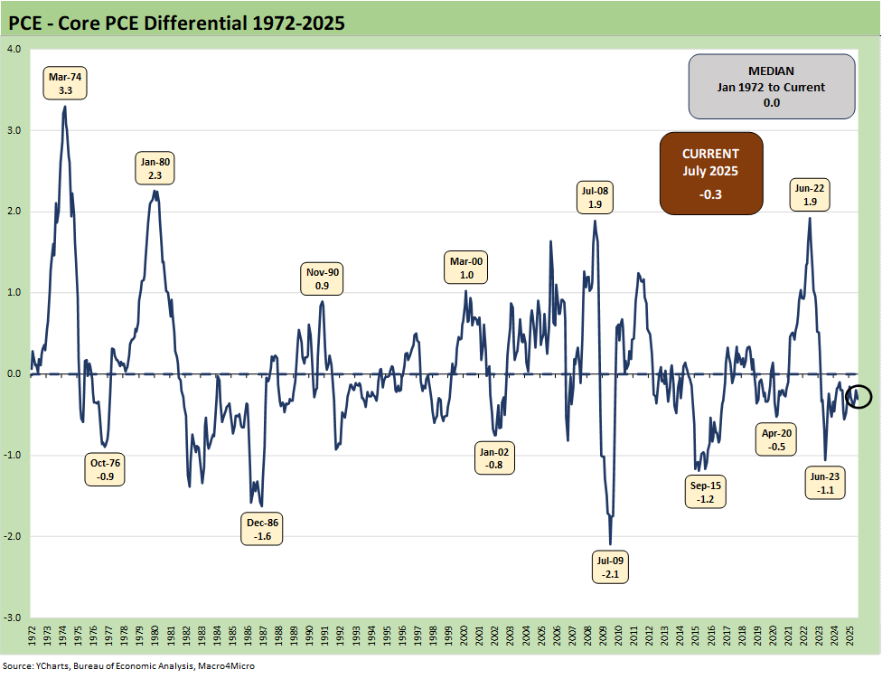
The above chart frames the long-term differential history between PCE and Core PCE since 1972. The long-term differential is zero and we currently stand at -0.3%. The volatility around that compressed long-term median ties into the energy wildcard with some food distortions also back in the 1970s. We look at some of the CPI energy and food inflation moves in separate commentaries (see Inflation: The Grocery Price Thing vs. Energy 12-16-24, Inflation Timelines: Cyclical Histories, Key CPI Buckets11-20-23).
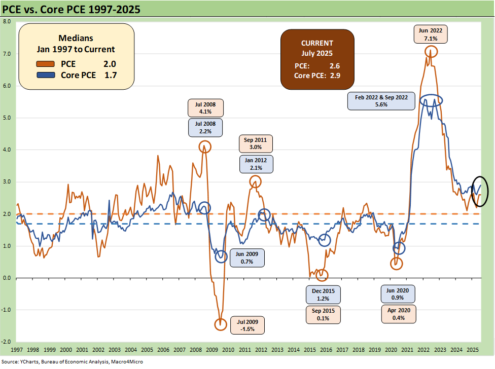
The above chart looks at a shorter timeline from 1997 to offer a better visual scale separate from the wild 1970s and 1980s. The recent days after Powell’s Jackson Hole speech restarted the debate in financial and economic circles around whether the target should be 2.5% or 3.0% or in some range. The above chart offers a reminder of how hard it is to get to 2.0% or below for headline PCE or Core PCE. The price chart covering the timeline from the inflationary/stagflationary periods of 1973 to 1982 hammer that home as well.
The “1997 to 2025” period also shows a rare stretch at or below the 2.0% PCE line and Core PCE median. It took a lot to go wrong in that time horizon to cross that 2.0% threshold. The events along the way included tech bubbles bursting in 2000-2001, oil crashes in the late 1990s and the late 2014 to early 2016 period, and a financial systemic crisis from 2008 to 2011 (including sovereign stress) to get us there. The COVID pandemic was a new one for the modern capital markets.
In the above timeline, we even see deflation in the post-crisis recession trough in mid-2009. The collapse in oil prices in late 2015 and then the COVID impact in 2020 gave an assist to low PCE. Oil is a big headline mover whenever there is a sharp decline or spike, and we have had plenty of both. It is interesting that the topic of the Feb 2022 invasion of Ukraine and ensuing oil and gas spike never seems to find a way into the Trump and MAGA rhetoric on inflation in 2022.
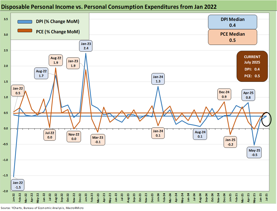
The above chart covers the time horizon for DPI vs. PCE from early 2022 as the tightening cycle kicked into gear after March 2022. Life in Jan 2022 was still quiet for Disposable Personal Income.
Looking back before the start of this chart, the 2021 period was a big macro rebound in GDP off the COVID peak period. The strong macro backdrop in 2021 and heavy dose of fiscal accommodation did not mesh well with residual supply side shortages in goods broadly as 2022 saw the end of ZIRP and a material inflation spike.
Oil was a problem after the Putin invasion of Ukraine in late Feb 2022, and inflation hit a high in June 2022 at +9.1% for CPI as a headline grabber (headline PCE at +7.1% in June 2022) before the steady inflation slide to current rates. Core PCE had dueling peaks at +5.6% for Feb 2022 and Sept 2022.
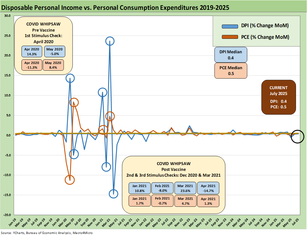
The above chart plots MoM Disposable Personal Income vs. PCE as a read on how wild things got during and right after the pandemic peak. This is a chart we use each month to revisit the DPI swings that came with the three COVID relief/stimulus packages. That included two under Trump and one under Biden.
As a reminder, Trump signed the CARES Act in March 2020 (shows up in the DPI in April 2020) and Trump also signed the Dec 2020 legislation disbursed in Jan 2021 (Trump seldom mentioned that Dec 2020 one since it was easier to blame Biden and Powell). Biden signed the America Rescue Plan (disbursed in March 2021) that was a demand pile-on (we would argue over the top) in a supply constrained environment (thus inflation). The DPI and PCE wave tied to each of those shows up in the chart above.
The vaccine was announced in early Nov 2020 just ahead of two stimulus actions. That was soon to be a factor in PCE patterns and lag effects. The quarterly GDP numbers in 2021 on the post-COVID bounce were numbers generally not seen since the Reagan and Clinton years (see Presidential GDP Dance Off: Clinton vs. Trump 7-27-24, Presidential GDP Dance Off: Reagan vs. Trump 7-27-24).
COVID was a distinct period for supply chains and supply-demand imbalances. With tariffs and potential trade wars, it will be important to look for similar imbalances whether in narrow product categories or in broad commodities and materials areas. Jacking up aluminum, steel, copper, and seeking even more tariffs on lumber is not a great idea for keeping prices and costs contained. Auto tariffs in Section 232 are extreme even after the array of “deals” and could go higher if the USMCA breaks down in 2026. We saw semis, pharma, and aircraft/engines/parts added to the Section 232 pipeline although most of the aircraft/parts risk was mitigated in EU talks.
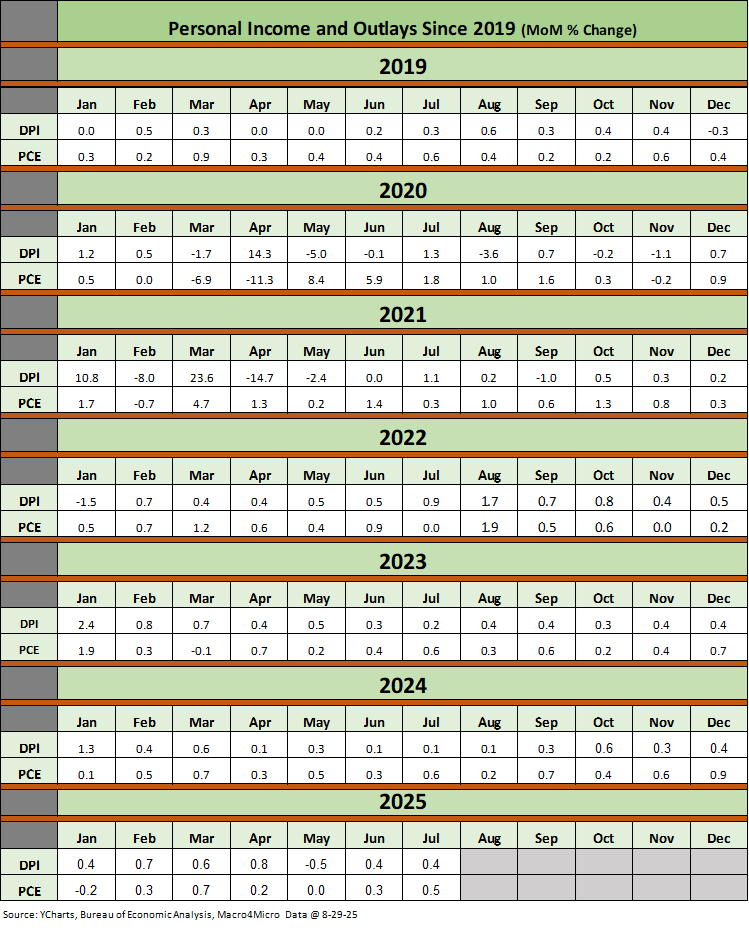
The above table plots the monthly Disposable Personal Income MoM change numbers vs. the Personal Consumption Expenditure numbers across the years from 2019 through July 2025. It is an easy scan across key time periods for a look at turning points in DPI (e.g. stimulus payments) or PCE.
One exercise to do from time to time is to look at Table 1 in the monthly “PCE release” for the granular dollar amount on each line. The line items can sometimes show some volatility. We like to look for gaps between DPI and PCE and moves in Personal Savings.
Any reader of Table 1 can simply tick off which lines might come under pressure in coming months. Examples include expense lines such as Medicaid (post tax bill) or durable goods that face tariffs. It is always worth remembering that a tariff is a regressive tax that hits lower income consumers harder and the same for small businesses. The same is true in Medicaid costs based on the income brackets of Medicaid users. A loss of health care benefits and higher pharma costs is a zero-sum game with other consumption lines.
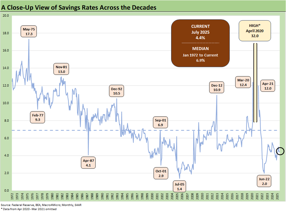
The above chart updates the savings rate history with the latest number flat MoM at 4.4% after a 2025 peak in April of 5.0%. We have looked at the savings rate dynamics in earlier commentaries (see Savings Rates: Context Across the Cycles 10-27-23). Savings rates peak in times of worry (occasionally panic) as evident in the chart above.
The period leading into May 1975 was no picnic after the massive stagflation bout and the same was true in Nov 1981. Dec 1992 had a raft of issues as the commercial real estate bubble was bursting (and hammering some banks), the leveraged finance boom on the back end of the default cycle, the thrift crisis effects were still playing out, and the regional oil patch pain that had come home to roost in 1987-1990 was lingering.
See also:
2Q25 GDP: Second Estimate, Updated Distortion Lines 8-28-25
Avis Update: Peak Travel Season is Here 8-27-25
Durable Goods July 2025: Signs of Underlying Stability 8-26-25
Toll Brothers Update: The Million Dollar Club Rolls On 8-26-25
New Home Sales July 2025: Next Leg of the Fed Relay? 8-25-25
Credit Markets: Dull Week for Spreads 8-25-25
The Curve: Powell’s Relief Pitch 8-24-25
Footnotes & Flashbacks: Asset Returns 8-24-25
Mini Market Lookback: The Popeye Powell Effect 8-23-25
Existing Home Sales July 2025: Rays of Hope Brighter on Rates? 8-21-25
Home Starts July 2025: Favorable Growth YoY Driven by South 8-19-25
Footnotes & Flashbacks: Credit Markets 8-18-25
Herc Holdings Update: Playing Catchup 8-17-25
Footnotes & Flashbacks: State of Yields 8-17-25
Mini Market Lookback: Rising Inflation, Steady Low Growth? 8-16-25
Industrial Production July 2025: Capacity Utilization 8-15-25
Retail Sales Jul25: Cautious Optimism in the Aisles 8-15-25
PPI: A Snapshot of the Moving Parts 8-14-25
CPI July 2025: Slow Erosion of Purchasing Power 8-12-25
Iron Mountain Update: Records ‘R’ Us 8-11-25
Mini Market Lookback: Ghosts of Economics Past 8-9-25
Macro Menu: There is More Than “Recession” to Consider 8-5-25
Mini Market Lookback: Welcome To the New World of Data 8-2-25
Happiness is Doing Your Own Report Card 8-1-25
Payrolls July 2025: Into the Occupation Weeds 8-1-25
Employment July 2025: Negative Revisions Make a Statement 8-1-25
Employment Cost Index 2Q25: Labor in Quiet Mode 7-31-25
PCE June 2025: Prices, Income, and Outlays 7-31-25
2Q25 GDP: Into the Investment Weeds 7-30-25
2Q25 GDP: First Cut of Another Distorted Quarter 7-30-25
United Rentals: Cyclical Bellwether Votes for a Steady Cycle 7-29-25


