
PCE March 2025: Personal Income and Outlays
Consumers showed firm spending appetites with steady income to support a habit that will soon feel higher tariffs.


Is consumption on the game clock?
For March 2025 on the way into a countdown to material tariff disruptions, the market got a favorable sequential decline of headline PCE inflation from 2.7% (revised) to 2.3% and Core PCE inflation from 3.0% (revised) to 2.6%. That would be very good news any other time, but the tariff cloud is still ahead.
Real PCE of +3.3% YoY outpaced Real YoY Disposable Income of +1.7% in a sign of a consumer that may be “beating the deadline” or who remains confident and is bucking the sentiment surveys.
For MoM data, current dollar PCE at +0.7% ran ahead of current dollar personal income at +0.5%. The MoM PCE Price Index was 0.0% for both headline and core.
We see a savings rate of 3.9% in March vs. materially revised numbers for Feb 2025 at 4.1% and Jan 2025 of 3.9% after only 3.3% in Dec 2024.

The above time series updates “fed funds minus Core PCE” since 1973 for a read on real fed funds and to what extent the Fed is engaged in “real” tightening as opposed to the “closet accommodation” that we saw in much of 2H22 when tightening was moving into higher gear but badly lagging inflation.
The long-term differential is +1.4%, and the differential now is +1.7%. That leaves a little room for easing, but the final judgement on actions comes down to how you see the tariff threat and what that might mean for forward inflation. There is not much room in that differential for an adverse move on Core PCE at the current fed funds rate. A PCE move higher on tariffs could push that number well inside the median and even into negative range.
We had a question checklist in a recent PCE commentary that framed some of the risk factors on the way into an aggressive tariff policy framework (see PCE Jan 2025: Prices in Check, Income and Outlays Diverge 2-28-25). Some clarity is starting to enter into the risk handicapping, but the discourse is not being helped by Trump browbeating the Fed with a recurring, false representation that the “seller pays” the tariff. As of now, the political rhetoric and misinformation on policy (talking to Xi, not talking to Xi, etc.) is a negative factor as market volatility has hammered home with headline swings on qualitative and often inconsistent policy statements.
The debate on the “Fed put” and “Trump put” has started to lose its conversation value, but the PCE price trends and fears of tariff fallout are not helping arm the FOMC with ammo to ease. That would require some payroll weakness, and we will get those numbers Friday.
The market also needs more significant economic data points to change the math. The consumption lines and fixed investment in 1Q25 as released today were not as bad as the headline numbers given the distortions on some critical GDP lines (1Q25 GDP Advance Estimate: Roll Your Own Distortions 4-30-25).
Trump is demanding lower rates now as he seeks some empirical support for the misguided view that “purchasing power” will not weaken whether you call it inflation or not. As we often point out, he still refuses to state that the “buyer pays.” He cannot state a basic fact, so that undermines the opinions. The view that lower oil prices is a sign of good times neglects the fact that forecasted weakness in global demand is moving oil lower with an assist from OPEC supply plans.
Whether we call it inflation or an erosion of purchasing power, there is no question whether goods prices are going higher with tariffs. Services are more of a question mark but those have stayed stubborn in the PCE numbers (+3.5% YoY in March vs. +2.3% for Goods and -0.3% for Durables). That reality is intrinsic to the scale of the tariffs that could end up being “stacked” on top of product tariffs. The tariff % levels being assigned are onerous. What was announced on Liberation Day (April 2) is bad for both expenses and prices. That is quite a combination. Higher costs and lower earnings for companies and higher prices for the consumer are not positive factors. The ongoing pause and “information” (whether “mis” “dis” or accurate) will just have to keep playing out.

The above chart updates the long-term time series for PCE vs. Core PCE across the decades and cycles. We see the 2.6% headline long-term median (vs. current 2.3%) and the 2.4% core PCE median (vs current 2.6%). That is better than where we came from in 2022 but short of the 2.0% target. Those are good numbers for March, and in the absence of the tariff uncertainty the Fed might have room to cut (in theory).
As the medians highlight and following charts show, it takes a lot to go wrong to get sustained 2.0% PCE inflation. What no one seems inclined to point out in the FOMC bashing is that multiple trade wars could cause more than a few economic calamities including stagflation.
We include a box of “critical events” to jog memories for the older crowd and a historical checklist for the new folks on the block. The 1973 to 1975 period was a turbulent one for domestic politics and geopolitics (Israeli war, Arab Oil embargo, the fall of Saigon, etc.) while 1979 offers some intense history in the Middle East also (Iran, fall of Shah). The1980 to 1982 double dip recession saw the peak inflation fighting of the Volcker years. That was helped by rising oil production from non-OPEC sources (North Sea, Mexico, Alaska, the Lower 48, etc.) and a breakdown in OPEC discipline. Oil crashed in 1986.
The latest round of volatility will keep markets on edge for any more signs of stagflation, which was on the curse list for Nixon/Ford and later Jimmy Carter. The current market is the closest we have come to a legitimate (vs. town crier excess) stagflation threat since the Carter years. That weighs heavily on the Fed and FOMC. Nobody wants to end up on the “Burns/Miller list” by caving to political pressure on rates ahead of stagflation risks.

The above chart frames the long-term differential history between PCE and Core PCE since 1972. The long-term differential is zero and we currently stand at -0.3%. The volatility around that compressed long-term median flows into the energy wildcard with some food distortions also back in the 1970s. We look at some of the CPI energy and food inflation moves in separate commentaries (see Inflation: The Grocery Price Thing vs. Energy 12-16-24, Inflation Timelines: Cyclical Histories, Key CPI Buckets11-20-23).
The oil wildcard will remain one that Trump and team want to work in their favor. Russian oil supply back on the market would satisfy that oil price plunge ambition even for Core PCE since the energy bill flows into goods and services costs and can impact PCE ex-Food and Energy. Lower energy costs also bolster consumer confidence in the peak driving season and are supportive of the ag sector and in easing freight and logistics costs.
Rooting for Russian supply for the wrong reason clearly has its limitations with the fate of Ukraine a sticking point. A more material trade clash with Canada and the overt hostility shown to our G7 neighbor and USMCA trade partner would be bad for the US and Canada. It would also be bad for oil prices with Canada being the largest importer of crude with very attractive economics for US refiners.
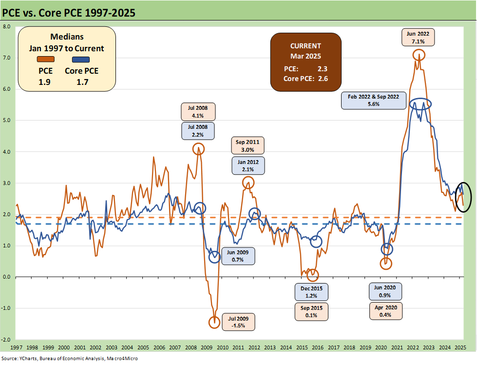
The above chart looks at a shorter timeline from 1997 to offer a better visual scale separate from the wild 1970s and 1980s. We see deflation in the post-crisis recession trough in mid-2009. We see the collapse in oil prices in late 2015 and then the COVID impact in 2020. Oil is a big headline mover whenever there is a sharp decline or spike, and we have had plenty of both.
The 1997 to current stretch also shows a rare period below the 2.0% PCE line and Core PCE median timeline. It took a lot to go wrong in that time horizon to cross that 2.0% threshold. The events along the way including oil crashes in late 2014 to early 2016 and a financial systemic crisis from 2008 to 2011 (including sovereign stress) to get us there. COVID was a new one for the modern capital markets.
Trumps focus on increased demand and increased supply was his Trump 2.0 election campaign pitch. His version of low oil was not tied to weaker demand and cyclical weakness from tariff damage.

The above chart covers the time horizon for DPI vs. PCE from early 2022 as the tightening cycle kicked into gear after March 2022. Life in Jan 2022 was still quiet for Disposable Personal Income, and we see Consumption still running ahead of DPI coming off bullish macro headlines in 2021. The 2021 period was a big macro rebound in GDP off the COVID peak period. The strong macro backdrop in 2021 and heavy dose of fiscal accommodation did not mesh well with residual supply side shortages as 2022 saw the end of ZIRP and a material inflation spike.
Oil was a problem after the Putin invasion of Ukraine in late Feb 2022, and inflation hit a high in June 2022 at +9.1% for CPI as a headline grabber (headline PCE at +7.1% in June 2022) before the steady inflation slide to current rates. Core PCE had dueling peaks at +5.6% for Feb 2022 and Sept 2022.
For March 2025, DPI is slightly above the median at +0.5% and PCE is higher than the median at +0.7%. Those are the types of levels that reassure on the current economic cycle run rates, but it is different from what might happen if we see more disarray in the markets tied to tariffs. Employers and consumers will have decisions to make as the side effects of tariffs unfold. Policy makers might light the wrong fuse.

The above chart plots MoM Disposable Personal Income vs. PCE as a read on how wild things got during and right after the pandemic peak. These comments are somewhat of a replay each month with some edits and updates. This is a chart we use each month to revisit the DPI swings that came with the three COVID relief/stimulus packages. That included two under Trump and one under Biden. The most recent month (March 2025) shows PCE ahead of DPI.
As a reminder, Trump signed the CARES Act in March 2020 (shows up in the DPI in April 2020) and Trump also signed the Dec 2020 legislation disbursed in Jan 2021 (he seldom mentioned that one since it was easier to blame Biden and Powell). Biden signed the America Rescue Plan (disbursed in March 2021) that was somewhat of a demand pile-on in a supply constrained environment (thus inflation). The DPI and PCE wave tied to each of those shows up in the chart above.
The vaccine was announced in early Nov 2020 just ahead of two stimulus actions. That was soon to be a factor in PCE patterns and lag effects. The quarterly GDP numbers in 2021 on the post-COVID bounce were numbers generally not seen since the Reagan and Clinton years (see Presidential GDP Dance Off: Clinton vs. Trump 7-27-24, Presidential GDP Dance Off: Reagan vs. Trump 7-27-24).
COVID was a distinct period for supply chains and supply-demand imbalances. With tariffs and potential trade wars, it will be important to look for similar imbalances whether in narrow product categories or in broad commodities and materials areas. Jacking up aluminum, steel, and seeking even more tariffs on lumber and new tariffs on copper is not a great idea for keeping prices and costs contained. Supply-demand factors are also timeless in significance. Washington spends too little time discussing how it fits into their plans (since it often does not). Dislocations already underway in shipping and freight can cause many unintended consequences (all bad for consumers).
The typical political game into the 2024 election was to concentrate inflation cause-and-effect on the March 2021 disbursement. The idea is that a single stimulus plan signed by Biden in early 2021 was the cause of all inflation, which is a case of “dumbassery” and a sales pitch from the “politically axed.” That Biden plan certainly made things worse from the demand side. The invasion of Ukraine by Russia in Feb 2022 also drove the ensuing spike in inflation to a June 2022 CPI high of 9.1%. That invasion was caused by Putin, who has been in the favor of the current White House.

The above table plots the monthly Disposable Personal Income MoM change numbers vs. the Personal Consumption Expenditure numbers across the years from 2019 through Mar 2025. It is an easy scan across key time periods for a look at turning points in DPI (e.g. stimulus payments) or PCE.
One exercise to do from time to time is to look at Table 1 in the monthly “PCE release” for the granular dollar amount on each line. While this month’s personal income pop of +0.7% is good news (see line 32 for the DPI total), the line items can show some volatility. We like to look for gaps between DPI and PCE.
Any reader of Table 1 can simply tick off which lines might come under pressure in the coming weeks with tariffs, post-DOGE fallout and a final budget bill with the tax cuts and offsets. There are some major lines such as Medicaid that serve a broad array of people on the lower rungs of the economic ladder (including a massive number of seniors and sick children). How the final tariff actions, retaliation risks, and budgetary cuts flow into the Income and Outlays lines will be getting a lot of attention.

The above chart takes the Personal Savings line from Table 1 in the PCE release after framing income vs. outlays. The sharply revised savings rates since last month leaves saving rates low. We have looked at the savings rate dynamics in earlier commentaries (see Savings Rates: Context Across the Cycles 10-27-23). Savings rates peak in times of worry (occasionally panic) as evident in the chart above. The period leading into May 1975 was no picnic while Nov 1981 and Dec 1992 had a raft of issues.
Sometimes there are anomalies during expansions such as in 1987 when the oil patch had basically crashed starting in 1986. Regional stress was high, and banks and thrifts were failing. People had to draw down savings or they saved to weather the storm. COVID and the various stimulus actions had a distorting effect on the numbers as well. The exercise is one of looking at the numbers and seeking out trend lines across the income and outlays disclosure.
The long-term median savings rate is 6.9%, and we remain well inside that level. Adjustments to income at the industry levels or stress in major regions can move multiple lines in what is a derived number. Radical adjustments to transfer payments tied to political tides (like the attack on Medicaid in recent legislation) could strain these numbers in 2025. The same for income lines as more get deported and cyclical conditions could lead to payroll pressure.
See also:
1Q25 GDP Advance Estimate: Roll Your Own Distortions 4-30-25
JOLTS Mar 2025: No News is Good News 4-29-25
Tariffs: Amazon and Canada Add to the Drama 4-29-25
Credit Snapshot: D.R. Horton (DHI) 4-28-25
Footnotes & Flashbacks: State of Yields 4-27-25
Footnotes & Flashbacks: Asset Returns 4-27-25
Mini Market Lookback: Earnings Season Painkiller 4-26-25
Existing Home Sales March 2025: Inventory and Prices Higher, Sales Lower 4-24-25
Durable Goods March 2025: Boeing Masking Some Mixed Results 4-24-25
Equipment Rentals: Pocket of Optimism? 4-24-25
Credit Snapshot: Herc Holdings (HRI) 4-23-25
New Home Sales March 2025: A Good News Sighting? 4-23-25
Footnotes & Flashbacks: Credit Markets 4-21-25
Footnotes & Flashbacks: State of Yields 4-20-25
Footnotes & Flashbacks: Asset Returns 4-20-25
Mini Market Lookback: The Powell Factor 4-19-25
Ships, Fees, Freight & Logistics Pain: More Inflation? 4-18-25
Home Starts Mar 2025: Weak Single Family Numbers 4-17-25
Credit Snapshot: Service Corp International (SCI) 4-16-25
Retail Sales Mar25: Last Hurrah? 4-16-25
Industrial Production Mar 2025: Capacity Utilization, Pregame 4-16-25
Credit Snapshot: Iron Mountain (IRM) 4-14-25
Mini Market Lookback: Trade’s Big Bang 4-12-25
Tariffs, Pauses, and Piling On: Helter Skelter 4-11-25
CPI March 2025: Fodder for Spin 4-10-25
Credit Snapshot: Avis Budget Group (CAR) 4-9-25
Payroll March 2025: Last Call for Good News? 4-4-25
Payrolls Mar 2025: Into the Weeds 4-4-25