
The Curve: Easing Anxiety at Bat, Tariffs on Deck 9-28-25
No joy in Mudville for the mega-easing advocates on Team Trump. The clock is ticking for the new Fed head, but caution reigns for now.


Striking out: No 300 bps in cuts this year … or any time soon.
The post-FOMC sentiment suddenly went into more defensive mode as the UST curve backed up this past week and the odds of two more cuts in 2025 shifted lower (while remaining high). PCE price metrics were not cooperating this week with fundamentals sequentially looking a bit stronger and inflation anxiety from tariffs picking up again with a fresh crop of new tariffs announced to end the week while others are stacking up in the queue.
UST steepener fears loom as do stagflation worries in a wave of crosscurrents in a very unusual market. The specter of more disarray in Washington on shutdown risks and political instability is not going to do wonders for confidence in governance, budget deficit modeling, and currency stability with so much to tackle in the months ahead (including the USMCA review by June). Weaker USD will only make tariff impacts worse for importers.
We update the 2Y to 10Y UST slope, which remains well inside the long-term median at a time of uncertain inflation fears.
Recent Highlights:
With the Sept easing printed at -25 bps and -50 bps resoundingly rejected, the two FOMC meetings (Oct, Dec) will bring major decision points. Each meeting might (or might not - subject to shutdown plan) have more PCE/CPI and payroll releases to digest. The Dec meeting also should have the pending SCOTUS decision in hand on the legality of Trump’s IEEPA strategy (expected November).
Data points effectively locked in the odds for Oct at -25 bps (91.9% FedWatch last week, dipped to 89.3% as we go to print) and December at -25 bps (80.5% FedWatch last week, down to 64.9% as we go to print). Essentially the odds are lower than they were but they remain high.
The headline CPI for August had come in warmer MoM and a YoY increase from 2.7% to 2.9%, and the PCE inflation print this past week did not offer relief either (see PCE August 2025: Very Slow Fuse 9-26-25). While inflation is clearly not hitting the more dire scenarios one could spin if trade wars broke out and Trump did not dial back many of his tariffs. The tariff expenses, potential price adjustments, and tariff cost mitigation actions will only play out over months and quarters and will be subject to other cyclical factors at play.
Payroll may hold the key here for doves since the cyclical fundamentals have not fallen out of bed yet. The question is whether the data will be disrupted in a shutdown and based on the ensuing actions by the executive branch. Will this shutdown offer an excuse to ideologues to radically overhaul data operations? The lose-lose bet for Democrats in a shutdown is that the blame game is usually a tie but the Project 2025 crowd (Vought and the non-economist, religious extremists) could see it as an opportunity for mass purges at the BLS and BEA and accelerate consolidation of data capabilities. This is detailed in Project 2025. They are neither subtle nor cautious.
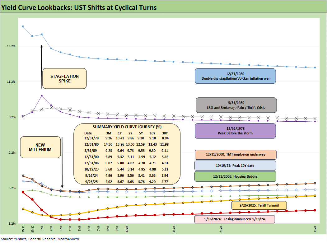
Historical Context:
The above chart overall helps give historical context to the level and shape of the current yield curve vs. a range of market backdrops. The curves are plotted across some historical economic expansions and in some cases pending turns in the economic and/or monetary cycle. They are worth pondering for compare-and-contrast purposes since they mark key transition points in cycles and market risk backdrops. In some cases, the timelines included bouts of dulled risk senses and occasional valuation excess (notably 1989, 2000, 2006).
Highlights across monetary journey…
The last time a stagflation threat had to be considered was after the Carter inversion of 1978 indicated above. The stagflation threat then showed up in force by the Dec 1980 curve after a peak Misery Index of 22% in June 1980 and Volcker was in full swing trying to break inflation.
Another useful period to ponder is the TMT cycle faltering in 2000 on the way to a massive Greenspan easing in 2001. The current cyclical tech boom and valuations cannot escape looking back at the late 1990s. That period saw credit markets under pressure in 1999 and creeping up on 6% HY default rates, but that did not stop the NASDAQ from printing an 86% total return year in 1999 on the way to a March 2000 peak (see UST Curve History: Credit Cycle Peaks 10-12-22, Greenspan’s Last Hurrah: His Wild Finish Before the Crisis 10-30-22, Yield Curve Lookbacks: UST Shifts at Cyclical Turns 10-16-23).
That period offers another case study in excess in equity and credit markets with the peak in 1999 (credit) and NASDAQ (2000). The TMT bubble bursting soon led to excessive easing by Greenspan in 2001 and then into early 2004, in turn setting the table for the housing bubble peak in 2006. During the 2004 to 2007 period, leveraged derivative exposure and structured credit was out of control and counterparty risk was soaring. The good news is that currently the credit markets and banking/dealer system are sound unlike 1999 and 2007.
Passing across the distortion years…
The chart above jumps from 2006 to 2023, which takes the market beyond the crisis period and the ZIRP years and COVID. Both the post-credit crisis period and later COVID crisis prompted the Fed to deliver a wave of market liquidity support and confidence building programs that helped save the capital markets, reopened the credit markets, reduced refinancing risk anxiety, and reduced the contingent liquidity risk profile of the banks.
The credit crisis period from late 2008 to COVID in 2020 brought plenty of QE and normalization distortions to the yield curve shape. The Fed’s dual mandate made that possible. The market could soon face new legislative threats to the Fed in 2026 that seek to reel in the dual mandate. That is based on commentary from Bessent and mirror plans discussed in Project 2025 (See Chapter 24). That will be a topic to tackle as we get closer to those ideas coming into play.
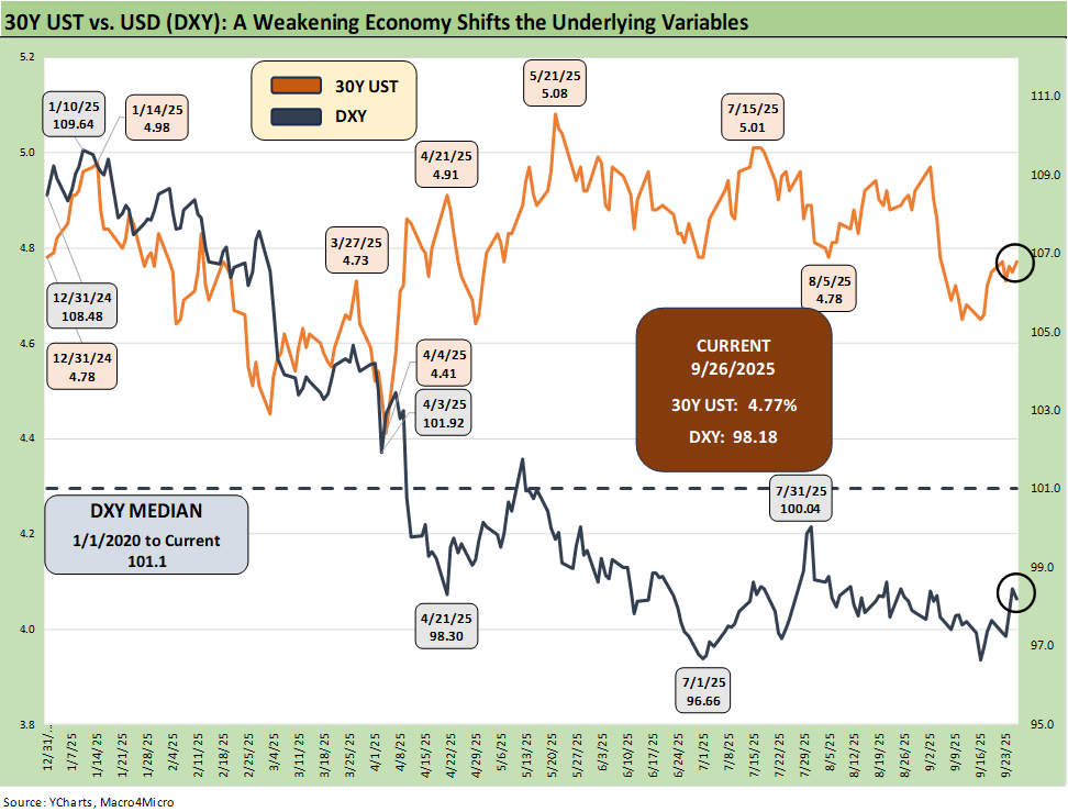
Recent Highlights:
The above chart plots the recent trends in the 30Y UST vs. the dollar index (DXY) as the US dollar weakness throws another risk variable into the picture and poses a major risk factor for non-US buyers of UST. This past week saw the dollar firm up, with the headline color tying some of that rebound to the FOMC actions and post-meeting commentary not signaling a hyper easing move – or at least until Trump gets “his guy” in the seat and more like-minded people in leadership positions.
This week saw a rise on the long end of the UST curve as detailed below, and the reality is that a UST steepener remains very much a threat with inflation not easing and UST supply pressures remaining higher despite the tariff revenue.
Team Trump loves to speak of record tariff revenue as if the word “record” makes it a good thing when it comes out of US pockets. If you wanted to create a recipe for stagflation, that would be the easier recipe book. Just add record deficits and a weaker dollar from the spice rack. Tariffs hit prices or profitability. Resulting expense offsets create layoffs or slow hiring and expansion by companies who get hit on the cost line.
Historical Context:
The dollar has gone through its worst pounding since the 1970s during the dark days of stagflation and multiple deep recessions. On the one hand, lower rates could be a catalyst for dollar weakness while political risk factors and governance quality should now be factors in the US sovereign credit quality assessment. The flip side is rates and inflation metrics may not cooperate with baseline scenarios. In a world where everyone is a borrower, someone has to be the lender.
Record forward-looking deficits and the optics of political instability (military occupation of major cities by an authoritarian-leaning, confrontational leader) adds a negative element to the sovereign risk profile of the US that no rating agency would have the courage to flag. The latest assault on free speech and Trump’s threat to arrest people who accuse him of being against free speech is not without its humor and twisted irony (“Call me a fascist and I will arrest you.”?!?).
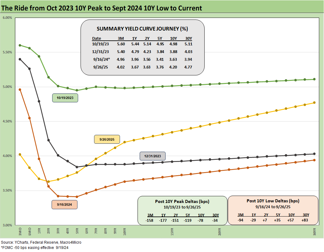
Recent Highlights:
The above chart updates the post-easing shift and gives it some context to the last major easing in Sept 2024. The current curve did not follow the Sept 2024 shift into a bull flattener to go with the lower fed funds. The rally after Sept 2024 was brief and soon gave way to a bear steepener.
We saw an upward shift this week with short to intermediate rates moving in a bear flattener pattern after a year that saw a bull steepener. The long bond (30Y) chaos in various countries has kept global investors on edge and the supply-demand concerns for UST funding are not going away.
Historical Context:
The above chart frames today’s rates amid the wild ride from the Oct 2023 peak (10Y UST) down across the bull flattener into year-end 2023 and then into the easing actions and rally of Sept 2024. Then came the ensuing bear steepener that is evident in the journey to Sept 2025. We break out some numerical UST deltas in the box.
The UST experience in the period after the Sept 2024 and the -50 bps in cuts (followed by another two cuts in 4Q24) will loom large in memory banks. This chart reminds us that the “ease and flatten” shapeshifting is hard to rely on in a market where the supply-demand of UST is tenuous and tariff impacts are hard to predict.
Fed easing and the flattener vs. steepener debate…
There was a lot of bear steepener action from the end of 2023 into the summer of 2024 and fresh bouts of the same after the big rally in the fall of 2024. The Sept 2024 easing gyrations will make it hard to take much for granted this time after Sept 2025 with much higher, sweeping tariff policies and an ongoing debate over a cyclical slowing in the mix of variables.
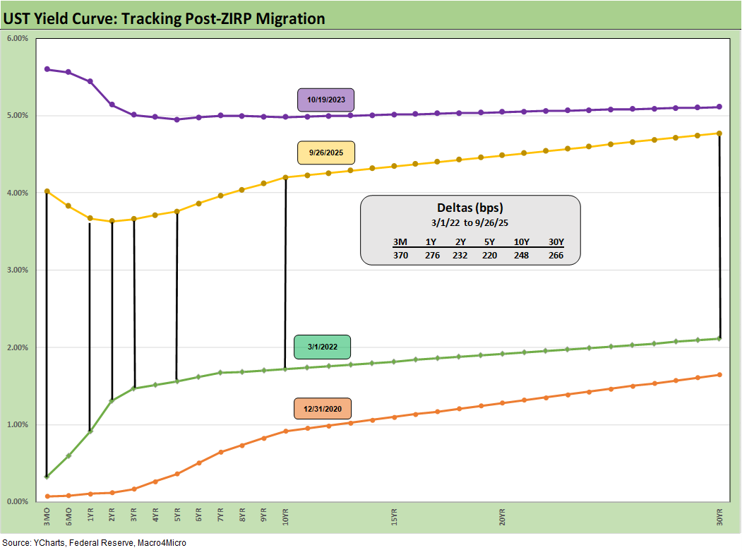
Historical Context:
The above chart just updates where the current UST curve stands relative to the Dec 2020 UST curve on the low end and the 10-19-23 highs after the tightening cycle went into effect in March 2022.
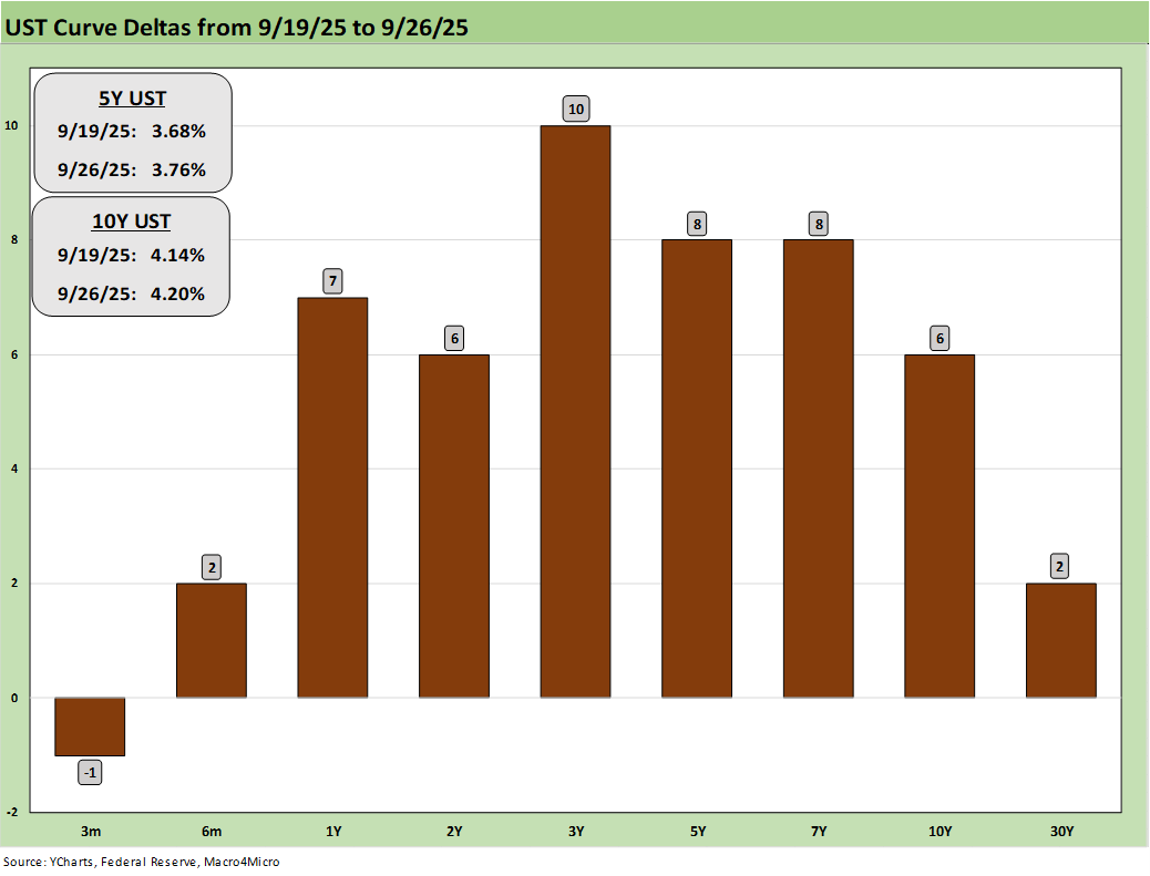
Recent Highlights:
The above chart updates the 1-week UST deltas, and we see the stark reminder that the FOMC controls the short end, and the long end is dictated by the market. Anxiety around the pace of easing set in rapidly after the FOMC meeting with some constructive economic numbers and more than a few public comments from the Fed speech circuit and others who believe caution was warranted with the tariff effects still highly uncertain.
For all those who say the Fed is damaging the housing market, the mortgage story and the supply-demand imbalances by region and price tier underscore that the topic is a lot more complicated than that. We saw mortgage rates move higher to almost 6.4% after the easing after getting closer to 6.1% prior to that action. Everyone got a taste in late 2024 and into 2025 that the fed funds rate does not dictate mortgage rates, and that Sept 2024 aftermath was before the tariff wave started to work its way into the various industry ecosystems.
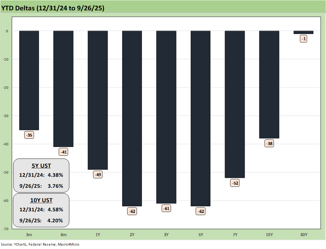
The above chart updates the YTD UST deltas. We see how the bull steepener has paid off for bond returns in YTD 2025 with the 7 bond ETFs we track all in positive return range (see Market Commentary: Asset Returns 9-28-25).
Recent Highlights:
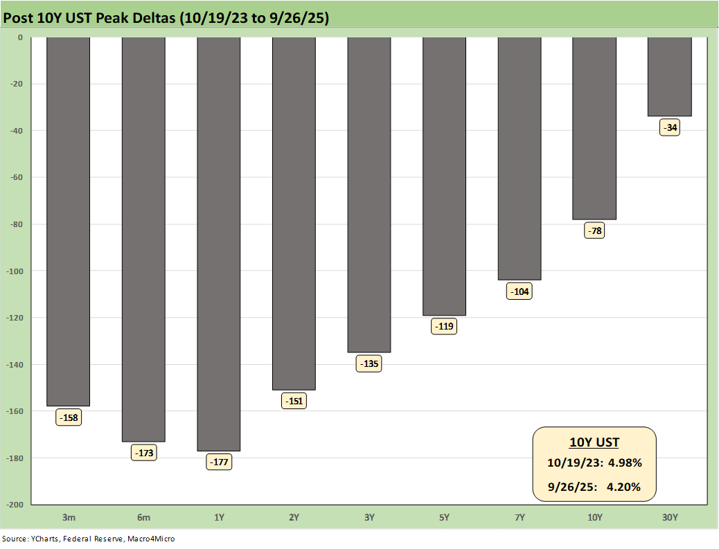
The above chart updates the running UST deltas from 10-19-23 through Friday. At the very least, it offers a reminder of what could go wrong if we get adverse inflation outcomes from tariffs. The politics of inflation have always been a death knell for reasonable discussion based on facts (“seller pays” vs. “buyer pays,” etc.).
If jobs stay weak and inflation numbers get uglier, there is every reason to expect intervention by the White House in the data delivery as we saw after weak July payrolls (see Happiness is Doing Your Own Report Card 8-1-25). At this point, the shutdown could open up some extreme scenarios for actions against the BLS and BEA.
Historical Context:
We now live in a world where votes and economic data get rejected, and the lemmings fall right into line and join the disinformation chorus. The data sets do struggle in payroll, and the need to better model assumptions and survey issues have been picked over ad nauseum. When Trump piled on the “get rid of quarterly reports” bandwagon (in the age of AI and streamlined data delivery), the “intent” to mask any negative trends in the economy started to get more transparent in terms of motives.
The Project 2025 ambition (Chapter 21, 24) is to consolidate data and information and unify control – not to assure better and more comprehensive data. That has been evident in an array of actions that we have covered in other notes. Ambitions for better data require more investment, more tech, and more public-private alliances. That dilutes control – and control is the point.
Recent Highlights:
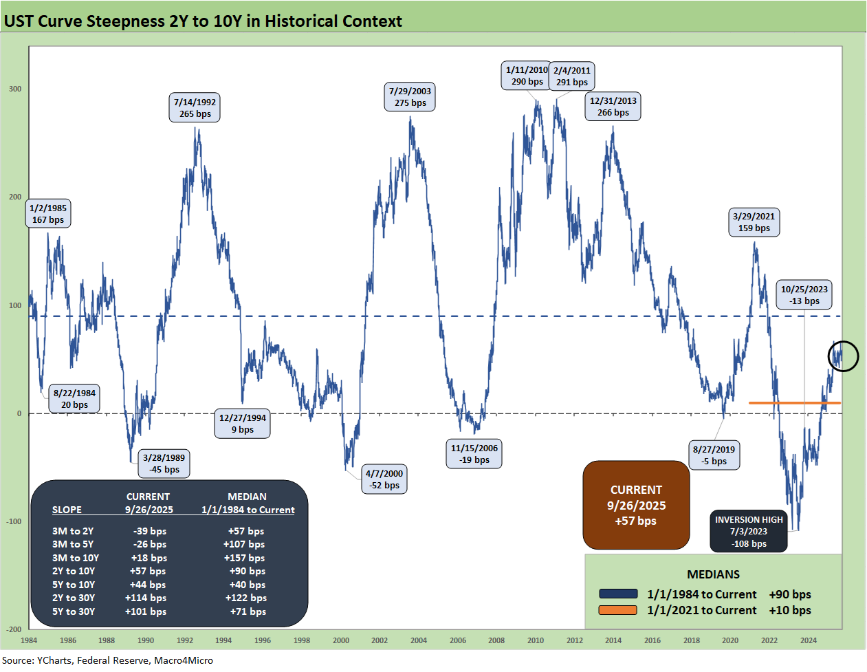
The above chart plots the 2Y to 10Y slope from 1984 for a read on the current shapeshifting potential ahead. For the 2Y to 10Y, the current +57 bps vs. long-term median of +90 bps shows ample room for steepening from current levels. Bear steepening moves have been common in the 2024-2025 timelines, and the tariff topic is one more force that keeps it on the front burner as a risk to watch.
Historical Context:
We see a peak inversion in July 2023 of -108 bps after the 2Y to 10Y had hit a slope of +159 bps in March 2021 when the macro picture had bounced off COVID in a ZIRP market and fed material supply-demand imbalances.
Oil and gas prices spiked with the Russian invasion of Ukraine in Feb 2022. That Russian inflation catalyst is seldom – if ever – cited by Trump and his GOP leadership when they point fingers. Politics as usual in Washington.
We also include a box within the chart that details the other UST curve segment slopes that we watch along with the long-term medians. The front-end inversion from 3M is still the most anomalous part of the curve when you consider the fact we have been in an economic expansion since spring 2020 after a very brief 2-month recession per NBER.
The economy is now slowing in 2025 with PCE inflation still inside the 3.0% line (see PCE August 2025: Very Slow Fuse 9-26-25). The 3M to 2Y UST inversion of -39 bps is starkly different from the post-1984 historical median of +57 bps. The 3M to 5Y inversion of -26 bps is a long walk from the +107 bps median.
See also:
Market Commentary: Asset Returns 9-28-25
Mini Market Lookback: Market Compartmentalization, Political Chaos 9-27-25
PCE August 2025: Very Slow Fuse 9-26-25
Durable Goods Aug 2025: Core Demand Stays Steady 9-25-25
2Q25 GDP Final Estimate: Big Upward Revision 9-25-25
New Homes Sales Aug 2025: Surprise Bounce, Revisions Ahead? 9-25-25
Credit Markets: IG Spreads Back in the Clinton Zone 9-22-25
The Curve: FOMC Takes the Slow Road 9-21-25
Market Commentary: Asset Returns 9-21-25
Mini Market Lookback: Easy Street 9-20-25
FOMC: Curve Scenarios Take Wing, Steepen for Now 9-17-25
Home Starts August 2025: Bad News for Starts 9-17-25
Industrial Production Aug 2025: Capacity Utilization 9-16-25
Retail Sales Aug 2025: Resilience with Fraying Edges 9-16-25
Credit Markets: Quality Spread Compression Continues 9-14-25
The Curve: FOMC Balancing Act 9-14-25
Footnotes & Flashbacks: Asset Returns 9-14-25
Mini Market Lookback: Ugly Week in America, Mild in Markets 9-13-25
CPI August 2025: Slow Burn or Fleeting Adjustment? 9-11-25
PPI Aug 2025: For my next trick… 9-10-25
Mini Market Lookback: Job Trends Worst Since COVID 9-6-25
Payrolls Aug 2025: Into the Weeds 9-5-25
Employment August 2025: Payroll Flight 9-5-25
JOLTS July 2025: Job Market Softening, Not Retrenching 9-3-25