
Yield Curve Lookbacks: UST Shifts at Cyclical Turns
We start our multi-part series on UST curves during cyclical transition periods.


We start a series of UST lookbacks to fill in some of the history of how the UST has moved across various monetary and macroeconomic backdrops.
We will start with the UST curves that show the shift from inverted to flat and upward sloping during critical periods of cyclical transitions including periods from the late 1970s just before Volcker arrived on the scene in 1979.
We see the exercise as a good one to ponder as the current market sentiment shifted from a high certainty of a recession in the fall of 2022 associated with the inverted curve to a current debate more focused on steepening risk and the proper term premiums.
The fear of another adverse move for duration is now getting complicated by war threats bringing some more potential for a flight to quality but also bringing a need for more deficit spending.
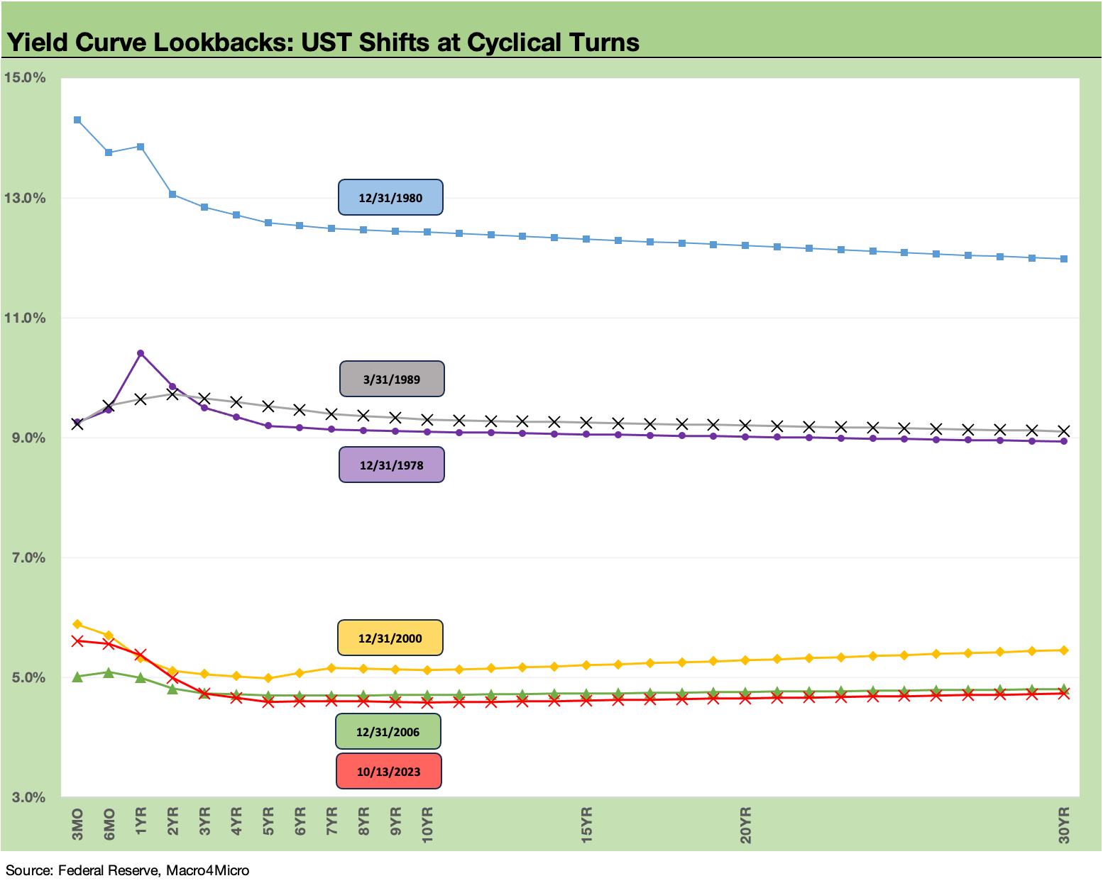
For the next stage of our reviews of historical yield curves, we will be looking back at some cyclical turning points. This commentary is the start of a series that will review the UST shapeshifting and pace of migration across the cycles.
We will start in the early periods of the Volcker years, which was rather dramatic as the economic indicators moved rapidly over a handful of quarters. After we get through the cyclical turns seen in the time periods noted in the above chart, we will then move on to infill on the UST curve patterns across the interim expansion years.
The stark differentials in the absolute levels of interest rates from the late 70s/early 80s versus today jump off the page. This stayed somewhat the case in the late 1980s, when the secular shift in UST rates was about to hit after the 1990 downturn.
For those less familiar with those long-ago periods, the GDP data for some of those early days might surprise people since numerous ugly high inflation/high UST rate periods were posting up strong annual GDP expansion numbers. Some of these inversion years such as 1978 (+5.5% GDP) were in strong stages of the cycle. That demand side of the equation was fueling inflation that has some parallels to the post-COVID period when “old school” supply-demand imbalances still ruled.
The volatility across a few quarters can be dramatic in some of these earlier years (e.g., from -8.0% in 2Q80 to +7.7% in 4Q80). The needle could move quickly and in larger magnitude in a smaller and less diverse US economy. That was before the booming nominal growth of the 1980s and 1990s that reaped the benefits of the Volcker victory over inflation.
The inflation numbers from the late 1970s through 1981 show an obstacle course of double-digit CPI numbers. It is safe to say a lot was going on in terms of structural changes in the US economy and globally around manufactured goods, energy, currencies/trade, and how leadership in Washington reacted (or failed to react) in policy decisions.
As we enter a period of geopolitical stress today and further into a trade environment that likely increases in protectionism (notably in China trade), it is never a bad idea to look back at what did (and did not) work in the face of trends and events that might be long forgotten or never learned (speaking of Congress...).
UST curve has a wild history…
The transition from the late 1980s to the early 1990s marked some critical changes along the timeline as Greenspan reinvented the game during that post-1989 cyclical transition. His last go-around after the TMT bubble and his hyper-accommodative policies in 2001 to 2004 led many to say he then cursed the game after reinventing it. That post-2000 mega-easing into 2004 set the stage for the 2008 crisis. We will revisit those periods in the timeline and look for ties to what is going on (or not going on) today.
The perplexing part of the UST curve history is that the pattern of steepening did not always play by the rules and typical assumptions about which UST curve segments would steepen and when that would happen. The lookback exercises might offer some food for thought or at least some “event context.”
In the coming series, we will break out the time periods across the late 70s/early 80s, the late 80s/early 1990s, the 2000-2001 TMT cyclical transition, and the wild year of 2007 ahead of the crisis. After that we will address the more recent post-crisis world of ZIRP and QE. Fed “normalization” efforts (raising rates/shrinking Fed balance sheet) never quite took hold before a very abnormal pandemic showed up on the way to an inflationary shock.
As part of this series, we will wrap up the transition cycle years and then turn back to the timeline of the expansion and recession periods. We will fill in the curve action market backdrops by infilling the expansion years between the cyclical turning points.
Years such as the 1987-1988 credit market peak (and peaks of excess), the 1994 Fed ambush (at the time, the “mother of all bear flatteners”), and the 1995-1996 risk rebound and race toward spread lows are among periods that present some very interesting data points. The times when the market was “way wrong” are among the interesting and more humbling moments.
The goal of our series is to help streamline the historical review process for readers who might be new to the game or did not live through it.
We will pick the late 1970s for the starting point…
The Volcker and pre-Volcker inflation periods were very different than the post-COVID spike, but the constant comparisons to that Volcker period in the financial and political media (the refrain of “worst in over four decades”) tend to pull in the whole timeline. At a minimum, the comparison of events and monetary policy cycles are always good mental exercises to see how the markets move.
Starting with Volcker at least starts with a Fed that won the battle. There is also less distortion from wage price controls (notably under Nixon-Ford), recent currency shocks (Nixon years), and the suddenness of the first oil shock in late 1973. There is also better tracking data and Fed policy transparency vs. the early to mid-1970s, when information required getting hauled in front of Congress. It took 1978 legislation to get the Fed’s mandate settled in the Full Employment and Balanced Growth Act (a.k.a. “Humphrey Hawkins Act”) signed by Carter. There have been attempts over the decades to restrict the Fed mandate to just price stability.
It all comes back to asset allocation…
Those who face the challenge of “making a yield curve call” in today’s markets after the inflation spike of 2021-2022 and ensuing tightening cycle face a very distinctive set of market conditions. That recent inflation experience was the first one of its kind since the Volcker years, so some quick background on the histories can be of use in the compare-and-contrast exercises.
That 2022 experience actually was quite mild relative to the 1973-1975 pain and the shock of inflation and rates from 1979 to 1981. There is a lot of history in the post-Vietnam and post-Arab Oil Embargo inflation periods (see Inflation: Events ‘R’ Us Timeline 10-6-22). There were obviously much worse shocks to the economy than 2022 given how this post-COVID expansion has continued. That does not change the psychological impact of such a shock when coming off low inflation years and the stretches of ZIRP and QE.
Asset allocation decisions since early 2022 have been all over the place with more than a few major debating points and topics to wrestle with:
The “real fed funds” dilemma: Back in 2022, many predictions saw the Fed pausing by the fall. Those with that view could never quite reconcile their Fed predictions with a “real fed funds rate” that was deeply negative. The negative real fed funds was in sharp contrast to prior tightening cycles and implied the need in 2022 for much lower inflation or much higher fed funds – or both (see Fed Funds vs. PCE Price Index: What is Normal? 10-31-22, Fed Funds-CPI Differentials: Reversion Time? 10-11-22).
The inverted curve as a recession predictor: There is no question that flat curves and inverted curves have come before recessions. In “normal” cycles, the pattern of the Fed tightening into recoveries and easing into recessions almost made flat-to-inverted a natural and logical occurrence. In this current cycle, we have had “flat” and even “inverted” without a timely recession to follow. The UST as “symptom, not a cause” is something we embraced a long time ago, and the correlation vs. causation discussion tended to take a back seat in the latest wild ride of 2022.
We have observed that the inversion as a predictor was not always more useful than “looking out the window” (i.e., looking at how the consumer sector and industries were doing in real time not just forecasted). At times, the turmoil may already have arrived, and you don’t need to check the curve twice or wait for NBER to tell you a year or more later what’s happening now, before your eyes (see Business Cycles: The Recession Dating Game 10-22-23).
The unique nature of the post-crisis monetary cycle: The recent monetary cycles and protracted use of ZIRP since late 2008 and in the COVID peak through early 2022 (plus a heavy dose of QE and Fed balance sheet use in those ZIRP periods) made this post-2008 monetary cycle quite different by any definition. Toss in a 100-year flood in the form of a pandemic, and you have enough qualifiers to call into question most any economic model (even if you name the models after yourself).
Market structure as a different set of conditions: The evolution of the capital markets with a massive base of corporate bonds outstanding (see Systemic Corporate and Consumer Debt Metrics 9-15-23), the stunning growth of derivatives/counterparty lines, soaring bank interconnectedness risk, the rapidly expanding world of private credit, and the “securitization of everything” (“Got any dreams? We can also tranche those up for a fee.”) among other variables complicate comparisons of systemic risk across cycles when rates move sharply.
The sheer size of the OTC bond markets is a major difference by itself. The USD BBB tier index ($4.1tn) is bigger than France and the UK and right on top of Germany the last time I checked. That comes with a smaller number of market makers than the 1990s, so the “crowded exit risk” is also food for thought in framing systemic risks.
The regulatory overlay is entirely different than during the “Volcker cycle”: The crisis and post-crisis years were part of increasingly deregulated financial markets relative to the “old days” of Glass-Steagall. The convergence of the securities and bank lending sectors and extraordinary growth of counterparty credit risk via derivatives made the markets a very different world in terms of the risks. What that means for credit contraction effects and market-making is still being sorted out (and with a fresh dose of post-crisis regulatory overhauls).
There is a wide range of events and market developments for the UST lookbacks to consider vs. today, and we will tackle some in the context of the time periods we frame. Unfortunately, just as we see today, war and terrorism were a part of the picture in some past cycles. We also saw bad behavior in the markets (i.e., underwriter standards, systemic leverage, imprudent risk appetites etc.). The jury is still out today on how much excess will be seen in some of the high growth markets such as private credit. The worst behavior is more likely to be housed (pun intended) in DC.
There have been plenty of examples of dysfunction in Washington, but nothing quite like today, including in the Nixon years when GOP leaders had spines. Remember, conservative icon Goldwater was the one who had the dagger that ended with Nixon’s resignation. The political risk factor in the US is in a class by itself now. Washington has set the bar now at an all-time low since the Civil War.