
The Curve: FOMC Takes the Slow Road 9-21-25
Post-FOMC chatter, a SEP report, dot plot digestion, and some key economic indicators keep risk appetites intact.


The FOMC moves to cut by -25 bps while the SEP report and dot plot paint a picture of slow and steady easing. The FOMC behavior implied internal institutional support among Fed leadership for a Federal Reserve that is under autocratic siege (see FOMC: Curve Scenarios Take Wing, Steepen for Now 9-17-25).
The speeches from all sides and politicking will start up again ahead of the next set of Fed moves as the market will absorb more data points across inflation and payroll with 3Q25 earnings soon to get underway. The past week had a constructive mix of economic releases that push back on recession scenarios.
We have another big data set this week with PCE inflation and income and outlays along with the final numbers on 2Q25 GDP. So far in 2025, the GDP numbers have delivered weak results in personal consumption and fixed investment with sub-2% PCE and negative Gross Private Domestic Investment. These two buckets combine for around 86% of nominal GDP (see 2Q25 GDP: Second Estimate, Updated Distortion Lines 8-28-25).
The IEEPA SCOTUS ruling should be settled before the December FOMC meeting, and the market can take stock of the new mix of risks at that point and what it might mean for FOMC handicapping (see Market Commentary: Asset Returns 9-21-25, Mini Market Lookback: Easy Street 9-20-25).
We update the 3M to 5Y UST curve slope history this week, and that front end inversion anomaly remains an aberration and outlier across time during a multiyear expansion.
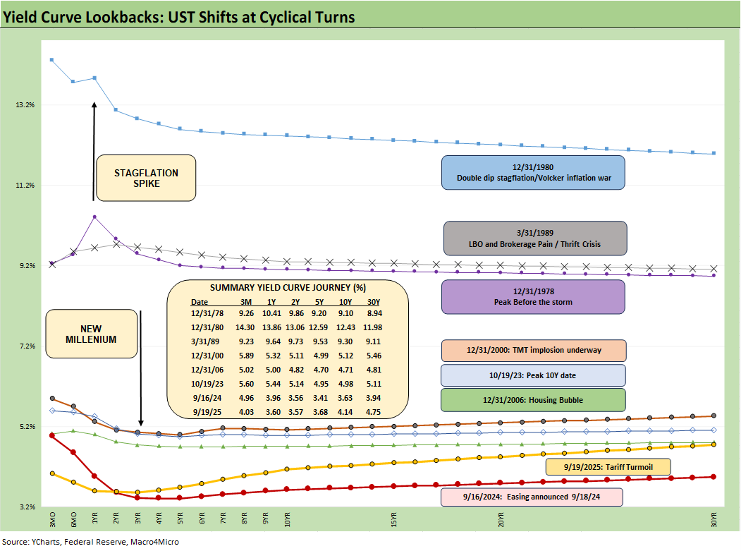
The above chart helps give historical context to the level and shape of the current yield curve vs. a range of market backdrops. The curves are plotted across some historical economic expansions and in some cases pending turns in the economic and monetary cycle. They are worth pondering for compare-and-contrast purposes since they mark key transition points in cycles and market risk backdrops. In some cases, the timelines included bouts of dulled risk senses and occasional valuation excess (notably 1989, 2000, 2006).
We recently saw headline CPI come in warmer MoM and a YoY increase from 2.7% to 2.9%. Piling on, initial claims surprised the markets with the highest weekly claims total (+27K to 263K) since Oct 2021 (268K). These numbers helped cement the Sept easing of -25 bps and effectively locked in the odds for Oct at -25 bps (91.9% FedWatch) and December at -25 bps (80.5% FedWatch)
The two FOMC meetings (Oct, Dec) will be major decision points, but each one will have PCE/CPI and payroll releases to digest. The Dec meeting should have the pending SCOTUS decision in hand on the legality of Trump’s IEEPA strategy (expected November).
The last time a stagflation threat had to be considered was after the Carter inversion of 1978 indicated above. The stagflation threat then showed up in force by the Dec 1980 curve after a peak Misery Index of 22% in June 1980 and Volcker was in full swing to break inflation.
Highlights across monetary journey…
Another useful period to ponder is the TMT cycle faltering in 2000 on the way to a massive Greenspan easing in 2001. The current cyclical tech boom and valuations cannot escape looking back at the late 1990s. That period saw credit markets under pressure in 1999 and creeping up on 6% HY default rates, but that did not stop the NASDAQ from printing an 86% total return year (see UST Curve History: Credit Cycle Peaks 10-12-22, Greenspan’s Last Hurrah: His Wild Finish Before the Crisis 10-30-22, Yield Curve Lookbacks: UST Shifts at Cyclical Turns 10-16-23).
That period offers another case study in excess in equity and credit markets with the peak in 1999 (credit) and NASDAQ (2000). The TMT bubble bursting soon led to excessive easing by Greenspan in 2001 and then into early 2004, in turn setting the table for the housing bubble peak in 2006. During the 2004 to 2007 period, leveraged derivative exposure and structured credit was out of control and counterparty risk was soaring. The good news is that currently, the credit markets are sound unlike 1999 and 2007.
Passing across the distortion years…
The chart above jumps from 2006 to 2023, which takes the market beyond the crisis period and the ZIRP years and COVID. Both the post-credit crisis period and later COVID crisis prompted the Fed to deliver a wave of market liquidity support and confidence building programs that helped save the capital markets, reopened the credit markets, reduced refinancing risk anxiety, and reduced the contingent liquidity risk profile of the banks.
The credit crisis period from late 2008 to COVID in 2020 brought plenty of QE and normalization distortions to the yield curve shape. The Fed’s dual mandate made that possible. The market could soon face new legislative threats to the Fed in 2026 that seek to reel in the dual mandate. That is based on commentary from Bessent and mirror plans discussed in Project 2025 (See Chapter 24). That will be a topic to tackle as we get closer to those ideas coming into play.
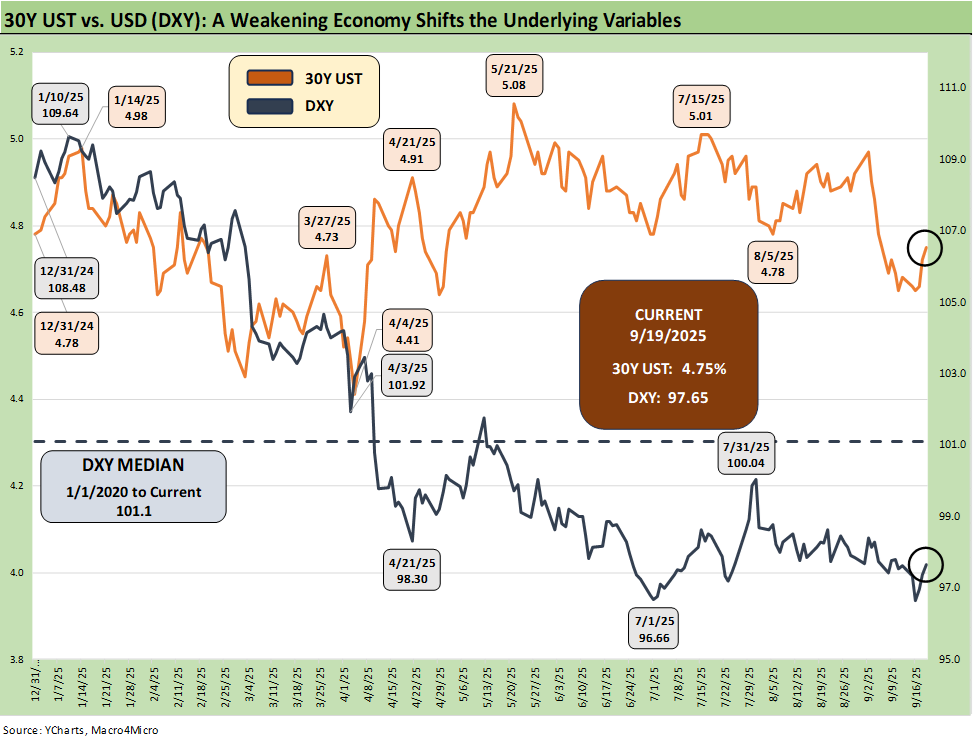
The above chart plots the recent trends in the 30Y UST vs. the dollar index (DXY) as the US dollar weakness throws another risk variable into the picture and poses a major risk factor for non-US buyers of UST. This past week saw the dollar rally to end the week, with the headline color tying some of that rebound to the FOMC actions not signaling a hyper easing move (or at least until Trump gets “his guy” in the seat).
This week saw a rise on the long end of the UST curve as detailed below, and the reality remains that a UST steepener remains very much a threat with inflation not easing and UST supply pressures remaining higher despite the tariff revenue.
Lower rates could be a catalyst for dollar weakness while political risk factors and governance quality are no longer non-factors in the US sovereign credit quality assessment. Record forward-looking deficits and the optics of political instability (military occupation of major cities by an authoritarian-leaning, confrontational leader) adds a negative element to the sovereign risk profile of the US that no rating agency would have the courage to flag. The latest assault on free speech and Trump’s threat to arrest people who accuse him of being against free speech is not without its humor.
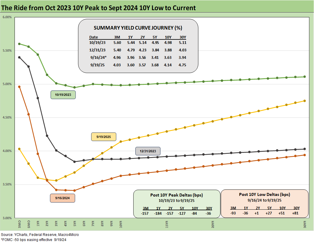
The above chart frames today’s rates amid the wild ride from the Oct 2023 peak (10Y UST) down across the bull flattener into year-end 2023 and then into the easing actions and rally of Sept 2024. Then came the ensuing bear steepener that is evident in the journey to Sept 2025. We break out some numerical UST deltas in the box.
The UST experience in the period after the Sept 2024 and the -50 bps in cuts (followed by another two cuts in 4Q24) will loom large in memory banks. This chart reminds us that the “ease and flatten” shapeshifting is hard to rely on in a market where the supply-demand of UST is tenuous and tariff impacts are hard to predict.
Fed easing and the flattener vs. steepener debate…
There was a lot of bear steepener action from the end of 2023 into the summer of 2024 and fresh bouts of the same after the big rally in the fall of 2024. The Sept 2024 easing gyrations will make it hard to take much for granted this time after Sept 2025 with much higher, sweeping tariff policies and an ongoing debate over a cyclical slowing in the mix of variables.
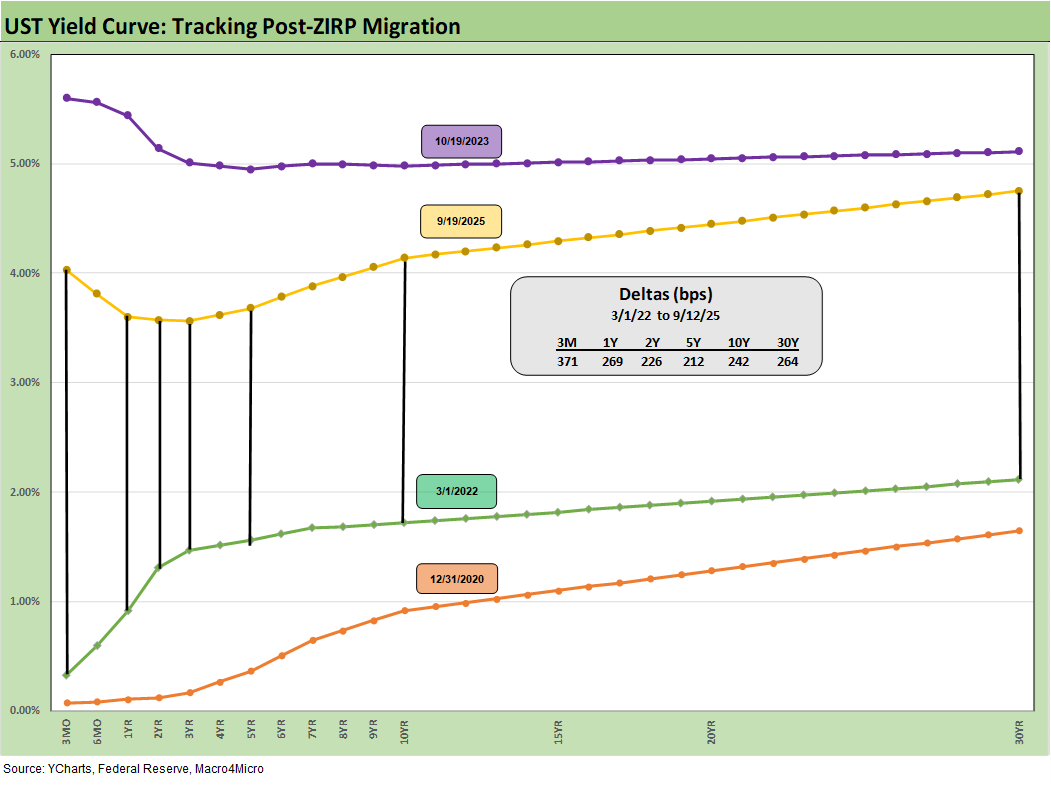
We drop in the above chart to frame the UST deltas since March 2022 when ZIRP ended and the tightening cycle began. It offers a reminder that we had a major move out to Oct 2023 and a smaller move to Sept 2025 from Sept 2024 (see prior chart for Sept 2024).
The past year kept the long duration UST ETF (TLT) under pressure for much of the year even with the positive YTD 2025 performance for bonds. The long-duration UST ETF (TLT) posted negative returns looking back 1 year but is now positive on a YTD basis.
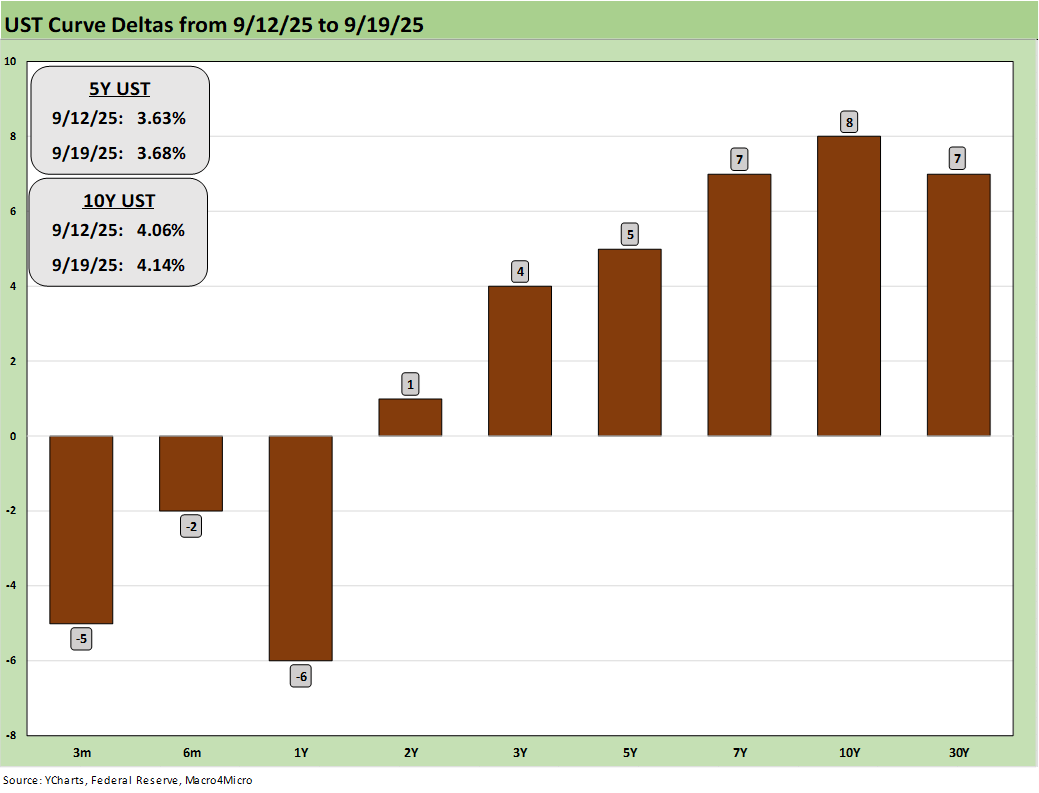
The above chart updates the 1-week UST deltas, and we see the stark reminder that the FOMC controls the short end and the long end is dictated by the market. For all those who say the Fed is damaging the housing market, the mortgage story and the supply-demand imbalances by region and price tier underscore that the topic is a lot more complicated than that. Everyone got a taste in late 2024 and into 2025, and that was before the tariff pile-on.
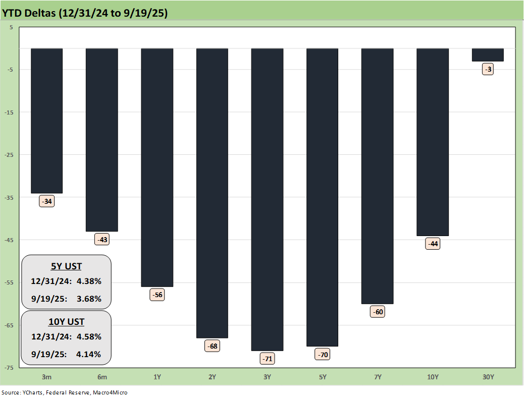
The above chart updated the YTD spread deltas, and we see how the bull steepener has paid off for bond returns in YTD 2025 (see Market Commentary: Asset Returns 9-21-25).
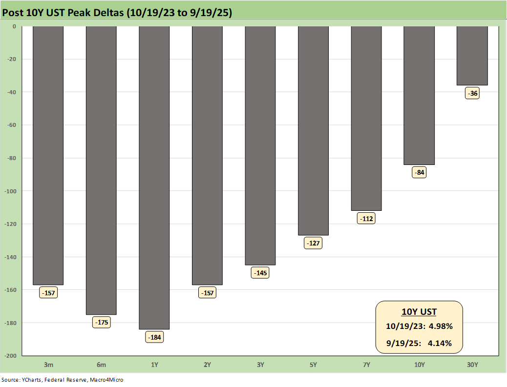
The above chart updates the running UST deltas from 10-19-23 through Friday. At the very least, it offers a reminder of what could go wrong if we get adverse inflation outcomes from tariffs. The politics of inflation have always been a death knell for reasonable discussion based on facts (“seller pays” vs. “buyer pays,” etc.). If jobs stay weak and inflation numbers get uglier, there is every reason to expect intervention by the White House in the data delivery as we saw after weak July payrolls (see Happiness is Doing Your Own Report Card 8-1-25).
We now live in a world where votes and economic data get rejected, and the lemmings fall right into line and join the disinformation chorus. The data sets do struggle in payroll, and the assumptions, models and survey issues have been picked over ad nauseum. When Trump piled on the “get rid of quarterly reports” bandwagon (in the age of AI and streamlined data delivery), the “intent” to mask any negative trends in the economy started to get more transparent in terms of motives.
The Project 2025 ambition (Chapter 21, 24) is to consolidate data and information and unify control – not to assure better and more comprehensive data. That has been evident in an array of actions that we have covered in other notes. Ambitions for better data require more investment, more tech, and more public-private alliances. That dilutes control – and control is the point.
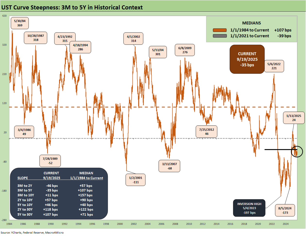
The above chart plots the 3M to 5Y slope from 1984 for a read on the current inversion of the UST curve. We see a peak inversion in May 2023 of -197 bps after the 3M to 5Y had hit a slope of +221 bps in May 2022 when the macro picture had bounced off COVID in a ZIRP market and fed material supply-demand imbalances. Meanwhile, oil and gas prices spiked with the Russian invasion of Ukraine. That Russian inflation catalyst is seldom – if ever – cited by Trump and his GOP leadership when they point fingers. Politics as usual in Washington.
We also include a box within the chart that details the other UST curve segment slopes that we watch along with the long-term medians. The front-end inversion from 3M is still the most anomalous part of the curve when you consider the fact we have been in an economic expansion (now slowing in 2025) with PCE inflation still inside the 3.0% line (see PCE July 2025: Prices, Income and Outlays 8-29-25). The 3M to 2Y UST inversion of -46 bps is starkly different from the post-1984 historical median of +57 bps. The 3M to 5Y inversion of -35 bps is a long walk from the +107 bps median.
See also:
Market Commentary: Asset Returns 9-21-25
Mini Market Lookback: Easy Street 9-20-25
FOMC: Curve Scenarios Take Wing, Steepen for Now 9-17-25
Home Starts August 2025: Bad News for Starts 9-17-25
Industrial Production Aug 2025: Capacity Utilization 9-16-25
Retail Sales Aug 2025: Resilience with Fraying Edges 9-16-25
Credit Markets: Quality Spread Compression Continues 9-14-25
The Curve: FOMC Balancing Act 9-14-25
Footnotes & Flashbacks: Asset Returns 9-14-25
Mini Market Lookback: Ugly Week in America, Mild in Markets 9-13-25
CPI August 2025: Slow Burn or Fleeting Adjustment? 9-11-25
PPI Aug 2025: For my next trick… 9-10-25
Mini Market Lookback: Job Trends Worst Since COVID 9-6-25
Payrolls Aug 2025: Into the Weeds 9-5-25
Employment August 2025: Payroll Flight 9-5-25
JOLTS July 2025: Job Market Softening, Not Retrenching 9-3-25
Hertz Update: Viable Balance Sheet a Long Way Off 9-3-25
Mini Market Lookback: Tariffs Back on Front Burner 8-30-25