
Footnotes & Flashbacks: Credit Markets 7-15-24
The weekend assassination attempt came after credit markets saw CPI light up the screens while some bellwether major banks weighed in.


Just row… don’t get distracted…this should go smoothly.
The capital markets have successfully avoided pricing in too much political and policy risk, but the weekend chaos, the start of the GOP Convention, and shifting probabilities on the election might start to change the forward-looking calculus with Trump likely pulling away.
The balancing act of credit risk vs. interest rate risk is always a key trade-off, and the odds making has to weigh FOMC easing probability against what might unfold in fiscal policy (supply and demand for UST) and tariffs in 2025 (import inflation, supplier chain disruption, trade retaliation, currency risks, demand from major UST buyers such as China, etc.).
The CPI reaction the past week fires up FOMC optimists and seems to be overstimulating the perception that long rates will come down in lockstep despite the pronounced inversion and the chance that a Trump victory might get us back into a steepening bias on the long end to go with easing on the short end.
Earnings season at the micro level is a critical factor underway, but we also have retail sales, industrial production, and housing starts this week. We will see if such critical multiplier effect releases tweak the post-CPI, post-sniper sentiment ahead of 2Q24 GDP advance numbers and the PCE release the following week.

We already covered the week’s trends for yields (see Footnotes & Flashbacks: State of Yields 7-14-24) and asset returns (see Footnotes & Flashbacks: Asset Returns 7-13-24). Equities and bonds had a good week as both stocks and duration got a lift after CPI. We covered some of the chatter on sector rotation ideas heard in equities around a shift to Small Caps in what would be a vote for the issuer base that most overlaps with HY.
The above bar chart updates YTD returns (Total Returns on the left, Excess Returns on the right) for each credit tier. The chart is one more reminder that credit risk and shorter duration has carried the day in 2024. We now move into a fresh debate on what wins in the home stretch – credit or rates or what mix of each and where along the curve.
The CPI numbers set off a wave of optimism with new highs on the large caps and material rebounds for some lagging benchmarks (Russell 2000). The market saw sharp rallies for the interest rate sensitive sectors (homebuilders at the top of the list) and some consumer financing dependent sectors (auto retail, new and used) could see some benefit given the exposure to short duration liabilities that drive the demand and cost side of the equation.
The 2024 home stretch of the year gets more complicated after the weekend events that likely made the election less complicated but the handicapping and pricing of the risks more convoluted (tariffs, trade retaliation, mass deportations and labor market pressure, budget deficit spikes, White House control of the Fed, the Project 2025 purge, slaughter, and repopulation with “like-minded” replacements in a smaller “administrative state” etc.). Foreign policy disciplines will also see a personnel purge and refocus the US alliances (Putin at top of the list) that would seek to disrupt EU “bloc power” in trade and throw Ukraine under the metaphorical bus and literal tank.
Despite the feigned indignation by the talking heads of the extreme right, textbook fascism is on the table. Power is the goal, and some fake hurt feelings constitute a low price to pay. The reality is the artificially stacked right wing Supreme Court has abandoned any pretense of its faux originalism, and the Project 2025 goals and desire to populate the government with the “like-minded” tells a very dark story. Meanwhile, the ability to prove misdeeds or seek accountability means checks and balances (remember those?) for election misconduct (crimes?) are nearing the dustbin.
The direction of Trump’s ambitions is not a mystery. Being shot at does not mean the motives and bad behavior (and potential crimes) suddenly disappear. It is not a “netting” transaction. The troubling ambitions include controlling the Fed, which is no small threat. That includes massive tariffs, which is a frightening desire for a President who keeps saying the US “collected” billions from China (try zero).
Ukraine and NATO could be in a downward spiral in 2025 that generates even more geopolitical risk. Abandoning Ukraine and NATO and any tariffs slapped on the EU (the largest US trade partner) will be more aggressively countered than in the past (see Trade Flows: More Clarity Needed to Handicap Major Trade Risks 6-12-24.). The EU and US are the largest economies and trade partners in the world. Undermine one and you hurt the other.
Trump tailwinds vs. Biden stall…
After the weekend events, Trump just had one of the scariest and disturbing attacks for a politician that will now be reshaped into a major PR tailwind that can only help his chances – arguably in a meaningful way. Biden has been a train wreck of lose-lose dilemmas since the disastrous debate that was not “just a bad night.” It is just an opinion, but he could counter the dynamics momentum of the post-assassination attempt by dropping out and bringing in new blood. That would shake up the race again. Biden was the Democratic nominee in 2020 by not being Bernie Sanders and elected President by not being Donald Trump. That looks like a formula that will not work this time.
Trump got another major boost today in the Florida case on classified documents, which was dismissed on the grounds that the Special Prosecutor was unconstitutional. While it flies in the face of past decisions and will get appealed, it takes more potential Biden ammo off the table. There will be no rescue package of damning evidence ahead of the election to help Biden’s “not Trump” sales pitch. Biden is completely inarticulate on all the issues where Trump either lies or where Trump is completely clueless (a long list).
Loose Cannon, conflicted pocket judge…
Even if you believe that particular Judge (Aileen Cannon) behind the Florida case is utterly biased, inexperienced, and likely sat at the back of the short bus in law school, it continues the string of court victories that peaked with a blank check from the Supreme Court. As a reminder, Cannon was jammed into the Federal lineup in a lame duck session of Congress (11-12-20) after Trump lost. For those keeping score at home, such lame duck appointments of that sort are rare across the decades. She was a handpicked backyard Fed go-to plan for Trump. Kudos on planning ahead in Florida.
After the Supreme Court decision on immunity, even the introduction of evidence in the remaining cases is now suspect. The election trial in Washington will get dismissed by Trump if he wins. Appeals to the Supreme Court don’t require a lot of Christofascist mindreading on what the decisions will be at this point (see Mein Zupreme Kourt: “Official Acts” in the Eyes of the Beholder 7-1-24 ). Less exposure on the alleged criminal violations could also remove the modest political risk hurdles ahead for Trump. Those had looked like pole vaults more than low hurdles not long ago, but the courts now do what the courts now do.
The fact of what happened this weekend in PA does not change the facts of what has happened in the past. The evidence in these cases is something that “they” do not want to see the light of day before the election. Note: “They” is a popular if ill-defined term these days from the Trump camp. So, we might as well use it. Trump and the GOP keep citing “everyone” and “they.” The world should get more names.
Guest charts: yields per unit duration…

In this edition, we update some of the usual movements in spreads and yields further below, but the next section adds two “guest charts” on “yield per unit duration” for some historical context and set that against some earlier economic and credit market cycles. We simply take yields for the IG and HY index YTW and the same for the credit tiers and divide that by the related duration. We left the CCC tier out of the bar chart since they mess up the visuals. We include the CCCs in the table further below.
In a world coming out of ZIRP and semi-normalization policies of the Fed, the biggest threat ever since the credit crisis was whether the world would see material inflation and aggressive FOMC tightening. The worry over the post-crisis period was the negative return risk that comes with an upward UST migration. That would be the worst of all worlds, and that is just what the market got. It came in the form of a brutal bear flattener and then a bear inversion.
We select the following dates for the bar chart and table:
6-23-14: This date was during the post-crisis spread rally and marked the initial trough in spreads with ZIRP still in place (10-3-18 was the final cyclical HY OAS low as “normalization” was underway). That June 2014 date marked the first trip to a par (100) dollar price on the CCC tier. It was thus by definition a frothy time. The spread widening came in a matter of weeks with the Saudis and OPEC gearing up for their late summer game plan to declare war on the US “shale” sector.
2-11-16: This date was shortly after ZIRP ended in Dec 2015. This period marked the highest spreads of the post-crisis cycle and posted the low tick for the HY market. The market got crushed as Jan and Feb 2016 saw $26 handle lows on oil in each month and fears around redemption risk rose with waves of energy defaults and brutal unsecured recoveries. The mix of factors unsettled OTC HY bond market-makers and potential sellers who were already facing outsized exposure to upstream oil and gas credits. Many names faced an identical handful of variables (i.e. oil and gas prices, material cash flow shortfalls and revision of the borrowing base and ticking liquidity crises.), so the sector was painted with a roller (not a brush) while it was the #1 industry in the HY index.
10-3-18: This was just ahead of the last hike by the FOMC. Early Oct 2018 marked the post-crisis HY spread low immediately before the CCC tier blew up in 4Q18 and posted a disastrous month of Dec 2018.
3-23-20: This date marked the COVID peak for HY spreads as ZIRP arrived again along with a tasting menu of QE and liquidity backstop mechanisms – some new and some variations from the credit crisis Fed toolbox. Spreads spiked and the UST rally reflected the broad panic. We cover those histories in other spread commentaries (see links).
3-1-22: This date marks the period immediately before the FOMC hiked and ended ZIRP by mid-March (effective 3-17-22). The tightening cycle began with many soon shouting for a Fed “pause” before fed funds even exceeded inflation. June 2022 saw a CPI peak of 9.1% and many in the market were forcefully stating the economy was already in recession even with positive PCE growth and low unemployment. What was in effect a forecast was often represented as current conditions (see Unemployment, Recessions, and the Potter Stewart Rule10-7-22).
7-12-24: This is the end of the past week as the market now sees better easing prospects. The expectation is that the FOMC easing will show up by Sept after a negative headline CPI MoM number of only -0.1% for all items and +0.1% MoM for core CPI (see CPI June 2024: Good News is Good News 7-11-24).
The table below shows the yield per unit duration is favorable for IG and select HY at a time when there are scenarios for favorable trends in duration returns but potential adverse trends in excess returns. The ultimate risk is stagflation and an upward curve shift on a number of factors more tied into supply-demand imbalances in UST or trade fallout. That could be a function of renewed inflation (tariffs, supplier chain turmoil, energy setbacks) or recession (wider spreads). That is what makes the policy risk factors so overriding for 2025. Trade wars, dollar weakness, or recession risks do not present minimal probabilities if Trump is remotely serious about his policy pronouncements.
The Yield per unit duration metric is supposed to capture the full flavor of risks with yields reflecting your theoretical expected returns. The yield per unit duration should capture how much you are being paid for any mix of credit risk and interest rate risk by asset class subsector or in credit. During the period of artificially deflated UST curve came the recurring caveat of “what we don’t need is an inflation spike and material upward shift.” That is just what we got, and it sent yield per unit duration metrics higher but at a cost to bond performance on the journey there.
The yield per unit duration metric was something I picked up in speaking with investors over the years as we published commentaries on yield ratios or spreads as a % of yield. It was just one more prism to compare the risk pricing angles. The ratio was more worrisome in bullish credit markets in the post-crisis days when ZIRP was in place and low absolute UST rates extended along the UST curve. That was a period still experiencing FOMC accommodation via the Fed’s balance sheet growth and reinvestment. It could not last, and IG corporate bonds are now at a much more favorable starting point.

The above chart provides a table visual on the trends. We include the CCC tier in this one. The reality is that if you are buying CCCs for low duration you are in the wrong asset class. If duration is winning on weak fundamentals, the last thing on your mind is CCC duration since that is when quality spreads run the maximum risk of a decompression wave.
If you are bullish duration at this point in the cycle, it comes down to “Why?” but that often means an expectation of slower growth and therefore more exposure to HY spread widening. The CCC yield per unit duration is still a frame of reference as a short duration sector with exponentially higher default risk.
For now, the comparison looks better for IG bond investors relative to the post-crisis credit years. The call comes down to how a portfolio allocation strategy factors in threats to spreads and where the UST curve heads next. If we assume the short to intermediate part of the curve balances the interest rate risk better in an easing environment and that the long end may be stubborn, the BBB/BB midsection appears to present the best risk-reward. The asterisk in BBBs always comes with the warning sign to beware of cusp BBBs (Baa3/BBB-) with marginal fundamentals and heavy mix of long-dated paper. Those can be the most volatile on downgrades.
Into the spreads story…
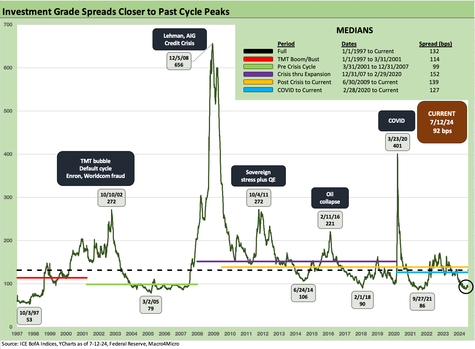
The above chart updates the IG spread histories across the cycles. We just wrapped a very eventful week for the world and the nation, but the market was in fact quiet in IG credit risk pricing with IG OAS essentially unchanged.

HY spreads had a good week with spreads overall tighter by around -8 bps to +319 bps with the B tier tightening the most at -14 bps vs. -7 bps for BBs and -8 bps for CCCs. While the above chart closes off at Friday close, the strength in markets rolled on across Monday with HY down another -6 bps on the day to +313 bps while IG was stable.

The above chart updates the HY-IG OAS differentials across time. We flag some notable Hi and Lo points. This relationship presents a shorthand way to capture the additional compensation for credit risk in the HY basket vs. the IG mix. The differential narrowed from +235 bps last week to +227 bps this week. That is in line with the June 2014 lows but above late 2021 and early Oct 2018 levels. As of Monday 7-15-24 close, the compression continued to +221 bps.

The above chart updates the BB tier where the HY lite investors live and where the traditional BBB buyers spend more time mingling with HY Classic B tier investors. The current +185 bps is compressed in historical context and inside most pre-crisis lows even if well above the Aug 1997 lows. The BB OAS is not far off from the spring 2007 lows. Monday (7-15-24) saw the BB tier tighten again to +180 bps.
BBs are in line with Jan 2020 when many BBs were trading above call prices and refinancing was expected at any time. That was before COVID showed up. The refinancing wave came with post-COVID ZIRP, but there was an adjustment period as ZIRP and fiscal support played out.
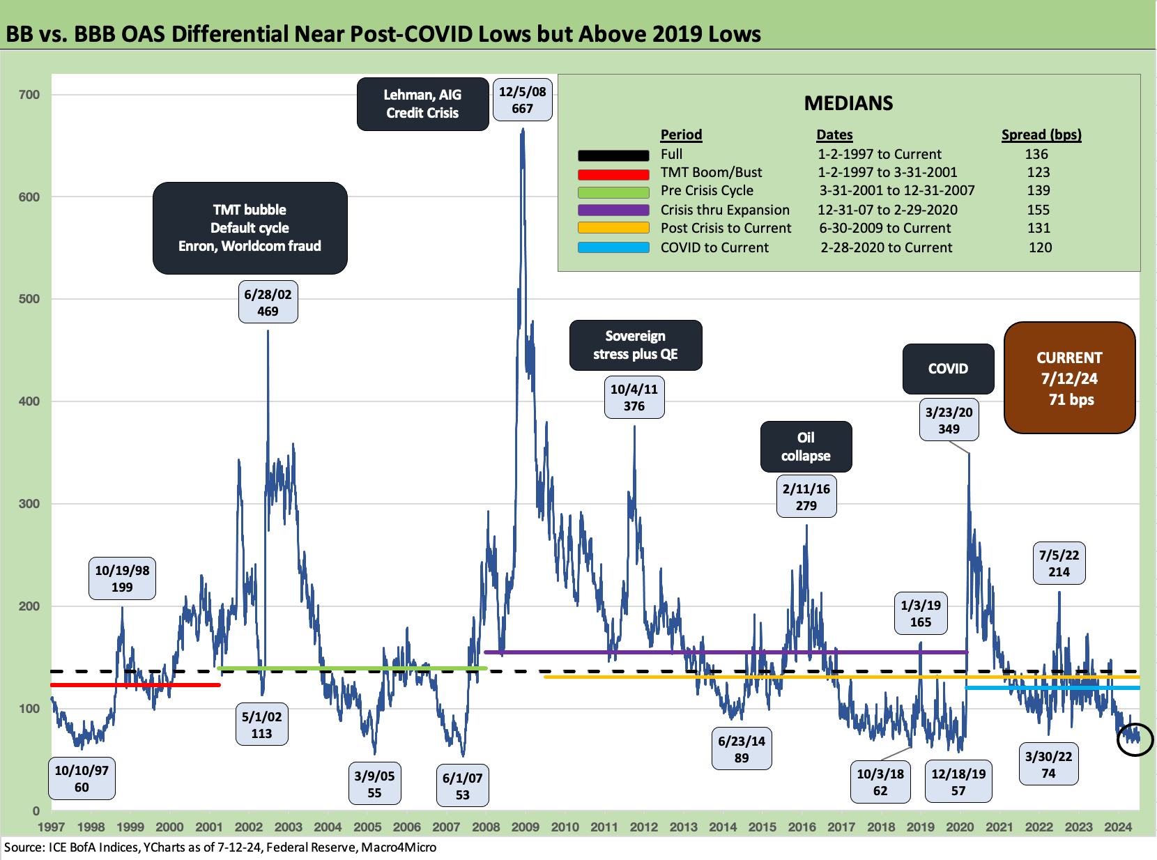
The above chart updates the “BB minus BBB” spread differential as the market has tightened to +71 bps from +77 bps last week. As of Monday (7-15-24) close, the differential is down again to +66 bps. This puts the BBB vs. BB speculative grade divide near the lows of past cycles but not yet at levels seen in Oct 2018 and Dec 2019 levels. Getting very close.

The B tier OAS and CCC tier trends are updated in this cyclical history. We looked at the CCC tier history and the B vs. CCC tier relationship in a detailed recent commentary (see The B vs. CCC Battle: Tough Neighborhood, Rough Players 7-7-24). The B tier OAS is well inside the long-term median while the CCC tier at +951 bps is hanging around the median of +963 bps. The CCC tier hit +938 bps on Monday (7-15-24) while the B tier ticked in at +290 bps.
The rise of private credit and what that means in terms of industry and issuer mix variables in the low B and CCC quality tiers mark an interesting structural evolution in this cycle. The leveraged PE issuers typically can be the key driver of decompression waves, and the CCC tier this time around comes with less speculative growth borrowing such as we saw in the TMT and Energy booms with all the capex-driven borrowing.
The most aggressive LBO and private equity transactions are spending more time outside the HY bond market in a trend that will continue as private equity players and seasoned leveraged loan players grow their AUM. That could bring benefits to HY bond investors if that in fact translates into less redemption panics that see pricing get maimed by inevitably impaired street market-making in the post-Volcker world.

The above chart updates the B to CCC quality spreads, and we see a small widening over the week on the stronger rally in the B tier than CCC tier but with both tighter. The +657 bps narrowed to +648 bps on Monday (7-15-24).
A look at yields…
In the next few charts, we update IG and HY yields across the cycles and how they look today vs. some past credit market peaks with the 1997 and 2007 years marking the periods of ultimate spread compression.

The above chart shows the timeline for IG vs. HY benchmark yields. The main takeaway from this chart is that the pre-crisis medians from 1997 to Aug 2008 are the more logical frames of reference since they are outside the world of ZIRP just as the current market is back in a “normal” fed policy zone.
That means the proper frame of reference is 6.1% for IG and 9.3% for HY, and the current market is well inside those yields on tight spreads and a lower UST curve that took a long time to get outside ZIRP and slow normalization.

The above chart updates our running comparison we look at each week for the current UST curve and IG index yields vs those of late 1997 and mid-2007. Those historical comps are two of the notorious credit cycle peaks as we covered in a number of market histories we have published (see Credit Markets Across the Decades 4-8-24, Credit Cycles: Historical Lightning Round 4-8-24).
As detailed in the chart, the UST curve is much lower today than 1997 and 2007 and the spreads also are tight, so IG yields remain well short of the long term median of 6.1%.

The HY chart does the same exercise for the same dates as the IG yields. In the case of HY, the 7.7% YTW is well inside the long-term median of 9.3% that we see as the relevant timeline, but the HY index is below the June 2007 level of just under 8.0% and the year end 1997 level of 8.6%. What really stands out in the IG and HY charts vs. prior peaks is the steeply inverted curve at the front end.
The current inflation battle under Powell and the sustained tightening cycle has not seen a “comp” in past cyclical history since the Volcker double dip stagflation years in 1980-1982. Those Volcker years were very early in HY bond market history and before the more explosive growth period in the IG corporate bond market. I was working on the audit of a major Drexel HY issuer client back in the early 1980s (Rapid-American and subsidiaries) when HY was a “new, new” thing.
The level of disintermediation of the banks and major insurance companies (private placements) took off after 1984 when I had landed on the buy side (Prudential) and notably with the plunge in inflation to a 1% handle in 1986. The roadshow volume and new issue activity went spiraling higher as rates came down, mutual funds soared, and pension AUM took off.
Contributors
Glenn Reynolds, CFA glenn@macro4micro.com
Kevin Chun, CFA kevin@macro4micro.com
See also:
Footnotes & Flashbacks: State of Yields 7-14-24
Footnotes & Flashbacks: Asset Returns 7-13-24
Consumer Sentiment: Still Feeling the Heat 7-12-24
Homebuilder Equities: “Morning After” on Rate Optimism 7-12-24
Homebuilders: Equity Performance and Size Rankings 7-11-24
CPI June 2024: Good News is Good News 7-11-24
Footnotes & Flashbacks: Credit Markets 7-8-24
Footnotes & Flashbacks: State of Yields 7-7-24
Footnotes & Flashbacks: Asset Returns 7-7-24
The B vs. CCC Battle: Tough Neighborhood, Rough Players 7-7-24
Payroll June 2024: The Race Gets Confusing 7-5-24
JOLTS May 2024: The Jobs Oasis Still Has Water 7-2-24
Footnotes & Flashbacks: Credit Markets 7-1-24
State Unemployment: A Sum-of-the-Parts BS Detector 6-30-24
The Debate: The China Deficit and Who Pays the Tariff? 6-29-24
PCE, Income and Outlays: Practicing Safe Growth? 6-28-24
HY Spreads: The BB vs. BBB Spread Compression 6-13-24
HY Spreads: Celebrating Tumultuous Times at a Credit Peak 6-13-24
Trade Flows: More Clarity Needed to Handicap Major Trade Risks 6-12-24
Miscellaneous histories:
Systemic Corporate and Consumer Debt Metrics: Z.1 Update 4-22-24
Credit Markets Across the Decades 4-8-24
Credit Cycles: Historical Lightning Round 4-8-24
Histories: Asset Return Journey from 2016 to 2023 1-21-24
Credit Performance: Excess Return Differentials in 2023 1-1-24
HY vs. IG Excess and Total Returns Across Cycles: The UST Kicker 12-11-23
Inflation Timelines: Cyclical Histories, Key CPI Buckets 11-20-23
 |
|