
Systemic Corporate and Consumer Debt Metrics: Z.1 Update
We update systemic corporate and consumer debt metrics as we wade into a critical stretch for inflation and the interest rate burden.


We update our collection of Corporate and Systemic debt metrics from the March Z.1 report from the Fed covering 4Q23 data, and it may surprise more than a few that systemic corporate and consumer systemic leverage are in check in historical context (the US government is a separate topic!).
The most critical analysis takes place below the headline systemic debt ratios on the topic of quality mix, default/loss exposure, asset class risk, counterparty exposure of leveraged entities, and how interconnectedness risk fits into the bigger picture.
The metrics around corporate and household debt % GDP are important in giving context to the overuse of the term “record” when records are set in nominal GDP, asset values, revenues/earnings, and in terms of demand for debt investments (lending) in the marketplace whether from banks, asset managers, or emerging growth markets such as private credit.
In this commentary, we tap the Fed’s Z.1 report (released in March 2024 for 4Q23) to frame debt levels across the US corporate sector and consumer markets relative to GDP. The Z.1(“Financial Accounts of the United States”). This data tome is produced by the Fed each quarter at a few-months lag and gives a high-level gut check on balance sheet trends across various markets.
The balance sheet relationships are useful as a framework in giving some context to the constant use of the word “record debt” or some variation of that in a growing economy. You always need a measuring stick. We frame various debt lines against nominal (not real) GDP since you service debt out of current dollars and issue new debt (incremental debt or refinancing) in current dollars. You owe face value, and you pay back what you owe in today’s dollars or new borrowings.
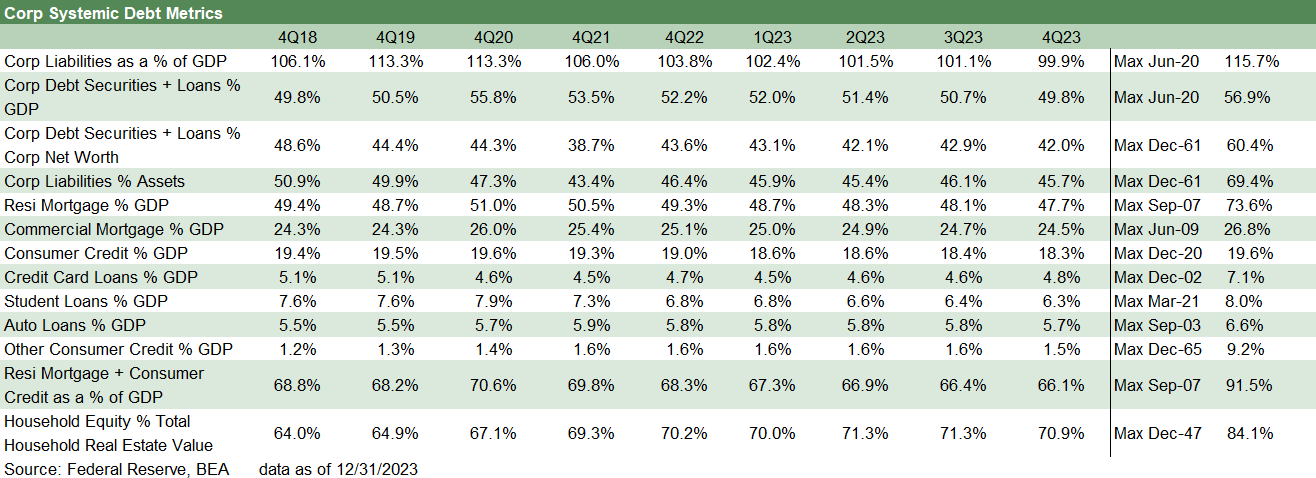
The table above gives an idea of the Z.1 numbers that we look at periodically. They help fill in the story around the balance sheets in aggregate for the corporate sector and households. We started looking at these stats back during the financial crisis when there was a lot of confusion around systemic corporate debt vs. mortgage debt and what the main failure was that “brought the house down.”
The revisionism since those crisis days on the cause of the crisis, whether from the far right or far left, are often case studies in simplistic self-serving rationales and reverse-engineered to suit ideologies. For the ideologues, the credit crisis realities on the ground back then are ancient history. The same is true around what kept debt markets out of crisis in 2020. The parties to blame are chosen in advance and the heroes who saved the world tend to be the home team.
While markets can be nuanced, the 2008-2009 backdrop saw residential mortgage debt levels that defied all rational risk management. RMBS and structured credit excess broadly compounded the counterparty credit risk exposure and turned the interconnectedness problem into a lit fuse. The counterparty exposure of the overleveraged securities firms is what led to the distinction of the 1980s “bulge bracket” in bonds. Survivors of that list basically became banks or were merged into banks. For the banks, asset risk hit a “new low” (as in too high).
The banks/brokers systemic leverage wagged the nonfinancial corporate sector…
In contrast to the financial sector and structured products, the corporate sector debt levels as a % GDP had not broken from the long-term trend line even if there were record LBOs, record leveraged lending (and CLOs), and very sketchy HY bond deals. The last time sketchy HY bond deals were prevalent was “every cycle since the 1980s” so that was not the variance from norm.
The problem was the counterparty crisis coming out of the structured credit and RMBS binge and blank check counterparty lines that saw banks and brokers roll into a state of crisis. That is when credit contraction unfolded on a dramatic scale, secondary market liquidity evaporated, and market risk hedges quickly turned into defaulting credit exposure. That was one for the ages (see Credit Markets Across the Decades 4-8-24).
In that crisis market, commercial paper backup lines were at risk, and the CP-heavy brokers really were on a firing line of asset-lability mismatches even as fund redemption waves created a fresh “maturity transformation” crisis for mutual funds. Any entity needing credit backstops or investor confidence was at risk. Working capital funding was in the crosshairs, and that meant Wall Street and Mainstreet were both in crisis.
In other words, the dynamics of the risk symmetry would not be captured in point-in-time balance sheet snapshots and Fed data. That said, the problem concentrations that broke dramatically from trend were painfully obvious in systemic mortgage debt. The question was around “how bad” the debt quality was. We found out.
The transmission mechanisms to consumer debt quality and corporate default risks are topics we have covered in other histories, but the systemic timeline histories below bring us back up to date.
The corporate debt systemic trend line…

The above chart is an update of what we have written about in detail in past commentaries (see links at bottom). Looking back to the 1980s and across the 1990s TMT and LBO boom remind us that radical breaks from the long-term trend line (rising leverage, more corporate debt vs. GDP) are when we have seen default cycles kick into gear.
During the 1980s, nominal GDP doubled and the rise in corporate debt % GDP to a 1990 peak in the time series above still broke wildly from trend. That is when the question to ask is, “Has the structure of the market evolved enough to be able to make orderly markets in the event of a recession and shift in investor demand and asset allocation?” The answer to that question in 1990 was clearly “No.”
The Glass Steagall regulatory overlay saw every broker (including my employer) moving in the same direction at the same time. That is, those brokers who did not collapse (e.g. Drexel into Chapter 11 in early 1990) or face bailout lockdowns on risk (like my employer, Lehman, bailed out in 1990 by Amex) were going defensive out of self-preservation. That is when the term “no bid” was in vogue.
We saw another major break in the chart above from trend in the 1990s as leveraged finance and underwriting doors were thrown wide open and the US banks and non-US banks piled in. Set against that was the boom in derivatives and new tech services firms (explosive growth of internet stocks and debt-financed TMT capex) and M&A and roll-ups. Despite another decade of heady economic growth, the 1998 to 2000 stretch went into “deal too far” mode, and the default cycle was on. That interestingly only brought the mildest downturn in postwar history but the longest default cycle. We see declines in corporate leverage in the chart back to below trend as the banks regrouped and many companies defaulted (thus lowering system corporate debt the old-fashioned way). This was the period of Enron and WorldCom among many others.
The sharp rise from the 2005 low to the Sept 2008 high was still not a major break for corporate systemic debt risk. The real action was in mortgages, structured credit, and derivatives. That was fueled by excessive easing by Greenspan all the way to 1% on the way into 2004.
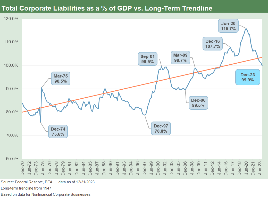
The above chart offers a different vantage point on risk by including total corporate liabilities and not solely focusing on debt. The ratio here is manageable in context today and during a time when the hidden risk on the counterparty side has been reeled in by regulators and legislative changes that came out of the post-crisis years (Dodd-Frank 2010, etc.). The changes cut across disclosure, rules for structured credit that increase liabilities from underlying assets used by deal architects (RMBS, ABS, etc.) and restrictions on prop trading, risk hedging, counterparty disclosure in CDS etc. The liability ratio in the corporate sector now is at least below the long-term trend line and below the prior peak of 2016 and 2020.

The systemic trend line for commercial mortgages is much less dramatic than residential mortgages, but the history is mixed and had some scary moments along the way during periods of building excess that saw a late 1980s/early 1990s crisis in commercial real estate (“CRE”). The thrifts had a parallel crisis unfolding from 1988 and 1989 on through the early 1990s.
The CRE pain crushed oil patch banks first and then went national by the early 1990s, driving a few major regional bank collapses including some New England bellwethers. Citibank was under intensive regulatory scrutiny on CRE exposure multiple times with Citi on the ropes in the early 1990s. Financial system stress was one of many contributors to Fed easing of 1991.
The structured credit boom sent CMBS risks into another red zone once again. The record LBOs also used commercial real estate to turbocharge leverage on more deals, sending commercial real estate % GDP to record highs into 2009 as a material break from the long-term trend line continued.
In this current cycle, the worry is more about the quality of the underlying assets than the systemic levels of CRE. This will be an area of concern more on the CRE subsector exposure and mix quality in 2024 and how that could flow into the next variation of the recent NYCB scare.
The consumer side of the equation in multicycle context…

The above chart tells a clear story with a quick glance. The RMBS excess and subprime lending chaos and how that rolled into a counterparty crisis has been picked over ad nauseum. A 73.6% high in 2007 vs. the current 47.7% is, if anything, dramatic. The iconic mortgage lender, Countrywide Credit, was seeking a bailout from BofA right around the time of the Sept 2007 peak. Bear Stearns was folded into JP Morgan by March 2008 and Lehman was gone a year after the peak.
In Sept 2008, AIG also was getting bailed out to protect the US and Western European banking system from a collapse in counterparty credit that would have set off fresh chain reactions. AIG was an unlimited risk taker as a hundred or so professionals went on a casino night bender on derivative risk taking and brought down the world’s largest insurance company. That amount of systemic counterparty leverage does not get measured in the Z.1.

The above chart replicates the % GDP line for systemic residential mortgages but adds a dollar bar chart series to remind us that systemic exposure needs a measuring stick. The record residential mortgages outstanding now are materially higher than the credit crisis and housing bubble years, but the systemic scale is dramatically lower and the quality and underlying asset protection much more favorable.
As covered in the next chart and in the table at the top of the piece, home equity values relative to mortgage debt are higher now than before COVID, and the refinancing wave of the COVID period has left many homeowners with record low mortgage rates or modestly above record lows.
The low mortgage rates in the homeowner sector (60% below 4%) bring constraints on mobility and transaction flexibility as we cover in our housing sector research. Despite that constraint, this critical asset class (housing) and that slice of household net worth (home equity) is a source of support for many consumers. The household debt line has a very different profile than what was seen in the housing bubble.

The above chart offers a wild time series with respect to residential real estate value vs. home equity. The metric is home equity as a % of real estate value. In simplest terms, the chart is saying “there is a lot of home equity out there relative to mortgage debt.” The chart shows the plunge in the housing crisis and ensuing rebound.

The above chart rolls in the total of the consumer credit categories (detailed in following charts), and we see the consumer credit systemic metrics at the high end of the range even if down from the 2020 peak. The GDP growth offers some support to cushion the climb in consumer credit systemic metrics as a % GDP, so the denominator helps relative to 2020 with three years of growth under Biden (see 4Q23 GDP: Final Cut, Moving Parts 3-28-24).
The consumer credit time series is obviously very important in a consumer-driven economy. The consumer side of the equation comes with record payroll counts and climbing population that includes a record retiree base from the boomers and a high base of undocumented workers to keep the consumer count busy and spending (see Payroll March 2024: Payroll Spike Brings a Political Theme Shift 4-6-24).
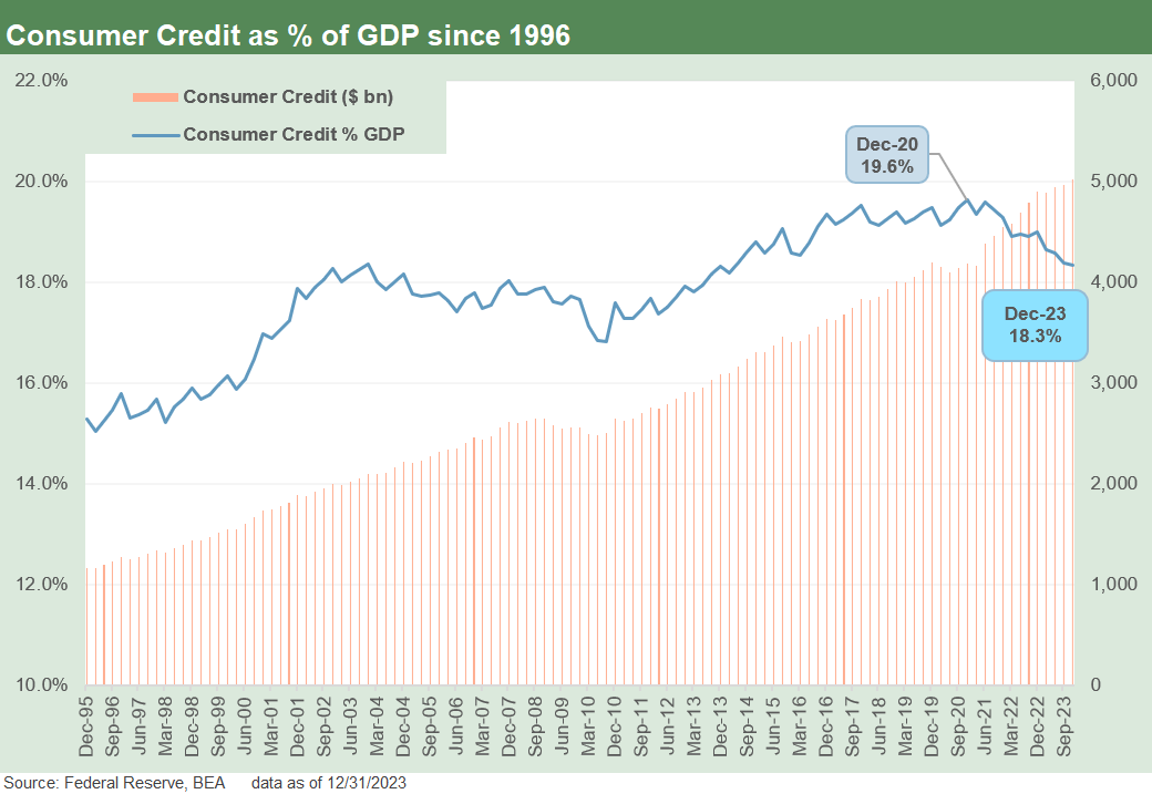
The above chart combines the systemic metric of consumer credit % GDP with the dollar bar chart across time. We tend to beat some themes to death, and one of them is the limitations of the term “record borrowing” when there in fact should be record amounts of borrowing given demographics and nominal income levels.
The next layer of analysis below the systemic metric is the process of framing the quality of the lending, the due diligence of the lenders in credit line approvals and reserving in a market with such high interest rates relative to the post-crisis period. There should be an expectation of higher delinquencies and defaults, but the fact that a borrower defaults on his debt does not take back that consumer’s earlier contribution to GDP.
The next set of concerns revolves around whether that lender was ready for the number of defaults in the normal course of its business and is not put in harm’s way by its own excess in lending. If you reserve 4% for losses and you run below that in loss experience, then the world turns, and the nonpayers meet the loan collection services. If you reserve 5% against loans and the portfolio loses 10%, you have trouble.

The above chart breaks out the dollar trend line for the consumer credit line items. As detailed in earlier commentaries, the most striking line is the Student Debt time series that went from not having its own category to being the largest category of the mix at over $1.7 trillion and 6.3% of GDP as covered in the next chart. The state of student loans dominates the lives of many in the younger layer of demographics, and the asset class is a topic unto itself after decades of painfully high inflation in college and grad school costs. We would have to tag that as a balance sheet impaired subset worthy of a separate review. That is a topic for another day.
The Auto Loan lines run the full gamut of credit quality tiers from prime to near prime to nonprime to subprime and deep subprime with a lien. We recently updated our profile on used car industry leader CarMax with its financial units results and asset quality and reserve metrics (see CarMax FY 2024: Secular Neutral? Or Cyclical Gear Shift? 4-16-24). The quality at CarMax is eroding but is consistent with loss reserve ratios and very manageable. The credit quality excess of classic dedicated subprime lenders (which is not CarMax) are still unfolding. We will get another view on auto loans quality dead ahead this week from the GM and Ford captive finance units.
Credit card debt is continuing to climb and getting plenty of headlines as a threat to the cycle with savings rates in the tank and consumers spending more than they make in income (see PCE Prices, Personal Income & Outlays: Sideways Tone 3-29-24, Savings Rates: Context Across the Cycles 10-27-23). High payrolls cure a lot of ills, but the balance sheet impact is clearly moving in the direction of more credit card debt and more auto loans. That has to be proven as a negative factor to believe it at this point, but PCE has been a clear positive in economic growth story. The market sees a lot of job openings (see JOLTS Feb 2024: Steady and Sideways 4-2-24) and bullish payroll stats (see Payroll March 2024: Payroll Spike Brings a Political Theme Shift 4-6-24) pushing back on the consumer credit risk-reward perspective.
The market will get more concerned when payroll starts declining. Then the transmission mechanism will turn to Fed cuts under that scenarios and there would be better lending spreads for consumer finance. It is never that simple, and the FOMC would have a lot more room to maneuver under a mild contraction scenario (which we still do not see). The scenario of troubled consumer credit story derailing PCE has not been an easy case to convince consumer bulls.

The above chart takes the components of consumer credit discussed in the prior chart and frames them vs. GDP. We see the growth in the mix of auto loans and credit cards in the post-COVID rebound as auto demand picked up, jobs soared across 2021-2024 and supplier chains loosened up, bringing volumes of new vehicle sales off the recession-type lows of 2022.
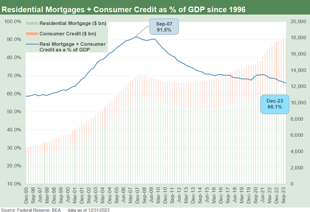
We wrap the systemic debt piece by adding residential and consumer debt and dropping in a dollar bar chart with the residential mortgage debt with consumer credit totals. Even if just on the residential mortgage piece, the world is very different now vs. the record mortgage excess of the 2000s. The systemic metric for consumer debt overall including mortgages has been on a steady decline even with total debt in dollar terms running up in the record zone. The 66% handle level at Dec 2023 pales in comparison with the 91% area of Sept 2007.
Contributors:
Glenn Reynolds, CFA glenn@macro4micro.com
Kevin Chun, CFA kevin@macro4micro.com
See also:
Credit Markets Across the Decades 4-8-24
Credit Cycles: Historical Lightning Round 4-8-24
Systemic Corporate and Consumer Debt Metrics 9-15-23
Consumer Debt in Systemic Context 7-13-23
Great analysis, as always. Thank you very much.