
The B vs. CCC Battle: Tough Neighborhood, Rough Players
We look back across the volatile B vs. CCC history with the wildest rides in credit risk valuations.


Beyond HY: Brutal backdrop, tougher crew in the CCC realm
This commentary looks at the CCC tier credit risk valuation history in the HY bond market and some important periods of outsized Hi-Lo price differentials. The industry and credit tier divergence makes a statement on how CCC issuers can get treated in credit cycle downturns.
The pricing whipsaws can be less dramatic across those borrowers who are well positioned fundamentally but rated CCC on “leverage and layers” vs. those rated CCC due to severe operating and liquidity stress.
Looking back across the years, you see all types of backdrops in issuer/industry concentrations from cash flow bleeders on capex demands (E&P in 2015-2016) to crisis era volume crashes and panics (many auto suppliers in 2009) to overleveraged LBOs with minimal asset protection for unsecured layers and forecasts that did not play out as expected with record LBO volumes across some cycles.
A very interesting period lies ahead with private credit as a favorable “refinancing risk X factor” in an asset subsector likely to grow dramatically, but the small share of CCC tier exposure in the HY benchmarks still end up more a matter of name-by-name selection and industry concentration analysis.
The current CCC concentration stories show a lot of pain in TMT in a trip down memory lane with a healthy dose of healthcare tossed in the mix.

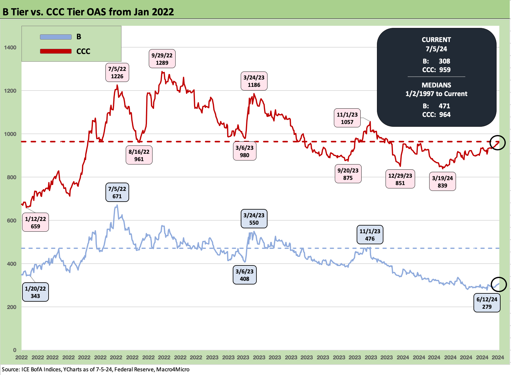
The above chart plots the time series for CCC tier and B tier OAS across time. We gave the B tier OAS history a close look in our credit market update last week, so we give more attention to the CCC data points here. This note is in part a historical lookback for reference (memory joggers, folks new to credit, etc.) and in part to set the stage for what could unfold in the tier of the credit markets most vulnerable to a breakdown in the macro picture in 2025 if macro policy goes off the rails.
The CCC memory lane exercise is one I worked through on both the buy side and sell side since the early 1980s, and the institutional pain and P&L volatility can be quite real. With the exception of 2008 and related bank system stress, the credit cycle-busting spread decompression waves usually get triggered from the bottom up. Every cycle has its own distinct flavor across industry and issuer mix, investor profiles and strategies, and the ability of the street to make orderly markets.
Hedge funds and distressed debt players are waiting for the chaos to arrive. It always does. With the growing base of private credit assets, they will be staffed up and geared up to be strong sources of demand (at a price). That is the good news at the low end of the credit food chain, since Dodd Frank and the Volcker Rule has taken many market participants out of the game.
We reviewed the rolling total returns and excess returns of IG Corporate and HY bonds in our recent Footnotes publication (see Footnotes & Flashbacks: Credit Markets 7-1-24). We also updated histories on credit tiers and relative spread differentials. The takeaway is we are in a period of compression now. The market is working on framing what comes next and gauging how long the credit cycle peak period can last.
Almost all credit spread histories these days point at a backdrop of extreme compression of credit compensation in absolute and relative terms. That is the case when using quality spread differentials across the tiers or when risk premiums (spreads) get framed in proportion against the risk-free asset class (UST).
Coupon income flows were distorted during the ZIRP years, so the cash vs. accretion part of the analysis gets down to the bond-by-bond process. A major part of the story in the lower tiers of HY is the odds making on refi-and-extension timing and the pull-to-par upside. That is not an exact science.
The lower the quality of the credit, the more stressful the timing decision. A CCC name does not want to get caught in a game of maturity roulette. Then again, some companies know the distressed or coercive exchange process is coming and are timing liability management battles ahead. There are numerous underway now in the CCC tier.

The above chart takes the relative OAS framework for B and CCC and flips it into a YTW framework for B vs. the CCC tier. The yield numbers at panic peaks are multiples of long-term returns in the equity asset class. That offers a reminder that you get paid to step into HY markets when fear and impaired secondary liquidity rules. As an asset class call, you get paid in such times for a lot more than default risk and loss given default downside.
The low yields on the B tier during cyclical peaks in the ZIRP and QE years and slow normalization period tell a story of poor compensation with 4% handles. The median relationship from early 1997 where we have data available shows 7.9% for the B tier and 12.3% for the CCC tier. The incremental default risks for CCC vs. B tier is more exponential than a low multiple based on historical default rates, and that is another reason to think of the CCC tier as being about issuer and bond picking and not a generic group of riskier credits. The search for the mispriced bond, whether overpriced or underpriced, has been the tradition. It is less about CCC weighting vs. the index.
The FOMC sets a new bar…
All-in yields in credit have moved dramatically higher with the Fed tightening cycle and the UST curve upward shift, but spreads are compressed. The upward shift of the UST curve came at a high price for those who were long duration, so the next leg of duration is an important part of the IG vs. HY decision. The YTD total return on the IG Corp is less than +1.0% vs. +2.8% on HY (7-5-24).
If you see weaker fundamentals and lower inflation, the idea is that duration wins and HY spreads widen on the underlying cause if the easing comes alongside fundamental weakness. As a rule, “That is why God made diversification.” We favor IG looking out a year, but that is in part the expectation that HY spreads will struggle. It is harder to have conviction on duration as a major winner depending on post-election policy (tariffs, enforced FOMC easing on a Fed “takeover” by the White House). That said, the election is a very tough call tied to turnout and a third-party clown-fest.
The counter on a defensive view on HY at these prices is about the cycle and fundamentals. The favorable HY view vs. IG says, “stay bullish on the economy” and be a bear on the curve. The stock market is telling a good forward-looking story on fundamentals. The UST bull advocates would counter that the consumer is fading, ISM is telling us a story, construction markets have peaked, and homebuilding is fading. That manufacturing weakness will soon show up more consistently, and the Fed will start to ease. In that school, the CCC tier and weaker B tiers are exposed to material decompression of spreads. That is especially the case if Trump gets elected and goes tariff happy while at the same time exposing European economies to his buddy Putin’s ambitions.
As we go to print, the 7.9% yield on the HY index (7-5-24 pricing) has kept demand high supported by a credit cycle showing solid industry and issuer quality. Where and why the UST curve and the FOMC moves from here obviously will be a key driver of total returns and excess returns with the election potentially playing a bigger role as a risk factor than ever given the wide gap between the specific proposals being tossed around. Trade wars are not an X-factor. Such a risk is an XYZ factor.
There is certainly no shortage of scenarios with a tariff-driven dislocation and stagflation threat a probability that is not insignificant if Trump goes off the rails in trade. If the US has a major breakdown with China or Mexico (see Income Taxes for Tariffs: Dollars to Donuts 6-13-24, Trade Flows: More Clarity Needed to Handicap Major Trade Risks 6-11-24), the word “unintended” will not apply. If it is an obvious cause-and-effect, is it intended? (or reckless, ignorant, and vindictive?).

Before we get into the CCC history bullets, we thought a review of the Hi-Lo relationship of yields for the top quality HY tiers (BB) vs. the low quality CCC tier was worth a look also. The 3% handles on the BB tier were cracked in Sept 2021 in a sign of credit excess with a +2.9% YTW. The lows in the ZIRP taper tantrum period of spring 2013 saw a 3.85% BB tier. Those were the reach-for-yield periods, and the question was always, “How far to reach before I dislocate my portfolio?”
Historically, when HY “cracked” and gapped wider from the low end, some very attractive risk-adjusted values would surface in the upper tiers of HY in the BB tier. That history has helped the HY Lite strategy become more widely embraced by pension funds in need of higher income flows to meet pension plan benefit demands in attractively priced risk tiers.
Some would shorthand credit risk appetites and risk tier allocation strategies with BBB as “the new single A” and the BB tier as “the new BBB.” In recessions, the issuer base in both categories has a lot of financial flexibility to weather bad storms. As more issuers refinance to current coupon levels, there will be plenty to choose from.
Cyclical shifts, shocks, and HY history on the low end…
We have looked at some longer timeline histories in past publications and summaries (see UST Curve History: Credit Cycle Peaks10-12-22). The variety of trigger points for radical repricing of credit risk runs the gamut. History shows that credit cycles cracked before equities and the economic expansion. The default cycle comes after the credit cycle pricing moves materially.
The epic credit cycle earthquake for the ages came after the 2007 credit cycle peak saw the market essentially freeze in the summer of 2007 (see Wild Transition Year: The Chaos of 2007 11-1-22). During the summer, the President of Bear Stearns was sent packing and had to sell all his stock (bless that timing!) Mortgages were unraveling, hedge fund canaries were keeling over, and Countrywide was looking to be rescued (BofA).
The mortgage excess in turn rolled into a systemic bank system crisis by late 2008 after Bear was rolled into JPM in March 2008. Bank interconnectedness soon rose to panic after Lehman and AIG on unbridled, unchecked, opaque, and often poorly measured counterparty derivative exposure. That brought the credit markets (and the house) down and set off a severe credit contraction. It is funny to look back at how some dividend cut predictions and negative commentary on mortgages were later redefined in personal accolades (often self-proclaimed) by some headliners as “I predicted the bank crisis.”
Systemic corporate balance sheet debt was not the trigger for the credit crisis. It was mortgages and counterparty risk cracking, which in turn then spread to banks and tight credit. A case can be made now that the current backdrop is also not a major systemic corporate debt problem either, and the same on the consumer side with a very different set of risks in mortgages (see Systemic Corporate and Consumer Debt Metrics: Z.1 Update 4-22-24). The economy is much larger and better diversified almost two decades later, and the banks broadly healthier (asterisk for select regionals).
The funding crisis for banks and fears around HY fund redemptions and evaporating secondary liquidity was the immediate catalyst for CCCs shooting wider in the crisis lead-in and after. Back then, spread decompression swamped the ability to make OTC markets in HY bonds and in loans. That was a rare time when the credit market repricing radiated out from the middle rather than starting at the bottom. Of course, the bottom caught up very quickly and blew past it as the default cycle followed as the lagging indicator.
Some risk pricing context for the bottom of the credit tiers…

The above chart updates the OAS differentials between the B tier, the traditional sweet spot of the HY Classic investor, and the CCC tier that is for the most aggressive HY investor (or distressed debt players). Many end up investing in CCCs the old-fashioned way (by downgrades).
In looking at the time series, the risk pricing faced a range of key risk factors including underwriting standards in deals (or lack of standards sometimes), industry/issuer mix shifts (e.g. too much TMT, too much energy), the cyclical backdrop, credit conditions in the capital markets, and liquidity availability from the banks.
Investor flows and asset allocation trends in the massive retirement fund base are major factors in what clears the market after all those risks are rolled in. The supply and quality mix in loans and bonds and how the demand side of credit assets compare (with private credit the new X-factor) all flow into the equation dictating risk pricing and asset volatility. The reality is that the current HY backdrop is the highest quality seen across the cyclical peaks with a heavy BB flavor. You don’t see the same levels of credit excess in the HY issuer and industry mix as seen in earlier cycles.
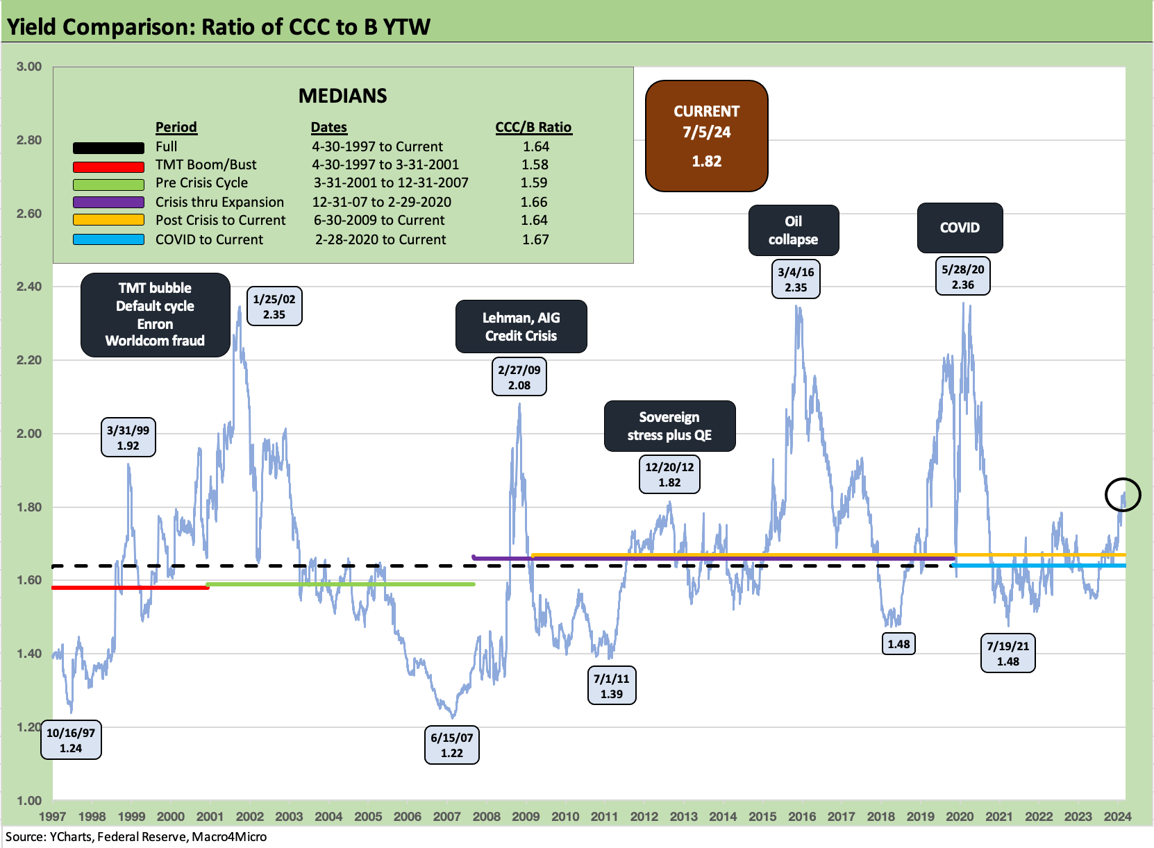
As with the spread differential between the B tier and CCC tier, the YTW ratios also tell a similar story. The yield ratio rolls in the support of the UST market for the fixed income yields and how those frame up in markets that includes a lot of ZIRP, QE, and minimal UST rates. There was a period when a 1,000 bps HY OAS could mean around 11% yields. The 1989 credit cycle peak had 9% handle 3M UST bills. The chart shows the sharpest sell-off with low 2x-handle YTW ratios.
The current 1.82x ratio is below the peaks of the TMT cycle, the credit crisis, the oil collapse, and COVID. That makes a case for current CCC valuations as reflecting a lot of pain already. After all, we are still in an expansion with low default rates. The medians highlighted in the box include a range in the 1.6x area. We are closer to the 1.6x than the 2.3x area of past problem cycles.
Summary points on the CCC tier history…
Below we generate some bullets to summarize some notable cyclical adventures and events across the CCC time horizons covered in the spread and yield time series charts we include in this piece.
Questionable relative value in the highest risk tier: If we narrowly look at the CCC tier excess returns over time, the 27 years from 1997 to 2023 saw 14 years with positive excess returns for CCCs and 13 years negative. That history can only be described as inadequate credit compensation relative to risks. After all, the risks are much higher in CCCs, and the excess returns should be as well. Half of the annual excess returns being negative is not consistent with that basic requirement of getting paid for the risks. There are always mispriced securities in the CCC tier (too high or too low), and that is where the value-added exercises will always keep investors in the game.
We had looked at various BBB/BB tier vs. CCC tier returns in past lives across the decades, and the CCC tier always come up short in risk-adjusted return ratios (Sharpes) vs. upper tier HY and BBBs. Moving down into the CCC tier from B and BB is when you move on from Marquis of Queensbury to the UFC Octagon. The CCC tier presents a very tough history given to periodic bouts of very painful asymmetry. As a sign of the risks vs. price, the CCC tier hit par for the first and only time in June 2014. It did not last.
History has been unkind: As we look back across time at the spread volatility of the CCC tier evident in the chart above and spreads differentials chart below, the TMT bubble flowed into 3 straight years of negative excess returns for the CCC tiers for 2000, 2001, and 2002. We had back-to back years of negative excess returns in 2007-2008 and again in 2014-2015. We saw negative excess returns during the expansion years of 1998, 2005, 2011, 2018, the COVID year of 2020, and again in 2022. All HY tiers posted negative excess returns in 2018 (yes, during one of Trump’s “greatest economy ever” years) and that was followed by the Fed easing 3 times to relieve economic pressure in 2019.
Industry and issuer concentration risk were key drivers: TMT dominated the weakness in 2000 to 2002 across HY from BB to CCC even though Enron grabbed a lot of headlines (with Dynegy). Autos and Financials were the epicenter of trouble in 2007-2008 with very crowded CCC tier of auto OE suppliers as well. Upstream energy and the unconventional drilling success turned into a financial train wreck by late 2014, across 2015, and into early 2016. In the current market, we are now back to the future with TMT as the weakest industry grouping in the low end of HY. We update some details on the B tier and CCC laggard details further below.
There is overlap across B and CCC in the capital structure: When looking across the performance of spreads for the B tier vs. the CCC tier, it is useful to remember the overlap of issuer and balance sheets across tiers of the capital structure from 1L to unsecured or any other structural variations on guarantors or collateral. The layers flow into assessments of distressed exchange exposure and relative structural subordination risks. That adds to the complexity as you move down the ratings tier and capital structure. The margin for error narrows.
The TMT bubble years ramped up the rise in CCC face value share: The excesses of the bad TMT credits in the late 1990s lit a fuse that led to the longest default cycle in HY history. Defaults moved above 4% in the spring of 1999 and did not move back below that level until mid-2004. The CCC tier was less than 8% of face value at the end of 1996 and was just under 26% by the end of 2001. That 26% share came even as waves of names were dropping out of the index on defaults including double-digit defaults from the fall of 2001 to the summer of 2002. That CCC index share declined to a low under 15% by the end of 2005 and then ran back out to almost 32% by the end of 2008. As of June 30, 2024, the CCC share is 14.9% based on face value (12.4% based on market value). In contrast, the BB tier is over 51% of face value, up from a post-1996 low of 29.6% at the end of 2000 when a lot of BBB downgrades were seen in 2001-2002.
The TMT, Enron years 2000-2002 and price dislocation: The full plunge from IG to CCC (or D) was front page news when Enron and WorldCom shocked the market (and many in Washington). HY saw 6% area default rates closing out 1999 even when the NASDAQ was peaking with a record +86% total return on the way into a March 2000 NASDAQ peak. We even saw some IG-to-default periods in Electric Utilities (e.g., PG&E in 2001) and in asbestos-exposed names in those late 1990s/early 2000s cycles. The initial news of WorldCom fraud repriced the entire HY market in a day even before a bit of “trust contagion” (lenders, underwriters, auditors, rating agencies) drove a fresh wave of Washington hearings and punitive action by regulators.
Very mild recession, longest default cycle in HY bond history: The swing in spreads volatility across the TMT credit cycle downturn started ahead of what was the mildest economic contraction in postwar history in 2001 (see Business Cycles: The Recession Dating Game 10-10-22). With only a mild setback in GDP, it was the equity and credit market plunge and the headline impact that was arguably the most significant motivator for Greenspan’s over-the-top easing in 2001 (see Fed Funds, CPI, and the Stairway to Where? 10-20-22, Greenspan’s Last Hurrah: His Wild Finish Before the Crisis 10-30-22). Fears of consumer retrenchment was one theory. As we have covered in other commentaries, Greenspan eased 7 times even before 9/11 with another 4 shortly after.
The CCC tier hit a 42.9 dollar price low in Oct 2001 after the CCC YTW hit 28% in late Sept 2001. The “B minus CCC” dollar price differential soared to 43.5 (Jan 2002), which was wider than the later credit crisis at 31.9 (Feb 2009). For the B to CCC differential, the difference in the credit crisis in late 2008/early 2009 was that everything plunged in price.
The crisis years 2007-2009: The bank and broker chaos shocked and distorted the credit tier quality spread timing after the crisis and notably in the weeks and months from Lehman in mid-September through the GE spread disarray in early March 2009 (the stock market low). The CDS market was off-the-rails in late 2008 as interconnectedness risk dominated the initial fears for a number of reasons including which bank/broker’s name was attached to them. Risk aversion loomed across the bank crisis where even backup lines for commercial paper were suspect (notably the excess of asset backed CP programs). The fear of bank line drawdowns was also creating a laundry list of dark scenarios to handicap.
The banner crisis headlines continued from Sept 2008 on through the spring with the Chrysler Chapter 11 (4-30-09) followed quickly by GM (6-1-09) and the related bailout actions coming in waves. Plunges in corporate bond prices after epic events such as Lehman and AIG in 2008 saw credit spreads spike ahead of downgrades and index rebalancing dates. There was a mad scramble to find bellwethers that could be proxies for credit spreads. At one point, GE Capital short-dated CDS hit 4-digits. The GM Chapter 11 moved the needle on index constituent mix at the time.
The CCC dollar price swings in the credit crisis: For some data points on the post-Lehman shock period, the dollar price of the CCC tier hit 31.6 and the CCC YTW 41%. As noted in the first chart in this piece, the CCC OAS ran north of 4400 bps. Some CCC tier bonds become more like high-risk equities in price action. We are not getting into detailed default histories in this piece, but the CCC tier has a long-term average default rate exponentially higher than the B tier. As noted earlier, the B minus CCC dollar price differential was just under 32 points in Feb 2009 or around double the long-term median.
The upstream oil crisis of 4Q14 to 1Q16: The Saudi oil price war escalated after the summer 2014 oil price peak. In July 2014, WTI was around $107 in the early summer. Depending on which data source you use, WTI declined by around $11 per barrel in Oct 2014, $12 in Nov 2014, and $16 in Dec 2014. The crash and upstream chaos was underway. Most HY E&P issuers were not covering capex from cash flows at much higher prices. At lower oil prices, the bleed would get that much worse, and capex could not be cut fast enough without destroying the economics of short-lived, formerly high return projects. The E&P and suppliers to the E&P sector fell into a freefall.
I had been through the Saudi-driven 1986 oil crash on the buy side and sell side, and that was a period that crushed the regional economies which often get rolled up under the heading “oil patch.” That period ended up as a Texas bank system meltdown and broad commercial and residential real estate crisis more than a HY oil bond nightmare (despite the Texaco Chapter 11 in 1987 on Pennzoil litigation). There was a smaller mix of HY oil bonds that got crushed, but that was not an asset class mover.
Oil wagged the entire HY asset class for a while: In the debt-finance world of “shale” boom, most issuers were hemorrhaging cash even at higher oil prices given the scale of capex. Ugliness was peaking in Dec 2015 on the way to the bottom tick of the HY index on 2-11-16 after back-to-back months (Jan-Feb 2016) saw $26 handle oil. The CCC tier dropped 33 points from July 2014 to Dec 2015. From a broader perspective vs. the credit crisis and TMT years, the CCC tier “only” declined to a low of around 58-dollar price and the “B minus CCC differential” was just under 30 points in early March 2016. The dollar price of the E&P index was 107 in June 2014. It hit a 26-dollar price on 2-11-16.
Waves of bankruptcies and distressed exchanges in the upstream energy space lasted years and brought poor unsecured recoveries. At the peak of the trouble in 4Q15/1Q16, HY fund redemption fears further roiled secondary markets. Early in the process, the headline recoveries on numerous upstream names (names that were most vulnerable) saw more than a few single digit recoveries in the B and CCC tier. That type of punishing price action in Chapter 11 hit the market hard and gave borrowers a big seat at the distressed exchange table.
The year 2015 was one of the worst years for the CCC vs. B tier incremental excess returns at around -9.9% as both the B tier (-6.3%) and CCC tier (-16.2%) were in the negative zone. The age-old rule of “buy when there is blood in the streets” applied in late 2015 and early 2016 since the full year of 2016 was one of the best CCC vs. B tier excess return differentials at +19.5%. The bounce off the lows in the spring of 2016 sent the HY rally into overdrive.
The COVID spread spike: COVID certainly does not fit into the usual credit cycle, monetary cycle, and economic cycle themes in the classic sense since it was an exogenous shock. On the other hand, COVID and the aggressive response to avert a more pronounced crisis does fit into the framework of emergency monetary and fiscal response options (ZIRP, legislative activism, etc.) like we saw in the credit crisis period. The fear of a collapse in demand, crushing supply disruptions, evaporation of revenue, defaults on residential and commercial mortgages/rents, and waves of bank line drawdowns and defaults is easy to forget now given how quickly it was addressed, but it was cooking on the front burner with a full serving of risk aversion ready to go. CCC tier OAS spiked to +1,962 bps at the peak (3-23-20) while the CCC minus B differential ran out to 1,015 bps by early May.
The established framework and toolbox from the credit crisis period was easier to put to work in COVID with some modifications, and Powell at the Fed and Mnuchin in Treasury did a very impressive job of coordinating. They don’t get enough credit for “the save.” The fact that Powell was not an “econ egghead” and had substantial market experience and Mnuchin was a Goldman debt markets rainmaker brought a lot of immediate expertise to managing “market confidence” and keeping the credit markets open. The array of actions is quite a laundry list and cannot be revisited here, but the point is the strategic ground had been covered in the crisis and the backstops and stimulus for risk appetites was rapidly deployed.
By taking action to give investors, OTC HY market makers, issuers, and underwriters good reason to stay confident in a functioning market (the same sea level concept as with FDIC insurance and deposits), the policies brought waves of consumer refinancing (residential mortgages) and corporate sector refi-and-extension. That served to bring lower coupons and push out maturities. Locking in cash interest savings is by definition a positive for households and corporate entities alike.
The potential “investor run on open ended mutual funds” that hammered HY bonds in the oil crisis period did not become a lasting COVID issue to further disrupt pricing. Toss in a vaccine, and HY credit risk pricing rallied impressively. COVID’s side effects and secondary/tertiary impacts are a longer story. The return to ZIRP and reach-for-yield and stimulation of demand in a supply-disrupted market would have inflation effects, but the initially ugly HY price action was quickly navigated. That set the stage for a macro and micro rebound boom in markets in 2021.
Looking for parallels in today’s market…
In the following charts, we shorten up the timelines from Jan 2022 for better granularity on the moves. The earlier charts showed the full time series trauma of bubbles and blowups and made some other big spread moves seem small in a longer historical timeline.
The above chart flags the highs and low for the B and CCC tiers from early 2022 and across the tightening cycle through today. We also include some medians from 1997 as frames of reference. The B tier at +308 bps is well inside the long-term median of +471 bps. The CCC tier at +959 bps is just inside the median (+964 bps) after some constituent changes and the post-2022 rally.
Some of the parallels between the TMT implosion of 1999-2002 and the upstream energy bond disaster of 4Q14 to 1Q16 (with lagging defaults across the energy sector continuing for years) was the debt-financed capex and major cash bleeds of emerging growth stories including TMT in the late 1990s and the unconventional drilling tech boom (often shorthanded as “shale”) that accelerated in the post-crisis years.
When so many industry and issuer balance sheets get stretched by capex that cash flow can’t keep up with, that means the revenue model better work. The revenue and earnings forecasts and forward-valuation “street games” (e.g., a bullish 7-year forecast discounted back, etc.) did not work for many debt-heavy HY telecom names, and the problem was very quickly evident as credits started blowing up in the peak NASDAQ markets of 1999 with 5% to 6% default rates from the spring of 1999 through year end 1999.
A similar experience came with the post-recession E&P boom. The oil patch financial models also did not work in the E&P and leveraged E&P supplier chain when the Saudis and OPEC decided to throw down with “Market Share War Part Deux.” The midstream and infrastructure exposures had their volatility but were intrinsically less risky while E&P and upstream suppliers quickly had a revenue and counterparty crisis on their hands.
We do not see parallels today in a major debt issuing sector being driven by that much debt-financed excess. The equity boom and off-the-charts tech equity price action of 2021 and now 2024 has some parallels in asset valuations soaring, but the current AI phenomenon is not funded by debt. There have been pockets of software credit turmoil in the CCC tier from leveraged PE activity in tech, but we don’t see many parallels. The leading CCC tier trouble areas currently involve more old-school, mature names using their liability managers to get them out of trouble.
While there is always a long list of names that struggle, there is less of a clearly identifiable trend. One pattern that is clear is that we now see more legacy TMT and some remaining headline pharma trying to navigate balance sheet stress. We look at sector concentrations further below.

The above chart shortens the time horizon on the B and CCC tier spread differential from Jan 2022 to just before the end of ZIRP and the start of the tightening cycle in March 2022. When looking at CCC tier spreads, the constituent migration distortions include the “dropouts” after defaults and the drop-ins on downgrades or new issues. On distressed exchanges, sometimes we see some moderate swings on what gets kicked out of the index ahead of the new bonds that eventually roll back in (e.g. Carvana). A default of a big, ugly issuer often has the ironic impact of driving a rally in CCC tier spreads on the mix shift.
The tightening of the B tier and the CCC compression from the late 2022 CCC OAS peak (+1289 bps 9-29-22) to +959 (7-5-24) this week makes sense. The economy has been in solid growth mode with a healthy consumer cycle. That came ahead of what may now be a slow consumer fade underway. We saw strong fixed investment trends (see 1Q24 GDP: Final Cut, Moving Parts 6-27-24) and higher state and local spending (see State Unemployment: A Sum-of-the-Parts BS Detector 6-30-24) that supported the overall view of constructive credit fundamentals.
There is also the hope that more bonds will get refinanced along the way or see distressed exchanges that come in above market prices for many of the issuers carrying low coupons from COVID-era financing. HY bond managers generally do not scare easily, but street market makers and intermediary risk managers do get anxious if more exogenous shocks pop up in a post-Volcker Rule world.

The above chart frames the running CCC tier excess return YTD 2024 vs. the B tier. The CCC tier excess return is higher just as it should be. The question is whether it is enough excess return as we move toward a period of rising cyclical uncertainty and a wide range of potential outcomes in policy-driven macro risks (tariffs, trade battles/wars, mass deportations and related fallout, etc.). Those worry lists are for another day. The next few weeks start with, “Who the hell is running for President?” The macro risks can get tricky with 6 members of the Supreme Court ordering Russian and Hungarian takeout for lunch.
Macro policy will remain in a cloud until the election is over (then again, some people think 2020 is not over). Along the way, Biden policies have helped many industries, and that shows up in the collective stock action with around 3 dozen all-time highs in the S&P 500 and another record to end this past week for the S&P 500 and NASDAQ. There is a reason that Trump, who fixated on stock market records in his term, did not bring that up in the debate. Tapper and Bash (the overrated dynamic duo of low value added) never asked about it. Why Biden did not just take a gratuitous shot at Trump on the topic is a darker question on his capabilities. Biden’s “bridge” may be shorter than he thought, so the politics=policy issue remains a very big but very amorphous variable.
Payrolls had been soaring and real wages started to rise at a lag. June had another strong payroll number even if Trump thinks they are “illegals” and released from an asylum. On those asylum vacancies, anyone who believes Trump’s spin on employment should check into those vacancies and get some rest.
No one is saying considerable purchasing power has not been lost with inflation, but the economy is more diverse than ever with HY credit markets more BB heavy. For households, refinanced mortgages are locked-in with 60% of mortgages below 4% and around 30% below 3%. Those low mortgages were major cash flow blessings for households (before becoming a locked-in trap for some). Having a material embedded home equity gain at least eases their pain.
Energy issuers got very healthy very quickly on the back of Russia-Ukraine for all the wrong reasons. At this point, the “upstream” sector exposure (E&P, Equipment/Suppliers) is down to a much lower level of HY face value index share from the 11% area of the 2015 peak. Upstream energy was 3.1% in 2001, climbed to 6% by mid-2008 and then almost doubled. Currently, upstream face value HY share is 5.4%.
Among other notable sectors with economic multiplier effects back along the supplier-to-OEM chains (includes impact on chemicals, metals, and freight and logistics), auto industry profitability soared on the other side of the consumer crunch in affordability. Volumes had been constrained by supplier chains with recession level volumes in 2022. There is some forward-looking anxiety around a Trump war on Electric Vehicles that could roil production chains and economic activity in many regions (mostly red and swing states).
Above the CCC tier, the B tier spread compression into 2023 and 2024 reflects low defaults and solid fundamentals. For riskier exposures, there is less fear of refinancing risk with private credit in the picture. The credit markets are quite busy in the next stage of evolution and more credit availability for leveraged transactions in private equity land should reduce some of the typical late cycle excess in HY-bond-funded, PE-based leveraged transactions. That is a favorable quality and mix factor for the HY bond index. That takes some of the edge off the occasional cyclical redemption panics we see in HY funds when extreme events happen. Some of those exposures will be less transparent in pricing (private credit), but it would be less of a source of HY fund technical dislocations that come with fund redemption pressures.
The high-level, top-down policy risks that could wag the macro picture and CCC pricing will be in flux into 2025. Who knows what extreme events will pop up if a new President feels he has blanket immunity and a captive GOP body who would not cross him under any scenario. The unilateral action and legal tariffs will be bad enough. The ability to violate existing laws through use of executive orders of any preference will get tested.
A split Congress could also lead to more extreme scenarios (think debt ceiling). Calling out the military against protesters will not get a favorable vote from the consumer sector and its 68% of GDP. The fact that many employed consumers will be deported will be an economic factor and variable to be tested (double digit millions is a big number).
As we have covered in other commentaries, the mass deportation promised by Trump is on a scale with the peak of WWII mobilization. Such action at the border could elicit a hearty “no way” (or something spicier) from the new Mexican President and a “counterpoint” response from Trump. Then trade conflicts and supplier chains could be another catalyst for bottom-up repricing with spread decompression from B to CCC reverberating up the chain in a classic credit pricing cycle dynamic. As a reminder, Mexico is our #1 trade partner nation LTM (EU nations as a group is #1). See Trade Flows: More Clarity Needed to Handicap Major Trade Risks 6-12-24.
B and CCC tier problem mix…
In the next two charts, we look at the sector/industry mix in the B and CCC tier and then the “problem mix” as reflected in pricing.

The charts offer food for thought on industry risk. We see Media and Telecom leading the mix of CCCs at just under 1/3 of CCC tier market value (MV) and almost 37% of face value (FV) at risk. For the B tier, we see Healthcare again as a leading concentration with MV share at +11.8%, but Media and Telecom are well down the rankings.
For the B tier, Energy at #2 (10.9%), Leisure at #3 (9.9%), Basics at #4 (8.5%), and Services at #5 (8.5%) comprise almost 38% of MV share. That is a cyclically diverse mix with Capital Goods at #6 (7.2%) bringing the tally of the next 5 below Healthcare to 45% of the B tier MV. The low mix of Energy in CCC at 3.6% of MV (2.9% of FV) is a notable contrast with some prior cycles. The same is true for Automotive at only 1.8% of CCC MV.
We don’t look at the BB mix in this piece, but Energy leads the BB tier ranks with a #1 MV share of 14.0%, well ahead of Basic Industry at 9.2% while Autos is only 1.9%. That is a reminder that sector concentration can swing wildly across the credit cycles.

The above chart breaks out some industry concentrations using market value mix where the composite subsector OAS is above the thresholds noted in the chart. We list the Top 15 industry groups for CCC with sector OAS >1000 bps (vs. the +959 bps CCC composite at 7-5-24) and for the B tier >600 bps (vs. the +308 bps B tier composite at 7-5-24).
Cable/Satellite is over 26% of MV problem share in the CCC tier with Wireline/Telecom at over 18% for a combined total of almost 45% of the CCC problem mix. The larger B tier is less concentrated with a heavier REIT mix and Pharma mix in double digit MV share for around 29%.
We are not detailing the various single name exposures in the mix, but the basic drill is to look at the MV issuer concentrations (vs. face value at risk) and try to gauge how the directional risk in pricing can unfold. MV share drives asset class performance but “face value at risk” certainly matters.
There are a wide range of old school TMT and Pharma risks in the concentrations in July 2024. The current problem list cut across the usual rogues’ gallery names such as Altice, Dish, iHeart, Zayo, CommScope in the TMT crowd and Bausch in Pharma. If you own them, you know the other names. We are not getting into any of the issuer weeds in this note.
A look at maturity schedules at the issuer level is usually a good early indicator on which issuers’ bankers will be working on the refinancing and extension or possible exchanges of some variety. For CCCs that are on the ropes with prohibitive market clearing levels, a distressed exchange or one dressed up as a more respectable form of liability management is common. Some are underway now.
Contributors:
Glenn Reynolds, CFA glenn@macro4micro.com
Kevin Chun, CFA kevin@macro4micro.com
See also:
Footnotes & Flashbacks: Credit Markets 7-1-24
Footnotes & Flashbacks: State of Yields 6-30-24
Footnotes & Flashbacks: Asset Returns 6-30-24
State Unemployment: A Sum-of-the-Parts BS Detector 6-30-24
The Debate: The China Deficit and Who Pays the Tariff? 6-29-24
PCE, Income and Outlays: Practicing Safe Growth? 6-28-24
HY Spreads: The BB vs. BBB Spread Compression 6-13-24
HY Spreads: Celebrating Tumultuous Times at a Credit Peak 6-13-24
Trade Flows: More Clarity Needed to Handicap Major Trade Risks 6-12-24
Miscellaneous histories:
Systemic Corporate and Consumer Debt Metrics: Z.1 Update 4-22-24
Credit Markets Across the Decades 4-8-24
Credit Cycles: Historical Lightning Round 4-8-24
Histories: Asset Return Journey from 2016 to 2023 1-21-24
HY vs. IG Excess and Total Returns Across Cycles: The UST Kicker 12-11-23
US Debt % GDP: Raiders of the Lost Treasury 5-29-23
Credit Performance: Excess Return Differentials in 2023 1-1-24