
Credit Markets Across the Decades
We share our presentation from a recent session at the Wharton Executive Education Program on Fixed Income Credit Market Investing.


We recently had the opportunity to present in a class for the Wharton Executive Education program as part of the Aresty Institute of Executive Education. The 4-day program was led by Michael Roberts, Professor of Finance at Wharton, who tag-teamed with Fred Hoffman, a highly experienced portfolio manager (bond funds, hedge funds) who I have known since we worked together on the buy side in the 1980s at Pru. He is now on the Professor circuit (Rutgers) and is a Wharton fellow.
The class had seasoned vets, which made for an interactive session and vibrant Q&A. My part of the program across some guest speakers was for a history of the credit markets and where some of the past rolls into prologue, lessons learned, and how that plays into the journey ahead. We thought it worth posting here as a “history lookback” for people newer to the credit markets or for a memory jogger.
I used the “handout” below as a springboard for discussion in the class with some notes to be read at their leisure “after class.” The visuals helped the two-way exchanges. I will post the other handout separately.
The second handout I used was called Credit Cycles: Historical Lightning Round. That was a recap of over 4 decades of major market events and credit-centric war stories along the way from my own “time served” in credit research on the buy side, sell side, and my independent research years as one of the founders of CreditSights back in 2000.
Having interacted with regulators (SEC) and in Washington (House, Senate), I brought some points to the discussion of structural changes in areas such as market-making, systemic risk, and the latest hot topic of private credit (which we don’t see as “systemic”).
It was a pleasure to be part of the program along with the mix of outside speakers who dropped by to add their inputs in other sessions.
CONTENTS
Yield Curve Lookbacks: Walking to School in the Snow, Uphill Both Ways
Expansion and Quality Mix of Bonds in the Credit Markets: 2024 vs. 2007
Shared Bank Loan Commitment History (Fed, OCC, FDIC)
Loan Quality: Total Special Mention + Classified Loans
History of post-1950s Economic Expansions
Dates from the Business Cycle Dating Committee (NBER)
US HY and IG Annual Total Return History
US HY and IG Annual Excess Return History
Investment Grade Corporate Spreads
A Volatile History of High Yield Spreads
Quality Spread Differentials: Investment Grade vs. High Yield
Relative Risk Premium: HY OAS/5Y UST 1997-2024
The Ratio of Highest Risk Tier CCC vs. BB Tier Bonds
Consumer Price Index vs. PCE Price Index from 1973
Fed Funds Effective Rate minus Core PCE from 1973
UST Curve 1989-1992: Cyclical Slide
Post-TMT Cycle UST Curve Transition
Bear Flattener 2003 to 2006: UST Curve Plays Catch-Up
Yield curve histories offer a reality check on today’s rates…

A sense of historical scale around interest rates is a challenge after 16 years of minimal rates including ZIRP in late 2008 through Dec 2015, minimal normalization efforts through Dec 2018, 3 cuts in fed funds in 2019 on economic weakness, and then back to ZIRP in March 2020 through March 2022.
The chart above shows the UST curve moves across the bull market 1980s/1990s when stock returns averaged nearly 18% across 20 years, nominal GDP doubled in the 1980s, the US took a global leadership role in Tech and Financial Services in 1990s, all despite much higher interest rates than what we see today.
The 12-31-80 UST followed the yield curve inversion of 1978 and upward pressure from inflation to June 1980, when the market saw a peak in the misery index (unemployment + CPI) of 22%.
UST highlights include 3M UST at 17% (12-11-80), 5Y UST at over 16% (9-30-81), and a 14% average in the Moody’s Corp AAA rate in 1981.
The 1989 UST curve noted above came as the credit cycle would soon come to an end, but then Greenspan took us into the years of mega-easing during the downturns of 1991 and 2001.
The current 5Y UST and 10Y UST are below the 2000 and 2006 curves posted while the Oct 19, 2023 peak from this cycle was above the 2006 but just below 2000.
Framing the Investment Grade Corporate Market and High Yield bonds…

The above chart captures the enormity of the investment grade corporate bond index during the post-COVID cycle and how it has multiplied in size since June 2007, which was the credit cycle peak ahead of the Dec 2007 start of the recession (per NBER) and before the credit crisis of 2008.
The combined IG and HY index totaled over $10 trillion in March 2024 vs. $2.7 tn in June 2007.
The IG Corp Index stood at over $8.8 tn in March 2024 vs. $2.0 tn in June 2007 for more than a 4-fold increase.
The BBB tier is #1 at 41% of the total credit spectrum face value (from AAA to CCC) as the BBB tier rose by almost 6x and the A tier by almost 5x. The total HY index only rose by just under 2x.
The rise of debt-funded M&A in a ZIRP market saw bonds take on the role of “cheap equity” for many acquisition-oriented companies with low-coupon, long-dated debt as the acquisition currency in some consolidating industries such as Health Care, Tech, Chemicals and Energy.
Many issuers with large offshore cash hoards (notably in Tech) had used the low rate backdrop to fund debt-financed stock buybacks while leaving high cash balances offshore before the tax law changed.
The potential for some normalization of coupons in a post-tightening market into the 2024-2027 years ahead leave corporate bond demand well positioned in asset allocation strategies and notably for retirement funds.
The bank loan market facing the next rounds of evolution and disintermediation…
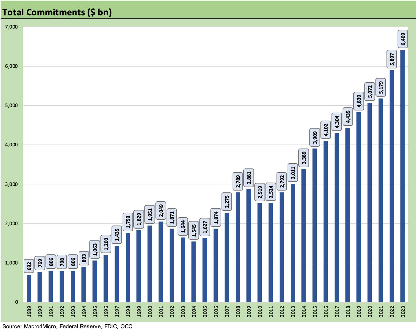
The regulators track a lot of data, and the “shared national credit” report list is one of them as regulators watch loans “shared” across regulated banks for loans of $100 mn or more.
The “shared” title in the report refers to loan commitments shared by a minimum of three banks (raised from a minimum of 2 to 3 in 1998) and a minimum commitment of $100 million (raised from $20 million in 2018).
The $6.4 trillion in commitments above and over $10 trillion in bonds outstanding underscore the scale of debt on the books before we even include loans that don’t make the criteria for this group above or the bond index minimum requirements.
When we consider small cap and midcap loans smaller in size or loans not “shared,” the rapid growth in private credit outside the regulated banks gives more context. Private credit is still a small market in comparison with room for growth even if just replacing some of the loans on bank books or in funds.
The 9-fold growth in commitments from 1989 to $6.4 trillion in 2023 includes $3.14 trillion outstanding as of the most recent SNC Report date (released in Feb 2024 for 3Q23).
Loan quality mix is manageable but not low risk…
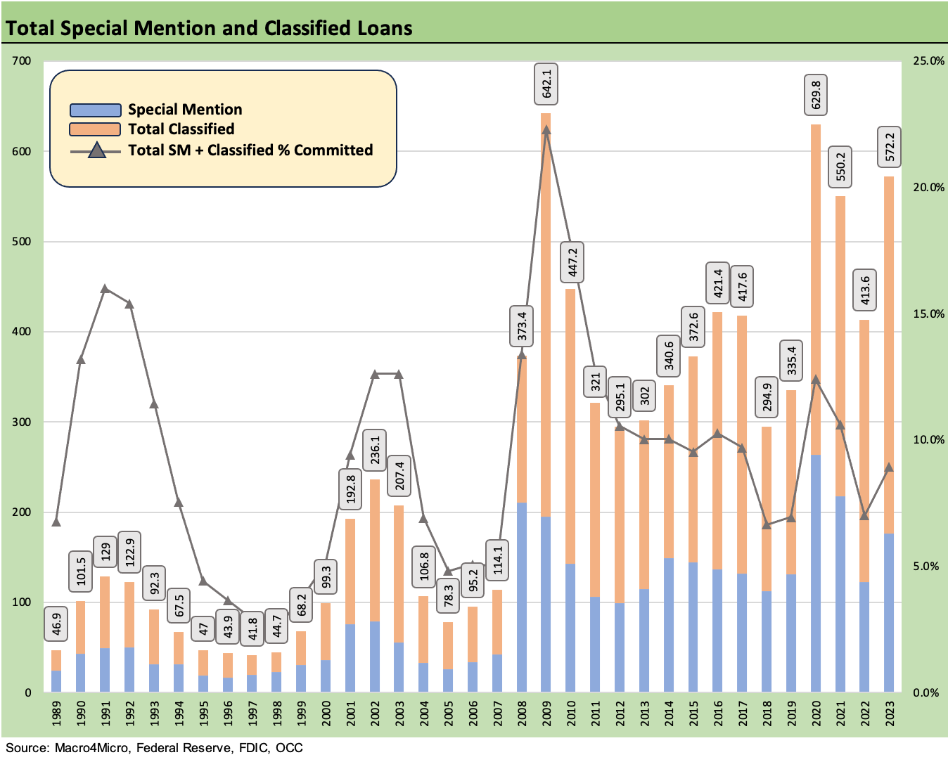
Regulators use rating categories such as “Classified” and “Special Mention” as a macro watchlist for asset quality. These ratings can have direct relevance to the banks’ reserving policies. In other words, the ratings “have teeth.”
The categories and terms are part of the arcane world of regulator-speak with “Special Mention” translated as “potential weakness that deserves management’s close attention” and “Classified” as an adverse rating that cuts across three buckets of flags: Substandard, Doubtful and Loss.
When the OCC looks at bank exposures, they can flag a loan as either “Pass” or “Non-pass.” Pass means not rated Special Mention or one of the three deadly sin buckets of Classified.
In terms of the Classified buckets, “Substandard” is basically commitments that are “inadequately protected.” Doubtful means collection is “highly questionable and improbable.” At the bottom of the food chain, “Loss” gets the word “uncollectible” in the definition with the phrase “should be promptly charged off.”
The line in the graph shows the swings in the share of loans rated classified and special mention, and it is ticking higher to 8.9% but below the recent peak of 12.4% during COVID in 2020.
The bottom line on the most recent round of regulatory reviews drew the conclusion: “Overall, SNC credit risk increased but remains moderate.”
A look back across the economic expansions…

The above chart looks back across the timelines of economic expansions starting back in the 1960s, and we add some commentary next to each expansion to highlight some of the more notable events of those years. Those were certainly some notable years.
There was no shortage of major events at the geopolitical level, across fiscal and monetary policy, in terms of secular industry change, and many exogenous events beyond the control of most decision makers on the home front.
The 1980-1982 double dip was the most traumatic for structural change in manufacturing, but the ending expansion of the 1980s also revolutionized the credit markets alongside an unprecedented rate of economic expansion and industry change that some hate (the demise of so much manufacturing) and some love (those in financial services and those in the wider array of tech and services professions).
The cyclical downturn in 1990-1991 gave way to the second longest expansion in history through 2001 that saw the rise of tech, financial services, and health care tracking demographic needs and comparative strengths of the US.
While the credit crisis of 2008 laid waste to the housing sector and banking landscape for a period, the expansion that followed was the longest in history with only the Go-Go 1960s at #3 breaking into the Top 3 longest expansions since the mid-1800s with the 1980s at #4.
A look back across the recession dating game…

The timelines of recessions get determined officially (often at a serious lag as noted in the chart) by the NBER’s cycle dating committee (established in 1978) that also provides an extensive history of when past expansions and recessions began and ended.
The lag time in announcement often leaves people wondering why the NBER is so slow even if the market makes its own call on conditions and forward expectations long before some think tank fills them in on what they have decided.
In the case of the 1992 election, we suspect that George HW Bush would not have minded knowing the recession announced in April 1991 (designating July 1990 as the start of the recession) had ended in March 1991 when he was having debates ahead of the Nov 1992 election. The end of the recession was announced in Dec 1992, the month after the election.
The record longest recession since the Great Depression came after the credit crisis and lasted 18 months, just ahead of the 16 months for the second leg of the 1980-1982 double dip and the 16 months of the Nov 1973 to March 1975 recession.
The longest expansion in history that peaked in Feb 2020 was sidetracked by COVID and the 2-month “official” recession that came with it. That was the shortest in history.
The history of the credit markets has been that it turns down well before the official recession date with 1989 being one of the more dramatic departures of the credit markets and recession timing in July 1990.
The Dec 2007 recession date was set 12 months later in Dec 2008, or 4 months into the credit crisis during the near collapse of the banks/securities sector.
Total returns across event-filled cycles…

The above chart plots IG vs. HY total returns since 1997, and that covers a wide range of markets, two bubbles (TMT, Housing), two major default cycles, a bank systemic crisis, a pandemic and an inflation spike and tightening cycle. That is quite an array of market conditions. The plunge in 2008 and 2009 rebound throws off the scale, so we made some adjustments to the bar chart to ease the visual impact.
The 2001-2002 credit cycle was somewhat “normal” in that it was tied to credit risk. It was the worst origination cycle in Wall Street history while the systemic crisis of 2008 was a “multiple of unprecedented” after the housing bubble and structured credit excess and RMBS binge sent counterparty credit domino fears reverberating from Wall Street to Main Street. Washington was ill-prepared to even understand what was unfolding.
The math for HY bonds generating negative returns implies it takes a lot of spread widening to wipe out a high coupon, so we have only seen 7 years with negative total returns over 37 complete years of HY index data (starting 1987, partial year 1986). IG bonds only had 6 years negative over the same time frame. For IG, the idea is that the UST rallies in markets when recessions happen.
The outliers in HY total return are 2008 at -26.4% and 2022 at -11.2%. The 3rd worst was 2000 at -5.1% followed by 2015 at -4.6%, 1990 at -4.4%, 2018 at -2.3%, and 1994 at -1.0%. 2008 saw a systemic crisis peaking in 4Q08 while 2022 marked the first high inflation period and aggressive tightening cycle in HY market history.
Excess returns as a metric to consider…

The above chart plots “excess returns” from IG vs. HY from the TMT cycle trough 2023. The excess return over a duration matched UST return offers a view on portfolio performance gained (or lost) on taking credit risk.
Rankings of funds are often in descending order of total return (not excess return) set against a peer group focusing on a similar asset class. Sometimes risk adjusted metrics can show up in the mix as investors pitch their active management skill sets or use the “enhanced indexing” approach that started as far back as the 1980s as asset managers highlighted their credit acumen.
As the industry grew competitive and performance attribution analysis grew more sophisticated, framing where the portfolio “got it right or got it wrong” became more important and notably as credit cycles grew more volatile. Sorting out the “rate call” from the “credit call” was a key factor to include as a differentiator vs. peers and benchmarks.
At the end of the day (or more to the point, the end of the quarter or year) investors look to total returns for the guiding light on performance since the cash income and price returns are closer to your liquidity event than a theoretical relative level of performance against a risk-free duration matched benchmark. After all, you look at your balance.
Investment Grade Spreads…

The time series for investment grade corporate spreads shows some wild swings during multiple credit cycles but nothing like the credit crisis of 2008 with the banks and securities firms the largest sector of IG bonds. Regulatory seizure and collapse loomed for more bank holding companies and brokers. That implied credit contraction and recession risk.
The systemic shock roiled all financial companies (including captives of manufacturers) that rely heavily on securitization and ABS, short-term funding such as commercial paper, and for those issuers who needed available bank lines to support CP programs.
The TMT default cycle (2001-2002) severely tested secondary markets with multiple BBB tier names plunging and setting off a confidence crisis in several major sectors after companies such as Enron and WorldCom shocked the world with fraud and inadequate liquidity options.
Other major BBB whipsaws included the telecom sector names in the summer and fall of 2002 and controversial names such as Tyco, where the asset protection and cash flow was real, but the talking heads generated fear that Tyco might have been hiding more financial skeletons than actually existed.
The same bouts of volatility seen in HY were evident in 2011 (sovereign and systemic fears) and in late 2015/early 2016 with energy.
High Yield Spreads…
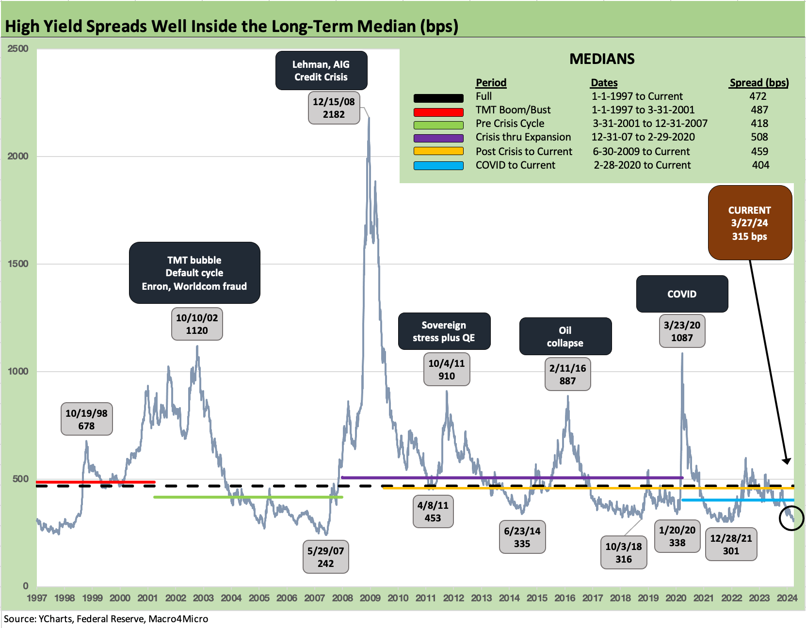
The above chart shows the journey of HY index spreads across multiple turbulent periods in the credit markets after the TMT cycle, an unfolding systemic crisis in late 2008, and a pandemic that brought the Fed, the US Treasury, and legislative actions to the rescue.
The 2001-2002 pain was tied to a combination of excessive risk appetites, bad deals, bad credits, and bad behavior (Enron, WorldCom among many others).
We saw extraordinary cyclical lows in HY spreads during 1997 and 2007 and then two periods of less extreme but notable lows in June 2014 and early Oct 2018 before some spread volatility saw material swings (notably Dec 2018) and a 2019 rally on the way to the eventual COVID crisis and March 2020 HY spread spike.
Fundamentally driven whipsaws along the way included Oct 2011 (sovereign stress), Feb 2016 (oil crisis, defaults in energy, and fund redemption fears).
During 2024, HY spreads recently moved inside the June 2014 and Oct 2018 lows and closed this past week just below the Oct 2018 lows.
Quality Spread Differentials and Market Pricing of Risk…

The pricing of credit risk along the credit spectrum can move sharply across time in absolute terms for a given company, industry, or rating tier, and also relative to one another. Therein lies the value-added opportunities for portfolio managers and research analysts whether it be buying opportunities or loss avoidance in issuer and industry selection.
The differential in risk premiums across credit tiers or asset class subsectors (IG vs. HY) can be called “quality spreads” or “incremental compensation for the additional risk.” The chart above shows the timeline of such quality spreads and medians for key periods and highlights spikes across various market events (2011, 2016, 2020).
The buzz words can change, but it amounts to the same general idea for a relative value pricing framework. For equities, the gauge can be relative multiples. For risky credit, relative spreads tend to be a useful shorthand.
The chart shows the peaks and valleys and median for IG spreads vs. HY spreads since the rise of the TMT bubble and cyclical lows in spreads in 1997. The chart shows the fallout in 2001-2002 during the credit cycle downturn and default wave.
We see a stunning spike in spreads during the post-Lehman credit crisis and bank system turmoil as secondary liquidity was pummeled and outflows set off panics in market making.
Relative risk premiums vs. the risk-free asset…

The chart above offers another angle on risk pricing generated from the historical relationship of HY spreads vs. UST as the risk-free investment alternative.
The time series shows how little you get paid for credit risk in today’s markets if you frame HY index OAS as proportionate risk compensation vs. UST.
We use the 5Y UST as the measuring stick for HY OAS since the duration of the HY bond index and 5Y UST are close enough. For IG, a longer duration frame of reference would be more useful such as 7Y UST.
We use a multiple rather than % terms since the HY OAS tends to go off the rails in ugly market such as 2008 and given the heavy use of ZIRP in the post-crisis years.
While some may cite the reality of the “low denominator effect” in the ratio, we highlight that the denominator is also an investment alternative and had the effect of investors taking more risk and reaching for yield. Today, the alternative could even be the 5% handle 3M UST.
The UST curve is back in a pre-ZIRP framework, so the ratio is relevant. The 0.75x is close to – but above – the 0.49x of the cyclical lows in June 2007 and 0.39x of May 1997. The long-term median of 1.97x drives home how low the relative compensation is now during a credit market peak.
All-in yields matter more to many these days and are attracting demand after 16 years of ZIRP, QE, low rates, and coupon starvation. Many investors look past the tight spreads.
Relative compensation and expected returns across the High Yield tiers…
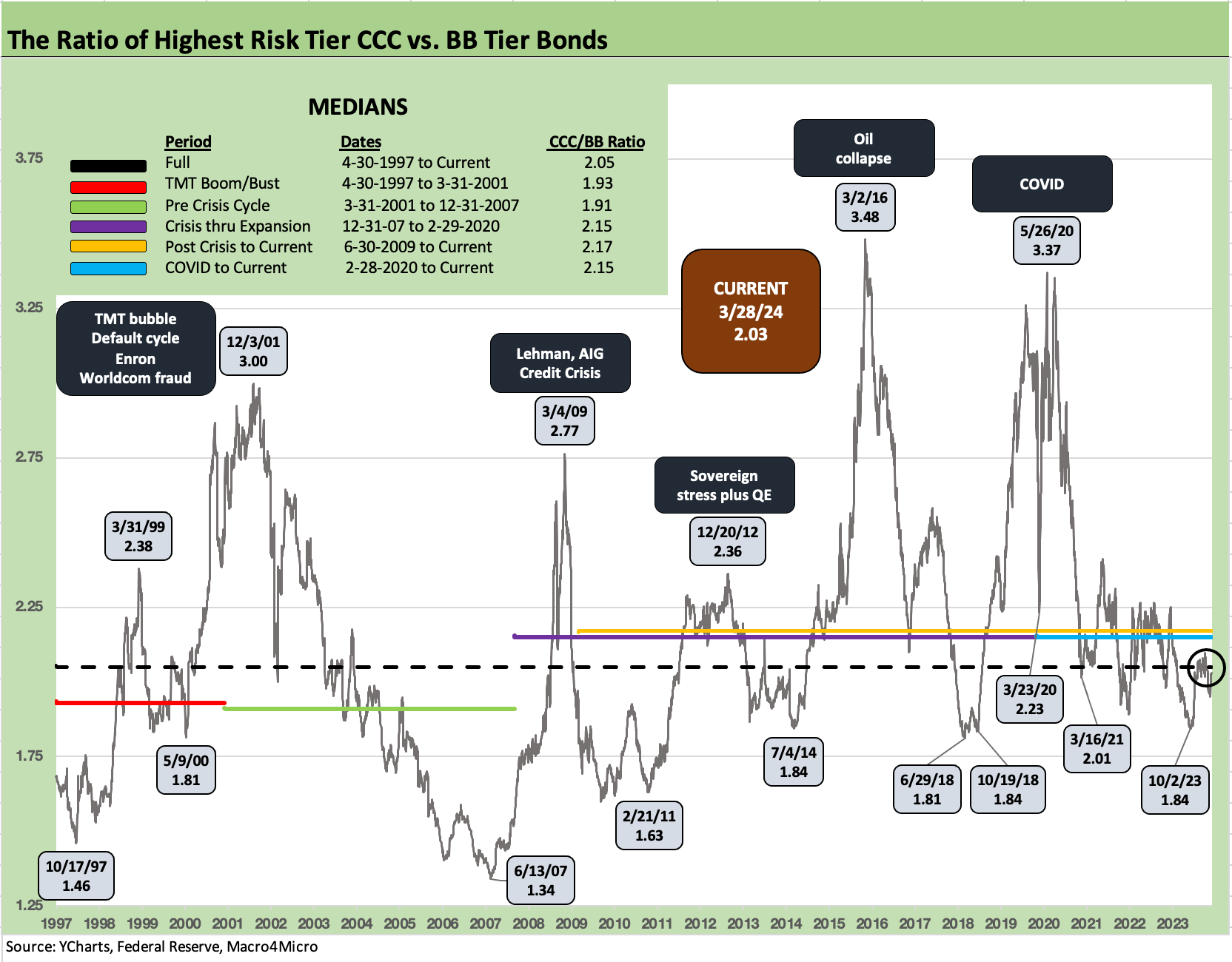
The above chart plots the ratio of CCC tier yields to BB tier yields to capture how risk pricing and the relationship of expected minimum returns in risky credit move across credit cycles during good times and bad times.
The CCC vs. BB yield relationship offers somewhat of a “Hi-Lo” frame of reference within the speculative grade ratings tiers of BB, B, and CCC.
The reality is that average default rates rise exponentially across the cycles from BB to B and then rise exponentially again from B to CCC. While the numbers are now somewhat dated after years of ZIRP, we use the “1-4-16 rule” on the default rate risk across the cycles with BB at 1%, B tier at 4%, and CCC at 16%.
While just a rule of thumb, it tells a story rooted in history as so many overuse the term “junk” when risks vary dramatically across names and tiers and layers of the capital structure.
The CCC/BB YTW ratio plotted above includes medians, peaks, and troughs. The current 2.0x is in line with medians. As of 3-28-24, CCC YTW is 13.1% with a par weighted coupon of 7.3% and OAS of +852 bps. BB was 6.4%, coupon 5.5%, and OAS +187 bps.
A big increase in risk should come with a big increase in compensation. At the securities level, layers and structural seniority add to the complexity. The challenge is framing price relationships across markets.
CPI and PCE context across the cycles…
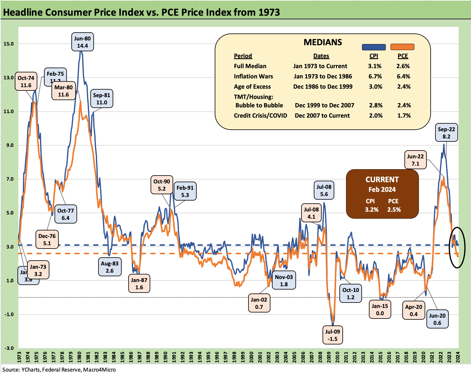
The headline CPI vs. headline PCE history above gives more color on the differentials of inflation with fed funds whether we compare it to headline PCE or Core PCE or variations of CPI.
The theme is that tightening requires fed funds to be higher than both CPI or PCE or it still constitutes “closet accommodation.” The Fed tends to give more attention to Core PCE as discussed in the next chart.
Anything inflation-related matters to the consumer and to his wallet or credit card, and that consumer is who drives GDP and spending. The typical household or investor will pay more attention to headline CPI as they fill up the tank while driving to the grocery store.
The CPI/PCE metrics from 1973 to1982 offer a reminder of why the Fed is hard-wired to fight inflation and needs to do it successfully. Those were ugly years no one wants to revisit.
The long-term median of 3.1% for headline CPI (current 3.2%) and the 2.6% long-term median for headline PCE (current 2.5%) shows medians close to the current levels.
The “real fed funds rate” challenge in fighting inflation…
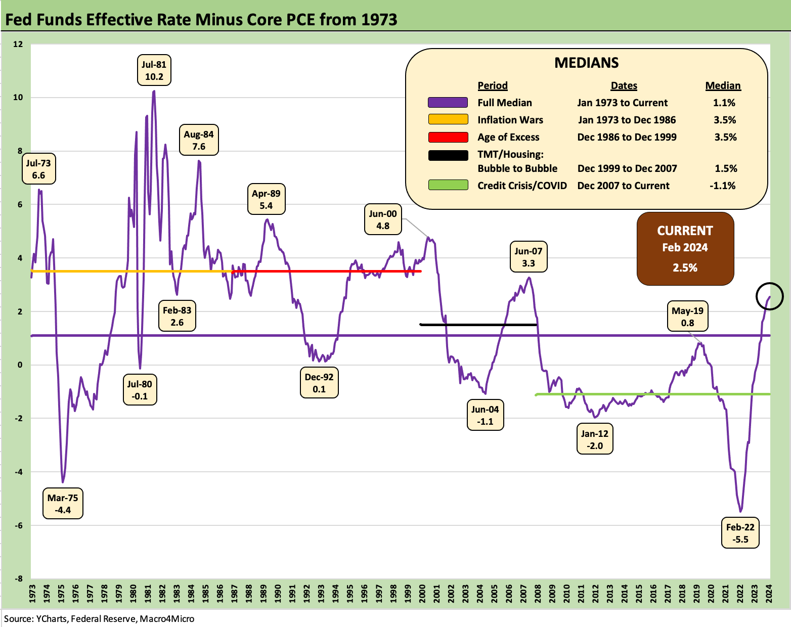
The handicapping of “How many, how much, and when?” around Fed easing in 2024 can get some help from the past rounds of intensive inflation fighting in the early to mid-1980s.
“Fed funds minus core PCE” is used as one guide to relative accommodation vs. tightening, and the above time series plots that relationship from the early 1970s when Fed policies fell short before the Volcker years brought success in breaking inflation.
The medians for real fed funds show a +3.5 point differential in two major periods (1973-Dec 1986, Dec 1986-1999) spanning parts of the 1970s, 1980s and 1990s. That includes a 10 point differential peak followed by a 7 point handle peak during the Volcker years.
The timeline for the differential shows the Volcker terms (1979-1987) with fed funds running well above core PCE but also shows the big shortfall in the pre-Volcker 1970s. That offers some history on the much-discussed risk of easing rates too early.
We see Greenspan over 5 points in early 1989 and close to 5 points in June 2000. In contrast, we see the -5.5 points in Feb 2022 as the Fed waited too long in the catch-up process to get positive real fed funds. Negative fed funds spilled into early 2023 before tightening brought the current differential of 2.5 points. That makes it tough to see “early and often cuts” in 2024.
The cyclical turn after the roaring 1980s…

The next few charts look at several UST curve transitions as credit markets and economic cycles were on the move into a problem zone or coming out of a period of stress and Fed activism.
The shapeshifting and level of the curve had material effects on market behavior, and the retrospectives are not always favorable even if the effects had pros and cons.
The chart above looks at the period from just before the 1989 credit cycle peak through the economic recession and default spike. The credit cycle started its downturn later in 1989.
The “official” economic expansion did not end until July 1990 (see related charts on the NBER Cycle Dating Committee) when the recession began (ended March 1991).
The UST curve downshifted rapidly as 1989 moved on, the Fed was easing in the face of severe turmoil in the financial sector (S&L crisis, FIRREA), LBO bridge loans were hung up, and some proposed LBO deals scrapped (e.g., United Airlines, “Black Friday” Oct 13, 1989).
The markets soon cracked, it got very ugly (Drexel Chapter 11, broker bailouts, Iraq War, etc.) and Greenspan eased with a vengeance across 1991.
The Post-TMT UST cycle and Greenspan response…

When investors debate past cycles and how the reaction to excess in the “last one” sets the stage for the “next one,” the 2001 easing is as good as it gets as an example of how monetary policy can promote calm but plant seeds for more problems if it stays too low for too long.
The March 2000 NASDAQ peak already was moving into the HY credit default cycle, and the price action saw serious pain unfolding in equity and credit markets alike across 2000 to 2002.
NASDAQ was the worst performing benchmark for those 3 years, and the HY market battered by the longest (not the highest) default cycle in HY bond market history.
Greenspan eased frantically in 2001 even though the broader economy was going through the mildest downturn in postwar history.
This downturn was the one that brought the world Enron (2001) and WorldCom (2002) bankruptcies and set off years of regulatory and legislative responses including new research analyst restrictions and new rating agency rules.
UST migration and tightening cycle into the housing bubble and credit excess …

The UST migration from 2003 to 2006 set the stage for the housing bubble, structured credit boom (CLOs, CDOs, SIVs, etc.), record leveraged loan issuance, record-sized LBOs, and leveraged derivative positions (notably CDS) that lit a fuse to a cascading counterparty exposure crisis that could have brought down the global banking system.
Heading into 2004 (the “official” end of the recession was Nov 2001) with 1% fed funds rate set the stage for risk-taking and leveraged positions with borrowing costs low and risk appetites high.
Rapid Fed tightening across 2004 to 2006 with little movement on the long end resulted in a bear flattener and modest front-end inversion by the end of 2006.
The 2006 peak in RMBS was starting to show cracks in collateral quality but did not yet infect leverage finance sentiment as deals got bigger and set records.
Loan repricing and refi/extensions came at a breakneck pace into early 2007 while HY index spreads moved inside of +250 bps in June 2007 as also seen in the Oct 1997 credit cycle peak. In an obvious statement, peaks have their downside.
By summer 2007, a surreal pause took hold of the market, hedge funds were faltering/failing, and Countrywide was seeking a bailout buyer (BofA). The S&P 500 peaked in Oct 2007.