
HY vs. IG Excess and Total Returns Across Cycles: The UST Kicker
We frame historical IG vs. HY excess and total returns and consider the UST factor in 2024. Shades of the late 90s?


As we head into 2024, a bigger part of the picture for relative returns could shift over to the portfolio decision on the UST curve and duration in framing the optimal credit asset allocation.
We look back at the 1994 to 1998 UST curve action for some interesting compare-and-contrast with today’s moving parts in some bullish street forecasts on how 2024 could play out.
The theory is that you should always get more in “credit returns” for taking incremental credit risk, but it does not always work that way over shorter time horizons and on a calendar schedule.
Looking back at excess returns across time from the late 1990 TMT period, we see HY beat the IG market on an annual basis around 2/3 of the time as annual periods mix in bear/bull transition periods.
In this commentary we look at some of the major moving parts of the relative return equation getting sorted out ahead of 2024. Excess returns and total returns both serve to tell stories of what transpired across the cycles.
For total returns, the mixed UST curve reactions across various time horizons allowed IG or HY bondholders to hitch a return ride on any combination of higher coupons, reinvestment compounding, or gyrating spread moves. As we get into a period where the refinancing and extension process needs to pick up pace for callable paper, there could be some interesting liability management profits to be taken by holders along the way. Different CFOs and Treasurers have a range of risk appetites on whether to play “maturity roulette” with the cycle, so the decisions are not getting easier for anyone in 2024.
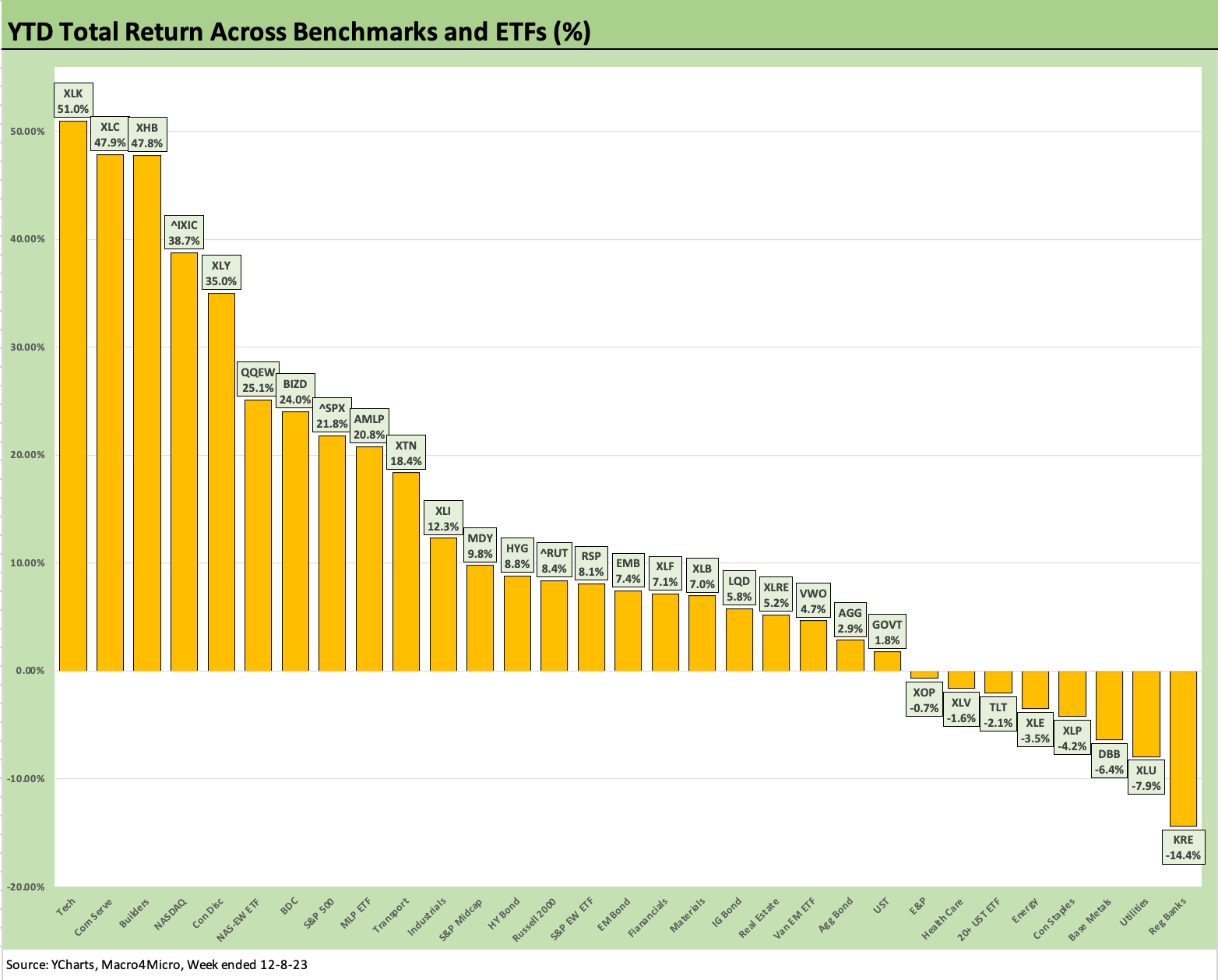
The chart above frames up where 2023 asset returns were positioned as of the end of last week (see Footnotes & Flashbacks: Asset Returns 12-10-23). The themes changed quickly across the second half of the year as consumer weakness never quite surfaced, and healthy growth across a wide range of industries often came with constructive guidance. The result was that Goldilocks could thread her needles without drawing blood (for now).
The consumer credit watch and fixed investment worries await another day and/or another quarter for metrics to slow. That all adds up to a year of impressive favorable equity returns so far with few remaining events (hurdles?) left this week with Nov 2023 CPI and the FOMC.
The bullish returns noted above in equities were not only in the market cap weighted benchmarks (the Magnificent 7 distortion seen most of the year) but also with respect to the breadth of these numbers. Those favorable returns cut across large caps to midcaps to small caps, market cap weighted and equal weighted proxies (e.g., QQEW, RSP), and numerous industry groups with double digit returns. Tech and growth were big winners of course, but that is a longer list with a top quartile cut including subsectors such as homebuilding and BDCs.
Handicapping 2024 and looking to history…
We might see a very distinctive market in historical context in 2024 since we have not had a UST repricing and potential “re-couponing” of this magnitude in the modern HY/IG corporate bond era. This note looks at some 1990s parallels of UST curve shapeshifting. Notably, we see the 1994 bear flattener and subsequent 1995 downshift rolling into a few years of volatile yield curve shifts with big swings in the duration impact. The end of the story was one of big winnings for fundamental risk interspersed with material moves in how duration was treated each year.
In the first section of the commentary, we look at some annual histories of excess returns vs. total returns for IG vs. HY back to the TMT years through current days. The contributions of credit spreads relative to the UST curve and how that flowed into total returns can swing quite a bit in the anomalous years, so we also look back at a few of the wilder stretches before excess return data is available to tap into in the pre-1997 data.
The old rule of thumb is that IG correlates more with UST (the interest rate risk factor) while HY was more correlated with equities (the fundamental risk weighting). That usually works reasonably well across the decades as a simple rule, but there are no shortages of exceptions to the rule across time (notably in the credit crisis years when banks and brokers were imploding). We saw IG (heavy bank/broker exposure) and HY and equities all correlate in dramatic fashion when the world was in meltdown in 2008-2009.
We also spend some time in this note looking at some of the dramatic moves in the UST curve from the Fed ambush and mega-tightening of 1994. The preemptive strike on imaginary inflation by Greenspan saw a bear flattener similar in magnitude along the UST curve when compared to what we experienced from March 2022 through 2023.
Some believe the Fed action in 1994 was a function of “easer’s remorse” after Greenspan’s very aggressive action after the 1990 recession (see Greenspan’s First Cyclical Ride: 1987-1992 10-24-22). As we cover below, the 1994 UST curve action set off a wild series of UST curve moves from 1995 through 1998. That period has relevance as a “history comp” for what some UST and equity bulls could be looking for in 2024.
Questions to ponder…
As we gear up for 2024, we see a period with a lot of major risk variables on the list for all 12 months ahead (and even this coming week with the Nov 2023 CPI release and FOMC meeting). We will need to keep evaluating more than a few questions with some of them tied to history and some to the unique set of factors at work in this current market.
We take a stab at some questions we have been knocking around as of now as investors and the street follow up on their outlooks and consider asset allocation trends ahead:
Will the Fed follow some of the more bullish forecasts on the front end with 100 bps (or more) in cuts in 2024? What would such an action imply about fundamental risks in broader portfolio context? Does that require weakening household financial health and asset quality stress in the financial sector?
Will other factors beyond inflation start to gain weight in the decision-making such as slower economic growth?
Will the catalysts for easing simply take on the more benign flavor of 2019 or financial market turmoil such as that seen in late 1998? Both of those were late cycle preventive moves by the Fed that sought to extend the expansion (the TMT cycle imploded during the 1999-2002 period while COVID reared up in March 2020 to end the longest expansion in history).
Will the Fed depart from the Volcker school of inflation fighting that involves a protracted positive fed funds differential vs. PCE and CPI designed to drive a stake through inflation and instead ease to step in front of potentially slowing economic growth?
Since we always hear the phrase, “the worst in four decades,” does that imply the most aggressive Fed policy of four decades ago is the template? That implies higher fed funds for longer or a material improvement in inflation.
Will the 2024 bulls get the desired replay of the post-1994 bear flattener when a material downward shift in the UST curve in 1995 generated the best year for the S&P 500 in the bull market decade of the 1990s?
Would a wave of 2% and even 1% inflation handle headlines for CPI and PCE be needed? That level of inflation brought the best market of the 1990s with spreads remaining tight into the 1996-1997 bull credit markets and the 1997-1998 double-digit average OAS for IG.
Will the oil markets and OPEC policy upset the currently favorable trend line in headline inflation and the lower oil prices that are easing household burdens? Will OPEC+ “throw down” with a new price war and push supply higher at a time of demand weakness to win the day on household costs and push back on any threat of EV inroads? Will Congress throw Ukraine under the bus and pent-up supply of Russian oil find its way into the markets? (That seems more a 2025 decision if Trump wins).
Or will OPEC instead push for higher prices at a time of record US oil production and weakening Chinese demand? Will material costs that can sway goods and service pricing set off more inflation and more political risk for the Democrats and their climate agenda while Trump chants “drill drill drill” in his recent “Dictator-for-a-Day” speeches?
Will the UST market (which sets the long end) agree on the coming yield curve reshaping and cooperate with the bulls when record supply and record US deficits are ahead? Will the need to clear the market bring different ideas from investors on what price that takes?
Will Trump campaign on the idea that he will fire Powell (as he wanted to do last time) and force rates lower?
Of course, there is a lot more to ponder than that…
IG vs. HY: Excess Returns vs. Total Returns
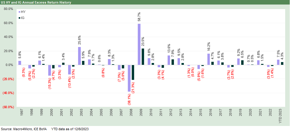
In the above chart, we plot the annual excess returns for HY vs. IG across the period from the TMT years through the past week. We use “excess return” as a useful proxy for credit returns as the “excess” is framed against a duration-matched basket of the “risk free” asset (hold that “risk free” thought around debt ceiling votes, but that is a Jan 2025 thing as of now). January 2025 might not even agree on who is President – let alone set a debt ceiling.
The winner of the IG vs. HY excess return matchup each year is tied to the spread and coupon and not the curve action. We recently covered this history before for HY alone (see HY Multicycle Spreads, Excess Returns, Total Returns 12-5-23), but this one puts IG in head to head context across a few credit cycles. The crises and the bounces off the crisis lows for HY really stand out in the chart. For those underweight HY now at tight spreads, that is a reminder of how patience can be rewarded.
Most everyone looks at their portfolio (notably individual “PAs”) in total return context and how that stacks up. When they choose to “get fancy” on performance attribution or risk adjusted returns, they can frame credit effects, curve effects, and the relative contribution of cash returns vs. price returns in the total return picture. Portfolios seeking cash income (retirement funds, etc.) are examples of where the return mix criteria can be separate and distinct.
We are keeping it simple here in the two return charts we use in this piece by looking back at historical excess and total returns across a few credit cycles and economic cycles from the end of 1996. These periods included massive swings in credit pricing and a post-crisis period that saw too many years of ZIRP and QE and a record stretch of yield starvation. We cover all these individual cycles and their economic and monetary backdrops for US HY in other commentaries. This year is shaping up favorably in historical context with HY total returns in line with long-term nominal return on equities.
The excess return chart above is for review and consideration against the parallel performance of period total returns in the chart further below. The usual effects that are most pronounced in high return years see Fed curve support for total return set against problems in credit markets where excess returns get pounded. As we head into 2024, the distinction is that the market is looking for Fed support in healthy economic times and not set against clear economic problems. The dilemma for the Fed is whether to keep the ammo supply high and the inflation defense intact until there is a 2% handle inflation number (even a low 2% number) for a few months.
The common-sense pattern is that the most adverse excess return differentials for HY when compared to IG occur during steep sell-offs in risk as decompression waves take over. Periods like that in 2000 to 2002 and again in 2007-2008 and somewhat in 2014-2015 show the excess return pain. Excess return differentials for HY-IG turned negative. That is when either the Fed (controlling the front end) or the UST market (controlling intermediate to the long segment of the UST curve) take over in the total return math.
The plot thickens in 2024 on total return ambitions for IG vs. HY
We don’t see big total return divergences in IG vs. HY that often. This is especially the case during expansion periods. We saw memorable “disconnects” between IG and HY total returns in 1989 and 1998. Both of those years saw trouble coming on quickly from risky assets and HY. We are not revisiting those periods in depth here, but 1989 was the beginning of the end for HY and bridge loans (and soon Drexel saw Chapter 11 in early 1990 with the bailouts of Shearson Lehman, Kidder Peabody, and First Boston in 1990 as well). The year 1998 brought the world LTCM, EM contagion, and some Fed easing before one last tech equity gasp in 1999 even with the HY default cycle already underway.
That UST vs. spreads history is part of the debate now. If you believe in the Fed making a material easing move, the natural next question is whether we will see a more material decompression or event triggers in 2024 that send HY OAS wider. Spreads in HY right now are very low in terms of the OAS % UST relationship.
We still vote with IG and upper tier HY as the path to play in 2024 in terms of where the credit and economic cycles are positioned. The market will require a monetary cycle and fundamental overlay not seen in decades to get to a bull market in UST, credit, and equities while the Fed eases at the same time.
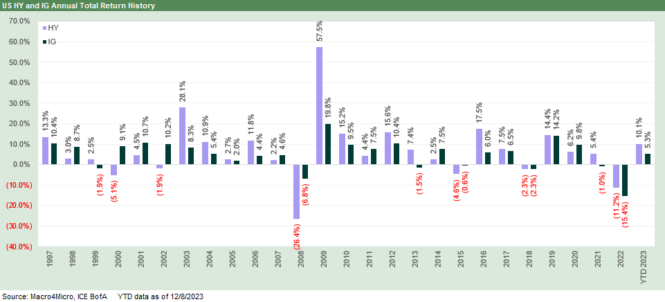
The above chart shifts back to total return from excess return, and we see the cycles where the UST curve bolstered returns (or mitigated negative excess return damage). In some cases, the markets were swept up in some bigger issues around systemic relief prioritization. The easy reminder across the cycles is how much the return impact of duration can dwarf all other factors. We see that in the big moves of the 20Y UST ETF (TLT) in our Footnotes and Flashback commentaries (see Footnotes & Flashbacks: Asset Returns 12-3-23). TLT was at a -33% total return for calendar 2022 and -36% running from the end of 2021 through the end of this past week.
The pain in 2022 for duration was other worldly and dwarfed the last time there was severe pain in returns from the UST curve in 1994. While 1994 predates this chart, the magnitude of the move of the UST curve was similar to what was seen in 2022. In that bear flattener of 1994, the 10Y UST ran over +200 bps higher and the 5Y UST over +260 bps higher. We look at the curve vs. credit issues in plenty of our commentaries, but the history above offers some food for thought after such a brutal 2022 into 2023.
The ability to realistically seek double digit total returns in IG benchmarks gives the credit asset allocators much to think about in terms of using the curve as a pathway to superior returns. That is in a market where yield chasing has been fully embraced at this point with relative risk premiums and “fair” credit compensation (“fair” in historical context) a secondary consideration.
This most recent period of 2022-2023 was the first major inflation fighting cycle since Volcker. The 2022-2023 battle against inflation was really the First Heavyweight Championship Fight since 1979-1982. The other brief bouts of Fed aggression were minor four-round undercards in relative context. The fight imagery matched how Volcker approached the challenge. It is unclear how Powell will approach the challenge in 2024.
As we cover in some of the history links we provide below, only the 1994 Fed surprise really created a major problem in the markets, but one that was short-lived when 1995 put up the best S&P 500 return of the bull market decade for that index (NASDAQ is a separate story with +86% in 1999). The Fed tightening into the TMT bubble bursting did not help the severity of the asset risk repricing in 2000-2002, but inflation was not the threat then that we just encountered in 2022.
Revisiting the crazy 1990s for a frame of reference on UST action…
In the next few charts, we frame the UST deltas across the current tightening cycle and then look back across the transition from the 1994 mega-tightening and then on through the impressive risk rally in both equities and credit in the bull market 1990s. That rally after 1994 broke plenty of records in the second half of the 1990s.
The supply of capital markets credit was expanding dramatically with the phase out of Glass-Steagall and inroads of US banks and global banks (notably from Europe), into the securities markets. An extraordinary rise of credit business line strategies from the legacy securities “bulge bracket” players was also a fact across loans, derivatives, mortgages, emerging markets, and other markets. Equities boomed while hedge funds and private equity firms were on a bender. LTCM was the poster child for the rise of systemic leverage.
There are more than a few common features when looking at the 1990s vs. today. The biggest differences are tied to the inflation cycle we experienced across 2022 since that was absent back in the tightening of 1994 even if the hiking action was more on the fear of future inflation. In addition, the layers of aftereffects tied to lingering supplier chain disruptions from COVID and what that means in the goods and services markets stand out as differentiating factors. Numerous industry cycles are out of sync with the traditional business cycle dynamics.
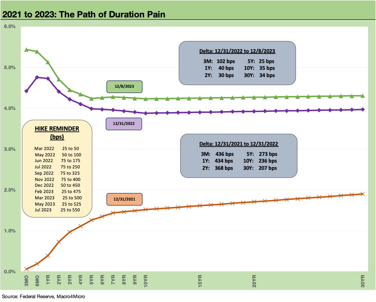
The above chart breaks out the UST curve deltas for 2022 before we add in the YTD 2023 UST deltas that have been dialed back of late. We use that tightening move as a measuring stick for the 1994 comparison since there has been no other period like 1994 or the current tightening cycle since the Volcker years. We cover recent UST curves routinely (see the histories section and links further below) and in our weekly in the Footnotes publications, so we focus more on the 1990s comparison in this piece.
A 1994 lookback as food for thought…
The above UST deltas in 2022-2023 that we break out in the box above can be compared to the 1994 bear flattener. We used to call 1994 the “Mother of All Bear Flatteners” since it came during an expansion (the Volcker tightening peaked during a double dip stagflation horror show). The Greenspan move of 1994 was set against an early cycle stage of the post-1991 recovery (recession “official” dates were July 1990 to March 1991). The tightening came during a year (1994) with 2% CPI monthly handles throughout the year except for Sept at 3.0%. The year started at 2.5% and ended at 2.6% and averaged 2.6%. That was a lot of tightening for a 2% handle inflation bias.
Calendar 1994 saw small (and rare) negative total returns in both IG (-3.3%) and HY (-1.0%) with NASDAQ, small caps, and midcaps also in the red. The S&P 500 eked out a +1% handle positive total return (negative price return). Back in the 1990s at prevailing coupon levels, it was not easy to generate a negative return in US HY during an expansion. Negative HY returns generally are more related to credit market crashes and unfolding default cycles (1990, 2000, 2002). In the credit crisis (2008) and times of ZIRP, we saw negative returns. We also did in 2015 and 2018. The year 2022 brought serious yield curve pain to all bonds, and that year saw a -11.2% total return, which was second only to the -26.4% of the 2008 crisis and the late 2008 credit market crash.
To front run the end of the story, the following year (1995) saw the best S&P 500 performance of the bull market 1990s and a major downshift across the UST curve. Both IG and HY boomed with total returns for IG at +21.6% and +20.5% for HY. Risk and rates both won big. We look at the 1996-1998 story line later in this piece.
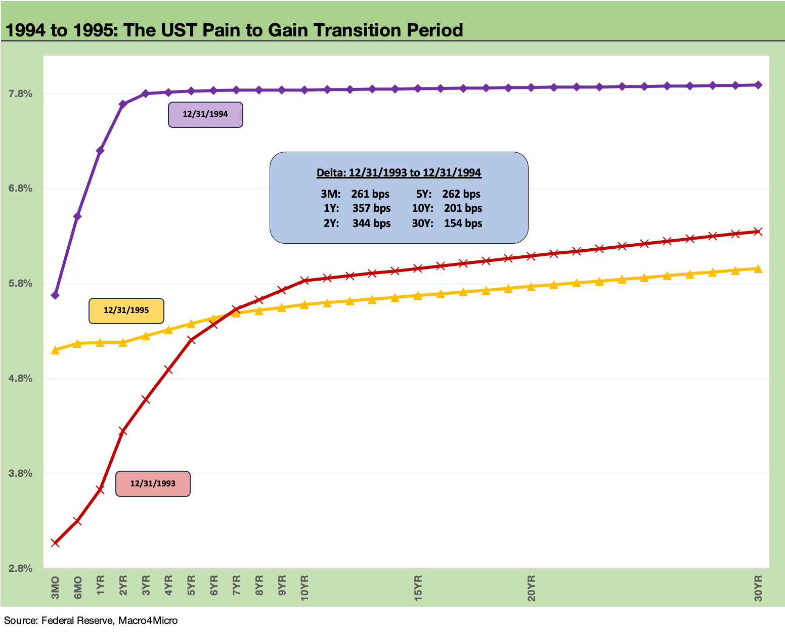
Framing 1994 (a clear overreach by the Fed) vs. the potential 2024 FOMC action has some difference in inflation and, in theory, cyclical timing. For PCE price indexes, the year 1994 was a low 2% year for both headline PCE and Core PCE that even saw a 1% handle headline PCE in May. Headline PCE saw a range of 1.8% to 2.3%. In other words, the year 1994 was a low inflation year and a very strange one for such Fed policies. In the end, the Fed has legislated maximum flexibility. To quote a movie line “This is my ‘I can do whatever the &@#! I want’ badge.”
The most recent headline CPI in Oct 2023 is 3.2% with PCE at 3.0% ahead of this week’s CPI release for Nov 2023. The inflation trend will continue to beg the question of whether the Fed will move with a higher Core CPI (Oct 2023 Core PCE 3.5%, Oct 2023 Core CPI 4.0%) in the new year in the absence of 2% handles. A move could in theory not happen unless there is economic weakness in the headlines (especially employment). We will perhaps get some hints this week on how 3% handles now vs. 2% targets ahead can be reconciled.
We look at the 1994 Fed action in more detail in other commentaries (see Bear Flattener: Today vs. 1994 and Aftermath 10-18-22). What we are framing here is whether that year and what followed offers some precedent as to how 2024-2025 could play out in extending the cycle and in driving material returns in both equities and in UST markets and longer duration bond classes (notably IG Corporates).
Does the Fed need to see financial damage?
The year 1994 was fairly brutal on the markets (the bear flattener came just as my employer, Lehman Brothers, was teed up to get spun off by American Express). The Fed slammed interest margins for financials and especially those dependent on short-term funding in the CP market (like Lehman). Secondary traders using inventory to generate positive carry had to start thinking more about secondary volumes, position aging, and turnover rates. Bond investors were getting punished by duration losses and the upward shift that radiated out across the UST curve.
Another side effect that is easy to forget was the pain in mortgages (the term “toxic waste” arrived and was in active use). Emerging Market stress and currency turmoil brought events like the Tequila Crisis that required some Mexico soft bailouts (the hard bailouts were blocked by Congress). We also saw derivatives get their first round of bad headlines and “inverse floaters” became “a thing” that was quickly a disaster. Orange County was sent reeling on exposure to the “new breed” of asset volatility that came with Wall Street creativity. The Fed had some reassessing to do in 1995 which they did as the market also decided low inflation and declining long rates were not a bad thing.
One of the major differences in the 1994 curve vs. today was the absence of a dramatic inversion from the front end that we see today. That sends different cyclical signals (in theory). The absolute rates were also much higher than today along the UST curve. 1994 was a strong GDP growth year (2Q94 posted a high quarter of +5.5% GDP per BEA and +4.7% in 4Q94), and that fueled inflation theories. The year 2023 just posted a 5% handle quarter, so that fits the bill of being defensive on inflation.
As history has shown, getting too bearish in 1994 on UST fallout was not the winning move as the UST curve shifted down drastically in 1995. In the end, the Fed saw it was “out of school” on the direction of inflation. Duration and equities proved to be a big winner. The economic expansion kept running into early 2001. The credit cycle crashed well before that.
The wild next moves from 1996 to 1998…
While views of history vary widely, the Fed seemed to have struggled in the mid to late 1990s on grasping how a strong recovery was still not bringing inflationary pressure even with low unemployment through 1998 and high rates of capacity utilization. That was forcing a few Fed members to reevaluate their models (even if secretly). The acronym NAIRU (Non-Accelerating Inflation Rate of Unemployment) was back in vogue.
From 1995 to 1997, demand for risky credit assets was quite high and spreads compressed into 1996 on the way to 1997 lows. The UST curve gyrated higher off the 1995 market strength as we detail below into a shift higher in 1996 and then two years of shifting lower in 1997 and 1998.
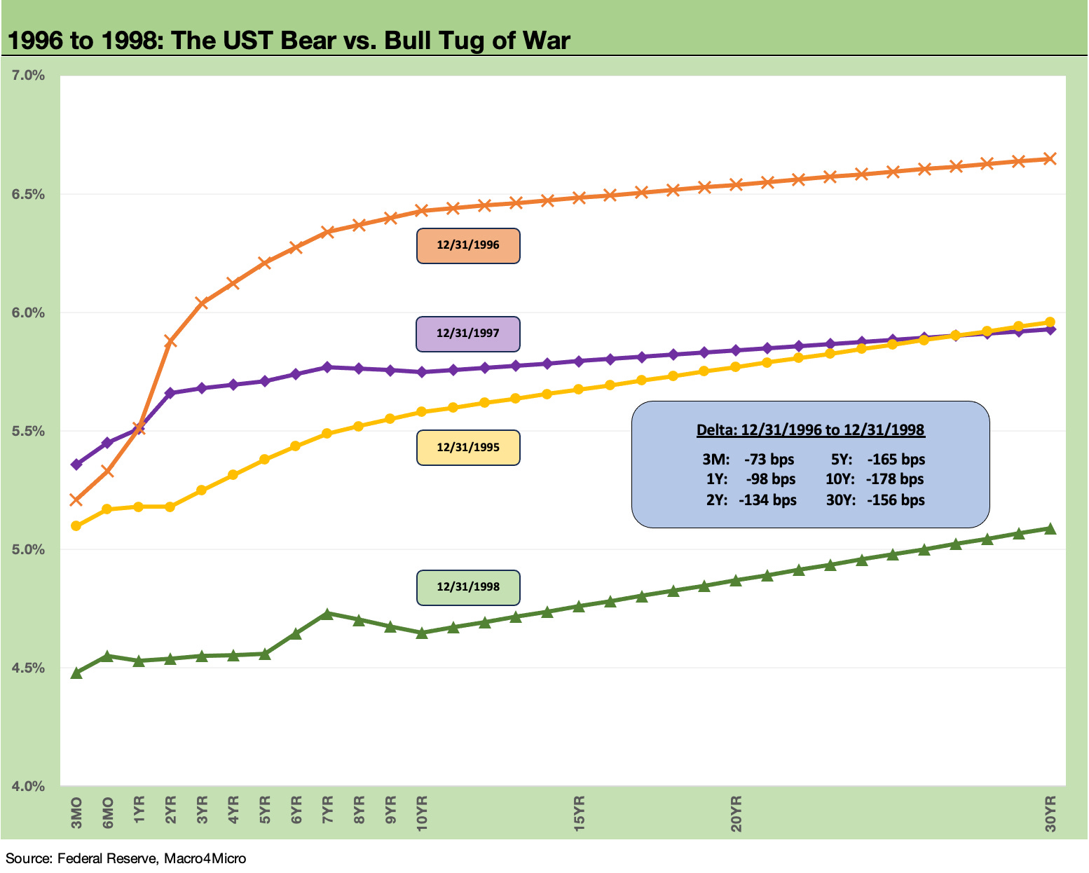
The above chart takes the baton from the end of 1995 and then runs across some years of material shifts in the US curve. The year 1996 brought trouble to duration but also positive spread actions and bullish credit markets that saw double-digit positive returns. During 1996, IG bonds took a hit with only a +3.4% total return while HY posted another double-digit year at +11.3%.
Then 1997 saw both IG and HY as winners again in double digits with IG at +10.4% and HY at +13.3%. We saw another curve vs. spread disconnect by the end of 1998 with IG at +8.7% and HY at +3.0%.
The 1997 spread compression was only rivaled by the June 2007 compression as we cover in our weekly Footnotes publication on all-in yields (see Footnotes & Flashbacks: State of Yields 12-10-23). The 1997 spread lows were in a credit cycle that had some time to keep playing out while June 2007 was on a very short fuse. The 2007 lows were hit in June on the way to the summer of “suspended animation” before the Dec 2007 cyclical peak in the broader economy came ahead of the credit crisis of late 2008.
The 1998 UST curve shift is another move that might excite those with very bullish views on how the post-tightening of 2022-2023 could play out. The year 1998 played out with favorable 1% handle CPI levels for each month of the year and PCE below 1% for 11 of 12 months.
Meanwhile, rising risk appetites in US credit and equities were leading to imprudent risk management and rising systemic leverage. A legacy example was the occasional zero (or minimal) haircuts on LTCM collateral just to earn the right to do business with them. As history has been written (and books published, see “When Genius Failed”), the unwinding of trades just made the backdrop worse as the Fed helped facilitate a bailout of LTCM by the banks/brokers who were counterparties and had both direct and indirect exposure.
The turmoil in the summer and fall of 1998 was unfolding as Asia was melting down and EM contagion kicked in during the summer after the Russia default. During late 1998, the Fed eased 3 times by 25 bps each in the fall on the back of such financial market stress. One concern in 2024 is that a parallel might be found in global financial market pressure with shaky sovereigns and potential economic stress from wars. China is a topic by itself.
Cyclical histories and lookbacks…
For some cyclical histories, we have some articles in the archive that might be of interest to “new folks” or the younger crowd (we have plenty of students signed up) or for some memory joggers for the vets. I know it helped me to revisit the granular data of those periods even though I had worked through them all.
We recommend signing up for Substack for more user-friendly access and archive scrolling. A quick note on the links: you don’t have to log into Substack (just click “No Thanks” when prompted). If you choose to get the emails directly from Substack when we publish the articles, all you need is the email of your choice (business, personal or anonymous).
Inflation: Events ‘R’ Us Timeline 10-6-22
Misery Index: The Tracks of My Fears 10-6-22
Business Cycles: The Recession Dating Game 10-10-22
Expansion Checklist: Recoveries Lined Up by Height 10-10-22
Fed Funds-CPI Differentials: Reversion Time? 10-11-22
UST Curve History: Credit Cycle Peaks 10-12-22
Bear Flattener: Today vs. 1994 and Aftermath 10-18-22
Fed Funds, CPI, and the Stairway to Where? 10-20-22
Greenspan’s First Cyclical Ride: 1987-1992 10-24-22
Greenspan’s Last Hurrah: His Wild Finish Before the Crisis 10-28-22
Wild Transition Year: The Chaos of 2007 11-1-22
Contributors
Glenn Reynolds, CFA glenn@macro4micro.com
Kevin Chun, CFA kevin@macro4micro.com