
Histories: Asset Return Journey from 2016 to 2023
We drill down into the relative asset returns across a period that should get a lot of scrutiny in an election year.


With the Biden vs. Trump comparisons likely to see a lot of scrutiny ahead, we look back at the annual return histories of the 31 benchmarks and industry ETFs we watch.
We cover a wild swing in 2016, the handoff to Trump in 2017, across an abysmal 2018, a Fed fueled rebound in 2019, through the wild year of COVID in 2020, into a major rally in 2021, a tightening cycle in 2022, and then on to a very bullish 2023.
The transition from a faltering Fed normalization effort in 2018 to multiple fed funds cuts in 2019 and then a return to ZIRP in 2020 during the COVID crisis was one of a range of stark transitions across government policies, political turmoil, inflation shocks, supplier chain disruptions, monetary policy shifts, and how the consumer sector adjusted to the rapid changes.
The 2022-2023 asset performance also tell a story of volatility and a return to a somewhat normal absolute level of UST rates after years of coupon starvation with more shapeshifting of the yield curve dead ahead.
If candidates start arguing about “Who did what?” in the stock markets or for various industry groups, we put this piece together as a reminder that there are numbers to look at to avoid drowning in the disinformation and doubletalk.
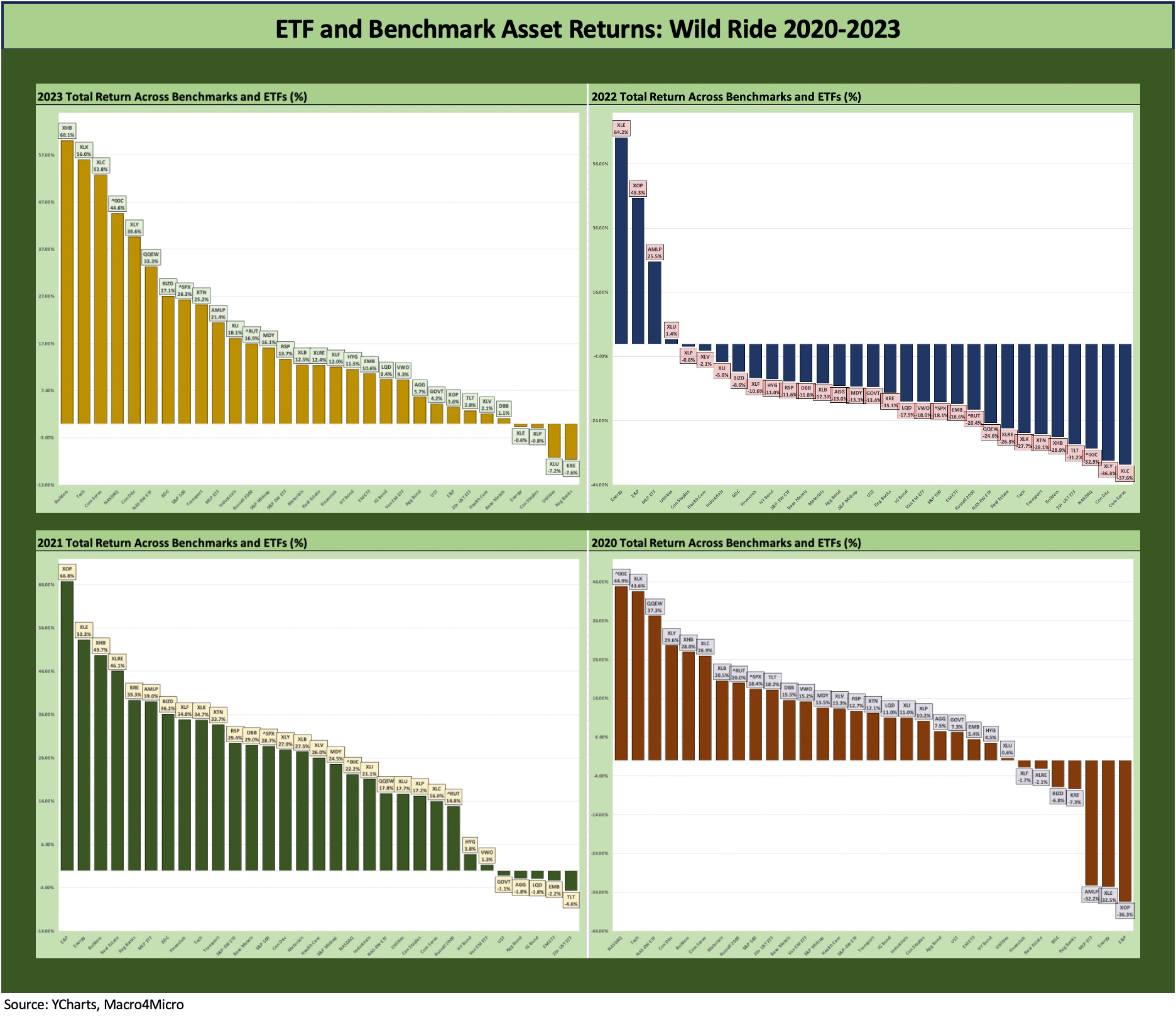
In this commentary, we look back across the years from 2016 to 2023 for the 31 benchmarks and ETFs that we watch each week. The chart above shows the 4-block view of the 2020 to 2023 return profile (we start in the upper left). This recent post-COVID block of years is easier for most to remember (unless you are campaigning, and amnesia sets in).
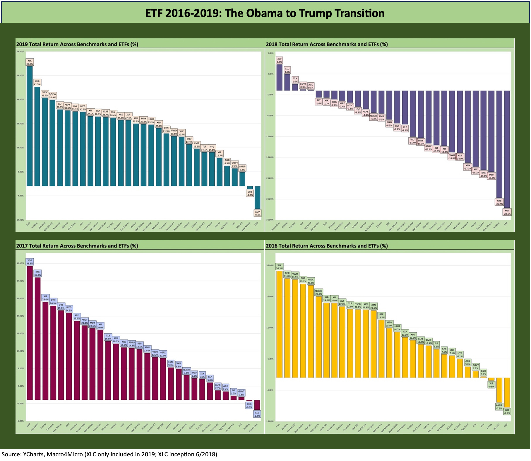
Below we post the 2016 to 2019 visual, and those years were much more volatile than they look at a glance. Obama’s last year in office was a wild one and notably so in the credit markets. An implosion in the debt-financed shale boom set off soaring default rates in a major HY sector and that in turn dislocated secondary market-making and raised fund redemption fears in illiquid markets.
The result was distressed exchanges and quite a few single digit unsecured recovery rates at the time. HY index dollar prices hit a cyclical low on 2-11-16. We address those issues briefly in the annual breakouts further below. The year 2016 (and late 2015) offer a reminder of how some of the most attractive markets across credit cycles are when optics are ugly and secondary liquidity impaired.
Note that we break out each of these years individually for a better visual (readability) with a few more brief comments for each.
2020 to 2023 was all about the COVID adjustments and then an inflation spike and Fed tightening…
As the decades go by, the 2020 to 2023 span of time is hard to rival since the Volcker years, but we still rate the systemic crisis of late 2008 and early 2009 for utter chaos at the top of the list. After all, the global banking system essentially broke and would have set off cascading collapses in business credit and the consumer sector implosion if not dealt with by governments and central banks. It was an all hands on deck moment.
The 2020-2023 box of four above shows the full calendar year performance from the COVID crisis, across the tech boom of 2021, into the inflation pain and tightening shock of 2022, and then into 2023. Most expect 2023 will be seen as a key transition year of materially lower inflation rates and a year when fed funds peaked. The last leg of the inflation path lower in 2024 will naturally be the hardest based on long term inflation histories.
The years can include wide swings, major Hi-Lo ranges, and mixed credit and economic cycles…
As the election year of 2024 carries on, a mix of disinformation and amnesia likely will be part of the usual revisionism. The main takeaway is mostly that the calendar years were “net good” to “net excellent” in running 12-month asset returns under Trump and Biden but with some occasional wild swings (2018, 2022). Economic performance, employment trends, price stability, trade, and pandemic mortality are separate discussions. We are talking about asset returns in this piece.
The two exceptions were 2018 and 2022, and each had their own stories with layers of factors. Of course, the GOP and Democrats only want you to hear their versions of the layers. The bar should be raised for the proper use of facts in Q&A, and the CNNs of the world do not use them well in their interviews. MSNBC selects a subset of the facts, and Fox can’t revise facts if they never use them in the first place. Either way, this historical cheat sheet might help some who are new to the game and need a quick primer.
We had not seen such a varied and volatile time period as 2018 to 2023 since the early 1980s even if just on the inflation spike and aggressive monetary tightening. The 2016-2017 years looked more like past cyclical swings, but both years were technically in economic expansion periods until the very brief, outsized contraction of COVID in early 2020. If we toss in a pandemic, it is a safe statement that we have never seen such a stretch of years in the postwar period (as in post-WWII) or the modern capital markets era.
2020 as a year of activism in fiscal and monetary policy…
As we look at the 2020 period, the activist role of the Fed through ZIRP and QE ruled the asset return story. We saw some confidence-building backstops in 2020 that effectively reopened the credit markets for a massive refi-and-extension wave that locked in low coupon debt (corporate and household mortgages).
The open markets and low rates eased pressure on banks seeing credit line drawdowns, but most importantly headed off cascading consumer and corporate defaults that would have set off a downward spiral. That is digging pretty deep for an economic silver lining when over 350 thousand died in the US from COVID in 2020 and another 460 thousand during 2021.
Gauging how the Fed’s credit market support and confidence building maneuvers combined with Washington’s stimulus and relief legislation to translate into a demand spike for goods in 2020 and later into services is not easy. The market rallies also require consideration of the supply-demand imbalances and supplier chain problems and what that all meant for pricing power. There is no free lunch, and the cost was price increases along supplier chains and inflationary pressures for the consumer.
The 2018 to 2019 swings combined tax cut incentives with trade policy chaos…
The interesting years that tend to get revised on what actually unfolded were 2018 and 2019. Many memories seem to begin life after COVID, but the Fed was already easing on signs of economic weakness and trade problems in 2019. Some of the policy critics from the conservative, pro-business elements stated out loud that Trump’s tariff actions were negating the benefits of his Dec 2017 tax cuts. That was before numerous Senate and House GOP leaders were driven out of Congress and various business organizations went radio silent out of fear of retaliation.
Business investment had been flagging along with signs of weak exports, and that led the Fed to make three 25 bps cuts in the summer and fall (implemented Aug 1, Sept 19, and Oct 31 of 2019). That tends not to come up in GOP talking points on Trump’s “awesome, greatest ever” economy, but the Fed had to step in during 2019 to give the markets and economy a fresh boost after an ugly end to 2018 threatened a replay.
The 2018-2019 chart tells the story of how 2018 played out in asset returns, but the Fed cuts in 2019 helped drive a material risk rebound. By the end of the year, HY bonds were in a par plus yield-to-call world, the duration of the economic expansion that started after the June 2009 trough had hit an all-time record and eclipsed the 1990s expansion. We all know what came next in early 2020.
The 2016 to 2017 transition set the table…
As we cover further below, the year 2016 started off ugly and then rallied in dramatic fashion late in 1Q16. We soon moved on into a banner year for risky assets as the laggards of 2016 ran to the head of the return rankings with the Russell 2000 and Midcaps and HY index in the Top 3 slots across the main debt and equity benchmarks.
Then 2017 came and the Trump team took the baton from Obama’s last year and got busy with full control of the Senate and House. There was a clean slate for legislation for the new team to make their mark in tax, infrastructure, trade, immigration, and foreign policy (see below for granularity).
Getting into the annual close-ups…
Below we run through the years covered above but with less eye-straining visuals and a few brief highlights.
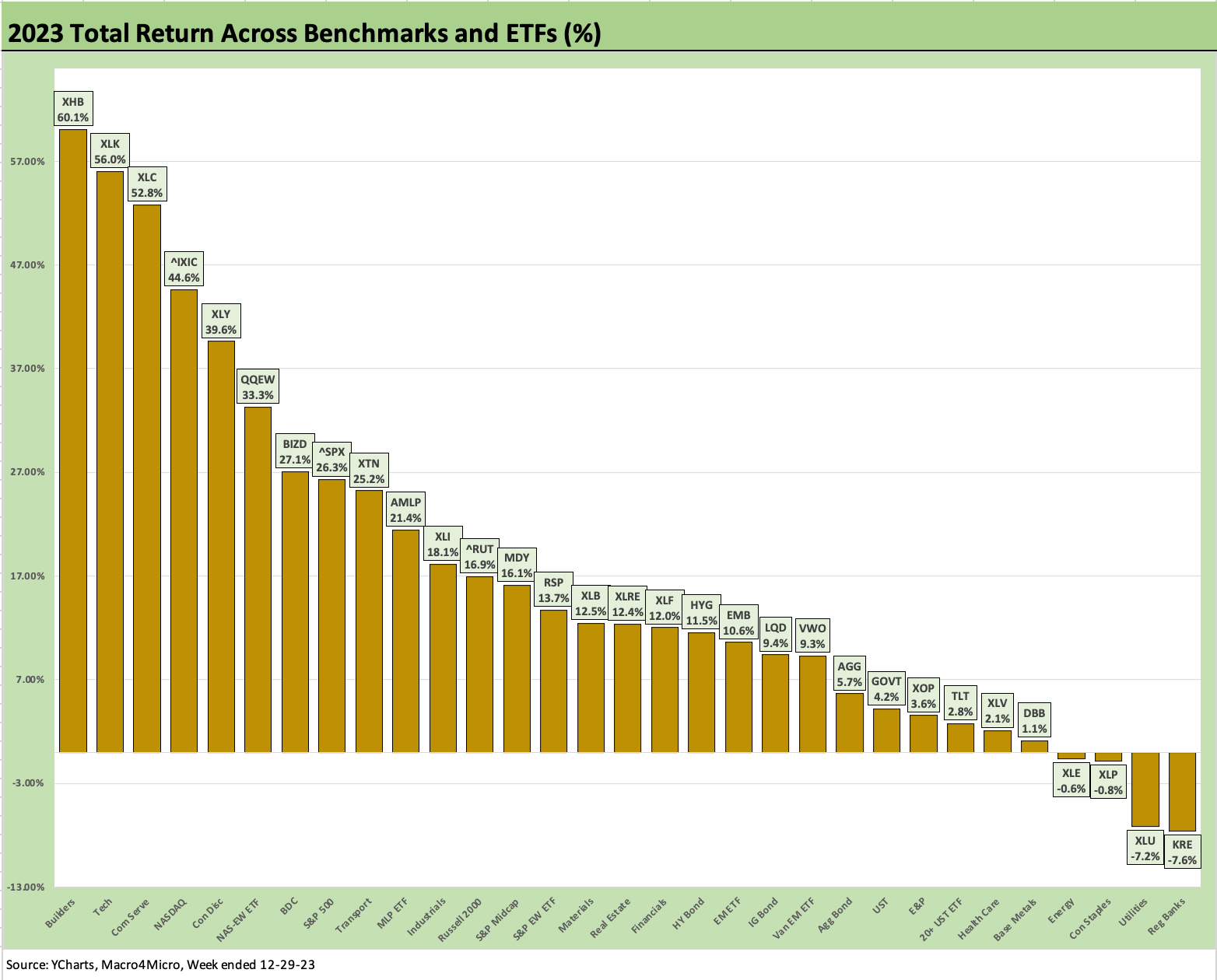
The above chart revisits the recent winnings of 2023. We’ve already discussed them in detail in our asset return Footnotes (see Footnotes & Flashbacks: Asset Returns 1-1-24). With some of the residual economic releases for Dec 2023 still rolling in at a lag, the most distinguishing factor this past year has been the consumer sector resilience that tied into employment strength, rising wages, and as we saw this past week, consumer sentiment improvement (see Consumer Sentiment: Multiple Personalities 1-19-24).
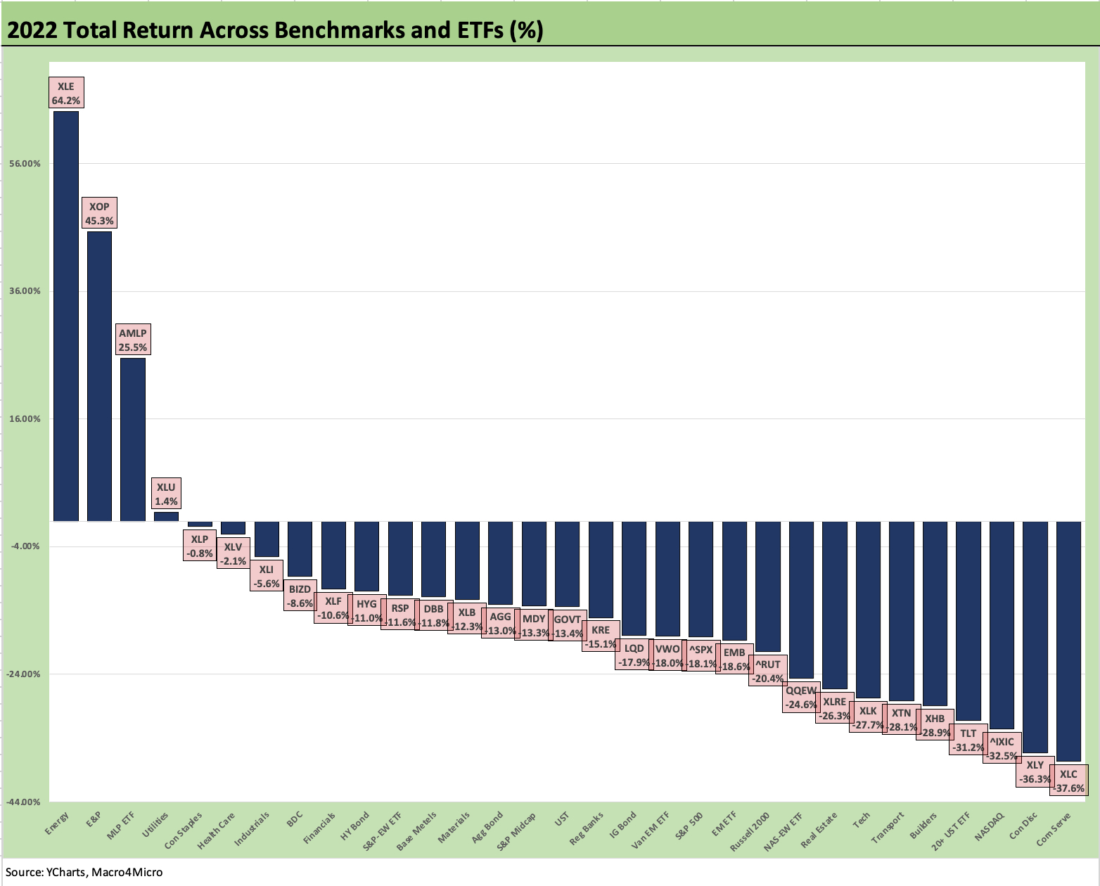
The above chart tells an easy story. 2022 was simply a bad year tied into a tightening cycle and aggressive monetary policy that had many screaming “we are in a recession” even when we most certainly were not (see Unemployment, Recessions, and the Potter Stewart Rule 10-7-22). If we were in a recession, even NBER would have told us more than a year later anyway (see Business Cycles: The Recession Dating Game 10-10-22).
There was plenty to worry about in 2022, but it takes a lot to drive a contraction – as in a lot (see Inflation: Events ‘R’ Us Timeline 10-6-22). Past recessions have carried a massive amount of baggage on the way to a recession or faced a systemic or exogenous shock that turbocharged the fallout from existing market structure problems. For 2023, the rapid decline in inflation helped as did strong employment trends and rising home equity among other factors. We entered this period with the most cyclically diverse and occupationally varied economy in US history.
The only very mild recession since the early 1970s was the one we faced in 2001. The post-TMT contraction was as close as the economy came to a poorly defined (as in not explicitly defined) “soft landing” (see Greenspan’s Last Hurrah: His Wild Finish Before the Crisis 10-30-22).
All the other downturns (late 1973 to early 1975, the double dip of 1980-1982, the 1990 official recession that was bracketed by pain from 1989 to 1992, the Dec 2007 peak and later post-credit crisis body slam were true hard landings.
The very mild downturn of 2001 tends to be forgotten given the brutal credit market default cycle and TMT stock bubble crash. The excess of Greenspan’s reaction and heavy easing sometimes obscures the very mild real economy downturn (brief and mild).
The problem in all the recession talk in late 2022 was the reality of low unemployment and solid PCE and consumer resilience. The expectation was that this would eventually have to take a toll on demand and investment. That clearly did not happen in jobs or consumer spending to the point of contraction.
Meanwhile, a construction boom was not something many were discussing back in 2022 (see Construction Spending: Timing is Everything 12-1-23). The table was set for a 2023 asset rally after the pain of 2022 set the table for lower inflation. So far, that is exactly what we are getting but it was not in the equity markets outlook as priced through the end of 2022.
In the end, the consumer sector carried the ground game with an assist from legislative stimulus during the two-year political window (single party control) available in 2021-2022 that fired up “infrastructure classic “(“roads and bridges”), tech investment (CHIPS), and clean energy (the EV battery and assembly plant boom). That has fed into a recovery in 2023 that likely peaked in 3Q23 GDP with more muted numbers ahead (4Q23 GDP advance estimate is this coming week).
During Trump’s narrow window with full control of the Senate and House, he skipped infrastructure and instead went for tax cuts, the NAFTA replacement, and his somewhat thwarted attempt at a wall. Obama’s narrow window brought the Affordable Care Act and Dodd-Frank. Such windows close fast.
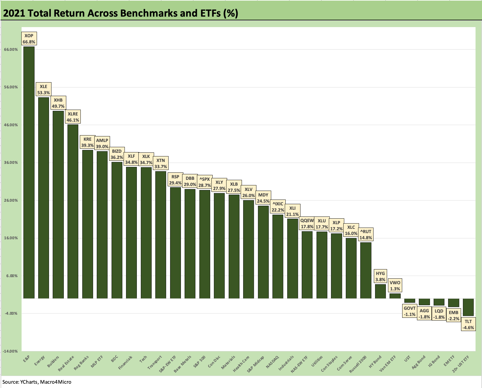
The 2021 growth stock boom year was a reminder that markets can still buy into unrealistic growth stories even if it comes with a cash bleeding tech-centric twist (Peloton at $167 in Jan 2021? Carvana at $370 in Aug 2021?). The rise of meme stocks was captured with names such as GameStop in Jan 2021 as that epic situation multiplied many-fold. The market has seen stranger times. Just not that many.
The material UST curve support during COVID made the risk-chasing excess very explainable. Start on the left of the chart above and it is easy enough to understand the chase of these industries and subsectors. Free money promotes risk taking and the use of leverage. That and too many stay-at-home day traders during COVID chasing their tail and barking at the moon.
We saw negative WTI futures in the peak COVID shock in 2020 (negative oil prices means they would pay you to take the delivery requirement since the market was running out of storage at the peak of COVID), so we see the E&P ETF booming a year later. In Canada, a barrel of bitumen was less than a bottle of Molson. That all rebounded with a vengeance in 2021.
Builders (ETF XHB) were hot on extremely low rates and the sustained “work from home” and the “flight to the burbs” trends. Real estate generally (ETF XLRE) made REITs look like outsized high yields for the income starved. Now they compete with short UST.
The same yield attraction was evident in Midstream stocks (ETF AMLP) as HY bond surrogates with reliable cash flow and investment grade credit risk. The same high dividend impulse chasing was evident with BDC equities (BIZD), which have been very solid performers with their numbers holding up well so far.
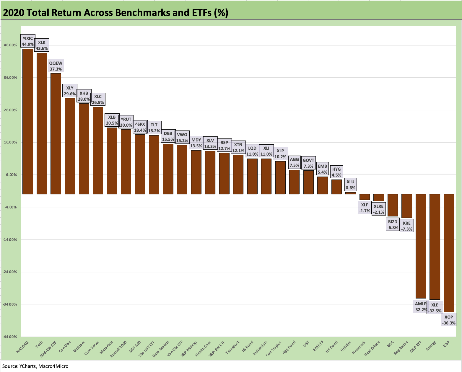
The above chart for 2020 shows the value of extremely aggressive monetary support, excellent coordination between Powell and Mnuchin, and very ambitious bipartisan legislation during the “Year of COVID.” The market went from panic over systemic crisis and a potential multimillion body count to a record refi-and-extension wave in credit markets and in the housing sector.
Low rates were locked in and debt savings were had by all. Household fixed charge coverage and asset protection were very favorable. In the corporate sector in 2024, we see 4% handle par weighed coupons in the IG market (well below current UST rates) and 6% in HY. That’s the lingering benefit of the COVID Fed support. For homeowners, 60% of mortgages are below 4%.
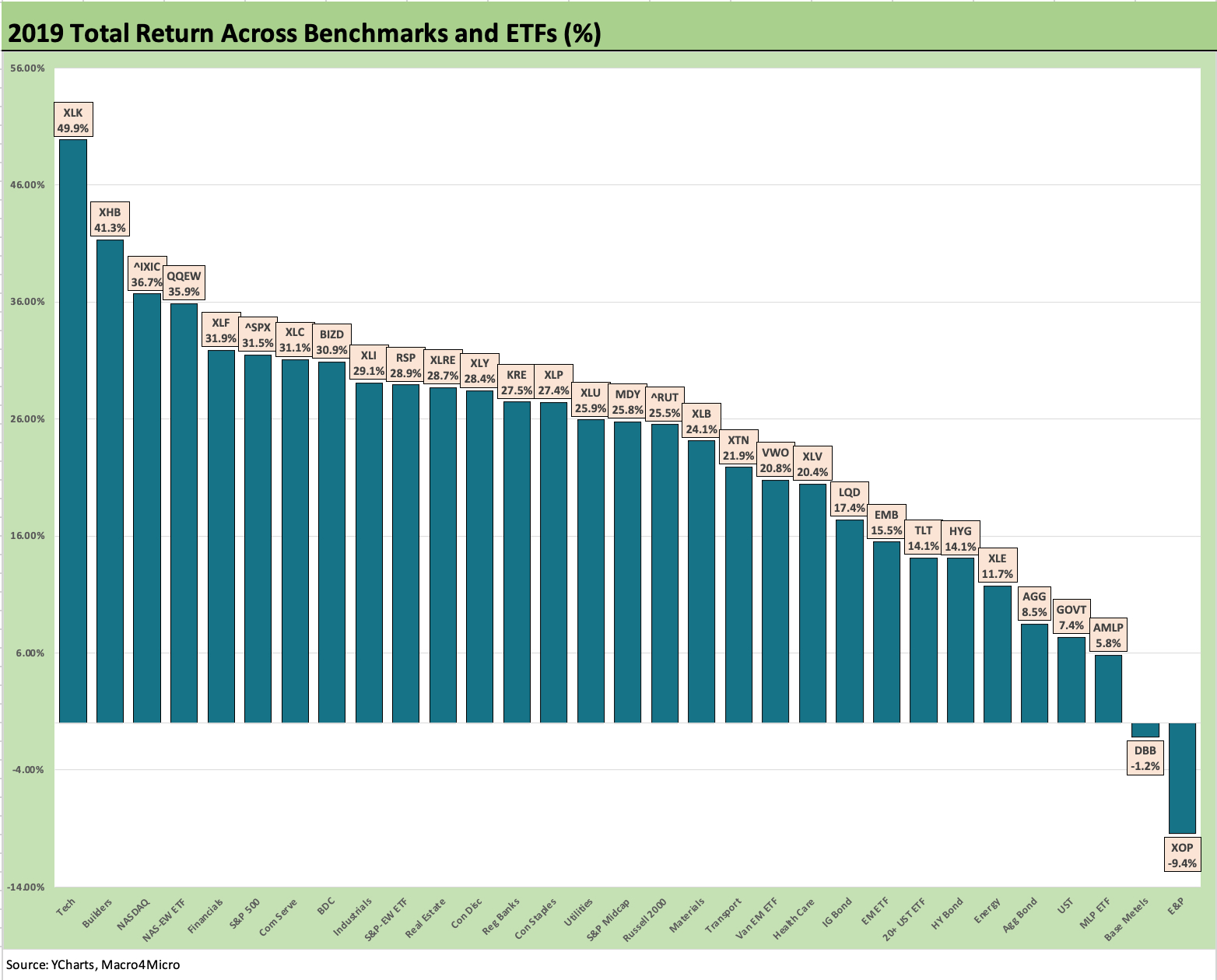
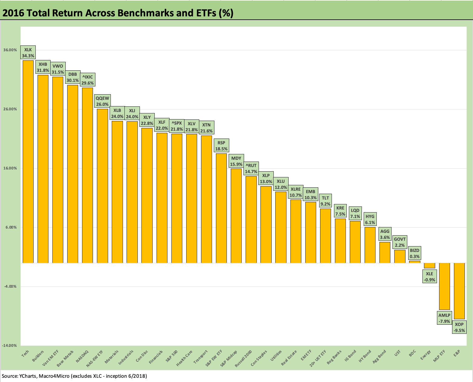
The above chart shows the 2019 rebound off an atrocious 2018. That “very bad year followed by a very good year” history is common enough. The fact of 2019 is that the Fed was seeing trouble ahead and came in with three 25 bps cuts as noted earlier. We saw a fed funds cut from the July meeting (effective Aug 1) moving fed funds down to 2.0-2.25%. Then came the mid-Sept cut down to 1.75-2.0% and finally, at the end of October, down to 1.5-1.75%.
The year 2019 was a solid year for risky assets but comes with the reality of the Fed easing to bolster fears around capex and exports. It also comes with the asterisk of a rebound from a very bad year in 2018 just as 2023 came off a bad year in 2022.
If the tie breaker is the next best year, that would be 2021 vs. 2020 (instead of 2023 vs. 2019) and the year of COVID. The asset return performance in that case goes to 2021 as a winner over 2020, but we could also cite COVID distortions for both whether it be massive monetary and legislative support for the 2020 markets or the gross supply-demand distortions and pent-up demand that drove 2021.
Debating asset classes on the head of a pin is somewhat of a mug’s game when cheap money and free money dominated the backdrop for these markets until 2022-2023. Both Trump and Biden had plenty of good markets along with one notably weak performance year each.
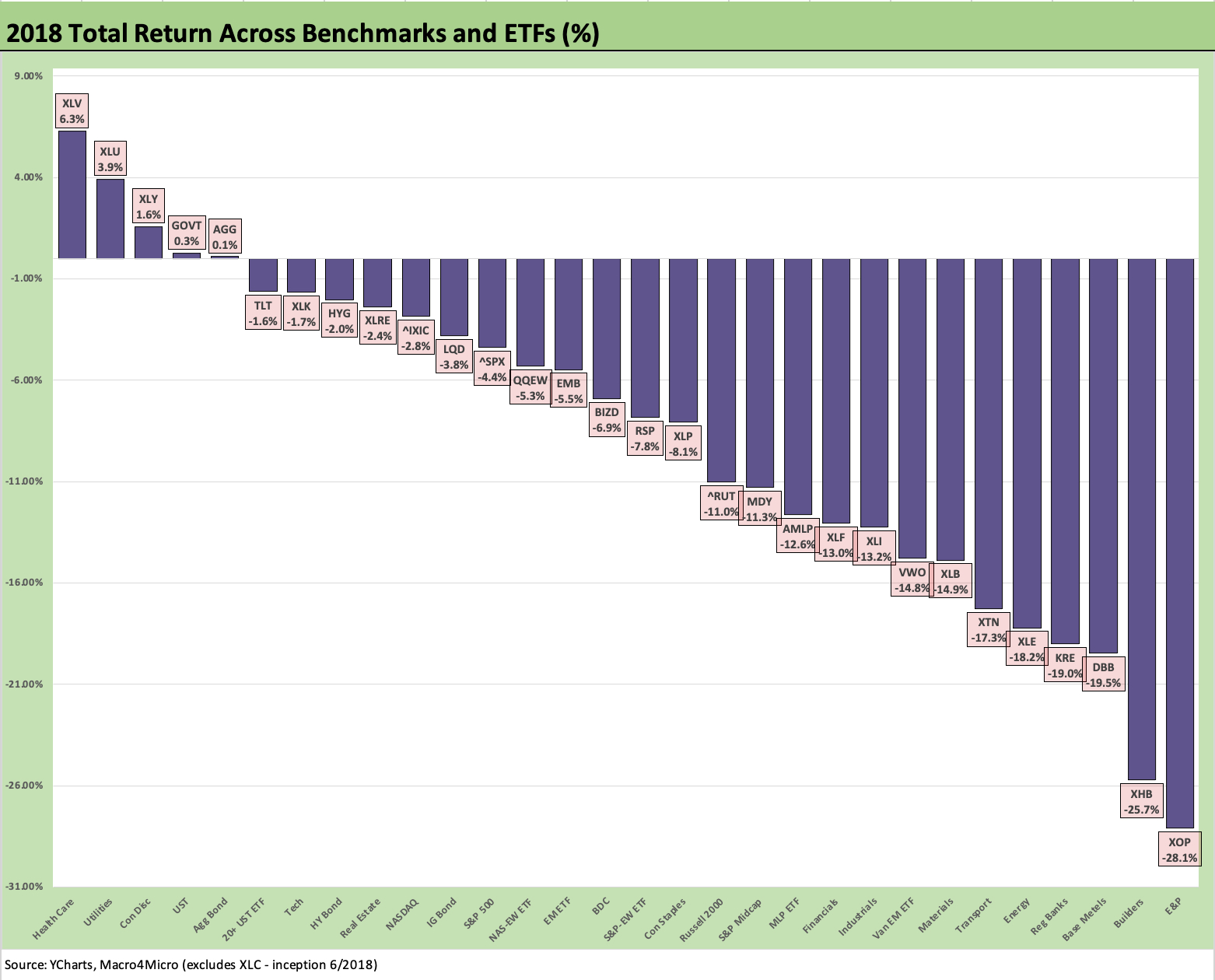
The 2018 numbers were bleak and the sharp sell-off in 4Q18 was easy to frame even if it was evident in HY (plunging oil). The year sees 5 ETFs in the positive range (two of them barely) with the defensive, interest rate sensitive Health Care and Utilities at #1 and #2. HY and IG corporates generated negative returns. Large caps, midcaps, and small caps were all negative. The Russell 2000 and the S&P Midcap ETF were in double digit negative territory.
The year 2018 was important since it could be seen as the first full calendar year that would reflect Trump’s first year in office with GOP control of both houses. This was the year after the Dec 2017 tax cuts. The market also could vote on Trump’s frequently articulated ambition to kill NAFTA and beat trade concessions out of Europe and China.
What the market saw received some market responses as more actionable policy demands were put on the table. The NAFTA/USMCA deal was struck in broad terms after much acrimony in the late summer 2018. The fine print dragged on, and the USMCA was not in full implementation until after COVID hit the markets.
2018 ended up as an ugly year with a lot of uncertainty from trade to energy to political stress in Washington as the voters were getting ready for a midterm swing. Oil hit a new post-2014 high by the early fall and then crashed to end the year as 4Q18 was a death spiral in energy and risky credit. We see the E&P ETF on the far right in last place above.
HY put up almost a -5% total return in 4Q18 with the CCC tier at -10% total return and a +183 bps widening in CCC tier OAS just in December. In our end-of-2018 total return ranking on equity benchmarks vs. fixed income subsectors (not shown above), cash came in at #1 at under +2% total return. That is an awful year by any standard.
The year was supposed to be a celebration of the corporate sector capex after the record tax cuts and massive investment incentives. However, share buybacks dominated more than fixed investment.
The year soon degenerated into trade chaos, the threat of a potential demise of NAFTA that spooked investment plans from the supplier chain to OEMs, and heightened worries around pockets of escalating trade conflicts and tariff tit for tat. That trade noise spilled into 2019 and undermines fixed asset investment, in turn prompting the Fed to bring more accommodation.
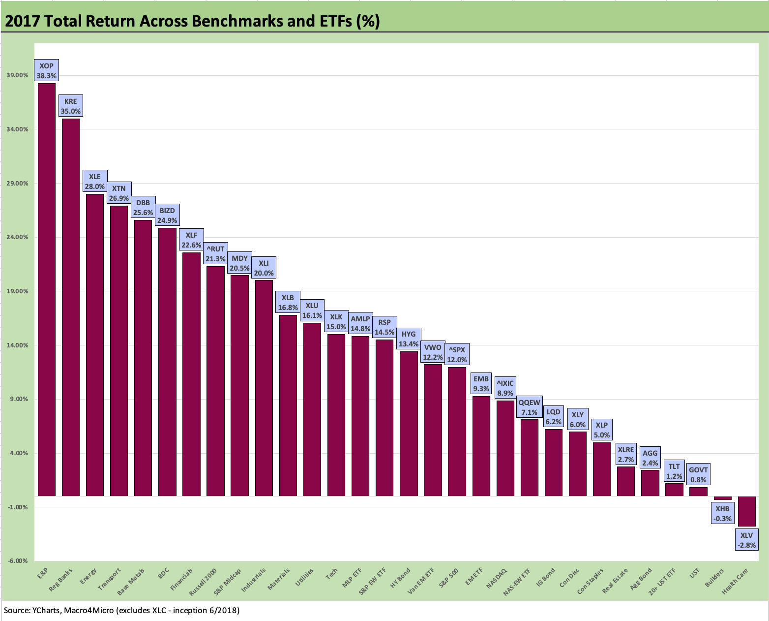
Another rally year in 2017 kept the beat going as Trump made a lot of promises. One of them was kept with the largest tax cut in history (Reagan’s was bigger relative to GDP). Infrastructure promises moved on from limbo to a graveyard as 2018 turned into the year of trade battles and NAFTA death threats before USMCA was born.
The year 2017 was only Trump’s first year, and as we usually see with new Presidents it takes a while to get policy and legislative agendas on track. There is a need for speed, however, given the history of midterm election pain that is often delivered at the ballot box. That is exactly what happened in 2018.
Obama printed his “big tickets” in 2010 and then had the biggest adverse House swing in history – even worse than Truman’s in 1946. The good news for Trump on his 2018-2019 priorities was that there were a lot of protectionist impulses on both side of the aisle (just as there is now). Trump never got infrastructure on track, and his focus was more on “the wall” than roads and bridges and ports.
Obama’s last year of his second term was not going to get much done with GOP control of the Senate and House. Obama even got derailed in his right to nominate a Supreme Court Justice. That will be in the history books 100 years from now, but the short-term driver of the market during 2016 was oil and gas and the end of ZIRP in Dec 2015 with a 25 bps hike. The year 2016 was messy early, and there was only one hike in Dec 2016 by 25 bps.
The second half of 2015 had seen a lot of chaos from China equity markets to oil prices collapsing in the US and driving soaring bankruptcies and defaults (selective defaults on distressed exchanges or old-fashioned defaults by running out of cash and a complete absence of equity valuation viability). Emerging markets equity and HY bonds were near the bottom of the performance rankings in 2015. Small caps and Midcaps were also negative in 2015, but the S&P 500 edged into a 1% handle positive return (+1.4%) with NASDAQ above 7% (+7.1%).
Credit markets were in a bigger mess on the way into 2016. HY was in negative total return range during a cyclical expansion in 2015, and that was unusual across history. We saw that in the mega-tightening of 1994 but usually such an outcome is for years such as 1990, 2000, 2002. As covered above, we saw that HY smackdown again in 2018 under Trump as oil and trade worries were roiling markets late in the year.
With so much ugliness in the markets entering 2016, the HY market bottomed in Feb 2016 with HY market above 10% YTW and OAS at +887 bps on 2-11-16. The HY index was around 83 in HY index dollar price while the CCC tier was at a 58 dollar price in a very low UST market. The Energy sector in HY was at a 52 dollar price in Feb 2016. IG Energy was over +400 bps OAS and trading at a 92 dollar price in a 102.6 dollar price IG index market. In other words, life in the credit markets was quite ugly early in 2016.
Then the HY markets rallied with oil and two of the best months in mid-cycle HY excess return history showed up in March and April 2016. The markets were off to the races broadly. The results are detailed above as the ugly election season saw slim margins in a handful of states bring Trump to the White House.
While Hillary trash talked Trump about Russia after a very close race in the usual swing states, she immediately and gracefully conceded to Trump by 2:30am. Any reader can do the side-by-side margins in states such as Pennsylvania, Michigan, and Wisconsin. You win some, you lose some. Just not in Trump world. Hillary won the popular vote. Trump called it fraud.
Obama left a note in the drawer in line with tradition and gave a tour but did not call out Seal Team 6 to go orange whale hunting. Times change.