
Footnotes & Flashbacks: Credit Markets 7-29-24
We look at some multicycle results on return differentials across IG vs. HY and update the spread compression story.


Hmm…not sure that’s going to change course…
A week of material shifts in equity markets was not mirrored in a very quiet backdrop for credit spreads and a modestly favorable move in the UST curve (see Footnotes & Flashbacks: Asset Returns 7-28-24).
We run through the histories across the cycles from the late TMT years to current times on total returns, excess returns, and HY-IG differentials as “more reward for more risk” is not always the way life plays out.
We run through quality spread differentials from IG down into the bottom of the credit tiers.

The above chart updates the running YTD total returns and excess returns across the credit tiers. We can see the meager total returns YTD on the adverse UST curve action (see Footnotes & Flashbacks: State of Yields 7-28-24). Long duration IG has struggled in 2024, and short duration HY had the edge on coupon income, lower duration exposure, and spread compression.
The excess return relationships look the way they should with higher credit risk rewarded with higher credit returns. We see the BB and B tier very close YTD, and that raises questions on the adequacy of the B tier compensation vs. the BB tier looking back. The CCC tier has exponentially higher average default risks across cycles, so the higher excess returns are justified and necessary with such risks.
Looking back across the cycles…
The next two charts line up the total and excess returns for HY and IG and how they stack up for incremental returns. The first chart is chronological and captures the cyclical flavor (those were some wild cycles). The second chart lines up the highest to lowest for the range of good, bad, and ugly.

The above chart is a reminder that things can look great before they get decidedly ugly. The assumption that the higher reward for higher risk is a normal occurrence is countered by the array of “red” in the HY-IG math and the range of negative relationships in the excess return differential column for HY-IG.
The simple theory is that times of bad excess returns get some relief from favorable UST moves to support total returns when the Fed does its dual mandate duties (in recessions, the full employment part). Some backdrops are so bad that the Fed is also helping the banks stay sound.
We have often looked at these time periods in our research (see UST Curve History: Credit Cycle Peaks 10-12-22) and in the spread histories. The TMT meltdown brought the longest default cycle in terms of months and saw 3 years of CCC excess returns in last place across the credit tiers. We also see the 2000-2002 time horizon as the one time the HY-IG returns were negative for 3 straight years in both total returns and excess returns.
We see back-to-back negative years in 2007-2008 during the systemic crisis and again in 2014-2015 with the oil sector collapse. We see a negative differential for total returns in 2018 (yes, during Trump’s “greatest economy in the history of the world”) and again with COVID.
The 2022 tightening year and inflation peak was also a grim one for asset returns (see The 2022 Multi-Asset Beatdown 12-31-22), but the relationship between HY and IG was rational in the differentials with duration punished in IG and excess returns beaten up in HY.

The above chart lines up the differentials between HY and IG from highest to lowest for another angle. Every year has its own story, and we have told more than a few of them. It is always interesting to look for negative excess return years, and there are plenty of them. Similarly, in HY total returns, it takes a lot of bad credit news to wipe out the impact of a high coupon.
When one considers that you should always get paid for taking more credit risk, the fact that HY-IG excess returns is negative in 10 of the years presented offers a sobering reminder to watch credit trends in an OTC market that has fewer market makers than ever.
There is not a lot of mystery to the most negative excess return differentials on the chart. From the bottom up, we see the credit crisis (2008) and TMT meltdown (2000-2002). 2015 was the worst stretch of late 2015 calendar months in energy and saw an especially brutal Dec 2015. While Feb 2016 was the low point, that flipped into some of the best HY months in HY history as the spring of 2016 brought a post-selloff rally.
For 1998, the burgeoning EM meltdown after Russia, the LTCM mini-crisis, and Lehman rumors resulted in a Fed-arranged bailout of LTCM by the counterparties (ex-Bear and a smaller slice from Lehman, who was under severe pressure at the time). We also saw a series of FOMC cuts to get the market out of a hole.
2007 saw the summer of suspended animation as the mortgage pain, derivative counterparty panics, a growing hedge fund canary body count, and Countrywide “merger rescue” by BofA set the stage for 2008. The housing sector was in a swoon and consumer systemic leverage including mortgages ran off the charts (see Systemic Corporate and Consumer Debt Metrics: Z.1 Update 4-22-24).
The 2022 tightening cycle was not all that bad in context since the fundamental economic backdrop and deal quality was sound. 2014 saw the initial cyclical spread low in HY to that point in the cycle, but the Saudi oil price war set off panic in the lead HY sector of Energy. The 2018 4Q18 collapse came right on the heels of cyclical lows in early Oct 2018. That spread swoon in Dec 2018 is the least explainable of the meltdowns even if energy did drop from a post-fall 2014 high in the $70 handle range into the low $40s by Dec 2018. CCCs got pounded badly in Dec 2018. Many (not all) of these ugliest periods presented great buying opportunities to step down the credit tiers.
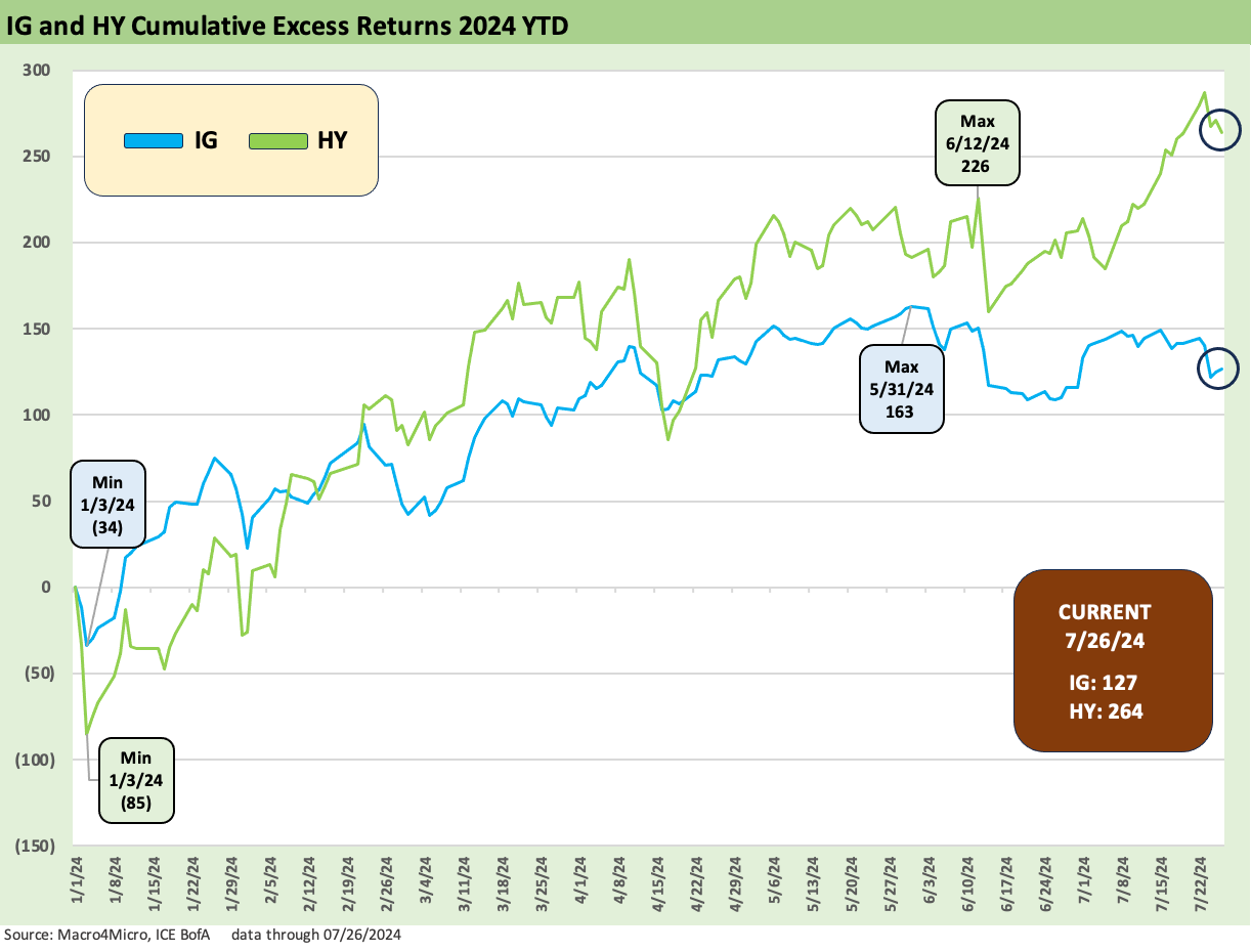
The above chart details the running excess returns for HY vs. IG YTD 2024. We see HY comfortably ahead, which is good news and arguably required news. That can then start the discussions around whether that magnitude of outperformance in excess returns is enough for the incremental risk.
Asset class constraints for HY mandates make the discussion somewhat moot at times for IG vs. HY, and the discussion on where to be positioned in HY is the next question (Heavier in BBs? More BBBs for some duration risk? Loans and floating rate based on spreads?).

The updated running excess returns for BB vs. BBB has recently converged in a manner that is a flag on weak relative value, but the BB tier has pushed back into a running lead YTD. The fade seen above in BBB and fresh move higher by BBs leaves a lot of year to play out. We would expect the BB tier to outperform BBB in 2024 as it should given the higher risks. The year 2025 prospects will be a topic for later.

The above chart updates the running excess returns for the CCC vs. the B tier. The relationship is at least in the right order with the riskier CCC tier paying more than the B tier.
Spread compression highlights…
We did a more comprehensive dive into the OAS numbers and moving parts last week (see Footnotes & Flashbacks: Credit Markets 7-22-24). This week we focus more on the spread differential compression after another week where the “tight stayed tight” and the incremental credit risk compensation stayed thin.
As in equities, the credit markets are going to “cross that bridge” when they come to it around forward-looking policy risks (notably trade and tariffs). We see a Grand Canyon-esque gap in what the two Presidential candidates see as their priorities on tax, trade, and fiscal budget challenges. Some of the ideas are very risky and border on tectonic (that, Trump’s planned trade war and the inevitable shocks and defensive response along the economic chain).
The FOMC decisions come first for the UST curve and credit markets when we roll into the fall after Labor Day. Then comes the grinding headlines to the election and the next election confirmation process with all those fond memories of Jan 6. The election will determine if the J6 choir will be singing on the White House lawn or in the prison rec yard. The debt ceiling countdown also will be a parallel path of anxiety with the debt ceiling deal ending at the beginning of January. No end of the good times to come. Those are topics for other days.

The long-term time series for IG spreads is detailed above. The +95 bps IG OAS is down in the area of former IG credit market peak periods such as 1H04 to 1H07 and the average across 1997-1998. The late 1997 period still sets the mark for IG OAS lows. Early March 2005 came just ahead of the IG auto bond chaos and downgrades later in the year. The +90 bps handle spreads have held in for protracted periods in past cycles.

The long term HY OAS series shows the extreme volatility in recessions as well as during economic expansions. The timeline shows the post-crisis swings seen in fall 2011 with the sovereign systemic fears that infected the banks so soon after the credit crisis peak with the HY upstream oil crisis that peaked in Feb 2016 ahead of a monster rally. It was then on into COVID turmoil and a return to ZIRP.
The good news for this HY cycle is that we don’t have the disproportionate exposure to industry concentration risks seen in the past where debt-funded capex (TMT, upstream oil and gas) saw cash flows negative, balance sheets stretched and unsecured asset protection thin.
We also do not see the magnitude of excess LBO-related bond exposure in HY as in prior cycles with so much happening over in private credit. The threats of a decompression wave from the bottom up are still there, but a case can be made that it is less threatening this time in the B to CCC tier mix (see The B vs. CCC Battle: Tough Neighborhood, Rough Players 7-7-24).

The “HY minus IG” OAS differential is telling the same story of tight spreads and is inside the June 2014 lows but still wide to several of the post-crisis lows of Oct 2018 and Dec 2021. The Dec 2021 market was in ZIRP mode while Oct 2018 would still see one more Dec 2018 hike. That last hike came ahead of some 2019 economic pressure that brought 3 FOMC cuts. Those would be to support weak trade and fixed investment during Trump’s “greatest economy in history” (see Presidential GDP Dance Off: Clinton vs. Trump 7-27-24, Presidential GDP Dance Off: Reagan vs. Trump 7-27-24).

We included the BB OAS history again this month as a reminder of the much-diminished “cost of being wrong” on downgrades from BBB to BB in a market where the depth of demand for many BB tier industries and issuers remains strong and the cycle resilient in many industries.
As the refinancing and extension process continues into 2025-2026 for BBs, income-oriented investors will see some attractive current market coupons from a BB credit tier that ended last week at a yield of 6.3%. The BB tier dollar price is under 97 with a par weighted coupon of under 5.7% for shorter duration exposure. The HY lite strategy has been popular for a good reason for retirement AUM.

The above chart shows the challenge for those who rode the solid BB tier names in the compression wave. The “BB minus BBB” OAS differential is detailed above, and the +60 bps differential is down near the lows of 2018 and 2019 and not far from the early 2005 and mid-2007 lows.
The screen for the “rising stars” and “falling angels” are a regular practice in managing name and industry exposure along the BBB and BB tier divide. That gets back to the question of time horizons for each investor rather than just calling the bottom in spreads. The BB tier presents very low default risk.
The BB tier is a shorter duration tier than BBB and could ride some of the FOMC easing and UST shapeshifting more than longer duration exposures if in fact the intermediate and long end of the UST curve lags. The coupon maximization game is also part of the BB tier strategy as good solid BBs with very low default risks and solid credit positioning can be good stable coupon clippers for funds that need income.
In the end, there is no getting around how compressed the BBB vs. BB relationship is in historical context for an investor clipping 5% handles on cash.

The above chart updates the bottom of the credit tiers and the credit compensation differential. The current “CCC minus B OAS” differential of +640 bps is wide to all the medians broken out in the box within the chart except one. That is favorable news in context.
The exception is the late TMT cycle median of the 1997-2001 period. That was an ugly stretch. That is a favorable signal, but we always get back to the CCC tier being all about the industry, the issuer, and the relative risks of the typically deep structural subordination risk for many of the bonds on the menu. Aggregate OAS and dollar prices for the CCC vs. B tier feature a very volatile history (see The B vs. CCC Battle: Tough Neighborhood, Rough Players 7-7-24).

The above chart shortens up the CCC-B OAS differential for a more granular look at the tightening cycle. We see the compressed +315 bps from Jan 2022 to a wide of +741 bps in Nov 2022 and then a fresh ride down under 500 and back to the current area. The CCC tier can materially swing around on constituent exits (defaults or upgrades) or new arrivals (downgrades from the B tier, new leveraged deals tapping HY bonds vs. private credit). In other words, sharp incremental swings around index rebalancings always bring some asterisks.
Some updates on yield…

The above chart updates the running HY vs. IG index yields. Our small point on this chart is the logical and rational frame of reference for historical HY and IG YTW is the pre-crisis period outside a ZIRP or normalization framework. That means 6.1% for IG and +9.3% for HY.
Right now, we are in a very low UST backdrop across the history of the modern debt markets (see Footnotes & Flashbacks: State of Yields 7-28-24) and we also are in credit markets with very compressed spreads. The 5.28% IG YTW and the 7.58% HY levels are thus low in context. That is where the debates in credit risk pricing, the curve, and compensation for the bundle of risks come into play.
I am a believer in diversification, but if I had to pick one it would be short to intermediate IG exposure based on the list of variables ahead in 2025. A lot will happen before then that will clarify that list of risks (with the FOMC and especially the election at the top).
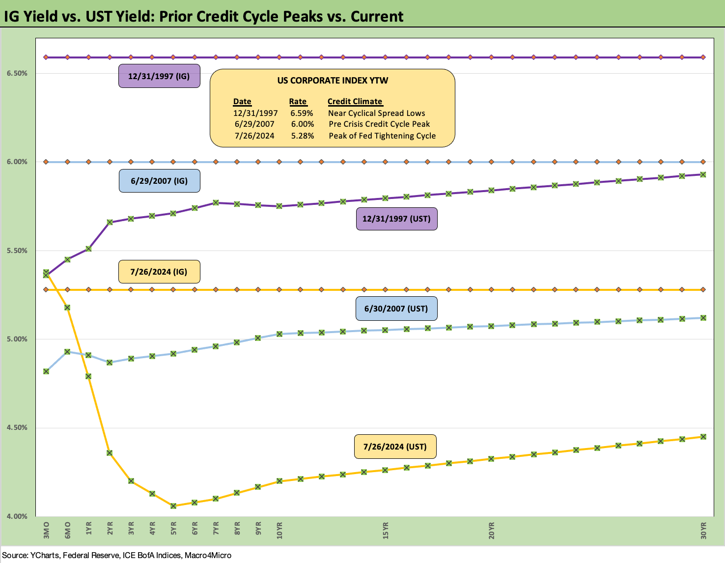
The above chart frames current IG yields vs. past credit cycle peaks in mid-2007 and late 1997. We include the IG index yields for each (horizontal lines) and the related UST curves. We have covered these periods in many past commentaries, so this is more for an update.
The IG yield story is dominated by the UST curve and extremely low UST levels in the current market vs. the earlier cycles. The current inversion is still an anomaly for the ages since the corporate bond market took off after the Volcker years of inflation fighting in the 1980s as waves of bank and private placement disintermediation took over and outstanding IG and HY bonds soared. M&A and aggressive financial policies reigned.

The above chart does the same drill for HY that we did in the prior chart for IG with a look back to the pre-crisis, pre-ZIRP credit cycle peaks. We have run through the details on credit market peaks and valleys in past commentaries (see HY Spreads: Celebrating Tumultuous Times at a Credit Peak 6-13-24).
The all-in yields in this market for US HY are below the past credit bubble period of June 2007 and the credit cycle peak of late 1997. That TMT credit cycle ran into 1999 before the default cycle kicked into gear but spreads got volatile and wider in 1998-1999.

The above chart is just a yield ratio that frames the YTW ratio of the CCC tier to the BB tier for a snapshot on the Hi-Lo risk pricing relationship within the HY layers. There are a lot of industry and issuer stories, mix variances across time, subsector crises, bouts of macro credit contraction, and extreme excess across the periods, but the current level of 2.17 is right around the long-term median and numerous median timelines detailed in the box in the chart.
We cover those histories across multiple commentaries including some cycles that pre-dated the use of OAS (see The B vs. CCC Battle: Tough Neighborhood, Rough Players 7-7-24, UST Curve History: Credit Cycle Peaks 10-12-22, Greenspan’s First Cyclical Ride: 1987-1992 10-24-22, UST Moves: 1988-1989 Credit Cycle Swoon10-20-23, UST Moves: The 1990-1991 Risk Factor Pig Pile10-24-23).
See also:
Footnotes & Flashbacks: State of Yields 7-28-24
Footnotes & Flashbacks: Asset Returns 7-28-24
Presidential GDP Dance Off: Clinton vs. Trump 7-27-24
Presidential GDP Dance Off: Reagan vs. Trump 7-27-24
PCE June 2024: Inflation, Income, and Outlays 7-26-24
2Q24 GDP: Into the Investment Weeds 7-25-24
GDP 2Q24: Banking a Strong Quarter for Election Season 7-25-24
Footnotes & Flashbacks: Credit Markets 7-22-24
Footnotes & Flashbacks: State of Yields 7-21-24
Footnotes & Flashbacks: Asset Returns 7-20-24
Industrial Production June 2024: Is the Sector Rotation Alive? 7-17-24
Housing Starts June 2024: Still All About the Deliveries 7-17-24
Retail Sales: Second Wind 7-16-24
Footnotes & Flashbacks: Credit Markets 7-15-24
Consumer Sentiment: Still Feeling the Heat 7-12-24
Homebuilder Equities: “Morning After” on Rate Optimism 7-12-24
Homebuilders: Equity Performance and Size Rankings 7-11-24
CPI June 2024: Good News is Good News 7-11-24
Footnotes & Flashbacks: Credit Markets 7-8-24
The B vs. CCC Battle: Tough Neighborhood, Rough Players 7-7-24
 |
|