
Market Lookback: Monkey Business 2-9-26
We look back at some performance trends, UST deltas, and credit spread action in a strange week for tech.


To my fellow Irish American Catholics: A handful of generations ago, we were the apes at the beck & call of Papist radicals (some “Christian” elements never change).

Something for Irish to ponder. Similar forces of hate and ignorance pushing agendas.
In a strange week of wild tech equity valuation swings alongside more than a little xenophobic and racist hatemongering, the Friday rally eased some pain ahead of a big week ahead with payroll data and CPI.
We looked at the asset return mix already across our group of 32 benchmarks and ETFs, and this week we added another chart with 24 benchmarks and tech equities (single names and ETFs) as we expand what we monitor (see Market Commentary: Asset Returns 2-8-26). We picked up the pace recently in terms of writing up single chart comments on our LinkedIn page (under Glenn Reynolds, CFA).
The new tech equity comp chart is one to watch with the AI multiplier effect story lines getting more complex. The software fear immediately put private credit investors on alert given the high exposure to the subsector in leveraged transactions.
The story lines around inflation, payrolls, and tariff lag effects will heat up ahead of Warsh taking the helm. The “low hire, low fire” payroll theme could easily shift into “low hire, more fire” based on some of the ugly numbers from the Challenger report this week and soft ADP numbers. The BLS gets back in action this week with the employment report, but JOLTS releases are still lagging.
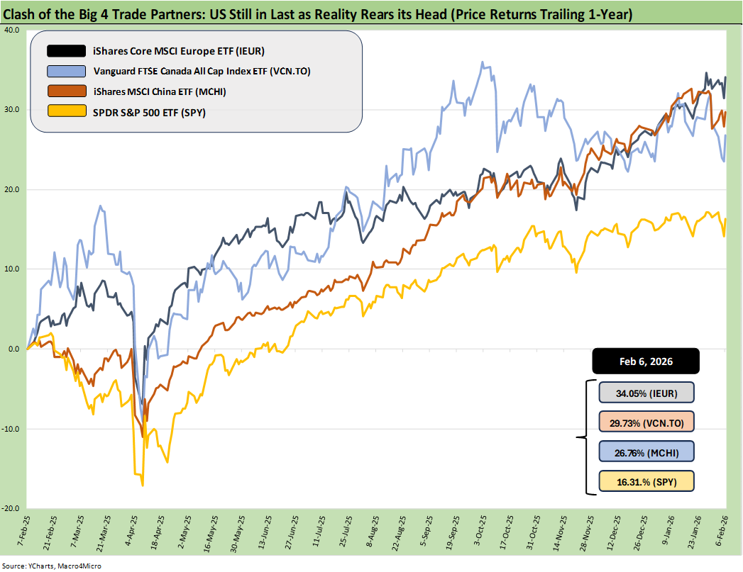
The above chart updates the running returns for the S&P 500 ETF (SPY) vs. three ETFs reflecting the performance of some critical trade partners (Europe, Canada, and China). The chosen ETFs reflect the currency impact and offer a reminder that even with the US stock market reaching new highs, there were other places to be in a diversified portfolio as the dollar was battered. By this metric, the US finished last among the four ETFs.
As we hear about “record stock markets and 401(k)s” we like to point out that the only Presidents to see record stock markets the last 50 years were…all of them. You can slice and dice the numbers by record high index prices (in an “up and to the right” world) or look at each year with annual return metrics. The various metrics can drive different conclusions on relative performance. That is a story for another day
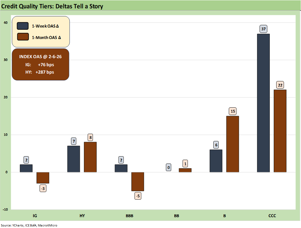
.The above chart breaks out the 1-week and 1-month OAS deltas and we see some modest widening in the HY and IG indexes. We see +7 bps for HY on the week and +8 bps for 1-month. The headline index OAS for HY at +287 bps is still inside the range of the June 2007 bubble spreads. IG with a 70-handle is also still in a very rare zone.
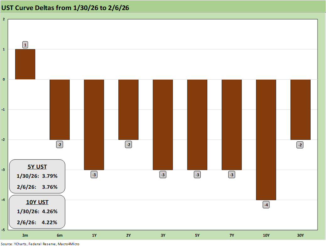
The above chart updates the weekly UST curve deltas, and the fear factor managed to generate a very slight flattening that was, in context, fairly minimal. This coming week’s payroll and CPI numbers could shake things up.
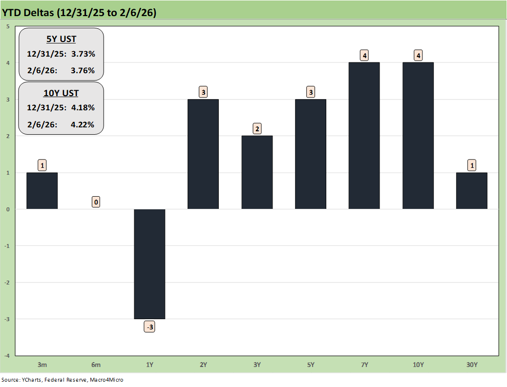
The above chart updates the YTD UST deltas and reminds us that the long end has been stubborn and nothing is all that reassuring for the risk of UST supply-demand imbalances in the dollar trends, deficit funding needs (supply), or the alienation (growing enmity?) of former allies (big UST holders). We are still looking for UST steepening in 2026.
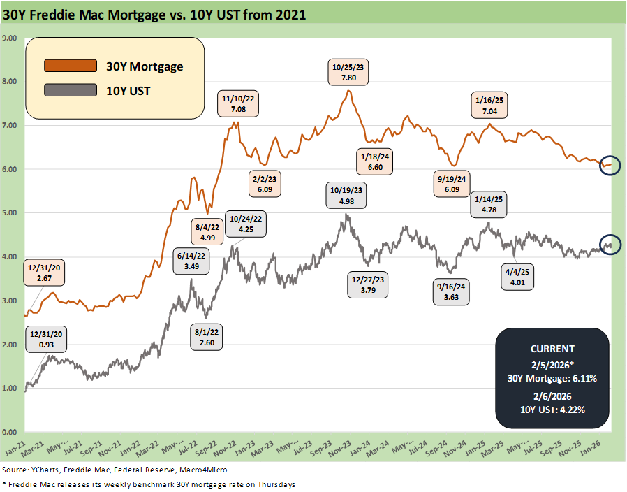
The above chart updates the running 10Y UST time series and the Freddie Mac 30Y mortgage benchmark (released on Thursday). Friday saw the Mortgage News Daily survey close at 6.15
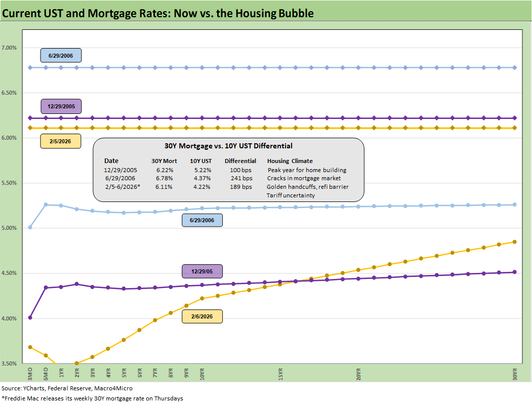
The above chart offers some historical context for the current UST curve and 30Y Freddie Mac level. We choose the date of mid-2006 as the RMBS market started to show signs of trouble. We also include year-end 2005 as the peak homebuilding year. The plunge in housing came on with a vengeance from the end of 2005 into 2006 as the crack in mortgages and RMBS in late 2007 and 2008 was one for the ages.
We include the 10Y UST and 30Y mortgage rates and the “30Y mortgage minus 10Y UST” in the box. Those markets in 2005 and 2006 showed relatively flat UST curves beyond 1Y out to 30Y while the current UST curve has grown steeper in the current cycle with the notable exception of the front-end inversion. The current Freddie 30Y is the lowest of the group. The 2Y to 10Y segment of the curve is also lower and steeper now
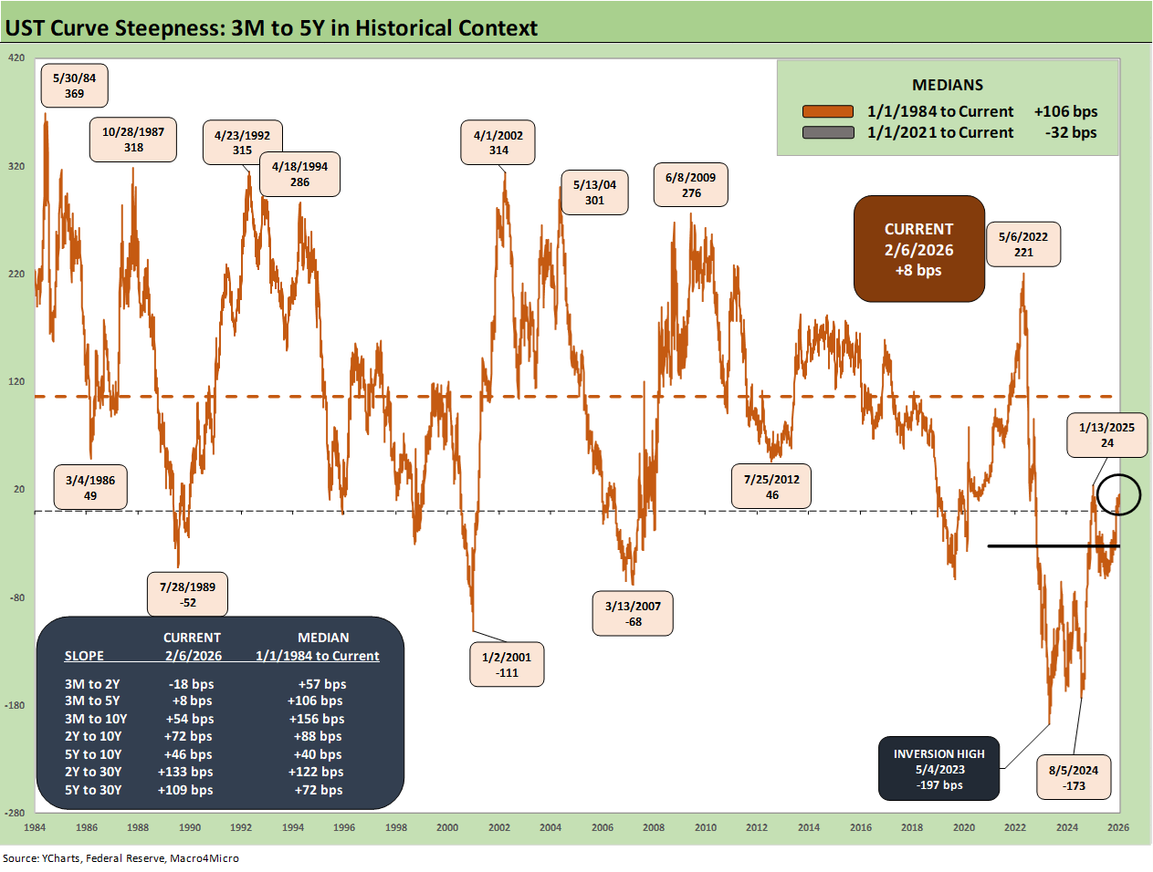
.The above chart updates the 3M to 5Y UST segment slope at +8 bps vs. a long-term median of +106 bps. That certainly signals a lot of room for normalization and steepening with FOMC easing, but the case for lower 5Y UST could also get caught up on the same debate that revolves around the sticky 10Y and 30Y.
The box in the chart includes a number of curve segment slopes we like to monitor with the relevant long-term medians. Anything starting from 3M has a lot of room to steepen in historical context.
Historically a steep 3M to 5Y segment encourages extension in the usual reach-for-yield impulse with the curve and the OAS levels experiencing some natural tension in risk and term premiums. Easing is also supposed to intrinsically lessen floating rate debt pressures and interest costs for more leveraged entities. That can be a double-edged sword in private credit with lower interest expense for borrowers but less income for lenders
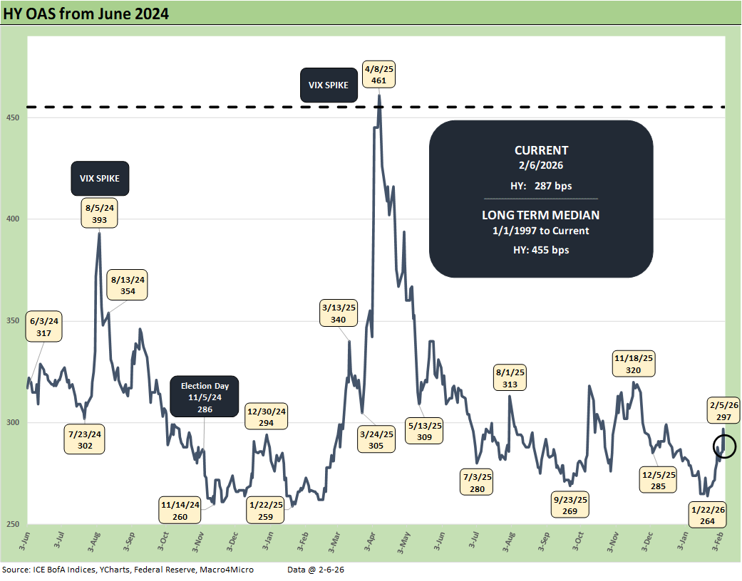
.The above chart plots the HY OAS from mid-2024 across the Liberation Day whipsaw in April 2025 up through the recent milder gyrations. After the Thursday tech equity carnage this week, HY OAS did a mild pop to +297 bps before rallying back to +287 bps to close Friday. Those spreads are very compressed vs. the long-term median of +455 bps
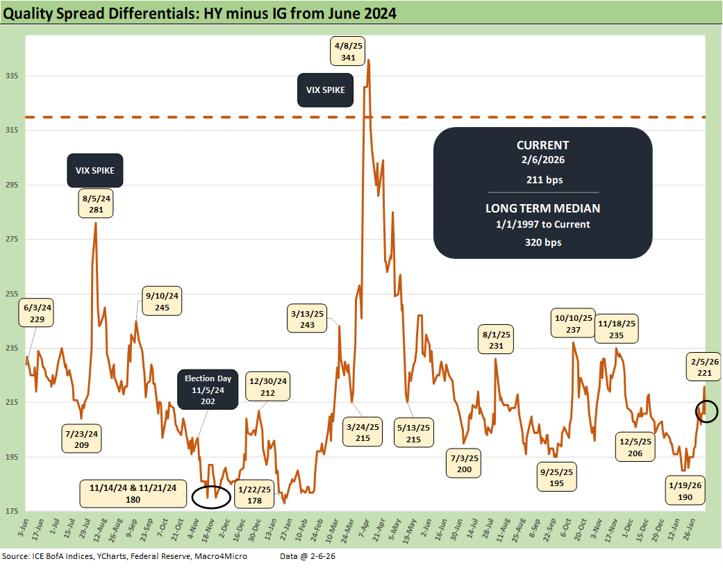
.The above chart updates the “HY OAS minus IG OAS” quality spread differential. The sub-200 bps “credit compensation” seen in recent lows (+190 bps Jan 2026) has decompressed modestly out to +211 bps after hitting +221 bps on the tech equity selloff this week. The current +211 is still a long way from the long-term median of +320 bps. Highly compressed credit spreads remain a fact of life.
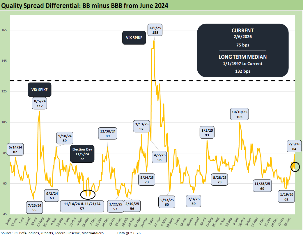
The above chart updates the “BB OAS minus BBB OAS” quality spread differential along the speculative grade divide. The current +75 bps is comfortably above the lows seen on the chart at or near the high 50s and low 60s from 2024 through early 2026, but the long-term median of +132 bps makes another statement on extreme spread compression.
See also:
Market Commentary: Asset Returns 2-8-26
Switzerland-US Trade: A Deficit that Glitters 2-3-26
US-Taiwan Trade: Risks Behind the Curtain 2-1-26
Market Commentary: Asset Returns 2-1-26
Trade Deficits: Math Challenge 1-30-26
China Trade: Shrinkage Report 1-28-26
Mexico Trade: Gearing up for More Trade Trouble? 1-27-26
Canada-US Trade: Trump Attack N+1 1-25-26
PCE Income & Outlays Nov 2025: Resilient Consumer, Higher Inflation 1-24-26
3Q25 GDP: Updated Estimate 1-22-26
Industrial Production Dec 2025: CapUte Resilience 1-17-26
Existing Home Sales Dec 2025: Getting up off the Mat? 1-16-26
Policy Mud on the Wall: Consumer Debt, Residential Mortgages 1-15-26
CPI Dec 2025: Sideways Calms Nerves – For Now 1-13-26
Payrolls Dec 2025 and FY 2025: Into the Weeds 1-10-26
JOLTS Nov 2025: Job Openings and Hires Down, Layoffs Lower 1-7-26
2025 Spread Walks and Multicycle Return Histories 1-5-26
Annual Return Differentials: HY vs. IG Across the Cycles 1-3-26
Total Return Quilt Across Asset Classes 2008-2025 1-2-26
Cyclical Histories: Will Facts Be in Vogue in 2026? 1-2-26
3Q25 GDP: Morning After Variables to Ponder 12-27-25
Durable Goods Oct25: Core Capex Still in Gear 12-23-25