
Cyclical Histories: Will Facts Be in Vogue in 2026?
We start 2026 with some objective numerical histories to keep in mind ahead of the coming deluge of disinformation and qualitative self-praise.


We recommend facts and numbers to gauge when you are being lied to.
Will 2026 be a year of transparency and economic coherence in Washington with honest performance attribution across tariffs and inflation side effects with truthful discussions of small business impact? (Hint: No).
It is important to look at the past cyclical facts for frames of reference that can be yardsticks for “grading on the curve.” Those who misrepresent the past are probably doing the same in the present.
We reproduce some of the historical economic growth tables in this note with a new one looking at the best Fixed Investment performance years for each President from Carter to Biden. The best fixed asset growth year from Trump 1.0 was 2018, which is in last place among the other “best of” years. He was also dead last in Residential investment that year vs. presidential peers.
When looking for what a “great year” looks like, Clinton 2 stands out in 1998 with Clinton 1 in 1996 close behind. Meanwhile, Reagan 1 in 1984 was one for the ages for investment growth. Carter’s best year of 1977 crushes Trump’s 2018 best year as did Obama 1 in 2012 in the post-crisis rebound.
Overall, the post-2000, post-Clinton years have been abysmal for PCE and Investment growth when framed against the 1980s and 1990s. No President from that period can come close to claiming the “greatest economy” even just for the last 50 years from that period using economic growth as a measuring stick. Of course, we will hear it a lot more again during 2026 despite Trump 1 being a bottom quartile growth economy since the mid-1970s.
As we detail the various key GDP lines since Carter, the simple exercise is a quick scan with a goal of gauging “What is a high number? and “What is a low number?” based on history. The speed of self-congratulations usually neglects to mention any specific numbers or history. That is also the case with the financial media, who want to make sure they keep their GOP guests coming back. As the old saying goes, the numbers “are what they are.” It’s not hard to find these numbers at the BEA.
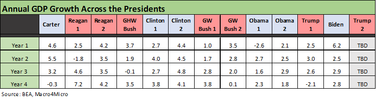
The above table plots the annual GDP growth across each year of the Presidential administrations from Carter in 1977 through Biden in 2024. The headline GDP is always a useful number but only if you look at the main moving parts with PCE (68% of GDP) and Fixed Investment (almost 18% of GDP) easily tied into the other stories that determine cycles (payroll, wages, savings, etc.).
As we await the final annual numbers for 2025 (and 4Q25), it is important to consider the unprecedented adjustments that were driven by volatile swings in Net Export deltas and how that ties into inventory changes. We discussed those topics at length in earlier commentaries and some of our recent LinkedIn posts (see 3Q25 GDP: Morning After Variables to Ponder 12-27-25).
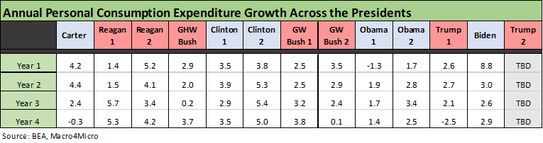
The above table tracks the PCE lines across the timeline from Carter to Biden. PCE is the critical driver at around 4x the size of the Fixed Investment line and 4x the “Government Consumption Expenditures and Gross Investment” line.
The PCE for Biden in 2021 obviously comes with a major asterisk with such a lofty number tied to the “great reopening” after the vaccine and pent-up demand was unleashed. Trump’s 2% handles before COVID in 2017 to 2019 had no excuses and most certainly were not impressive. Just scan back across time for objective evidence those were low.
That stretch of economic weakness and poor capital markets performance could be part of the reason why the FOMC had to step in and ease in 2019 as exports and capex weakened. Powell et al. bailed out the Trump 1 economy and markets after 2018 saw tariffs rise as an issue and in turn all the major equity and bond market benchmark returns ended 2018 in negative range (see Histories: Asset Return Journey from 2016 to 2023 1-21-24).
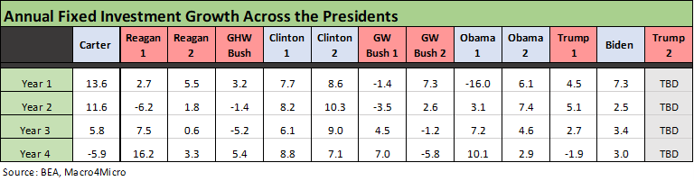
The above table tracks the Fixed Investment line as the distant #2 driver of GDP behind PCE. This will be a critical line for Trump in 2026 given all the noise around the “many trillions” of investment dollars that he claims his tariffs will bring (the promised investment number varies from very high to intergalactic).
Of the post-2000 Presidents, only Biden and Obama 2 got through those terms without a negative Fixed Investment growth year number. GW Bush had a tech bubble meltdown on the way into “GW Bush 1” above in Year 1 and a bank system and auto sector crisis on the way out in “GW Bush 2.” The 2001 period saw massive and recurring easing by Greenspan (see Greenspan’s Last Hurrah: His Wild Finish Before the Crisis 10-30-22).
Obama 1 inherited the financial crisis in 2009 as we see in Year 1. Obama 2 got back on track with improving Fixed Investment and payrolls that flowed into Trump 1. As we show in the tables, the Obama 2 annual Fixed Investment numbers handily beat Trump’s for each year paired up.
Ranking the best years for Fixed Investment…
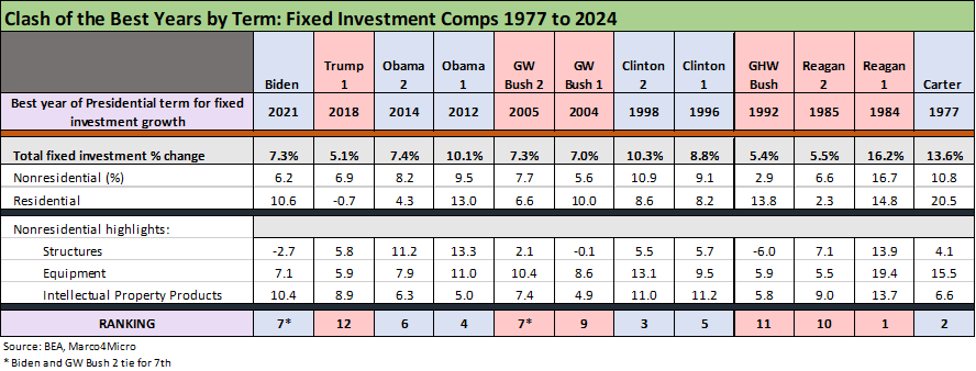
In the above table, we take the best Fixed Investment growth rate year from each Presidential administration. In this case, we use the most recent annual term available (Biden) and use a chronological order from most recent on the left back to Carter on the right. We await the 4Q25 and annual numbers for Trump 2.
It is basically a comp table for the “best investment growth year.” We see Trump’s best year of 2018 in dead last at #12. That does not flow smoothly into the “greatest economy in history” theme. The “give us your best shot” approach comes up short. Numbers matter, but when a leader avoids them it is usually a sign of bad intent and misleading commentary. We have seen plenty of that from Washington over the years from both sides, but Trump stretches the boundaries on economic performance.
Biden ranks #7 and is tied with GW Bush 2. The banner year of 1984 was one for the ages in Reagan 1 while 1998 in Clinton 2 took #3. The #2 spot is held by Carter in 1977. If you need a measure of what a “great year” or “good year” looks like, we see 3 of the best years in double digits. We see 5 years in the “best of” with 7% or 8% handles. We see 3 “best years” with 5% handles. In other words, 5% is bottom quartile among this collection of best years. The full collection of annual growth numbers was in an earlier table above.
Trump had great fun using Carter as a punching bag, but 1977 and 1978 into the “Carter” yield curve inversion were strong years with double-digit investment growth as detailed in the earlier tables. While that is a story for other days, the 1979 Iranian oil crisis and fallout from waves of deregulation sent the Carter economy into inflation and then stagflation mode. That haunted early Reagan 1 years. Massive deregulation does not come without its risks and unintended consequences.
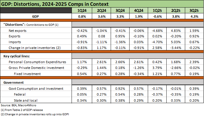
The above table reproduces the “GDP distortion table” that highlights the outsized anomalies of 2025. These distortions tie into market swings in imports related to tariff timing and inventory pre-buying. The scale of numbers that flow into the Net Export deltas % and the “Change in Private Inventories” line are extraordinary over the periods we reviewed (decades).
The PCE and Fixed Investment lines are the main events for the cycle and not the erratic Net Export line during the rapid phase-in. The same is true for working capital management “on the fly” and how that distorts inventory management and the timing of imports and ensuing inventory liquidation.
A 5.0% addition to the GDP math from imports in 2Q25 is something you don’t see. A glance at the BEA histories will hammer that home. The same is true for the scale of the partial offsets from change in private inventories.
Seeing should be believing…
If you say “greatest economy in history” often enough, a subset of the population will believe it (assuming they are allergic to numbers…and want to believe it). “Greatest economy of all time” is less threatening to democracy than “I won the 2020 election” since the “greatest economy” numbers are easily proven to be a lie using the government’s own numbers.
The election issue should be obvious based on the absence of evidence. The attacks on economic data (BLS and payrolls, etc.) in 2025 is an attempt to use the “election fraud strategy” but people intuitively feel the economy (jobs, prices, wages, etc.). They don’t “feel” the vote count as a one-time Big Lie. That is more an emotional choice devoid of factual substance.
See also:
3Q25 GDP: Morning After Variables to Ponder 12-27-25
Payroll % Additions: Carter vs. Trump vs. Biden…just for fun 1-8-25
Annual GDP Growth: Jimmy Carter v. Trump v. Biden…just for fun 1-6-25
Presidential GDP Dance Off: Clinton vs. Trump 7-27-24
Presidential GDP Dance Off: Reagan vs. Trump 7-27-24
Credit Cycles: Historical Lightning Round 4-8-24
Credit Markets Across the Decades 4-8-24
Histories: Asset Return Journey from 2016 to 2023 1-21-24
Tale of the Tape in GDP: Trump vs. Biden 12-4-23
Employment Across the Presidents 8-15-23