
Footnotes & Flashbacks: State of Yields 6-9-24
We look at a week that had a bad finish on Friday for UST bulls and duration, but that was still only a partial offset since May 31.


Thoughtful policy the main risk...
The yield curve faced a big payroll surprise that rattled the UST curve and changed the handicapping ahead of this week’s FOMC meeting and latest dot plot, but duration still had a decent week with rates not back to the prior Friday close in 2Y to 30Y.
The Services job strength and wage trends YoY will make for some interesting interpretations this week when the Services inflation lines get updated.
The energy part of the inflation story has remained in check as highlighted by the $73 handle WTI this past week after $79 the prior week, but those moving parts will be hard to rely on in either direction.
Credit spreads were mostly benign this week at +2 bps in IG and -5 bps tighter in HY to keep spreads in line with past credit cycle peaks.

The UST curve timeline above offers a reminder of what history looks like outside the post-crisis ZIRP years and the post-COVID actions by the FOMC. The Friday UST is the lowest curve in the pack once you move out the curve past 3 years and past the distorting impact of the short end inversion tied to the first inflation war since Volcker.
At the risk of sounding old, this current tightening cycle and related side effects on rates are a “walk in the park” compared to the 1973-1975 stagflation recession and 1980-1982 double dip. That does not make it any less of a shock to households and capital market participants accustomed to excess liquidity, ZIRP, and the lowest coupons in the modern era.
The fact that this period is mixed in with a broad economic expansion (vs. the protracted stagflation of the period inflation wars) is an important distinction. So are the consistent records being set on total payroll (as mixed as the overall profile of employment and wage levels may be) and broad stock market benchmarks rolling to frequent new highs with favorable earnings guidance built into many forward looking expectations.
The periods around the credit peaks of the TMT years (late 1990s) and the post-Greenspan ease-a-thon into the housing bubble (2004-1H07) make for very useful comps in credit markets and mortgages in considering the UST curve backdrop today. We look at some of those comparisons in the credit market section in this commentary.

The above chart updates the running UST deltas between the 10-19-23 peak through this past Friday close. We also update the running YTD UST deltas as the bond market has been beaten up during 2024. As the crow flies from the peak date of the UST 10Y barely under 5% in Oct 2023, we see the retracement YTD as still leaving the curve (for maturities beyond the Fed constrained inversion) waffling around the midrange when we look out to 10Y and 30Y.

The migration of the UST across 2021 to 2024 is captured above. We include a memory jogger in a box with the timing and magnitude of the FOMC moves. We plot the most recent UST curve at the top and we include the pre-ZIRP 12-31-21 curve at the bottom. Our main data points of interest in this chart remain the convergence of the 12-31-22 and 12-31-23 UST curves despite the 100 bps differential in fed funds between those two curves. It is a reminder that a lower intermediate to long end UST is not assured in the event of a Fed easing.
The UST curve shapeshifting has been unnaturally and anomalously inverted in a steady economy for a protracted period that everyone keeps citing. Given that this is the first major inflation war since Volcker and given all the structural changes that have unfolded in the markets since that long-ago period, the overreliance on UST inversions as harbingers of recessions is understandably getting second guessed. When absolute rates are low in historical context (see the first chart in this commentary...yes, rates are low in that context), the conditions in the market are like most markets – as in holding a unique mix of risk factors.
If you believe that fundamentals are the cause and the UST curve the symptoms, letting the curve do your thinking for you is not the best course of action in framing cyclical risks for industry groups. As a fundamental analyst, I am biased toward watching the consumer sector and industry groups that set the curve shape. I am not watching the curve shape to tell me how the drivers of economic activity are doing. The industries and issuers tell the story.
Watching the cost of capital and the economics of investment and the debt service risk of the leveraged or floating-rate-exposed borrowers is of course part of that exercise. It is the consumer sector that spoiled the party for the “recession is here now” crowd back in the fall of 2022 (see Unemployment, Recessions, and the Potter Stewart Rule 10-7-22).
It was fair to say the odds were against the cycle continuing to grow for a protracted period in a tightening cycle, but that has in fact been the case as jobs and GDP have demonstrated. Inflation may cost Biden the election as it did Ford and Carter, but the numbers beat the alternative in almost every other area of the major economic factor checklist (PCE, fixed investment, stock markets, etc.).
Sometimes the best read on the economy is looking out the window or into the earnings reports and not counting inversion days as the macro thermometer. That said, we update the slopes of the UST curve segments each week as part of the exercise (after all, why be narrow minded). UST slopes also play into the search for income, handicapping duration risk, and trying to put the all-in credit yields into context with the shape of the curve.

The above chart updates the UST curve deltas for the week. When you get through an ugly 1-day UST shift such as Friday, you have to go second-guess yourself on the initial reaction and look back at the accumulation of the UST curves over days and weeks. In fact, the week ended up with 5 of 6 bond ETFs in positive territory as we cover in our separate Footnotes publication on asset returns (to be published later today).
The recent UST action leaves 5 of 6 bond ETFs we track in positive return range for the 1-month period as well – even if barely. For 3 months, only the HY ETF (HYG) and the EM Sovereign ETF (EMB) are in positive return range with IG (LQD), the Agg (AGG), UST (GOVT), and long duration UST 20Y UST ETF (TLT) in the red. The market in 2024 has been very tough on duration. Looking back LTM, 4 of 6 bond ETFs are in the bottom quartile of the 31 benchmarks and ETFs we track.

The above chart offers another visual angle on the running UST deltas from the UST peak of Oct 2023. The monster UST rally of Nov-Dec 2023 has kept bonds in positive range for the running time period since the peak. Looking back LTM has been mixed with credit markets riding tighter spreads, but the UST index got considerable help from duration for the longer period since tightening peaked.
Since the Oct 10Y UST peak (10-19-23), the long duration 20+ year UST ETF has generated a total return of over 13% in a reminder that the curve can really do some damage and bring home the winnings depending on timelines and what end of fixed income you play in.
Some wealth managers in late 2021 and early 2022 missed the memo on when the UST and equities can correlate in an inflation and tightening cycle. Back then, bonds did not constitute diversifying your risk. They were both driven by the same overriding driver (inflation and rates).
The tendency to see the natural shape of the curve as flatter at this point or at least “less inverted” has consistently raised fears of a “steepening toward flat” pattern out the UST curve if inflation trends do not support more timely and more pronounced cuts.

The YTD UST shift is broken out above, and that has been a clear bad news trend for bond math. The long duration UST ETF (TLT) has generated a -5.9% total return YTD, offsetting some of the Nov-Dec 2023 gains.
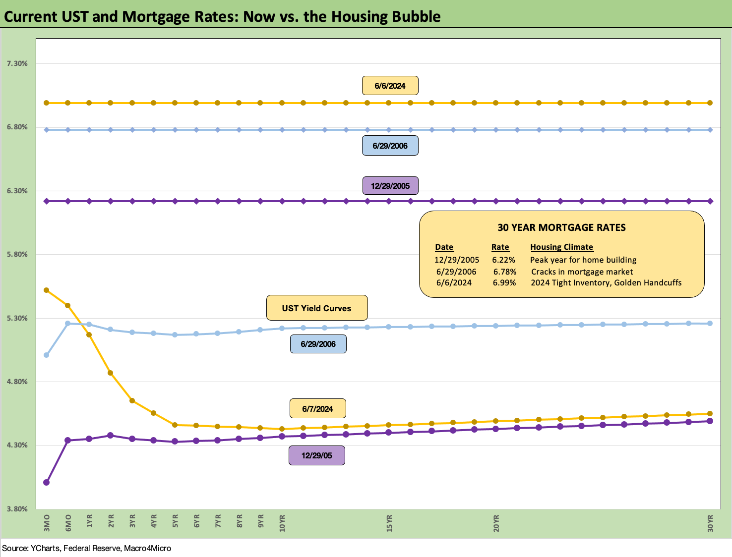
The above chart updates the Freddie Mac 30Y mortgage rate that is released on Thursday. The big move lower in UST rates was Friday and the trade press flagged the reality that all eyes will simply turn to the FOMC and CPI this week for a fresh read. We saw the Freddie 30Y at 6.99% and hanging around this range for weeks.
For historical comparison purposes, we include the UST curves from this past Friday along with those of the peak homebuilding year (2005) and the mid-2006 period when mortgage excess was starting to worry the mortgage market.
We have covered the mortgage impacts on existing home supply-demand dynamics in our housing sector and single name work on builders, and the stubborn rates are not going to unlock the existing supply yet. Creative Incentives will remain the life blood of the builders to keep capturing market share of total home sales. In addition, entry level and first-time buyers will remain the most challenged. We get more existing home sales data and housing starts the week after the FOMC and CPI data.
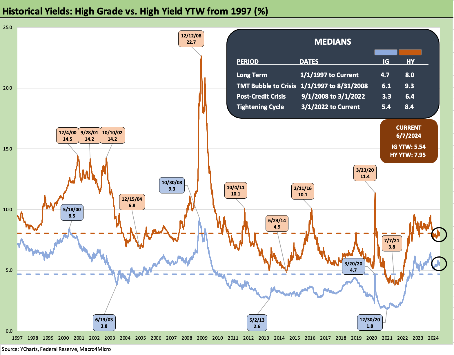
The above chart updates the yield time series from 1997 through Friday close for the ICE IG Index and the HY index. Now that we are back in a post-ZIRP world, the more relevant median is the pre-crisis median of 6.1% for IG and 9.3% for HY.
As we detail in the following charts, the current market presents lower UST rates further out the curve than the earlier credit cycle peaks but also presents very compressed spreads as well. The IG compression in the current market is consistent with spreads with earlier peak periods while HY is currently compressed but not on the level seen in the Oct 1997 and early June 2007 extremes.
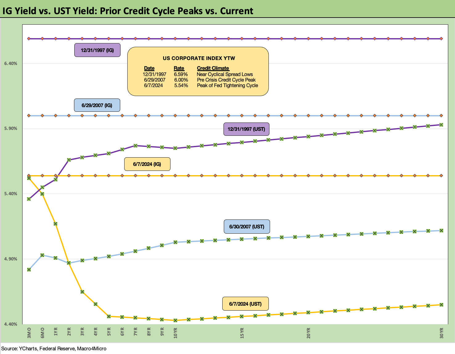
The above chart does a comparison of the current credit cycle as we did with mortgages. We take the UST curve from Friday close and frame it against earlier credit cycle peaks of late 1997 and mid-2007. Then we plot the IG index yields in the horizontal lines at the top. These lookbacks are old hat for regular readers, but the historical context is very tight spreads and periods of cyclical uncertainty as to how long the peak can last.
The 1997 UST curve was materially higher than today as was the IG index. Today’s UST curve is substantially lower out past 3 years beyond the inversion and thus current spreads lead to an all-in IG index yield materially below those earlier peaks with a 5% handle in this market. The low yields moving so much higher in this tightening cycle still promises some generous re-couponing in ongoing refinancing activities for many companies. The step-up will depend on the new issue date for the bonds up for refi. The par weighted coupon for the IG index is 4.2%, but there are a lot of bonds less than half that level (see Coupon Climb: Phasing into Reality12-12-23).

The above chart updates the IG market spread history for more context on what the +90 bps IG index YTW to end last week means across the cycles. The current market is right in the mix of past IG market spread lows even if well above the bell-ringing all-time low of +53 bps in 1997. The year 1997 ended at +70 bps on the index, so that market is still one for the ages.
1997 saw another two years to run in the credit cycle before it all blew up from below as the HY TMT market was seeing defaults spike as early as later 1999 with more explosions in the middle tiers on the way into 2001-2002 (Enron, WorldCom). The initial scare in the late summer and early fall of 1998 was met with FOMC easing, but the HY quality problems were ticking.
The credit markets on the way into the peak of the housing bubble came with a pronounced bear flattening of the UST curve from 2004 to 2006 ahead of the spread lows (see Greenspan’s Last Hurrah: His Wild Finish Before the Crisis 10-30-22, Wild Transition Year: The Chaos of 2007 11-1-22). During the bear flattening process, the longer end remained static. The low IG OAS of +79 bps in May 2005 was another cyclical low in IG spreads that was not matched later.
The 1H04 to 1H07 average of +93 bps and the 1997-1998 average of +95 bps gives more context to how long IG spreads can stay in the current zone at levels well below the long-term average of +132 bps. We all are still looking for triggers that can be a catalyst for repricing. The short and obvious list includes surprise FOMC actions (hike), geopolitics (Russia/Ukraine, China/Taiwan), or a radical shift in domestic policies with a new, more radically disposed White House that rattles consumers or business investment appetites.
More people should read more history to understand what they are looking at this fall. They should talk to more old relatives (I remember tales from grandparents of the rabid anti-Catholicism of the Al Smith election of 1928). Of course, some have grandparents who wore white hoods and liked to warm their hands near a burning cross. On a positive note, Hoover did a bang up, stellar job on that stock market crash thing in ’29.
In today’s terms, Ronald Reagan would have been harassed and reviled as a RINO like John McCain. In the Tarantino-style alternate universe, Reagan would probably carry 49 states at worst in 2024 if he were magically put on the ballot as GOP nominee as center left swung his way. (He won 49 states in 1984, when he was younger than Biden and Trump.) Reagan also took almost 59% of the popular vote. Trump lost both popular votes. As a reminder, Trump took 46.9% of the popular vote in 2020 and 46.1% in 2016.

The above chart does the same exercise for HY as we did for IG with the same 1997 and 2007 time periods for credit market peaks. Spreads narrowed modestly on the week by -5 bps to the 7.95% index YTW level. The HY OAS is about -24 bps YTD to the current +315 bps. Those spreads are inside the June 2014 and Oct 2018 lows but materially wide to the sub-250 bps lows of Oct 1997 and early June 2007.
For other frames of reference, 1997 ended the year at +296 bps and June 2007 ended the month at +298 as the clock was ticking on the mortgage implosion and escalating RMBS driven counterparty crisis.
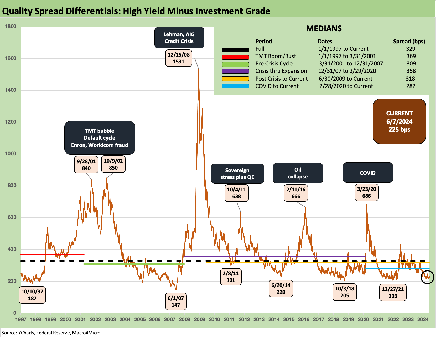
The above chart updates the HY OAS minus IG OAS differentials for a read on how much risk compensation the HY investor gets for stepping down from the investment grade basket to the speculative grade basket (as arbitrary as that distinction may be). The timeline comes with the usual caveats of rating tier mix (e.g., the BB tier heavy HY index of today and the BBB tier heavy IG index relative to the late 1990s).
We see the spread waves along the way with pronounced mini-cycles in credit risk pricing within the broader economic expansion. The summer/fall 2011 systemic flashback wave was ugly as was the oil market crisis of late 2015 and early 2016 as defaults in upstream E&P went off the charts and unsecured recoveries plunged while inflaming HY fund redemption fears and making the OTC HY market even more defensive in pricing. The March 2020 spread spike was in line with the oil market and sovereign stress spikes.
The current +225 bps is close to earlier lows in 2021, 2018, and 2014. June 2007 and Oct 1997 remain in another world. That said, the 2001-2002 default cycle double-dip took a major toll on investors with the longest duration (not the highest) default cycle in history.

The above chart measures relative risk compensation from a different angle using the HY risk premiums (HY index OAS) and dividing that by the 5Y UST yield (proximity to HY index duration). This is a metric to capture the proportionate compensation for taking on the risk in the HY basket. We see some wild swings in the age of ZIRP given the denominator effect, but the fact is that the risk free denominator was an investment alternative. It works better in “normal” times (as in non-ZIRP).
The debate of relative yields (e.g. IG vs. HY) vs. minimum expected yields is an old one, but this at least offers food for thought with the relative compensation in this market very low in context with the long-term median of 1.96x vs the current 0.71x. We see 1.5x at the 2018 cyclical low but 0.49x in June 2007 and 0.39x in 1997.

This week we again update the 3M to 10Y slope in the post-1984 timeline with a median of +161 bps vs. the current -109 bps. The peak inversion was -189 bps in May and June of 2023. That is not much term premium compensation for taking long-dated credit risk and duration risk.
While interest rate risk is managed at the portfolio level (for many), taking the double risk of duration + credit risk looking out across the cycles in a wealth portfolio is not a piece of cake. The attractions will grow as more current coupons get rolled into the market and high 5% and 6% handle coupons can get locked in for high quality names. M&A refi and extension could play a big role in 2024-2025 in such offerings as well.

We shorten the UST slope timeline to a Jan 2021 start for another angle on the wild ride across the tightening cycle. We see a peak slope of +227 bps in May 2022 ahead of the plunge to the -189 bps inversion. As covered in the past, that was a very ugly year for bonds and equities alike in 2022 (see The 2022 Multi-Asset Beatdown 12-31-22).

We wrap with our usual timeline chart showing the running UST deltas from the start of March 2022 when ZIRP ended (effective March 17). We also include the 12-31-20 UST curve and peak UST date (using the 10Y UST peak) of 10-19-23. The upward migration was fast and furious as covered across time.
One of the stranger periods was when inflation was high and yet many market voices were calling for a “pause” when real fed funds rates were in fact negative and thus still in accommodation mode. We are in a period now where many are calling for easing, and the fed funds vs. core PCE inflation relationship at least has positive real fed funds (see PCE, Income and Outlays: Lower Income and Consumption, Sideways Inflation 5-31-24).
This week’s CPI and FOMC dot plot will be a major focus yet again after that jobs number. The “data dependent” theme isn’t going away any time soon.
See also:
Payroll May 2024: The Wave Continues 6-7-24
JOLTS April 2024: Shorter Line but Not Short 6-4-24
Construction Spending: Stalling Sequentially at High Run Rates 6-4-24
Footnotes & Flashbacks: State of Yields 6-2-24
Footnotes & Flashbacks: Asset Returns 6-2-24
PCE, Income and Outlays: Lower Income and Consumption, Sideways Inflation 5-31-24
1Q24 GDP: Second Estimate, Moving Parts 5-30-24
Durable Goods: Staying the Cyclical Course 5-24-24
New Home Sales April 2024: Spring Not Springing Enough 5-23-24
Industrial Production April 2024: Another Softer Spot 5-16-24
Housing Starts April 2024: Recovery Run Rates Roll On 5-16-24
CPI April 2024: Salve Without Salvation 5-15-24
Retail Sales April 2024: Get by with a Little Help 5-15-24
Consumer Sentiment: Flesh Wound? 5-10-24
April Payroll: Occupational Breakdown 5-3-24
Payroll April 2024: Market Dons the Rally Hat 5-3-24
Employment Cost Index March 2024: Sticky is as Sticky Does 4-30-24