
Payroll May 2024: The Wave Continues
We look at the payroll numbers as the UST bulls have a bad day at the office.


Services payroll is still driving the bus on the +272K headline payroll with “Private Service-Providing” payroll at +204K led by Health Care and Social Assistance (+84K) and Leisure and Hospitality (+42K),
The State and Local Government numbers were strong again at +39K (Local at +34K) as many of the state and local governments bemoaning the horrid economic conditions of America added +532K to payroll over the LTM period as extremely low state unemployment rates remain the norm (often with Governors bragging about it).
The Household Survey employment data (the 4.0% headline unemployment rate) shows the sequential “employed” number down by -408K from April 2024 and the unemployed number up by +157K, so the good news for opposing economists arguing on cable channels is that everyone is right. The YoY hourly wage inflation of +4.1% is the tie breaker.
The UST curve action was pain on the day with the 10Y at +15 bps and 2Y at +15 bps as we go to print, but the curve move is really more a retracement over the past month than a shocking adjustment to recent conditions as the FOMC debates continue.
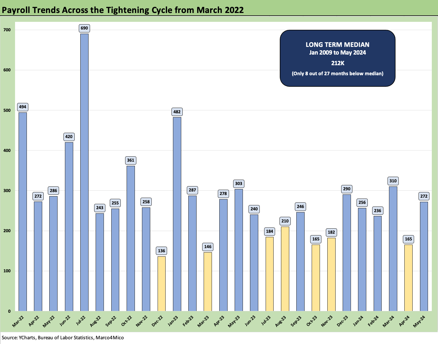
The above chart shows the “monthly adds” timeline with the +272K adds number comfortably above the +212K median since Jan 2009, when the systemic crisis was in full force on the way to the March 2009 stock market low and June 2009 cyclical trough. For the time horizon above from March 2022, we show only 7 of those months below the post-Jan 2009 median. We picked March 2022 for the chart above to capture the tightening cycle.
We will let the labor economists fight the battle over the relative utility of JOLTS vs. Household Data vs. the Establishment Survey as they explain why they are all correct. For now, the market sure believes that the latest job report shows a still robust economy and solid payrolls to support PCE with duration getting a fresh hammering today.
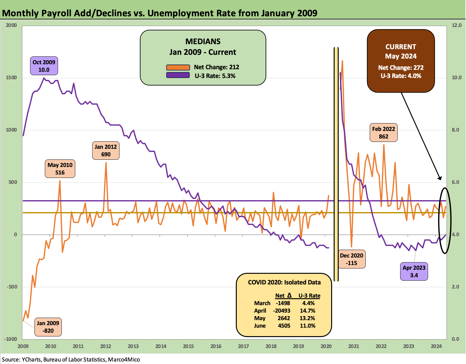
The above chart updates that payroll adds/declines vs. the unemployment rate from the crisis years (Jan 2009) through May 2024. We break out the COVID numbers in the box to “preserve the visuals” across what was still an extraordinary period with a record-long economic expansion running from the systemic crisis to a pandemic with protracted ZIRP and minimal rates on the way to what eventually became the first inflation war since Volcker.
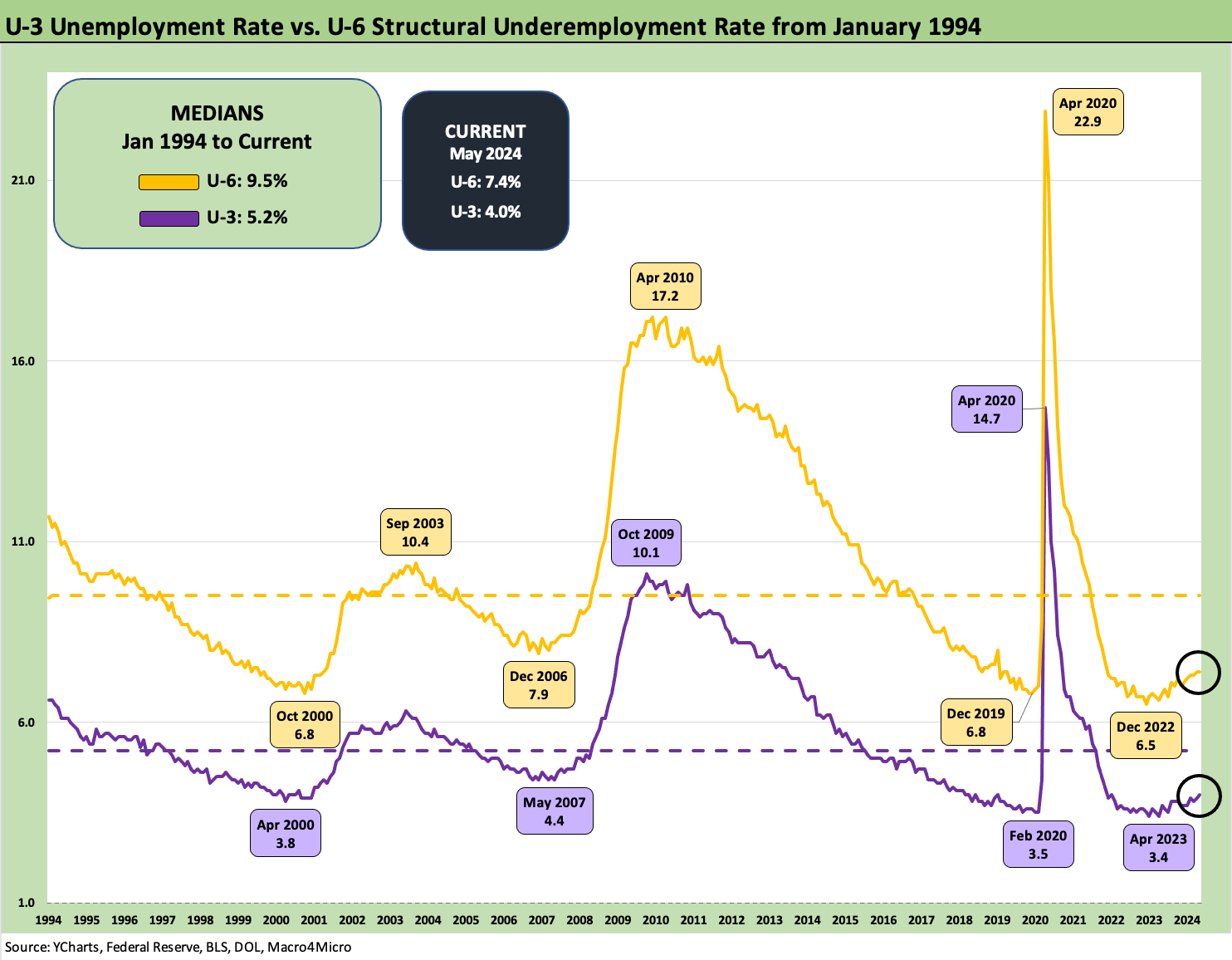
The above chart updates the standard unemployment rate (U-3) and the structural underemployment rate (U-6). The 7.4% in historical context is not a bleak number and always requires we give some context to structural change across industries and cyclical conditions. The year 2010 was especially ugly as the lag effects of the credit crisis took full effect and regions and industries took years to get hiring back on track.
As a reminder, the U-6 metric is defined with the numerator as “total unemployed + persons marginally attached to the labor force + total employed part time for economic reasons.” The denominator is “civilian labor force + workers marginally attached to the labor force.” The U-6 went sideways at 7.4% from April but remains above the 6.8% (SAAR) of May 2023 a year ago.
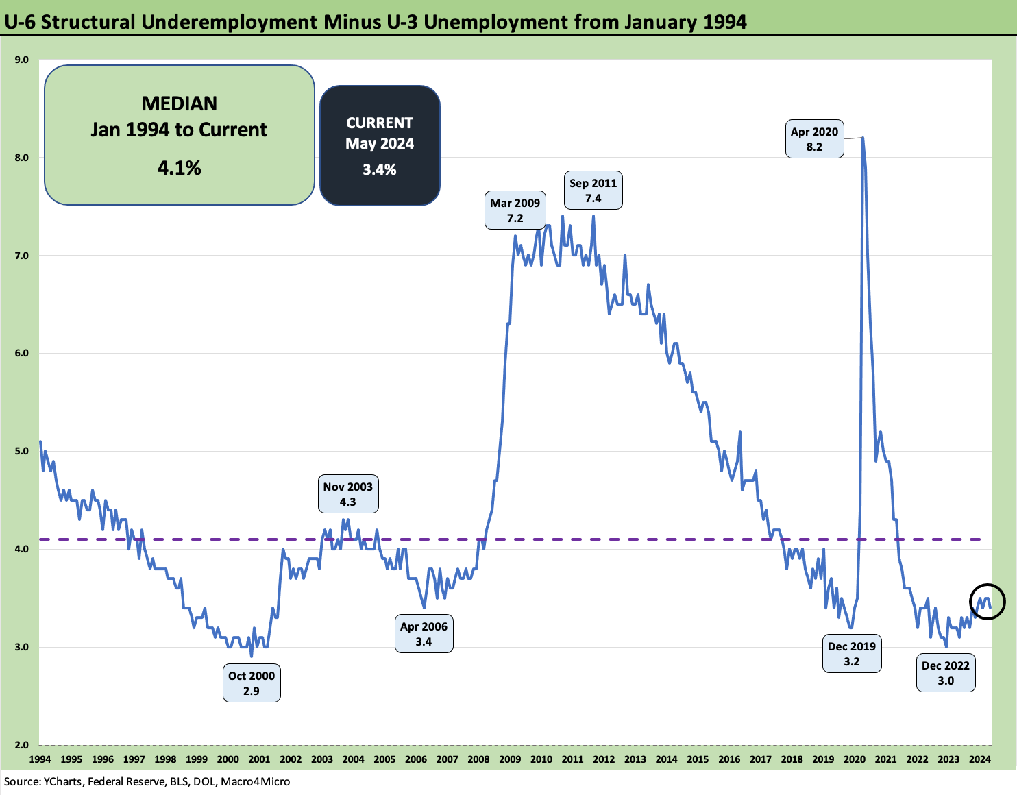
The above chart plots the differential of U-6 vs. U-3 (standard unemployment number) with the post-Jan 1994 medians at 9.5% for U-6 and 5.2% for U-3. We see the gap tick slightly lower from April to +3.4 but above the lows of 3.0 in Dec 2022. The median from Jan 1994 is 4.1%. The pre-COVID low was +3.2% in Dec 2019. The housing and credit bubble years saw a low of 3.4% in April 2006 while the TMT low tick was Oct 2000 at 2.9%.
As a net number, this differential gets back to looking at the U-6 first in longer term context as the starting point, and the 7.4% is a constructive number across the cycles even as the U-3 ticks higher.
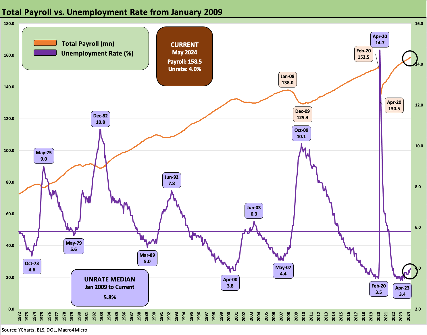
The above chart updates total payroll count across time vs. the unemployment rates from Jan 2009 as the crisis was cresting. The recurring (if varying) theme we cite of “Mo jobs, Mo bodies, Mo paychecks, Mo spending” is not rocket science with respect to what it can mean for the PCE line of the GDP accounts and the ability of the demand side to weaken enough to satisfy the FOMC. The story is hard to tell with record numbers of consumers at work (legally or otherwise).
Of course, a mass deportation in 2025 would change some hiring practices as well as consumption numbers. The unintended economic consequences of political uncertainty for economic indicators tend to get covered more by the think tanks than the street since it is politically toxic. The analysis gets down to how much growth it shaves off the PCE line. It is hard to have a recession without seeing negative PCE growth.
There is also the question of how much immigration policies spill into trade (Mexico) and trade battles if a President makes demands on Mexico that they refuse to comply with. That is scenario-spinning for another day. We have been down this road before on threats to close the border when the White House does not get what it wants. Trade flows can be a victim that can hit payrolls.
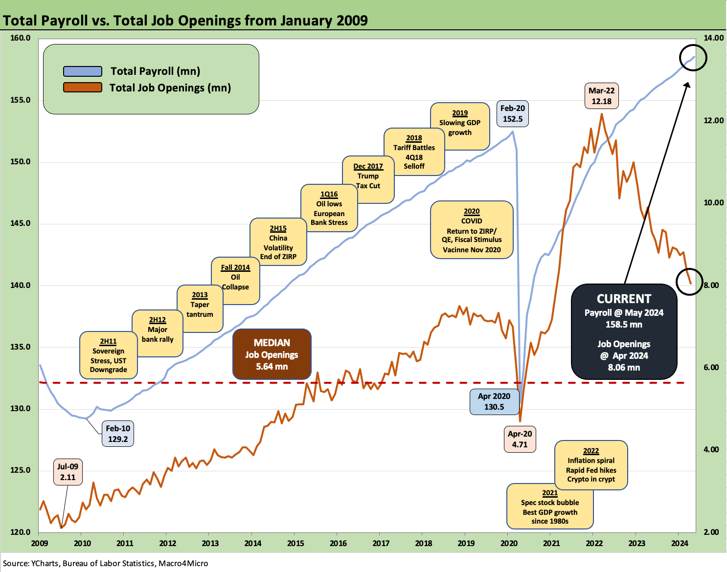
The above two-sided chart plots Job Openings in JOLTS vs. total payroll. We also add some historical events in the boxes as color. The JOLTS release this week (see JOLTS April 2024: Shorter Line but Not Short 6-4-24) was well below the peak but was also comfortably above the highest level posted in the pre-COVID cycle (the longest expansion in history).
In keeping with the spirit of the times, we have heard some economists on the wrong side of an outcome say, “don’t trust the data” (but of course trust those economists and their data) but something bullish is going on out there with so many bodies added to payrolls even if in jobs with low economic multiplier effects.
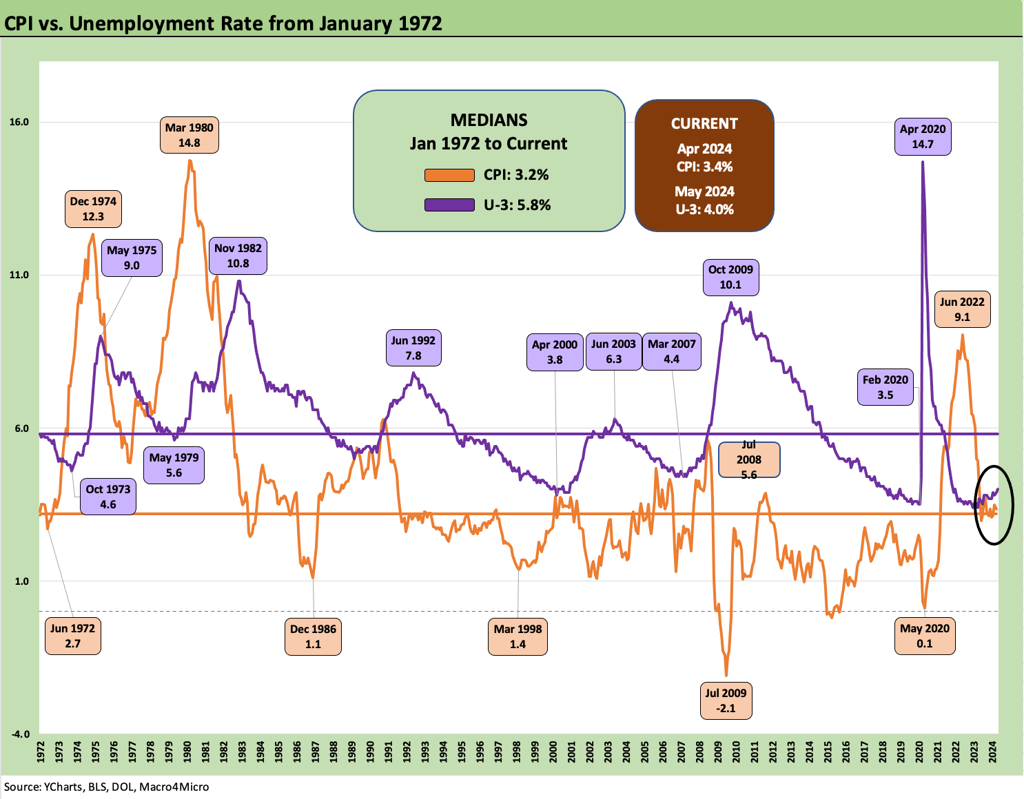
The above chart updates where the US economy stands in terms of unemployment rates vs. CPI rates since the early 1970s stagflation period and across the Volcker inflation war years. The 5.8% long term median unemployment rates and long-term CPI median rate of +3.2% at least offers some frame of reference vs. the current 4.0% U-3 in May and 3.4% CPI.
The repricing of food and many goods and services has been especially hard on many households, but the actual CPI rate as of now is only slightly above the long-term median. We cannot deflate back to 2019 prices, but it beats the 1970s and early 1980s.
Into the Weeds
In the next series of charts, we run through the occupation payroll deltas. Services still rule the roost, and that does not bode well for the stickiest and dominant portion of the inflation problem that will get updated (CPI) next week along with the latest FOMC dot plot.
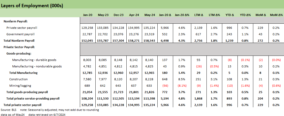
The above chart breaks out the private sector mix of payroll deltas (we look at Government separately further below). The private sector added 229K jobs (the 43K in government totals the 272K for May). The LTM adds of 2.14 million make a statement on the healthy economy (don’t let facts get in the way of a political story).
The private sector is now just under 6.0 mn jobs higher since Jan 2020, just ahead of COVID. Of that 6.0 million, we see 5.2 million of that in Services and 772K in “Goods-Producing” with 648K of that in Construction and only 180K in classic “Manufacturing” sector lines. If Obama and Trump both talked about their efforts to support manufacturing all the time, Biden followed their weak records even if he added more. The manufacturing renaissance has not unfolded.
On the other hand, Biden delivered in a big way on construction by getting an infrastructure bill done and piling on with clean energy support. However you may feel about the latter (EVs etc.), those jobs are real. Trump chose the tax cuts and fighting over the wall with his 2 years of full control. Obama chose health care and financial system overhaul. You only get so long for big legislation with full control.
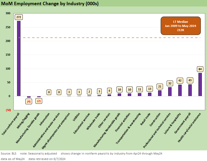
The above chart updates the MoM change by the main occupation lines that roll up into the MoM payroll added. We add a long-term median line at +212K for the monthly job adds numbers.
We consider the Government payroll adds significant. As we cover in the government charts below, that government jobs tally is dominated by the state and local (especially local) payroll additions.
Health Care and Social Assistance payroll additions are in part about population growth (more people need care) and in part about demographics (aging of America and need for care, etc.).
High payroll and rising population mean more food and drink (fresh water for the horses, etc.) and that shows up near the top as well. Within the goods-producing line items, construction has held in very well.
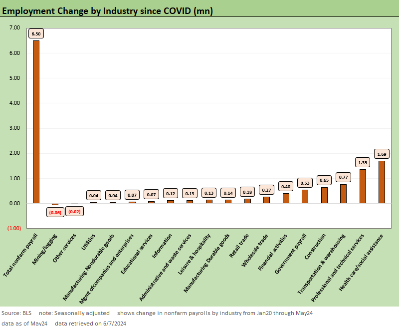
The above chart updates the occupational payroll deltas within the 6.5 million job adds since Jan 2020 or just before COVID was warming up by late Feb 2020. Two major trends that some might not guess include the radical changes in the freight and logistics sector as seen in the Transportation and Warehousing jobs line at #3. The construction boom is perhaps less of a surprise for those who watch the job numbers with almost 650K added including over 250K of that in the last 12 months.
Durable goods were in the middle of the pack and Nondurables well down the rankings. Notably, Leisure and Hospitality took a while to get back up the leadership board after all the COVID trauma and restaurant and bar closings and chain downsizings. Retail trade also had a slow mend with the early COVID impacts.
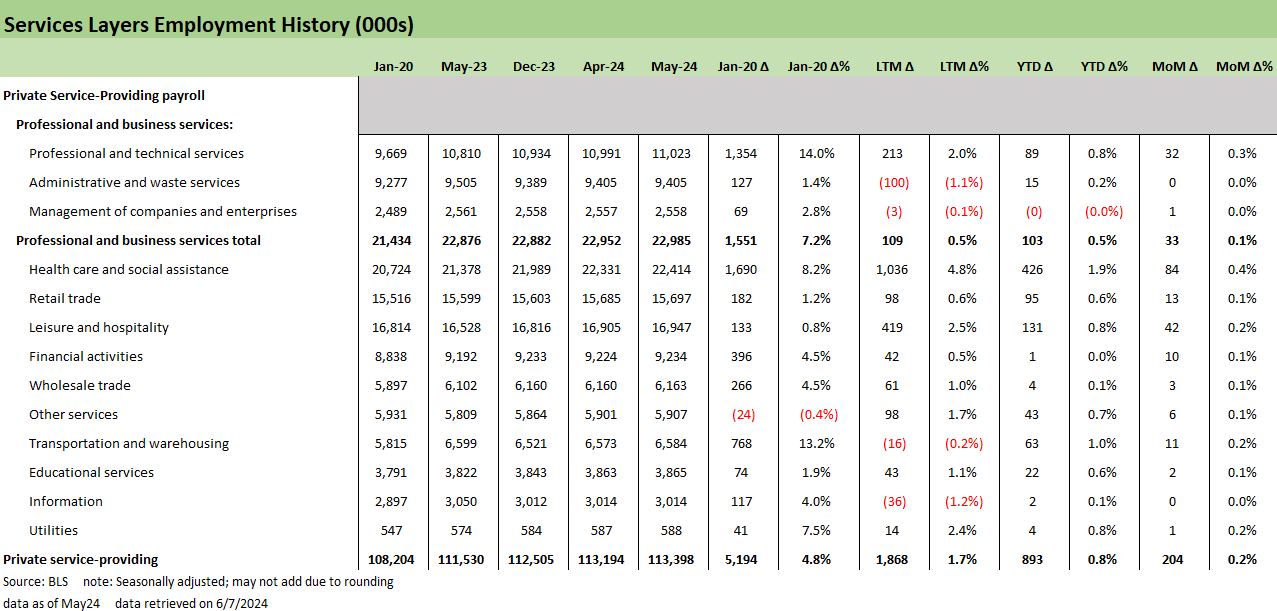
The above chart details the Service-Providing deltas across time with 5.2 million jobs added since Jan 2020 and 1.87 million over the last 12 months. The line items and buckets tell the story, but this is what a “service economy” looks like.
Some of the occupation lines show a disproportionately high share of the running payroll added over the LTM period such as Leisure and Hospitality and Retail. The Health Care and Social Assistance budgets and hiring have also improved over the LTM period with labor shortages still a problem in some areas of that sector.
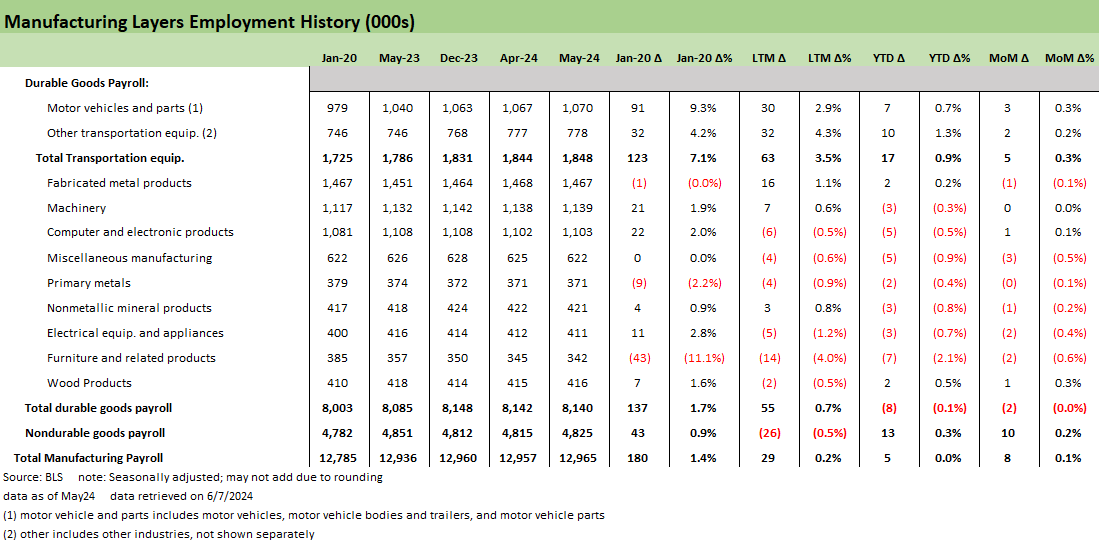
The above chart updates what is still a sad tale in manufacturing with only 29K jobs added over the LTM period, 5K YTD, and 8K this past month. Of that 29K in adds LTM, we see 30K in Motor Vehicles and 32K in “Other Transportation Equipment.” Going back to Jan 2020, we see a delta of 180K with 123K in Transportation including 91K of that in Motor Vehicles and 32K in Other Transportation Equipment. Durables is at least positive LTM with Nondurables negative.
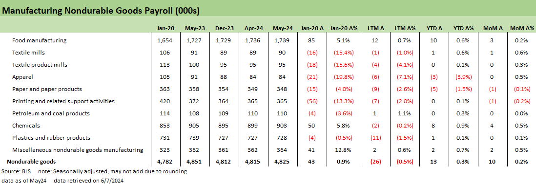
The above chart updates the perennially bad news in Nondurables with Food Manufacturing the only sector to even move the needle a little LTM and Chemicals making a contribution to the deltas since Jan 2020. Most of these line items are in long-term secular decline or offshored with little hope of return.
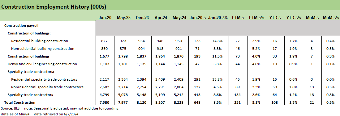
The above chart updates the good news in the construction lines of the goods-producing bucket. We see a broad mix across the construction subsectors in nonresidential and residential and in specialty subcategories.
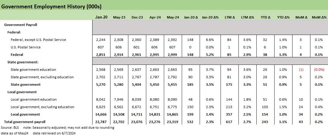
The above chart breaks out the Government employment lines as the state and local job adds call into question more than a little of the “horrible economy” rhetoric (see Employment: Real Numbers vs. Fictitious Dystopian Hellscapes 3-9-24). We looked at some of these recently at the state level and the economic commentary of the state and local leaders (Governors, etc.). It might be worth an update at some point.
We see +532K added to state and local payrolls LTM and 85K to Federal payroll. The state and local adds since Jan 2020 were only +384K, so something seems to be working the past year (Tax base? Sales tax? Income Tax? Excise tax? Fees?). Something is going on to generate all those hires.
If you look at what state unemployment rates look like and how state and local leaders and their US Senators brag about their booming local economies, it starts to get funny when juxtaposed against their national level politicking. The sum-of-the parts idea apparently does not factor into the roll-up of 50 states. Facts and truth are not in style, and the end justifies the means for many of these “honorable and “devout” types. The reality is the jobs part of the story is something states are proud of. That is all good. Just don’t have different stories in different forums. Some call that lying.
Contributors:
Glenn Reynolds, CFA glenn@macro4micro.com
Kevin Chun, CFA kevin@macro4micro.com
See also:
JOLTS April 2024: Shorter Line but Not Short 6-4-24
Construction Spending: Stalling Sequentially at High Run Rates 6-4-24
Footnotes & Flashbacks: State of Yields 6-2-24
Footnotes & Flashbacks: Asset Returns 6-2-24
PCE, Income and Outlays: Lower Income and Consumption, Sideways Inflation 5-31-24
1Q24 GDP: Second Estimate, Moving Parts 5-30-24
Durable Goods: Staying the Cyclical Course 5-24-24
New Home Sales April 2024: Spring Not Springing Enough 5-23-24
Industrial Production April 2024: Another Softer Spot 5-16-24
Housing Starts April 2024: Recovery Run Rates Roll On 5-16-24
CPI April 2024: Salve Without Salvation 5-15-24
Retail Sales April 2024: Get by with a Little Help 5-15-24
Consumer Sentiment: Flesh Wound? 5-10-24
April Payroll: Occupational Breakdown 5-3-24
Payroll April 2024: Market Dons the Rally Hat 5-3-24
Employment Cost Index March 2024: Sticky is as Sticky Does 4-30-24
Understand looking at employment but what about full time jobs that are basically static vs a year ago vs part time jobs that have been growing...shouldn't the economy be generating full time jobs so folks can actually live a full life and pay all their bills on time vs the poll I read this week that 42% of Americans struggle to pay bills every month