
PCE: Inflation, Personal Income & Outlays
The PCE numbers offer a fresh reminder of a robust consumer, but the PCE inflation needle did little to change the outlook.


What’s all this talk about tariffs? After all, the seller pays? Right?
The headline PCE index posted +2.6% for Dec, up sequentially from +2.4% in Nov 2024 and the highest since May 2024. The MoM rose sequentially to +0.3% from +0.1% in Nov and +0.2% in Oct and Sept. It is hard to be reassured on inflation trends with those numbers even if they are not showing a worrisome relapse.
Core PCE prices were flat at +2.8% for the third month in a row and up from the 3 months in a row at +2.7% from July to Sept. The MoM number at +0.2% ticked higher from +0.1% in Nov but was a tick below the +0.3% of Oct and Sept while flat to the +0.2% of Aug, July, and June.
PCE consumption numbers were bullish for the consumer demand story with MoM Disposable Personal Income (DPI) at 0.4% MoM but Personal Consumption Expenditures (PCE) at +0.7%. That translates into a slide in personal savings rates back under the 4% line to +3.8% after months of 4% handles.
The YoY Real DPI number weighed in at +2.4% while Real PCE was +3.1% with Goods PCE at +3.5% that included +6.1% in Durables (+2.2% Nondurables). Services PCE was +2.9%. That Durables growth signals a solid and steady consumer in the overall “PCE mix.”
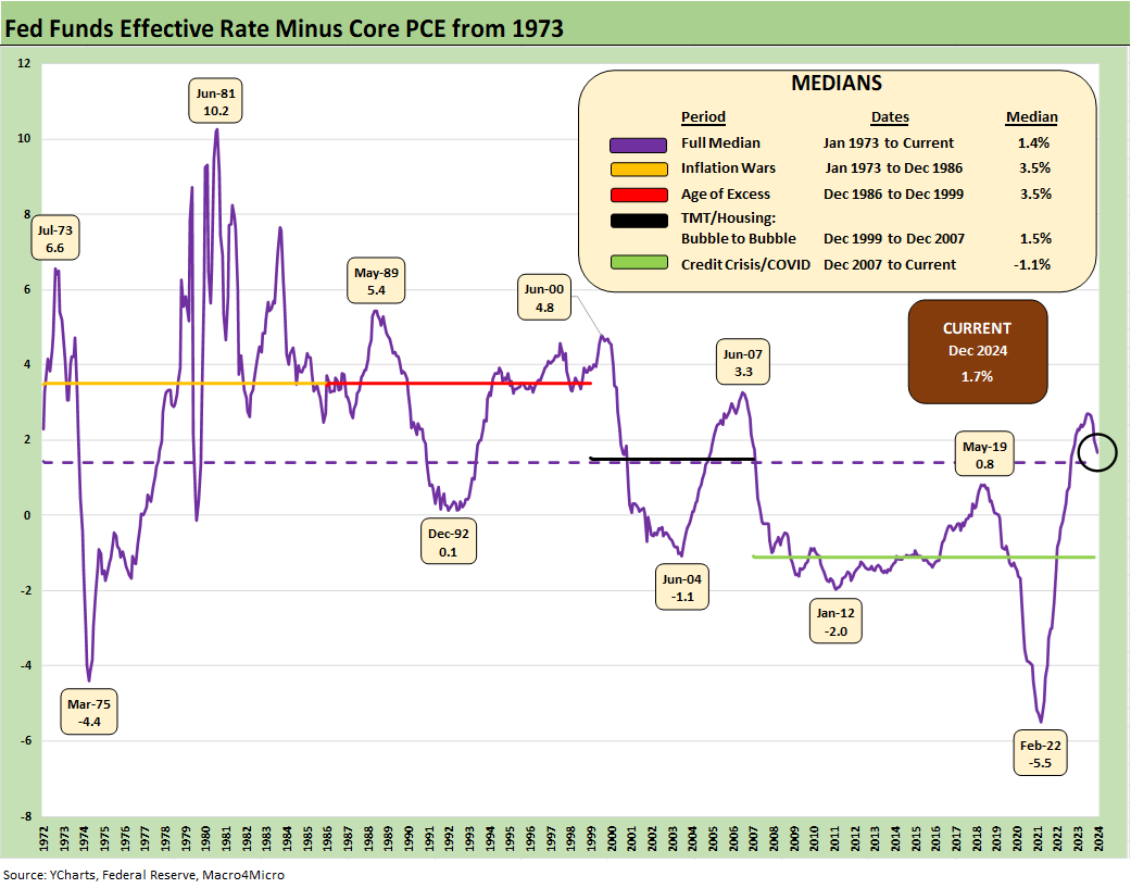
The above chart updates the recurring time series on real fed funds. We use fed funds minus core PCE inflation as a shorthand to capture how much latitude the FOMC has in its cushion before it looks more like accommodation as we saw well into 2022 even when many were screaming “PAUSE!” in the fall.
The current +1.7% point buffer is still above the long-term median of +1.4%. The low inflation year of Dec 1986 (a year when CPI hit 1% handles) through the end of the 1990s was 3.5% (with the US seeing balanced budgets under Clinton but also a TMT bubble). The 1972 to Dec 1986 period also posted a +3.5% median differential during the inflation and stagflation war years (including Volcker from 1979). Those were very different times, but the 1970s through early 1980s was the last painful inflation cycle until 2022. The +1.7% cushion thus may not scream “cut” in that context.
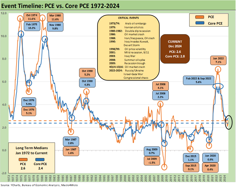
The above chart updates the time series for PCE and Core PCE from 1972. The +2.6% median for PCE is where we stand now while the +2.4% median for Core is below the current +2.8%. That does not seem to call for lower fed funds set against the backdrop of a decent economy with some tariff shocks and labor imbalances (deportation) potentially around the next corner.
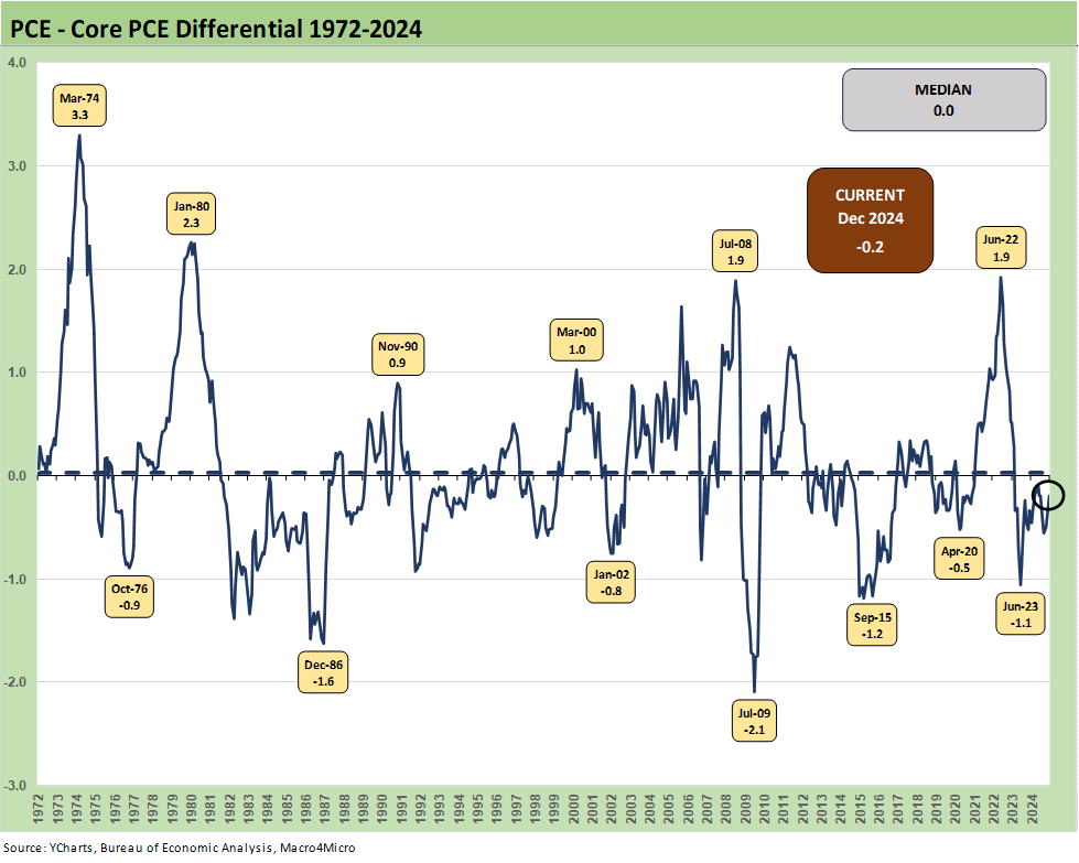
The above chart updates the PCE – Core PCE differential across time. The long-term median is zero (0.0%) with the current differential at -0.2. The material divergences typically come when there are major moves in crude oil prices although food prices played an important role in some earlier cycles such as 1973 and 1979 (see Inflation: The Grocery Price Thing vs. Energy 12-16-24).
The connection between oil/gas and food is a matter of historical fact as evident in the period when food inflation peaked. Food prices feel the impact of delivery costs (e.g. fuel surcharges), processing costs, packaging costs (petrochemicals, power costs for aluminum), ag equipment operations and diesel etc.) We even saw that food inflation effect with the 2022 energy spike on the Russian invasion. Politicians being what they are (fill in the blank), naturally got a lot less attention in the headlines as an inflation cause during the CPI and PCE spike than a Biden stimulus plan.
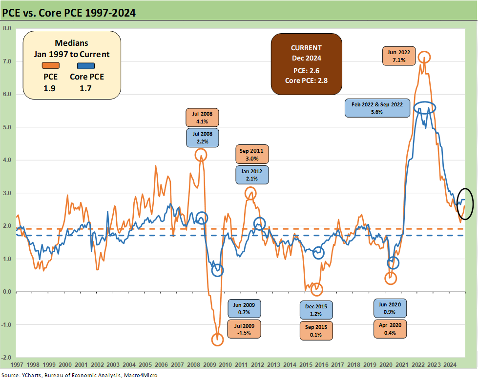
The above chart updates the PCE vs. Core PCE time series from 1997 to the current period. We see sub-2% price index levels that are worth framing in the context of the typical 2.0% target. We appreciate the concept of target discipline to reassure markets. That said, this slice of history starts with a TMT bubble that rolled into a Greenspan mega-easing in the 2001 equity and credit market beatdown and TMT default cycle (see Greenspan’s Last Hurrah: His Wild Finish Before the Crisis 10-30-22).
Then the timeline cuts across a housing bubble, a structured finance binge with unlimited counterparty exposure (bank/broker interconnectedness risk spike) leading to a systemic bank crisis and the onset of ZIRP (see Wild Transition Year: The Chaos of 2007 11-1-22). Then comes the wild finish with a pandemic and return to ZIRP.
The takeaway is that 2% is pretty hard to come by and economies with strong demographic demand profiles, high payrolls, and ample credit availability make it even harder. The 2.0% PCE line (Headline or Core) has traditionally come when times are hard and structural challenges and institutional and household pain is not hard to find.
We had oil spikes in the 1970s and early 1980s, an oil price crash and regional meltdown in the oil patch in 1986 to 1988, multiple swoons in oil in the 1990s, then a record spike in summer 2008 and a crash in late 2014 to early 2016. Those swings in oil and gas are reasons why core PCE tends to get favored. That does not change the fact that what goes on in oil and gas can have material impacts on what goes on over in PCE Core due to costs and related pricing strategies by providers of goods and services.
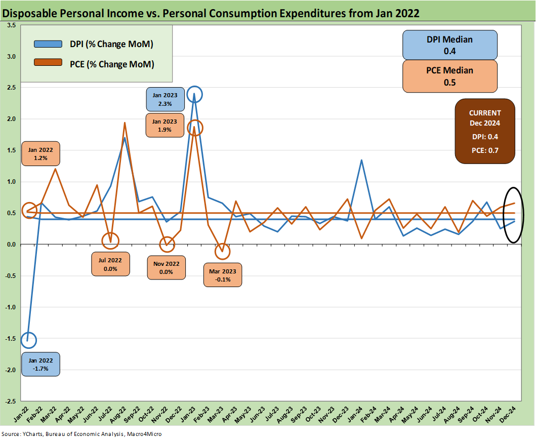
The above chart covers the time horizon for DPI vs. PCE consumption from early 2022 as the tightening cycle kicked into gear after March 2022. Life in Jan 2022 was still quiet for Disposable Personal Income, and we see Consumption still running ahead of DPI coming off a bullish macro period in 2021. That year was a big macro rebound in GDP off the COVID peak period.
Oil was a problem after the Putin invasion of Ukraine in late Feb 2022, and inflation hit a high in June 2022 at +9.1% for CPI as a headline grabber (headline PCE at +7.1% in June 2022) before the steady inflation slide to current rates. The Core PCE has dueling peaks at +5.6% for Feb 2022 and Sept 2022.
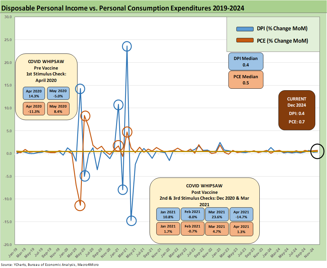
The above chart plots MoM DPI vs. PCE as a read on how wild things got during and right after the pandemic peak. These comments are somewhat of a replay each month with some edits and updates. This is a chart we use each month to revisit the DPI swings that came with the three COVID relief/stimulus packages. That included two under Trump and one under Biden.
As a reminder, Trump signed the CARES Act in March 2020 (shows up in the DPI in April 2020) and Trump also signed the Dec 2020 legislation disbursed in Jan 2021 (he seldom mentioned that one since it is easier to blame Biden and Powell). Biden signed the America Rescue Plan (disbursed in March 2021) that was somewhat of a demand pile-on in a supply constrained environment (thus inflation). The DPI and PCE wave tied to each of those shows up in the chart above.
The vaccine was announced in early Nov 2020 just ahead of two stimulus actions. That was soon a factor in PCE patterns and lag effects. The typical blame game from some is to lay all the cause-and-effect on the March 2021 disbursement. The idea is that a single stimulus plan signed by Biden in early 2021 was the cause of all inflation. That is a mix of partisan and dumb and “politically axed,” but that Biden plan certainly made things worse from the demand side. The invasion of Ukraine by Russia in Feb 2022 also drove the ensuing spike in inflation to a June 2022 CPI high of 9.1%.
Debates without a winner are typical in inflation histories and the “my theory is bigger than your theory” in academic circles. People still debate who to blame for the bouts of 1970s/early 80s inflation decades later. Nixon? Ford? Carter? Arab Oil? Back then, it was “blame Carter” in 1980 and “blame Ford” in 1976. Since then, a generation of econ Professors have moved on (most of them to cemeteries). The cause-and-effect argument rages on. This coming tariff and deportation price threat in 2025 and related inflation debate will be no different.
The positions on tariffs and prices will be set early (probably in advance) and the explanations will be unlikely to change as events unfold. We await Trump’s final game plan on tariffs due this weekend and also whether he will attach the tariffs to Canadian heavy crude that are heavily desired by many advanced US refineries. He threatened to tariff (the new action verb) oil in Trump 1.0 but did not. Playing with the idea but a priority (in theory) will be to avoid looking stupid about supply-demand factors and energy shocks. Such shocks can offer daily reminders to voters at the gas pump and in grocery aisles as freight and logistics costs also soar.
Our own personal experiences in the 1970s (including some years “trying” to understand the economic theory debates during college even when some pedigreed Professors were saying the opposite things) point at supply-demand imbalances as the natural explanation (oil, food especially). The “money supply only crowd” is not as loud now as they used to be back then, but those discussions never get resolved anyway.
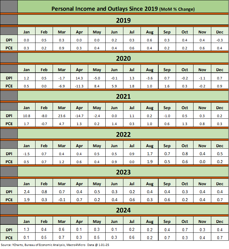
The above table is a cheat sheet for framing the DPI vs PCE swings from 2019 to this latest release. Watching where sustained PCE moves occurred relative to income can be useful for the direction of the consumer cycle vs. more defensive savings rates.
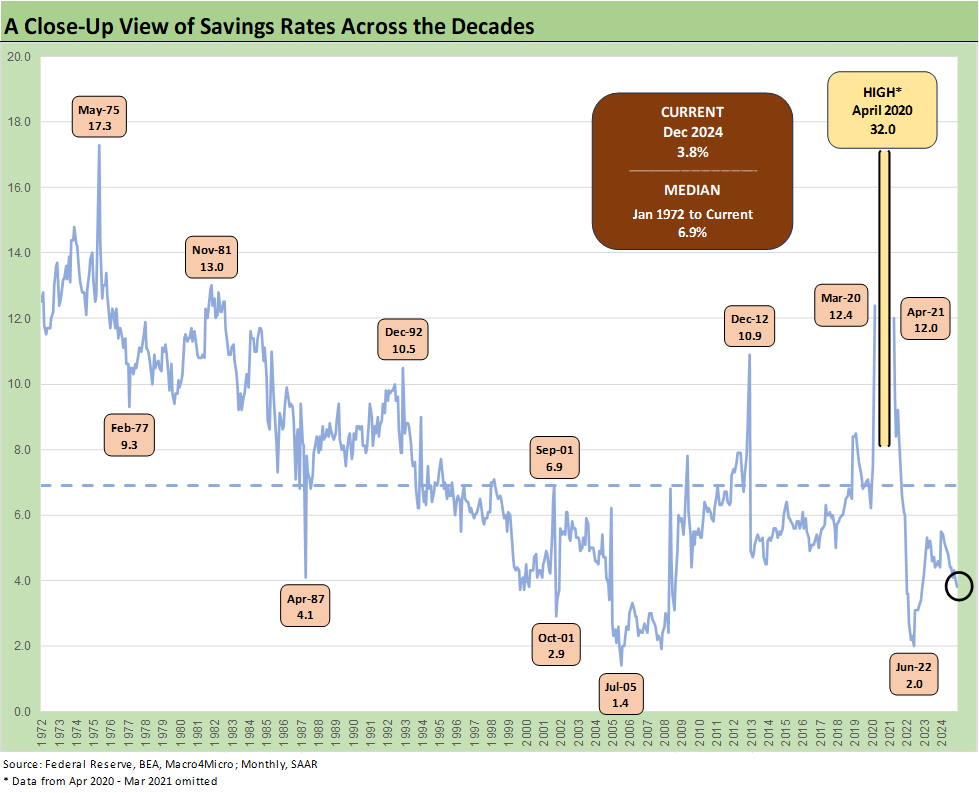
The above chart updates the savings rate time series. We see the time series take a dip back down below the 4.0% line to +3.8%, which is still well below the long-term median of +6.9% since 1972. Personal Consumption Expenditure strength has been a hallmark of this recent cycle and we saw that again in the 4Q24 GDP numbers (see 4Q24 GDP: Inventory Liquidation Rules 1-30-25) and again in this Personal Income and Outlays release.
The heavy use of credit cards this cycle keeps the two-sided debate going on savings rates vs. the positive aspects of strong PCE and the worrisome aspects of household balance sheet strain. The potential delinquencies/defaults would come at a time when payrolls are at record highs. That is when the “more bodies, more paychecks” rule comes into play (see Payroll Dec 2024: Back to Good is Bad? 1-10-25, Payroll % Additions: Carter vs. Trump vs. Biden…just for fun 1-8-25, JOLTS: A Strong Handoff 1-7-25 ). Jobs matter, and that is not a complex relationship with consumption.
See also:
4Q24 GDP: Into the Investment Weeds 1-30-25
4Q24 GDP: Inventory Liquidation Rules 1-30-25
Credit Crib Note: Lennar Corp 1-30-25
D.R. Horton: #1 Homebuilder as a Sector Proxy 1-28-25
Durable Goods Dec 2024: Respectable ex-Transport Numbers 1-28-25
New Home Sales Dec 2024: Decent Finish, Strange Year 1-28-25
Footnotes & Flashbacks: Credit Markets 1-27-25
Footnotes & Flashbacks: State of Yields 1-26-25
Footnotes & Flashbacks: Asset Returns 1-26-25
Mini Market Lookback: Policy Blitz Formation 1-25-25
Existing Home Sales Dec 2024: Another “Worst Since” Milestone 1-24-25
Top 10 Fun Facts on Past Presidents and their Economies 1-20-25
Industrial Production Dec 2024: Capacity Utilization 1-17-25
Housing Starts Dec 2024: Good Numbers, Multifamily Ricochet 1-17-25
Retail Sales Dec 2024: A Steady Finish 1-16-25
CPI Dec 2024: Mixed = Relief These Days 1-15-25
KB Home 4Q24: Strong Finish Despite Mortgage Rates 1-14-25
United Rentals: Bigger Meal, Same Recipe 1-14-25
Mini Market Lookback: Sloppy Start 1-11-25
Payroll Dec 2024: Back to Good is Bad? 1-10-25
Payroll % Additions: Carter vs. Trump vs. Biden…just for fun 1-8-25
JOLTS: A Strong Handoff 1-7-25
Annual GDP Growth: Jimmy Carter v. Trump v. Biden…just for fun 1-6-25
Mini Market Lookback: Mixed Start, Deep Breaths 1-5-25