
Footnotes & Flashbacks: Credit Markets 9-16-24
We look back across a relatively quiet week in the credit markets on the lead-in to the FOMC action and dot plot.


Post election forecast makes the variables tough to identify…
A key decision point in the -25 bps vs. -50 bps cut debate at the FOMC with inflation tamed but more than a few important line items (notably Services) still stubbornly elevated.
The twist on this round of FOMC decisions and forecasts (dot plot) is gauging how the top shelf of economic thinkers will portray the pricing impacts and growth expectations with massive tariffs from Trump or higher taxes from Harris. Will they evade the tariff topic and run for cover or let ideology creep into their models?
The UST curve is the lowest across the last few decades of cycles when compared only to the pre-crisis market (pre-ZIRP etc.), and those low absolute UST rates dominate the yields along the credit tiers and thus the all-in compensation for taking credit risk and duration risk.

The above chart updates the running total returns and excess returns for IG and HY and also for each credit tier. The market started with compressed spreads after the monster rally of UST, credit, and equities in Nov-Dec 2023 (see Footnotes & Flashbacks: Asset Returns 1-1-24, Footnotes & Flashbacks: Asset Returns 12-3-23), and the credit markets are still compressed.
The total returns have been picking up later in 2024 as duration benefits kick in with the summer and fall UST rally while excess returns are more about coupons and carry since the coast-to-coast HY OAS differentials from late Dec 2023 remain minimal. Relative yields and relative spreads are always a mental toggle, but relative UST trumps the comparative return story when framed across similarly compressed spread markets.
That duration impact is especially critical as a return driver in the case of IG, but the ability to reduce the front-end inversion also will weigh heavily on the direction of HY returns. The dollar price action is important in the pull-to-par process in refi and extension that is so important for liability management exercises of HY issuers who need to worry about cyclical pressures and perceptions of shifting default risk. The HY bond index and tiers are all still at a discount to par even at low rates given the generation of low coupons rolled into place in the ZIRP and COVID period.
For HY overall, spreads started tight, then tightened, and then whipsawed around recently but in a range that looks a lot like what we saw near the end of 2023. Those spreads are still close to past cyclical lows in June 2014, Oct 2018, Jan 2020 but comfortably above the +301 bps of Dec 2021.

The above chart updates the running excess returns for IG vs. HY. The ordering is rational since the market gets paid more for taking more risk. As we have covered in the past, for many calendar years that has not been the case. We are clearly operating in a compressed market for HY bonds right now, so sustaining that into 2025 requires a soft landing that does see major industry groups taking a beating (e.g., collapse in energy pricing).
The good news is that there is little visibility supporting such a problematic outcome in equities or credit at this point. You are getting compensated for a very low risk of such an outcome. The low coupons also will gradually reprice to market rates and the promise of higher cash income flows for more portfolio strategies and a higher cash return component in the mix. If the UST keeps trending lower, however, the expected income advantage will diminish as refi plans heat up.

The above chart updates the running excess returns of BB vs. BBB, and the compression of those returns is still pretty tight given the strong demand for BB paper from traditional BBB tier investors and the industry and issuer mix. At least the BB > BBB excess return equation is working the right way.
In a downturn, life can also get very complicated for “full curve issuers” in the BBB tier as they run the risk of pricing dislocation from weaker long end demand in HY portfolios for low coupons, long duration, and IG covenants. The biggest headline lately on that front is Boeing, but energy and autos always need to be monitored in a downturn if weak economic scenarios unfold.

The above chart updates the CCC excess returns vs. the B tier. The B tier has seen very notable compression in multicycle context. Interestingly, the CCC tier is not as ugly as it used to be in past late cycle periods with so much of the most aggressively leveraged deals over in private credit these days (see The B vs. CCC Battle: Tough Neighborhood, Rough Players 7-7-24).
A look at spreads…
We already reviewed some of the spread moves over shorter time horizons in our “Mini” market lookback (see A Strange Policy Risk Week: Mini Market Lookback 9-14-24), and below we look at the longer term timeline for multicycle context.
There is no hiding from the fact that the credit markets are operating in a compressed spread environment by any measure. The tight spreads are a fact of life at a time when the FOMC will be easing out of fears around payroll and at the very least slowing growth. We see signs of macro pressure that is not hard to find in the consumer sector and very easy to find in manufacturing.
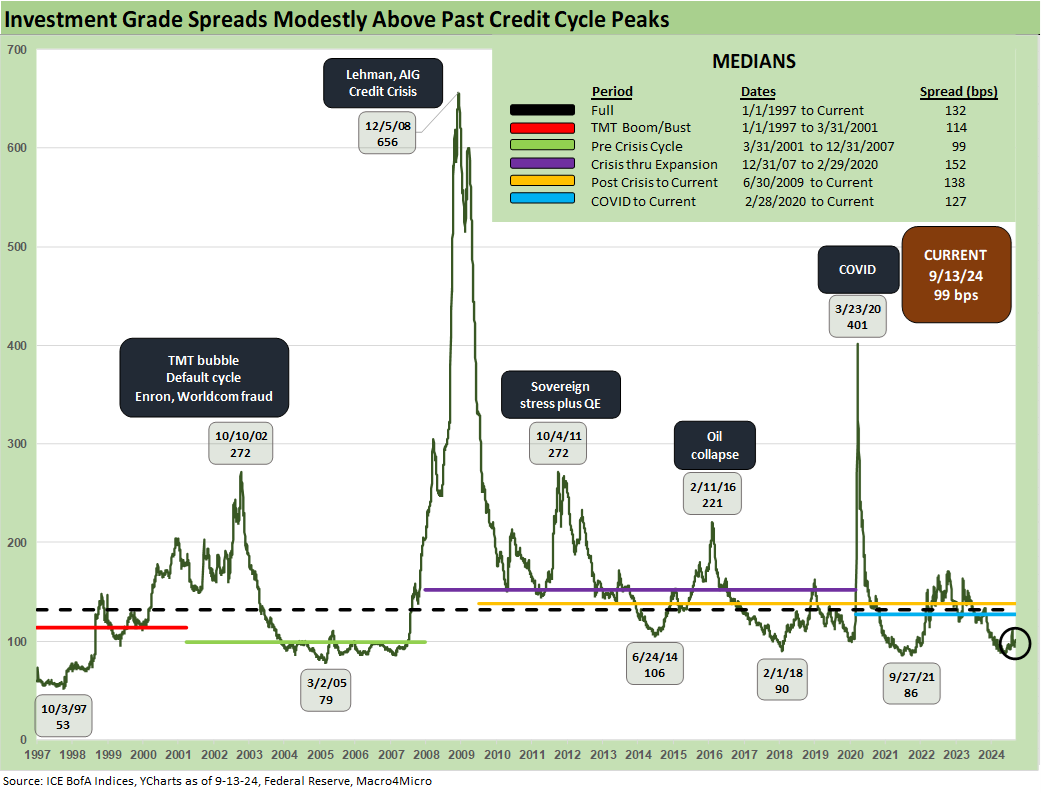
The above chart updates IG spreads, and this week was flat at +99 bps. IG cruised through this year despite some volatility during the early August VIX spike, but the real tests could come in 2025.
Historically, IG spreads have shown resilience. We see IG spreads now in line with prior credit cycle peak periods even if modestly above some of the low ticks noted in the chart. As we look back across credit cycle peaks, the +70 bps for the IG index at the end of 1997 was lower than today after the market saw the record low in Oct 1997 at +53 bps.
The 1997-1998 average for IG OAS was +95 bps, and there was plenty of visibility on the path to trouble (Russia default, LTCM) in 1998 which led to Fed easing in the fall. IG spreads as we wind down 2024 are closer to the lows of the late 1990s period than the long-term median of +132 bps noted in the median box above.
Looking at the credit bubble peak of 2007 as a frame of reference, IG OAS was at +100 bps at 6-30-07, and that was a very frothy month ahead of a turbulent summer and fall. We are basically at that late June 2007 level as we head toward 4Q24. IG spreads had widened by mid-2007 after the period from 1H04 through 1H07 saw IG OAS averages in double digits at around +93 bps. The lows in 1H07 of +86 bps were like the lows in 2H06 at +90 bps and 1H06 at +87 bps.

We saw a quiet past week with HY OAS only -2 bps tighter to +337 bps. HY OAS from the end of 2023 through this past Friday close of +337 bps HY OAS shows minimal change. Recent volatility in early August did not last (see HY Industry Mix: Damage Report 8-7-24, Labor Day Weekend: Mini Market Lookback 9-2-24).
Looking back across past credit cycle peaks is something we always like to do. That can involve a lot of compare-and-contrast on market structure, economic backdrops, banking system health, asset allocation trends in the market, and regulatory overlay (e.g., post Dodd-Frank and Volcker Rule, rise of private credit now etc.) but that is for other commentaries past and future.
For some OAS level comps, HY OAS ended 1997 at +296 bps after HY OAS was inside +250 bps in Oct 1997 (+244 10-17-97). The 1997 period saw average spreads of +282 bps in 1H97, +270 bps in 2H97, and +298 bps in 1H98 before the summer chaos of Russia and LTCM (and brief Lehman funding and counterparty exposure scare) rolled in from August into the fall.
In other words, we are tight now but have been tighter in markets with lower quality mix (ratings tiers, leverage excess, record LBOs, bank system challenges, industry stress points etc.).
The 2007 and 1997 periods faced very distinctive backdrops in the economy and capital markets. Refinancing/repricing, and maturity/extension deals in 1H07 saw record leveraged loan volume and structured credit deal flow along with counterparty derivatives excess that hit systemic levels. HY OAS moved out to +298 bps on 6-30-07 after being as tight as +241 on 6-1-07.
The current market easily has the edge in overall deal quality vs. the late 1980s, the TMT peak of the 1990s, and the housing bubble and record LBO years (2006-2007). The E&P and shale origination deal flow was off the charts before the Saudi price war and a warm winter sent that sector into crisis mode in late 2015 and early 2016.
In the current market, we see less industry concentration of emerging sectors with too much debt and not enough cash flow as seen in earlier HY credit cycles (e.g., TMT, E&P). We see less secular crisis points (legacy Detroit 3 in autos and supplier chain in 2008-2009). We see less late-cycle, hyper-leveraged deal flow in HY bonds as that migrated to the emerging private credit market sector.
The ability to avoid more fund outflow panics (e.g. Jan-Feb 2016) and market liquidity stress points (think early 2016 on E&P dislocations) is a positive factor for HY price risk vs. past cycles.

The above chart updates the quality spread differential (“HY OAS minus IG OAS”), and we see the +238 bps materially inside the long-term median of +328 bps. That additional compensation is modestly above the lows seen in June 2014 but a little more distant from Oct 2018 and Dec 2021.

The above chart updates the IG/speculative grade divide differentials for “BB OAS minus BBB OAS.” The metric comes with the asterisk that it is not the low BBB (Baa3/BBB-) and high BB (Ba1/BB+) differential, but it is another metric helpful to spread compression perspective. The current +82 bps is well below the long-term median of +136 bps but above the multicycle low of +55 bps reached in July 2024.
We note the lows of Oct 2018 and Dec 2019 in the chart. Dec 2019 was a par plus market with many bonds trading above call prices. The current BB market has a composite price of a 98 dollar price handle on lower coupons (6.3% par weighted). If the UST market keeps moving lower, the repricing of coupons in the refi wave will be less compelling.

The above chart updates the running BB tier OAS. The current +205 bps is materially inside the long-term BB median OAS of +301 bps but wide to the +186 bps lows of Jan 2020 just before COVID.

The B tier has seen the most pronounced compression among the HY Classic sweet spot with the current +328 bps well inside the +470 bps long-term median. The current B tier OAS is around the lows of June 2014, Oct 2018, Jan 2020, and Dec 2021 as noted in the chart. The B tier had hit +278 bps in July 2024.

The above chart looks back across the time series for the B tier vs. the CCC tier OAS. The periodic dislocations of the CCC tier from the B tier are typically better measured in dollar price differentials than bps as we have covered in other commentaries (see The B vs. CCC Battle: Tough Neighborhood, Rough Players 7-7-24).
A look at yields…
As we have covered in our Footnotes publication on the State of Yields, the IG and HY index yields are getting pulled lower with a UST curve that is materially lower than any pre-crisis cycle before ZIRP, QE and some normalization policies took over the curve (see Footnotes & Flashbacks: State of Yields 9-15-24).

The above chart updates the running HY and IG YTW levels across the cycles. The most relevant curve to today’s macro backdrop is the pre-crisis cycle after the sustained tightening of the Fed since March 2022 through the last move in July 2023. We get our answer on the easing magnitude this week.
That means we are comparing today’s levels to the pre-crisis medians of +9.3% for HY and +6.1% for IG. At the current +4.7% for IG and +7.2% for HY, the cost of funding for US companies frames up well in historical context while the yields to investors only look good when framing them vs. post-crisis curves. As we detail in our last two charts below, the all-in yields are now distinctly lower than past credit cycle peaks in 2007 and 1997.

The above chart updates the HY index yields at the June 2007 credit cycle peak and late 1997. We frame those on the horizontal line against the current HY index YTW. We also plot the UST curves for each period. As noted in the box, the UST curve carries the day, and you get much less all-in yield today than 1997 and less than 2007.

We do the same exercise for IG yields above that we did in the prior chart for HY. The low UST curve of Sept 2024 sets the tone and the relative yields vs. the IG yields of today vs. 1997 and 2007. We see 4% handles now vs. 6% handles then.
See also:
Footnotes & Flashbacks: State of Yields 9-15-24
Footnotes & Flashbacks: Asset Returns 9-15-24
A Strange Policy Risk Week: Mini Market Lookback 9-14-24
Consumer Sentiment: Inflation Optimism? Split Moods 9-13-24
CPI Aug 2024: Steady Trend Supports Mandate Shift 9-11-24
Facts Matter: China Syndrome on Trade 9-10-24
Tariffs: Questions that Won’t Get Asked by Debate Moderators 9-10-24
Footnotes & Flashbacks: Credit Markets 9-9-24
Another Volatile Week: Mini Market Lookback 9-7-24
August 2024 Payrolls: Slow Burn, Negative Revisions 9-6-24
Trump's New Sovereign Wealth Fund: Tariff Dollars for a Funded Pool of Patronage? 9-5-24
Goods and Manufacturing: Fact Checking Job Rhetoric 9-5-24
Construction Spending: A Brief Pause? 9-3-24
Labor Day Weekend: Mini Market Lookback 9-2-24
PCE July 2024: Inflation, Income and Outlays 8-30-24
2Q24 GDP 2nd Estimate: The Power of 3 and Cutting 8-29-24
Harris Housing Plan: The South’s Gonna Do It Again!? 8-28-24
New Home Sales July 2024: To Get by with a Little Help from My Feds? 8-25-24
All the President’s Stocks 8-21-24
 |
|