


You never got me down Ray
After a 0.5% 1Q26 for PCE growth and the same +0.5% for both Services and Goods, the 2Q26 GDP advance report showed a solid rebound with the monthly PCE release also showing May and June with PCE comebacks. The consumer took some blows but is still swinging.
The main takeaway for the two releases today (GDP and PCE) is that inflation is a long way from target rates but the consumer and corporate sector are hanging tough.
For the June monthly PCE price data, we see 3.7% headline inflation and 3.3% core PCE price inflation. The most notable product bucket is “Energy Goods and Services” at +15.8% for June after +24.3% in May and +18.3% in April. Goods was +3.7% and Services also +3.7%. “Services ex-Energy and Housing” was +3.8% with Housing at +3.2% as measured by the BEA.
The 2Q26 inflation data brought uglier metrics. The inflation story has not been as friendly for the curve as the consumer demand trend and price pressure go somewhat hand in hand. The 2Q26 PCE price index reported with GDP was +5.1% (+5.7% for gross domestic purchases) while core PCE for 2Q26 weighed in at +3.4%.
The annual rates on prices for “gross domestic purchases” (Table 1.6.7 in GDP report) really rang the bell for 2Q26 with 5.7% headline, 5.1% PCE and lines such as +114.6% for “gasoline and other energy goods,” +8.3% on Goods, +5.0% on Durable Goods, +10.1% on Nondurable Goods, +13.1% on “Information processing equipment” (+29.8% on the sub-category of “Computers and Peripheral Equipment”). The headline Equipment category of fixed investment at +5.6%.
The raging bull visual at the top of this commentary may not apply to the consumer, but the theme works given what has been going on in the stock market. The consumer being resilient and fixed investment lines driving a lot of multiplier effects in related goods and services (notably financial services, materials, transports) gets back to the concerns around inflation and the absolute UST rates and steepening risks where higher 10Y and 30Y rates could take a toll (notably on housing and growth stock valuation inputs).
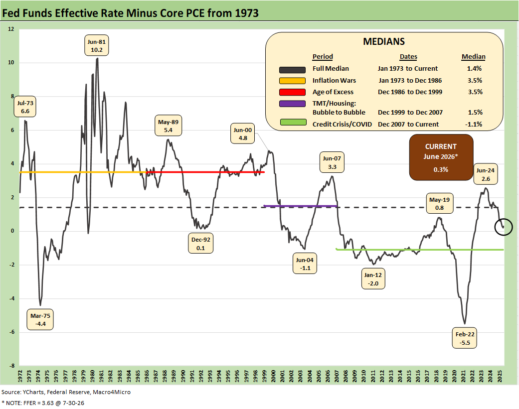
The above chart frames the timeline for “effective fed funds minus Core PCE.” For this latest June measure, we see the differential at +0.3% vs. the long-term median of 1.4%. It is a safe statement that current levels are almost a case of accommodation at a time of inflation peril. If one sees inflation moving higher and demands from the White House to take rates lower, the economics class students could realize there is no need to study (cue Queen singing “nothing really matters”). Fed funds minus the headline PCE price index was negative last month and is now a virtual tossup.
The Warsh wildcard just had its second test with the takeaway being “eloquence without any information.” Warsh brings the intrinsic advantage of running no risk of being right or wrong since he offers no expectations at this point. The combination of his communication policy and the well-recognized Trump pressure to ease was a UST steepening reaction. Such a curve scenario could bring some tech equity valuation damage and hammer housing even more with the 30Y mortgage reaction. The 30Y mortgage rates per Mortgage News Daily peaked last week at over 6.8% but as we go to print is back just under 6.8%.
FedWatch odds of an FOMC easing by the Dec 2026 meeting had essentially been zero but now the odds of no change by Dec 2026 are 17.7%. The latest odds of 1 hike are 45.2%, 2 hikes at 31.0%, and 3 hikes at 6.1%. Those odds will swing around with Iran, oil and inflation readings. The trend has generally been going badly for the easing scenario and Iran events (and now Yemen and Iraq) will remain in flux.
June numbers have been easier on energy than what has since unfolded in July. Refined product pricing has been far more destructive than oil moves even as oil prices tailed off. Diesel gets a lot of airtime for its adverse effects.
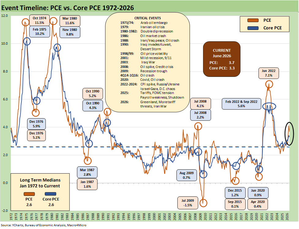
The above chart updates the long-term time series from 1972 for PCE vs. Core PCE across the decades and cycles. We see the 2.6% headline PCE long-term median in the lower left (well below the current 3.7% for June after 4.1% in May following 3.5% posted in April). The 2.6% Core PCE median is well below the current 3.3%.
That 4.1% headline PCE for May 2026 eased back to 3.7% in June. That level is dramatically better than where we came from in July 2022 at 7.1% PCE, but it is still well above the 2.0% target and potentially going in a bad direction from here subject to oil but also the cyclical demand for labor and wage trends. So far, that wage pressure has been in check.
In the context of 2025-2026, the headline PCE price index was 2.6% in Jan 2025 to start Trump 2.0 before the ensuing moves higher. Iran was the dagger and is flowing into a range of PPI, Goods, and Services lines as the effects reverberate. Oil and downstream effects are pervasive across the economy from operating costs on farms to freight and logistics to petrochemicals and materials costs including metals and mining.
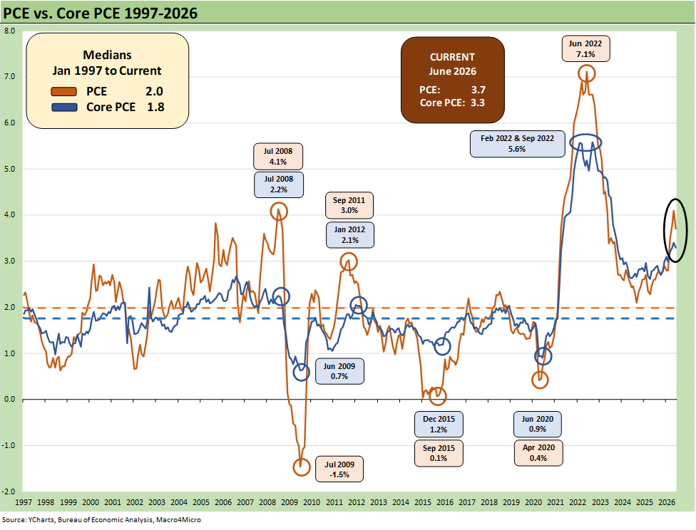
This is a “replay slide” that we use as a reminder on how the 2.0% target inflation rate frames up across the cycles.
We include the 1997-2026 timeline above as it offers a useful frame of reference on the PCE target of 2.0% that is routinely discussed by the Fed and in the markets. The shorter timeline from 1997 offers a better visual scale separate from the wild 1970s and 1980s. We will see what comes out of the Warsh working groups in their reviews of Fed policy.
The “1997 to 2026” period presents a rare stretch at or below the 2.0% target PCE line and Core PCE median as noted in the chart. It took a lot to go wrong in that time horizon at the systemic level and in terms of macro shocks to cross below or at that 2.0% threshold.
The events along the way included tech bubbles bursting in 2000-2001; oil crashes in the late 1990s and in the late 2014 to early 2016 period; and a bank system crisis from 2008 to 2011 (including a global dose of sovereign stress) to get us there. The COVID pandemic in 2020 was a new one for the modern capital markets.
That gets us back to the debate over what is the correct formal inflation target or the “closet target” somewhere above 2%. There is not likely to be a formal change in the target, but the current backdrop would be missing it regardless and going in the wrong direction. Warsh cites what is to “left of the decimal” (i.e. “2” or “3”). As of now, he is at “3” left of the decimal but only weeks away from it recently being at a “4.” Warsh is leaving himself a lot of room even as he buys time.
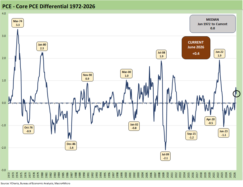
The above chart frames the long-term differential history between PCE and Core PCE since 1972. The long-term median differential is zero and we are currently at +0.4%. The volatility around that compressed long-term median ties into the energy wildcard with some food distortions also back in the 1970s.
We look at some of the CPI energy and food inflation moves in separate commentaries (see Inflation: The Grocery Price Thing vs. Energy 12-16-24, Inflation Timelines: Cyclical Histories, Key CPI Buckets11-20-23). Food and electricity inflation have been near the top of the affordability political rage-fest in this cycle. Households have been hit hard by energy costs (gasoline and electric bills and indirect impact of freight and operating costs rising in just about everything across food, goods and services).
The power demands of data centers are going to keep that energy and power line item in the headlines and notably as data centers get pushback in the states given power needs/costs and environmental effects. Life will get sticky in AI and the related ecosystem if the electricity topic cannot be addressed. The phrase “infrastructure bottlenecks” is getting tossed around a lot. That will impact valuation assumptions and pricing power questions.
With an oil spike and uncertain direction of the Mideast war, the inflation history on the other side of such events is a very bad one. All we need to do is look back at late 1973-1974 (Arab Oil Embargo) and again in 1979 (the original “Iran oil crisis”) on the way into the 1980-1982 double dip. Much of what unfolded after 1979 was closely tied to refined product inventory management. That period crushed many mature manufacturing industries and led to wholesale restructuring alongside wide deregulation. The industrial and services diversity and credit profiles now are much different and much healthier than the Volcker period.
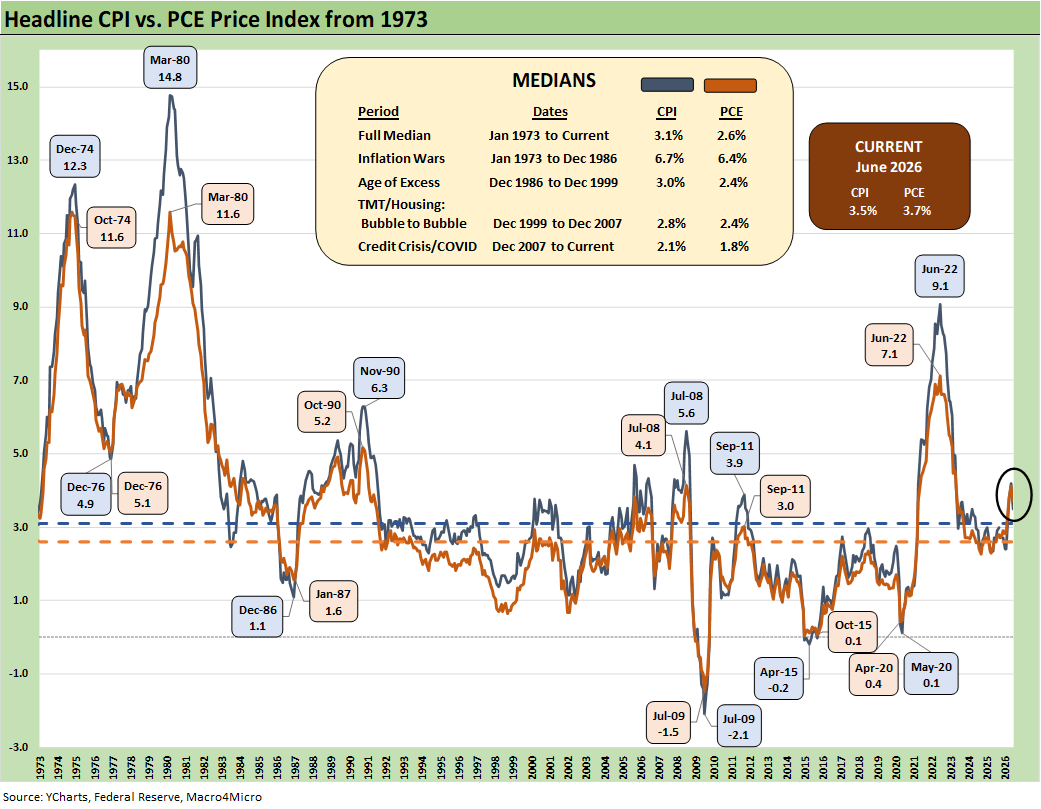
The above time series plots headline CPI vs. PCE across time. The debates around which inflation metric is the best is something more for the faculty club types, but the above chart drives home how each has behaved across time. The consumer tends to lock in on affordability and purchasing power – as in the “cash in, cash out” impacts on daily life.
“Higher or lower or stable?” is a good place to start regardless. Any investor should be aware of the line-item trends by product groupings. Relative weights are also useful to help guide the strategic reaction to headline and core inflation metrics.
Food and Energy (i.e. not “Core”) is crucial for the consumer even if the monetary ideologues will carry on their views around inflation as narrowly defined in academic terms. The household experience with prices underscores that consumers care about discretionary cash flow and how their take-home pay frames up vs. their household basket. “Derived metrics” used by benchmarks such as CPI often do not match up with their own checkbook experience (owners’ equivalent rent, health insurance CPI, etc.). Such metrics matter less to many. They care about the reality of increasing health insurance premiums or loss of health insurance, as well as the financing costs for their big-ticket purchases (e.g. autos, homes, boats, appliances, etc.).
Financing costs also are not captured in CPI metrics for Goods. The best example is monthly car payments and monthly mortgages, and the UST curve is not helping at this point. Despite that reality, autos are doing well and home prices are only gradually starting to feel downward pressure after a big post-COVID spike.
Note:
The following is a recurring commentary we roll forward for new readers and students on the history of the COVID relief and stimulus plans and how that rolled into inflation. Please skip this section if you have read it before. The lies and distortion never go away when talking heads in political circles or related media do their soundbite specials.
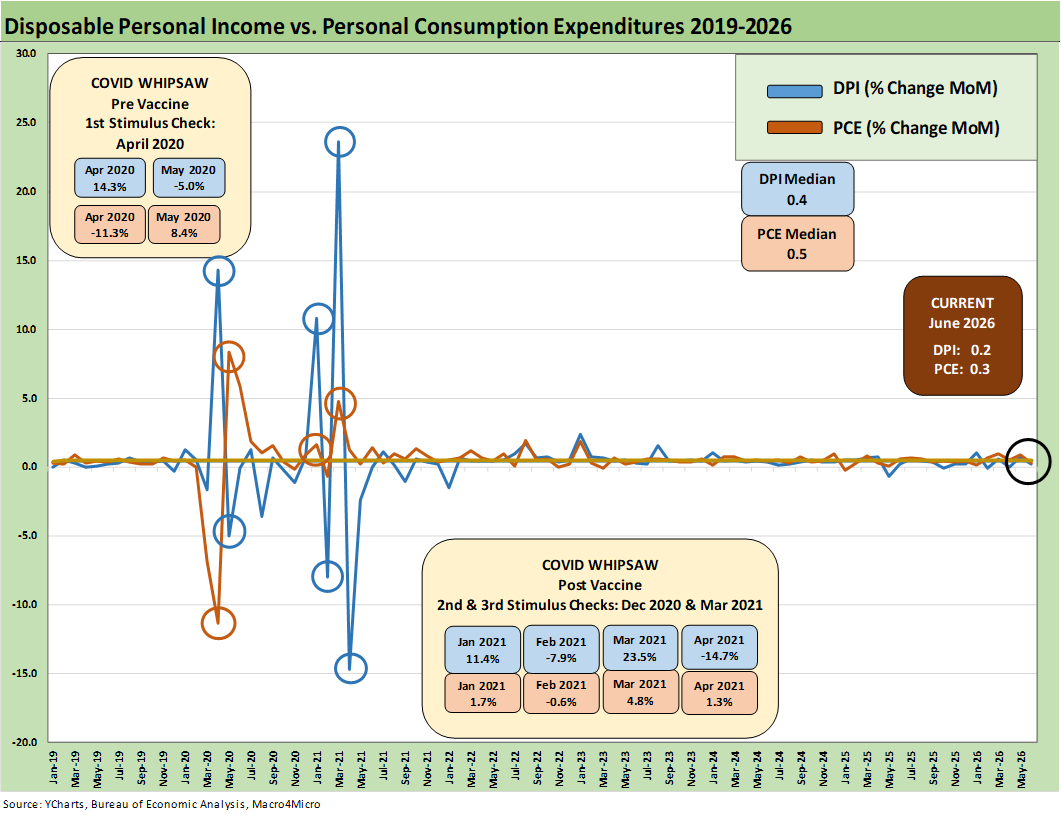
The above chart is something of a “replay chart” we include in updates as a reminder that political theme-spinning out of Washington on economic cycles and inflation are usually stacked with selective memories, false statements (aka self-serving lies), material omissions, and conceptually anorexic story telling (like “seller pays the tariffs”).
The above chart updates the trend line in disposable personal income (DPI) vs. personal consumption expenditures (PCE) that we get with each monthly PCE release. We like updating this chart each month to offer a reminder of what really happened given the waves of disinformation from the current administration. Revisionist history is one thing, but it is good to challenge gross falsehoods and misstatements with facts and history.
PCE growth vs. DPI…
When PCE growth exceeds DPI growth (or negative DPI), as we often see, one conclusion is that many consumers are feeling good (i.e., ignore the sentiment metrics). Or perhaps they are tapping credit cards by necessity (e.g. the PCE could include outsized health care premiums put on their credit cards?).
We have been watching the rate of ACA dropouts and premium increases and shift to higher deductible plans. Health care is a mess and not clearly captured in the headline data. It all adds up to less cash flow at the household level, more borrowing (in some cases), and zero-sum effects on other outlays. Thus any softening PCE numbers in the GDP updates tell a story. We saw trouble in personal consumption in 1Q26 (see GDP 1Q26 Final: PCE Growth Plunge 6-25-26). As detailed in 2Q26 GDP and herein, we are seeing a rebound (see 2Q26 GDP: Good Underlying Numbers Despite Headline 1.5% 7-30-26).
The stimulus overload of 2021…
Talking heads in Washington will “play pretend” around what happened in the COVID tunnel of 2020-2021 and what unfolded coming out of that tunnel. That was a lot of structural imbalances and supply-demand dislocations for the economy to absorb.
The 2021 period was a big macro rebound in GDP off the COVID peak period. The strong macro backdrop in 2021 and heavy dose of fiscal accommodation did not mesh well with residual supply-side shortages in goods broadly as 2022 saw the end of ZIRP and a material inflation spike ensued.
Oil was a problem after the Putin invasion of Ukraine in late Feb 2022, and inflation hit a high in June 2022 at +9.1% for CPI as a headline grabber (headline PCE at +7.1% in June 2022) before the steady inflation slide to under 3% by the end of 2024. Core PCE had dueling peaks at +5.6% for Feb 2022 and Sept 2022.
Try to get Team Trump to even mention the oil price spike in 2022 as a factor in the 2022 CPI numbers. The questioning on the topic by mainstream media is also lame. The CNBC team does not push such Q&A since they are looking to take GOP interview share away from Bartiromo and Fox. They need the GOP guests to keep coming back. Tough questions don’t help that priority.
The COVID relief binge…
The above chart plots MoM Disposable Personal Income vs. PCE and offers a read on how wild things got during and right after the pandemic peak. This is a chart we use each month to revisit the DPI swings that came with the three COVID relief/stimulus packages. That included two COVID relief bills under Trump and one under Biden.
As a reminder, Trump signed the CARES Act in March 2020 (shows up in the DPI in April 2020) and Trump also signed the Dec 2020 legislation disbursed in Jan 2021 (Trump seldom mentions that Dec 2020 one since it is easier to blame Biden and Powell). Biden signed the America Rescue Plan (disbursed in March 2021) that was a demand pile-on (we would argue it was over the-top-stimulus) in a supply-constrained environment (thus inflation). The DPI and PCE wave tied to each of those shows up in the chart above.
As a reminder, the COVID vaccine was announced in early Nov 2020 just ahead of two stimulus actions. That was soon to be a factor in PCE patterns and lag effects. The quarterly GDP numbers in 2021 on the post-COVID bounce were numbers generally not seen since the Reagan and Clinton years (see Presidential GDP Dance Off: Clinton vs. Trump 7-27-24, Presidential GDP Dance Off: Reagan vs. Trump 7-27-24).
COVID was a distinct period for supply chains and supply-demand imbalances. With tariffs and potential trade wars, it will remain important to look for similar imbalances whether in narrow product categories or in broad commodities and materials areas. We clearly face some supply pressures in the post-Iran period for oil and gas, refined products, fertilizers, aluminum, and numerous other inputs generating headlines (helium, sulfuric acid undermining copper production). Some shortages also undermine military readiness.
Tariffs, unit costs, and pricing decisions…
In terms of tariffs, the major trade partners have not initiated much in retaliation with the exception of a brief China spat. A “peace at all costs” strategy by the EU and USMCA partners has mitigated the damage, but that de facto submission could come back to haunt some major trade partners if other leaders run for office with a “get tough on Trump” election pitch. Caving in to Trump on tariffs is getting less popular in the EU and Canada. Trump is also pushing his luck after Iran in attacking allies.
Jacking up aluminum, steel, and copper on the materials side and seeking even more tariffs on lumber was not and is not a great idea for keeping prices and costs contained. Auto tariffs under Section 232 are extreme even after the array of “deals” and could go higher if the USMCA breaks down in 2026. Trump recently fired a shot across the EU’s bow aimed at German autos. Then he frame 50% tariff threats on Canada that will unfold in coming weeks.
We saw semis, pharma, and aircraft/engines/parts added to the Section 232 pipeline although most of the aircraft/parts risk was mitigated in EU talks. Those EU talks are now in jeopardy again. Other actions brought in commercial vehicles, branded pharma, cabinets, and a range of targets on national security grounds including upholstered furniture (seriously, upholstered furniture)
The most important development in the tariff area was the SCOTUS decision on IEEPA. Trump has launching tariffs under Section 122 laws and initiating more Section 301 actions (unfair trade) to maximize his flexibility with Section 232 (national security) also in the playbook. He has already been hit with setbacks in court. Trump’s goal is tariff revenue maximization for his discretionary deployment and not economic efficiency.
Trump’s latest gambit uses a Smoot Hawley (1930) provision (Section 338) that allows him to use legislation on the books without consulting Congress. Smoot Hawley is viewed in most circles as one of the most self-destructive pieces of legislation in US history.
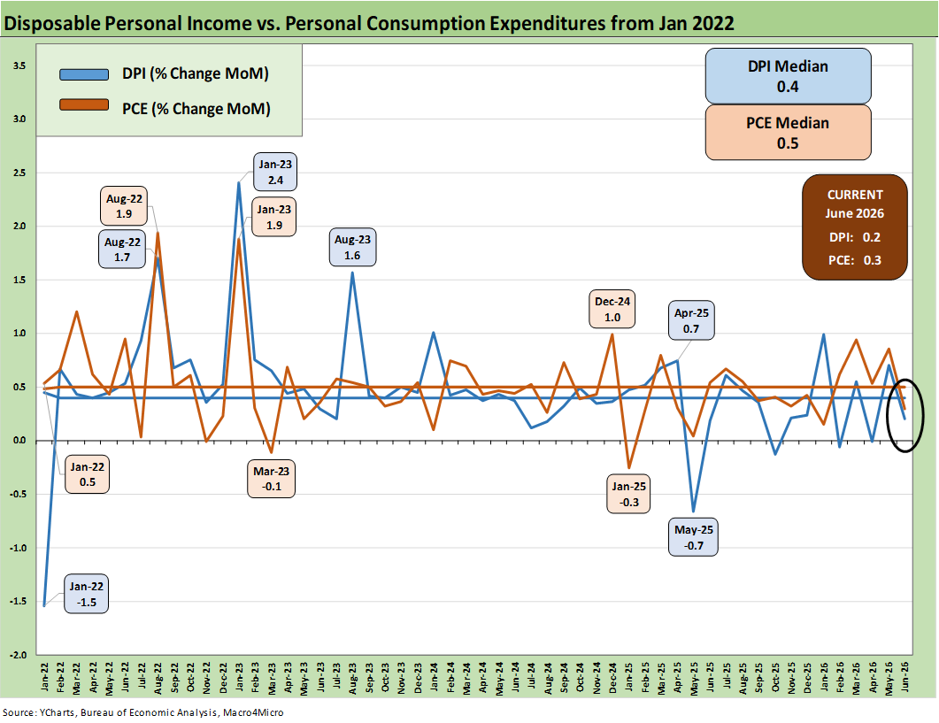
The above chart covers the time horizon for DPI vs. PCE from early 2022 as the tightening cycle kicked into gear after March 2022. Life in Jan 2022 was still quiet for Disposable Personal Income.
We like to include this chart in the PCE updates just given the heavy mix of disinformation and politically axed story lines we constantly hear from Trump on Biden being the cause of all the macro problems even at the end of 2025 and into 2026.
Accurate factual and conceptual frameworks of “the now” matter more than qualitative political spin looking backwards. That said, having a sense of what the numbers were then helps clear up the misinformation nonsense. After all, this is a very different world of tariffs and top-down government policy with very different tax structures and priorities.
The good news from the turmoil of the 2022 tightening cycle and transition into 2023 was that unemployment stayed low, PCE recovered, and a recession was avoided.
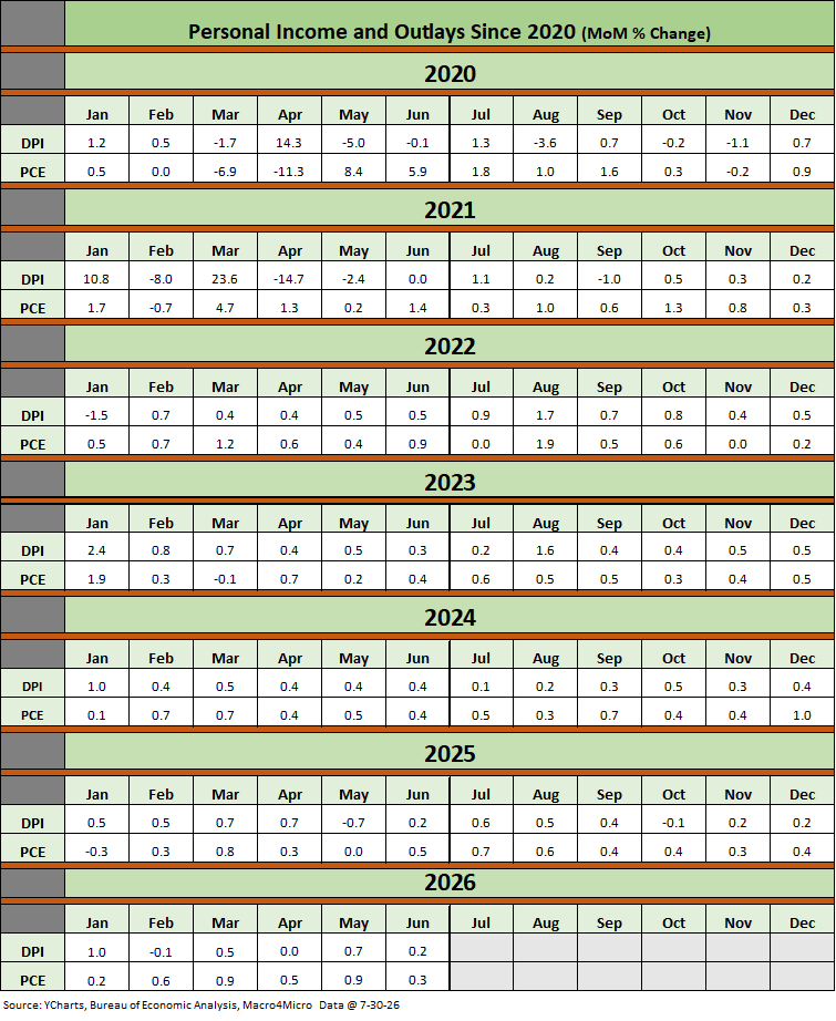
The above table plots the monthly Disposable Personal Income MoM change numbers vs. the Personal Consumption Expenditure MoM numbers across the years from 2020 through June 2026. It is an easy scan across key time periods for a look at turning points in DPI (e.g. stimulus payments) or PCE.
One exercise to do from time to time is to look at the table of reconciliation in the monthly PCE release for the granular dollar amounts on each DPI reconciliation line. The line items can sometimes show some volatility. We like to look for gaps between DPI and PCE and moves in Personal Savings. PCE had been running ahead of DPI in recent months.
It is always worth remembering that a tariff is a regressive tax that hits lower income consumers harder and the same for small businesses. The same is true in Medicaid costs based on the income brackets of Medicaid users. A loss of health care benefits and higher pharma costs present a zero-sum game with other consumption lines. The current trends in ACA premium spikes will also be a zero sum “game” for many budgets. Households have shifted to high-deductible plans or even ceased health care coverage entirely to “take their chances.” That is when consumers take on open-ended risk to medical care cost inflation.
This is where the “K recovery” can start to break down and create challenge to PCE growth and consumer credit quality. That has not shown up in the macro numbers on a broader scale at this point even as household budgets and balance sheets are getting stretched.
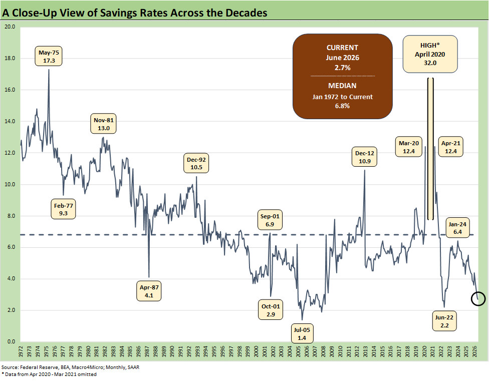
The above chart updates the running savings rate reconciliation that comes with the Personal Income and Outlays each month. We see a fresh low in June 2026 of 2.7%. That is the lowest savings rate during the Trump Administration.
The “Why?” of declining savings rates can be like a political Rorschach test on “buying on happiness” or “getting slammed on the prices of the household basket, tariffs and financing costs.” That is, some consumers may need to borrow to meet basic bills in the realm of the nondiscretionary.
The savings rate dipped below the 4% line in Oct 2025 and posted 3% handles and edged back above 4% for one month (Jan 2026). That savings rate decline can be a function of various forces, but the inflation trends (health care premiums, gasoline, home heating, and financing costs) and related household cash drain are eating more into real wages and the household bottom line.
See also:
2Q26 GDP: Good Underlying Numbers Despite Headline 1.5% 7-30-26
Market Commentary: Asset Returns 7-27-26
Yield Curve: Vegas Odds Keep Moving 7-26-26
New Home Sales June 2026: Soft Pricing, Tepid Volumes 7-25-26
Synchrony: Consumer Bellwether Reassures on Quality 7-23-26
Earnings Season Beckons: Homebuilder Stock Returns 7-20-26
Earnings Season Beckons: Comparative Auto Equity Returns 7-20-26
Housing Starts June 2026: 5 Units or More is Not a Crowd 7-19-26
Industrial Production June 2026: Sideways Syndrome 7-18-26
Company Profile: Ford Motor and Ford Motor Credit 7-17-26
Producer Price Index June: Still Hurts…Just Less 7-15-26
CPI June 2026: Eye of the Storm? 7-14-26
Existing Home Sales June 2026: The Stall is On 7-11-26
Employment Situation June 2026: Back to a Crawl 7-2-26
JOLTS May 2026: Openings Flat, Hires Down, Layoffs Up 7-1-26