
Footnotes & Flashbacks: State of Yields 5-27-24
We look at a slow week of modest adverse yield curve moves and static spreads.


Will he sleep through the entire inversion?
We just had another “negative bond math” week with modestly higher rates across the curve and econ releases on balance were more favorable than not for the cycle but the more important data lies ahead over the next two weeks.
We update the UST curve slopes for 3M to 5Y as those defensively positioned with high cash balances still ponder what the election will mean for a range of policies across areas such as taxes, EVs, energy infrastructure green-lighting, defense priorities, women’s reproductive rights, AI regulation, crypto evolution, and mass deportation military roundups that could bring dislocations in labor and consumption and possible civil unrest. It will be a long 5+ months.
This week we get the latest PCE report (Inflation, Income & Outlays) and the second estimate on 1Q24 GDP (see 1Q24 GDP: Too Much Drama 4-25-24) as PCE line items and the incremental changes in fixed investment add a lot to the next stage of the cyclical debate ahead of JOLTS and payroll the following week.

The above chart was added for some multicycle context around what “high rates” really look like now that we are out of the ZIRP and the “free money” world that distorted perspective since late 2008. Once you get away from those Fed-driven curve backdrops and look back to pre-crisis years, the closing UST yields on Friday are the lowest on the chart.
As we look at spreads and compare them to risk free alternatives, the periods such as 2006 and 2000 are very relevant. Looking back to the late 1980s and the first decade of explosive growth in credit markets and the rise of HY bonds, the 9.2% 3M UST in March 1989 offers an eye-opener.
Even if the transition from 1978 into the developing inflation crisis of 1979 and the 1980-1982 double-dip stagflation wars are a long way off, the risk of facing more shocks and stagflation is not zero. With so much policy uncertainty ahead, voters have a lot to think about. Unfortunately, facts and concepts are down the priority list in the Washington square-off.
Is clueless the “new normal”?
The above chart says that the current UST curve is the lowest in a cyclical peak since the explosive growth of the credit markets through 2008. The bipartisan, Fed-supported free ride since then has distorted perceptions. Today’s rates a quite low in historical context, but Biden’s inflation might be a dagger in his election like it was for Carter.
Of course, it is worth remembering Trump was screaming for negative rates in 2018-2019. His desire after the election is that he wants to subjugate the Fed to the Treasury department as reported in the Wall Street Journal. As the year goes on, we will see if anyone says anything specific and how strategists and asset allocators react.
Unfortunately, the choices do not get articulated in the cacophony of the hate-o-rama and murky nonspecific blather. We assume some political strategists are celebrating the Harris Poll last week that said 49% of the country thought the S&P 500 was lower on the year. Power brokers love ignorance and anger. It can be tapped in an election year. Political activists feed one with misinformation and turbocharge the latter.

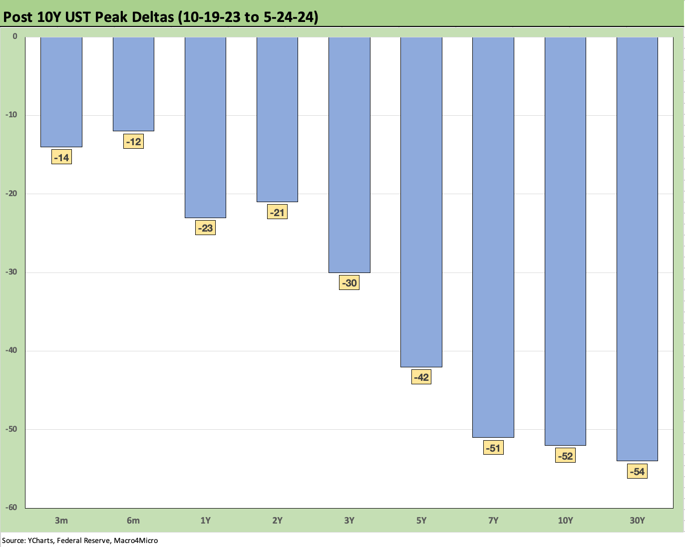
The above chart updates the move in the UST curve from 10-19-23, which was the peak of the 10Y UST. We detail the UST deltas for the running period from that date to the past Friday. We also plot the 12-31-23 UST curve and break out the bearish UST deltas YTD. We have still had a good rally from late Oct 2023, but duration has been taking a beating YTD. As a proxy for duration pain, the 20+ Year UST ETF (TLT) has generated a -6.4% total return YTD. That is not where the consensus was back in Dec 2023 even after a big 2-month rally in Nov-Dec 2023.
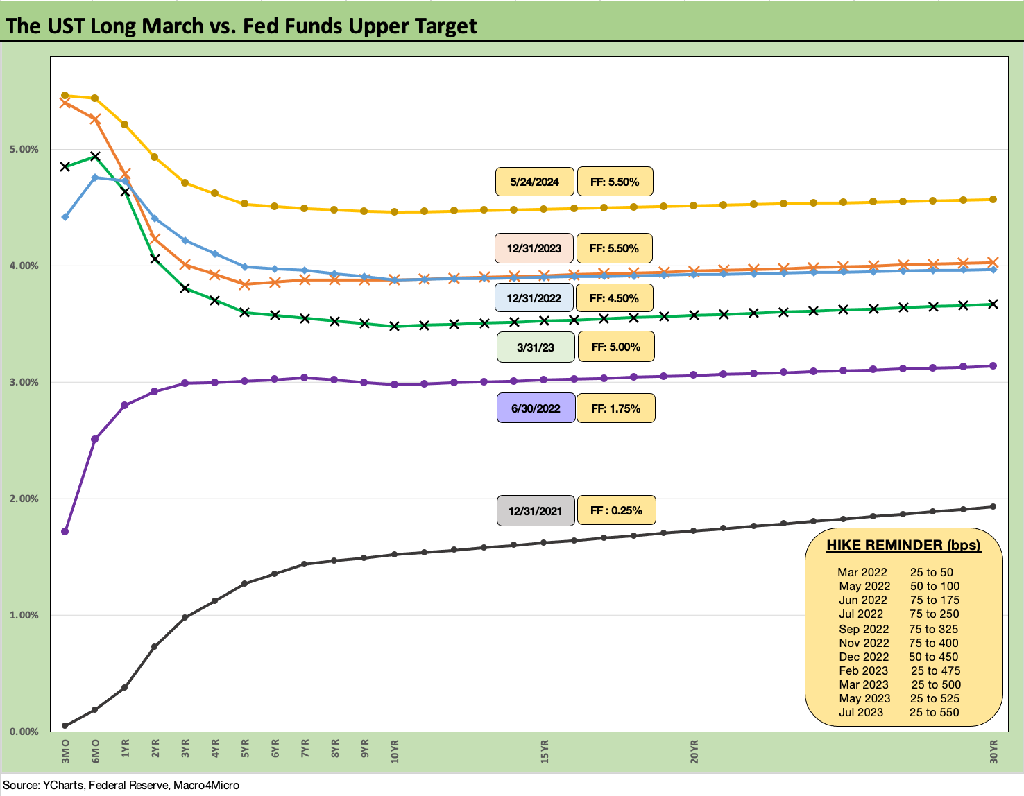
The above chart updates some notable dates along the UST curve journey with those moves framed by the 12-31-21 UST curve under ZIRP and at the top the latest UST curve. We include a memory box in the chart detailing the dates and size of hikes by the FOMC along the way.
We like to highlight the convergence of the 12-31-22 and 12-31-23 UST curves out the maturity spectrum and notably around 10Y UST and beyond. That convergence unfolded despite the 100 bps differential in fed funds. That begs the question: With an inverted curve, would a cut (or 2 or 3 cuts) in fed funds move the needle on 10Y UST with the record borrowing needs to be funded? Or will that require a recession being underway? We have some data points in the few years that certainly challenge the assumption that the long end will necessarily follow.

The above chart is the weekly UST deltas across last week. There were mild moves but adverse moves nonetheless for bond returns. For more details in asset returns this past week see Footnotes & Flashbacks: Asset Returns 5-27-24.
The above chart updates the running UST deltas from 10-19-23 through this past Friday. The bar chart offers a different visual covering what we discussed above.

The above chart updates the YTD UST deltas with another angle. We see the 2Y to 30Y looking more like a bear inversion in the middle of a major shift higher.

The above chart updates our weekly mortgage chart where we frame the latest Freddie Mac 30Y UST benchmark and UST curve vs. those seen in the peak year for homebuilding (2005) and the period in mid-2006 when the RMBS cracks and subprime quality woes were starting to creep into the light. We use June 2006 for that purpose. For this past week, the 30Y mortgage rate ticked lower again and moved back under 7.0% to 6.94%.
Those housing bubble backdrops make for an interesting comparison. As we know now, the fuse was burning down rapidly in the summer of 2007 as a series of explosions began with hedge funds in the summer and Countrywide M&A bailout (BofA) underway. Then came the big bangs in 2008 stretching from March 2008 (Bear) to the Sept 2008 end of the world (Lehman, AIG, etc.).
The chart shows higher mortgage rates today despite the yield curve now being well below 2006 and slightly higher out the curve relative to 2005. The front-end inversion could not be more starkly different than those periods despite the rapid tightening cycle and bear flattener of 2004-2006.
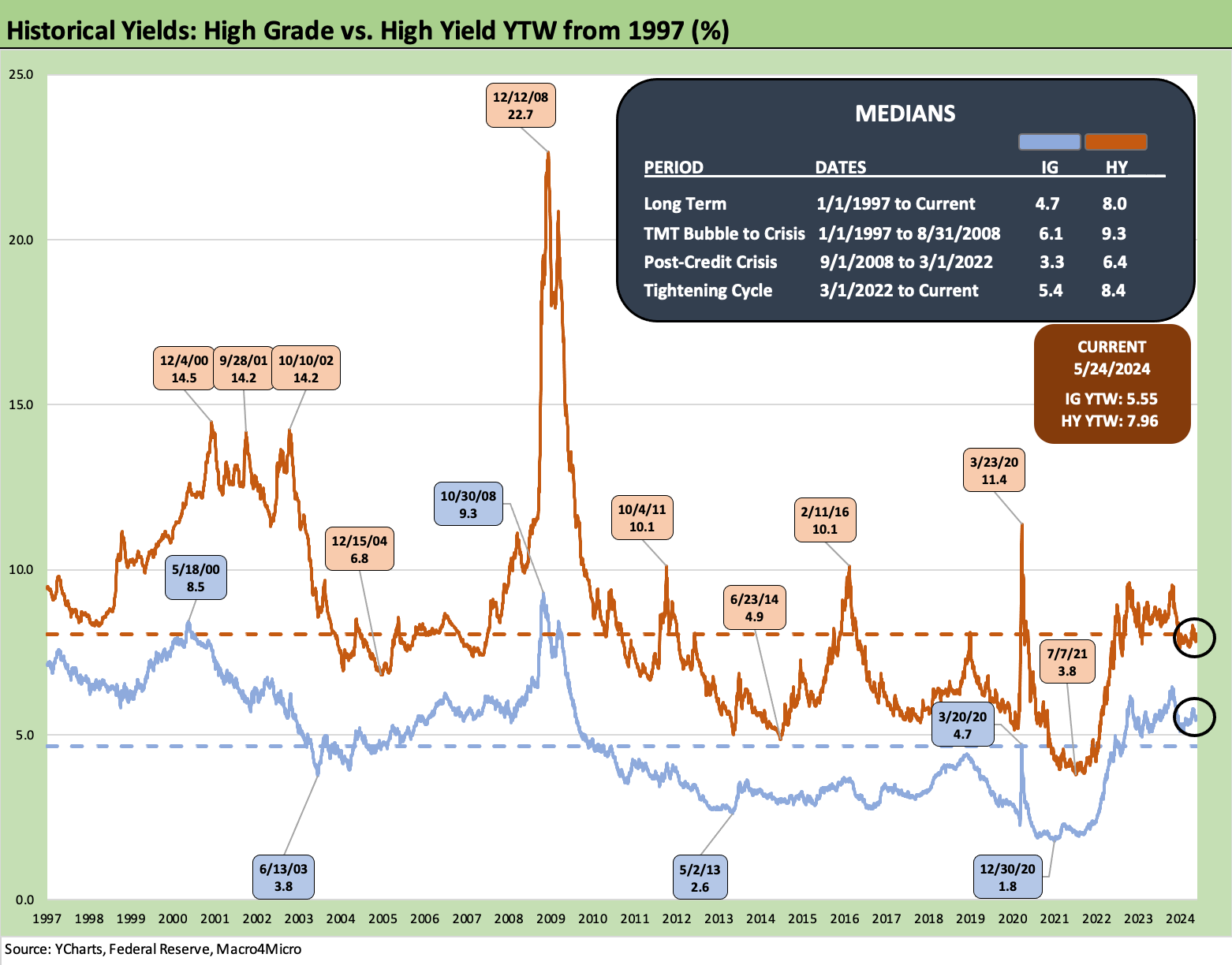
The above chart updates the index yields since 1997 for IG and HY. We highlight the pre-crisis medians of 9.3% for HY and 6.1% for IG as the more relevant frames of reference for today’s credit markets than the long-term median of 4.7% for IG and 8.0% for HY that includes so many ZIRP years. The interesting thing about the 8.0% long term median is that it includes much wider median spreads than what we see in the market today. Spreads in IG and HY are today more in the zone of past credit peak periods with the exception of the most extreme lows for HY in Oct 1997 and June 2007.

The above chart uses a historical frame of reference for Friday’s closing IG index an exercise similar to what we did with the Freddie Mac mortgage rates. We plot the UST curve above for this past Friday as well as UST curve from the credit cycle peaks of late 1997 and mid-2007. At +89 bps on the IG index to end last week, there was no movement over a slow week.
The UST curves drive the historical story on IG all-in yields with the 1997 IG yields above 2007, and 2007 above current 2024 IG yields as noted in the box. All three periods had tight spreads as we detail in the next chart.

The above chart provides some history of the time series of IG spreads with some of the lows and highs noted. Current IG spreads of +89 bps are well inside all the period medians and long-term median framed in the box in the chart. The low tick IG OAS of +53 bps in Oct 1997 is much lower than the +89 bps at Friday close and the May 2005 low of +79 bps is modestly lower.

The above chart does the same exercise for the HY index and UST curves that we did for IG. We use the same dates for the UST curves and HY index (horizontal line). The June 2007 and current HY index yields are in a dead heat at 7.96% but with June 2007 HY spreads tighter at +298 bps to end June after hitting a low point below +250 bps early in June.
For 1997 and its 8.6% YTW at 12-31-97, the lows of +244 bps in Oct 1997 saw spreads head wider to +296 bps by year end (12-31-97). At +311 bps to end last week (5-24-24), HY index spreads are not far from such frothy periods of HY market history.

The above chart updates the “HY OAS minus IG OAS” differential. This metric can be used as somewhat of a proxy for the credit compensation you get when stepping down from the IG basket into the speculative grade basket.
There are the usual asterisks of rating tier mix and industry mix with the main difference across the timeline being the BB heavy mix in today’s speculative grade index relative to the “HY Classic” focus on the B tier and below in the 1990s and earlier (daily OAS histories essentially started in 1997).
For the HY vs. IG OAS differential, the current +222 bps is well inside the long term median of +330 bps and the pre-crisis (2001-2007) cycle median of +309 bps and post-COVID median of +282 bps.
As we look back at low points, there is nothing quite like the +147 bps low of June 2007, but the +187 bps of Oct 1997 is not as far away from today. Low HY index spread dates such as June 2014 (differential of +228 bps) and Oct 2018 (differential +205 bps) did not hold up for long and were subject to almost immediate widening over the following weeks. The same is true for June 2007 although the 1997-1998 period was fairly resilient until the summer of 1998 whipsaw with Russia and LTCM market events that sent the Fed to the rescue.

The above chart updates the “proportionate risk premium” for HY spreads. We frame the risk premium (spreads/OAS) divided by the 5Y UST on the basis that it reflects the incremental yield received vs. the risk-free asset.
The metric is just a simple twist on the old theme of getting paid more for higher risk. At 0.69x, the current compensation is well below the long-term median from 1997 of 1.96x. We see low points along the way of 0.49x in June 2007 and 0.39x in May 1997.
The conclusions for absolute spreads and proportionate spreads are the same – very tight and offering low credit risk compensation. That view will still turn on an investors view of the market risk profile for a given industry mix and ratings tier mix and how long fundamentals can hold up.

The above chart moves on to our updates on UST slopes. We include the recent slopes (inversions for all except 5Y to 30Y) in the box. This chart looks at the long-term time horizon from 1984 and the next chart shortens up the timeline from the start of 2021.
This week we look again at the 3M to 5Y slope. With the inversion positioned as it is at -93 bps, the extension compensation and term premium on an all-in yield basis has been a barrier for many, but coupon income, spreads, and asset class mandates all come into play.
In the end, you are not getting paid fairly to extend with tight spreads, too many low coupons, and an inverted yield curve. As more new issue at current coupons come to market, the mix will get more attractive with a wider array of higher income securities in the mix than the many 3% and 4% handle coupons in HY coming out of the ZIRP years and overdue for refinancing and extension.

The above chart shows the UST slope swing from ZIRP in 2021 across the tightening cycle through this past Friday. We see a peak of +221 bps in May 2022 down to a peak inversion of -197 bps then on through the current inversion of -93 bps.
The role of cash returns in asset class selection remains very much part of a core allocation strategy and the need to give consideration to time horizons and events ahead. The weighting is subject to one’s views of how the key variables will play out whether in terms of inflation, the FOMC, trade wars, or extreme domestic policy actions (or inaction such as debt ceiling cooperation across parties).
The tricky part is not only tied to election outcomes but also assessing how much economic disruption might be associated with such policies as mass deportations and higher taxes and trade aggression among others. “Roll your own scenario” can directly influence the timing of cash deployment. The 5% on cash can ease the pain of uncertainty or indecision.
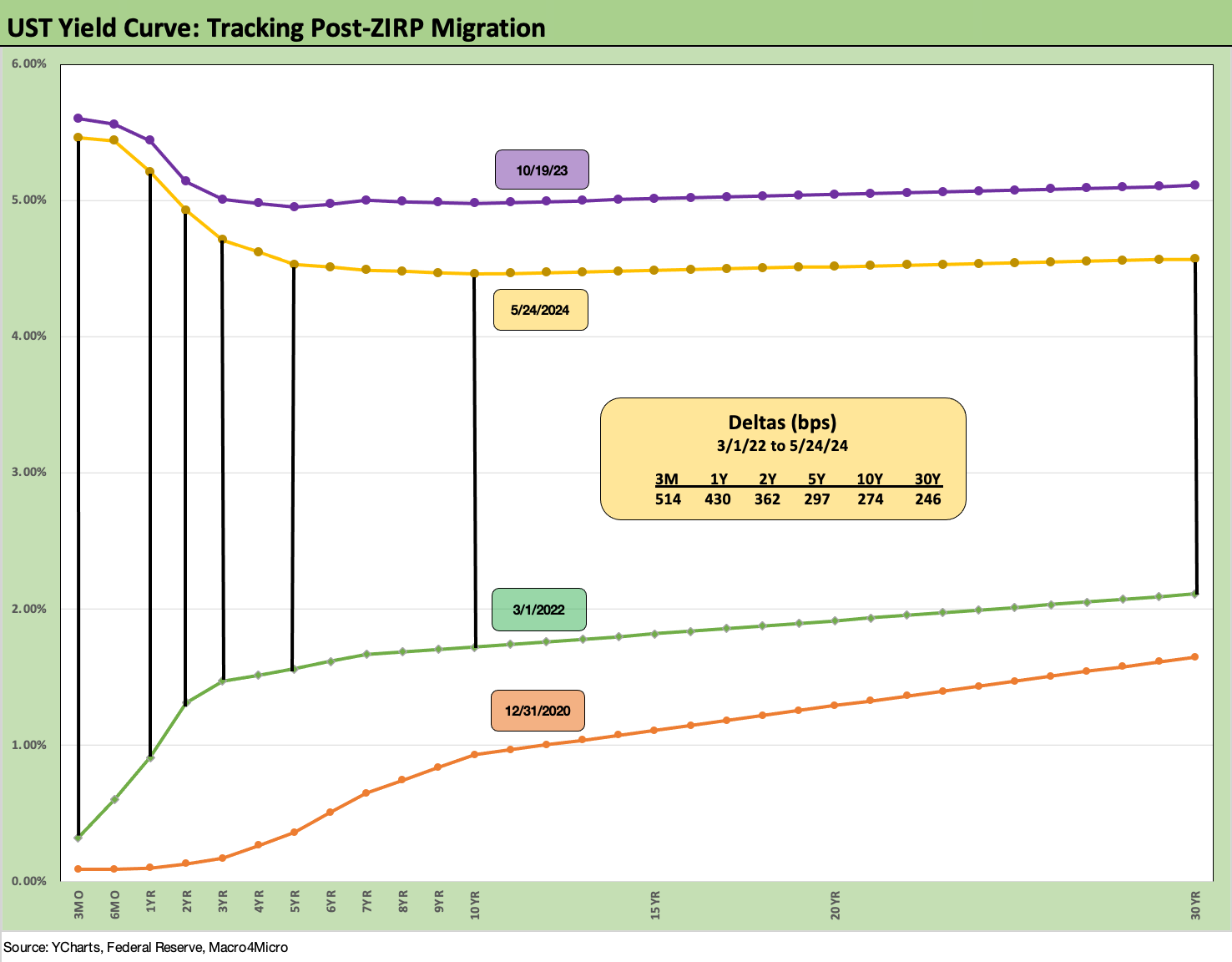
We wrap with our usual final chart that updates the running UST deltas from the end of ZIRP in March 2022. We include the 10-19-23 peak and 12-31-20 UST as frames of reference. The inversion will continue to shatter records for longevity.
See also:
Footnotes & Flashbacks: Asset Returns 5-27-24
Memorial Day: Ponderings for Donny the Dodger 5-26-24
Durable Goods: Staying the Cyclical Course 5-24-24
New Home Sales April 2024: Spring Not Springing Enough 5-23-24
Footnotes & Flashbacks: State of Yields 5-19-24
Footnotes & Flashbacks: Asset Returns 5-19-24
Industrial Production April 2024: Another Softer Spot 5-16-24
Housing Starts April 2024: Recovery Run Rates Roll On 5-16-24
CPI April 2024: Salve Without Salvation 5-15-24
Retail Sales April 2024: Get by with a Little Help 5-15-24
Consumer Sentiment: Flesh Wound? 5-10-24
April Payroll: Occupational Breakdown 5-3-24
Payroll April 2024: Market Dons the Rally Hat 5-3-24
Employment Cost Index March 2024: Sticky is as Sticky Does 4-30-24
PCE, Income, and Outlays: The Challenge of Constructive 4-26-24
1Q24 GDP: Too Much Drama 4-25-24
Systemic Corporate and Consumer Debt Metrics: Z.1 Update 4-22-24