
Footnotes & Flashback: State of Yields 5-19-24
We update UST, IG and HY yields after CPI and muted retail sales offered some mild relief from the cumulative setbacks for UST bulls.


It keeps getting uglier, so when will the market flag actual vs. theoretical policy risk?
A mild relief rally in the form of a very modest bear flattener of the UST curve helped fixed income returns but really energized equities with the S&P 500, NASDAQ and Dow hitting new highs during the week while the small caps still have a long way to go.
Credit spreads barely moved on the week with IG flat and HY slightly tighter as IG remains in the zone of compressed averages seen in 1997-1998 and across 1H04 to 1H07.
HY spreads still sit inside the post-crisis credit peak lows of June 2014 and Oct 2018 but are comfortably wide to the extreme 200-handle tights of Oct 1997 and June 2007.
After a strong earnings season overall, there was not much for UST bulls to grasp onto in the current metrics even though retail reporting season is starting to weigh in with a mix of news as Home Depot (bad) and Walmart (good) offered a split decision with a lot more to come this week after a lagging April 2024 retail sales release this past week.
For the coming week, the market awaits FOMC minutes and a few other useful indicators we like to watch including existing home sales, new home sales, and durables.
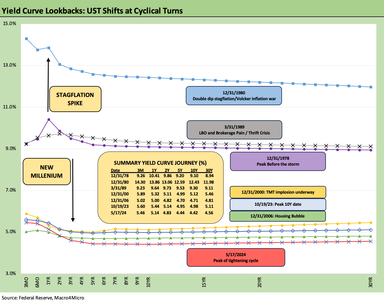
We recently added the above chart to our weekly for a useful historical gut check on where today’s UST curve sits in historical context. The timeline runs across the late Carter years (1978 inversion), the Volcker inflation wars, the 1980s bull market on through the Greenspan years (from 1987) into the age of recession hyper-easing and the systemic crisis as many began to believe that ZIRP or minimal rates were “normal.” People forget Trump was screaming at Powell for negative rates in 2018 and 2019 during the longest expansion in history before COVID sent us back to ZIRP.
The obvious point in the cyclical comparison of the UST curves is that current rates are the lowest one on the chart. There were certainly lower UST curves during the ZIRP years, but the comparisons to 2006, 2000, 1989, 1980, and 1978 have relevance to the markets today on what constitutes “high” interest rates outside the 100-year flood events of 2008 and 2020 (Yogi Berra would have said “100 years is a lot shorter than it used to be”).
For those who have not yet graduated to fossil status, we have some linked content in our collection for lookbacks at the wild curve action of the late 1970s cyclical turn and late 1980s cyclical transition into the first major HY default cycle (see UST Moves 1978-1982: The Inflation and Stagflation Years 10-18-23) and (see UST Moves: 1988-1989 Credit cycle Swoon 10-21-23).
As seen in the summary box in the chart, even during the late 1980s there were times an investor could get paid more in 3M UST than the HY index today. That gap vs. the late 1980s period (see the March 1989 UST curve in the above chart) is now close with HY repricing closer to 8% now.

The above chart details the UST deltas from the peak 10Y UST date of 10-19-23, which was not long before the Nov-Dec bull market rally for UST and equities kicked into gear. The yield curve delta from 10-19-23 is still impressive, but the YTD adverse shift in the UST curve took back quite a bit (but less after last week).
We break out the deltas in the box in the chart, and the 10Y UST is +54 bps higher YTD but still -56 bps lower from the peak in Oct 2023. The differentials in the 2Y UST are more pronounced with the 2Y UST -31 bps lower since 10-19-23 but +60 bps higher YTD.

The above chart updates the transition of the UST curve across the tightening cycle with the main focal point for us being the convergence of the 12-31-22 and 12-31-23 UST curves despite 100 bps in tightening. That data point can keep one debating whether an easing move on the front end necessarily takes the 10Y UST lower with it – and by extension mortgage rates.
We include a memory jogger box on FOMC actions with the dates and size of the hikes. We also include the 12-31-21 UST curve as a frame of reference ahead of the end of ZIRP (effective March 17, 2022).

The above chart breaks out this week’s UST deltas, and we see a modest move lower. The result brought some good news to bonds. As bull flatteners go, it was not too exciting relative to the equity market enthusiasm around the CPI release on the same day retail sales showed some lags (see CPI April 2024: Salve Without Salvation 5-15-24, Retail Sales April 2024: Get by with a Little Help 5-15-24). The softer CPI and consumer signals flowed into equities and brought multiple benchmark all-time highs across the S&P 500, NASDAQ, and Dow.
As we cover in our separate “Footnotes” publication on asset returns (to be posted later today), we saw all the bond ETFs we track all in the positive range (not a common event in 2024). The long duration 20+ Year UST ETF (TLT) posted a weekly return around the middle of the second quartile of our 31 benchmarks/ETFs. Of the 6 bond ETFs we track (TLT, GOVT, AGG, LQD, HY, EMB), all were in the positive range for the week, and 4 of 6 made it into the third quartile even in a big equity performance week. Only HY of the 6 bond ETFs ended up at the top of the bottom quartile since the duration benefits were less and spreads tightened only by +3 bps on the week.
For a frame of reference, looking back over the 1-month horizon, the bond ETFs show 5 of 6 in the bottom quartile of returns. Only the EM Sovereign ETF (EMB) made it across the line into the bottom of the third quartile for the 1-month period. For the rolling 3-months period, 4 of 6 were in the bottom quartile with HY breaking out on spread compression and less duration exposure. EMB led the bond ETF group in the middle of the third quartile with TLT negative and second to last across the 31.
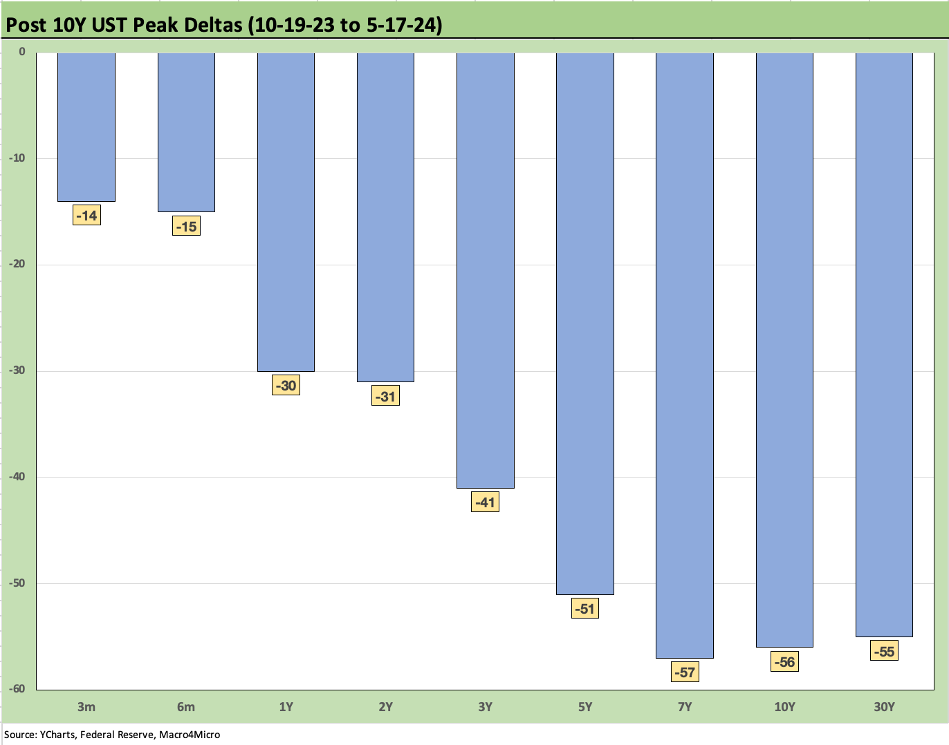
The above chart just offers another visual on the UST deltas from the 10-19-23 peak through this past Friday. The bull flattener has been kind and those looking for lower inflation and Fed easing tend to use this as a minimum expectation for their 2024 rebound from this point given the adverse shift seen YTD in the next chart. The similarities of recent macro metrics to what was seen across Aug-Sept 2023 keeps the tease alive of fresh rallies in the UST.

The above chart updates the painful UST bear upward shift in the UST curve in 2024 YTD. The biggest moves higher were from 2Y to 5Y.

Mortgage rates took a minor move lower (to 7.02% from 7.09% last week) for the latest Freddie 30Y benchmark shift. We cover quite a bit on the housing sector in the macro releases and in single name coverage, and we address many of the mortgage and affordability issues elsewhere in our work. This chart above is meant to highlight what the UST curve and mortgage rates look like today relative to the housing bubble peak in 2005 and 2006.
The peak homebuilding year was 2005 and mid-2006 was when the excesses of mortgage credit and subprime RMBS were starting to show cracks. We see the UST curves plotted and how unusual the current inversion is relative to those markets. The 30Y mortgage keys off the 10Y and the UST curve of this past Friday is slightly above 2005 but well inside June 2006. Despite those UST relationships, 30Y mortgages today are higher than 2006 and 2005.

The above chart updates the long-term time series for the ICE IG and HY indexes with various time horizon medians detailed in the chart. We look at the pre-crisis median as the most relevant since we have now graduated from the ZIRP years (in theory). That means the median HY of 9.3% and IG index of 6.1% should be a better frame of reference as the perspective distortion of the credit crisis and pandemic relief wear off.
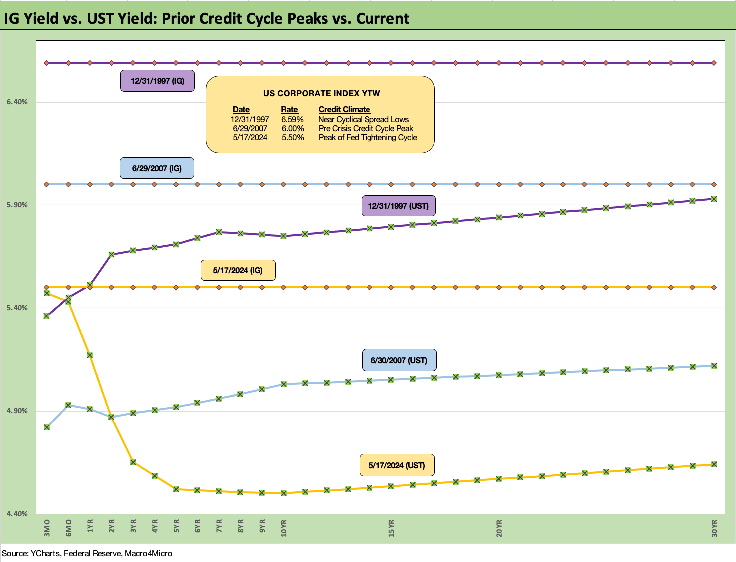
The above chart does a similar historical comparison drill as we used for mortgages. We plot the IG index yields on the horizontal lines for the Friday IG index close (5.50%) vs. those from prior, the notorious credit cycle peak periods of late 1997 and June 2007. We include the UST curves from those periods as well. Today’s UST curve is much lower.
The comparison for IG across these cycles is more rational with IG spreads tight today even if not as low as the tights of late 1997 (+53 bps in Oct 1997, +70 bps at year end). Today’s IG spreads have a lot in common with the 1997-1998 average as well as the 1H04 to 1H07 period of excess.
Investors are sensitive to the fact that 2007 did not end well for IG as the markets started to see serious problems, but the protracted tight spreads lasted a few years in the late 1990s. Obviously, HY spreads were severely punished in the 2000-2002 period and were crushed after the June 2007 peaks as the crisis spiked in late 2008. We look at some of those timelines in the next series of charts.

The above chart plots the IG OAS time series across the period from 1997. The current +89 bps looks more like some of the averages we can derive from prior credit cycle peaks but are only modestly higher than the low tick of 2005. The June 2007 IG OAS was slightly higher but that was set against an extraordinarily tight HY OAS. We look at the IG vs. OAS relationship in a separate chart further below. The IG OAS during Oct 1997 was in a different world and ended that year around +70 bps.

The above chart does the same exercise for HY at the late 1997 and June 2007 credit peaks. The UST rates beyond 2Y UST are much lower today as evident in the UST curves above, but the all-in yields of May 2024 vs. June 2007 are clustered on the horizontal lines given how low spreads were in June 2007.
Current HY OAS as of this past Friday was very tight at +309 bps. During June 2007 and Oct 1997, the market saw HY OAS dip below the +250 bps threshold. HY at the end of 1997 stood at +296 bps or only slightly inside where we are now.
One can debate the vulnerability of the credit markets at this point vs. 1997 and 2007. The 2007 period was a ticking nuke. The late 1990s period was more about deal quality, secondary market depth, and how the macro picture and economic cycle framed up against the credit cycle. The economy is performing well now even if forecasts can be debated. We get a second cut of 1Q24 GDP data on May 30. Growth has seen favorable depth and breadth so far across PCE and corporate investment (see 1Q24 GDP: Too Much Drama 4-25-24, 1Q24 GDP: Looking into the Investment Layers 4-25-24).
As we have covered in other commentaries along the way, the 2001 recession onset was the mildest in postwar history while the credit default cycle was the longest (not the highest). Despite all the to and fro on private credit theories and where that might head, this current HY market and origination cycle is vastly higher quality than what was starting to rot in 2000. Today’s HY market is BB heavy and running at very low default rates in historical context with much lower coupons.
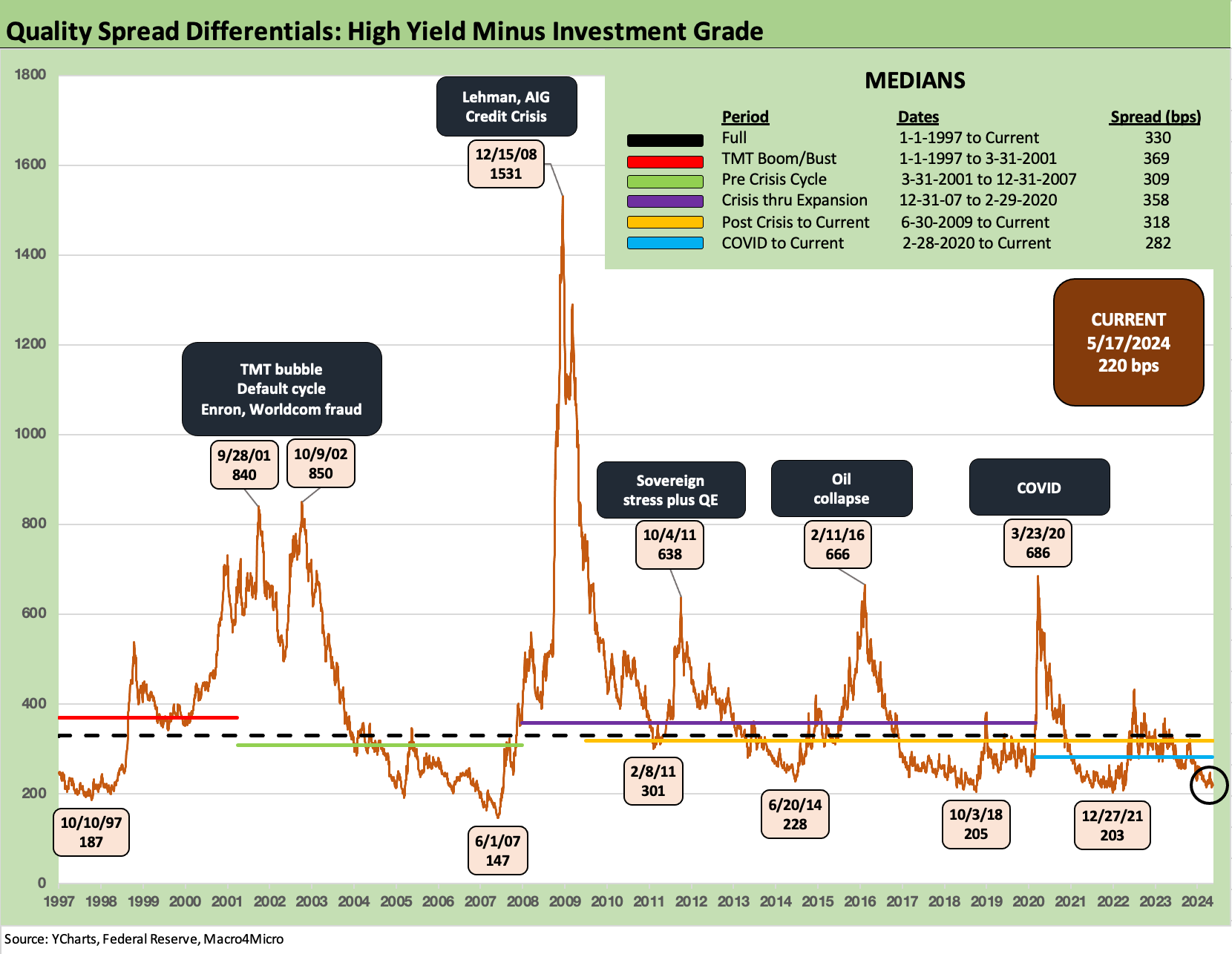
The above chart updates the IG vs. HY quality spread differentials. The risk premium differential essentially is an indicator of relative compensation for moving down the credit spectrum. Such comparisons always come with the asterisk of industry and issuer mix as well as weighted averages of ratings such as the BBB heavy IG index and the BB heavy HY index vs. the late 1990s and early 2000s.
At +220 bps, the HY-IG differential is extremely tight vs. the long-term median of +330 bps. We see the low +200-bps range in the spread tights of Oct 2018 and June 2014. Those tights of June 2014 and Oct 2018 ended badly and for HY energy very painfully in 2015-2016. During Dec 2018, CCCs were in freefall. The Saudi price war explains the first post-2014 chaos, but the 4Q18 risk pricing cratering so soon after a cyclical low was harder to delineate at the time although oil did briefly plunge in 4Q18 again after being at a post-2014 high not long before.
Framing the “trigger” event in this cycle is tricky, but there are a whole lot of question marks ahead depending on whether you like your flag with the “union” upside down or in the upper left (as the flag laws and regulations demand).
One question is whether something that is more about exogenous risk factors prompt a late 2018 style trigger point in late 2024 or early 2025 for risk repricing. Will mass military action to identify and report undocumented workers or an even more massive deportation process be the trigger in 2025? That would have an impact on PCE and labor supply. Would a new President send troops into blue state cities or just “blue cities” to put down protests? Will we kickstart the trade clash with China in 1Q25? Will tariffs be turbocharged? Will we cross the border into Mexico to hit cartels and would that flow into USMCA/NAFTA functioning? The term “exciting times” may not quite capture the risks ahead.

The above chart updates the proportionate risk premium for HY bonds. We take the HY OAS and divide that by the 5Y UST. We pick the 5Y UST since it is in the zip code of the duration of the HY index. It is a simple ratio to make a simple point and consider a simple question: Relative to the risk-free asset, how much incremental yield do I get paid to take HY credit risk vs. zero-default risk? This is where private credit has a better story to tell.
At 0.69x, the ratio is dramatically below the median of 1.96x but above the 0.49x low of June 2007 and 0.39x in May 1997. As a reminder, the summer of 2007 was a suspended animation in the credit markets, hedge fund canaries were collapsing, Countrywide was looking for a bailout, and Bear’s #2 exec was pushed out in summer 2007 and in turn sold his stock for a fortune (greatest thing that ever happened to him in that windfall with the clock ticking to the Bear collapse in March 2008).
The timeline for HY OAS vs. 5Y UST tells a story even though I have stopped believing that the tribal maniacs that roam Washington (current and future) would protect the UST from default. After all, Trump recommended it in a CNN Town Hall meeting. It is still useful at least as a frame of reference.
Some of the most hardline types play chicken with default even while saying they are against default. If you support sacking the capital, Jan 2025 dates offer a fresh bite at the debt ceiling debate. That seems a long way off, but the markets will get some specific color on policy by the election—hopefully. It is very hard to factor in policy risk at this point. As of now, the probability of extremely damaging economic policies (vs. sustained, extreme noisiness) is more than zero.
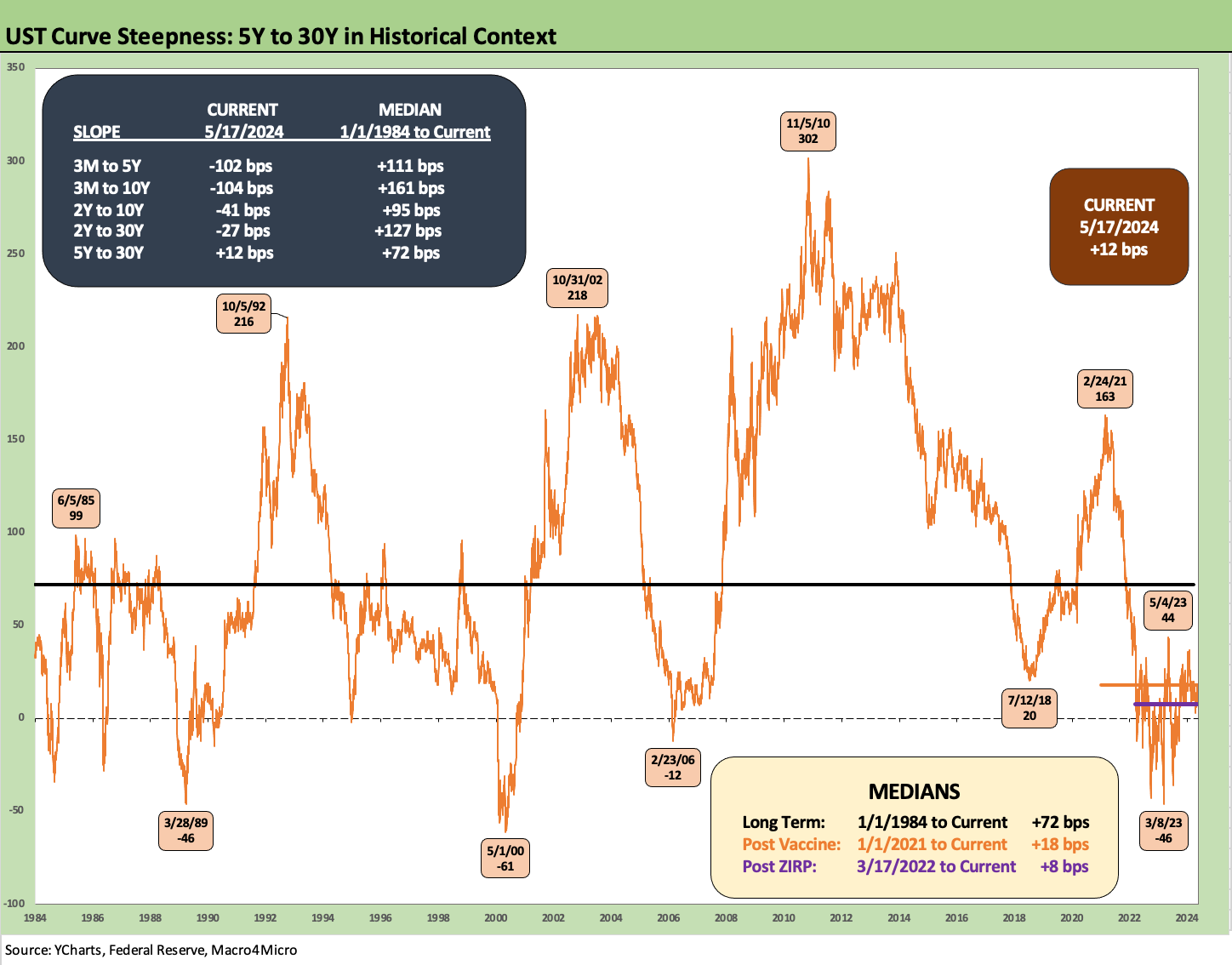
The above chart updates the UST slope for 5Y to 30Y. We also detail the other UST segment slopes we like to watch with the Friday close and long-term medians from 1984. As a reminder, we chose the start date of 1984 to get clear of the double dip recession and some of the most extreme UST moves of the Volcker inflation fighting period during 1980-1982. The economic recovery kicked into high gear in 1983 (Nov 1982 trough) and the bull market in equities was underway.
That 5Y to 30Y segment slope is interesting in terms of risk premiums (or absence of) for maturity extension and is one part of the usual UST segment monitoring. The 5Y to 30Y is at least upward sloping even if at only +12 bps vs. the long-term median from 1984 of +72 bps.

The above chart shortens up the time horizon for the 5Y to 30Y slope to get a better visual on the ride across the credit cycle from the start of 2021 during ZIRP. The move to a steep slope of +163 bps in Feb 2021 then goes on the wild ride across 2022 and 2023 with a -43 bps low in Sept 2022 exceeded in March 2023 at -46 bps. The median across this short period was +18 bps.
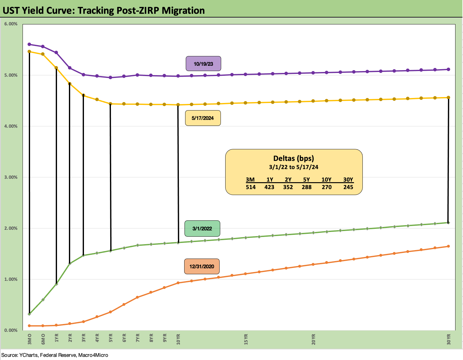
We wrap with our usual series of UST curves that cover the running UST deltas from the start of March 2022 (ZIRP ended during March 2022 effective March 17) through the past Friday close. We include the “bear inversion” UST deltas in the box. As an example, we see the 3M UST at +514 bps, the 2Y UST at +352 bps, the 10Y at +270 bps and 30Y at +245 bps.
We will not get another inflation read until May 30 with the PCE release (Income & Outlays) on the day after we get the next read on 1Q24 GDP second estimates. 4Q23 had some big moves across the estimate updates, so the PCE breakdown for 1Q24 and the Fixed Investment mix changes will be interesting with the cycle debate staying hot.
See also:
Industrial Production April 2024: Another Softer Spot 5-16-24
CPI April 2024: Salve Without Salvation 5-15-24
Retail Sales April 2024: Get by with a Little Help 5-15-24
Footnotes & Flashbacks: State of Yields 5-12-24
Footnotes & Flashbacks: Asset Returns 5-12-24
Consumer Sentiment: Flesh Wound? 5-10-24
April Payroll: Occupational Breakdown 5-3-24
Payroll April 2024: Market Dons the Rally Hat 5-3-24
JOLTS March 2024: Slower Lane, Not a Breakdown 5-1-24
Employment Cost Index March 2024: Sticky is as Sticky Does 4-30-24
PCE, Income, and Outlays: The Challenge of Constructive 4-26-24
1Q24 GDP: Too Much Drama 4-25-24
1Q24 GDP: Looking into the Investment Layers 4-25-24
Durable Goods: Back to Business as Usual? 4-24-24
Systemic Corporate and Consumer Debt Metrics: Z.1 Update 4-22-24