Footnotes & Flashbacks: Credit Markets 8-26-24
A risk rally sees tighter spreads and favorable duration returns as a volatile August winds down and the fed funds cut handicapping rolls on.
It is what’s under the surface that worries me…
A friendlier yield curve backdrop is feeding into risk pricing in both equities and credit and helping credit markets post improved running total returns and a rebound in excess returns after the early Aug volatility saw sharp but brief setbacks.
With the home stretch to the election underway, the competing forces include a more supportive FOMC, constructive bank system health, and balanced industry fundamentals on one side but a growing sense of policy anxiety (tariffs, mass deportation, taxes, deficits, US political instability) on the other side.
The next round of 2Q24 GDP revisions, PCE inflation, and then August payroll will set the terms of the -25 bps vs. -50 bps debate, but the normalization of the inversion will take more than 50 bps as the fall proceeds to get back into semi-normal UST curve shape.
The total returns and excess returns by credit tier YTD at least now have positive UST returns added to positive excess returns across the full credit spectrum. As we cover in our weekly review of asset returns, the recent UST rally had driven positive returns in the various UST and bond ETFs (see Footnotes & Flashbacks: Asset Returns 8-25-24). We also see the UST deltas YTD and from the Oct 2023 yield curve peak rate on the 10Y UST showing favorable moves for duration (see Footnotes & Flashbacks: State of Yields 8-25-24).
The UST curve trends and overall mix of factors in the macro backdrop have fed into bullishness in equity markets for interest rate sensitive subsectors with Homebuilders right up at the top but banks and real estate related sectors also riding the wave. As we cover below, HY spreads have rebounded impressively from the two days of carnage in early August that saw Aug 5 HY OAS close at +393 bps vs. the recent Friday (8-23-24) close of +319 bps. That run from Aug 5 with its intraday VIX spike to 65 marks a tightening through this past Friday of -74 bps narrowing from the peak of the selloff.
The above chart updates the running excess returns for the IG index vs. the HY index, and the relationship is in the right order at +263 bps for HY comfortably above the +126 bps for IG. Investors are getting paid more for taking more risk, and that relationship does not always work out too well in late cycle markets facing mixed risks. So far, the consumer and corporate sector earnings have held in well with some signs of flagging PCE that we will get updates on this coming week in the fresh data.
The BBB vs. BB excess returns along the credit tier midsection had earlier shown signs of a low-value convergence of running excess during the summer, but BBB vs. BB is now getting back into a healthier relative excess return relationship. We look at those credit spread relationships in more detail further below.
The B vs. CCC tier running excess returns are in a healthy relationship although the threats to a major decompression wave in the bottom of the credit tiers always lurks based on historical trends in HY OAS behavior patterns. We did a deeper dive in the past on the B vs. CCC history in an earlier commentary (see The B vs. CCC Battle: Tough Neighborhood, Rough Players 7-7-24).
From our vantage point, the CCC tier has always been about name picking rather than composite tier OAS with such a wide range of dollar prices and risk profiles. The all-in yields of the CCC tier is in the zone of equity-like returns and the 20-point discount to par leaves a lot of room for those who think they can pick the best values until the point of refi and extension and the pull to par.
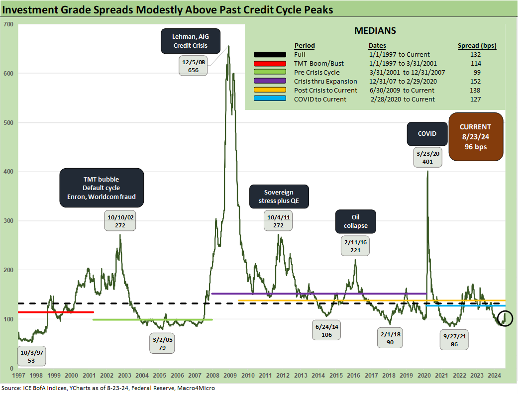
The current backdrop in IG spreads is back down in the range of past cyclical lows seen in 2021, 2018, and 2014 even if above the 2005 lows and nowhere near the Oct 1997 lows of +53 bps. The credit market peak of June 2007 has been detailed in past commentaries, and IG OAS was around +100 bps to end June 2007 or essentially on top of where the market is today.
That booming credit period of 1H07 generated IG OAS at an average of+86 bps. The 1H04 to 1H07 credit boom averaged +93 bps. The 1997-1998 timeline posted an average OAS of +95 bps despite summer 1998 volatility. The ability to post such sustained tight spreads reinforces the view that low IG spreads can stay firm for protracted stretches of time.
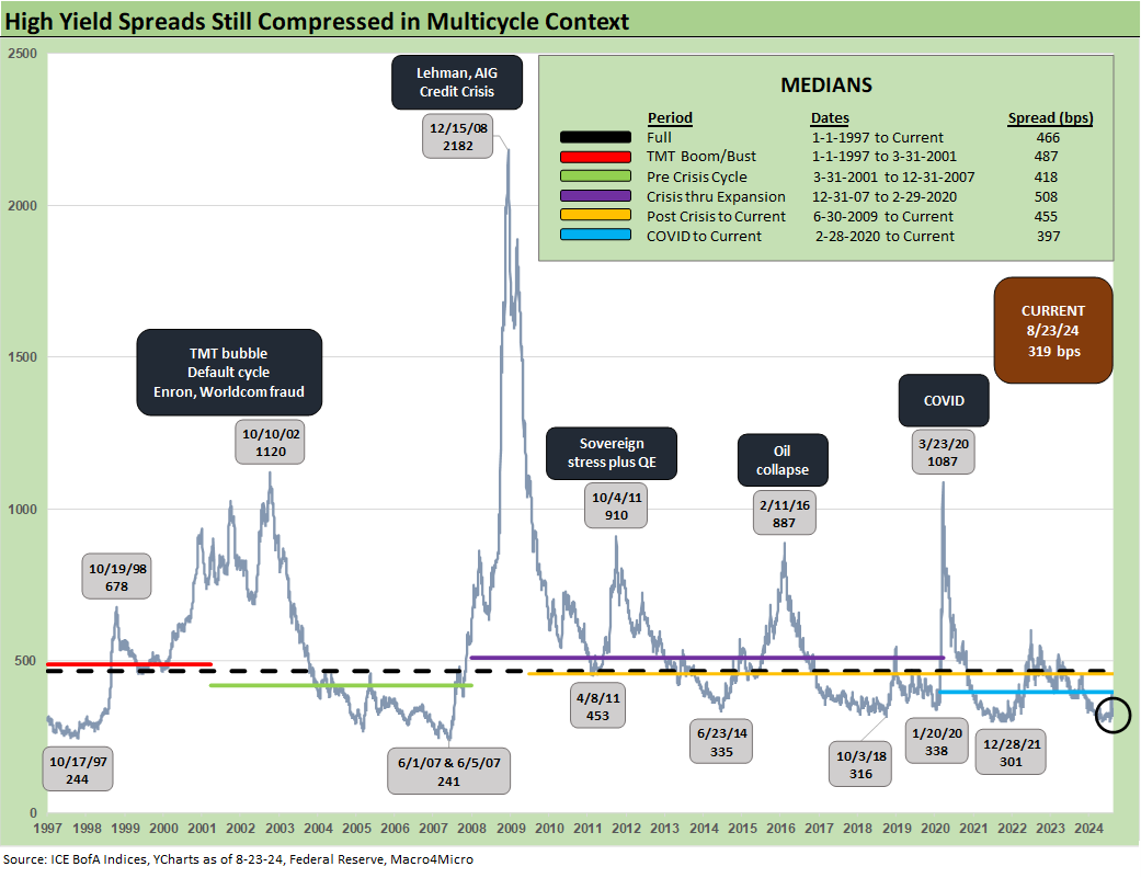
The rapid rebound from the early August selloff puts the HY OAS of +319 bps at Friday close back in the area of multiple HY OAS index lows even if well above the early June 2007 low of +241 bps. We always highlight that June 2007 ended at +298 bps, which is a few good months (or very good weeks) from where HY spreads are today.
The HY market history should always keep an investor on edge in late cycle periods where pivotal events are ahead (FOMC actions, elections, etc.). In a sign of what sustained spread widening looks like if a lot goes wrong, the year 2007 ended at +592 for a +351 bps move off the June 2007 lows.
The “HY minus IG OAS” differential of +223 bps is back down in the compression zone and well below the long-term median of +328 bps. The low point in June 2007 of +147 bps reminds us of what a bubble looks like, and that was a riskier issuer mix back then in HY relative to what we have in the HY market now.
We update the proportionate risk premium chart above where we frame HY OAS vs. the 5Y UST. With the recent move of the UST curve, the comparison was worth an update. The HY OAS/5Y UST ratio is just a snapshot.
The relative compensation vs. the risk-free asset is near the post-2007 low zone at .87x vs. the long-term median of 1.96x as seen in the chart. The Oct 2018 cyclical low in HY OAS was 1.05x as noted. The same theme of extreme spread compression and credit peak pricing is seen in this relationship as well.
The “BB OAS minus BBB OAS” is back down in the 60-handle range after gapping earlier in the month to +112 bps. The Dec 2019 lows of +57 bps are not too far away and current levels are comfortably inside the June 2014 HY OAS low point that came before the later Oct 2018 lows in HY OAS.
The BB tier OAS level of +188 shows a major rally from the +249 bps seen on “VIX Day” (Monday, 8-5-24) when BB OAS closed at +249 bps on Day 2 of the brief meltdown. That +249 bps level in the midst of the selloff was similar to the HY OAS levels in that both were well inside the long term median. That is a reminder of how bad a real decompression can be if tied to a fundamental shift that wags the risk pricing environment.
We don’t see a transmission mechanism to such a backdrop yet, but the trigger to a recession can easily be seen under many different trade war scenarios and notably a clash with China or Mexico under some of the proposals being tossed around in election season. HY markets are very unlikely to discount too much politics into pricing unless the equity markets “insist.” Such policies still have to arrive for many credit investors before they will be fully discounted into the pricing (“call me when we get there”).
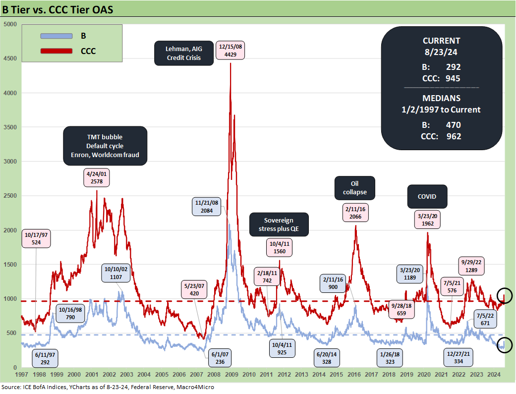
The B tier has been the most compressed of the tiers relative to history with the rebound to +292 bps from +376 bps on “VIX Monday” (8-5-24). That has been a material swing given how little fundamental change was actually underway. The B tier OAS of +292 bps is well inside low points of Dec 2021, Jan 2020, Oct 2018, and June 2014. The B tier OAS is still materially wide to late May 2007/early June 2007 and flat to June 1997.
The OAS time series of B tier vs. CCC tier shows the major disconnects that can occur on the low end when the world turns ugly. The exponential increase in long term average default rates along the HY credit tiers show up in the spread waves in the above B vs. CCC tier relationship.
The “CCC OAS minus B OAS” tells a story of market volatility across credit cycles as the market shifts its risk pricing framework. The B vs. CCC OAS differential is much wider than those seen across other tiers relative to history. The CCC-B OAS differential is wide to long term medians given the extreme compression in the B tier and the relative issuer mix in the CCC tier. Defaults are a lagging indicator, but the market can move quickly in anticipation of changes in perceived repricing volatility from the bottom up.
The potential for volatility is another reason why corporate liability managers use the “refi early and often” game plan. That typical refi planning has been stalled by the tightening cycle as many issuers have held on for as long as possible with the low coupons locked in during the ZIRP refi wave. For investors, that refi cycle will be picking up and that pull-to-par effect will offer favorable price symmetry for many steady and stable HY names.
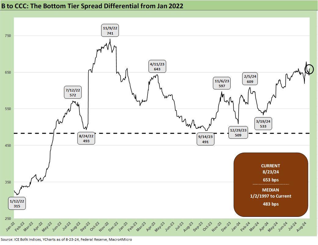
The above chart shortens up the time series to just before the tightening cycles for a more granular look at the B vs. CCC tier path across the turmoil of 2022.
The “CCC OAS – B OAS” differential shows some wild swings and some of that is tied to constituent migration and some to the more typical compression and decompression waves. CCC tier OAS always comes with the asterisk that defaults can have the effect of tightening OAS when a defaulted name drops out of the index while downgrades from B to CCC can also push spreads wider for an issuer facing a credit quality or “event” swoon.
A look at yields…
The above chart updates the running IG vs. HY YTW histories with some medians noted in the box. Now that the market has “graduated” from the 14 years of ZIRP and “normalization” efforts after the 2008 credit crisis, we see the pre-crisis HY YTW of 9.3% and the IG YTW of 6.1% as the most relevant median comparison. The 3% handle HY index YTW of 2021 is one for the ages as is the 1% handle IG index in 2020.
The above chart updates the UST curve and IG index yield levels for the Friday close vs. the credit market peak periods of mid 2007 and late 1997 for some frames of reference. We have written extensively on those periods and the backdrop in other commentaries, and there was a lot going on in each period in domestic and global credit markets. The comparative UST levels and distinctive, protracted inversion in the current peak cycle highlight how unusual the recent economic and monetary cycle has been.
The above chart does the same drill for HY as in the prior IG chart. Spreads are tight now just as they were in mid-2007 and late 1997. We see a much lower UST curve now, and sometimes that does not travel well to investors in other asset classes (notably equity oriented portfolio managers) who have been living through so many years of post-crisis ZIRP and normalization (the term “financial repression” has gone out of style).
With more FOMC easing ahead, the cost of capital in the corporate sector for issuers offers favorable fixed rate prospects relative to history. Over $10 trillion in the IG and HY bond indexes are also a long way from less than $3 trillion in June 2007 during that credit bubble. That is a lot of exposure to monitor and track.
The above chart updates the BB tier and CCC tier YTW comparison and offers a Hi-Lo view of credit pricing and the proxies for expected returns as priced in the credit markets. The double-digit yields in the CCC tier are above the long-term nominal returns for equities across the ages. Meanwhile the BB tier with its 6% area yield is more in line with the long-term median for the IG index.
The lows noted along the way also tell a story with the BB tier below 3% at some points in 2021. The relief at seeing the slow and steady increases in coupons and cash flow generation in credit markets as companies refinance offers a fresh look at opportunities for the classic institutional manager (notably pensions servicing benefit payments) as well as wealth management players. The HY market and IG tiers will be back to being reliable generators of cash income.
The Hi-Lo YTW relationship within HY offers some perspective on the relative risk pricing from the BB tier with its exponentially lower default rates vs. the CCC tier. The current 2.23x is modestly above the long-term average given the compressed BB tier and growth in BBB tier demand moving into the BB tier. Credit peaks and credit spread compression often translated into 1x handle range ratios as noted in the chart.
The B vs. CCC tier relationship is more relevant to the HY Classic managers in core HY. We see the CCC YTW relationship with the B tier as underscoring the much wider range of pricing in the CCC tier. The 7.1% current YTW and the 7.9% long term median in the B tier are consistent with an asset class with long term returns at a haircut to equities. For the CCC tier, where default risks are higher and more equity-like in nature, we see double-digit return proxies in the yields.
The fact that some CCCs have been priced below 5% at new issues along the way and some issuers’ securities are like high-risk equities with very high expected return rates demanded (sometimes at a multiple of expected equity returns) is a reflection of the nature of the HY bond market and leverage loan markets.
Such investments are part of what at times be a very complex analytical framework across risk pricing, relative value, secondary liquidity assessments, industry and issuer analysis, structural risk factors (obligor risk, structural subordination, guarantors and collateral mix, etc.), and framing default risk and recovery rate downside. The investors run the gamut from the “HY lite” bond investor to the distressed debt terminator types.
We wrap this week’s Footnotes with the ratio of CCC to B YTW, which like the CCC to BB tier is above the long-term median based on the material compression of the B tier relative to the CCC tier. We see CCC OAS hanging around the long-term median.
See also:
Footnotes & Flashbacks: State of Yields 8-25-24
Footnotes & Flashbacks: Asset Returns 8-25-24
New Home Sales July 2024: To Get by with a Little Help from My Feds? 8-25-24
Existing Home Sales July 2024: Making a Move? 8-23-24
Payroll: A Little Context Music 8-22-24
All the President’s Stocks 8-21-24
Footnotes & Flashbacks: Credit Markets 8-19-24
Footnotes & Flashbacks: State of Yields 8-18-24
Footnotes & Flashbacks: Asset Returns 8-17-24
Housing Starts July 2024: The Working Capital “Prevent Defense” 8-16-24
Retail Sales: Third Wind? 8-15-24
Industrial Production: Capacity Utilization Trends 8-15-24
Total Return Quilt: Annual Lookback to 2008 8-14-24
CPI July 2024: The Fall Campaign Begins 8-14-24
Credit Crib Note: PulteGroup (PHM) 8-11-24
Credit Crib Note: D.R. Horton (DHI) 8-8-24
HY Industry Mix: Damage Report 8-7-24
Volatility and the VIX Vapors: A Lookback from 1997 8-6-24
HY Pain: A 2018 Lookback to Ponder 8-3-24
Payroll July 2024: Ready, Set, Don’t Panic 8-2-24


