
Footnotes & Flashbacks: State of Yields 8-25-24
The UST shift is now getting warmed up for the Fed to whittle away at the protracted inversion.


Some curve dynamics are trickier than others…
The Powell speech takes the handicapping from “when” to “how much” with a few more big economic releases to swing the vote in favor of -25 bps or -50 bps ahead of the FOMC’s rendezvous with its next dot plot in mid-Sept.
While some Fed watchers have cited the Jan 2001 and Sept 2007 for -50 bps as the logical start given past easing cycles, those were pretty ugly market backdrops with a lot of pain dead ahead (see CPI July 2024: The Fall Campaign Begins 8-14-24). This might lend itself to a series of -25 bp like the late cycle 1998 or 2019 actions.
Banks are healthy, services have been steady, manufacturing mixed to weak depending on metric, and the consumer has been resilient even if balance sheet weary.
The inversion has been otherworldly in slope and its staying power across an expansion, but the broad strokes of the economy and fundamental trends don’t signal major trouble even if the election policy divergence is shocking at this point around tariffs, trade wars, and the potential for turmoil as some elements are preplanning opposition to the peaceful transfer of power in the event Trump loses.

The above chart is our recurring lookback at the histories of the UST curve transition periods. We break out UST curves from outside the ZIRP and normalization world of the post-crisis monetary policy years. We start with the Carter economic peak and inversion of 1978 before 1979 went to hell with the start of the inflation spiral on the way to a 1980 recession and into a double-dip with Reagan taking the baton on the second leg. That 1981-1982 recession was only exceeded in length by the post-crisis recession ending in June 2009.
We break out the UST curve rates in the box for each period and plot the UST curves. The current UST curve is the lowest and the most inverted on the front end as a reminder of what an unusual monetary backdrop and UST migration process this has been. We have only had one inflation spike since the stagflationary 70s and early 1980s Volcker inflation war. As it played out, this current inflation battle has been a minor league game compared to 1973-1975 and 1980-1982.
The rates today are very low in such context and the front end very inverted, but the economy is much more diverse and much larger. The competitive position of the US is also much better in many different areas from tech to banking, but the more globalized and developed markets create a lot of trade policy risk that could come home to roost if tariffs run amok in 2025. We could see fresh inflationary questions or flagging growth on trade barriers and retaliation.
The history was filled with debates of what causes inflation back then, and the explanation was easier when you could just say “oil” or “wage price spiral” with so many COLA provisions in highly unionized industries (see Inflation: Events ‘R’ Us Timeline 10-6-22, Business Cycles: The Recession Dating Game 10-10-22).
Of course, the money supply gurus had their version, and the Professors having the 180-degree opposite views while carrying 100% certainty are all dead and buried now. The conversation around who to blame and on what basis they should be blamed for inflation will pick up in the election season. It will be a much lower brow experience than in the 1970s and early 1980s since there is little focus on facts. Just opinions and accusations. We heard JD Vance today giving his version of how tariffs are essentially a frictionless wheel without stating who pays them and how they work.

The above chart updates the shift of the UST curve from the 10-19-23 peak as well as the UST deltas on a YTD basis. After a long stretch of YTD deltas with the UST migrating higher through much of 2024, we now see all deltas showing lower rates with the exception of a modest uptick of +7 bps on the 30Y.

The above chart provides a view of the multiyear migration with the end of 2022, the end 2023, and the current date all converged around the 10Y despite the 12-31-22 curve being 100 bps lower in fed funds. That raises the question of how much the 10Y UST, which in turn drives the 30Y mortgage rates, will in fact follow the FOMC cuts on the front end.
The spreads on mortgages is another variable in that equation, and the 30Y mortgages are still hovering in the 6.5% area while waiting for the next move lower to get the housing market reignited on both the new home side (New Home Sales July 2024: To Get by with a Little Help from My Feds? 8-25-24) and in the existing home sales markets (see Existing Home Sales July 2024: Making a Move? 8-23-24).
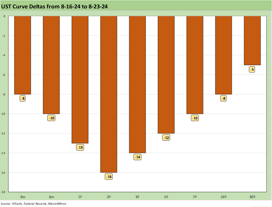
The above chart updates the weekly UST deltas that helped drive a positive performance in the bond markets and across the ETFs we track each week (see Footnotes & Flashbacks: Asset Returns 8-25-24). We have seen some long duration bond ETFs and notably the 20+ Year UST ETF (TLT) put in a series of top quartile return performances after a long stretch YTD down near the bottom as the curve rose.

The above chart offers a different visual angle on the favorable UST deltas YTD and the bull steepener that unfolded as the curve takes a shot at a flatter and more normalized 2Y to 10Y UST. We update the UST slope further below in this commentary.

The above chart updates the ride of the UST curve from the 10-19-23 peak on the UST 10Y, which closed on that day just under 5% on the way to the current 3.8% area.

The above chart updates the Freddie Mac 30Y benchmark mortgage that gets marked each Thursday. We plot a few historical comps on the horizontal line for the Freddie 30Y benchmark from the homebuilding peak year of 2005 (12-31-05) and one for mid-2006 when a higher UST curve was also running into some RMBS quality anxiety as subprime was starting to crack. This week’s Freddie rate splits the difference between the 2005 and 2006 rates despite much lower long UST rates today.

The above chart shows a running history of the 10Y UST against the Freddie 30Y since the start of 2021 when ZIRP still ruled and came to an end in March 2022 on the way to a high 7% range in Oct 2023. With 60% of mortgages at 4% or below and 30% at 3% or below, that is still a long way off to be able to break the logjam on existing home sales with such rates locked in within a materially higher market for mortgage borrowing.
This backdrop still favors the builders who now have more room to get rates down through buydowns and push profitable new home volumes. For refinancing and more existing home inventory to help ease pricing, there is at least some more room now for existing home sales to pick up and will likely be even more in the fall. That process is likely to remain slow unless the 10Y can follow the FOMC lower rather than just seeing a steepener from the front end.
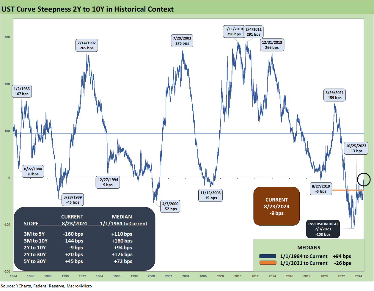
The above chart updates the long-term time series for the 2Y to 10Y UST slope and the shapeshifting gets the 2Y to 10Y closer to flat in that segment of the curve. We also include the other main UST segments we watch routinely with the 2Y to 30Y and 5Y to 30Y now upward sloping. The 3M to 5Y still has a very long way to go and the same for 3M to 10Y.
It will remain a challenge to get the 3M UST portfolio allocations too quickly whittled down for many investors with higher yields and minimal term premiums for extension until the election policy issues are clear. That is, the allocation depends on how you view tariffs and inflation risks and whether a weak dollar policy (supported by Trump/Vance) could also have fallout on UST demand at a time when the supply of refi and new money borrowing will be exploding.
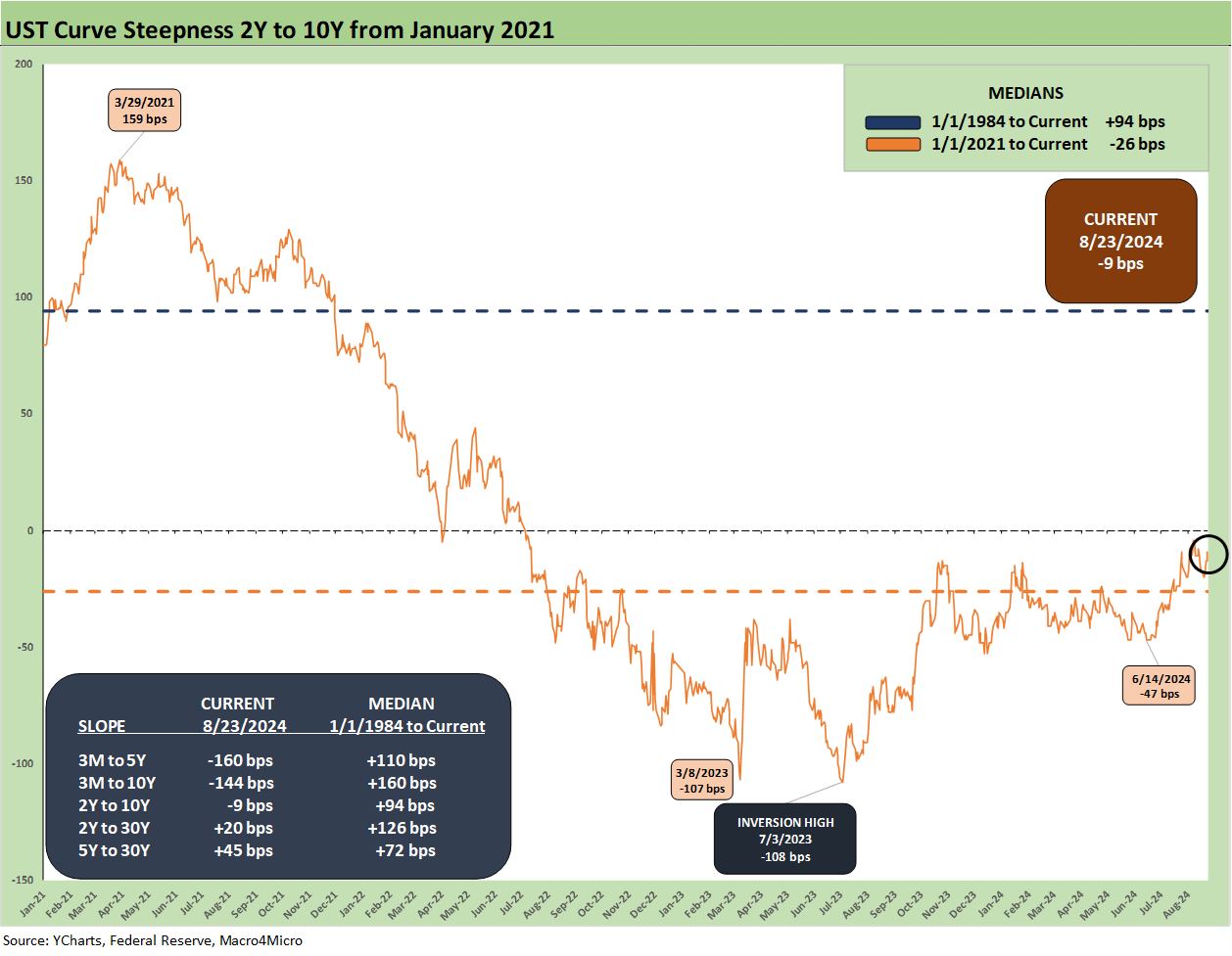
The above chart shortens up the timeline to offer a more granular view on the slope shapeshifting from ZIRP across the tightening cycle. We see the +159 bps slope peak in March 2021 shift down to the peak inversion of -107 bps in March 2023 and -108 bps in July 2023 on the way to the current -9 bps.
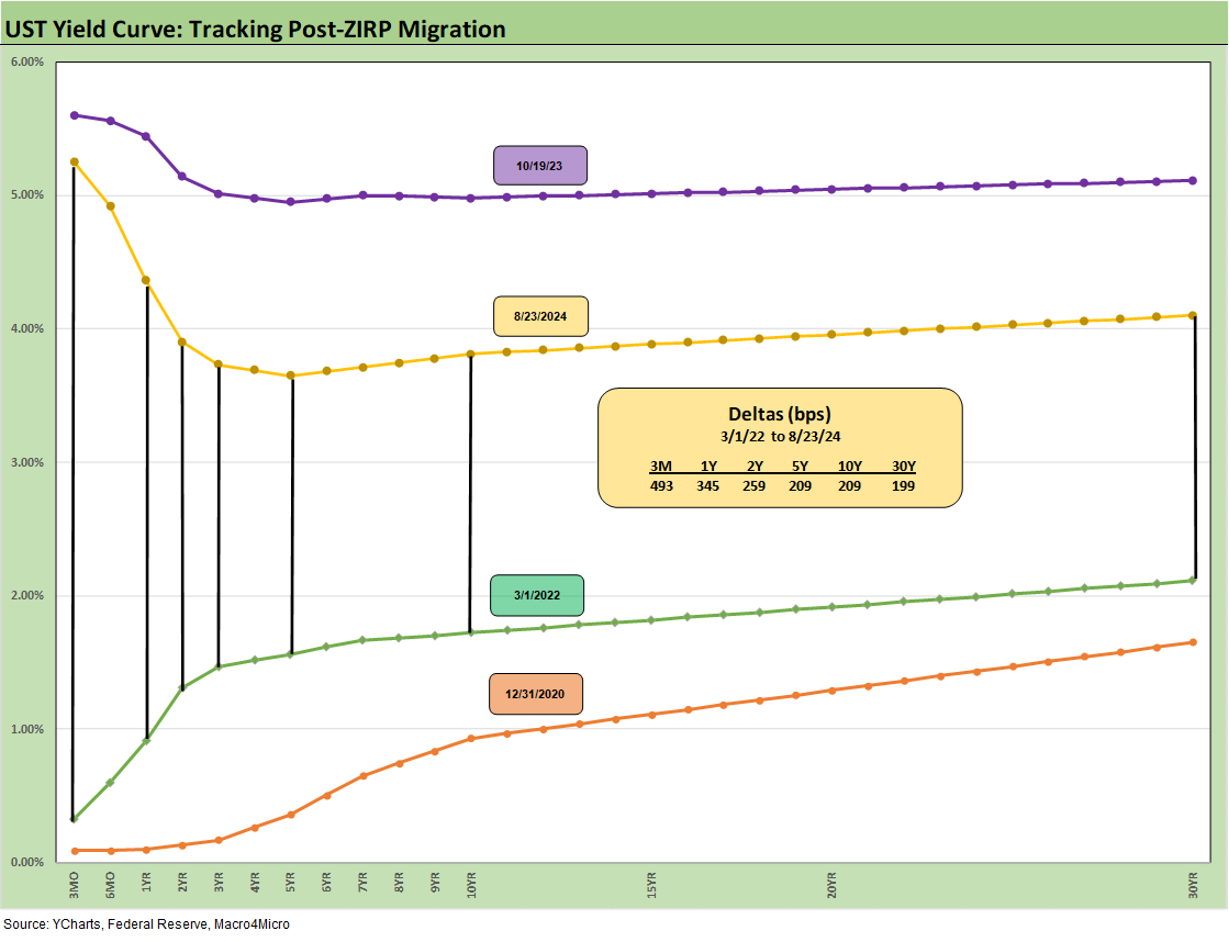
We wrap with the running UST migration across the tightening cycle showing the UST deltas from the start of March 2022 when ZIRP ended (effective 3-17-22) through this past Friday pricing. We also include the 10-19-23 UST curve that marks the high date on the 10Y UST and the 12-31-20 UST curves as frames of reference.
See also:
Footnotes & Flashbacks: Asset Returns 8-25-24
New Home Sales July 2024: To Get by with a Little Help from My Feds? 8-25-24
Existing Home Sales July 2024: Making a Move? 8-23-24
Payroll: A Little Context Music 8-22-24
All the President’s Stocks 8-21-24
Footnotes & Flashbacks: Credit Markets 8-19-24
Footnotes & Flashbacks: State of Yields 8-18-24
Footnotes & Flashbacks: Asset Returns 8-17-24
Housing Starts July 2024: The Working Capital “Prevent Defense” 8-16-24
Retail Sales: Third Wind? 8-15-24
Industrial Production: Capacity Utilization Trends 8-15-24
Total Return Quilt: Annual Lookback to 2008 8-14-24
CPI July 2024: The Fall Campaign Begins 8-14-24
Credit Crib Note: PulteGroup (PHM) 8-11-24
Credit Crib Note: D.R. Horton (DHI) 8-8-24
HY Industry Mix: Damage Report 8-7-24
Volatility and the VIX Vapors: A Lookback from 1997 8-6-24
HY Pain: A 2018 Lookback to Ponder 8-3-24
Payroll July 2024: Ready, Set, Don’t Panic 8-2-24