
Footnotes & Flashbacks: State of Yields 8-4-24
We update the yield curve shifts with the YTD UST deltas now lower across all but the 30Y and the 3M to 10Y slope again materially more inverted.


Is the slope too inverted to be rational these days?
The UST downshift and shapeshifting is now at the point where the optics of the inversion is getting downright strange in an expanding economy (to this point) with a few respectable inflation reports that will inevitably allow for some action in Sept.
The YTD moves in UST are now overwhelmingly inside where we started the year after the impressive UST rally from the late Oct 2023 peaks.
The easing debate has escalated to a -50 bps move with some commentators talking about a full point by year end, but that is a very aggressive model move after one jobs report that still posted higher payroll of over 100K and a worsening ISM that has been bad for months.
The upbeat expectations for 30Y mortgages after the Friday rally had the trade rags talking about 6.4% 30Y mortgages on Friday vs. the Freddie 30Y benchmark issued Thursday that was over 30 bps higher at 6.78%.

The above chart updates our recurring historical timeline of UST curves that we lead with each week. We include the UST curve yield data points in the box as well as plot each UST curve.
We use UST curves outside the ZIRP, QE, and “normalization” periods for a more relevant comparison to what the “normal” market looks like outside a crisis like 2008 and the slow road to an eventual pandemic in 2020.
We start the curve histories back during the cyclical peak period of the Carter years’ inversion on the way into the Volcker inflation wars. We break out the 1980s credit cycle peak year of 1989 before things got very ugly in the summer and fall.
We look at the TMT economic cycle peak year of 2000 (the credit cycle was arguably over by late 1998 with the credit spread trough occurring in late 1997). We include 2006 as the last full calendar year before the mortgage and structured credit chaos set in during the summer of 2007 before financial Armageddon a year later (Bear, Lehman, AIG, etc.).
We include the reference point from this cycle of the 10-19-23 curve when the UST 10Y peaked at a fraction below 5.0% vs. the current 3.8% area. The UST curve today is materially lower than all those years, and that is while we are at the peak of a tightening cycle that is about to become an easing cycle.

The above chart updates the post-shift UST curve that now looks very different over the course of a week. From 12-31-23, the UST curve is now finally lower than where the year began with the exception of the 30Y UST. We break out the YTD deltas in the box from 12-31-23 and 10-19-23. After retracing some of the post-Oct rally in 2024 on rising rates, the last week of action is back to the profile that the UST bulls were looking for to start the year.
The horsefly in the ointment again is that the economic releases do not cooperate from here. One issue is what expectations of lower rates might mean for economic activity and capital budgeting in the corporate sector where investment trends had been very favorable in the quarterly GDP data (see GDP 2Q24: Banking a Strong Quarter for Election Season 7-25-24, 2Q24 GDP: Into the Investment Weeds 7-25-24). The economics of investment is altered by lower rates.
The market could see a few good economic releases that start a reversal of some of this rally. This coming week is quiet except for ISM Services, but the week after brings CPI, Retail Sales, Industrial Production, and Housing Starts. Usually, you need to see an actual PCE contraction or some job reduction, not just a badly missed forecast with positive payroll adds. Many had been screaming, “the recession is here now” in the fall of 2022 even when good PCE numbers and very low unemployment were a fact (see Unemployment, Recessions, and the Potter Stewart Rule 10-7-22).
The lower the front-end of the UST curve goes, the lower the burden on consumer purchases and notably for consumer durables providers (e.g., autos) to offer incentives. The lower long-term rates go, the more homebuyers we could see freeing up existing homes that could ease home price burdens with a better inventory supply. The UST curve shift could allow more owners to unlock cash gains embedded (and partly trapped) in home equity balances. Even at lower rates, the same “mortgage buydown” game the builders have been using could stay active as key incentives but at lower rates even below the 5% line. There is a lot to play out when UST rates decline, especially if the FOMC follows.

The above chart updates some notable UST curves along the trail, and we see the long end of the curve for 12-31-22, 12-31-23 and Friday’s UST curve closely compressed on the longer end. One notable feature is that the 12-31-22 and 12-31-23 UST curves were 100 bps apart on the fed funds target range. That same upper end of the fed funds of 5.5% is where we are now.
The obvious question is whether more easing on the front end would allow the 10Y UST to follow or would UST supply and more questions around the direction of the cycle keep the 10Y high and drive a bull steepener with a static long end and lower short rates. To this point, the long end that is controlled by the market is moving lower and wondering what the FOMC will do on the short end to move with it or even to move more than the 10Y decline. As of now, we see an even more inverted 3M to 10Y heading back towards peak inversion. We look at the UST curve slope history further below.
Our theory is that the US deficit trend and fiscal position translates into funding needs that will only get worse in 2025. That means a lot more issuance. Where on the UST curve will that get placed? The idea of pursuing trade battles with China and Trump’s stated desire to weaken the dollar is not a great way to market UST to offshore investors (including China). We have looked at those topics in other commentaries but the demand for UST is not going to get easier in the international markets on the balance of factors.

The above chart updates the weekly UST deltas. That is a serious rally by any measure. Bonds and bond ETFs have been rewarded this past week as we cover in our Footnotes publication on asset returns we posted earlier today (See Footnotes & Flashbacks: Asset Returns 8-4-24).

The above chart updates the running UST deltas from the peak UST curve (peak 10Y) date. We see triple digit declines from 1Y to 30Y, and that is set against fed funds that have not moved since the last hike in July 2023.

The above chart updates the YTD UST deltas, and those deltas have now reversed from the higher YTD trends of last week to a decline in YTD rates across the 1Y to 10Y. As a frame of reference, last week this chart showed +13 bps higher YTD on 2Y UST, +22 bps higher on 5Y UST, and +32 bps higher on 10Y UST. They are all lower this week and now again adding bps to the late year 2023 UST rally.

The above chart updates the weekly look at the Freddie Mac benchmark 30Y mortgage rates that are set on Thursdays. We include the Freddie rates from the end of the peak homebuilding year of 2005 and the middle of 2006 when rising UST rates and outrageous mortgage excesses were starting to unnerve the RMBS markets. The horizontal lines capture the Freddie Mac rates and we also reproduce a UST curve for each date.
The 6.73% rate is a slight downtick from last week (6.78%) and down from a very recent high of early July of 6.95%. The Thursday level this week became obsolete by Friday with 6.4% a frequent quote in the trade rags on Friday. The current levels are a long way from the high 7% handles of 2023 with some higher (depending on terms, fees, quality, etc.).
The hope is that the 30Y mortgage can start chasing and drive through the 2005 levels (6.2%) noted above, when the UST curve was materially higher in 10Y UST than what we see today.
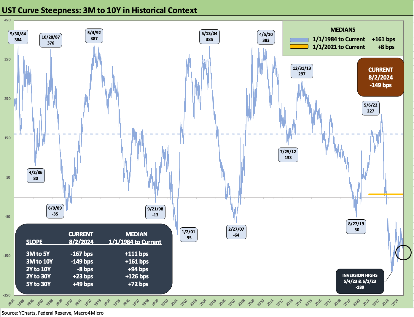
The above chart updates the long-term time series for the 3M to 10Y UST slope. We see the move lower in 10Y UST now take the inversion to -149 bps. That inversion is a distant +310 bps below the post-1984 median. The FOMC has some explaining to do if they let that hold up.

The above chart shortens the timeline from the start of 2021 for a closer look at the moves across the tightening cycle. We see a max steepness of +227 bps in May 2022 on the way to an inversion of -189 bps in May 2023 and again in June 2023. The slope started to flatten more to -62 bps on the peak 10Y UST date of 10-19-23 and now the slope is back to -149 bps. Something’s got to give here at some point, and that would in theory be fed funds easing starting the process.

We wrap with our usual chart showing the running UST deltas from March 1, 2022, which is the month ZIRP ended (effective 3-17-22). We also include the peak UST curve of 10-19-23 and the 12-31-20 UST curve as frames of reference. The delta of +497 bps on the 3M UST vs. the +208 bps on the 10Y UST is a dramatic bear inversion by the end of that timeline.
There is a lot of room in that 3M UST to maneuver for the Fed. It comes with risk, but the CPI this month should help in the process one way or the other. The protracted inversion in the midst of sustained growth is starting to defy past approaches and thinking in this area.
See also:
Footnotes & Flashbacks: Asset Returns 8-4-24
HY Pain: A 2018 Lookback to Ponder 8-3-24
Payroll July 2024: Ready, Set, Don’t Panic 8-2-24
Employment Cost Index: June 2024 8-1-24
JOLTS June 2024: Countdown to FOMC, Ticking Clock to Mass Deportation 7-30-24
Footnotes & Flashbacks: Credit Markets 7-29-24
Footnotes & Flashbacks: State of Yields 7-28-24
Footnotes & Flashbacks: Asset Returns 7-28-22
Presidential GDP Dance Off: Clinton vs. Trump 7-27-24
Presidential GDP Dance Off: Reagan vs. Trump 7-27-24
PCE June 2024: Inflation, Income, and Outlays 7-26-24
2Q24 GDP: Into the Investment Weeds 7-25-24
GDP 2Q24: Banking a Strong Quarter for Election Season 7-25-24
Footnotes & Flashbacks: Credit Markets 7-22-24
Footnotes & Flashbacks: Credit Markets 7-15-24
Footnotes & Flashbacks: Credit Markets 7-8-24
The B vs. CCC Battle: Tough Neighborhood, Rough Players 7-7-24