
Footnotes & Flashbacks: State of Yields 6-30-24
We look at the latest moves in the UST curve deltas and slopes in historical context.


It’s not the slope, its the turns.
A mild steepener on the week undermined bond returns, but the overall mix of economic releases offered some constructive data for the soft landing scenario (see PCE, Income and Outlays: Practicing Safe Growth? 6-28-24).
With the holiday week bringing JOLTS and the next round of payroll data, some more inputs are on the way after we just saw another downward revision of the PCE line in the 1Q24 final numbers (see 1Q24 GDP: Final Cut, Moving Parts 6-27-24) and muted PCE price index action.
We look at the 3M to 10Y UST slope history this week as inversions continue to make it hard to run away from cash as a core asset allocation in the debt markets with so much uncertainty ahead in politics, trade policy, and possible post-election governance dislocations at the FOMC.

Note: As a reminder, last week we separated out the Credit Market weekly comments from the UST State of Yields publication (it was getting too long). We will publish that one separately after the final June 30 information.
The above chart cuts across the UST curve histories from the late 1978 inversion and then across a range of periods relevant to today’s post-ZIRP markets. We include a UST curve from the double-dip inflation/stagflation period (see UST Moves 1978-1982: The Inflation and Stagflation Years 10-18-23) on through the 1989 credit cycle peak (see UST Curve History: Credit Cycle Peaks 10-12-22). That 1989 credit cycle peak came well before the expansion peak seen in the summer of 1990 (see Business Cycles: The Recession Dating Game 10-10-22).
The most relevant comparisons fall outside ZIRP markets, and there are plenty of comparisons in the post-Glass Steagall markets with credit cycle peaks in 1997 and 2007. Like this market, we also saw exceptionally ambitious valuations in tech after 1997. We saw a lot of global turmoil in 1998 in Emerging Markets. Credit cycles were tied to leveraged loans and high-risk deals, so there will be conversations to have as the private credit markets grow and get tested in an inevitable recession.
For all the compare-and-contrast one can do, the visible takeaway above is that the current UST curve is below those relevant prior cycles. One complicating factor that the current cycle faces is that it is the first major inflation cycle since 1980-1982 with much lower rates today, radically different capital markets and banking systems globally, and a much different set of risks with the rise of bank interconnectedness risk (derivatives) even if that counterparty exposure is much lower now than in 2007-2008.
The UST rates of today are certainly not high when framed against markets outside the world of ZIRP and the very slow normalization seen in the years from 2008 to 2022. An inversion of the sort we have seen for months is also unprecedented with the exception of some front end whipsaws in the 1980-1982 Volcker inflation wars.
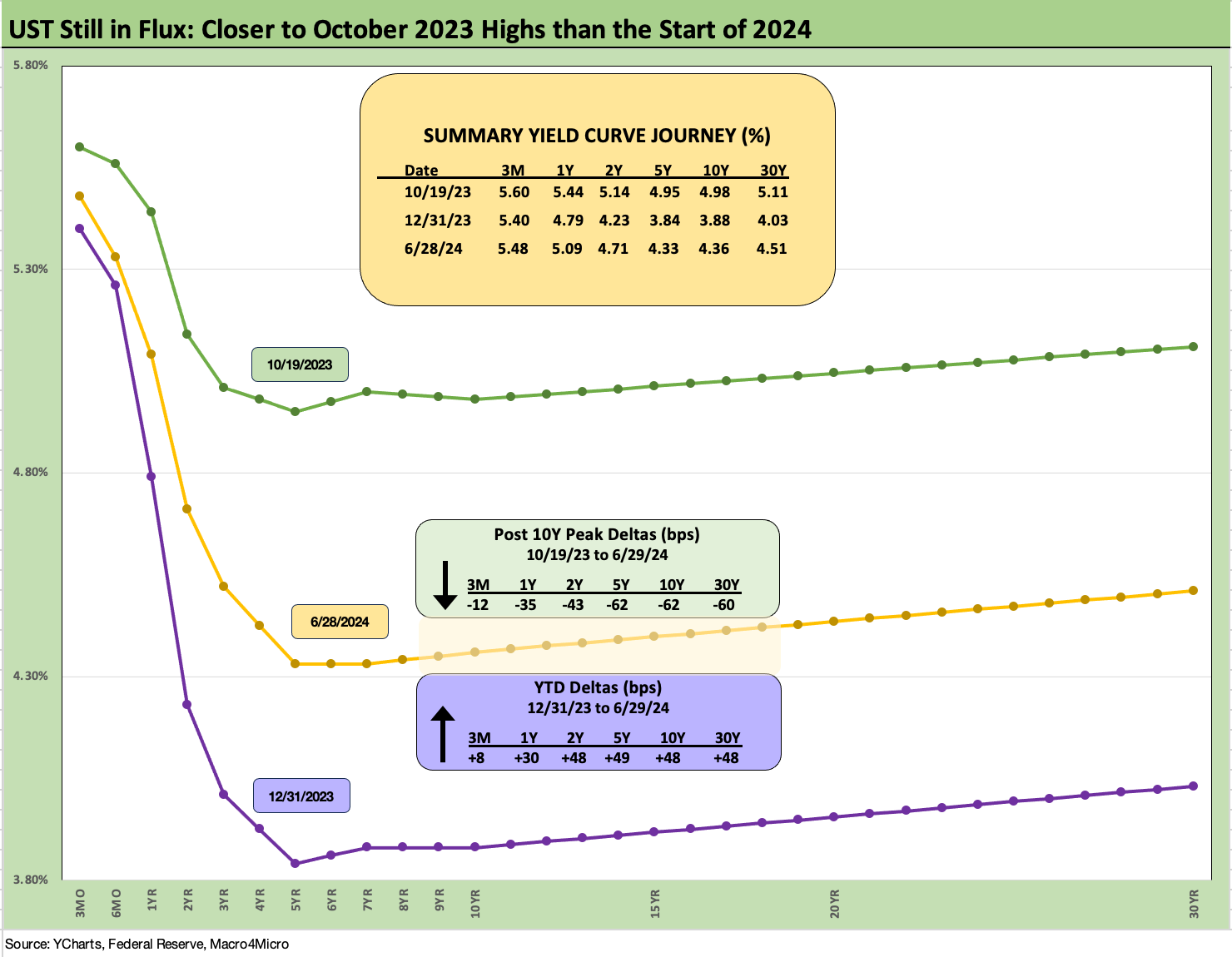
The above chart updates the UST deltas from the date of the peak 10Y UST rates in Oct 2023 (10-19-23). We also break out the YTD 2024 deltas as a comp. The latest UST curve shows the 10Y UST -62 bps below the 10-19-23 peak, and that comes after +48 bps of YTD increases on the 10Y UST. As we look back across expansion periods, seeing an inversion in an expansion that has been this inverted and this protracted for this many months reminds us that markets can go through radical changes that make it hard to use the past as prologue.

The above chart updates some important UST migrations across the tightening cycle. We also include a memory box reminder of the FOMC actions in timing and magnitude. We are coming up on the 1-year anniversary of the Fed hike that wrapped up 100 bps of hikes in calendar 2023.
The relationship we like to watch from this chart is that the year end 2022 and 2023 UST curve converged in longer maturities despite the 100 bps difference in fed funds. That pattern reminds us not to take for granted that a Fed easing will necessarily translate into a lower 10Y UST and/or lower 30Y mortgages.
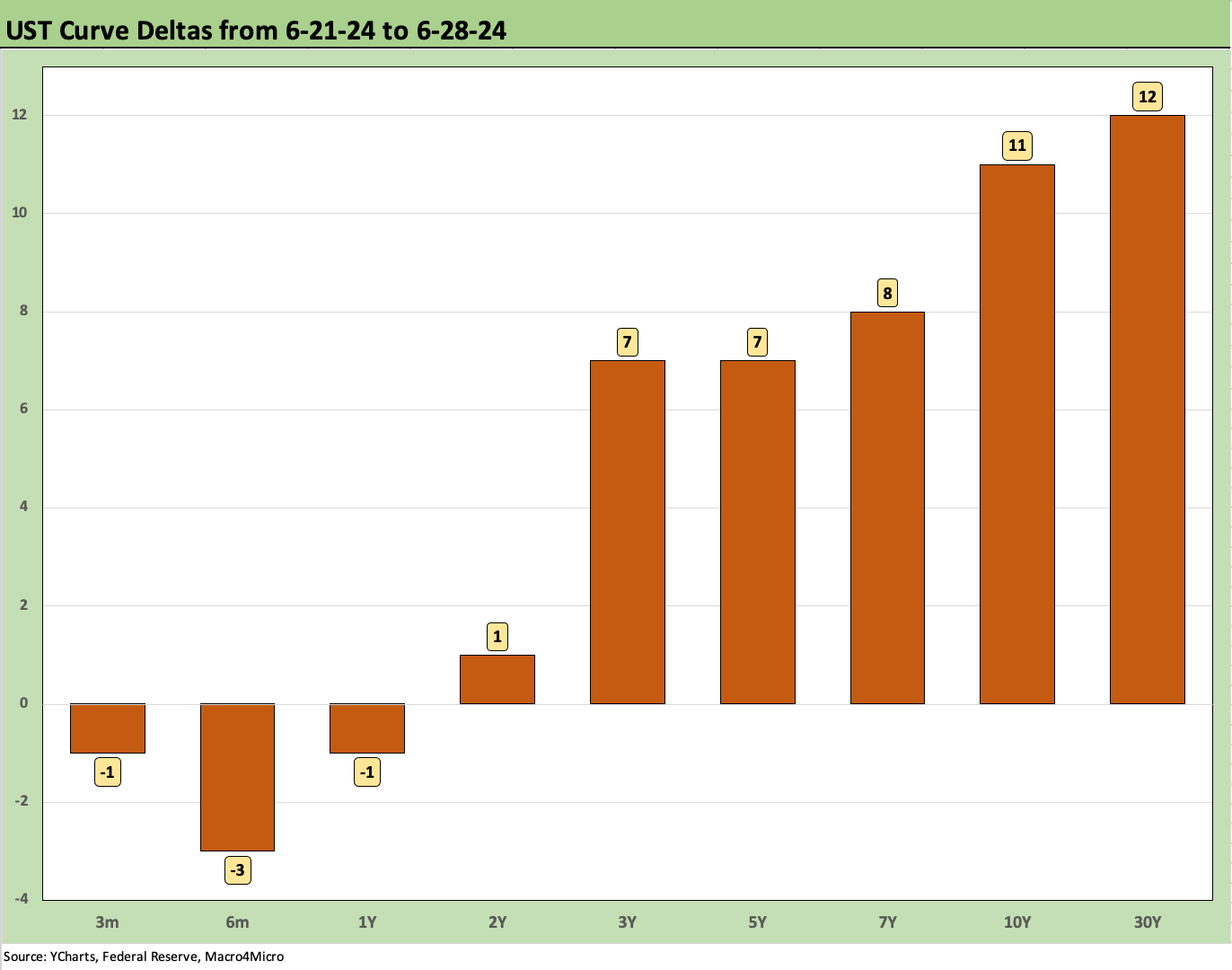
The above chart breaks out the UST deltas for last week. We see a steepener from 2Y to 30Y and modest downticks on 3M to 1Y. That move on the long end was enough to send the long duration 20+ Year UST ETF (TLT) to the bottom of the 1-week return rankings in our 32 benchmarks and ETFs that we track (see Footnotes & Flashbacks: Asset Returns 6-30-24).

The above chart provides another visual in the UST deltas from 10-19-23 (peak 10Y UST) through this past Friday. That run was a material bull inversion with the massive rally in Nov-Dec 2023 ahead of the duration setbacks of YTD 2024 that ate into those running returns.

The above chart updates the YTD UST deltas so far in 2024. As a measuring stick on asset impact, the long duration UST ETF (TLT) has generated a total return of -5.6% while the UST ETF (GOVT) is at -0.8%.

The above chart updates the Freddie Mac 30Y UST, which barely moved this week with a sequential downtick on the week to 6.86% from 6.87%. We plot the Freddie benchmark on the horizontal line with a comparison to two important dates in housing. We include the year end 2005 rate when homebuilding peaked and the mid-2006 date when subprime RMBS had started to rattle the markets.
We also include the UST curves from Friday close with the UST curves from those prior housing bubble peaks. We see a convergence in the current yield curve with the UST curve of 2005 with Friday’s UST further out the curve. Once again, the inversion on the front end of today’s curve is like it landed from another planet’s economic expansion while the markets flirt with record stock index highs and sustained growth.

The above chart updates the 3M to10Y UST slope with its -112 bps inversion vs. the +161 bps long term median with an upward sloping differential of +273 bps. We update the range of UST curve slopes and long-term medians in the box.
Other than this current cycle’s peak inversion of -189 bps, we don’t see anything like this back to 1984. We saw -95 bps back at the start of 2001. This current inversion has encouraged more investors to sit tight in cash and resist the duration risk.

The above chart shortens up the time series to the start of 2021 for more granularity on the swings in this tightening cycle as the move from ZIRP saw a slope of +227 bps in May 2022 just ahead of the June inflation peak. We have seen a few material swings since then on the back of the 10Y volatility in 2023-2024.

We wrap with our usual UST delta chart that tracks the UST changes from the beginning of March 2022 when ZIRP ended by mid-month (effective 3-17-22). We also include a 12-31-20 and 10-19-23 UST curve as frames of reference. The history has been regularly recapped in our work with a bear flattener moving into a bear inversion that has set records on inversion duration in a recovery.
See also:
Footnotes & Flashbacks: Asset Returns 6-30-24
State Unemployment: A Sum-of-the-Parts BS Detector 6-30-24
The Debate: The China Deficit and Who Pays the Tariff? 6-29-24
PCE, Income and Outlays: Practicing Safe Growth? 6-28-24
Durable Goods: Playing Defense 6-27-24
1Q24 GDP: Final Cut, Moving Parts 6-27-24
New Home Sales: Pumping the Brakes 6-26-24
Footnotes and Flashbacks: Credit Markets 6-23-24
Footnotes & Flashbacks: Asset Returns 6-23-24
Footnotes & Flashbacks: State of Yields 6-23-24
Existing Home Sales May 2024: Weary Climb 6-21-24
Consumer Sentiment: Summer Blues or Election Vibecession 6-14-24
Income Taxes for Tariffs: Dollars to Donuts 6-14-24
HY Spreads: The BB vs. BBB Spread Compression 6-13-24
HY Spreads: Celebrating Tumultuous Times at a Credit Peak 6-13-24
FOMC: There Can Be Only One 6-12-24