
PCE Prices Aug 2024: Personal Income & Outlays
With a wave of material data updates/revisions from the BEA, we see another favorable set of inflation metrics and mixed adjustments to DPI and PCE.


Devil: Check out those savings rates! Go spend! Angel: Savings is a virtue!
The YoY headline PCE at +2.2% (down from +2.5% in July) and +2.7% Core PCE (up from +2.6% in July) will keep a debate going. Both were down MoM to +0.1% from +0.2% in July.
The talking heads are locking in on the rolling 3-month annualized rates hanging in below the 2.0% threshold, thus allowing for more easing action to trim back the US inversion and stabilize the real fed funds rate (fed funds minus PCE) rather than allow more de facto tightening.
The savings rate data saw material upward revisions that shifted the numbers bias this year from 3% handles to more 5% handles with 4.8% for Aug 2024. Last month posted a +2.9% savings rate that was revised this month to 4.9%, and the scale of the changes are significant in the context of the “stretched household” debate.
August shows Goods in deflation mode MoM at -0.2% (Durables -0.2%, Nondurables -0.1%) with Service at +0.2%. For YoY, PCE prices on Goods are -0.9% (-2.2% Durables, -0.2% Nondurables) but Services still stubborn at +3.7% for an overall PCE line of +2.2%.
Real DPI YoY of +3.1% ran slightly ahead of Real PCE YoY at +2.9%.
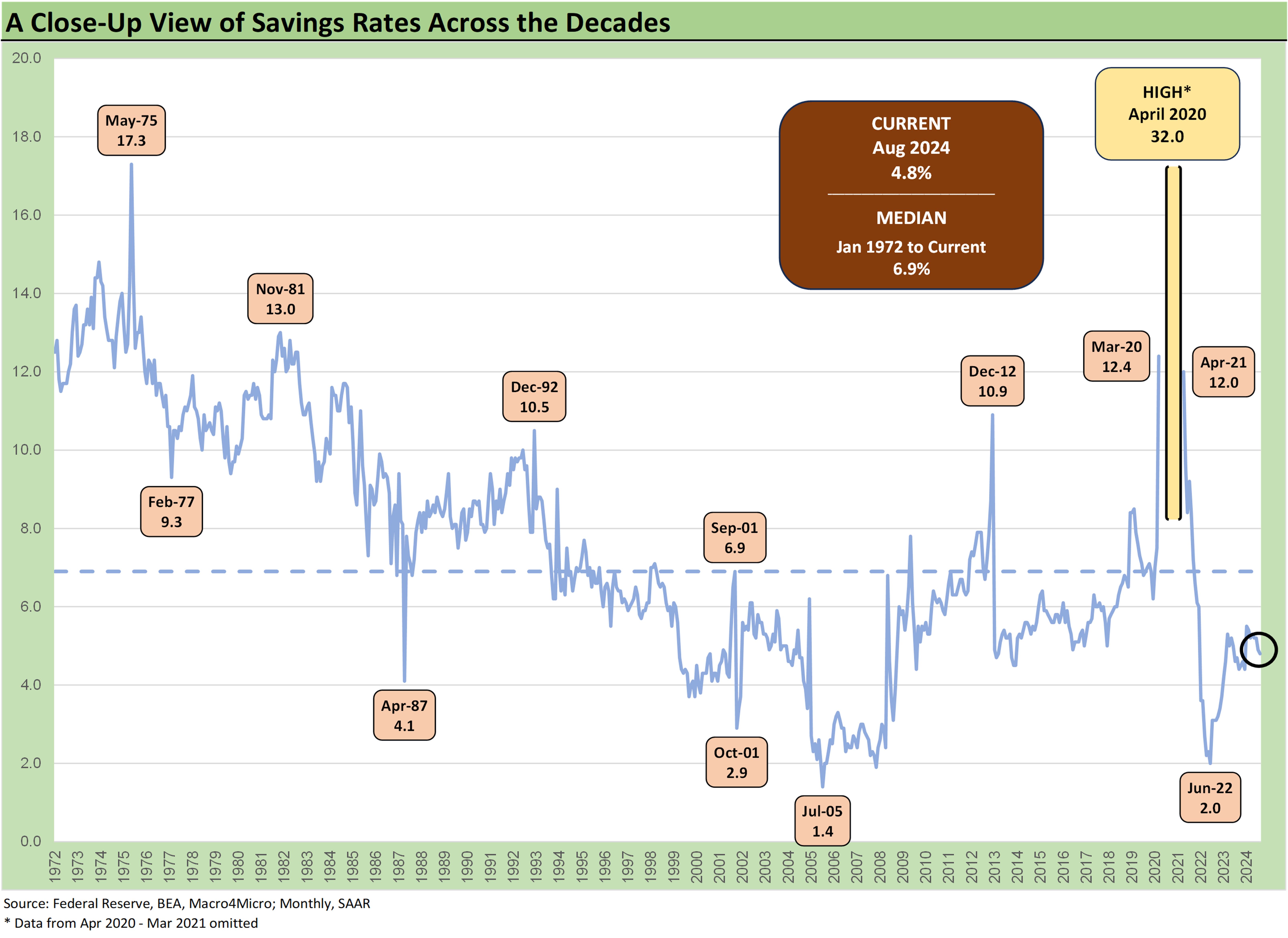
We usually start with the chart covering fed funds vs. core PCE, but the adjustments in the savings rates jumped off the page this month with the sharply higher savings rates now seen in the data with 6 of the first 8 months of 2024 now at 5% handles. That contrasts with the 3% handles reported last month for 6 of the 8 months from Dec 2023 to July 2024.
That is a material measurement change which should shift the debate on how stretched the broader range of households are relative to where the thought process had been. No one is questioning the erosion in credit quality that is easy enough to tie out to consumer lenders, but the theme of “consumers have spent all their money” is not consistent with this data. The revised data helps the soft-landing scenario since there is money to spend (or to service debt). That is, the household savings profile is supportive before factoring in post-election policy threats such as tariffs etc. (topics discussed in other commentaries).

The above chart updates the time series for fed funds effective rate vs. Core PCE from 1973 when inflation and stagflation burst on the scene. We see 2.2% points vs. the long-term median of +1.3%. We use Aug 2024 Core PCE vs. Sept 2024 fed funds. The main takeaway is that the FOMC has room in the real fed funds relationship to ease while still being in tightening mode.
There is more room using headline PCE, and that is where the real fed funds metric gets murky with the FOMC and statements using “inflation” as their term of choice (which inflation?). As we have cited in past commentaries, we have seen both headline and core as the focal point for the 2.0% target metric across the cycles (based on statements and writings of FOMC members), so we just assume they don’t all agree and like to toggle as needed for the hot issues at hand.

The above chart updates the running histories of PCE and Core PCE across the cycles from the end of 1972 with occasional revisions flowing in along the way. We include a memory box as a reminder of critical market events. The long-term medians of 2.6% PCE and 2.4% for Core PCE across this timeline give some context to the 2.0% target.

The above chart uses the shorter timeline from 1997 in framing headline PCE vs. Core PCE. We see that median at 1.9% for PCE and +1.7% for Core PCE. This makes the +2.0% target seem realistic. All you need is a post-TMT bubble Greenspan panic taking fed funds down to 1.0% almost three years into the recovery (2004) that fueled a housing bubble and structured credit binge (see Greenspan’s Last Hurrah: His Wild Finish Before the Crisis 10-30-22, see Fed Funds vs. PCE Price Index: What is Normal? 10-31-22).
Then you follow that up with a systemic crisis that calls for ZIRP and very slow normalization periods, a crash in oil prices…oh, and a pandemic. The fact may be that recent rolling 3 months have met the 2.0% target, but that is not a level that holds up across time as we look back.

The above chart updates the differential of PCE vs. Core PCE as food for thought. With oil prices at a crossroad right now with China talking up a storm of stimulus this week and the Saudis talking about increasing market share, we could end up in an unusual set of moving parts ahead. Between China stimulus, Mideast escalation (will Iran or won’t they), and Saudi supply threats, the range of potential outcomes are pretty high on the oil front. That flows into one of the usual Headline vs. Core PCE divergences we show above.
There is also a scenario where Trump throws Ukraine under the bus if he is elected, oil volumes soar with Russia freed up, and the US goes into “drill, drill, drill” mode. That scenario comes with another Soviet-style genocide in Ukraine (see Holodomor), but Trump and Mike Johnson won’t lose any sleep over it.
Energy flows into so many different lines of the PCE and CPI index beyond gasoline that it is easy to forget how many different costs need to be recovered in pricing. That energy scenario offsets a lot of pricing pressure, but that has to be put in portfolio context with widespread tariffs needing to be recovered or possible recession and trade war turmoil. The 2025 event risk checklist is daunting.

The above chart highlights the DPI vs. PCE patterns with COVID relief through current times. We looked at the politics of stimulus and the overlay with other inflation X-factors in last month’s PCE update (see PCE July 2024: Inflation, Income and Outlays 8-30-24). Memories are short in the best of times, and this timeline is an example in framing inflation outcomes. During periods of intense partisan elections, facts and major economic variables often become “elective” when discussing the complexities of a major economic topic such as inflation.
Sometimes the partisan invective neglects to ponder such items as FOMC lags, the late Feb 2022 invasion of Ukraine, and how that flowed across multiple line items beyond just gasoline. You hear a lot about the last stimulus/relief package in early 2021 but not much about what was signed in Dec 2020 or the simple concept of lag effects in a world of tariffs, surcharges, raw material cost volatility, massive freight and logistics expense spikes, etc. Repetition and simplicity are the soul of politics. That is why there are so many dumb asses in Washington that are a mile wide and a quarter inch deep (on a good day). It would be okay if they were aware of the quarter-inch deep problem.
As a reminder, the wild DPI swings were associated with the three COVID relief and stimulus packages including two under Trump and one under Biden. The Trump signature was on the CARES Act (March 2020, shows up in the DPI in April 2020) and his signature was on the Dec 2020 legislation disbursed in Jan 2021 (he never seems to mention that one!). Biden’s signature was on the America Rescue Plan that was disbursed in March 2021. Those waves of DPI and PCE show up in the chart above. As a reminder, the vaccine was just becoming available on a wide scale in early 2021 when a deadly strain was still loose before a less threatening series of COVID waves later. That factors into demand patterns and the timing of the supply/demand imbalances that exacerbate inflation.

The above chart shortens up the time horizon for DPI vs. PCE from early 2022 as the tightening cycle kicked into gear after March 2022. Oil was a problem after the Putin invasion of Ukraine and inflation hit a high in June at +9.1% for CPI as a headline grabber (headline PCE at +7.1% in June 2022 as recently revised) before the steady inflation slide to current rates. The Core PCE has dueling peaks as of the latest revisions at +5.6% for Feb 2022 and Sept 2022.

The above chart posts the updated DPI and PCE MoM numbers looking back to 2019. We like this chart when we scan for periods when there are disconnects between DPI and PCE. PCE outpacing DPI is a sign of a strong consumer sector but also can flag inflationary pressures or household overextension via leverage. That’s when you need to look at other metrics to gut check what is at work. Table 1 in the Personal Income & Outlays release gives no shortage of head-spinning data on DPI.
Per the BEA, we see extensive restatements this month from January 2019 in the never-ending journey of economic models and data restatements. To reapply what they say about armies and weapons, it is important to use the data you have and not the data you wish you had. That is something to keep in mind with Project 2025 dedicating an entire chapter to how they want to gut the Department of Commerce and consolidate control of BEA and BLS data under a White House appointee who is “like minded.” That just sounds bad on its face when some partisan is deciding on the control of factual content and analytical frameworks and how and when it is disclosed.
See also:
Durable Goods Aug 2024: Waiting Game 9-26-24
2Q24 GDP: Final Estimate and Revision Deltas 9-26-24
New Home Sales Aug 2024: Waiting Game on Mortgages or Supply? 9-25-24Footnotes & Flashbacks: Credit Markets 9-23-24
Footnotes & Flashbacks: State of Yields 9-22-24
Footnotes & Flashbacks: Asset Returns 9-22-24
Mini Market Lookback: FOMC Week 9-21-24
FOMC Action: Preemptive Strike for Payroll? 9-18-24
Home Starts Aug 2024: Mortgage Rates to Kickstart Hopes Ahead? 9-18-24
Retail Sales: Down to the Wire? 9-17-24
Industrial Production: Aug 2024 Capacity Utilization 9-17-24
Consumer Sentiment: Inflation Optimism? Split Moods 9-13-24
CPI Aug 2024: Steady Trend Supports Mandate Shift 9-11-24
August 2024 Payrolls: Slow Burn, Negative Revisions 9-6-24