
Footnotes & Flashbacks: State of Yields 11-12-23
We look at the State of Yields ahead of a big week of indicators.


The curve shifted into a bear flattener from the front end this past week as everyone looks for signs of relief in this week’s CPI with Retail Sales and Industrial Production offering another fresh read on the economic balancing act.
Mortgage rates held in well down around a mid 7% handle, and that offers something (not that much) to a housing market where some builders shoot for sub 6% mortgage rate targets for buydowns and incentive programs.
We update the yield slope time series for 3M to 5Y and 3M to 10Y as the inversion reversal slows down for now.

The above chart updates the running UST migration of the tightening cycle. We include a memory jogger box on the Fed hikes and a 12-31-21 UST curve as a frame of reference. The journey from bear flattening to bear inversion with an upward shift all make for a case study in duration pain.
This chart highlights the tough year for duration and notably since the end of 1Q23 even after the regional bank mini-crisis. The late March whipsaw gave the UST curve something to think about from numerous angles from asset quality to theoretical bank system risks that quickly faded as a material negative influence on the market. That said, the regional bank sector remains the worst performing sector and major ETF YTD as we cover in our separate “Footnotes” publication on asset returns.
Since March, the supply of UST continues to dominate the dialogue along with theories around term premiums and the uncanny willingness of so many Washington geniuses to blow the place up rather than strike deals. The supply of UST can bounce around based on where on the curve the UST looks to issue, but the aggregate supply of short to long term debt is going in one direction – higher.
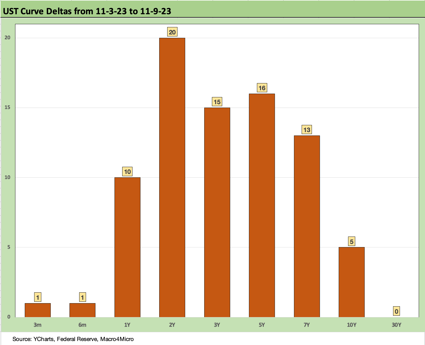
The above chart breaks out the UST deltas for the past week through Thursday close. The data sets we use (Fed H-15, YCharts) were not updated yet for Friday pricing (holiday quirks), but we checked in other data sources, and the UST moves on Friday were both mixed (some up, some down in mid to low single digits) and minor.
As detailed above, the front end moved higher with the 2Y doing a bounce off the prior week rally (slightly higher again on Friday). We looked at 2Y to 10Y and 2Y to 30Y slope moves in our last weekly (see Footnotes & Flashbacks: State of Yields 11-5-23 11-5-23). The 2Y swings around as a key benchmark.
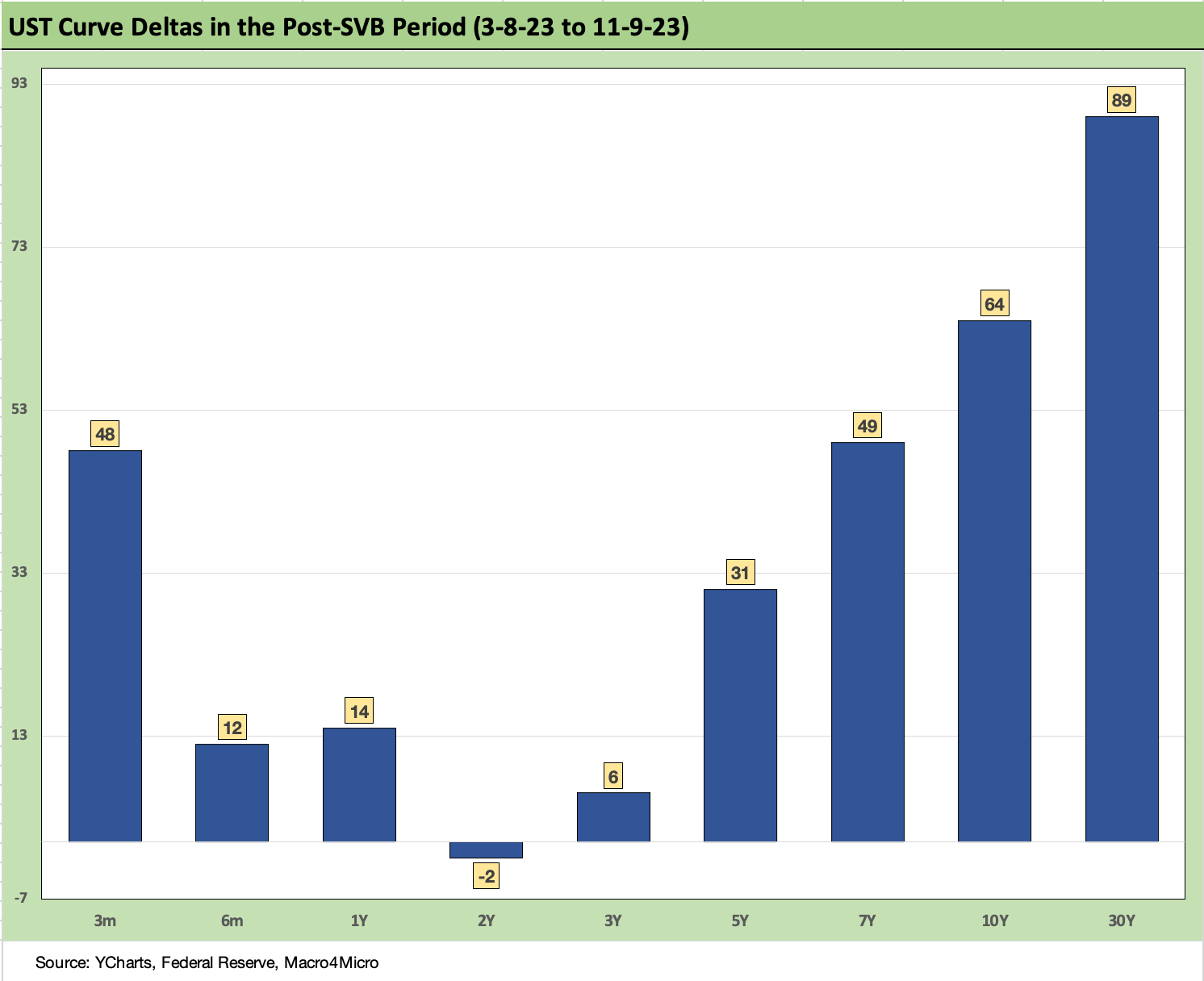
The above chart frames the UST curve deltas since immediately before the SVB collapse and regional bank mini-crisis rattled the market with an unexpected bout of correlated high anxiety. The arrival of the “push button run on the bank risk” was a new one for the risk variable checklist. Painting the regional banks with a roller rather than an artist’s brush unfolded quickly even for names where fundamentals were sound. Much of the asset quality fear was more a theoretical worry than actual delinquency and default risk in their loan book.
The vigilance factor was put on high alert for banks at that point and will remain in place and especially for commercial real estate and consumer credit. There are plenty of nuances across commercial real estate in the market of 2023 (see Construction: Project Economics Drive Nonresidential 10-2-23, Construction Spending: Demystifying Nonresidential Mix 5-9-23).
The Office bucket of commercial real estate is typically the first 3 things investors worry about these days, and the WeWork fiasco will not help by getting more attention focused on “empty offices” and what this all means for the A space – let alone B and C spaces – and rental income streams across too many locations.
The pattern is clear enough above with a bear steepening from 2Y to 30Y. Translation: duration pain and a tough time for the IG index benchmarks in total return and negative returns on UST benchmarks.
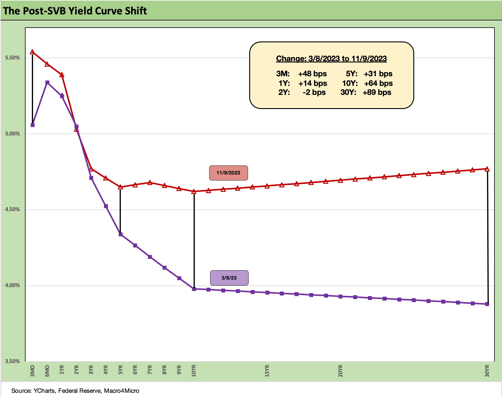
The above chart just puts the prior chart’s post-SVB curve deltas into a yield curve format. We see the steepening from the intermediate to long end with a material upward shift across the UST curve.

The above chart updates the 30Y Freddie Mac mortgage benchmark and the current UST curve. The Freddie Mac’s 30Y benchmark (released on Thursdays) has now caught up with last Friday’s major UST rally and posted a 7.5% level. A wider expanse of mortgages and fee structures had hit 8% in late October (see Sept Existing Home Sales: The 7% Solution Running Low 10-19-23, Footnotes & Flashbacks: State of Yields 10-21-23 10-21-23), but this past week the Freddie Mac 30Y was down to 7.5%.
With this chart, we also drop in the UST curves and Freddie mortgage level for two periods from the housing boom and bubble. The bubble gives context around how strong demand can be with 6% handle rates. The problem this time around is how much prices soared in 2020-2021 ahead of the Fed tightening cycle. We include the year end 2005 date as the peak homebuilding year and the middle of 2006 when the “liar loan” phenomenon and subprime excess was cresting.
Even though mortgage rates are the prime driver of monthly payments, the supply-demand imbalances (favoring demand of course) are not helping prices equilibrate to the monthly payment that works for many homebuyers and especially the first time buyers and many move-up buyers. Existing home sales are back at crisis period levels and the inventory swing factor has supported prices and stretched affordability beyond many potential buyers’ reach (see Sept New Home Sales: The Need to Live Somewhere 10-25-23).
Today vs. 2005 and 2006…
In 2006, subprime was starting to show some cracks but not yet sending the credit markets into a case of nerves. That would take more quarters to go by. Even then, equities only folded later in the fall of 2007 before the onset of a recession in Dec 2007 (that “official” date for recession was set much later).
It is notable that the current UST curve is now well above the end of 2005 in 10Y UST but below the intermediate and long end of the UST curve seen in mid-2006. Despite that UST configuration, the 30Y mortgage levels of 2023 are well above 2006 and were pulling away before this latest rally.
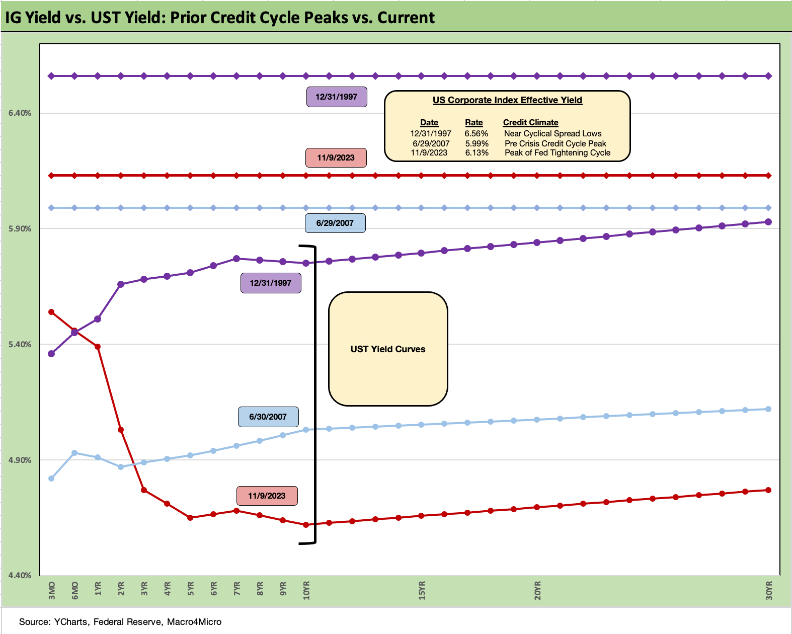
The above chart goes through a similar exercise for the current UST curve and IG index yield for current days vs. two periods where the market was at or near spread lows.
Spreads were much tighter in those peak periods relative to the +126 bps to close last week in the ICE IG index (11-10-23). For the past week, IG spreads tightened by -3 bps. The ICE IG index OAS is in the area of the long-term median, so spreads are not wide to historical levels.
The +70 bps for the IG index at the end of 1997 was much lower (the low was in Oct 1997 at +53 bps) and +100 bps at 6-30-07. The 1997 and 2007 periods were tight parts of the credit cycle on shaky ground given the direction of credit quality. As we know, a lot can happen in a hurry even in IG as later 2007 and 2008 showed.
It is notable that the BBB tier OAS has been pretty unflappable across the past month of swings in the UST and equity markets and is -1 bps tighter on the trailing month. That is over $4 trillion of face value ($3.6 trillion of market value) that is not showing a case of nerves at this point.
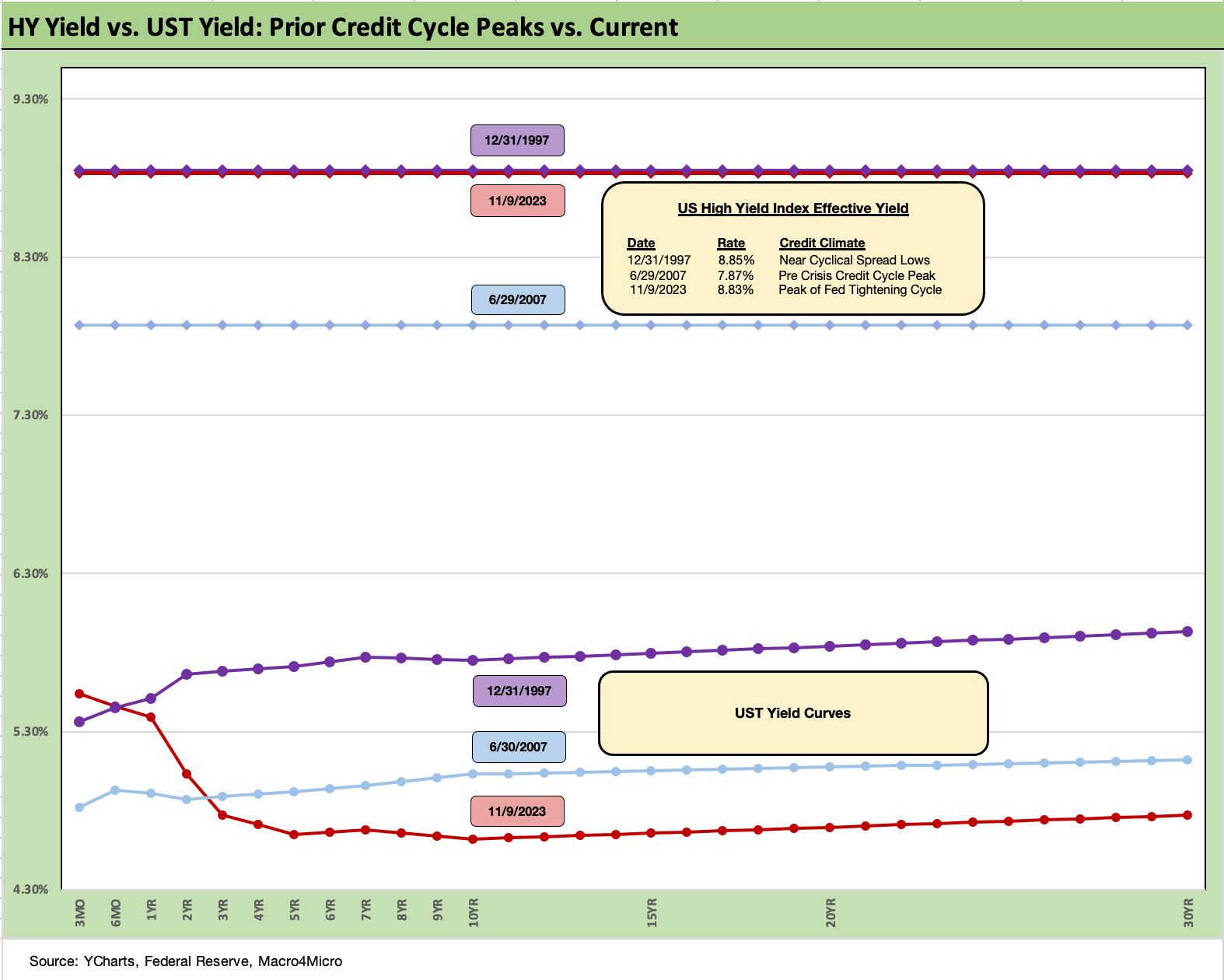
The above chart does the same drill for the US HY market as we did for the IG market. We use the same dates to frame the symmetry of risks today. We saw HY OAS at +296 bps (12-31-97) although HY OAS had been inside +250 bps in Oct 1997 (+244 10-17-97).
During the crazy period of June 2007 as the market fuse was burning down, we saw HY OAS of +298 bps on 6-30-07 (as tight as +244 on 6-1-07) vs. the +403 bps (11-10-23) to end the last week. HY OAS was a dazzling -49 bps tighter the prior week, but for the current week was only -1 bps tighter. The BB tier was -52 bps tighter the prior week, the B tier -47 bps tighter, and the CCC tier -24 bps tighter. The CCC tier remains wider for the trailing month while both B and BB are tighter over the month. Very little action in intra-HY quality spreads was seen this week (see HY Credit Spreads: Migration, Medians, and Misdirection 11-6-23).
These levels are comfortably below the long-term HY median of +472 bps, so there is a long way to go if the market gets sloppier and the geopolitical risks head in an uglier direction. Oil has been well behaved so far in all the Mideast turmoil and even dropped into $70 handles and $77 WTI to end the week, up from a low of $75 handle midweek.
The fundamentals have been in aggregate solid and 3Q23 earnings season is not signaling worry in the immediate context of spreads. The HY spread rally in the face of a modest shortfall in job adds (to a still record payroll count) seems more about the dynamics of light supply than a fundamental trigger or compelling value. The forward expectation handicapping continues, but this is a very different HY cycle than past downturns with the UST curve and inflation handicapping driving so much of the risk pricing reactions in a BB heavy market.
We see spreads in HY as quite tight from various angles, which we discuss in other publications. The absolute OAS in historical context and relative to the risk free and lower risk alternatives do not stack up well vs. history and medians. That said, they are a long way from the peaks of earlier credit cycles. It Is hard to shake them from a fundamental standpoint. They have tightened materially across the year from year end 2022 (+481 bps ICE). We expected HY OAS to get shaken by now from such tights, but this has not happened.
This week the UST market and equities will be locked in on the CPI release along with Retail Sales and Industrial production in the search for more signals. Last week, Powell jawboned on the modestly hawkish side of the ledger, but this week’s CPI number and PCE to end the month will be the last round before most HY investors get into holiday hunker down and year end mode.
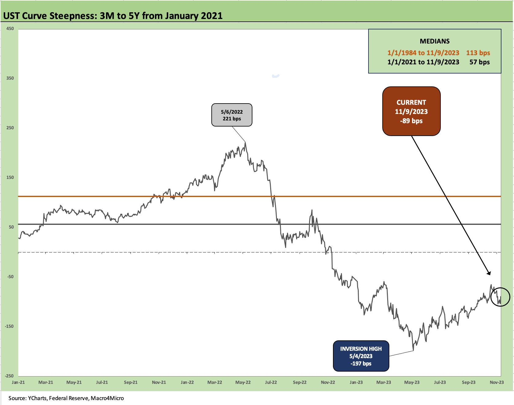
The above chart updates the 3M to 5Y UST that shows the steepest inversion since the wildest part of the Volcker years. This chart plots a short-term time horizon from the start of 2021 for better granularity in the visuals. The same is true in the next chart for the 3M to 10Y version.
We have been watching the movement on the 3M to 5Y UST closely since we first started posting commentary (see The Cash Question: 3M-5Y Yield and Slope 10-19-22). To get paid more in yield for taking no duration risk was always going to face a rendezvous with conceptual destiny at some point unless the recession was not only knocking on the door but kicking it in.
The macro and micro conditions set the cause and effect, and the UST is the symptom. The problem last fall was that the UST was forecasting what wasn’t happening before our eyes (see Unemployment, Recessions, and the Potter Stewart Rule 10-7-22). The tightening cycle was worrisome and the fears were justified; the problem was that it wasn’t in the employment numbers (not even close) or the actual results and guidance across many industries – services and manufacturing alike.
So here we are with a steep inversion in this case at -89 bps. We are more than a year later after all the “recession is here now” talk and still looking at strong household consumption patterns (reflected in the GDP numbers each quarter and the PCE numbers each month, in retail sales, etc.).
We still see steady fixed investment (see GDP 3Q23: Old News or Reset? 10-26-23) and the consumer has hung tough (see PCE Sept 2023: Consumption Strong, Inflation Steady 10-27-23). In other words, the debate continues.
Outside of longer tailed events (Congress gives Putin a big hug and makes Ukraine run out of ammo, China trade war unfolds, or the Strait of Hormuz gets blocked and the US sinks the Iranian Navy, etc.), an awful lot has to go wrong to cause a material contraction that would be called a recession. It takes more than inventory destocking and a bad trade deficit trend or a slowing rate of increase in fixed asset investment.
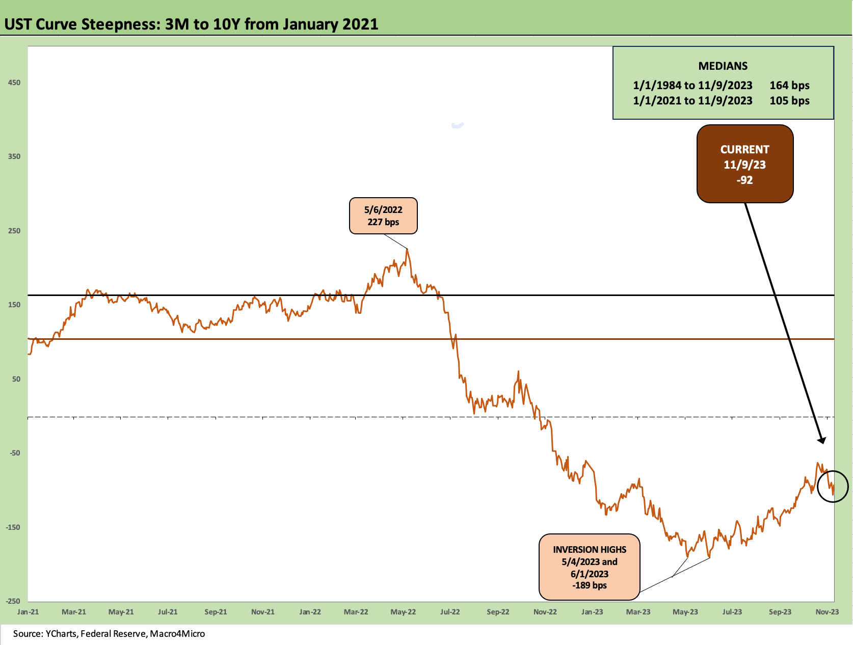
The above chart updates the 3M to 10Y slope and shows an inversion that is eerily similar to the 3M to 5Y slope. We see a steep inversion at -92 bps when the median history shows upward sloping. There is not a lot of mystery to the risk-return challenge on extension when the 3M UST yield is less than a point away from the IG Corporate index yields.
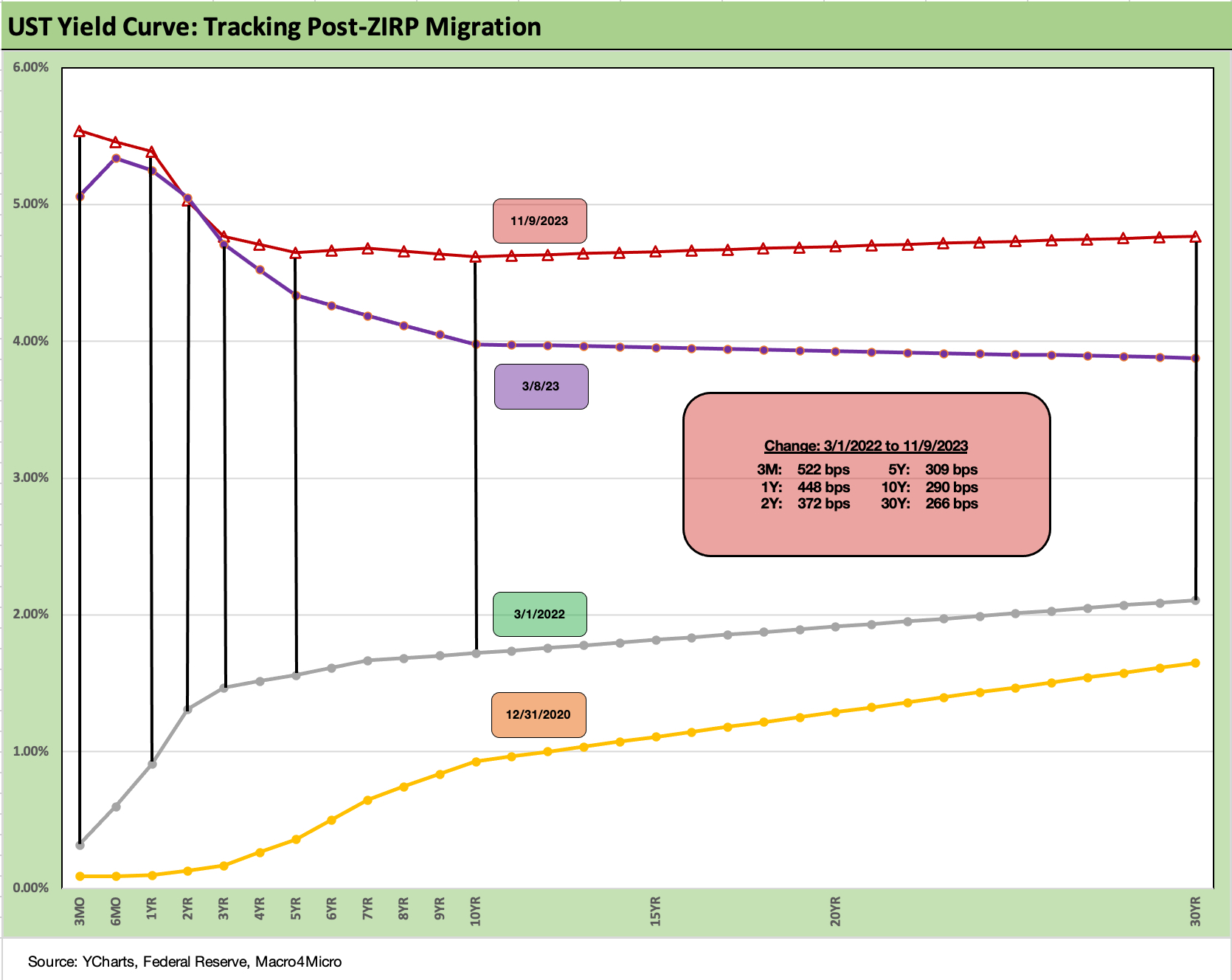
The above chart wraps our weekly with a look at the migration from the start of March 2022 as the tightening cycle kicked into gear in mid-March 2022. We also include a 12-31-20 UST curve as a frame of reference to end the year of COVID in the weeks after the vaccine rollout.
We see the migration of the UST curve from upward sloping across a flattening on the way to an inversion. We now see a relative flattish curve from 5Y to 30Y but a sustained inversion from the short end despite the long end of the UST taking a run at a 5% handle before rallying.
This week we will get the latest CPI (see September CPI: Big 5 Buckets and Add-Ons 10-12-23), Retail Sales (see Retail Sales: The Consumer is Alive and Well 10-17-23), Industrial Production (see Industrial Production: Holding Pattern 10-17-23), and another Housing Starts release (see Housing: Starts, Completions Firm Sequentially, Permits Down 10-18-23). These could test the recent UST rally or keep the buzz going. Confidence appears to have less conviction with Powell keeping the market on edge.
Retail sales have been defying gravity and challenging the “depleting savings and borrowing” theories. We saw some unfavorable news on credit card receivables quality the past week from the NY Fed, and that discussion will remain a vigorous one.