
HY Credit Spreads: Migration, Medians, and Misdirection
We do a deep dive on quality spread differentials in HY risk premiums with some cyclical history.


The juicy all-in yields for the US HY class have been the attention grabbers this year with 9% handles, but they just dropped down to an 8% handle to wrap the week on both a UST and spread rally.
The risk premiums still need to be mapped against below median spreads in a UST market not seen since the pre-crisis days, so the market may be making a counterintuitive leap with a UST rally that overlaps with the credit market’s modestly bullish view on fundamentals.
We look back at HY spreads and quality spread differentials across the highs and lows and medians with the same old question around the fundamental risk backdrop and whether the downshift in rates and potential pause by the Fed are signaling weakness in the cycle.
In the end, the all-in yields in HY are hitching a ride on the UST market, and the relative portfolio weighting needs to factor in relative coupons, the range of alternatives, and the time horizon to likely refi and extension.
In this commentary, we take another look at HY spreads and quality spread differentials starting with the IG to HY risk premium relationship (HY OAS minus IG OAS). We then move down across the speculative grade divide and plot the incremental differentials across the BB, B, and CCC tier relationships. We stack them up across the cycles and highlight Hi-Lo ticks from the TMT cycles through Friday close (11-3-23). We also update where these risk premiums for US HY frame up proportionately against the UST markets relative to history.
Before we get into the quality spreads section, we first expand the historical discussion in this piece so we can be more information intensive for some of our readers who do not eat, sleep, and drink the credit markets. Equity managers and wealth managers are paying more attention to the credit cycle and the expanded menu of credit asset classes. The quality spread topic often takes a back seat to the all-in yields. A little granularity and history can go a long way.
Market swings are picking up in HY credit…
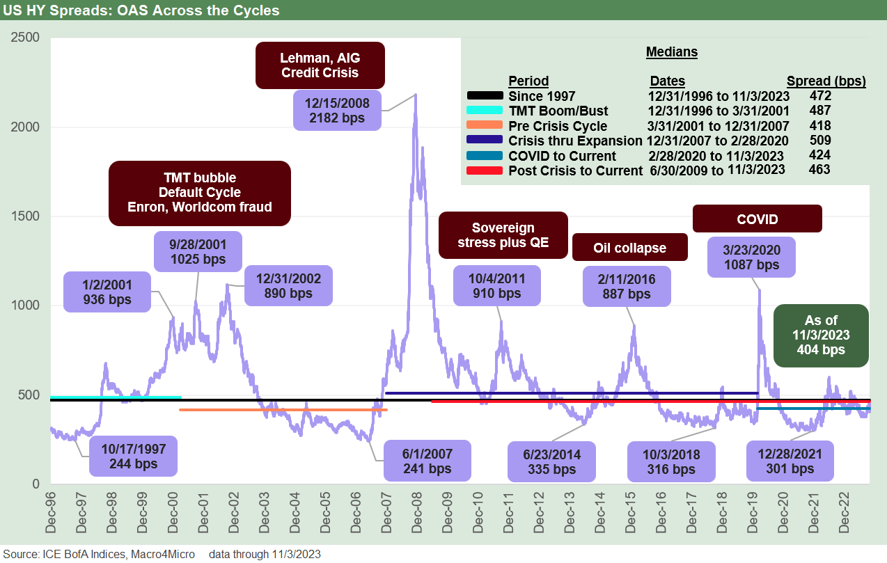
The past week was a wild one with HY index spreads almost 50 bps tighter on the week and the HY market back to 77 bps tighter from the end of 2022. The quality spread differential remains tight relative to long term history and the key time horizon medians that we look at. HY OAS is also still materially wide to those posted in earlier credit cycle peaks, so that offers some comfort also.
One exception in the tight quality spreads pattern is across the lowest tier as the B vs. CCC tier differentials are starting to show the wear and tear of the default cycle as some deals do not age so well. The B to CCC differential is now wide to long term medians but notably tight to those posted in the TMT bubble period. The TMT credit cycle years were strange ones with credit spreads at a low in 1997 at a time when the TMT excess had a few more years to run.
The low OAS points across the cycles…
The chart at the top of the page runs through some market event timelines across the credit cycles back to the start of 1997, which marked the credit spread lows by the fall as noted at +244 bps. The Oct 1997 low came right around the time Asia was starting to flame out and the EM crisis soon escalated out of Asia into the broader EM markets in 1998 (Russia default in August, LTCM margin meltdown, Lehman lights flickering in the fall on counterparty rumors, etc.).
Then we see the 2007 lows of +241 bps in June 2007. That 2007 peak saw record leveraged loans in 1H07 and waves of loan repricing and structured credit deals with what seemed like a counterparty blank check (and AIG taking on way too much of the risk on the RMBS side).
We all know what followed during the summer of 2007 as credit markets froze, mortgage exposure melted down, hedge funds started collapsing, Countrywide started looking for a rescue, and the recession started in Dec 2007 (official date came much later). The 2008 crisis unfolded with Bear Stearns in March followed by Lehman in Sept, the AIG bailout, and the rescue of the GSEs.
The June 2014 HY spread lows noted above came just ahead of the oil market crash in the late summer of 2014 when the Saudis pulled out the market share maximization playbook from the 1980s (I was following the oil and gas sector in 1986 as oil collapsed. The mix of HY issuers in E&P was quite small). That late 2014 oil price collapse rolled on into early 2016 and set off waves of redemption price panics that had the natural correlation effects on investment alternatives. Spreads were crushed.
The early Oct 2018 HY spread lows of +335 bps noted in the chart timeline flowed into a brutal 4Q18 HY performance and especially in the CCC tier on the way into a fresh risk rally in 2019.
During 2019, the Fed also went into fed funds easing mode as the economy was faltering (yes, that is right…during Trump’s “greatest economy ever”). The year 2018 saw cash as the #1 asset class in total return even at minimal returns on cash and was followed by the banner 2019 in risk with some Fed support. 2019 saw equities win big across debt and equity asset classes and benchmarks. The allocation discussion for 2024 juggles some similar issues after a Fed tightening fixation during 2018.
The 2021 lows in HY spreads in Dec 2021 shown in the chart came in the post-COVID rebound year of 2021 when “tech spec” took off and pent-up demand and pricing power ruled the economy. As a sign of those times, that market saw Carvana stock hit $370 (current $32.28 at Friday close) and Peloton hit $167 (current $5.21 at Friday close). The “excess of everything” in 2021 saw very bullish GDP numbers and great risky asset performance but also a lot of pricing power for companies that rode the supply-demand imbalance wave that brought us inflation.
Housing, autos (new and used), and goods of all types inflated while the cost of freight and logistics also spiked and flowed into prices. The interplay of so many factors in the supply chains, sustained ZIRP, some critical QE to keep credit markets functioning in 2020, and the massive boost to household cash flow with mortgage refi benefits are among other factors that make the inflation topic extremely complex. The inflation analysis has a lot of layers even if the talking head dolts in Washington reduce the topic to a blame game soundbite.
We just got a fresh taste of spread volatility to the downside and upside…
As we roll forward to the 2023 spread compression in HY, we just went through a sharp sell-off in risk in both equities and HY ahead of last week’s impressive one-week rally. We look at asset returns and curve action last week in our separate weekly Footnotes publications (see Footnotes & Flashbacks: Asset Returns 11-5-23, Footnotes & Flashbacks: State of Yields 11-5-23).
The bullish week will keep facing tests ahead, but the mix of 3Q23 GDP (see GDP 3Q23: Old News or Reset? 10-26-23), 3Q23 earnings season, and the balance of economic indicators are not signaling discernable (vs. speculative) hints of recession. Supplier chains are opening up (unless 2024 sees more geopolitical stress points that close some) and US oil volumes just posted another record production month per the EIA with oil fading to an $80 handle on Friday.
The geopolitical conditions are unfriendly, but oil going lower during a Middle East war is not in the old school playbook (think 1990). We are coming off a strong GDP print in 3Q23 with solid PCE and constructive fixed investment. The 3Q23 GDP was inflated a bit by inventory builds, and that can signal producer confidence in forward sales (or a slow destocking and overbuild mistake). That is where the forward-looking monitoring of indicators comes into play.
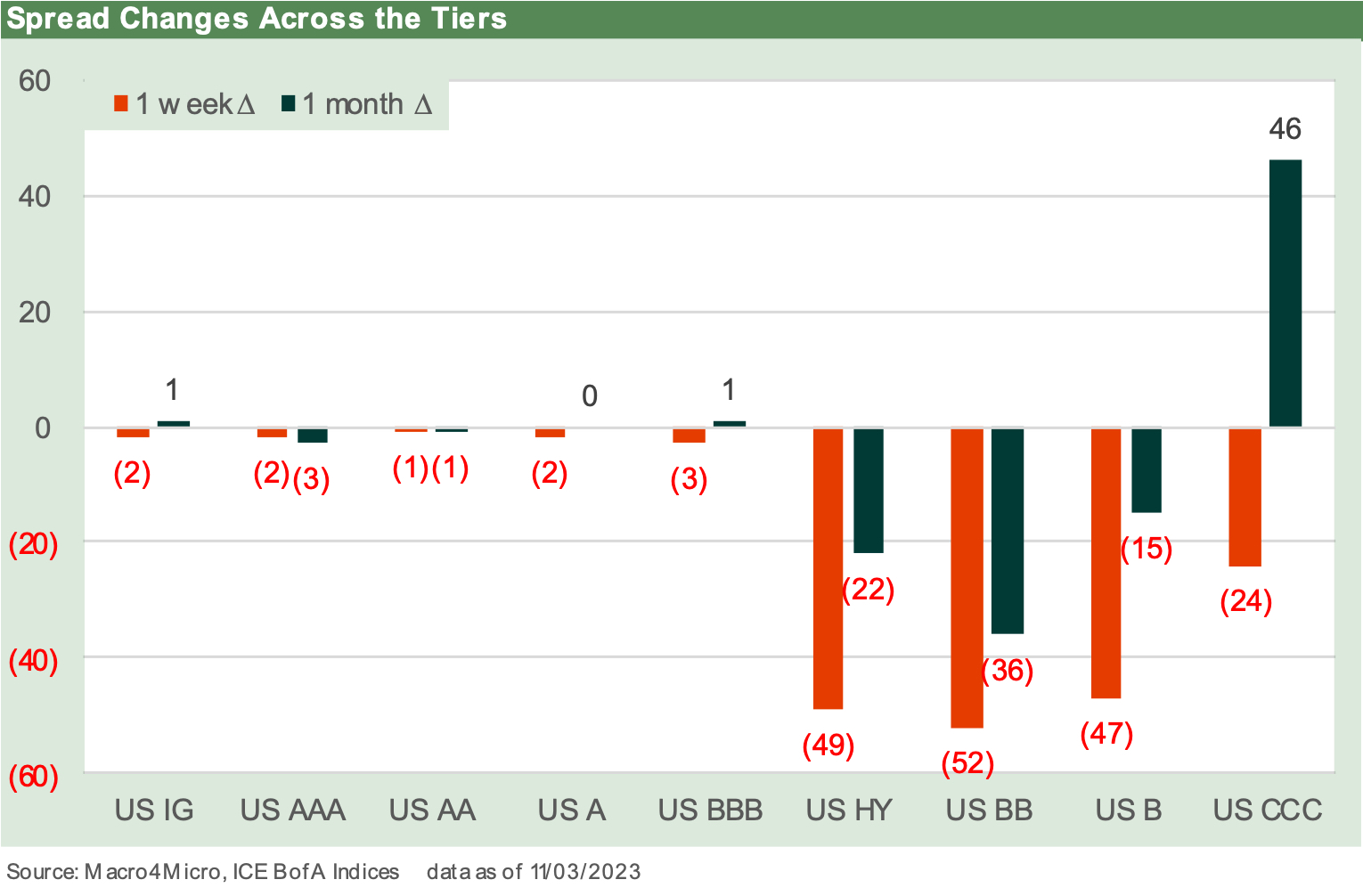
The above chart drives home the sharp moves in HY OAS the past week after coming off a material swing wider recently (see Spread Deltas: Not Rattled but Vulnerable 10-23-23). The HY market had a very tough month into late October and now has rallied back. The common feature is the CCC tier is still feeling a rolling dose of downside turmoil and defaults are ticking higher.
We are not in HY “deal too far” phase yet as UST curve headwinds enforced restraint…
The market has seen very tight spreads before, and current HY spreads are well wide to those buckets of past spread lows. The aftermath of those spread tights (i.e., risk premium lows) was usually not a great story as issuer risks grew and underwriting did what one might expect, which is pile on with fee generation opportunities until the “deal too far” causes the market to “scream stop.”
That credit market awareness of “enough is too much” was certainly the case in the TMT bubble and the record sized LBOs of 2007, which soon saw some deals scrapped by PE firms in 2H07 as a panic was stirring. Broken deals brought back some memories of 1989. We have seen some deals struggle to get financing in place of late and migrate to private credit markets. That is generating more discussions of the lagging “deal too far” effects over in private credit more than in HY bonds.
Nothing against underwriters (I spent a lot of years working for them), but it is what the relationship professionals were traditionally hired to do: commit to deals and produce revenues. If they did not, someone else would. Underwriters in past credit cycles were somewhat like builders in their markets whether commercial or residential. They keep building until the market “insists” that they stop.
These days one of the recurring themes that generates some worry is the competition with private credit players in the corporate lending sector might produce some pockets of excess. The market has not screamed “stop” per se, but deal volumes in HY bonds are well down from the soaring refi and extension numbers of 2020-2021. Rates and the tightening cycle are the easy explanation, but we assume the economics of some leveraged transactions have had more than their share of pushback from HY bond underwriters.
UST curve and the countdown to coupon repricing…
As we look at the spreads above, the HY OAS compression has been part of a strong credit cycle rebound that now has to deal with the weight of rising interest cost burdens on the floating rate part of the equation.
One topic that has gained a lot of attention is the days of reckoning ahead when the low coupon HY debt (the par weighted HY index coupon is not much above the 3M UST at this point) will face refi and extension reality. With the HY market at an $88 dollar price, this is not like the par plus days of late 2019 ahead of COVID.
The borrowers are hoping for a lot more UST rallies like this past week but for those rallies not to come with a hard landing to get the UST curve there. That is admittedly an optimistic outcome but would be possible with the right mix of deflationary trends rolling into the numbers (notably in shelter, energy, and food).
The ex-Shelter CPI numbers right now are favorable (2.0% for Sept 2023), and the quality of the CPI Shelter metric is dubious at best. The Shelter line is a whopping 34.7% of the CPI Index at last count (see September CPI: Big 5 Buckets and Add-Ons 10-12-23), and the balancing act of growth vs. price stability is working well from some important angles. Wages and how that flows into Services pricing is in the negative column for the bullish inflation story.
All you need is yield…and a soft landing scenario…
In the end, curve relief drives total return in all fixed income but also in risky assets (note the dazzling equity pop and spread contraction last week). That is what the credit risk bulls like about HY. You don’t have to be a bull on HY spreads per se; you just have to expect the absence of material fundamental erosion if you see the curve migrating lower on declining inflation in a soft-landing scenario. For the asset class constrained HY manager, their mandate is the only game in town. How they broaden out into loans is a case-by-case situation.
For those shopping for other ways to play credit risk, there are loans and private credit. The inverted curve was migrating toward flat via a steepener as we cover in our State of Yield weekly Footnotes publications. We have seen some segments of the yield curve graduate back to upward sloping along the way. The high-and-anchored front end of the UST curve keeps the debate tense since the good fundamental news and above-target Services sector CPI stats and high-but-easing wage inflation make it hard to plan on fed funds cuts (apart from hope and speculation).
The natural tendency of the curve to be flat or upward sloping is a mix of common sense (get paid for duration risk) and economic models that the “wicked smaahht guys” name after themselves. Term premium models are good to debate, but the supply-demand factors at work here in UST are also without a modern capital markets comp (see US Debt % GDP: Raiders of the Lost Treasury 5-29-23).
The lack of a good history is tied to more than the debt % GDP numbers. There is also the idea that the UST is not exactly a risk-free market any longer with an assist to a smaller collection of morons in Congress and some of the people they adhere to. Default is an option to some. They are on record.
The UST market is mostly about being the deepest and most liquid market. The record says it is not “risk free.” Even in a default, however, most everything else would get riskier. That supply pressure leaning towards steepening will still lurk and threaten duration from an inverted curve starting point. Setting a yield on where UST will head includes a lot of subjective factors looking out past the Jan 2025 end date for the debt ceiling. You just cannot spread UST to itself in setting a yield.
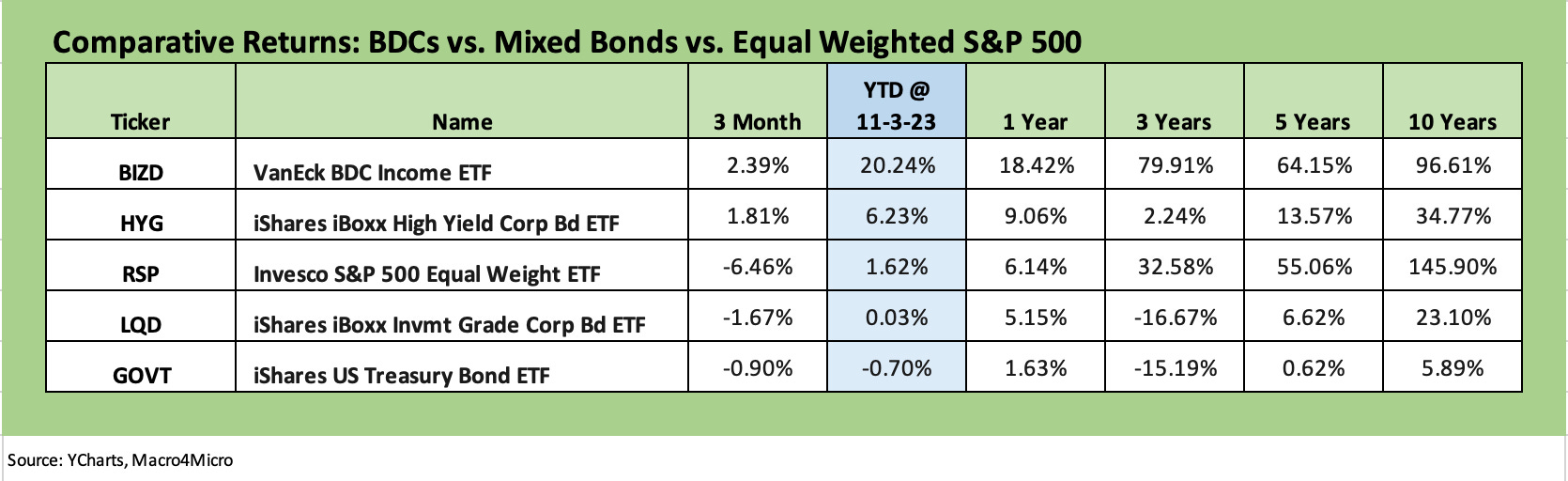
BDCs as another way to play risky credit as a complement to HY…
Below we post some notable fixed income and credit-based ETFs. We include the HY bond ETF (HYG), and IG bond ETF (LQD) and a UST ETF (GOVT). We also include a BDC ETF (BIZD) and an equal weighted S&P 500 ETF (RSP) to get a useful comp for equity market returns without all the Magnificent 7 distortions. BDCs are a credit market play but also are more tied into a floating rate asset and thus take the duration out of credit. There are other benchmarks to use, but these have the merit of daily pricing and liquidity.
I have been a UST curve skeptic for some time while being constructive on the credit cycle holding in well enough. My main worry since last fall was that the Fed had to execute on a policy that had fed funds above inflation for a protracted period (see Fed Funds vs. PCE Price Index: What is Normal? 10-31-22, Fed Funds-CPI Differentials: Reversion Time? 10-11-22). That was a matter of common sense (negative fed funds is accommodation) but also a matter of history in inflation fighting (see Fed Funds vs CPI: Narrowing of the Gap 12-14-22). That meant pressure on the UST curve and risk to duration returns with the longer end keying off the short end. An intergalactic budget deficit also sends supply one way even as borrowing rates rise.
The steady upward migration of the UST curve and duration beat-down underscored the threat to bonds this past 18 months. Now in 2023 the plot thickens with an inverted curve from the short end and ongoing questions around cyclical longevity and Fed staying power.
Markets in the past show that risk appetites can remain very strong and credit risk perform quite well in a bear flattener market (2004 to early 2007 an extreme example), so there was obviously still going to be a role for credit risk in a diversified portfolio seeking income even if you hate duration risk. Bearish on the curve and constructive on credit offer a lot more opportunities to institutions in the loan market, but the retail and wealth management players have the BDC market to turn to.
On a personal disclosure note, I took my credit risk in BDC equities rather than HYG bonds over 2022 and 2023. BDCs are a direct play on credit risk via a heavy mix of secured loans but from a risk maximization angle playing at the equity level. So, I do put my money where my mouth is as a high mileage “old guy” managing my own retirement funds.
BDCs are interesting as an investment, but they also have been very active in the corporate bond market and used the fixed rate markets to their advantage. Many locked in low fixed rates and then rode the front end of the curve and growth of the market in private credit.
Private credit in secular growth mode…
The private credit explosion is one of the differentiating features of this cycle. I started in a private placement department of an insurance company (back in the first Reagan Administration!), so there is nothing new about private debt. The nature of the asset base on the post-Glass-Steagall world continues to evolve (and occasionally devolve) at a rapid pace. The private credit AUM explosion is another evolution.
The private credit market is just one more form of disintermediation of the traditional banks that has been ongoing since the early 1980s with bonds. There are more asset risks and complex due diligence requirements that require a lot of resources. Those demands thus favor the brand name HY managers and legacy private equity players.
Whether the private credit falls prey to “deal too far syndrome” (or AUM maximization strategy risk) remains to be seen. Pick your managers carefully. We have certainly seen a diverging performance across the BDC equities (some for better and some for worse in my own portfolio).
There are some top talents in the private credit space, and that is where the trade-off of talent vs. AUM and fee hunger needs will need to prove they can find the right balance. This cycle will be an interesting test. I can remember in the mid-1980s when my employer and boss (the HY PM) refused some sizeable pension mandates in HY bonds since there was not enough quality product to buy. That is not typical. And he was right.
Risk compensation, proportions, and historical context…
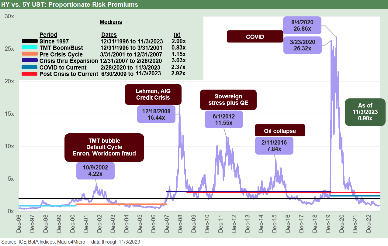
In the next chart we set up the quality spreads discussion with a look at the incremental premiums based on OAS % 5Y UST. We have done this drill before a few times (see Those Were the Days: HY Relative Yields, HY Relative Risk Premiums 2-9-23), and the takeaway is that the proportionate increase in risk premiums relative to the risk free alternative is very skimpy in historical context.
The above chart uses a metric we like even if it is not a typical one in market practice. If one views the cornerstone of risky asset investment as being tied to “higher returns for higher risk” then it makes sense.
The risk premium in the form of HY spreads can be framed against the risk-free alternative, namely UST. You can also substitute in IG all-in yields for UST as an exercise, but that is for another day. There are layers of other angles (duration adjusted yield ratios, etc.). It is just about more facets on the analysis prism.
This week brought one of those times when both spreads and the UST curve was rallying. That took the HY OAS % 5Y UST down to 0.90x. The more typical expectation would be for lower UST and wider spreads since the catalysts for lower UST curve on short duration assets are often tied to cyclical weakness and handicapping Fed easing. There are also mix shifts and industry or issuer stress that can rattle spreads. As always, it is never simple. During times of inflation, the mixed weighting of rates vs. credit and fundamentals is more complex.
The takeaway is that the current relationship is below the time horizon medians except for the TMT cycle median of 0.83x. That UST curve back across much of the late 1990s was mostly higher than what we have today (1998 was a tossup with big downward shift), but the relationships of credit spreads to market credit risk was not adequate to the risks.
The connection point on pricing adequacy is the central question now as it was then: “How risky is this credit market relative to that small premium? The market is still trying to put that together.
In my view, the wide range of potential outcomes says the HY market is riskier than the current HY pricing framework reflects. Better opportunities will come later. For the HY asset class constrained, defensive is the order of the day with rates and the cycle both a tough call in 2024 while geopolitical factors and domestic politics are maddening.
As we look back across time, the current market is more BB heavy at half the market value. We also have a more diversified mix than in some earlier markets with outsized TMT (late 1990s). After the crisis, we saw upstream Oil & Gas markets that were overleveraged, bleeding cash, and all correlated to the same variables.
This current market arguably saw the UST spike deter some of the worst of the excesses of prior periods since the curve move came on fast after the COVID crisis. The private credit market also served as a destination for some shaky deals that in the past might have ended up with the banks and in the HY bond markets. The PE sector and HY asset managers have captured a lot of private credit share relative to HY bonds.
Quality spreads from high to low…
In this next section, we break down quality spreads starting with the asset class move from IG to HY. Then we go ratings tier by ratings tier.
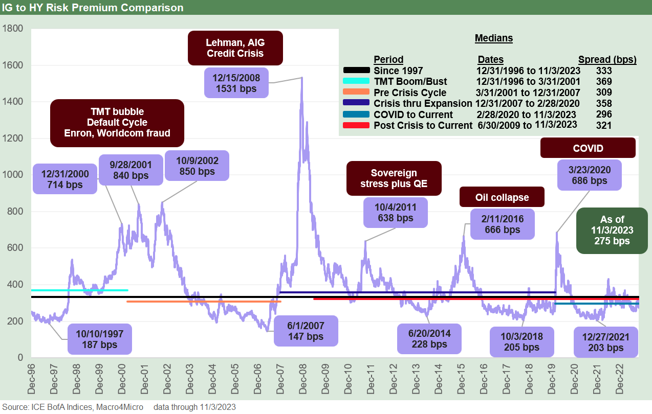
The above chart plots the IG vs. HY quality spread differentials back across the cycles. We also break out the key time horizon for comparison. The Friday (11-3-23) close of +275 bps is still wide to all the lows noted in the chart with the June 2014 low of +228 bps being the closest. We had a low in 2021 of +203 bps during the extended post-COVID ZIRP period. That 2021 low was in line with the 2018 low of +205 bps. The lows of 1997 and 2007 dates were the “lowest lows.”
The post-COVID median of +296 bps in the median box in the chart is only slightly higher than current IG vs. HY quality spreads, but the long-term median and remainder of abbreviated time horizon medians are all higher with +300 bps handles. The 2001 to 2007 timeline in the lowest of the mix at +309 bps before the COVID to current period. The use of medians in such varied macro and market backdrops is helpful, but it gets back to what an investor sees as the main threats to the pricing structure and what catalysts could send HY into one of its infamous whipsaws.
A near +50 bps move in a week such as we just saw is not typical unless we are coming out of high spread environments. On the other hand, there have been plenty of secondary liquidity almost-evaporations (the “2x2” occasions) that often unfold from industry groups and single names. The optics of mutual fund flows and redemption risks and event shocks always are there, but the bigger cyclical turns are the main events. That is the everyday debate since the balance of fundamental factors as of now are constructive.
The question remains: “What will it take to rattle the risky credit markets when fundamentals at the median are reasonably solid and we just wrapped a decent earnings quarter in a BB heavy HY market?”
You can check off the list (energy, autos, cap goods, aero and defense, manufacturing, metals/mining, consumer products, hotel and leisure, agriculture, health care, metals/mining, etc.). You can always find issuer problems, but sweeping credit contraction, bank system shocks, and consumer retrenchment are not on the scene - yet. The regional bank mini-crisis in March 2023 put that sector on the watchlist for macro stress but consolidation is the more logical outcome there.
It takes a lot to seriously spook the HY market for a long stretch. In contrast, the equity market tends to exist in a constant state of being excessively caffeinated.
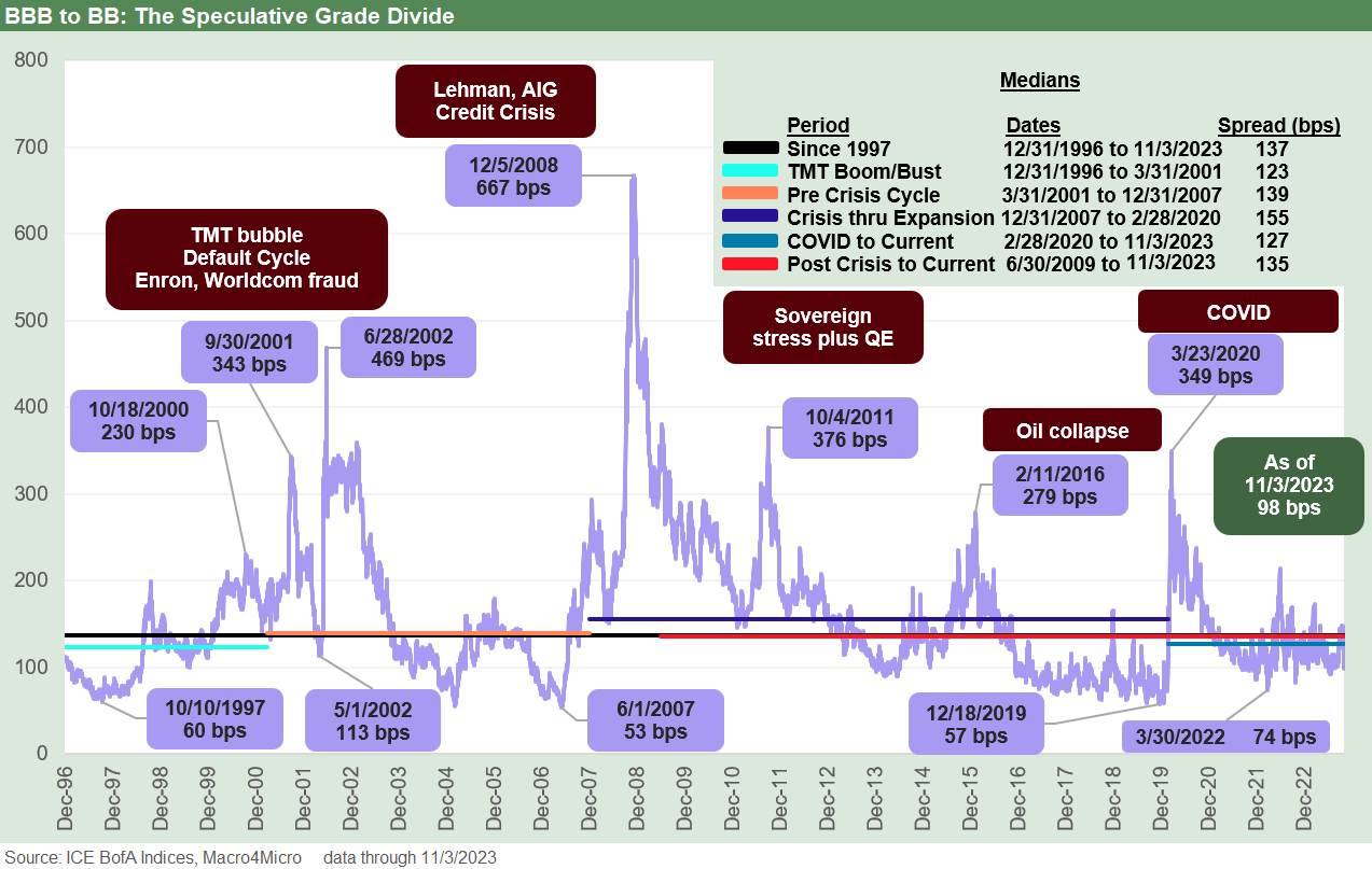
With a very big rally in the BB and B tier this week and not much movement in the BBB tier, we see the BBB vs. BB OAS differential down sharply to +98 bps (11-3-23). When HY gets volatile, these can whip around more on movement in the BB tier than the BBB tier. We just got a flavor of that this past week as BB OAS rallied by over -50 bps. The current quality spreads are now well down from just under +150 bps in less than a week.
As we look back across the cycles, we see the quality spread lows of 1997 and 2007 at cyclical HY spread lows for US HY. We also see the post-easing risk rally in 2019 when so much of the HY index was callable economically ASAP or at the next call. We add the 2002 data points as a reminder that some of the biggest distortions can come from the BBB tier. 2002 saw some headline collapses from the BBB tier into oblivion (WorldCom among the more notorious). The BBB tier and BB tiers also had more significant issuer concentrations at the time and thus could be moved by issuer developments.
The days of regulatory arbitrage have blurred with investment parameters…
The above chart frames a major focal point for IG investors who are BBB tier heavy (insurance, pensions) since the BBB to BB incremental yield relationships have always been linked to a defining upgrade/downgrade. The rating agency actions are tied into the “investment-grade vs. speculative-grade arbitrage.” It is a variation of an old theme but could be paraphrased as “one small step for a rating, one giant unilateral arbitrary tag for a risk score.”
Instead of being one small notch along the risk-reward continuum, the BBB to BB tier move had disproportionate significance. The good news is that the pricing effect has eased as a factor. Investment parameters evolved and more mainstream companies migrated down to BB. That has been true in both the USD and Euro markets.
Over the cycles, the migration is smoother and less “barbelled” in the HY vs. IG mix such as the days when the IG tier was A tier heavy and HY was B tier heavy. That is not to say it is not still important and especially for portfolios with rigorous rules (e.g., index funds, hard wired IG standards, etc.).
Besides being good for brand power and market clout for the rating agencies, the speculative grade tag (often just called “junk” as an unfortunate shorthand) tended to loom large in some portfolio parameters including regulated investors (e.g., insurance and NAIC).
The “speculative grade divide” loomed larger in earlier cycles and was especially important in the years before the line blurred and “forced selling” was prudently addressed by investors. The ability of IG-oriented (not necessarily IG-restricted) investors to buy BB tier names in the more recent cycles has been a key driver of reducing the cost of being wrong on rating agency behavior. Many pensions have embraced the HY Lite strategy during the worst of the ZIRP years and relatively minimal coupons. Paying pension benefits takes cash flow - that is, a coupon.
The BBB tier is now $3.6 trillion in market value ($4.1 trillion in face value) vs. just over $600 bn in market value for the BB upper tier of the HY market. The structural risks of a supply of falling angels vs. weak demand for long bonds with IG covenants can have a major pricing impact when major issuers with full yield curves get downgraded. The lack of natural buyers of long bonds created an imbalance that matters when longer dated bonds (notably further out in the long duration buckets of 20Y to 30Y bonds) get notched below IG.
The BB tier is 50% of the $1.2 trillion of HY market value, and a name such as Ford can swing the index total by around 6% and the BB tier by twice that. Ford has a much bigger balance sheet than the index constituents, but much of the liability structure is not in the index. Those are some of the rare outlying idiosyncrasies for purely indexed portfolios.
The distortions in 2005 when both Ford and GM were downgraded into junk was a bigger problem. As the auto names (OEM and Suppliers alike) spiraled south in 2008-2009, the situation was even more dire. The recent upgrade of Ford was important, but a rational portfolio would address the effects of such mega-fallen-angels.
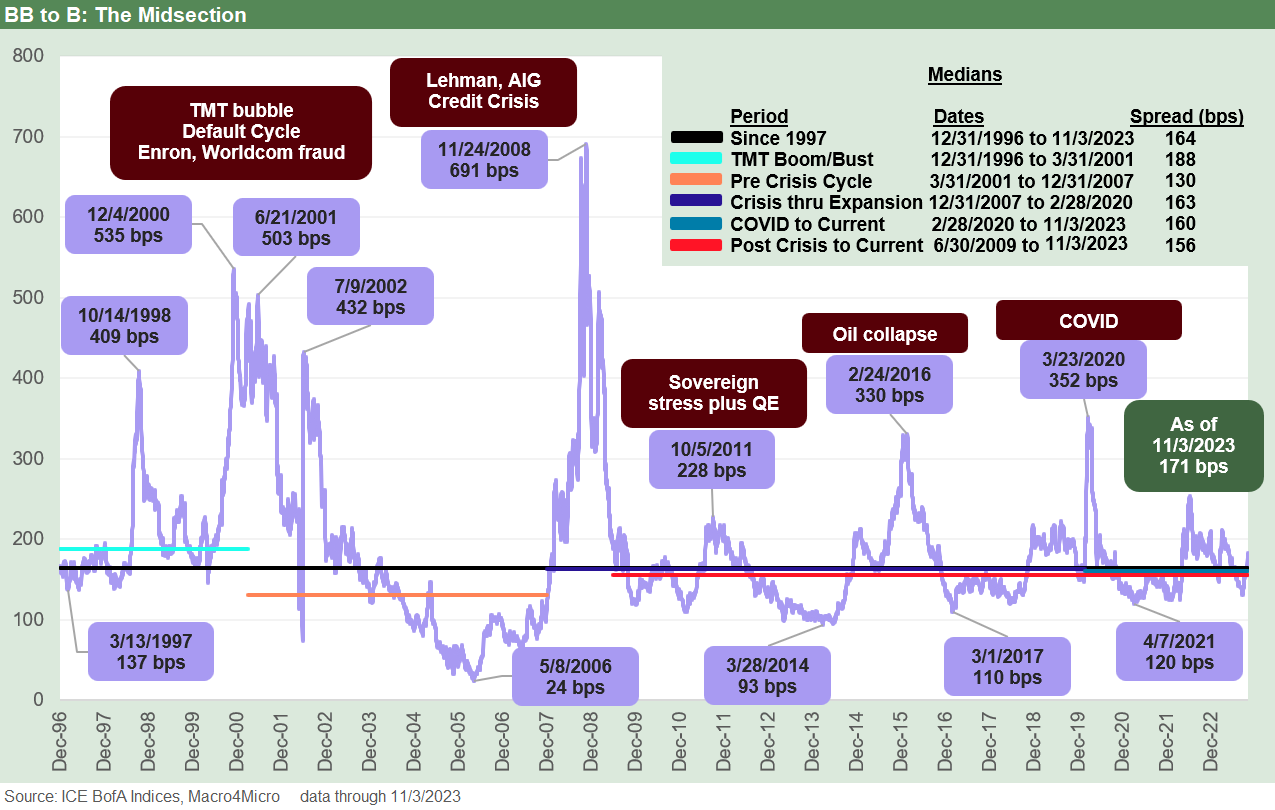
The above chart updates the spread differential from the world of the BBs to B tier. The B tier is “HY Classic” and traditionally the main event in the HY space. The BB names often get tagged as “crossovers.” That label is among the world’s most subjective and misleading terms across the years. The joke in the 1990s was “if it is tight and a single B, call it a crossover”). Whether you call it “HY Lite” or crossover, the main point with any issuer is to try to frame the risk and pricing vs. relative value comps.
The history of BB vs. B tier OAS differentials shows one of the most extreme examples of compression with +24 bps in the spring of 2006. We see another less dramatic one in March 2014 just ahead of the June 2014 HY OAS lows. One of the industry mix risks that made that 2014 BB vs. B tier compression a worry was the outsized issuance of upstream oil and gas. Oil prices were on their way to a July 2014 peak before the whole wave of upstream issuance set the HY market into a spiral in late 2015 and early 2016.
At a differential of +171 bps to end last week, the relationship is in line with most of the time horizon medians we frame in the box in the chart and is even slightly wider than most.
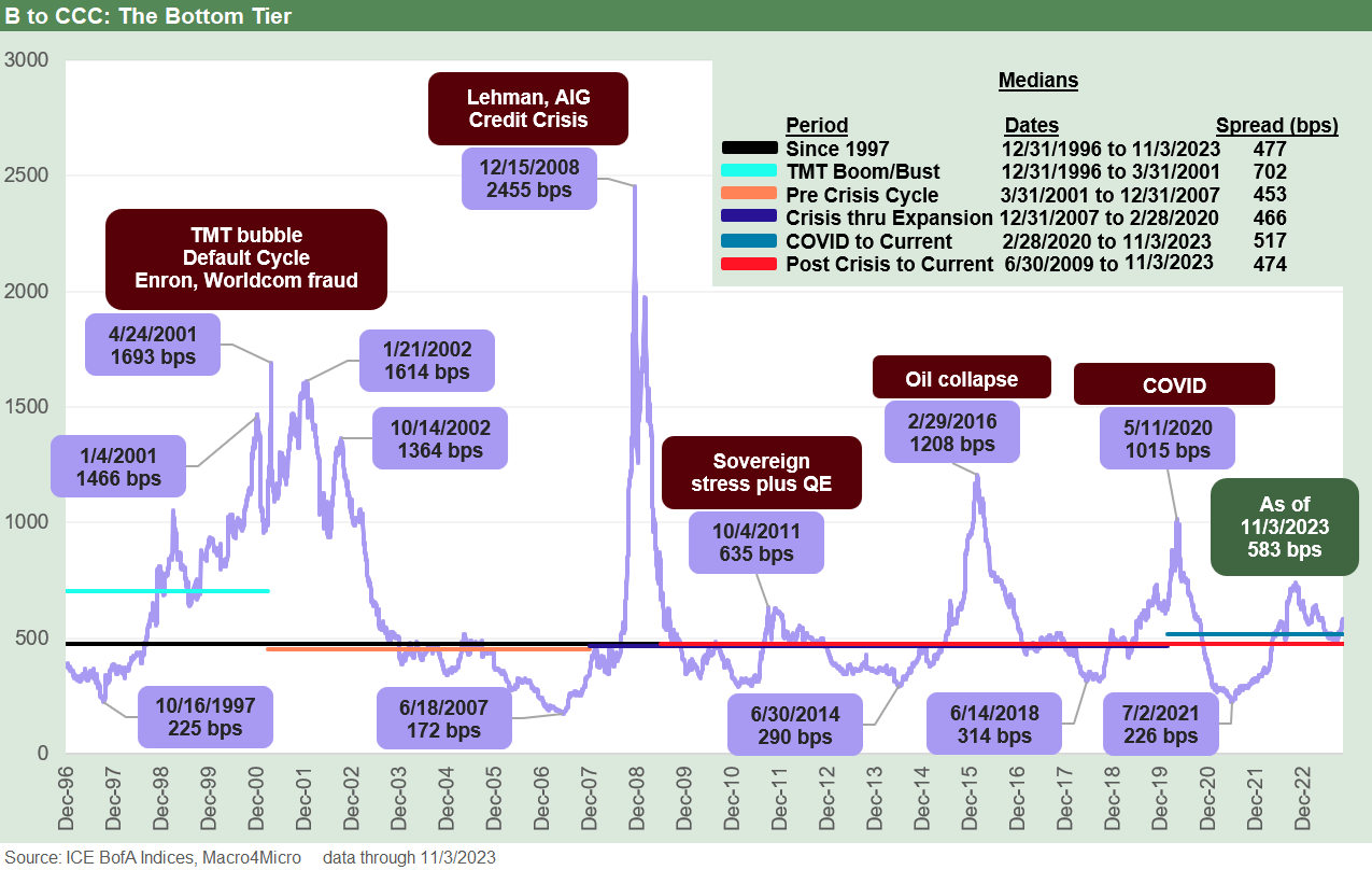
The B vs. CCC tier relationship is one where the fear of the “bottomless CCC” comes into play when credit cycles turn hard and fast. The fears after the post-crisis Volcker Rule fought its way into mixed implementation was that CCC liquidity would be severely damaged. That was a legitimate concern by definition when the market structure shifted around prop trading and compensation.
For those traders who loved playing distressed debt, the action in this tier was a great source of bonus pool in the “prop years” and occasionally a source of a rapid exit in the event of the wrong P&L impact. Those who loved the volatility of this relationship were the distressed credit managers of later (and now). Many are now retired on tropical islands and in penthouses.
The good old days of street desks tag teaming with private equity and hedge funds to control market making for distressed situations and organizing groups would be dead (in theory) under the Volcker Rule. Pre-Volcker, the brokers would traditionally work in a loosely aligned group to control the situation and run into some gray areas that often did not flag anything with the compliance police. That changed after the crisis around the prop rules and a general worry about riling regulators.
That fear was that secondary liquidity would collapse without the prop discipline. The idea was that in cyclical downturns the weakest credits would start falling and the price floor to generate trading would be lower than in past credit cycles. The limited opportunities for street desks were real, but the crocodile tears just meant more hedge funds and more credit specialty firms would get involved at lower prices without that street tag team approach as a stabilizing factor.
The opinions on how that widespread CCC risk has evolved is still a work in process since we really have not had a test of a normal credit default cycle after the longest expansion in history crashed into COVID. We had the oil collapse and then COVID, but the chart above shows what the peak spread relationships look like.
During the oil crack of early 2016, we see a +1,208 bps B to CCC quality spread differential. The oil market comes with the asterisk of so many distressed situations being driven by oil and gas prices. Even if each situation had its own story, there was not a lot of “special” in the “special situation.”
It would be better to have the dollar price differentials across time in the case of CCCs, but we do not have all that data in our reach at this point for a time series. The Dec 2008 spread peak differential of +2,970 bps makes it harder to grasp the pain than what was going on in dollar price as the UST market moved into ZIRP mode. However, digging through some old notes we highlight some of the B vs. CCC dollar price differentials below:
March 1999: We saw just under a 31 point differential as a stark reminder that the credit cycle was over while the NASDAQ equity benchmark was running to a +86% total return in 1999. When the equity guys did their post-mortems, they came around to a conclusion that “maybe we should watch the credit markets.”
January 2002: We saw a 43-point differential between the B and CCC tier that was in a class by itself. Enron had just folded up its tent with a Chapter 11 in Dec 2001 and confidence in audited financial statements was crashing. Fear and loathing were not hard to find. Sarbanes-Oxley would be inked by the summer of 2022. Laws were changed, research was investigated broadly, and the Global Research Settlement would soon restrict street research activities.
February 2009: The B to CCC differential hit just under 32 points. The equity markets hit a bottom level in March 2009 and the recession ended in June 2009. ZIRP was still the order of the day.
March 2016: The peak on B vs. CCC was just under 30 points in early March during the oil crash. The HY index overall had hit a low in early Feb 2016 (2-11-16 differential of just under 26 points). The CCC tier ratings and index rebalancing were still catching up with price action that flowed in the early March peak differential on dollar prices. Feb 2016 was the overall market low in HY markets and a major rally was soon underway in March in HY.
March 2020: We are not certain this was the max dollar price differential (it was the spread peak), but the 3-23-20 overall HY market lows in the COVID bottom of the HY market saw the B to CCC differential at just under 19 points as the Fed and legislative action were rushing in to support markets.
As a frame of reference, the current differential is around 14 points for B vs. CCC. We see the median B to CCC tier spread differential in the chart above around +477 bps vs. the current +583 bps, so we are wide to the medians. The Hi-Lo ranges for this one are quite materially higher than other differentials as companies migrate from being high risk credits to being de facto equity risk to then being in effect distressed equities. That is a wide risk/return range. The Dec 2008 peak of the crisis would be hard to replicate without another systemic crisis.
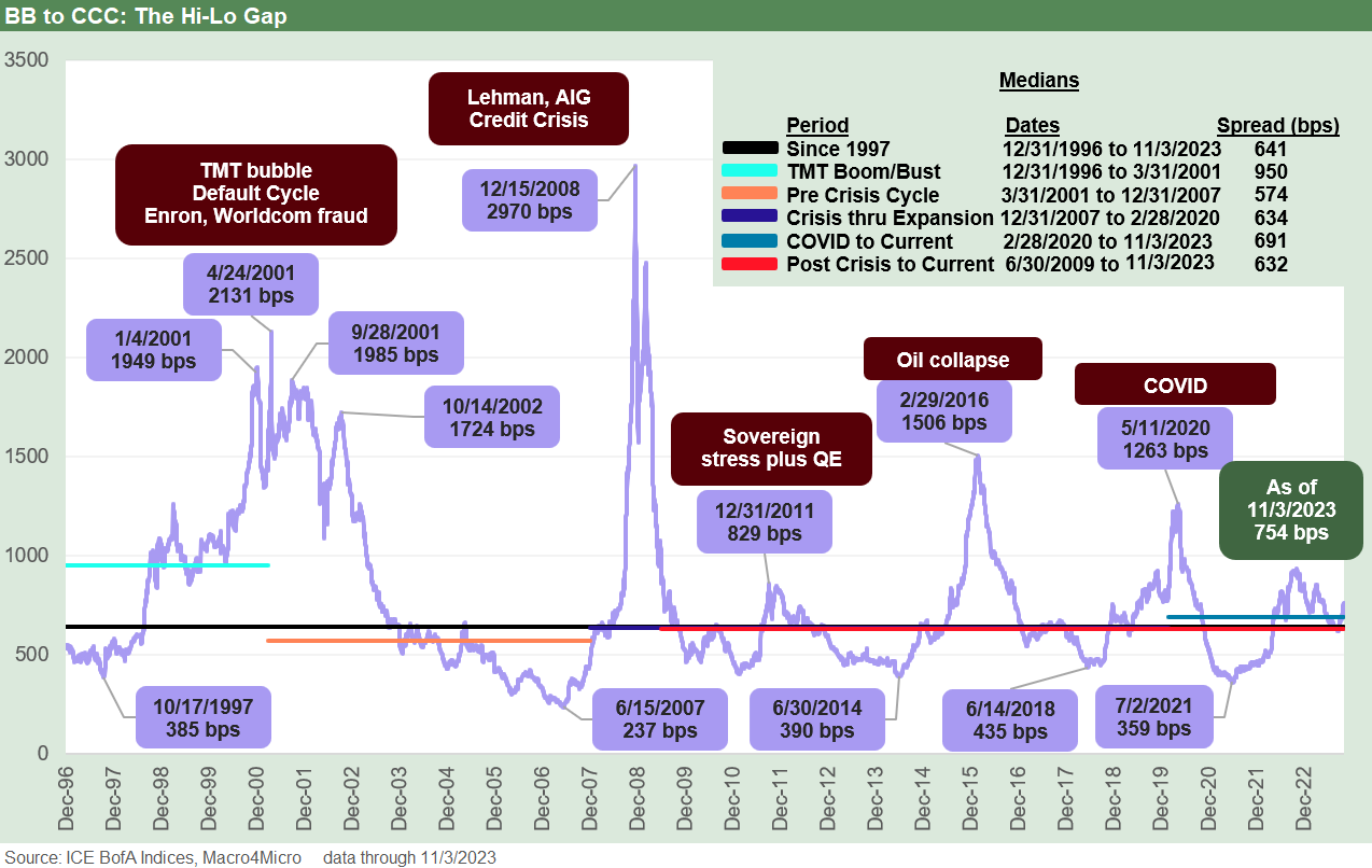
The final chart looks back across what we call the Hi-Lo spread range in BB tier vs. the CCC tier. This metric is meant to capture the risk premium differentials between the highest quality speculative grade tier and lowest tier with the highest risks. The default risks climb exponentially from the BB to the B tier and then again from the B tier to the CCC tier, so there is a lot of variety of risk profiles under the heading of “speculative grade.”
The +754 bps BB vs. CCC differential (11-3-23) is substantially wider than the long-term median of +641 bps and naturally even more distant from the lows. The peak differential noted in the chart tells a clear enough story on how much the high end and low can diverge. The 2001-2002 and 2008 periods were peak default risk and crisis periods. The 2011 whipsaw tied into sovereign stress while 2016 was mostly (not entirely) about oil and gas. COVID was a new one for the modern capital markets.
Among the more notable roller coaster rides was across 2001 and 2002 as various names blew up in various industries but with a heavy TMT mix despite some world class headlines in names such as Enron and Tyco. There were more than a little jail time and civil securities violation flags thrown across the management teams of the HY market in the late 1990s/early 2000s.
Contributors:
Glenn Reynolds, CFA glenn@macro4micro.com
Kevin Chun, CFA kevin@macro4micro.com