
Footnotes & Flashbacks: State of Yields 12-23-23
We update the state of yields as the market finally has a quieter stretch in UST gyrations.


In a quieter week for UST curve shifts, we update the state of yields after the Homeric run in the UST curve from late October that combined with the FOMC pep talk and dot plot reassurance to substantially raise confidence levels on easing.
We look at the UST deltas from the late October period when the 10Y UST flirtation with 5% peaked ahead of the ensuing rally that sent fixed income returns to near equity like returns for 2023 and drove a range of interest rate sensitive sectors into impressive rebounds over in equities.
As a side benefit, the lower UST curve brings potential for heightened refi-and-extension activity in HY that will bring less daunting coupon effects on interest expense for borrowers even if the coupon numbers still need a major increase and will reward investors seeking cash flow.
We update the 3M to 10Y UST slope with inversion still the main event and the market handicapping a bull flattener from the short end.
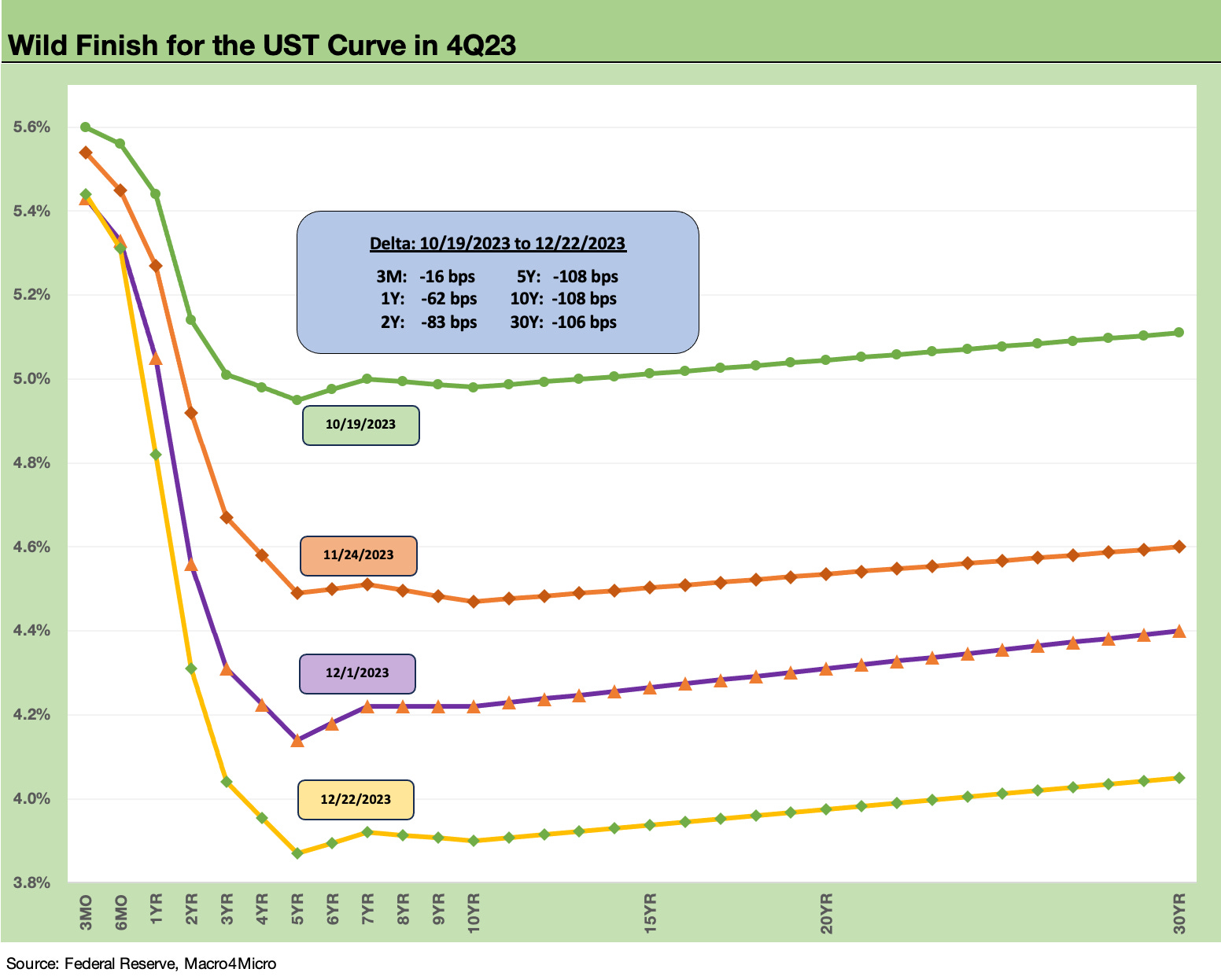
The action in the chart above tells the recent story and posts several UST curves over the past two months. We plot the 10-19-23 UST curve during a time when the markets had been getting beaten up and trailing 1-month and 3-month asset returns that we cover were in the red (see Footnotes & Flashbacks: Asset Returns 10-22-23). We then ride that curve pattern lower as all assets rallied from UST to credit to equities.
As noted in the above chart, the UST curve is now essentially back on top of the year end 2022 UST curve except for the front end. As always, the Fed sets the short end of the curve, and the market determines how the longer end shapes up.
The market handicapping is now in another zone and keeps moving beyond the three cuts that were framed within the FOMC dot plot. The new estimated target rate of 4.6% from the FOMC shows fed funds moving from the current 5.25% to 5.5% range (see FOMC: Hail Powell the Dexterous 12-13-23). The market has been pricing in more. We see bellwether industry leaders talking 100 bps to 250 bps lower, so the speculation runs deep these days on both economic events and trends and the Fed behavioral response.
We can see easing potential and notably on inflation progress, but we are still having a lot of trouble seeing how lower rates and stimulated economic activity from lower rates will still make for demand out the curve for what will be a record amount of UST issuance in 2024 on record deficits. Post-election policy risks in 2025 will certainly get into the discussion during 2H24 as investors hear quite a bit of policy grandstanding by both sides (oil, trade/tariffs, more tax cuts, expiration of debt ceiling in early 2025 and related risks, etc.). Forward looking pricing in 2024 might have some drawbacks given the political noise level.
This past week…
This past week was mild by recent standards with the UST curve mixed but the front end (1Y, 2Y) moving lower. Fixed income ETFs struggled this week as bonds and IG debt took a deep breath. We cover that in our separate Footnotes publication (see Footnotes & Flashbacks: Asset Returns 12-23-23).
The UST rally since October…
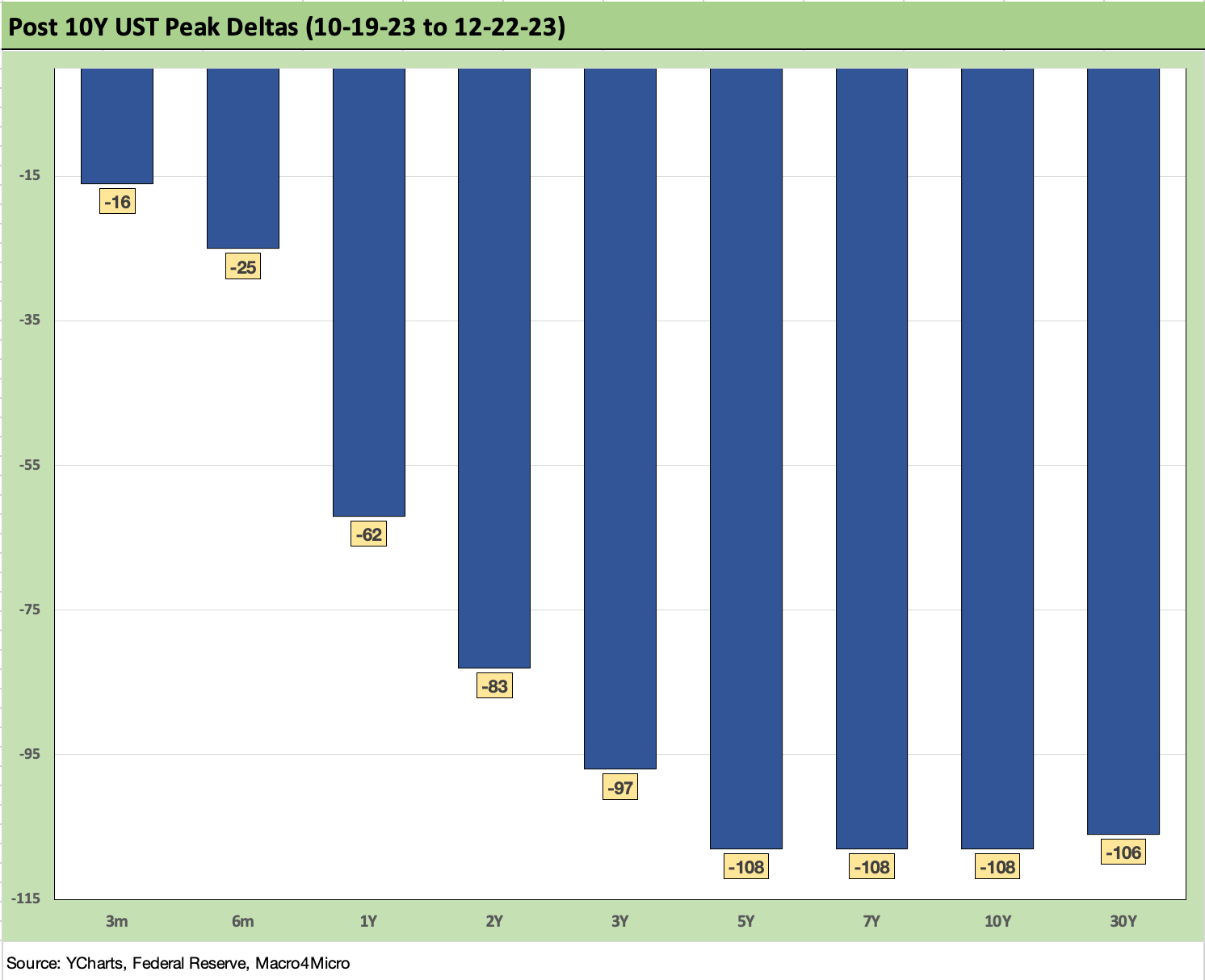
The above chart frames the yield curve deltas since the date 10-19-23, when the closing level on the 10Y UST was around the 5% line that was tested over several trading days in late Oct 2023. We could have picked any of a handful of days around then when intraday took a run at 5.0%, but this one was the highest close.
At that point of UST pain in October, the equity market returns lacked breadth and was all about the Magnificent 7 with the equal weighted S&P 500 ETF (RSP) weak. The yield curve was highly sensitive to anything that looked good as the “good is bad” school ruled market behavior (see Footnotes & Flashbacks: State of Yields 10-21-23 10-21-23).
Since then, there has been an ebb and flow of news, but the bulk of it has been positive for inflation and constructive on fundamentals. We have already told that story in our other publications, but the net effect on the moving parts of the UST curve is framed above.
The market shifted from a recurring bear steepener as the inversion was migrating with a “steepener towards flatter” pattern from its inversion. In contrast, the UST curve is now in a renewed, greater inversion as the market awaits a bull flattener from the front end with the market pricing in high probabilities of multiple cuts starting as soon as March.
The recent PCE inflation improvement is helping the case for cuts (see PCE Prices, Income, and Consumption: Goals and Assists 12-22-23), but the earlier CPI release was mixed in that regard (see November CPI: The Big 5 Buckets and Add-Ons 12-12-23). The 2.0% target PCE line looks increasingly doable. On the CPI front, the market can say the inflation war has already been won ex-Shelter, but that is not the Fed’s view on the Shelter CPI index idiosyncrasies.
We regularly update the macro econ indicators, and those are more supportive of the soft landing or no landing view but not the economic contraction view. It is easier to forecast weakness than to find it in the backward looking numbers and objective metrics. Just to cite a few:
Employment: Employment: What 200K Handles on Initial Claims Means (Not Much) 12-16-23, Nov 2023 Jobs: A Sad Story of More People Working 12-8-23
Homebuilding: Housing Starts Nov 2023: Foot by Foot, Row by Row 12-19-23
Retail sales: Retail Sales: The Consumer is Not Suffering Yet 12-14-23
Construction: Construction Spending: Timing is Everything 12-1-23
Manufacturing: Durable Goods: Strong Finish, Fresh Start? 12-22-23, Industrial Production: Steady Course, No Signs of Fade or Flourish 12-15-23
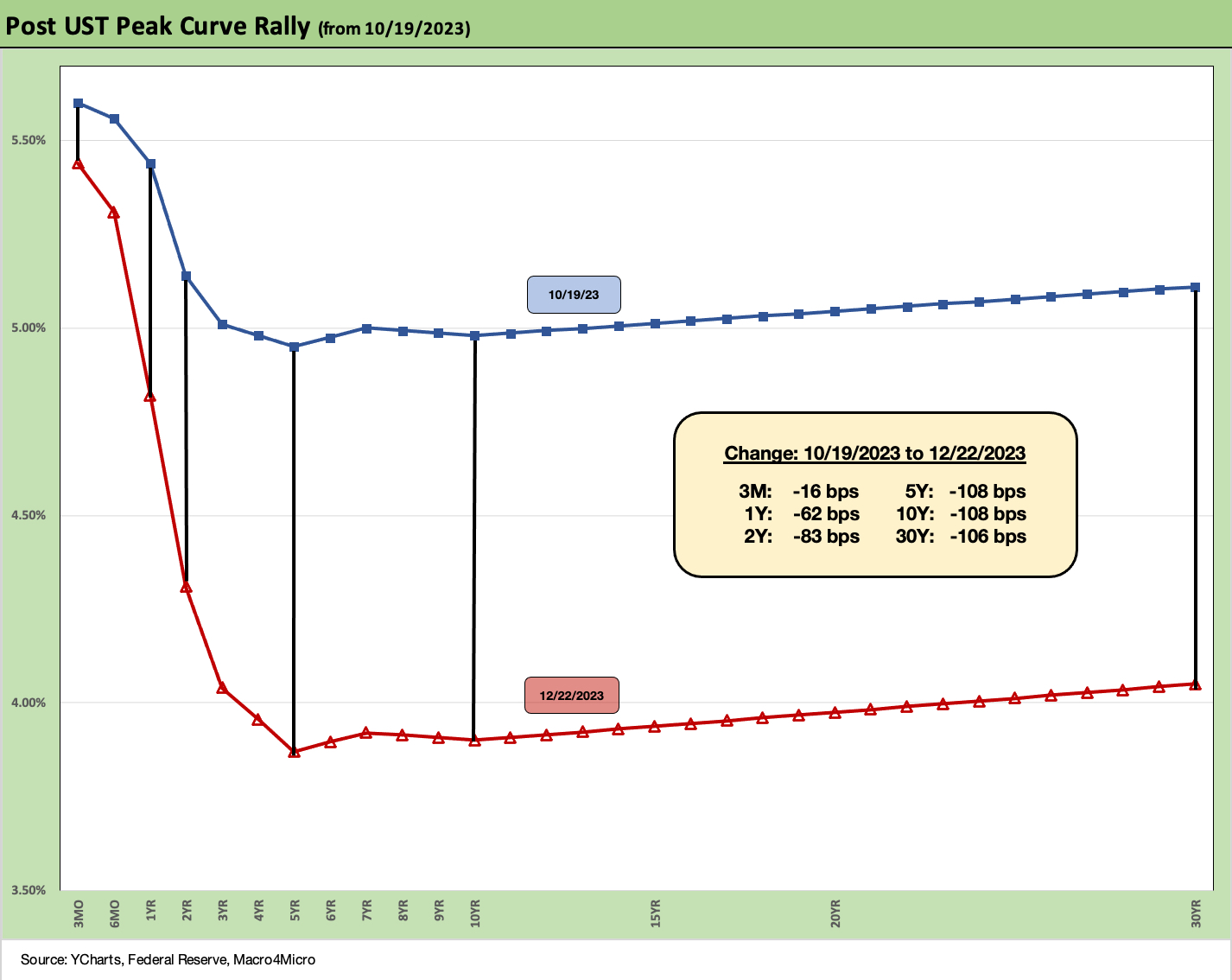
The above chart just takes the UST curve deltas from the 10Y peak period and puts it in yield curve format. It is not every day when you can cite a material “bull inversion” while talking about all-time highs on the Dow and monster equity rallies leaving the S&P 500 less than 1% from its record high set in early Jan 2022.
The change in FOMC tone has made all the difference since it takes the debate out of an adverse reaction to constructive numbers. After all, that was what we were seeing before the FOMC meeting (immediately before) and even more after. The PCE inflation news trumps the decent fundamental indicators. The lyrics are all about low inflation and steady fundamentals these days. Goldilocks is now a Wall Street busker with donations pouring in.
With the 10Y UST wagging 30Y mortgage rates, the news has been good with the Freddie Mac benchmark down to just under 6.7% this past week. That is still a long way from the Jan 2021 low of 2.65%. According to Freddie Mac, 60% of mortgage holders are under 4%. Freddie has run estimates of $800 bn of locked in value and savings on those mortgages.
That differential of new market contract rate vs. embedded low rates from the ZIRP years and low UST curve is where the term “Golden Handcuffs” gets its support. The good news is high savings for households and the demand profile in the market of preserving home equity value. The bad news is that it is hard to move or monetize! The questions around excessive borrowing against such home equity value has not been a major factor yet. HELOCs did rise to a 15 year high (since 2007) in 2022 per CoreLogic but are declining in 2023 on higher rates.
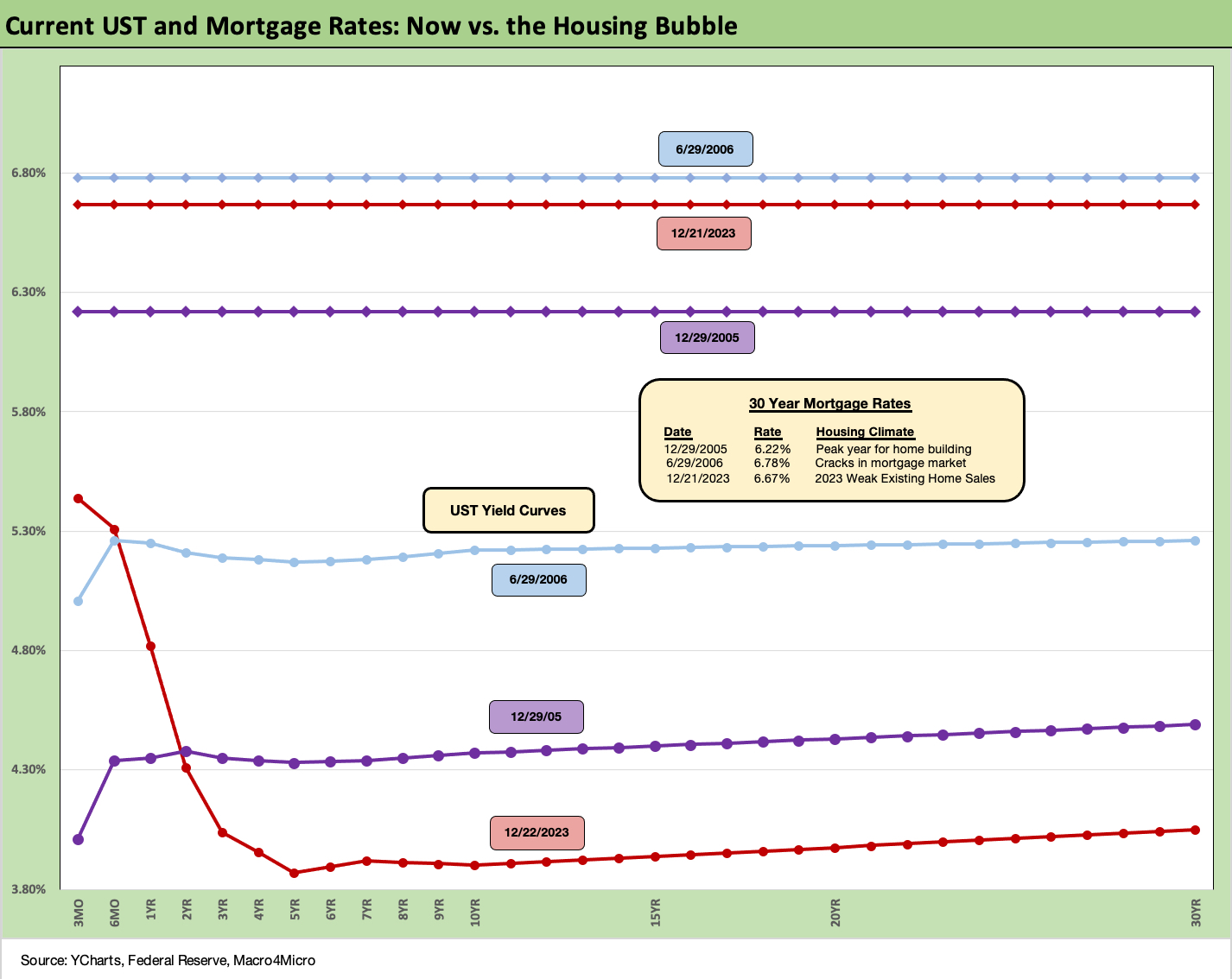
Mortgages and UST: 2023 vs. 2006 and 2005…
The chart above is one where we carry over some of the commentary each week since we get new readers on an ongoing basis. The comparison of current mortgage rates in today’s market to the peak of the housing excess of 2005 and 2006 makes for some interesting input on how to consider what factors can drive activity on new residential construction (“starts”) and existing home sales. We try to update as appropriate and tweak/add where needed.
As we cover in the separate Footnotes weekly publication on asset returns, homebuilder equities have turned in a stellar performance this year even in the face of a painful shift higher in mortgage rates across 7% and all the way to 8% before the recent rally. We have now retraced back into the 6% handle range. That still includes painfully higher monthly payment effects from this tightening cycle.
The bubble lookback years…
With this chart above, the exercise of looking back at prior periods of excessive risk appetites is worth considering. The same is true in gauging what 6% means to housing demand. We drop in the UST curves and the Freddie Mac 30Y mortgage benchmark for two periods from the housing bubble. The Freddie benchmark gets released each Thursday. The historical comparison above gives context to how strong demand can be with a 6% handle mortgage rate such as in 2005 and 2006.
There is still the challenge of how much home prices soared in 2020-2021 ahead of the Fed tightening cycle. We include the year end 2005 date as the peak homebuilding year and the middle of 2006 when the “liar loan” phenomenon and subprime excess was cresting.
In 2006, subprime was starting to show some cracks but was not yet sending the credit markets into a case of nerves. That would take more quarters to go by. Even then, equities only folded later in the fall of 2007 before the onset of a recession in Dec 2007 (that “official” date for recession was set much later by NBER).
It is notable that the current UST curve is now substantially below the end of 2005 in 10Y UST and even further below the intermediate and long end of the UST curve seen in mid-2006. Despite that UST configuration, the 30Y mortgage levels of 2023 are still above 2005 but only recently dropped through 2006 in the Feddie Mac benchmark.
The 30Y mortgage rates were pulling away before this latest UST curve rally in Nov and Dec 2023. The mortgage vs. UST relationship is a reminder of how mortgage spreads have trended in this cycle (much wider) vs. the years of overconfidence in the pre-crisis period.
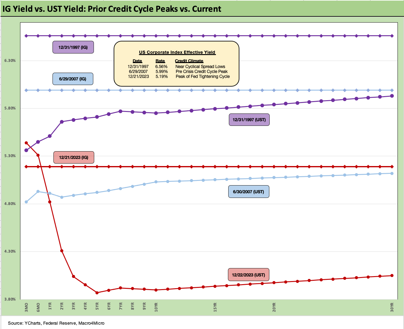
The above chart goes through a similar “then vs. now” exercise for the current UST curve and IG index yield. We compare current days to earlier credit peak periods (1997, 2007) when the IG corporate bond market was at or near credit spread lows.
Spreads were tighter in those peak periods of 1997 and 2007 than recent times, but this latest run in IG is closing in on 2007 with the ICE IG index closing last week at +107 bps after a slight widening (12-22-23). The ICE IG index OAS is around 30 bps through the long-term median, so spreads are not in any way signaling trouble or fears around a material spread wave along the speculative grade divide (see HY Credit Spreads: Migration, Medians, and Misdirection 11-6-23).
The demand for IG bonds is being driven by asset allocation waves that include retirement funds that are racing to gather up yields that they have not seen for years after prorated bouts of ZIRP in the post-crisis era.
Compression flashbacks…
As we look back across periods of spread compression near credit cycle peaks, the +70 bps for the IG index at the end of 1997 was lower than today even if the difference is narrowing (the low was in Oct 1997 at +53 bps). The 1997-1998 average for IG OAS was +95 bps. Those spreads and the yields cited in the charts above offer some historical context for today’s post-rally levels. Current IG spreads as we wind down 2023 are moving in the direction closer to the lows of the late 1990s period.
Looking at the credit bubble period of 2007 for comps, as the market was looking questionable by midyear, IG OAS was at +100 bps at 6-30-07 at the credit bubble peak. IG spreads were widening by mid-2007 after the period from 1H04 through 1H07 saw IG OAS averages in double digits at around +93 bps. The lows in 1H07 of +86 bps and IG OAS of +100 to end June 2007 were not far from the lows in 2H06 at +90 bps and 1H06 at +87 bps.
The takeaways from the 1997 and 2007 periods were that those risk premiums were in stages of the cycle that were on shaky ground given the direction of credit quality. That is where the “What comes next?” questions come in today whether that be around Fed policy, cyclical trends, geopolitics, Washington policy actions, underwriting quality, outflows away from less liquid assets, and the list goes on.
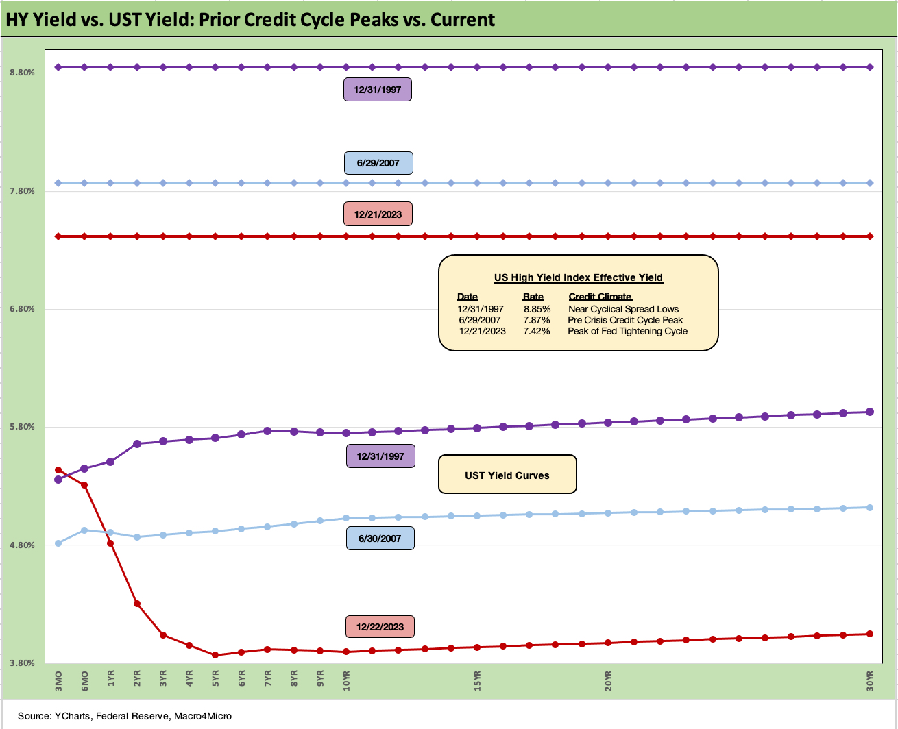
With HY moving closer to the post-crisis cyclical low points in the pre-COVID period (lows from June 2014 and Oct 2018), the history lessons are becoming more interesting again. If we break through those 2018 and 2014 levels (we are knocking on the door now), then there could be some market discussions of going after the exceptionally compressed 2007 and 1997 levels.
The UST framework saw tighter spreads in 2007 and 1997 but the UST curves were also higher and generated higher all-in yields. As of now, the HY index yields closer to 2007 than 1997, when the UST was materially higher. As investors try to handicap spreads and UST curves, the risk premiums in HY are extremely tight in absolute terms and even more so in proportionate terms vs. the risk free alternative, but yield maximization is the name of the game for many after 16 years of yield curve starvation.
One tailwind for refi and extension demand ahead in 2024 to 2025 could come from more current coupon rates on new issue with the 6.0% par weighed coupon (5.4% on BB, 6.4% on B, 7.3% on CCC) overdue for materially higher current coupons as part of a prudent maturity extension process. These are overdue (see HY Refi Risk: The Maturity Challenge 12-20-23, Coupon Climb: Phasing into Reality 12-12-23). Pension funds and wealth management cash flow seekers would be and should be then rethinking allocations.
Looking back at 2007 and 1997…
The above chart does the same drill for the US HY market as we did for the IG market. We use the same dates (1997, 2007) as IG to frame the symmetry of risks today. We saw HY OAS at +296 bps (12-31-97) although HY OAS had been inside +250 bps in Oct 1997 (+244 10-17-97). The 1997 period saw average spreads of +282 bps in 1H97, +270 bps in 2H97, and +298 bps in 1H98 before the summer storm of Russia and LTCM (and a brief Lehman funding and counterparty exposure scare) rolled in from August into the fall.
As a reminder, the peace and quiet of 2007 was very short-lived relative to the protracted credit cycle (wider spreads but longer timeline) after 1997 through 1999. The 2007 cyclical lows in spreads had come after a period of record leverage loan origination and structured credit creation and distribution.
HY OAS averaged around +270 bps in 1H07 vs. HY averaging +270 in 2H97, so the two periods have some common features in spreads. Refinancing/repricing, and maturity extension deals in 1H07 were in a volume sprint. During the crazy period of June 2007, the market fuse was burning down. We saw HY OAS of +298 bps on 6-30-07 (as tight as +244 on 6-1-07).
The current HY market has seen spreads narrowed dramatically in a short period. Quality spreads from CCC to BB compressed with trailing 1-month tightening of HY at -51 bps across BBs at -41 bps tighter, B tier at -62 bps tighter, and CCCs in by -110 bps on the month.
We like to watch quality spreads for hints of the bottom-up decompression threat (see HY Credit Spreads: Migration, Medians, and Misdirection 11-26-23, Quality Spread Trends: Treacherous Path, Watch Your Footing 10-25-23), but the compression has been one of tighter quality spreads.
It is impressive how well spreads have held in during 2023 after the 2022 turmoil neared +600 bps in HY and crossed the +500 bps threshold a few times in the summer and fall. The UST curve, equity rally, and FOMC color all played a part. Constructive earnings and decent macro numbers helps the Goldilocks theme spinning.
Closing in on 2018 and 2014 tights…
For reference points, we can once again start talking about the June 2014 lows (+335 bps on 6-23-14) and Oct 2018 lows (+316 bps on 10-3-18). Those 2014 lows and 2018 lows are closing fast as HY spreads closed this week at +339 bps or just above the June 2014 lows.
Those lows in 2014 and 2018 were not like 2007 or 1997 given the yield curve backdrop and how that flowed into all-in yield. That said, lower 300 handle HY index OAS levels are rare. It is worth remembering that the periods after the Oct 2018 lows and June 2014 lows did not go well in the immediate aftermath. Late 2018 was a bloodbath with an ugly Dec 2018 quality spread widening and oil crash, while late summer 2014 brought the Saudi oil price war looking to recover market share.
The all-in yields today are hard to resist for many even after the rally. In contrast to 1997 and 2007, all-in HY index yields in 2023 are much higher than in 2014 and 2018. On 6-23-14, the HY YTW was 4.85% while 10-3-18 posted YTW of 6.24%. Both of those yield backdrops are substantially below the 7.71% HY index YTW to close on Friday (12-22-23).
An asset allocation strategist can be forgiven for chasing yields that high even if the risk premium is too low in historical context vs. lower risk alternatives. Yield bogeys can carry the day for many, especially after 15 years of yield starvation since the credit crisis.
The UST curve has moved so quickly, we are already down under the 8% line in HY at 7.7%. HY YTW was 9.5% on 10-27-23 and down to 8.8% on 11-16-23. Equities and credit spreads and long duration all ran in. Whether you bought a long duration UST ETF, a small cap ETF, or IG bonds, victory was to be had in the wild finish of 2023.
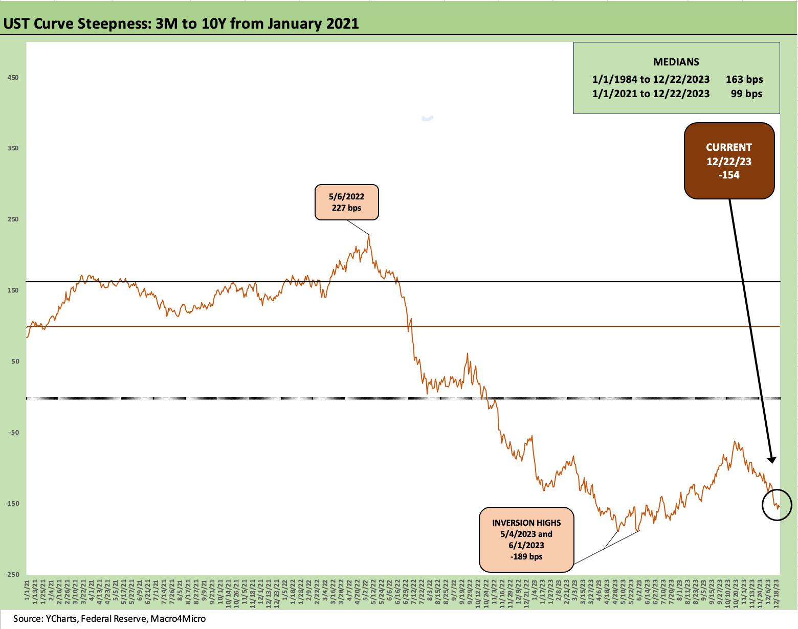
The above chart updates the 3M to 10Y UST inversion. We saw the conversion peak in early June at -189 bps and have now fallen back to -154 bps. The median for the UST is historically upward sloping as noted in the upper right of the box. That leads to the obvious question of what it takes to get the UST curve back to a normal shape (or normal term premium). Investors in recent weeks are suddenly much less worried about that premium. How far the 3M UST has to move vs. the 10Y UST is a question to think about. Then the question is how much 10Y UST can you sell at those theoretical forward UST curve rates to fund a deficit that tends to defy adjectives.
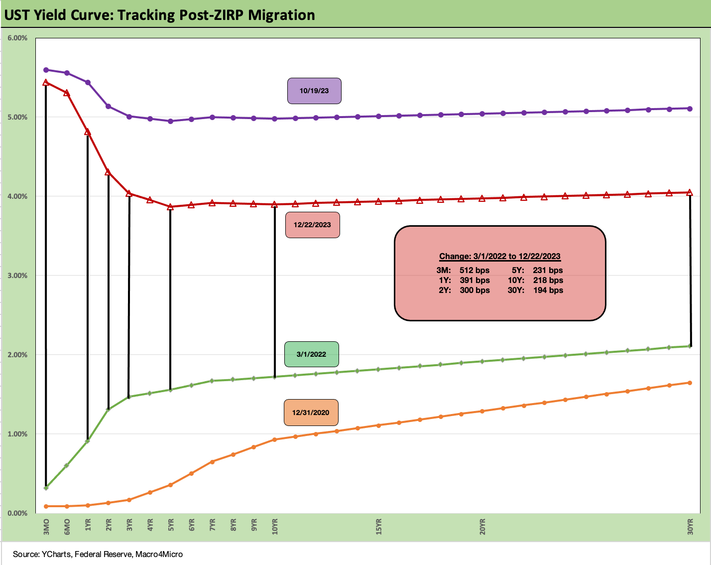
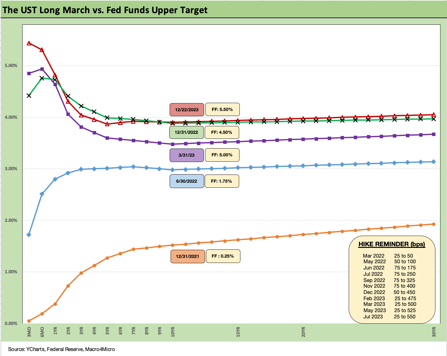
We wrap with our updated final chart that shows the cumulative move of the UST curve from the beginning of March 2022 when the tightening cycle began at mid-month. It has been a long ride as broken out in the box with the UST deltas. We also drop in 12-31-20 and a 10-19-23 UST curves as frames of reference.
The bear inversion is how 2022 crushed fixed income returns and beat some of the tech equity excess of 2021 into submission. The inversion was one of the various ways inflation had to be dealt with although it took a very long time to get to positive real fed funds rates (see Fed Funds vs dCPI: Narrowing of the Gap 12-14-22, PCE Inflation Ticks Lower, So Does Spending 1-27-23).
One of the topics for debate looking ahead will be “how real” will the Fed look to keep fed funds vs. actual PCE and CPI inflation levels as the market dynamics play out in 2024.