
Employment: What 200K Handles on Initial Claims Means (Not Much)
With the market so bullish after the FOMC, initial claims will need a pile of dead canaries to support it.


We revisit the current state of initial claims in historical context for a clear view of how extraordinarily low these claims are in absolute terms and in the context of record payroll counts and the broader demographic backdrop.
Looking back across the cyclical lows for initial claims and continuing claims of past cycles tells a story of today’s numbers when the civilian labor force is much larger.
The initial claims of 202K this past week are so low that it will be worth watching if 2024 sees even a series of weeks within screaming distance of the long-term median of 349K.
The 1997-1998 period sets a precedent of low inflation, high employment, and downward shifts of the yield curve in a winning market for the UST, equities, and credit, but replaying that type of performance in 2024 would really need a lot of good news from the Fed and inflation indicators.
The super bullish tone coming out of the FOMC meeting appears to depict a market outlook where rates and inflation come down, fundamentals charge ahead (but don’t speed up too much), geopolitics stays in a steady state (Iran plays nice in the Strait of Hormuz, Hezbollah keeps border intrusions to a minimum, and the Houthis keep aiming badly), and US domestic politics are remotely functional (or become less dysfunctional). For many, that seems like a backdrop when Graham and Dodd go into a state of economic nirvana while on vacation in Shangri-La. A lot has to go right.
Hope is good, but in the meantime the market will be zeroing in on some indicators that would need to weaken materially to make the case for consumer moderation with wages rising and credit still available. We would expect the consumer to be ground zero for a while as the prime driver of GDP or, alternatively, holding the key to any contraction risk. Initial claims numbers are one of the easier weekly metrics that will be at hand to use in monitoring, so we update some history on that metric.
The fact that jobs remain strong is not a late breaking news item by any stretch, but we thought some more input on initial claims might be worth the time.
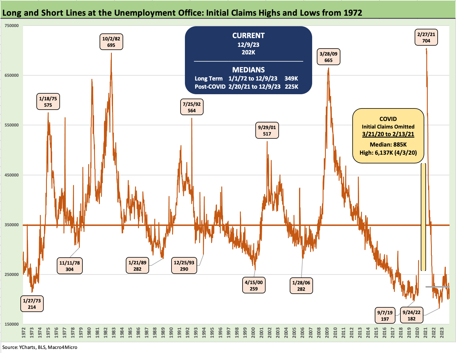
The chart above tracks the timeline of initial claims since 1972 through last week and across the highs and lows of the cycles. The easy takeaway is that the lows of the past cycles are almost all above where the initial claims are now (202K). That is despite the much smaller labor force of prior cycles (i.e., a much larger payroll count and labor force today). The one exception is Sept 2019 just ahead of the COVID shock. We had already moved below that level in the fall of 2022.
Initial claims as an easy part of the monitoring diet…
With a 202K number last week (Thursday releases), the above chart drives home how stunningly strong the employment backdrop remains if we look at the run rate on claims now vs. even the lows of past cycles. Initial claims and continuing claims come and go each week without a lot of focus (including on our part), but that initial claims release will be worth a little more focus ahead as the market does a reality check on the path for rates after such a bullish UST response that carried over to equities and credit spreads.
We gave some context in an earlier piece (see Initial Claims: Historical Context on what 211K Means 3-9-23), and the numbers remain very steady. Since the earlier note, there have been some restatements that are reflected in the numbers, but the basic theme remains the same. That is, employment has shown no meaningful signs (yet) of any material weakness despite the occasional layoff headlines.
Add in total unemployed and continuing claims for some additional tracking…
The chart below adds another angle and shows the time series for total persons unemployed and adds in continuing claims across time. In a labor force the size we see today, we see only 6.29 million unemployed. Using past cycles as a sample where the total of unemployed persons hit highs, you have to come up with a lot of millions to get there.
You can start checking off the list of major occupations we detail in our monthly employment drill and handicap where those job losses would come from (see Nov 2023 Jobs: A Sad Story of More People Working 12-8-23). We have a hard time unless you want to frontload “AI Armageddon” or the purging of a large swath of the Federal work force (that has been discussed by some).
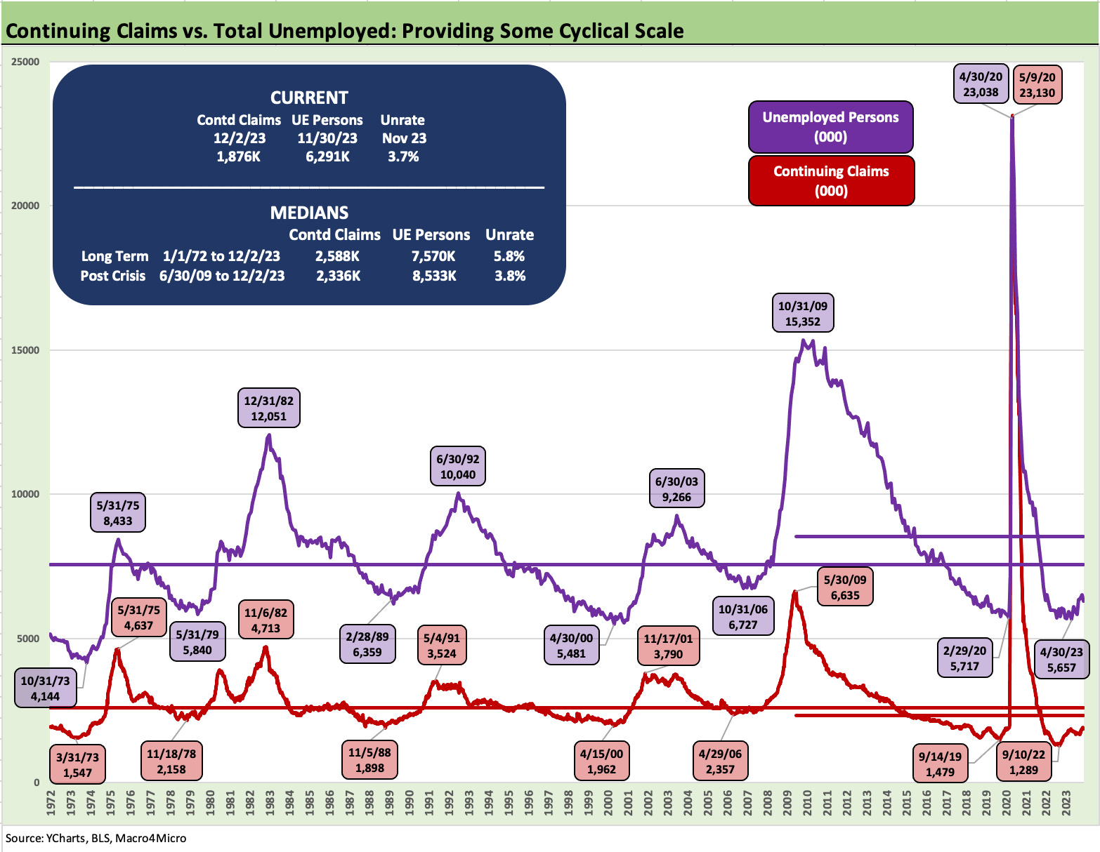
We see a long-term median from 1972 of 2.59 million in continuing claims with a median unemployment rate of 5.8%. We are currently at 1.88 million continuing claims and a 3.7% unemployment rate. The post-crisis (post-June 2009) period shows a median of 2.33 million for continuing claims, 8.53 million for unemployed persons, and a 3.8% median unemployment rate.
The employment vs. inflation connection can get bogged down…
In bygone cycles of yore, 5% used to be considered full employment and time for inflation alerts to go off. There were Fed debates in the mid to late 1990s as employment was strong (but not 3% handle strong!), capacity utilization was high, and the Fed was nervous. That did not stop growth from rolling on into 1997-1998 with the UST curve shifting lower from 1996 into 1997 and 1998.
A 1% handle CPI showed up in late 1997 and stayed at 1% handles across 1998 and into early 1999. We looked at that stretch in a recent commentary in the context of how equities and debt and the UST curve won during that 1997-1998 period (see HY and IG Excess and Total Returns Across Cycles: The UST Kicker 12-11-23).
Unemployment rates were higher back in that 1997-1998 period vs. now, so some weakness in payroll today would likely still leave unemployment rates lower than during those years. The backdrop in 1997 and at least part of 1998 was about a downward shifting UST curve and a market with high-risk appetites. The fall of 1998 saw some Fed easing for reasons we discuss in other publications (Russia, LTCM, etc.)
For 2023, the requirement to look like 1997-1998 on the UST curve still requires a lot more improvement in inflation while allowing room for more job loss. The inflation challenge now is where the services and shelter inflation metrics come into play (see November CPI: The Big 5 Buckets and Add-Ons 12-12-23). In terms of vulnerable sectors for job losses, financial services is high on the list right now while federal government jobs and social assistance/health care are more vulnerable in 2025 subject to election outcomes.
Big job base makes it hard to move the needle…
We add the chart below to hammer home the point on the scale of the employed base of workers in the labor force. To damage that number takes a lot of layoffs.
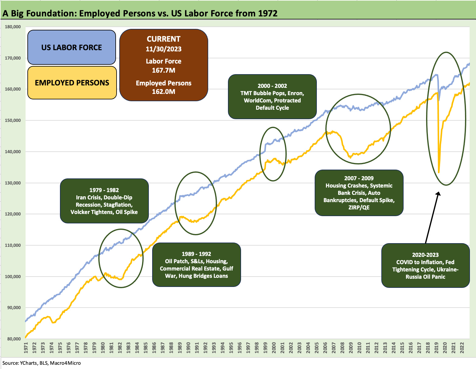
We highlight a few of the market events and economic setbacks that did move the needle on jobs. As we see in 1980-1982, 1990-1992, and 2000-2002, it takes a lot to move the lines much. The world sure managed to do that in the credit crisis and COVID. It took a few years after 2008 to get back to 2007 job levels.
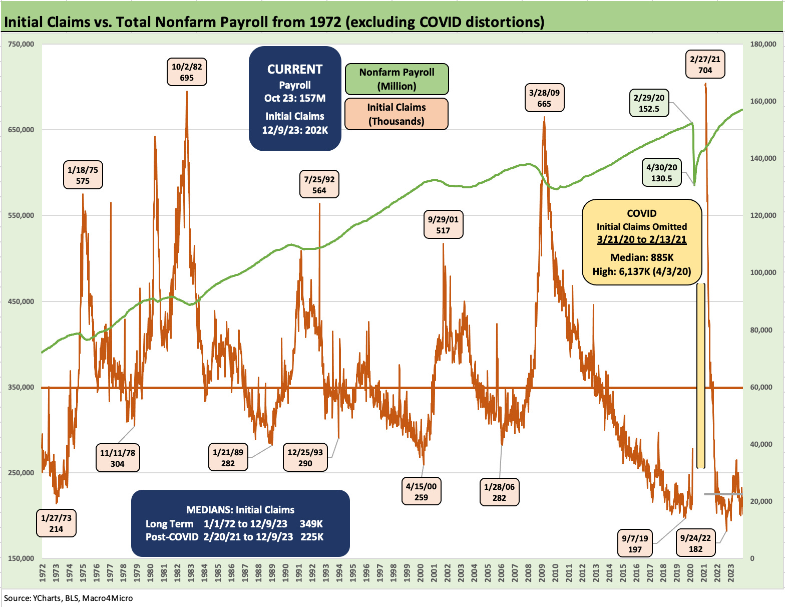
In the above chart, we attempt to beat the point on the scale of the job market to death. We plot the same initial claims time series and add in the total payroll count. The upward slope from left to right to 157 million jobs on the payroll underscores the size of the measuring stick one must use to assess the 202K initial claims vs. 214K in 1973 at the low point for initial claims.
Employment as the linchpin for 2024 economic and inflation risk handicapping?
Last fall there was an abundance of commentary talking about imminent recession risks with many saying “We already are in recession.” The main flaw in the bear story line was employment. It is very hard to have a recession with high employment and positive PCE (see Unemployment, Recessions, and the Potter Stewart Rule 10-7-22). That is the same situation today with jobs as anchors in the “soft” or “no landing” camp.
We expected jobs to weaken at some point in 2023, but a combination of factors (household cash flow savings from low mortgage refi actions, stimulus legislation out of Washington, consumer credit use, low savings rates (see Savings Rates: Context Across the Cycles 10-27-23), firm home equity values, reshoring green shoots, etc.) all kept the economy rolling. Payroll counts rose even if headline unemployment rates were mixed. Other factors include oil and gas, which did not do the expected damage into 2023. Oil even hit a $60 handle briefly last week. Oil production and natural gas production are at record levels in the US.
There is obviously a lot more going on, but record job counts, solid GDP growth and lower oil are a good short list. The higher rates and inflation of 2023 did not grind the consumer down and hiring was steady all year. The “lag” effect may still kick in, and that would make an easier case for the much desired “ease-a-thon” the market appears to be embracing as a high odds outcome. The employment weakness not only never came in 2023, but we just printed another record payroll count and a lower unemployment rate on job additions in tandem with an expanding labor force.
PCE is the main event in driving economic slowdowns and certainty for outright contractions. Negative input from items like trade deficits and inventory swings quarter to quarter do not make a recession (see 3Q22 GDP: It’s the Big Little Things 10-27-22) if PCE is positive and GPDI otherwise remotely reasonable. We see some small negative GDP quarters from time to time. A 5% handle 3Q23 quarter is backward looking, but many expected to be looking back at 1% area GDP earlier in the year.
If sustained low inflation will make the case for easing alone without any fear of what lower credit costs will mean for the demand side, then the CPI and PCE lines would seem to drive the bus on its own with no eyes on other factors. That “inflation only” focus does not square with the logic of looking at where the underlying drivers of supply and demand are heading.
The Fed talking heads who have been speaking up in the aftermath of the FOMC made clear (once they could speak out) that there are very different views within the Fed about the pace of easing. Prices matter most but so do jobs.
One helpful way to monitor reality will be in the initial claim releases over the coming weeks and months. If we do not see any sustained job erosion, the potential for PCE weakness will be questionable. The demand side of the equation with rising wages and a record amount of employed persons could raise some questions in the FOMC scrum on whether the inflation battle has been convincingly won.
Those in the employee ranks will be considering their housing, transportation, apparel, and leisure choices. The rent vs. buy decision does not let Owners’ Equivalent Rent off easily! PCE needs to weaken and that is very much a question at this point.
We wrap with a reminder of why the market so often neglects the initial claims numbers….
The needle on the total payroll line is slow to move materially since job turnover and brief periods on unemployment are the norm. The warning signs are important, however, and we see the long-term median above of 349K for initial claims vs. the latest print of 202K and the more recent short-term median of 225K since early 2021. As cited earlier, that 349K median was generated across periods with a much smaller average labor force size. The idea is we should be seeing a lot of 300 handle claims numbers before we start believing the PCE line is at risk and recession level job losses might be showing up.