
Footnotes & Flashbacks: The State of Yields 4-7-24
Another adverse UST shift on good economic news ups the ante for this week’s CPI and PPI numbers and the bear steepener threat.


Not feeling the 2.0% yet…
Duration takes another hit as the string of good economic news continues across the past two weeks and the magnitude of the surprise from the payroll pop shifts the FOMC debate yet again.
The setback in equity returns for the past week might reflect FOMC risk, but the arrival of earnings season will be as critical as this week’s CPI and PPI for equities as the market also sets up for the first 1Q24 GDP numbers later this month.
Oil and commodities seem to be generating excitement in those equity sectors, and that does not help sentiment on the last mile to 2.0% PCE.
The above chart updates the UST moves from the peak date for the 10Y UST (10-19-23). We also updated the YTD UST move to the end of last week. The material shift lower from the third week of Oct 2023 has been addressed in detail in past commentaries, and there is no fighting the tape on the negative impact on duration returns across the YTD period as we covered in a separate Footnotes publication on asset returns posted earlier today (see Footnotes & Flashbacks: Asset Returns 4-7-24).
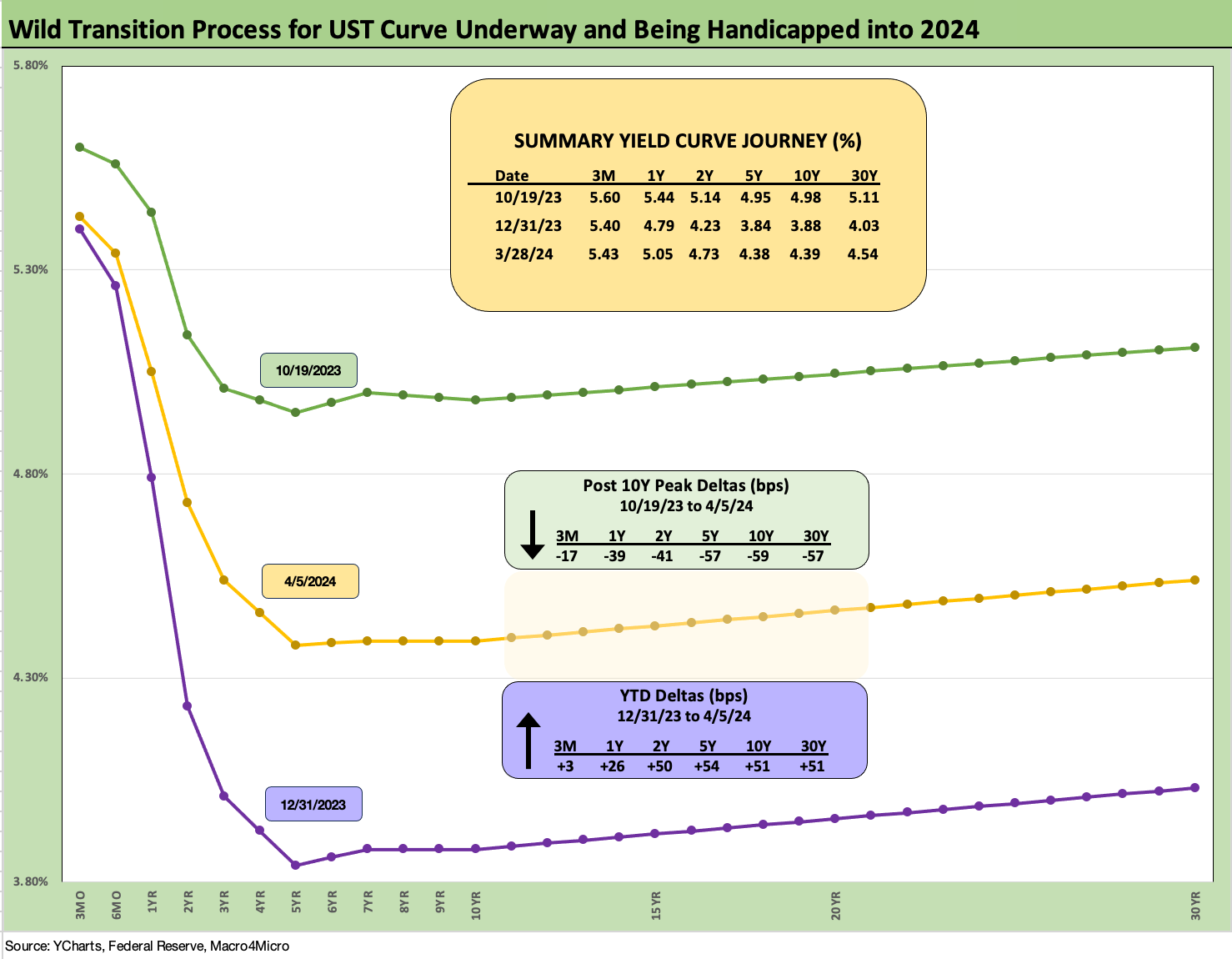
The above chart tracks the journey from the end of 2021 across key time periods in the tightening cycle. The path shows the UST downshift in March 2023 when the regional bank crisis flared up before resuming the path higher to the end of 2023. We include a memory jogger on the dates and magnitude of the FOMC action across the tightening cycle.
An interesting data point is the convergence of the intermediate to long end of the UST curve at the end of 2023 on top of the 12-31-22 UST curve despite the 100 bps differential in fed funds across those two dates. The inversion has eased from peaks, but if the more natural state of the UST curve should be flat around a cyclical peak, then the short end has to come down or trouble could still lie ahead for duration. The current curve as of April 2024 is well off the Oct 2023 peak as we cover in the following charts but has been stubborn YTD.
The above chart breaks out the 1-week UST deltas, and we see a modest bear steepener from 2Y to 30Y. That flowed into a fresh round of weak performance by bonds and a range of fixed income ETFs.
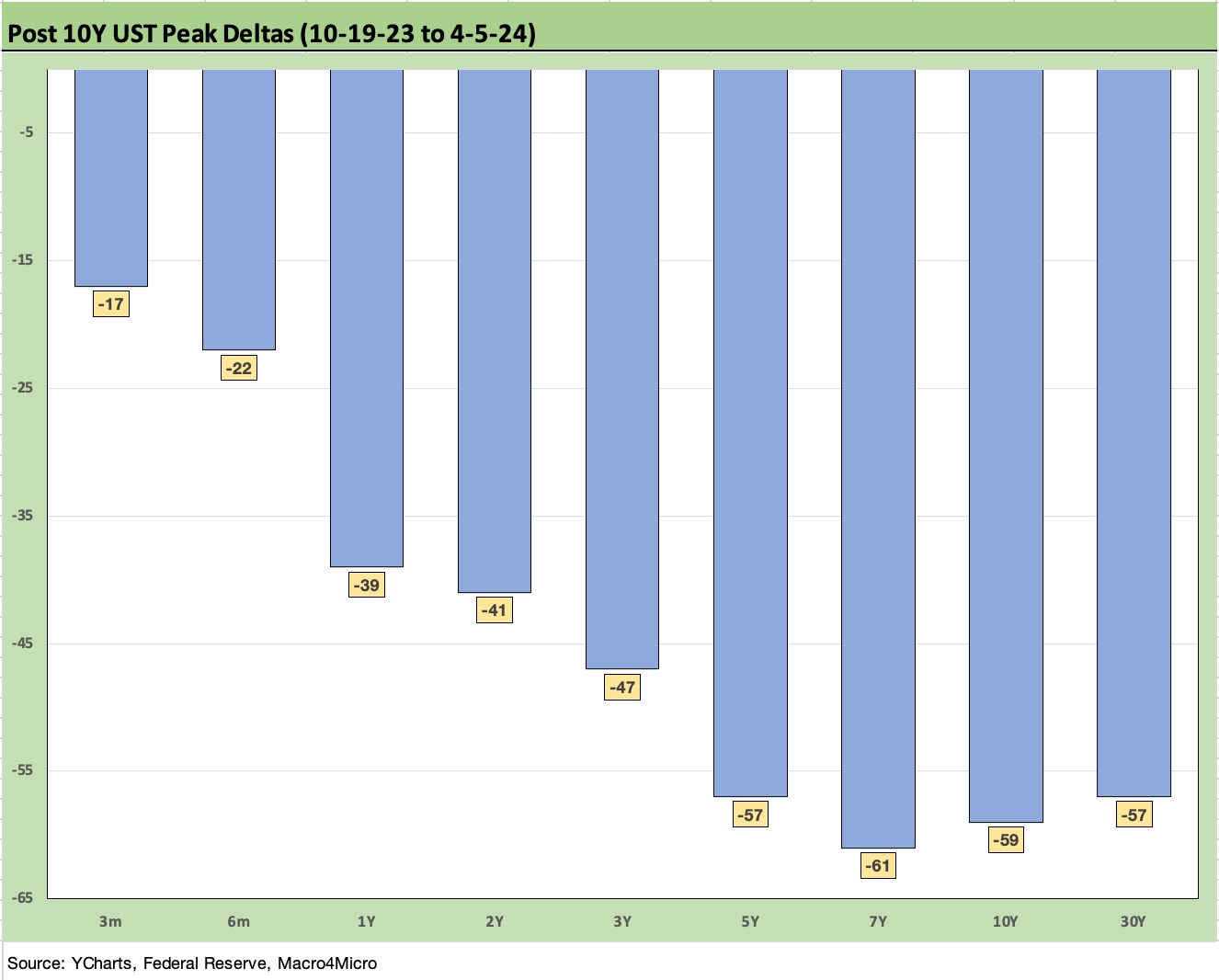
The above chart updates the running UST curve shift lower since 10-19-23 when the 10Y UST peaked. The Sept-Oct UST pain is still fresh in investors’ minds coming off the solid consumer numbers and resilient economic data at that time. That keeps the market on edge after the recent spate of good economic numbers. Right at the top of the list was the record total payroll count this past Friday with payroll adds well above consensus (see Payroll March 2024: Payroll Spike Brings a Political Theme Shift 4-6-24).
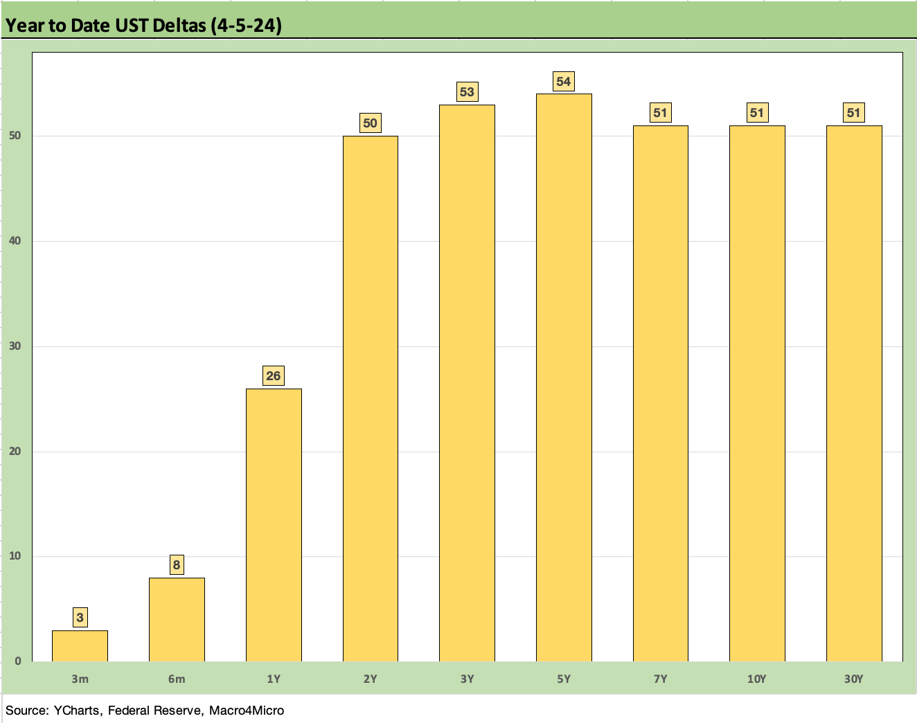
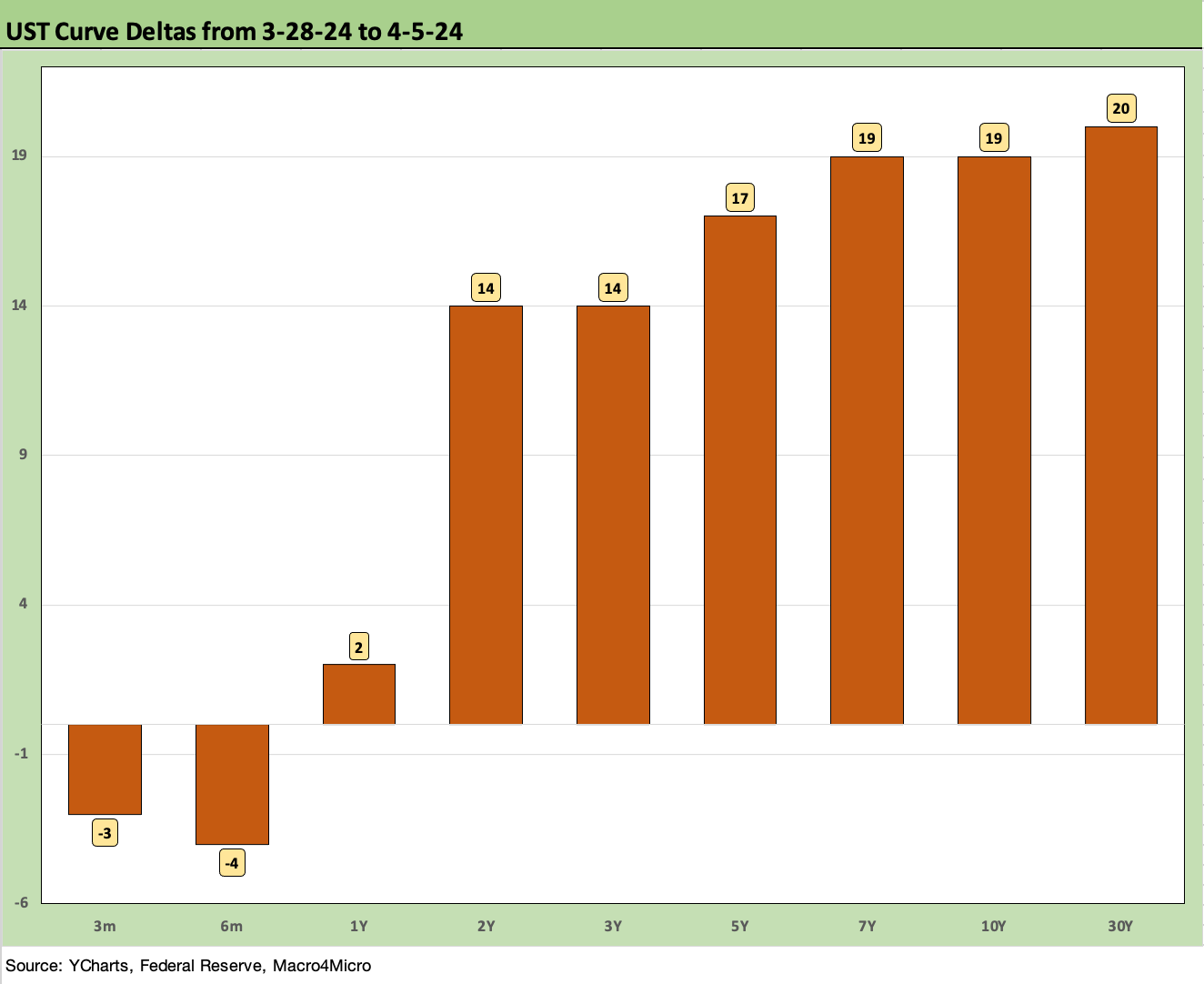
The above chart updates the material upward shift seen in the UST curve YTD. If the short end does not move soon the curve backdrop is a tough call on how that flows into consumer credit quality, housing, commercial real estate valuations, and a host of other areas that will see second guessing. That said, the UST curve stacks up well in historical context against a period such as 2006 when the economy was running hot. The curve today is lower as we cover below in some charts looking at past housing and credit sector peaks.
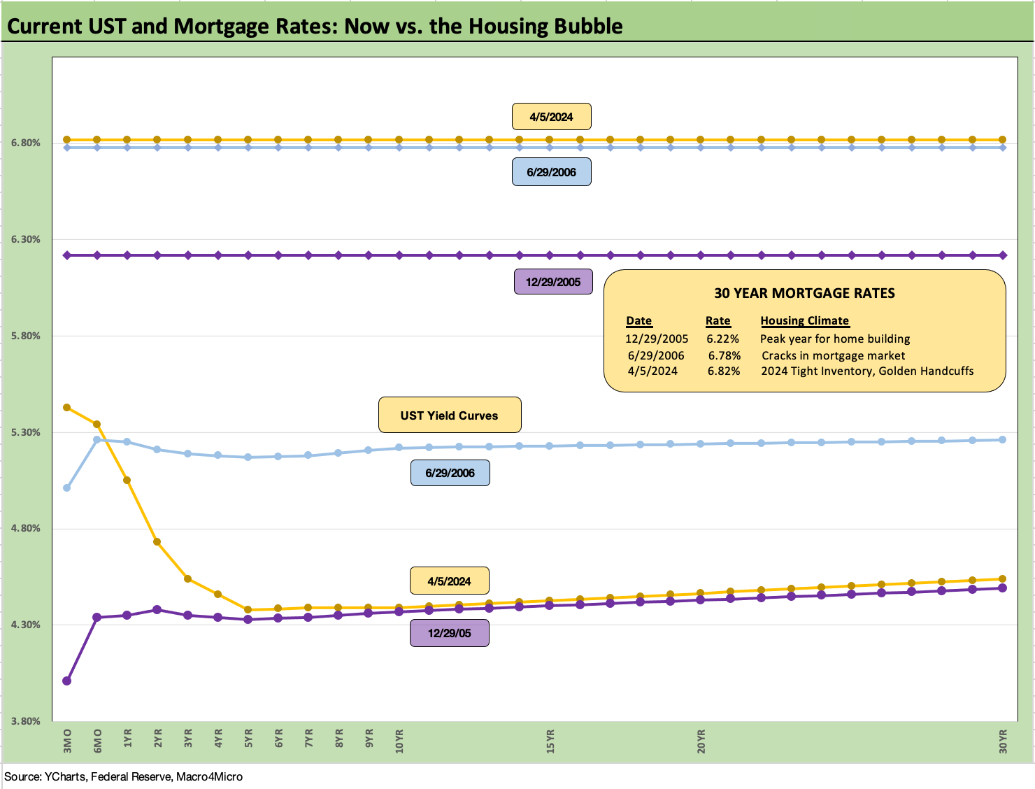
The above chart updates mortgage rates using the Freddie 30Y benchmark and UST curve for some historical comparison to two key periods during the housing bubble. We use the end of Dec 2005, which was the peak homebuilder year, and we also use mid-2006 when the RMBS market and subprime were making the markets nervous.
We note that all three periods posted 6% handle Freddie Mac 30Y levels, but the current UST curve is now slightly above 2005 in the 10Y area but much lower than 2006. The current UST curve just shifted above 2005 this past week. Despite that UST relationship, the current mortgage rates seen this past week are slightly higher than 2006 and above the 2005 level as noted in the box.
Mortgages have been a drag on affordability for first time buyers and entry level and are restraining existing home sales inventory levels on the “golden handcuff” effects since the majority of homeowners hold sub-4% mortgages. We cover more topics in that area in our housing sector research and single name work.
The supply-demand balance has cushioned home prices in the face of higher demographic demand and high employment. Builders have in turn been major winners in the equity markets as they fill in the home supply vacuum and use creative fee and mortgage rate incentives to drive volumes (see New Home Sales Feb 2024: Hope Springs Eternal, but Demand Seasonally 3-25-24).
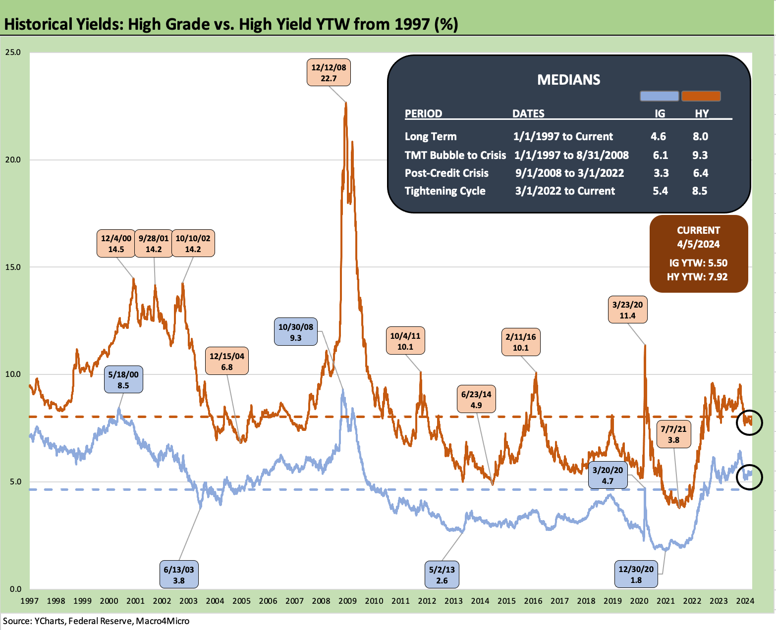
The above chart updates the running timeline for IG and HY yields (YTW). As we have covered in prior commentaries, the pre-crisis medians (9.3% for HY, 6.1% for IG) as posted present the best frame of reference after the protracted periods of ZIRP and QE seen since the credit crisis and later during the pandemic.
Yields for both IG and HY remain inside the pre-crisis medians, but the painfully low yields of the post-crisis period from 2008 have the effect of making IG and HY seem attractive to many asset allocators on the yields alone as indexes are priced at substantial discounts to par. The IG index closed the week at a 91.6 dollar price given the 4.1% par-weighted coupons. HY closed at 7.9% for an index dollar price of 92.6 with par-weighted coupons of only 6.2%.
The protracted period of low yields and low coupons and the need for income and better diversification across funds will support demand for current coupon new issue even at very tight spreads. That is notably the case for pension funds (see Pension Profiles: Benefit Drain Rates and Returns 3-22-24) with their intrinsic cash flow needs to service benefit payment obligations.
The tight spreads in both IG and HY is a fact of life, but the years of “financial repression” and the ongoing repricing of coupons will bolster demand in the credit market asset classes in search of income. The slow and steady repricing of discounted, lower coupon bonds will unfold gradually in IG.
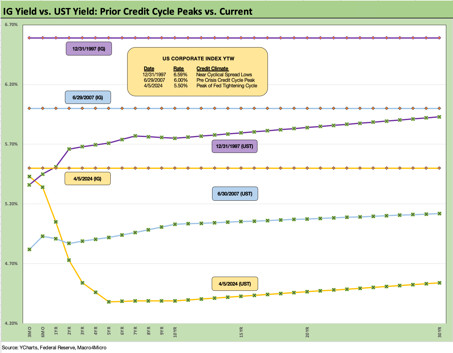
The above chart uses the same approach in framing some historical comps as we did with mortgages vs. 2005-2006 during the housing bubble years. We plot IG index yields vs. two notable credit cycle peaks including late 1997 (as TMT was starting to soar) and 2007 (the credit bubble, record LBOs, structure credit boom, leveraged counterparty roulette).
As in the mortgage charts, we plot the UST curves for current levels, 2007, and 1997. We plot the IG index yields along the horizontal lines for each period covered. The UST yields today are much lower than the 2007 and 1997 credit peaks.
All these periods posted tight spreads, so the UST curve is the main driver of the IG Corp index differentials. This past week saw a fresh round of adverse moves in UST with a slight tightening of the IG benchmark to +92 bps OAS from +93 bps to get to 5.50% with the UST shift, up from a 5.34% all-in yield last week.
As a frame of reference, the Friday close on the IG index spreads are inside those seen at the end of June 2007. The IG OAS is just below the +93 bps average of 1H04 to 1H07. The 1H07 period alone averaged +86 bps. The all-time low for IG was +53 bps in Oct 1997 before reaching +70 bps at the end of 1997 and averaging +95 bps for 1997-1998. Current IG spreads are quite tight right now even if well above the 1997 lows. Those timelines of tight spreads speak to how spreads can remain compressed for a long stretch absent a major catalyst to rattle them.
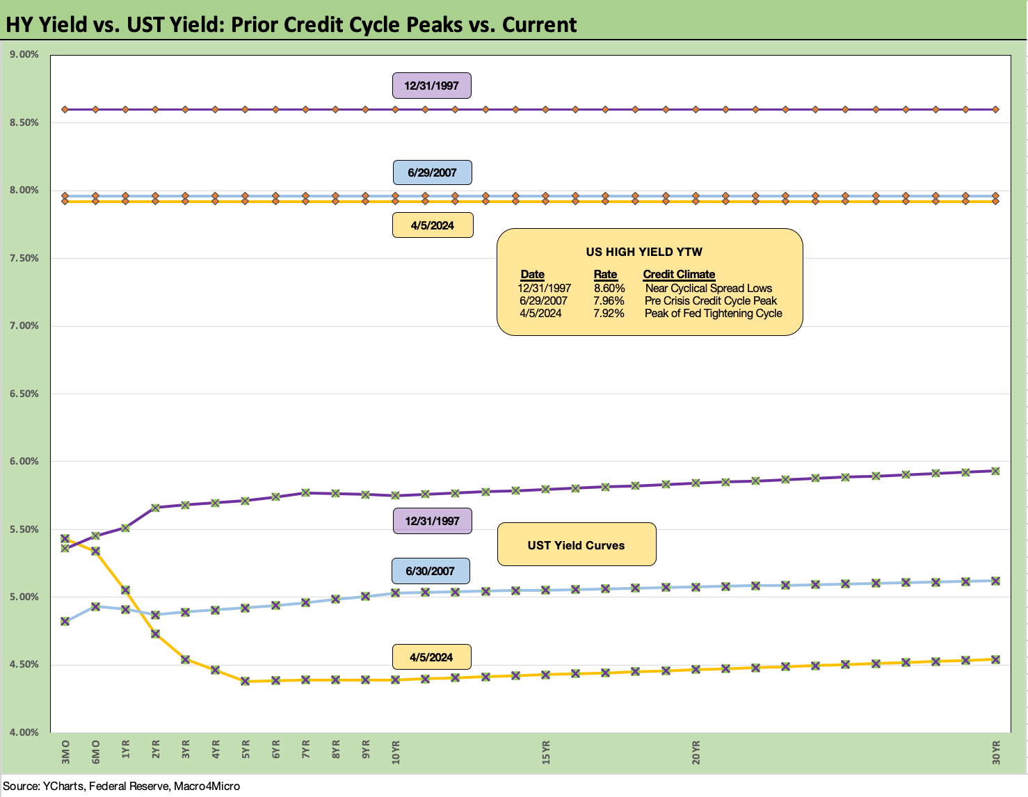
The above chart does the same drill as we did with IG. The all-in yield to end last week for the HY Index is lower than 1997 and barely below 2007 on a materially lower UST curve but with spreads wider today than the sub-250 bps lows of June 2007 and Oct 1997.
HY widened this past week to +318 bps and is now below the June 2014 lows of +335 bps (6-23-14) and near the Oct 2018 lows of +316 bps (10-3-18). As with IG, history shows that HY spreads can stay compressed for a long stretch of time.
The +270 bps average of 2H97 and +298 bps in 1H98 tell a story of resilience. Those earlier periods also offer reminders of how quickly the market can turn and do so with a vengeance. The June 2007 period ran into a crisis. The 1997-1998 period took a while to unravel but saw some volatility after the summer of 1998 crisis (notably Russia/EM and LTCM) as the Fed rode to the rescue with some easing in the fall.
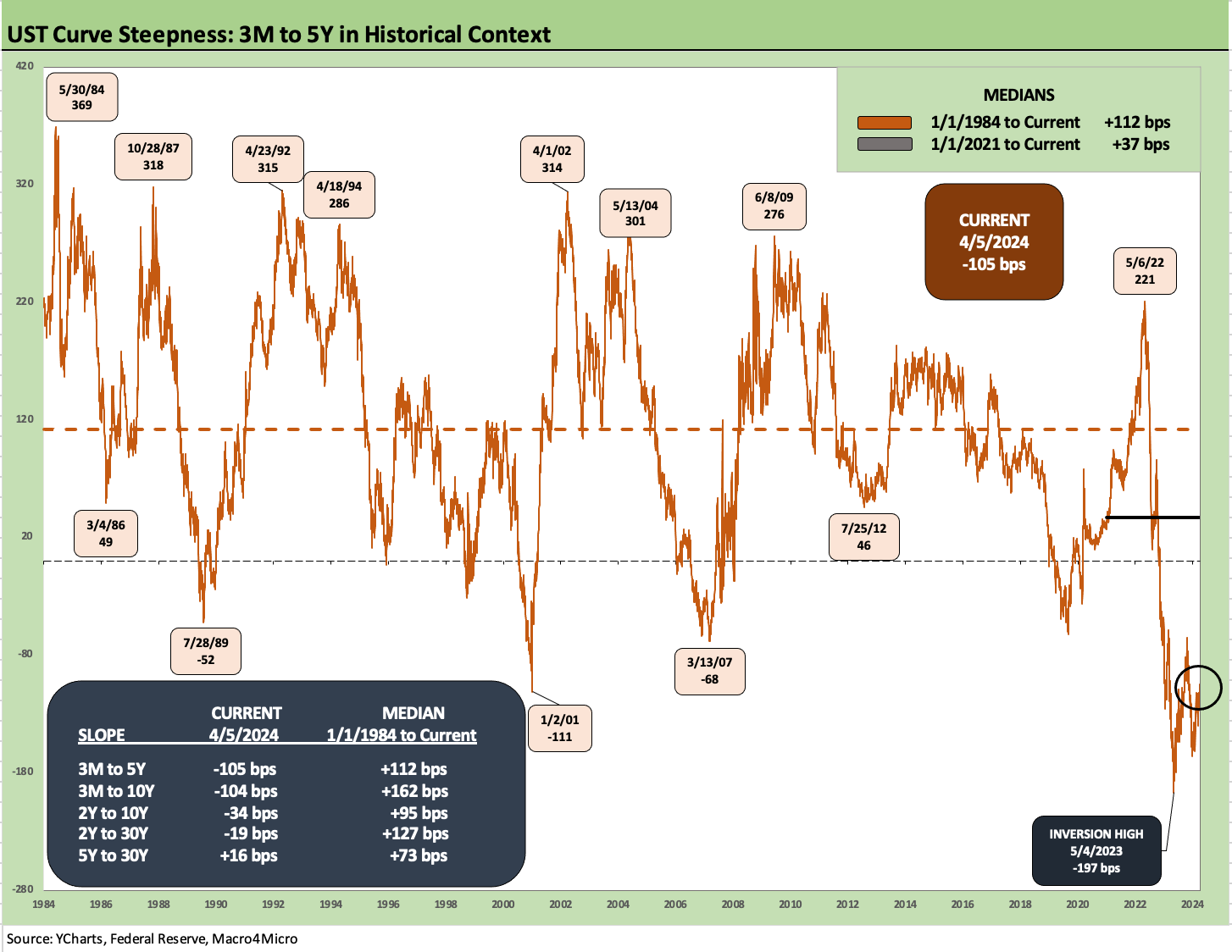
The above chart updates the longer timeline history (from 1984) of the 3M to 5Y UST. The current inversion of -105 bps is 20 bps lower than the -125 bps in last week’s Footnotes issue as the UST curve shifted higher after the holiday trading break and the news across the past week.
The peak inversion for 3M to 5Y UST was -197 bps in early May 2023. The box in the chart above breaks out all the current levels and long-term medians. The long-term median since 1-1-84 for 3M to 5Y is +112 bps. That is a long way off and would require multiple cuts with little movement in the 5Y UST.
The asset allocation decision on income vs. duration risk and framing what the right term premium is along the way and how we get there is no small task. In the push button age, moving out of 3M UST out the curve does not take very long. That is a decision best made when confidence is higher and when an investor has that conviction. Timing varies widely on that decision. The 5.3% 3M UST can ease the pain in the meantime.
Those who see a big UST rally can consider that such a backdrop might include weak economic trends or exogenous shocks (e.g., Iran conflict) that bring wider spreads. That scenario presumably will offer more alternatives in relative value in credit as spreads widen.
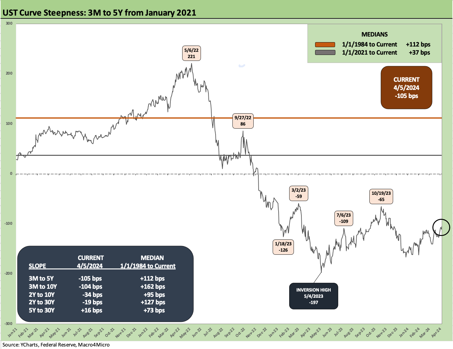
The above chart offers a shorter timeline from the start of 2021 for the 3M to 5Y UST slope for a closer view on the shift across the tightening cycle. We see the peak slope in May 2022 at +221 on the way into inversion by late 2022 and a median across the timeline of +37 bps. That is a long way off.
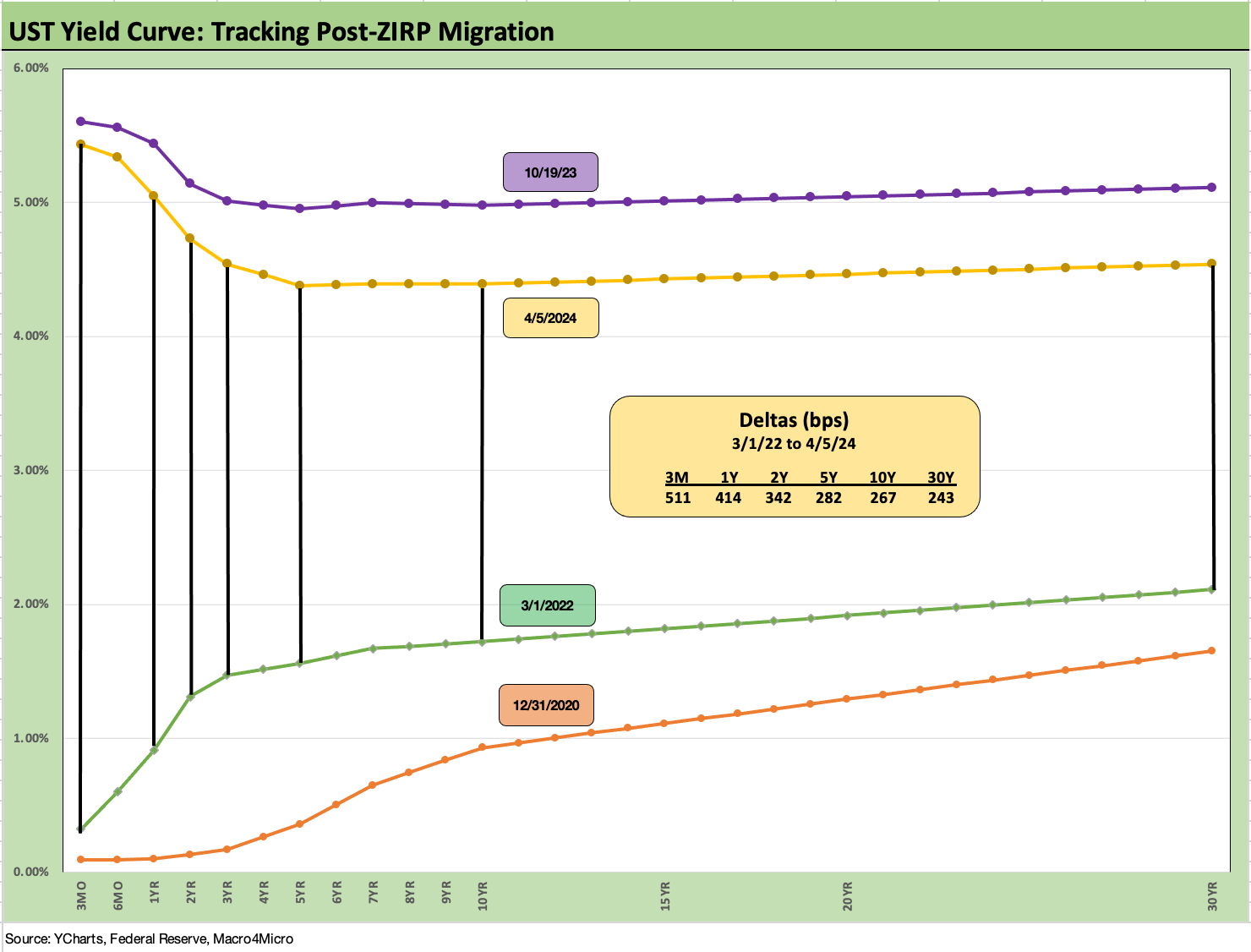
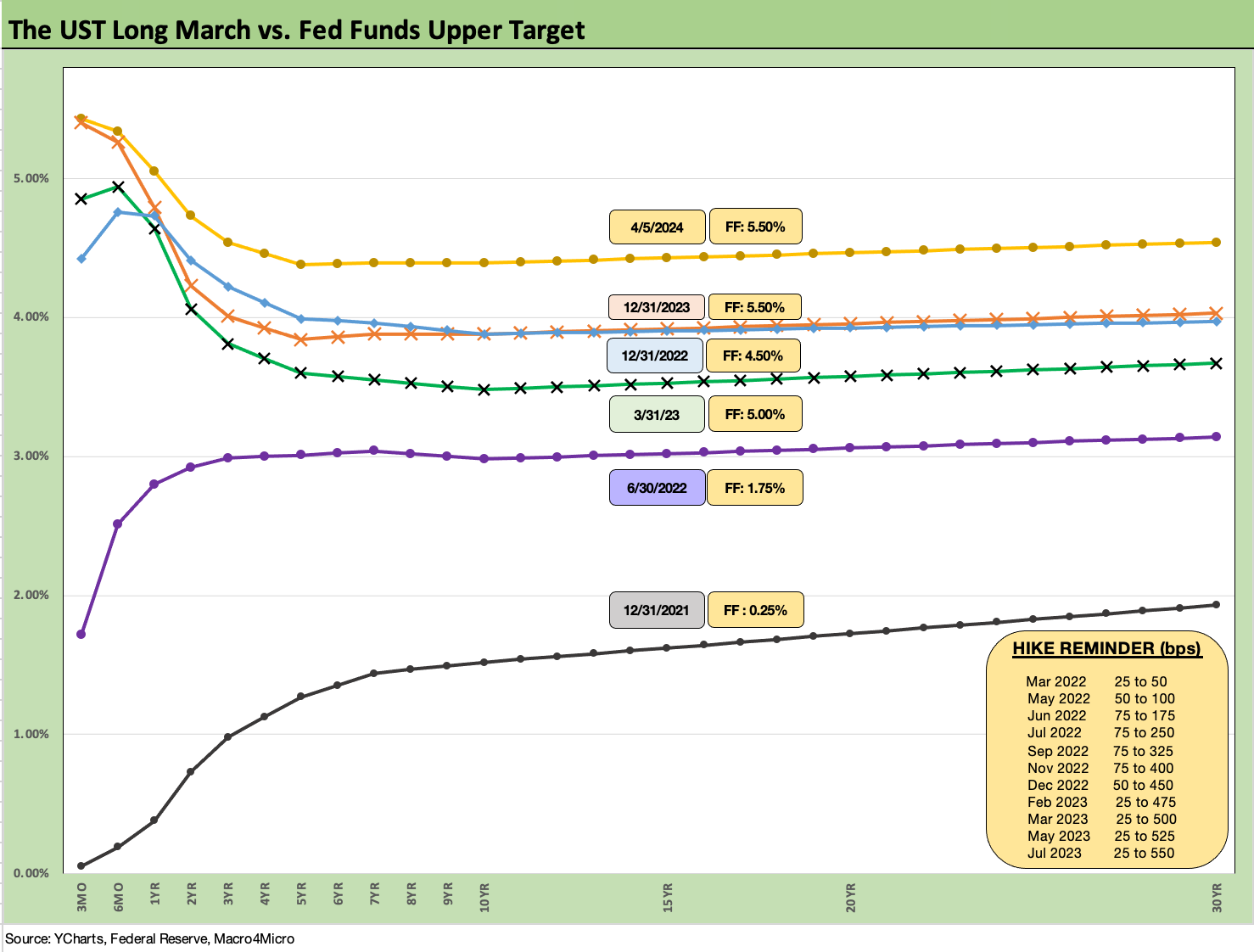
We wrap with our running migration chart that breaks out the UST deltas from the beginning of March 2022, the month ZIRP ended (effective March 17, 2022). The 12-31-20 UST curve is plotted as a frame of reference, and we also include the UST curve from the peak date (10-19-23) for the 10Y UST. The journey from ZIRP and upward sloping to flat to inverted has been a wild ride that punished bonds as detailed in our asset return commentaries.
It is hard to get too optimistic on duration after what looks to be more positive economic trends of late from the consumer sector and some signs of relief in the balance of manufacturing indicators.
There will be a lot to digest and handicap in election season. The latest red flag is the Iran-Israel escalation and how that will flow into the geopolitical action and risk pricing. That could lead to more off-the-rails commentary in US domestic political rhetoric. We at least know the tariff bluster is real, although someone might eventually fill in Trump that the buyer pays the tariffs and that he collected zero from China.
See also:
Footnotes & Flashbacks: Asset Returns 4-7-24
Payroll March 2024: Payroll Spike Brings a Political Theme Shift 4-6-24
JOLTS Feb 2024: Steady and Sideways 4-2-24
Footnotes & Flashbacks: State of Yields 3-31-24
Footnotes & Flashbacks: Asset Returns 3-31-24
PCE Prices, Personal Income & Outlays: Sideways Tone 3-29-24
4Q23: Final Cut, Moving Parts 3-28-23
Durable Goods: A Small Boost for Manufacturing 3-26-24
New Home Sales Feb 2024: Hope Spring Eternal, but Demand Seasonally 3-25-24
Pension Profiles: Benefit Drain Rates and Returns 3-22-24
FOMC: Hail Powell the Consistent 3-20-24
Retail Sales: Consumers Will Stop Shopping…Someday 3-14-24
CPI Feb 2024: Extra Innings 3-12-24
Employment: Real Numbers vs. Fictitious Dystopian Hellscapes 3-9-24
Histories: Asset Returns from 2016 to 2023 1-21-24
Inflation Timelines: Cyclical Histories, Key CPI Buckets 11-20-23