
Footnotes & Flashbacks: State of Yields 3-31-24
An uneventful week for the UST sees a busy week of supportive macro data for a resilient cycle in the PCE release and final 4Q23 GDP revisions.


A modest move lower for the UST curve from 7Y to 30Y and a mild move higher on the short end to 5Y made for a quiet, holiday-shortened week.
The PCE release came out on the market holiday with solid consumption levels well ahead of income and a split decision of YoY PCE inflation for headline vs. core.
Another 3% handle savings rate is not showing a timid consumer with PCE Services inflation sticky and Durable Goods still in modest deflation.

The above chart updates the UST deltas from the 10-19-23 UST curve that saw the peak 10Y UST through the 3-28-24 UST curve. We also plot the 12-31-23 UST curve and frame the delta to last week’s close.
The simple story is a bull flattener from the Oct 19 UST to last week and a material upward shift YTD from 2Y to 30Y. Duration won big to close out 2023, but YTD 2024 duration is losing as we cover in our separate Footnotes for Asset Returns (see Footnotes & Flashbacks: Asset Returns 3-31-24).
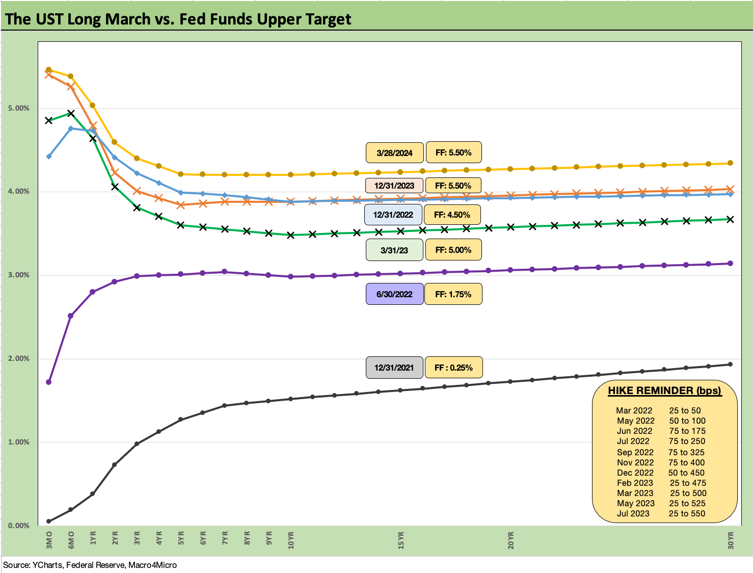
The above chart updates the journey of the UST curve during the tightening cycle. We include a memory jogger box on the timing and magnitude of the Fed hikes along with a 12-31-21 UST curve as a frame of reference.
The 12-31-22 and 12-31-23 UST curves have essentially converged as you move out towards the 10Y area despite the 100 bps differential in fed funds across those two dates. The move during 2023 into the late Oct 2023 10Y UST peak rallied into year-end 2023 before partially retracing wider YTD.
The curve relationship gives a hint around what could go wrong if inflation flares back up or if the Fed does not cooperate and the economy and jobs stay strong. There is a prevailing bullish view on duration from today’s levels, but entering the year the goal was for more cuts and the 5Y to 10Y moving toward earlier 2023 levels. That battle of variables continues, and this past week showed solid numbers in Personal Consumption in the Friday release and a number of positive growth revisions in the final 4Q23 GDP lines.

The above chart posts the UST deltas for the past week as a mixed move on the short end vs. the long end. That did not move the needle much in the overall picture. As we cover in the asset returns piece, the small move further out the curve was enough to generate a minimally positive return in bond ETFs (LQD, AGG, GOVT), but there was little excitement in the curve ahead of the PCE release on Friday. The market can get a fresh read after a key jobs number ahead this week.

The above chart plots the running bull steepener in the UST curve from 10-19-23 when the 10Y UST peaked through last week’s close.

The above chart updates the YTD shift higher on the UST curve as bonds have lagged earlier consensus expectations with a material move higher in the face of solid fundamentals and a strong performance in equities. Inflation has been mixed but the YoY metrics are in line with a constructive outlook for inflation ahead (see PCE Prices, Personal Income & Outlays: Sideways Tone 3-29-24, CPI Feb 2024: Extra Innings 3-12-24).

The above chart updates mortgage rates using the Freddie 30Y benchmark and UST curve using some historical comparison to two key periods during the housing bubble. We use the end of Dec 2005, which was the peak homebuilder year, and we also use mid-2006 around when the RMBS market and subprime markets were making the markets nervous.
We note that all three periods posted 6% handle Freddie Mac 30Y levels, but the current UST curve is lower than 2005 in the 10Y area and much lower than 2006. Despite that UST relationship, the current mortgage rates seen this past week are essentially in a dead heat with 2006 and modestly above the 2005 level.
Simply put, mortgages remain a drag on affordability and are squeezing the low end of housing and keeping a lid on existing home sales inventory. That in turn protects home prices given firm demographic demand and high employment.
This past week saw a key release from housing with the New Home Sales release (see New Home Sales Feb 2024: Hope Springs Eternal, but Demand Seasonally 3-25-24) after some constructive earlier releases the prior week on existing home sales (see Existing Home Sales Feb 2024: Surrendering to Mortgage Market Reality 3-21-24) and starts (see Housing Starts Feb 2024: Rites of Spring on the Doorstep 3-19-24).

The above chart updates the running timeline for IG and HY yields (YTW). As we have covered in prior commentaries, the pre-crisis medians (9.3% for HY, 6.1% for IG) as posted present the best frame of reference after the protracted periods of ZIRP and QE seen since the credit crisis and later the pandemic.
Yields remain well inside the pre-crisis medians, but the painfully low yields of the post-crisis period from 2008 have the effect of making IG and HY attractive to many asset allocators. The effects of yield starvation and low coupons and the need for income and better diversification across funds is a tailwind for demand even at very tight spreads. That is notably the case in pension funds (see Pension Profiles: Benefit Drain Rates and Returns 3-22-24).
The potential for yield curve shapeshifting as seen by some UST bulls includes a bull steepening with the front end coming down but the longer end more stubborn to deal with UST supply pressures. Another scenario is a material downward shift across the curve towards a flattening but at a more measured pace. The UST supply wildcard is the counterpoint that fights the decline on the long end. Moves lower on the shorter end could bolster refinancing and bring dollar price migration toward call prices in HY.

The above chart uses the same approach in framing some historical comps as we did with mortgages vs. 2005-2006 during the housing bubble years. We plot IG index yields vs. two notable credit cycle peaks including late1997 (as TMT was starting to soar) and 2007 (the credit bubble, record LBOs, structured credit boom, leveraged counterparty roulette).
As in the mortgage chart, we plot the UST curves for current levels, 2007 and 1997. We plot the IG index yields along the horizontal lines for each period covered. The UST yields today are much lower than the 2007 and 1997 credit peaks.
All these periods posted tight spreads, so the UST curve is the main driver of the IG Corp index differentials. This past week saw minimal action in UST with a slight widening of the IG benchmark to +93 bps OAS from +92 bps to get to 5.34%.
As a frame of reference, the Friday close on the IG index spreads are inside those seen at the end of June 2007. The IG OAS is on top of the +93 bps average of 1H04 to 1H07. The 1H07 period alone averaged +86 bps. The all-time low for IG was +53 bps in Oct 1997 before reaching +70 bps at the end of 1997 and averaging +95 bps for 1997-1998. Current IG spreads are quite tight right now even if well above the 1997 lows. Those timelines of tight spreads speak to how spreads can remain compressed for a long stretch absent a major catalyst to rattle them.

The above chart does the same drill as we did with IG. The all-in yield to end last week for the HY Index is lower than 1997 and 2007 on a materially lower UST curve but with spreads wider today than the sub-250 bps lows of June 2007 and Oct 1997.
HY widened this past week to +312 bps from +308 bps and is now below the June 2014 lows of +335 bps (6-23-14) and below the Oct 2018 lows of +316 bps (10-3-18).
As with IG, history shows that HY spreads can stay compressed for a long stretch of time. The +270 bps average of 2H97 and +298 bps in 1H98 tell a story of resilience. That period also offers a reminder of how it can get ugly when the market turns. Spreads can turn with a vengeance as we saw in 2000-2002. That gets back to the same old challenge of deal quality and chasing spreads in a compressed market.
The main worries are an inflation resurgence and fear of no cuts in 2024, but the flip side of “no cuts” might be strong fundamentals holding the Fed steady as opposed to higher inflation. Strong macro trends would in that case tend to support no cuts and that offers some offsetting considerations in stable or improving credit risk trends.
Looking out into 2025, the primary macro worries are trade wars and global economic dislocations coming in 2025 from tension with China in trade or problems with Mexico over the border and revisiting “close the border” threats. That will tie into what comes out of the election rhetoric and legislation. Tariff uncertainty can roil capex planning as we saw in 2019 when the Fed had to step in during 2H19 with 3 cuts.
“Bears will be bears” in handicapping what can go wrong in policy, but the economy is holding up well in a HY bond asset class that could see very strong demand from investors waiting for repriced coupons in both IG and HY. The pull to par dynamic on HY refinancing/redemption is also an important variable in the equation.

The above chart updates the long-term time series for the 3M to 10Y slope. In the box, we include the range of UST slopes we track along with the long-term upward sloping medians. The -126 bps inversion for 3M to 10Y is below the inversion peak of -189 bps but is nowhere near the long-term median of +162 bps.
The dubious bond investor parked in cash can quickly invest and extend as needed, but the Services inflation number and backdrop in economic growth are not helping the rollback in the inversion lately despite the distance from the May and June peak.

The above chart shortens up the time series for a better visual of the slope move from 2021 and across the tightening cycle. The steepness peaked in May 2022 at +227 bps and posted a median of +30 bps across the short-term time horizon. The cross into inverted was not sustained until the fall of 2022.

We wrap up with our usual post-ZIRP migration chart with the UST deltas from 3-1-22 to the end of last week. We include a 12-31-20 UST curve as a frame of reference as well as the 10-19-23 UST curve when the 10Y UST peaked. That 10-19-23 UST curve hangs there as a threat if jobs do not start declining or if economic fundamentals get new legs that flow into inflation.
See also:
Footnotes & Flashbacks: Asset Returns 3-31-24
PCE Prices, Personal Income & Outlays: Sideways Tone 3-29-24
4Q23: Final Cut, Moving Parts 3-28-23
New Home Sales Feb 2024: Hope Springs Eternal, but Demand Seasonally 3-25-24
Pension Profiles: Benefit Drain Rates and Returns 3-22-24
Existing Home Sales Feb 2024: Surrendering to Mortgage Market Reality 3-21-24
FOMC: Hail Powell the Consistent 3-20-24
Housing Starts Feb 2024: Rites of Spring on the Doorstep 3-19-24
Retail Sales: Consumers Will Stop Shopping…Someday 3-14-24
CPI Feb 2024: Extra Innings 3-12-24
Employment: Real Numbers vs. Fictitious Dystopian Hellscapes 3-9-24
Payroll Feb 2024: Record, Revisions, Reality 3-8-24
Inflation Gut Check Jan 2024: PCE Prices, Income, and Outlays Help the Story 2-29-24
Fed Funds vs. PCE Inflation: Peaks and Valleys Across Time 2-7-24
Inflation Timelines: Cyclical Histories, Key CPI Buckets 11-20-23
Savings Rates: Context Across the Cycles 10-27-23
Inflation Rorschach Test: Looking at Relief and Stimulus 2-7-23