
Fed Funds vs. PCE Inflation: Peaks and Valleys Across Time
We look at fed funds vs PCE differentials back to Volcker and Burns as the FOMC makes plans to get inflation to 2.0%.


We look back across the decades since 1973 to frame the differentials of fed funds vs. PCE inflation (headline and core) to consider which worked and which did not in the inflation fighting of the 1970s and early 1980s.
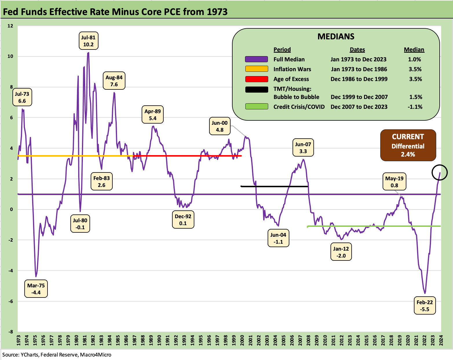
The median differential of over 3% back in the 70s/early 80s inflation wars (and across the late 80s to late 90s) are not supportive of the multiple cuts handicapped in today’s market, but absolute inflation rates today are not as ugly as what we lived through in the stagflation bouts of long ago.
The purpose of the exercise is to offer a reminder of what the FOMC is worried about with respect to real fed funds rates and what worked (or did not) during the long-ago inflation wars.
The inflation hawks today are hoping that Powell offers less Burns and more Volcker in the game plan and not leave a bad ending of the sort seen in 1979-1981 after the earlier 1970s effort did not get the job done.
In this commentary, we are going to look back at the inflation timelines for PCE and how fed funds rates framed up relative to inflation. For this exercise around FOMC decision-making, we use the PCE price index (vs. CPI) since it is favored by the Fed. In theory, we can also frame fed funds vs. CPI, which historically has a higher median than PCE inflation.
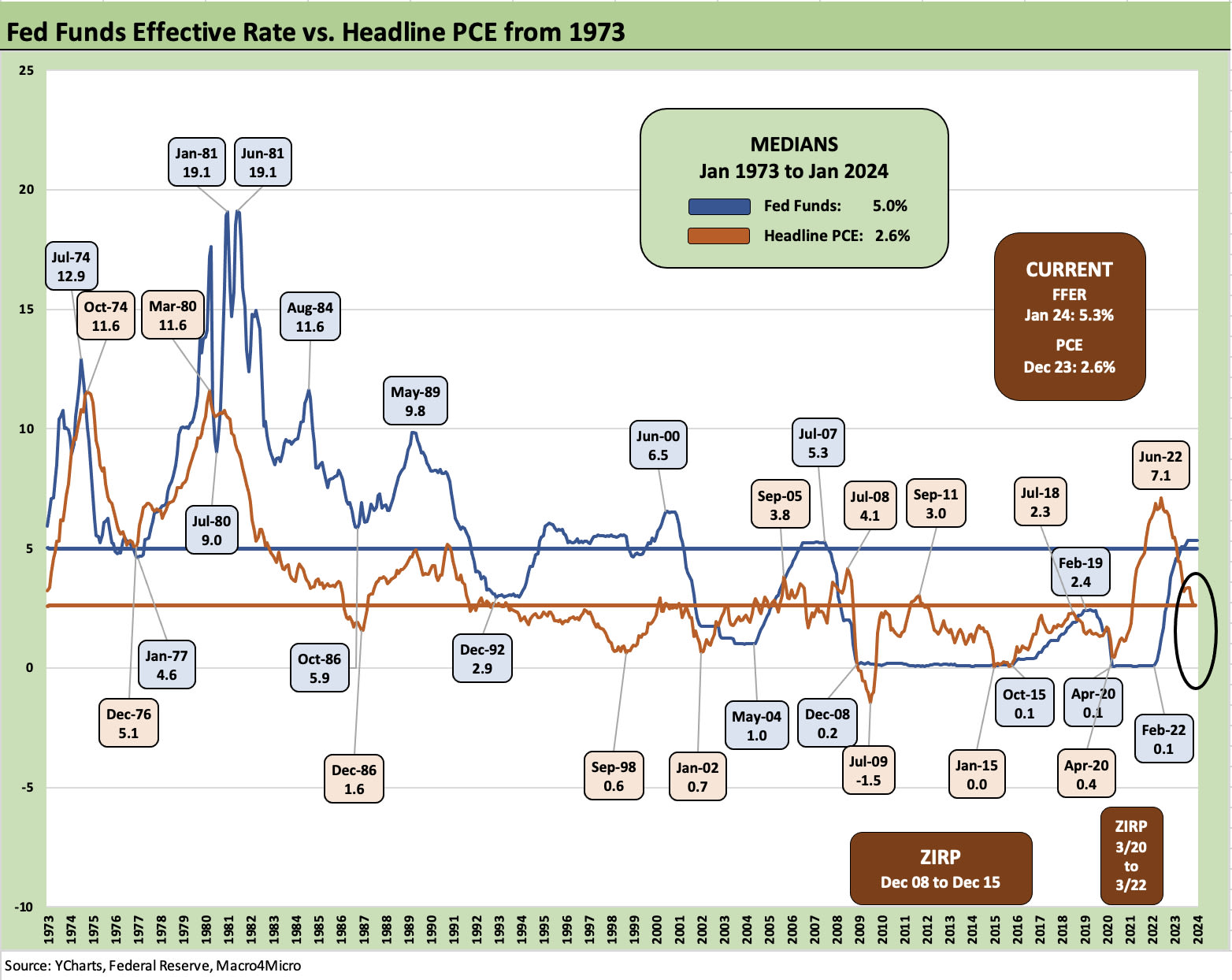
We look both at headline PCE above and core PCE further below. As a footnote to the above time series, we use the fed funds effective rate series provided by the Fed, so the 19.1% rolling average peak in the Volcker years does not show the smaller mix of periods where fed funds hit the 20% line.
One critical question since the tightening cycle began in 2022 revolved around how much focus should be given to positive real fed funds rates (i.e., fed funds > inflation) and what constitutes tightening vs. accommodation.
In theory, the need for positive real fed funds should be obvious and easy enough to frame against history. If you are tightening, the theory is you should have positive real fed funds. That was certainly the way the playbook worked with Volcker. It was surprising to hear so many “Fed pause” predictions in the fall of 2022 when the real fed funds rate was negative with inflation still high.
That need for real fed funds rates nonetheless did not happen for quite a while in this tightening cycle and across 2022 as fed funds was still short of headline PCE as well as CPI by the end of 2022 (see PCE Inflation Ticks Lower, So Does Spending 1-27-23, CPI Wrap for 2022: Beginning of the End? 1-12-23).
Volcker was a champion of very positive real fed funds. While Volcker saw a very brief period of negative fed funds, that was in connection with targeting monetary aggregates and letting fed funds swing wildly during some stretches in 1980. As evident in the timeline plotted above and other charts herein, fed funds spent a protracted period materially above PCE inflation.
The chart above visually hammers home the relationship of fed funds and PCE during the ugly stagflation years of 1980-1981. The next chart plots the differentials directly.
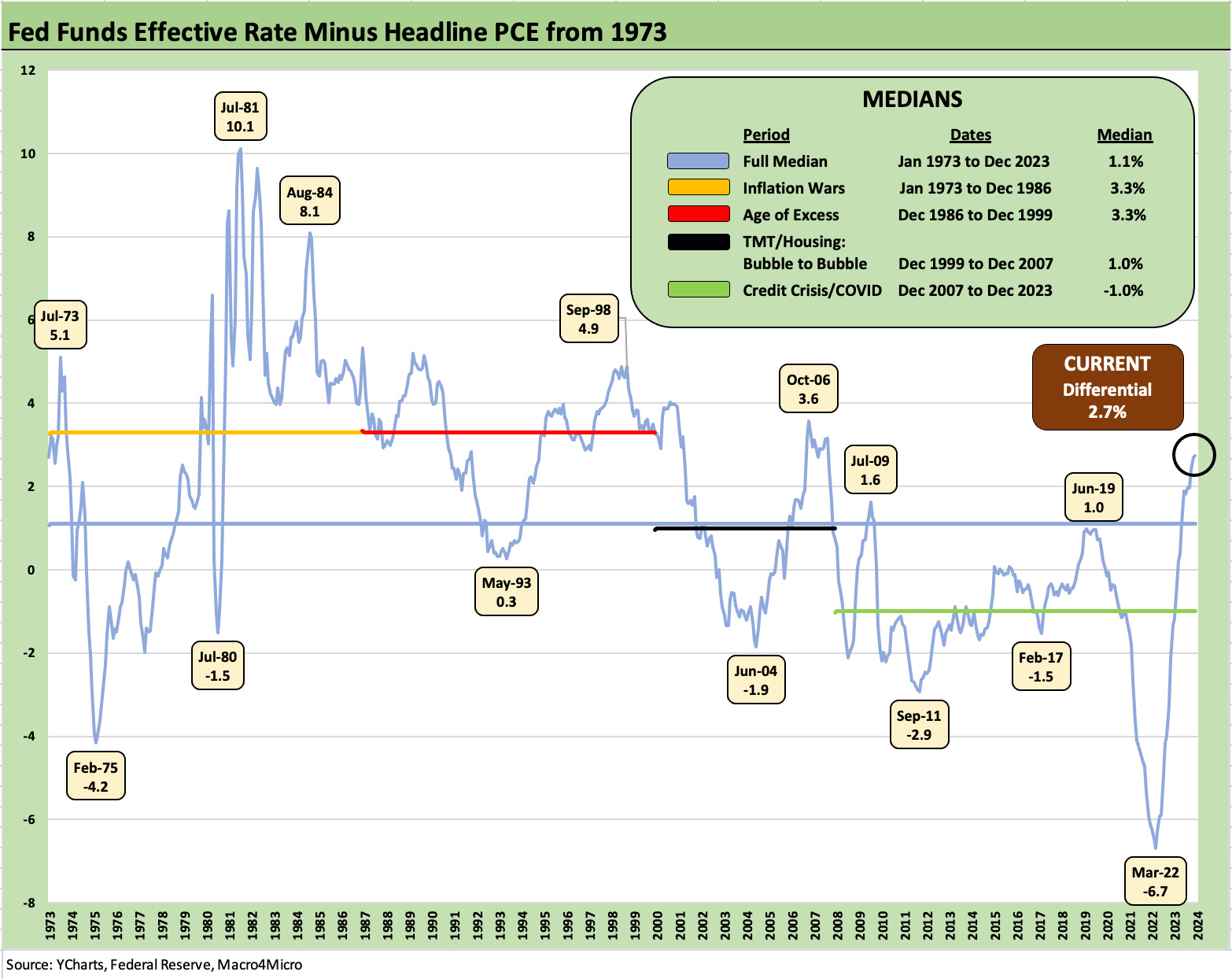
The above chart shows the fed funds rate minus headline PCE. We see how deep the negative fed funds rate was in March 2022 at lows of -6.7% over on the right side of the chart before the steady climb across 2022 and into 2023 to the current +2.7%.
The long-term median of +1.1% offers a frame of reference, but the differential median of +3.3% during the 1973 to 1986 period is more important. It is clear that the high, positive differential is heavily weighted in the Volcker years and not the Burns years through early 1978 when the relationship was more often in the negative zone. We note that the Dec 1986 to Dec 1999 period posted a median at +3.3% also but within a much narrower range and at a time of lower inflation.
The real story line is over on the left side of the chart as we see a peak differential of +5.1% in July 1973 decline rapidly to -4.2% by Feb 1975 just as an ugly stagflation-driven recession was wrapping up in March 1975. The recession dates we use in our commentary are in part from the official frames of reference including those set by NBER after it was set up in 1978 (see Expansion Checklist: Recoveries Lined Up by Height 10-10-22, Business Cycles: The Recession Dating Game 10-10-22).
The post-1973 contraction starting in Nov 1973 unfolded after the Arab Oil Embargo of Oct 1973 that rolled into the longest recession since the Great Depression to that point. The oil markets and natural gas markets both had their moments, but refined products took a brutal toll on consumers after the 1973 oil shock that saw gasoline rationing (odd-even license plate days) and more than a little geopolitical tension that came with it (the Saudis had Kissinger whispering subtle threats and OPEC mostly backed off). That oil shock in 1973-1974 was followed in 1979 by the Iranian oil crisis after the downfall of the Shah (see Misery Index: The Tracks of My Fears 10-6-22).
The 1979 shock gave more than a few consumers (and oil companies hoarding inventories) some flashbacks and kept inflation expectations high. History (and more than a few experts) have written that the refined product fallout was much worse than it needed to be, and the refined products are what hit the consumer. In other words, Volcker had his work cut out for him.
We look in more detail at the 1973 to 1986 timeline further below for some of the timing issues on the way to a fresh round of inflationary chaos later in the 1970s. We zero in on the 1973 to 1986 time horizon for a better vantage point on how the Fed Chairs ran the show from Nixon/Ford days with Arthur Burns at the Fed (Feb 1970 to Jan 1978) into the Carter years (with a brief visit from Fed Chair G. William Miller March 1978 to early Aug 1979) before Paul Volcker took the helm in Aug 1979 and went into hardcore tightening mode to beat back inflation.
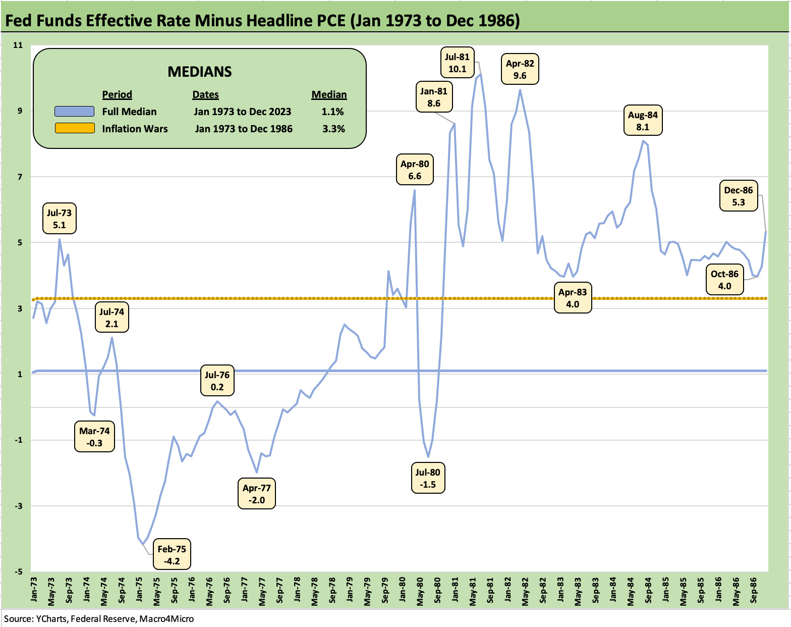
The above chart narrows the time horizon to the 1973 to 1986 period to get better visuals on what the inflation war looked like as that war was lost in the 1970s. We post a horizontal line of 3.3.% for the median during the period.
Arthur Burns was Fed chair under Nixon/Ford and the Carter Administration through Jan 1978, and he has not been treated kindly by history. In economic circles, he usually takes the fall as the Fed Chair who let the house burn down by not tightening enough or for a sufficient length of time. He was 0 for 2 in magnitude and duration.
Burns’ replacement (G. William Miller) was widely viewed as unqualified. He wanted to focus on growth. He was a businessman and lawyer who attended the Coast Guard Academy (not the usual background for monetary policy expertise). He was offered Secretary of Treasury, and Volcker was soon in the seat as inflation was soaring.
There is no questioning the monetary aggression of the years when Paul Volcker was Chair with fed funds high and well in excess of inflation and staying that way well into the next expansion. As a reminder, the second leg of the double dip recession reached a trough in Nov 1982 (see UST Moves 1978-1982: The Inflation and Stagflation Years 10-18-23). Volcker kept fed funds high as detailed in the charts with a fresh differential spike higher in 1984.
The broadly embraced view is that the period from later 1975 through 1978 let the process get away from the Fed after not doing enough in 1974 and early 1975 either. There is not much confusion around the approach that Volcker took. His strategy had the subtlety of a mushroom cloud.
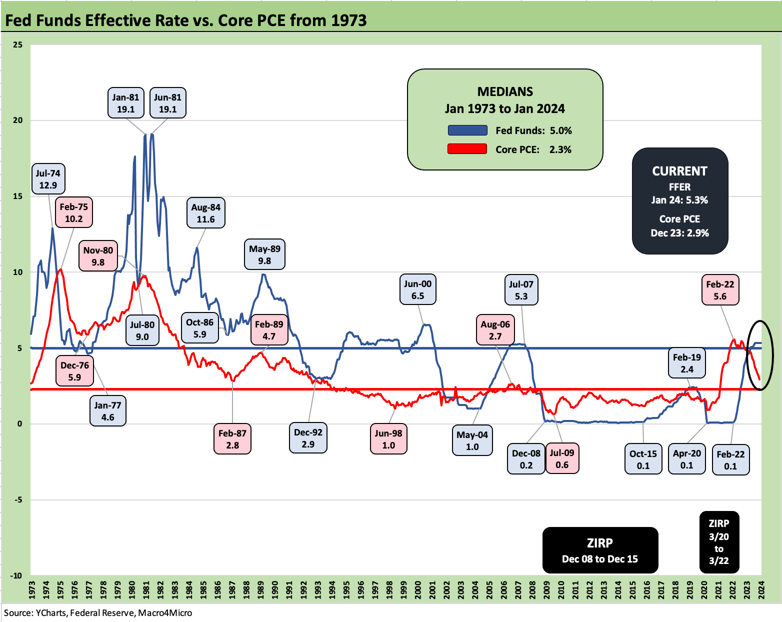
The above chart gives the same timeline and drops in core PCE instead of headline PCE. We are not getting too caught up in the “headline vs. core distinctions” for this purpose since inflation was grim either way even excluding the outsized move in oil prices. We have looked at headline vs. core PCE differentials across time in other commentaries (see PCE Inflation: Wild History, Recurring Oil Volatility 1-29-23).
The Volcker years were so aggressive and the Burns years were so far off the mark that the choice gets down to “Which is the best timing plan for the Powell FOMC from here?” If it comes down to just a few more meetings at a “3% or more” fed funds minus PCE differential” and waiting for supportive data closer to 2.0% PCE as a target line, that would still be far less aggressive than the monetary boot camp offered up by Volcker. That would imply inflation has to come down from here and fed funds would need to hold longer at current levels.
The above chart updates the real fed funds rate trend lines using core PCE rather than headline PCE to isolate the oil and food effects. The changes using core PCE are not material with respect to the challenge each period faced. The Burns vs. Volcker years compare-and-contrast are not altered in substance even if the energy crisis was a major driver of the consumer pain and in shaping inflation expectations.
There was a lot going on in the broader economy than energy and money supply. Structural changes across industries, currency swings, wage-price controls, moving off the gold standard under Nixon, and regulatory change were all part of a much bigger complex story.
The inflation periods of the 1970s saw some failed experiments around wage and price controls that distorted wages at a time lag. We saw a range of ideas from Nixon to Carter that either failed or had a lot of unintended consequences. Debates around the effects of self-imposed (inflicted?) market distortions are not new.
There was also quite a bit of conflict and tension between the Fed and the powers that be in the White House and Congress. The tension between fiscal and monetary only happens…all the time. Nixon and Burns clashed and the same with Carter. A few folks in the Reagan cabinet might have pondered poisoning Volcker’s cigars (or inserting an incendiary device). Donald Regan, the former CEO of Merrill Lynch and Reagan’s Secretary of the Treasury, was not too happy with Volcker either given his background and knowledge of market impacts of his policies. In the end, Volcker was not the type to be cowed.
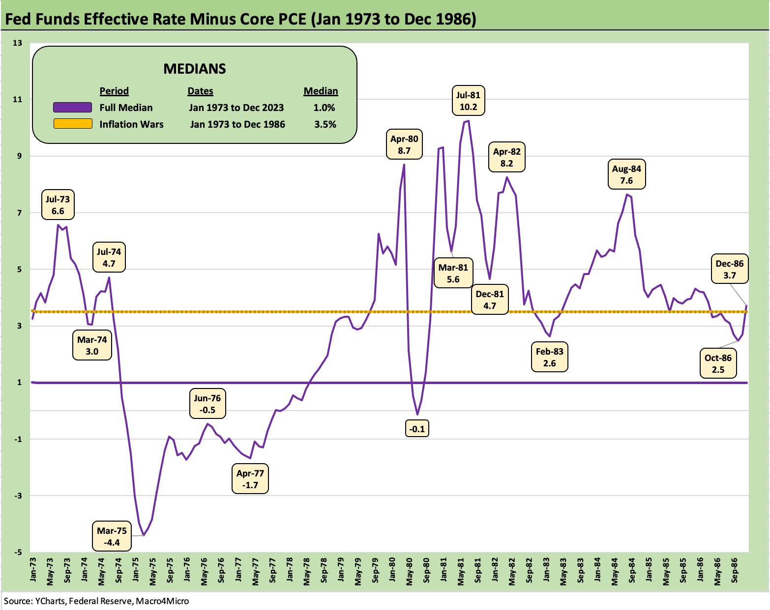
The above chart tells the same story for fed funds vs. core PCE as the shorter timeline (1973-1986) headline PCE chart did. The inflation fighting of Volcker was more of the Rocky Marciano school compared to Burns’ Pee Wee Herman. The intermission with G. William Miller was opposed by numerous senators. In the end, Miller’s pro-growth strategies were all wrong for the challenge of inflation.
It will be interesting to see how economic historians look back at Powell and his FOMC. They know they are under the microscope. Greenspan was a legend until he hung in too long at 1.0% fed funds well into 2004 and the expansion of structured credit and subprime became the legacy of that set of FOMC policies. Greenspan has been tagged with the housing bubble, structured credit excess, and unbridled counterparty risk. For his part, Burns gets torched by history.
The year 2024 will write the history of Powell during an election year. The first chapter of this inflation drama was “Too late!” We assume he does not want the last chapter to be “Not enough!”
For more info on differentials and inflation histories see:
UST Moves 1978-1982: The Inflation and Stagflation Years 10-18-23
PCE Inflation: Wild History, Recurring Oil Volatility 1-29-23
PCE Inflation Ticks Lower, So Does Spending 1-27-23
CPI Wrap for 2022: Beginning of the End? 1-12-23
Fed Funds vs. PCE Price Index: What is Normal? 10-31-22
Fed Funds-CPI Differentials: Reversion Time? 10-11-22
Expansion Checklist: Recoveries Lined Up by Height 10-10-22