
Footnotes & Flashbacks: State of Yields 1-28-24
We update a muted UST week ahead of an FOMC meeting with some in the market expecting more signals on “early and often” cuts.


After a quiet week for the UST curve, the main takeaway was the ability of the UST and risky asset markets to rally when the data says growth is favorable, consumption is strong, and earnings are constructive on balance.
With inflation heading into the 2% range YoY and even better over shorter time horizons, the dilemma for a pressured FOMC is whether to run with a status quo that appears to be working or cut to avoid any slowdown that does not seem to be in the economic signals (yet).
The FOMC can wait for more data points into a period when spring selling season looms large and major macro variables in geopolitics (oil) or financial assets (commercial real estate) can send mixed messages on what direction to take.
The UST curve demonstrated it can be fickle across 2023, and the yield curve is still well below prior credit market peaks (2007, 1997) even while in a steep inversion, so there is not a lot of history to grasp onto from recent decades.
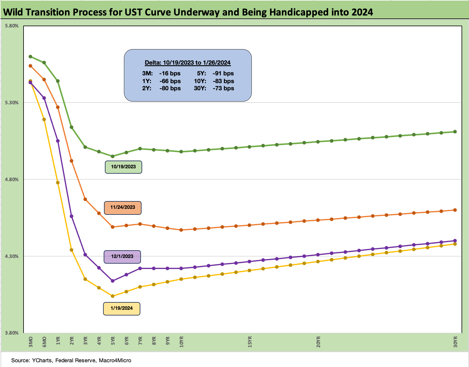
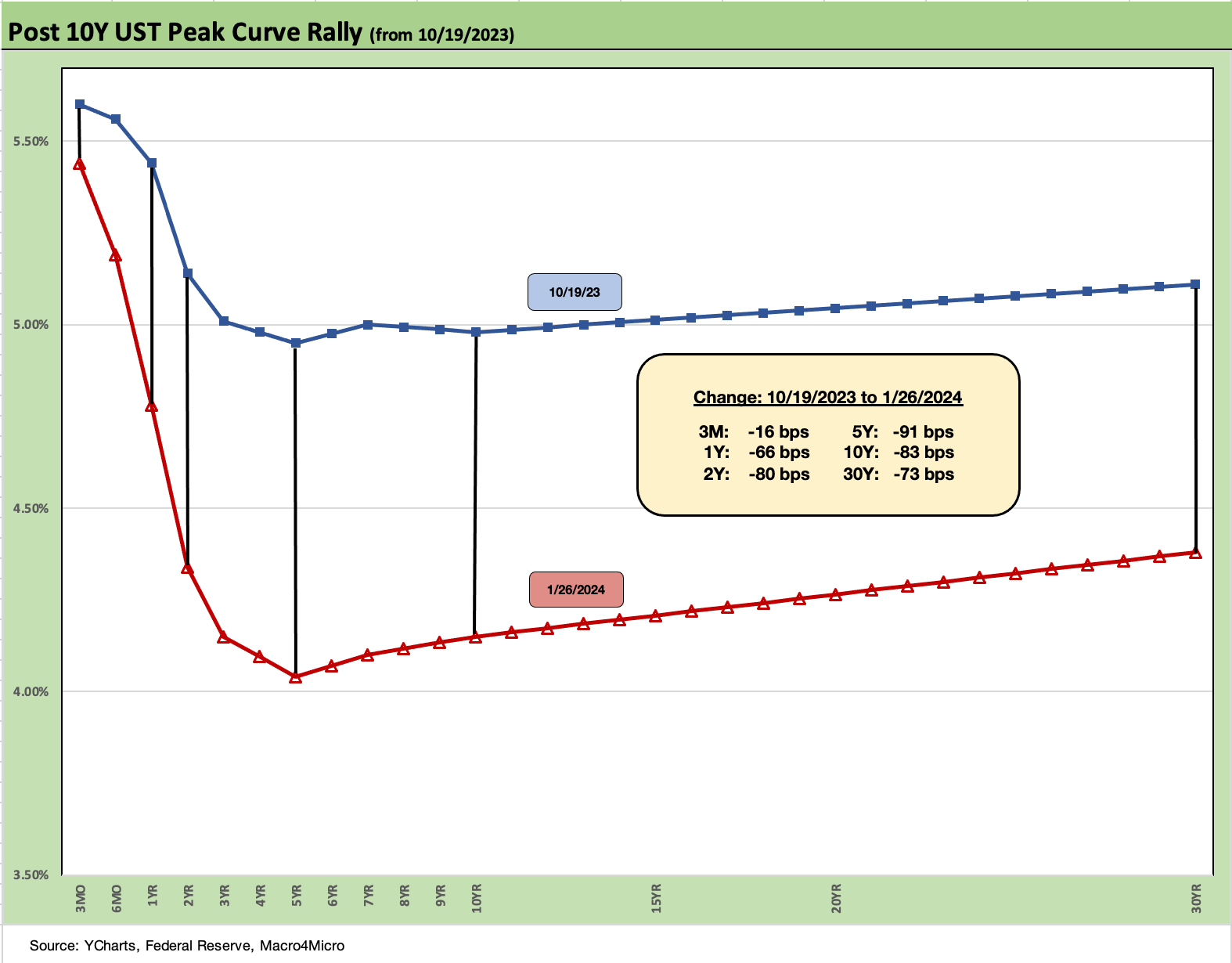
The above chart runs across the recent powerful UST rally since late Oct 2023 and offers a reminder of what a retracement could look like if the data turns unfriendly. The “good is bad” nerves got a serious test this week after a very strong GDP print (see 4Q23 GDP: Strong Run, Next Question is Stamina 1-25-24) coming on the heels of one of the bigger pops in consumer sentiment (see Consumer Sentiment: Multiple Personalities 1-19-24) that would have rattled the market back in the early/mid fall season. That was followed by very strong personal consumption numbers that matched Sept as outlays materially outpaced inflation.
The PCE price index came in favorably in the 4Q23 numbers and again in the PCE release (see PCE Release Dec 2023: Consumption Strong, Inflation Favorable 1-26-24), so that will give the FOMC a lot to think about as they head into this week’s meeting.
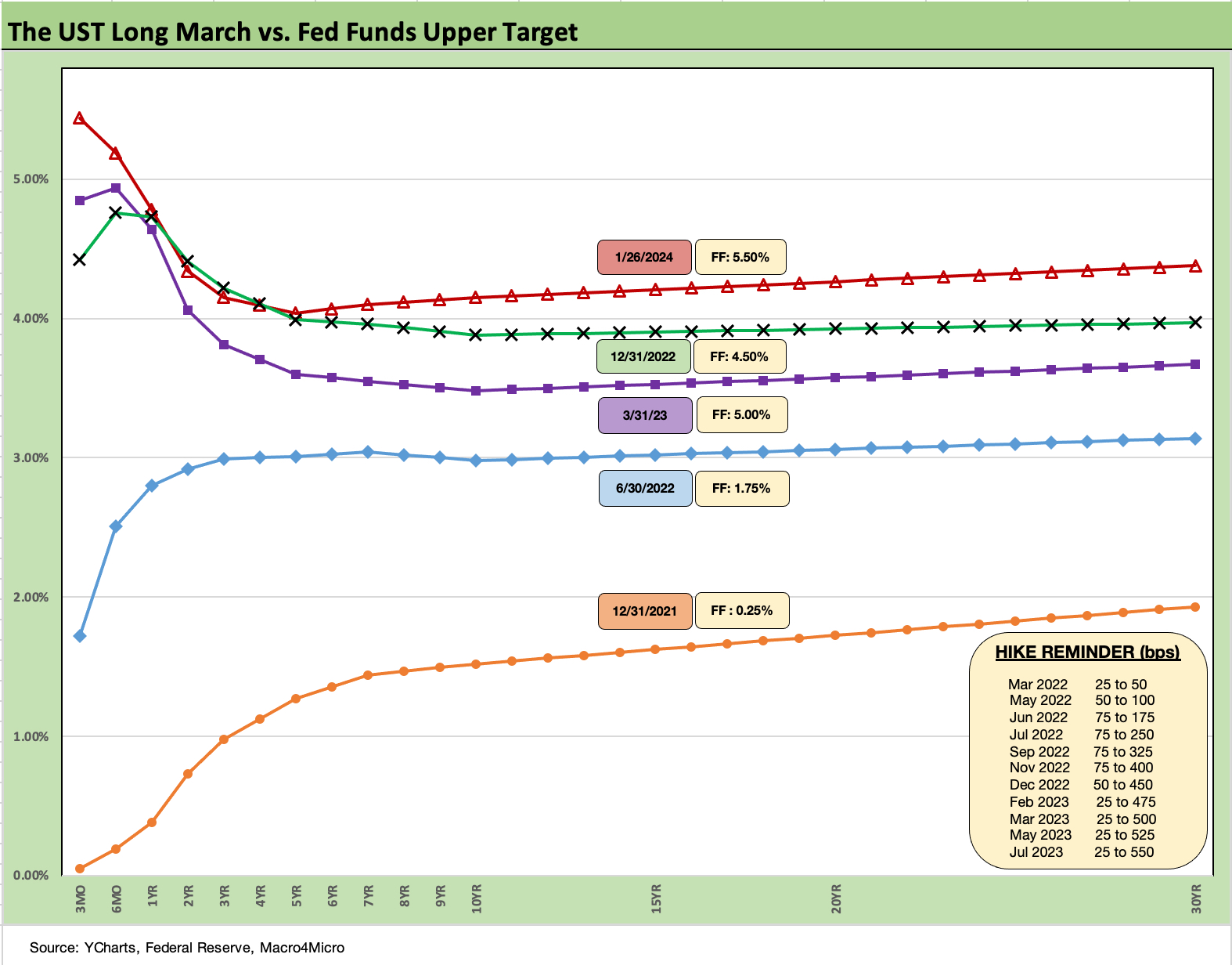
The above chart updates the long march across the inflation and tightening cycle. We start from the 12-31-21 UST curve. We include the timing and size of the hikes in the “reminder box” as the market went from bear flattening to bear inversion and is now wrestling with handicapping where we are heading with a bull inversion (after a while, the UST bull and bear monikers get strange).
We consider the 1Q23 UST curve after the regional bank crisis drove a UST rally as a good frame of reference for how far the market shifted. The UST curve shifted higher and slightly steepened from the 2Y. We look at more of the UST segment slopes further below. Broadly, the slopes are still inverted unless framing vs. 30Y UST (e.g., 2Y to 30Y, 5Y to 30Y).
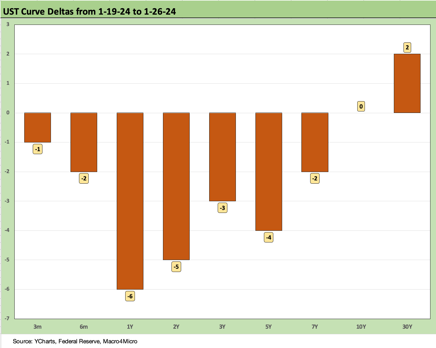
The above chart breaks out the UST deltas of this past week, which by recent standards were very mild despite some recent big headlines around growth (4Q23 GDP release) and the consumer (major rise on consumption, big jump in consumer sentiment).
The above chart updates the bullish UST deltas since late Oct that helped drive a favorable reaction in risk assets from equities to credit. The UST move refreshed confidence levels in housing and improved the prospects for everything from the economics of M&A and capex as well as refinancing, but the UST levels still seem high after so many years of free money and light borrowing costs.
As we cover below, the UST rates are below the period of earlier credit cycle peaks (e.g. 1997, 2007) and the housing bubble years (2005, 2006). The UST rates are even further below the 1980s, which is a period when nominal GDP doubled.
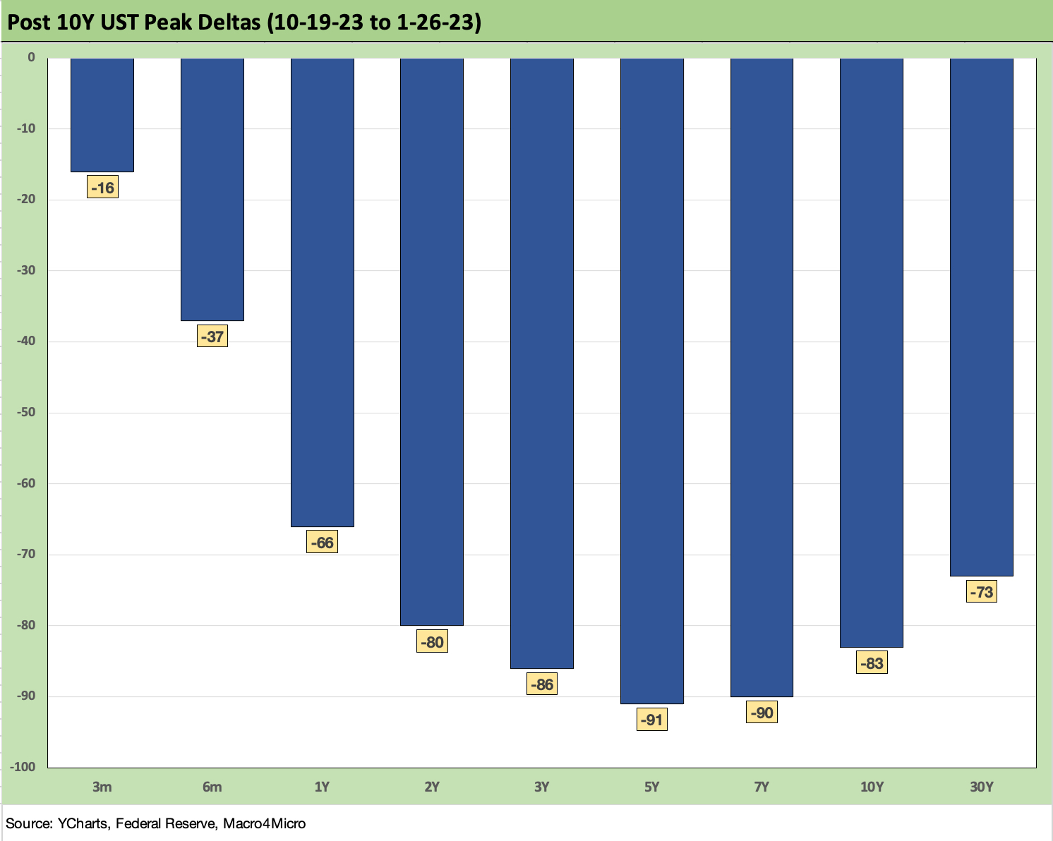
The above chart just puts the prior UST deltas in yield curve format and simply offers another visual on the material downward shift and modest steepener beyond 1Y.
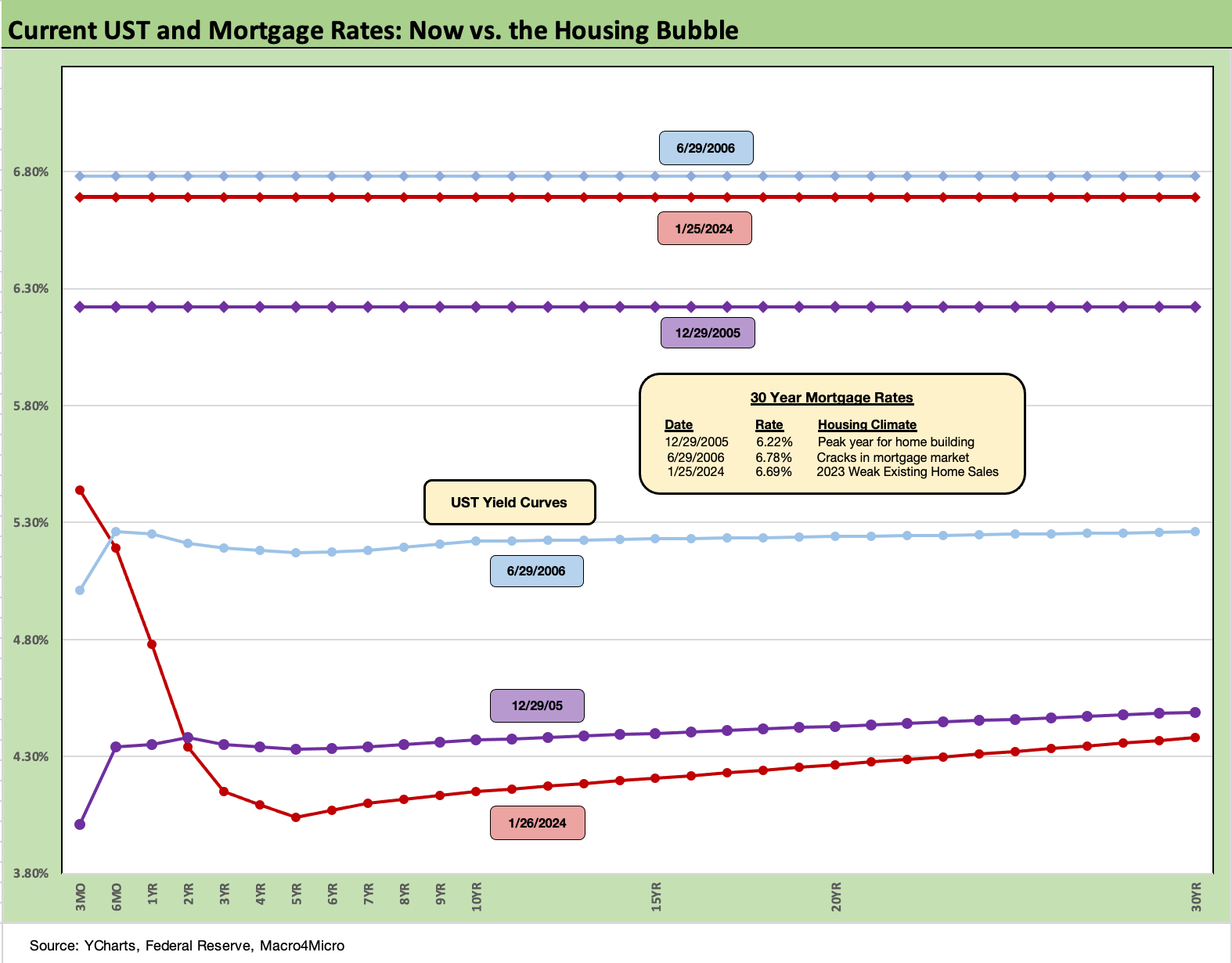
The above chart updates the UST vs. the 30Y Freddie mortgage yield released weekly. The market has seen renewed upward pressure on mortgage rates with the Freddie mortgage rate back up in the upper 6% area. That rate is positioned between the Dec 2005 level and the June 2006 level at a time when the housing bubble and mortgage boom was in full swing before the credit crisis.
We include the 2005 and 2006 rates as an example of how today looks vs. mortgage credit peaks for both the UST curve and the mortgage rates. We looked at the history in more detail in our 2023 year-end review (see Footnotes & Flashbacks: State of Yields 1-1-24).
Affordability of monthly payments is about home prices and mortgage rates, but the needle moves the most on mortgage rates. If the bullish consensus holds true in 2024, the expectation should be a major move in mortgage rates as well. We are not in sync with that view, but that is what the market is calling for.
The color from the homebuilder sector is that the sweet spot for higher demand identified in their mortgage buydowns has a high 5% handle on it. The buyer of an existing home does not have that flexibility to receive such incentives. Similarly, the seller on the other side of an existing home sale will most likely have a sub-4% mortgage based on the market mix. Those inventory-for-sale constraints are covered routinely in our housing research (see New Home Sales Dec 2023: Endurance Counts 1-26-24).
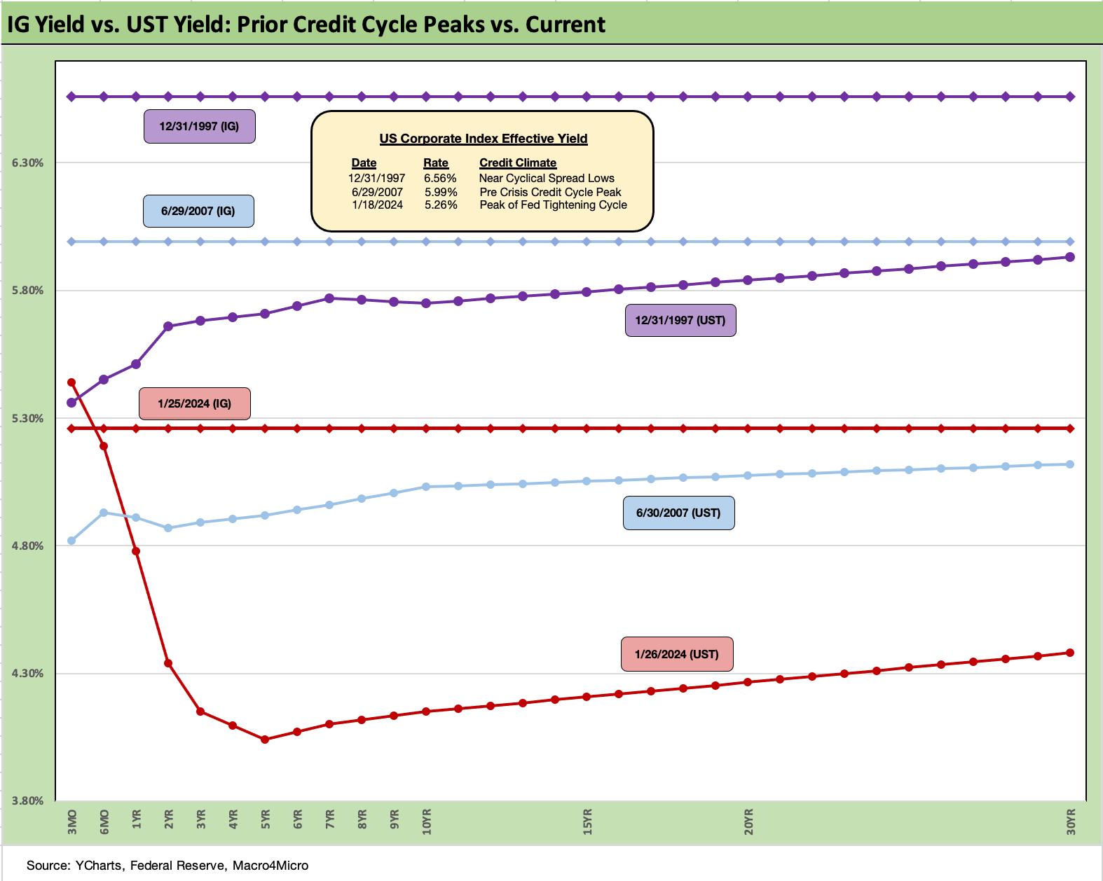
The above chart updates the current IG index yields (ICE) and frames that vs. the cyclical credit peaks of 1997 and 2007. We post the IG Corporate index yields for each period on a horizontal line and plot the UST yield curve from those dates.
We look at the spread histories in detail for this chart as well as the lows of 2018 and 2014 in the yield curve reviews in our year end recap (see Footnotes & Flashbacks: State of Yields 1-1-24).
The IG market saw 6% area yields in 1997 and 2007 as noted, but the UST curve was higher as well. Those cycles did not end well, but the bullishness in the UST outlook now is inflating demand for the all-in yield rather than the credit risk value. The 4.1% par weighed coupons in the IG index are less exciting for many, and current coupon issuance would change the menu.
The current IG index OAS of +97 bps to end last week is tight in historical context and in line with some of the averages we see from 1H04 to 1H07 as well as the 1997-1998 period averages. It is no mystery at this point that spreads are very tight, but the protracted yield starvation has lit up demand and IG has been the beneficiary of more asset allocation shifts.
The quality spreads from A to BBB tier are currently 40 bps and from BBB to BB are 83 bps. We have looked at these histories in past commentaries, and they can certainly go tighter to the extent demand stays as strong as it has been. The BB to BBB quality spread differential has been at or below 60 bps in 1997, 2007, and again in 2019. That is materially tighter than the current 83 bps and keeps investors happy with all-in yields in the BBB tier at 5.5%. We will be updating quality spreads differentials in a separate piece.
The appetite for current coupons is quite high, but the desire of companies to lock in high coupons is more limited where it can be avoided. The corporate Treasurers and CFOs face the unpleasant challenge of an inverted curve at high rates not seen in years on the front end or the long end.
An example from earnings the past week is D.R. Horton (DHI), who will most likely redeem a $500 mn maturity this year with cash if rates remain high since it is sitting on 1% and 2% coupons right now in its bond stack with maturities each year across 2024 to 2027. Not many companies in the BBB tier can boast cash in excess of debt like DHI, so there will be a lot of opportunities to lock in 5% coupons as refinancing picks up from companies for call protected bonds rolling off in 2024.
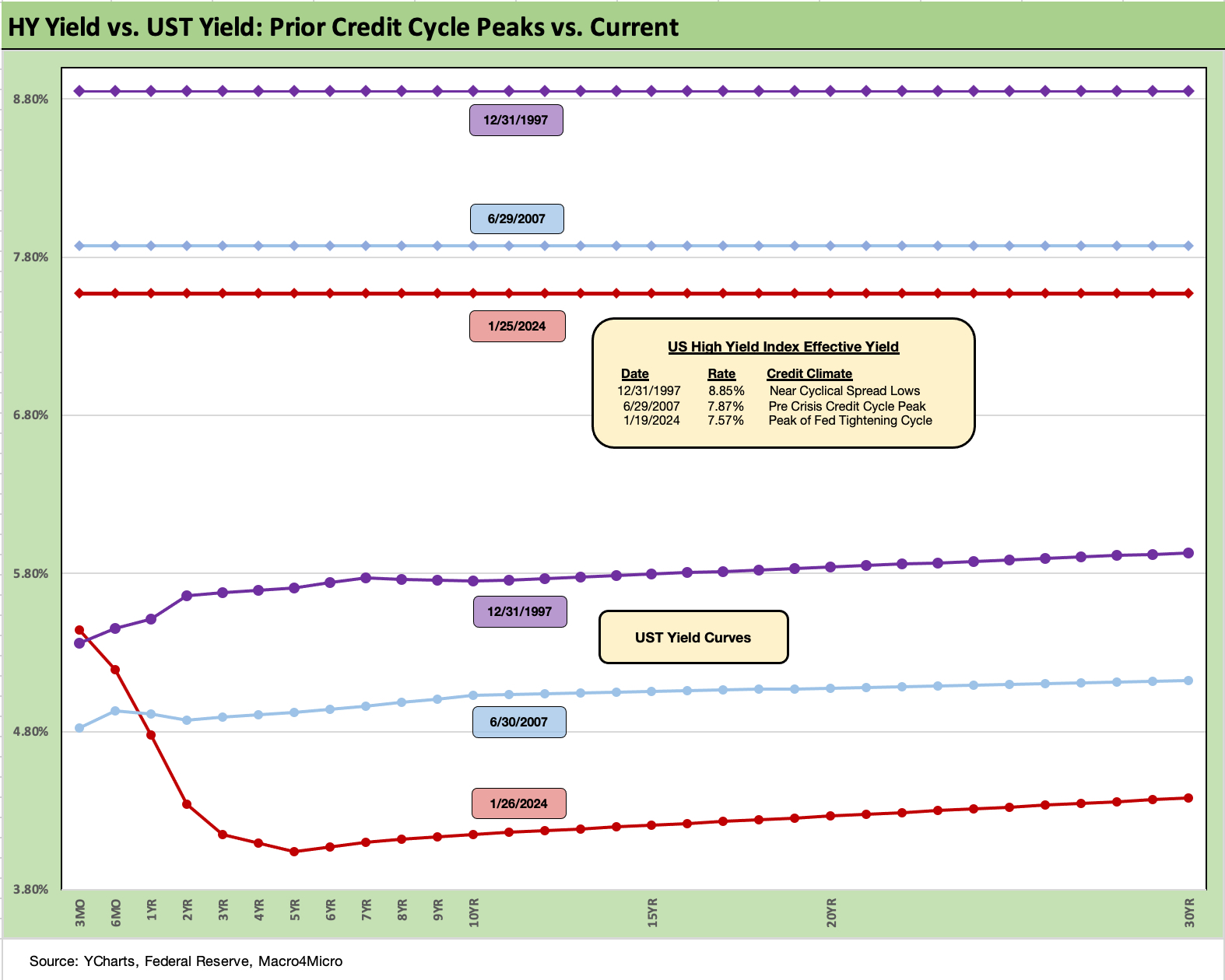
The above chart does the same drill for HY that we did for IG Corp. We look at current index yields vs. the UST for Friday close vs. the 2007 and 1997 peak periods. HY had another good week of spread compression by 15 bps to 339 bps OAS, which is just above the June 2014 lows of +335 bps (6-23-14) and 2 decent months away from the early Oct 2018 low of +316 bps (10-3-18). Those periods in 2014 and 2018 did not end well for HY spreads. The 1997 and 2007 lows are a long way down from here at sub-250 bps.
There is a reason more asset allocation strategies are unfolding to take credit risk somewhere else than in HY bonds. Many asset allocators are looking at secured exposure at higher income levels and structural seniority with the managers of those low coupon asset classes broadening out their portfolio offerings into private credit.
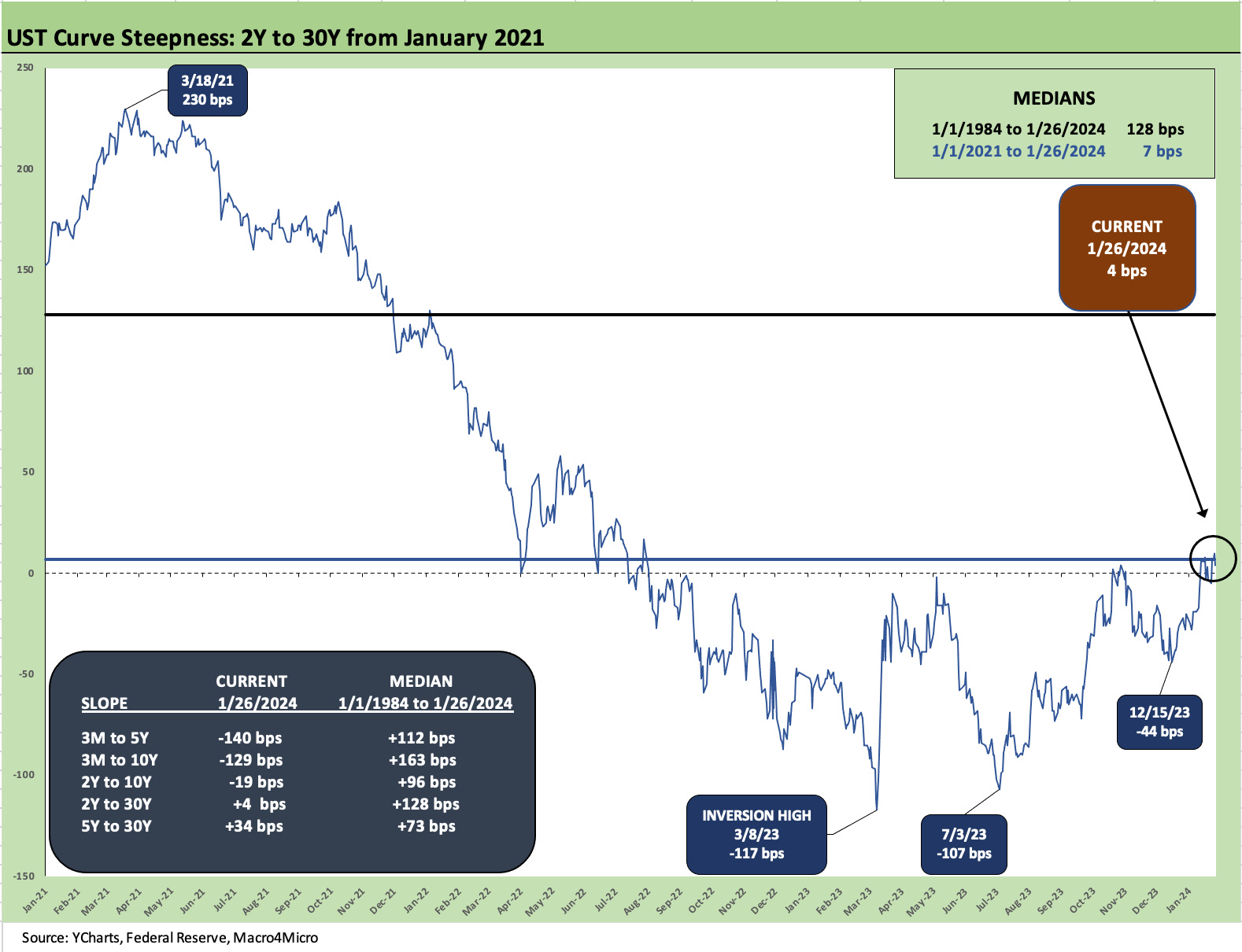
The above chart updates the 2Y to 30Y UST slope history across this latest inflation and tightening cycle. We start the time series in Jan 2021 as we ran from upward sloping to inverted and for this 2Y to 30Y back to upward sloping. The peak inversion was -117 bps on 3-8-23 with the regional bank crisis with the slope bouncing around on the way to a steepening with all the volatility in 4Q23 to the current +4 bps.
The box in the chart breaks out current slopes and details the long-term history of the slope from 1984. The current 2Y to 30Y and 5Y to 30Y is positively sloped but well short of history. The biggest inversion distortions are still on the front end with the fed funds and FOMC holding up the short end and the market setting the long end.
The challenge in the long-term trend line is that we have not had a major inflation spike or such an aggressive monetary policy since before 1984. The peak of the Volcker inflation war was 1980-1981 even if Volcker warmed up in late 1979 and had gotten into the “mop-up operation” stage by late 1982. As we covered in other inflation commentaries, Volcker ran fed funds well in excess of inflation for a protracted period after the battle looked complete. Some would argue the war was not over until oil crashed and CPI hit 1% in 1986.
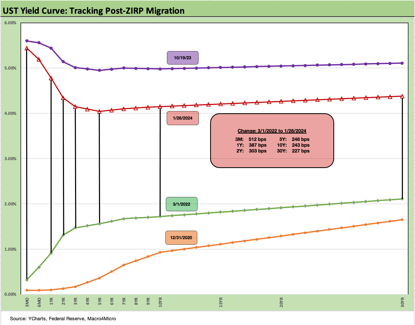
We wrap this commentary with our usual migration chart that posts the running differential from the beginning of March 2022, the month when ZIRP ended effective March 17, 2022. We break out the running differentials across the UST curve in the box, and the numbers show the “coast to coast” inversion from ZIRP to a peak and then the latest downshift to the 1-26-24 levels.
The UST differential as the crow flies from 3-1-22 shows a 3M UST rise of +512 bps, the 2Y UST moved by +303 bps, the 5Y by +248 bps, the 10Y by +243 bps, and 30Y by +227 bps. While that constitutes a bear inversion, the shift from 5Y to 30Y ends up looking more like a major upward shift and a seriously painful hit to duration.
We also include a UST curve for 10-19-23 when the UST curve just missed a closing high of 5% for the UST 10Y. We also include a 12-31-20 UST curve as a frame of reference in what has been a long journey across a COVID recovery into an inflation spike, a tightening cycle, and now into a waiting game as inflation declined materially since the June 2022 peak.
We will see what the FOMC will have to say this week or whether forceful ambiguity and “data driven” repetition will rule the day.
See also:
Histories: Asset Returns from 2016 to 2023 1-21-24
Credit Performance: Excess Return Differentials in 2023 1-1-24
Return Quilts: Resilience from the Bottom Up 12-30-23
HY Refi Risks: The Maturity Challenge 12-20-23
Coupon Climb: Phasing into Reality 12-12-23
HY vs. IG Excess and Total Returns Across Cycles: The UST Kicker 12-11-23
HY Multicycle Spreads, Excess Returns, Total Returns 12-5-23
HY Credit Spreads, Migration, Medians, and Misdirection 11-6-23
Quality Spread Trends: Treacherous Path, Watch Your Footing 10-25-23