
Footnotes & Flashbacks: State of Yields 1-1-24
We wrap the 2023 yield curve story as the first inflation war since Volcker appears to have at least peaked.


Sometimes it is easy to forget during all the yield curve shapeshifting analysis and inversion ponderings that such a backdrop has not been seen in four decades, and the last time this happened was before the corporate bond markets (IG and HY) exploded in scale while the world was still operating under Glass-Steagall.
The theory is that 2024 will be modestly less speculative with inflation materially lower, the FOMC somewhat more specific in language, and more than a few major CPI index lines in deflation mode with shelter slated to ease as well.
The newly repriced yield curve will offer more economically palatable alternatives for refinancing/extension and M&A even as the private credit and direct lending business opportunities heat up in 2024.
We update the history of the IG and HY yields and update the UST yield curve slopes on the way into 2024.
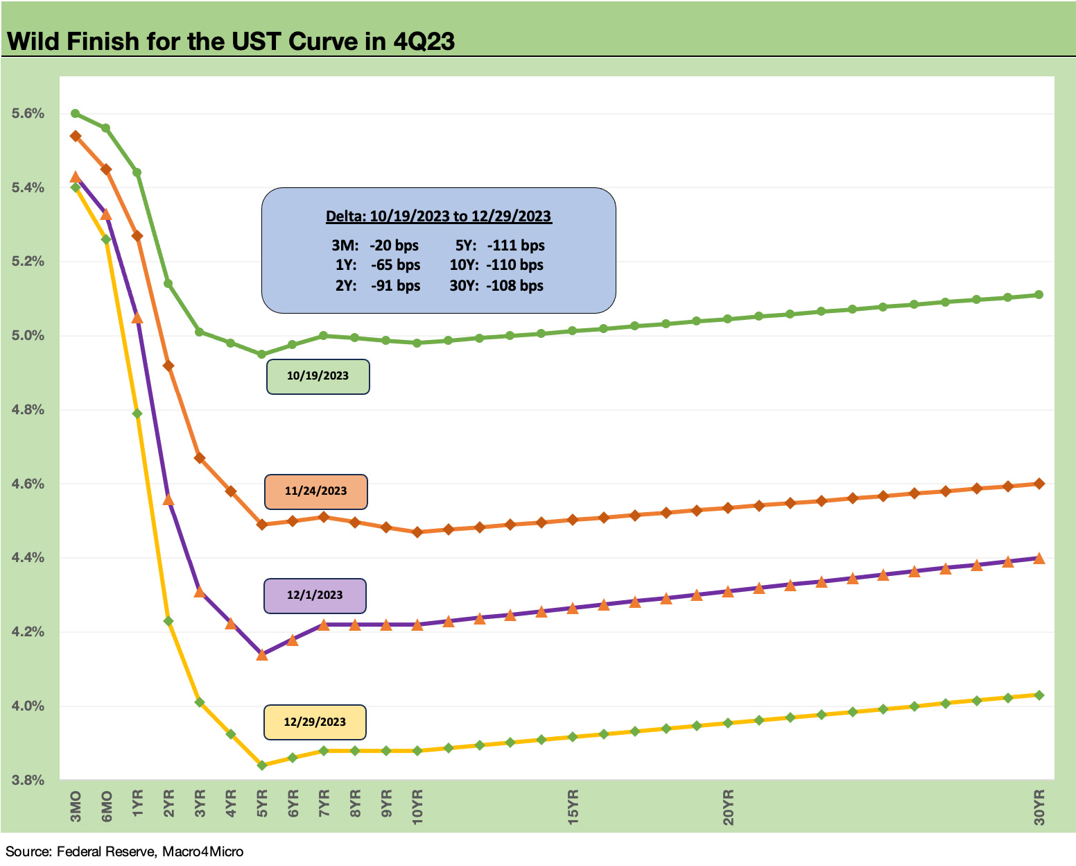
The above chart prints the final shifts for calendar year 2023 and the move from late Oct to the end of Dec. The rapid downward shift leaves no room for confusion on where the market is pricing in the next round of FOMC policies and the balance of inflation trends in early 2024. The market discounting goes beyond the dot plot and has prompted some other FOMC members to make some noise questioning the tone of dovish commentary.
The fact that risky asset performance is so bullish in credit and equities while waving off inflation concerns in 2024 has been especially striking. We looked at the wild finish for asset returns separately in our parallel Footnotes weekly publication (see Footnotes & Flashbacks: Asset Returns 1-1-24).
Reconciling the bullish view of risk at a time of declining inflation and lower UST rates makes for a complicated mix of Goldilocks’ best chowder recipe. That mix includes a lot of potential ingredients from the consumer to commodities to credit conditions to global markets (China and EU economy, trade flows/clashes, currencies, etc.). Some of those are highly unpredictable but are getting assigned high probabilities. That will get interesting.
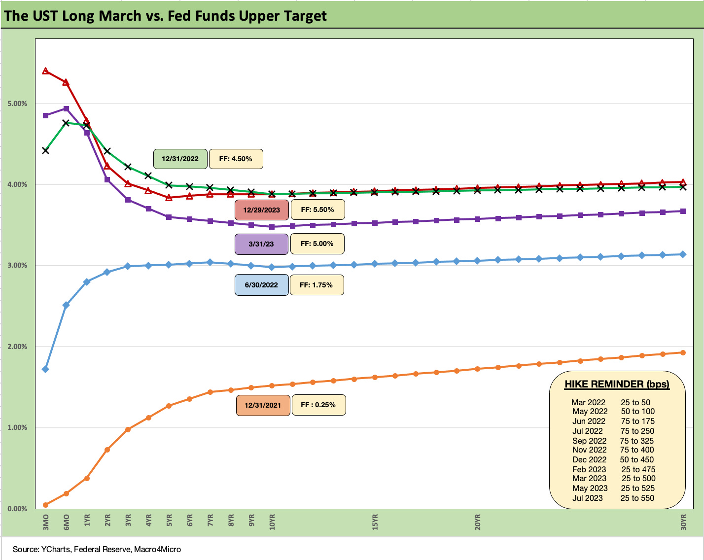
The above chart updates the march of the UST curve across the tightening cycle with a 12-31-21 UST curve posted as a frame of reference. We now see the UST curve retracing back to year end 2022 levels with the front end higher but some shorter segments of the UST curve lower.
A key part of the debate is that the inversion is not sustainable. Something has to give in one direction or the other. That means an upward shift on the long end as we already saw in the fall or, alternatively, the UST needs to be lower on the front end at some point to get back closer to “normalcy.”
If the normal state of the UST curve is flat to upward sloping, the consensus forecast is saying the curve has to flatten from the short end in a bull flattener pattern first. That would be a similar rationale to what was unfolding during the bear steepener stage in the early fall (Sep-Oct) as the term premium debate was heating up.
In theory, the desire to fully break inflation calls for a protracted period of positive real fed funds rates under the Volcker formula. That is not what the market is calling for at this point unless they are especially optimistic on inflation moves in 1Q24. The debate on “What is normal?” for fed funds vs. PCE inflation (or CPI) has been ongoing since last fall (see Fed Funds vs. PCE Price Index: What is Normal? 10-31-22, Fed Funds-CPI Differentials: Reversion Time? 10-11-22). It will continue in 2024.
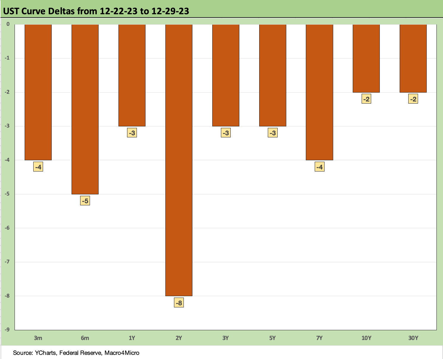
The above chart frames the past week in UST moves. It was very mild overall. The week ended a volatile quarter for the UST curve on a very quiet note.
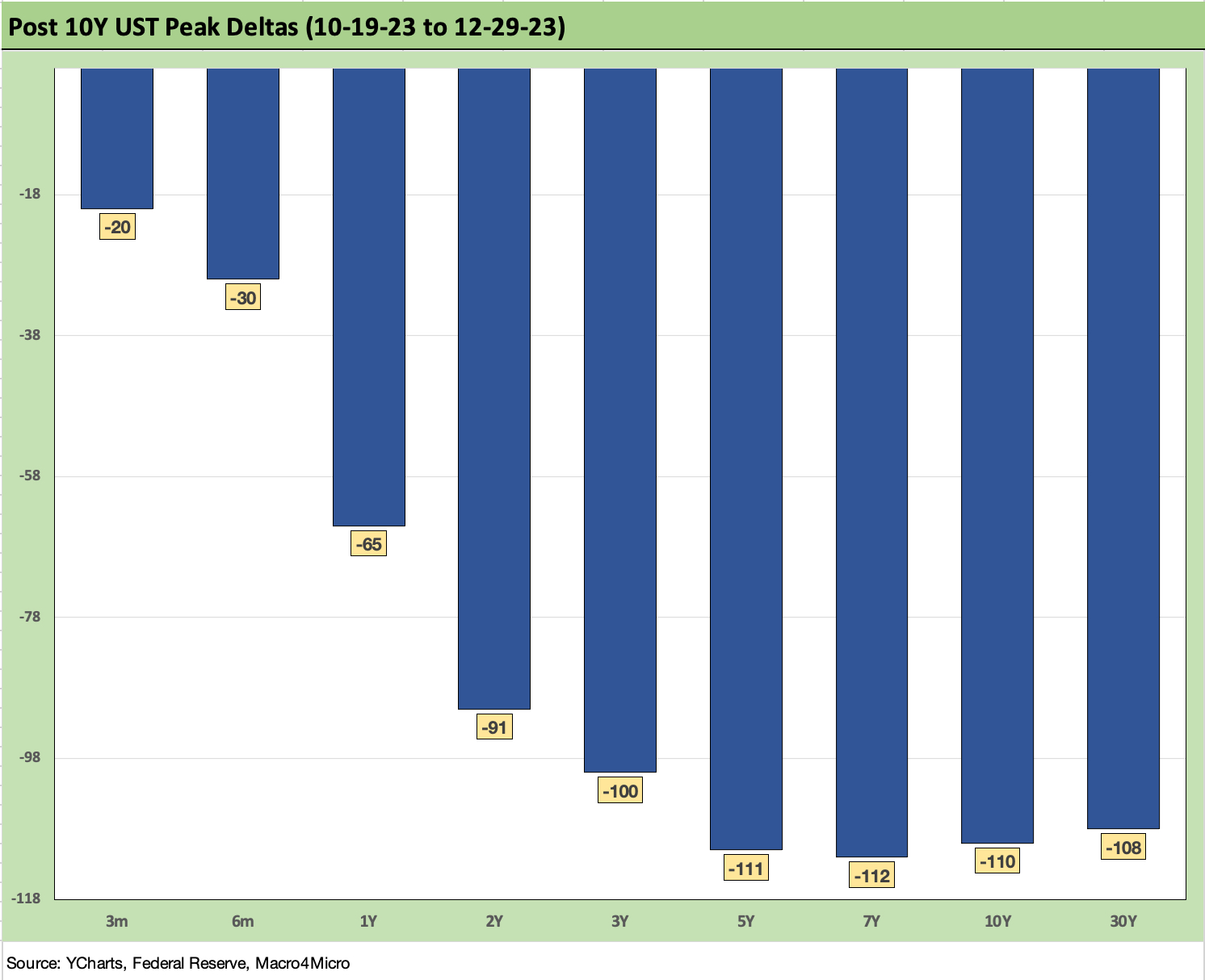
The above chart frames the UST deltas off the late Oct 2023 highs and really drives home the material bull flattener that unfolded. Inversion vs. the short end has started to revert in the direction of earlier peak negative slopes across a range of curve segments. The 3M UST is holding north of 5% since that is set by the Fed. The market is drawing its own conclusions since it controls the long end.
How the long end rates can shake out in clearing the market in 2024 and into 2025 with record deficits and borrowing needs and soaring interest expense will remain a core part of the UST bull vs. bear debate.
The subject of how rare such monetary backdrops are in fact across history (inflation fighting, etc.) will be a topic since inflation wars have not been seen for decades in the US. In addition, it is safe to say that a government borrowing need of this scale has never been seen in the modern capital markets era (outright or vs. GDP). That makes most models subject to a question mark on what inputs might not be factoring into their end game forecasts.
Basically, the supply of UST will have to clear the market and that is not easy to take for granted if the forecast is also for lower yields. The attraction of alternatives in credit and equities might draw off some allocation. The global offshore investor might also have some questions at a time when the banks might ease off on some of their excessive exposure to low coupon UST.
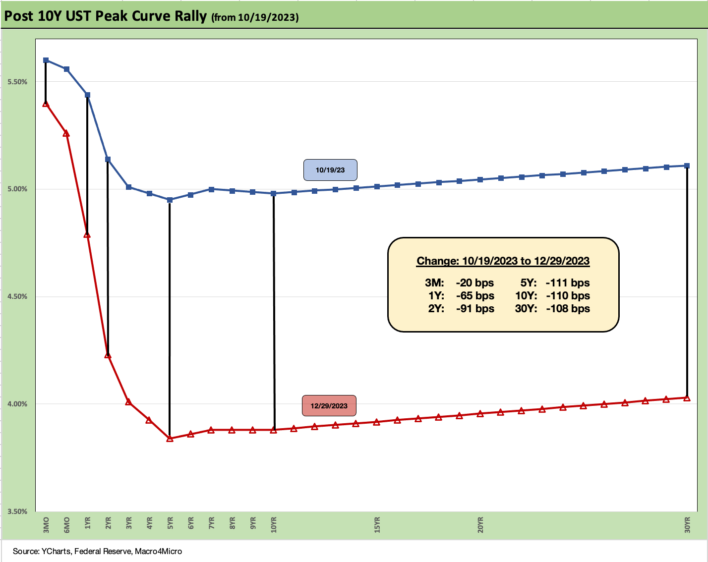
The above chart puts the UST deltas in yield curve format for a telling visual. That is one hell of a downshift. The theory is that the fed funds rate will need to chase that downshift if a flat curve or upward sloping curve is in the future. For some economists, inversion always means recession. That inversion = recession view gets no shortage of repetition from numerous economists.
We will get fresh employment numbers this coming week, and January will start the next round of guidance with 4Q23 earnings season rolling in and peaking in Feb 2024. The CPI and PCE numbers will remain under scrutiny as much as ever and especially with a March timeline for easing so prevalent.
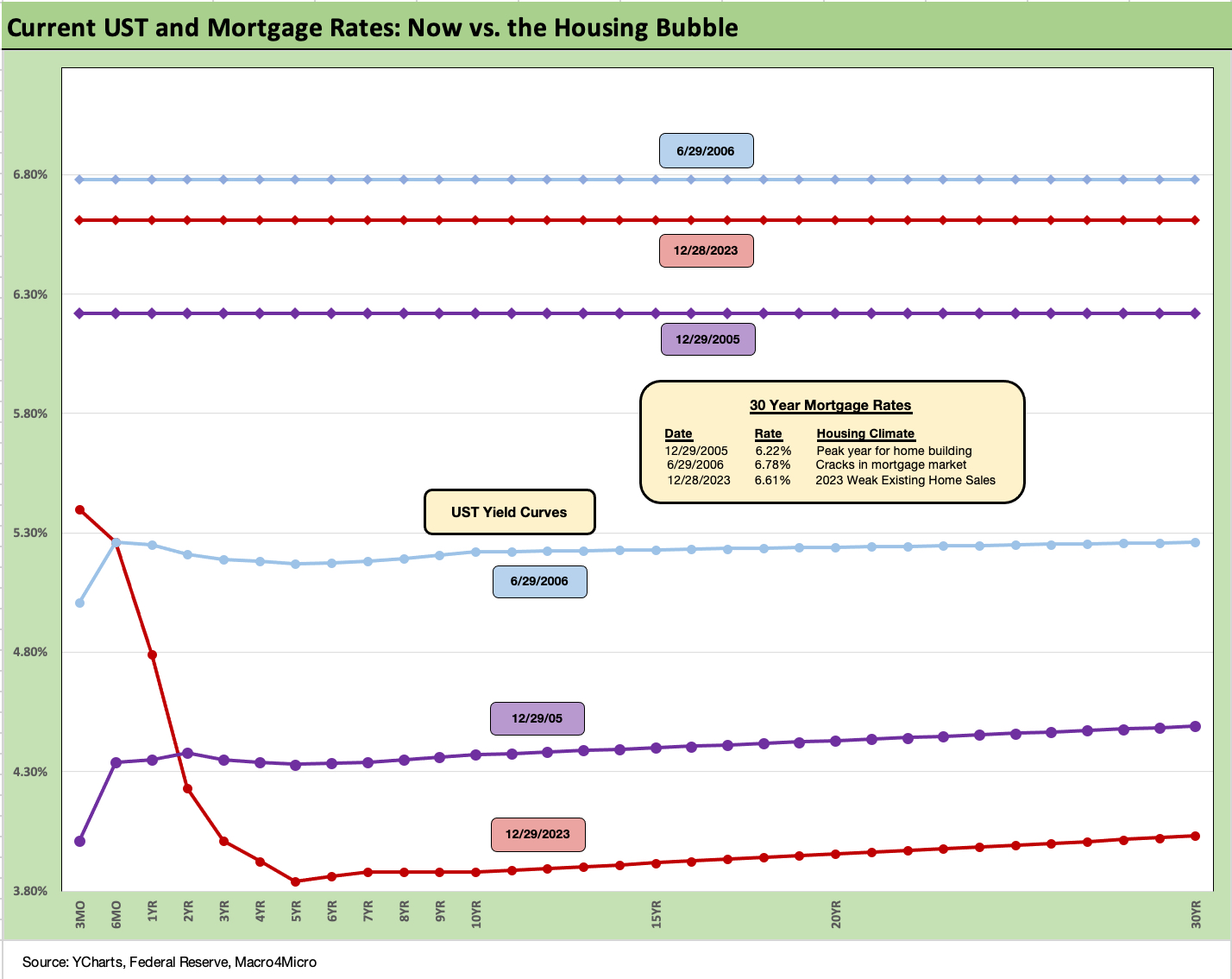
The chart above and some of the commentary below is text we carry over and update each week. We get new readers on an ongoing basis, and this is our summary guide to history in the mortgage markets framed against the housing bubble period. We do something similar for IG corporates and HY bond further below.
With the 10Y UST wagging 30Y mortgage rates, the news has been good with the Freddie Mac benchmark down slightly again to 6.6% this past week. That is still a long way from the Jan 2021 low of 2.65%. According to Freddie Mac, 60% of mortgage holders are under 4%. Freddie has run estimates of $800 bn of locked in value and savings on those mortgages. That is a lot of economic value as a barrier to refinancing in the existing home sales market.
That differential of new market coupons vs. embedded low rates from the ZIRP years and low UST curve is where the term “Golden Handcuffs” lives up to its name. The good news is high cash flow savings for households and a demand profile in the market that is preserving home equity value. The bad news is that it is hard to move or monetize!
The questions around excessive borrowing against such home equity value has not been a major factor yet. HELOCs did rise to a 15 year high (since 2007) in 2022 per CoreLogic but are declining in 2023 on higher rates.
Mortgages and UST: 2023 vs. 2006 and 2005…
The comparison of current mortgage rates in today’s market to the peak of the housing excess of 2005 and 2006 makes for some interesting input on how to consider what factors can drive activity in new residential construction (“starts”) and existing home sales.
As we cover in the separate Footnotes weekly publication on asset returns, homebuilder equities have turned in a stellar performance this year to rank #1 in our peer group of ETFs. That unfolded even in the face of a painful shift higher in mortgage rates across 7% and all the way to 8% before the recent rally. We have now retraced back into the mid 6% handle range. That still includes painfully higher monthly payment effects from this tightening cycle.
The bubble lookback years…
With this mortgage chart above, the exercise of looking back at prior periods of excessive risk appetites is worth considering. The same is true in gauging what 6% means to housing demand. We drop in the UST curves and the Freddie Mac 30Y mortgage benchmarks for two periods from the housing bubble. The Freddie benchmark gets released each Thursday. The historical comparison above gives context to how strong demand can be with a 6% handle mortgage rate such as in 2005 and 2006.
There is still the challenge of how much home prices soared in 2020-2021 ahead of the Fed tightening cycle. That complicates the affordability equation. We include the year end 2005 date for mortgage rates in the chart as the peak homebuilding year and the middle of 2006 when the “liar loan” phenomenon and subprime excess was cresting.
In 2006, subprime was starting to show some cracks but was not yet sending the credit markets into a case of nerves. That would take more quarters to go by. Even then, equities only folded later in the fall of 2007 before the onset of a recession in Dec 2007 (that “official” date for recession was set much later by NBER).
It is notable that the current UST curve is now substantially below the end of 2005 in 10Y UST and even further below the intermediate and long end of the UST curve seen in mid-2006. Despite that UST configuration, the 30Y mortgage levels of 2023 are still above 2005 but only recently dropped through 2006 in the Freddie Mac benchmark. The 30Y mortgage rates were pulling away before this latest UST curve rally in Nov and Dec 2023. The mortgage vs. UST relationship is a reminder of how mortgage spreads have trended in this cycle (much wider) vs. the years of overconfidence in the pre-crisis period.
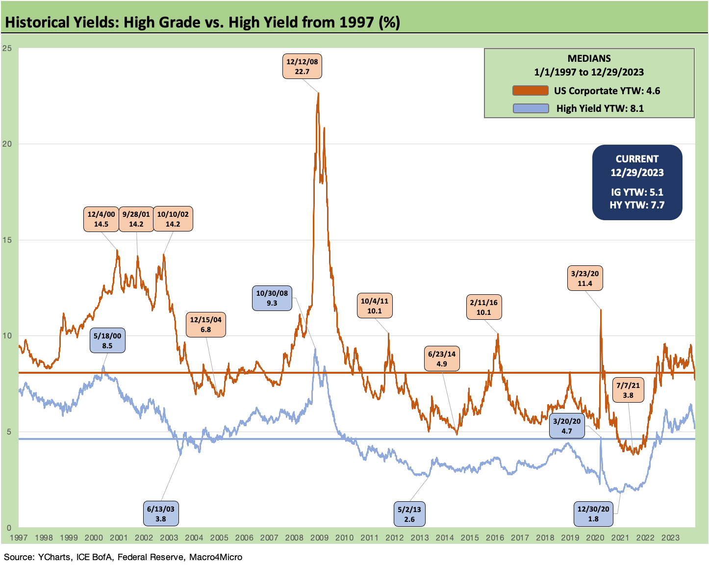
The above chart gives some longer term history on IG corporates and HY bonds. After a period of protracted ZIRP and QE and a brutal period of what had been dubbed “financial repression” (that term fell out of style eventually), a look back at the pre-crisis years and TMT period helps give some context to what is “normal” for the massive full spectrum of the corporate bond markets.
The current 5.1% yield in IG index is above the post-1996 median of 4.6%. If we included the full IG history back to the 1980s, it would be below the median, but the yield curve of the 1980s is a world away (see UST Moves: 1988-1989 Credit Cycle Swoon 10-20-23, UST Moves 1978-1982: The Inflation and Stagflation Years 10-18-23). We see the current 7.7% for HY bonds modestly below the long-term median of 8.1%.
The fact that the HY OAS spread levels just dipped below the June 2014 lows is worth highlighting since the HY index yield was below 5% at that point with ZIRP still alive and well (ZIRP ended Dec 2015). Back in 2004 during the start of a 3-year HY and leveraged loan credit bubble, the HY index was 6.8% on 12-15-04.
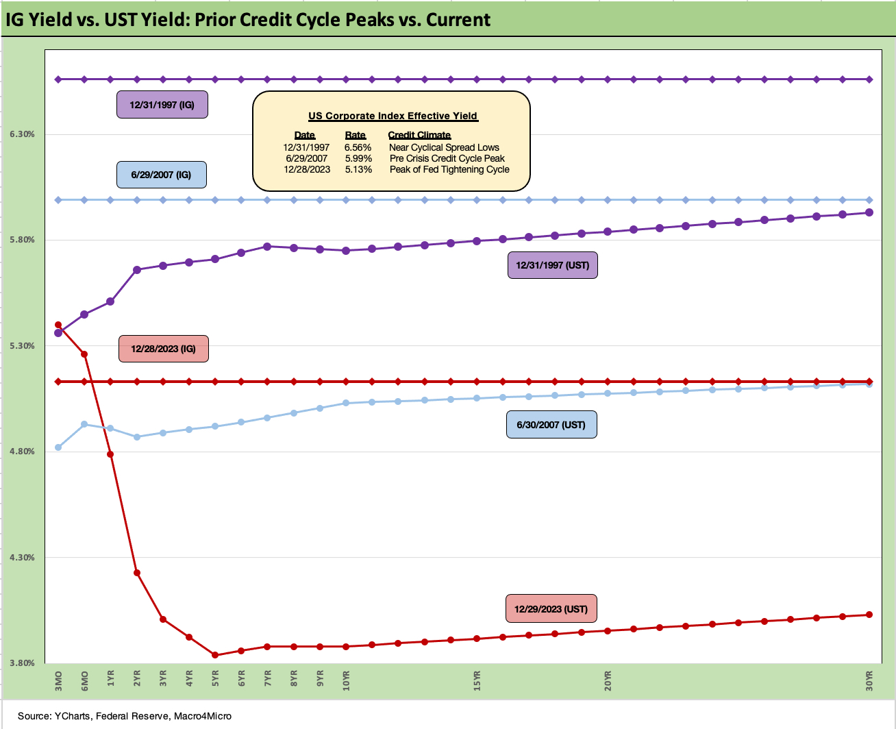
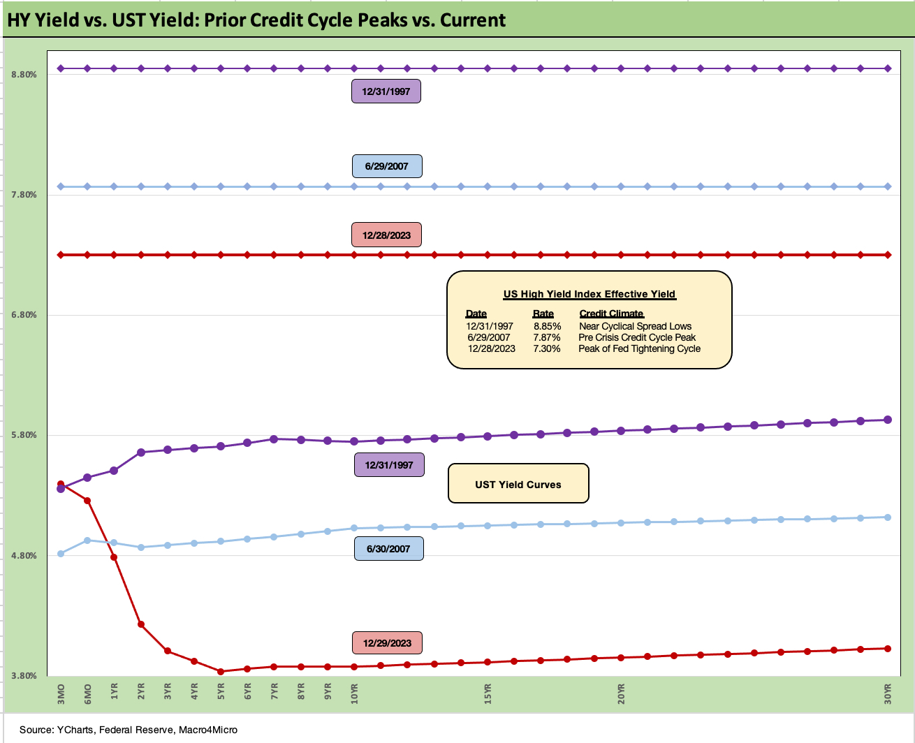
The above chart goes through a similar “then vs. now” exercise for the current UST curve and IG index yield. We compare current days to earlier credit peak periods (1997, 2007) when the IG corporate bond market was at or near credit spread lows.
Spreads were tighter in those peak periods of 1997 and 2007 than recent times, but this latest run in IG is closing in on 2007 with the ICE IG index closing last week at +104 bps to end the year (12-29-23). The ICE IG index OAS is around -30 bps through the long-term median, so spreads are not in any way signaling trouble or fears around a material spread wave along the speculative grade divide (see HY Credit Spreads: Migration, Medians, and Misdirection 11-6-23).
The demand for IG bonds is being driven by asset allocation waves that include retirement funds racing to gather up yields that they have not seen for years after protracted bouts of ZIRP in the post-crisis era.
Compression flashbacks…
As we look back across periods of spread compression near credit cycle peaks, the +70 bps for the IG index at the end of 1997 was lower than today even if the difference is narrowing (the low was in Oct 1997 at +53 bps). The 1997-1998 average for IG OAS was +95 bps. Those spreads and the yields cited in the charts above offer some historical context for today’s post-rally levels. Current IG spreads as we wind down 2023 are moving in the direction closer to the lows of the late 1990s period.
Looking at the credit bubble period of 2007 for comps, as the market was looking questionable by midyear, IG OAS was at +100 bps at 6-30-07 at the credit bubble peak. We are basically at that level as 2023 ends.
IG spreads were widening by mid-2007 after the period from 1H04 through 1H07 saw IG OAS averages in double digits at around +93 bps. The lows in 1H07 of +86 bps and IG OAS of +100 to end June 2007 were not far from lows in 2H06 at +90 bps and 1H06 at +87 bps.
The takeaways from the 1997 and 2007 periods were that those risk premiums were in stages of the cycles that were on shaky ground given the direction of credit quality. That is where the “What comes next?” questions come in today whether that be around Fed policy, cyclical trends, geopolitics, Washington policy actions, underwriting quality, outflows away from less liquid assets, and the list goes on.
With HY moving through one of the post-crisis cyclical low points in the pre-COVID period (lows from June 2014 and Oct 2018), the history lessons are becoming more interesting again. At +334 bps to end the week and the year 2023, last week we just broke through the June 2014 levels (+335 bps on 6-23-14 vs. +332 bps on 12-28-23). That is before any index rebalancing effects that will roll in for the new year. The market could cross the early Oct 2018 level (+316 bps on 10-3-18) with one good month. If that happens, there will be a discussion of going after the exceptionally compressed 2007 and 1997 levels.
The UST framework saw tighter spreads in 2007 and 1997 but the UST curves were also higher and generated higher all-in yields. As of now, the HY index yields are closer to 2007 than 1997, when the UST was materially higher. As investors try to handicap spreads and UST curves, the risk premiums in HY are extremely tight in absolute terms and even more so in proportionate terms vs. the risk free alternative. That said, yield maximization is the name of the game for many after 16 years of yield curve starvation.
One tailwind for refi and extension demand ahead in 2024 to 2025 could come from more current coupon rates on new issue with the 6.0% par weighed coupon for HY (5.4% on BB, 6.4% on B, 7.3% on CCC) overdue for higher current coupons as part of a prudent maturity extension process. (see HY Refi Risk: The Maturity Challenge 12-20-23, Coupon Climb: Phasing into Reality 12-12-23). Pension funds and wealth management cash flow seekers would be and should be then rethinking allocations.
Looking back at 2007 and 1997 spreads…
The above chart does the same drill for the US HY market as we did for the IG markets. We use the same dates (1997, 2007) as IG to frame the symmetry of risks today. We saw HY OAS at +296 bps (12-31-97) although HY OAS had been inside +250 bps in Oct 1997 (+244 10-17-97). The 1997 period saw average spreads of +282 bps in 1H97, +270 bps in 2H97, and +298 bps in 1H98 before the summer storm of Russia and LTCM (and brief Lehman funding and counterparty exposure scare) rolled in from August into the fall.
As a reminder, the peace and quiet of 2007 was very short-lived relative to the protracted credit cycle (wider spreads but longer timeline) after 1997 through 1999. The 2007 cyclical lows in spreads had come after a period of record leveraged loan origination and structured credit creation and distribution.
HY OAS averaged around +270 bps in 1H07 vs. HY averaging +270 in 2H97, so the two periods have some common features in spreads. Refinancing/repricing, and maturity extension deals in 1H07 were in a volume sprint. During the crazy period of June 2007, the market fuse was burning down. We saw HY OAS of +298 bps on 6-30-07 (as tight as +244 on 6-1-07).
The current HY market has seen spreads narrowed dramatically in a short period. Quality spreads from CCC to BB compressed with 1-month tightening of HY at -46 bps across Dec 2023 with BBs at -35 bps tighter, B tier at -58 bps tighter, and CCCs in by -109 bps on the month.
We like to watch quality spreads for hints of the bottom-up decompression threat (see HY Credit Spreads: Migration, Medians, and Misdirection 11-26-23, Quality Spread Trends: Treacherous Path, Watch Your Footing 10-25-23), but the compression has been one of tighter quality spreads.
It is impressive how well spreads have held in during 2023 after the 2022 turmoil neared +600 bps in HY and crossed the +500 line a few times in the summer and fall. The UST curve, equity rally, and FOMC color all played a part. Constructive earnings and decent macro numbers helps the Goldilocks theme spinning.
Those lows in 2014 and 2018 were not like 2007 or 1997 given the yield curve backdrop and how that flowed into all-in yields. That said, lower 300 bps OAS handles in the HY index are rare. It is worth remembering that the periods after the Oct 2018 lows and June 2014 lows did not go well in the immediate aftermath. Late 2018 was a bloodbath with an ugly Dec 2018 quality spread widening and oil crash while late summer 2014 brought the Saudi oil price war looking to recover market share.
The UST curve has moved so quickly, we are already down under the 8% line in HY at 7.7%. HY YTW was 9.5% on 10-27-23 and down to 8.8% on 11-16-23. Equities and credit spreads and long duration all ran in. Whether you bought a long duration UST ETF, a small cap ETF, or IG bonds, victory was to be had in the wild finish of 2023.
HY vs. IG: fundamentals vs. duration
The 5.1% yield in IG corporates now leaves ample room for debate on the relative asset class value of IG vs. HY in expected returns. If you are thinking soft landing or mild recession and easing, the old trade-off of duration and interest rate risk vs. credit risk comes into play. If you are thinking hard landing, then IG is the safer play vs. HY.
If you believe that the market will see a sustained improvement in credit quality and bullish cyclical trends that do not threaten Fed cut plans, the plot thickens again. That would in theory favor HY, but that is threading the needle with a charged hose as fundamentals take HY to the lowest spreads since 2007. The challenge for HY allocation is the expectation of a refinancing/extension wave that must come at some point in light of the maturity schedules. We look at that topic in more detail in a separate commentary (see HY Refi Risk: The Maturity Challenge 12-20-23).
If we had to pick either HY or IG for 2024, we would pick IG. On a disclosure note, I was invested in BDC equities in 2023 for my indirect credit cycle play and not HY bonds. I am scaling back on relative BDC exposure in this market at this point but still am long a smaller cross-section of names.
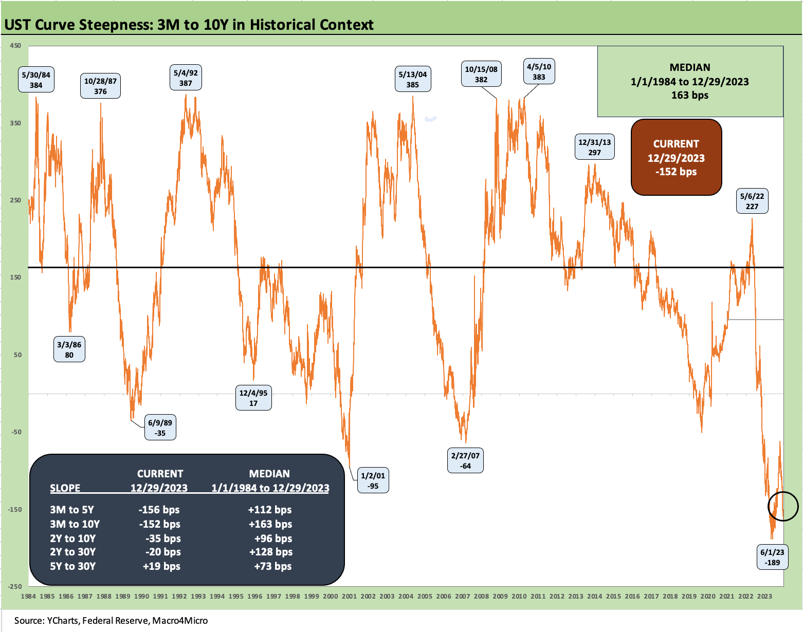
The above chart updates the 3M to 10Y UST slope with the inversion heading back towards -189 bps in early June 2023. The term premium inversion debates have now morphed into a discussion of how much the Fed will need to ease and how quickly (that was a quick reversal of that topical term premium debate!)
The box embedded in the chart frames various other slope segments. We detail where the UST segment slopes stand now as well as the related long-term median from the start of 1984 after the most onerous period of Volcker monetary policy.
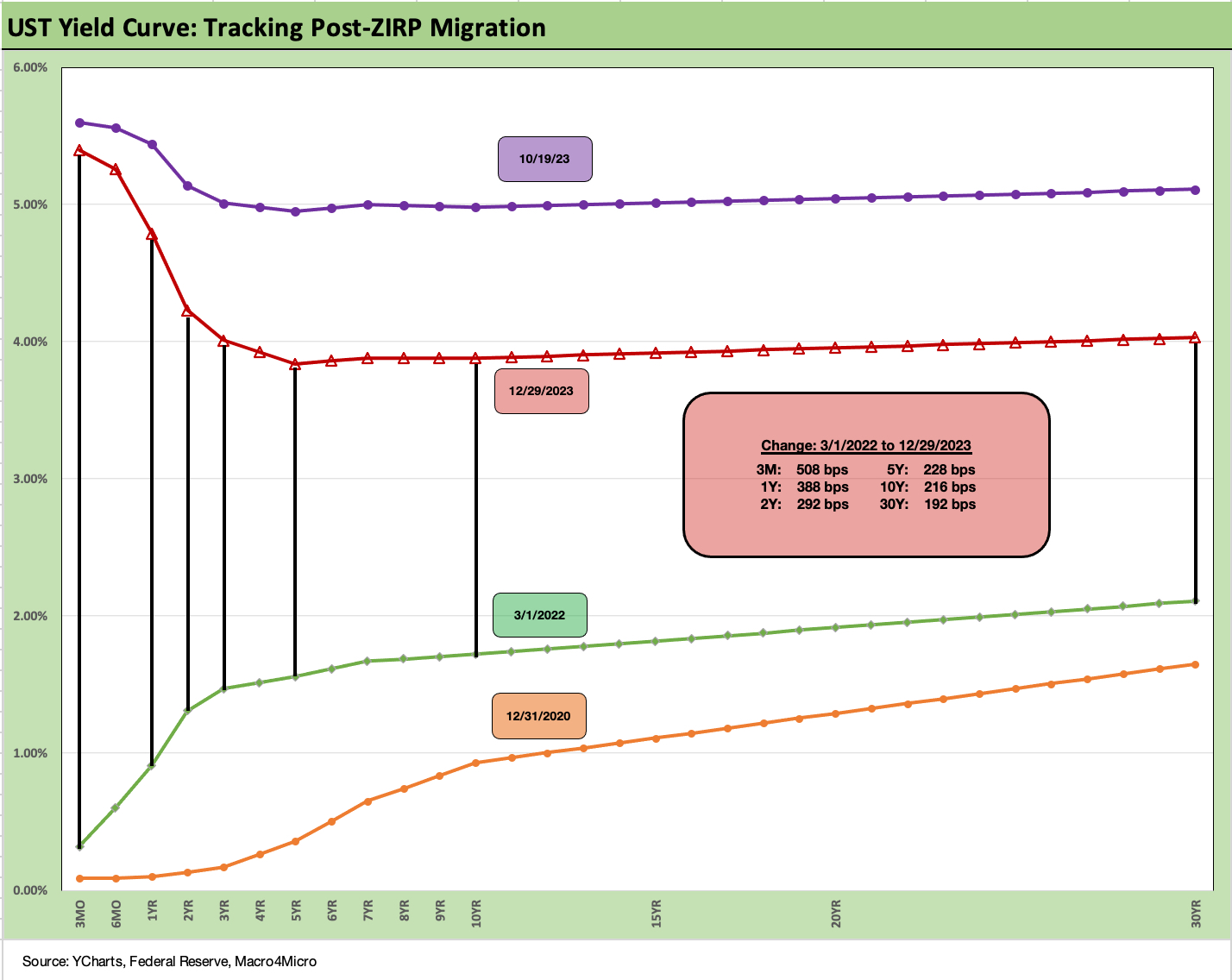
We wrap with our usual final chart that plots the migration pattern of the UST curve from the start of March 2022 just ahead of the end of ZIRP at mid-March. We plot a late Oct 2023 UST curve as the 10Y UST was flirting with a 5.0% 10Y UST over several days. We also drop in a 12-31-20 UST curve as a frame of reference. That was a very fast move.
See also:
Credit Performance: Excess Return Differentials in 2023 1-1-24
Return Quilts: Resilience from the Bottom Up 12-30-23
HY Refi Risk: The Maturity Challenge 12-20-23
Coupon Climb: Phasing into Reality 12-12-23
HY vs. IG Excess and Total Returns Across Cycles: The UST Kicker 12-11-23
HY Multicycle Spreads, Excess Returns, Total Returns 12-5-23
HY Credit Spreads, Migration, Medians, and Misdirection 11-6-23
Quality Spread Trends: Treacherous Path, Watch Your Footing 10-25-23