
Footnotes & Flashbacks: State of Yields 5-5-24
The UST rally of the week sent HY under the 8% threshold as spreads tightened but the overall duration effects carried the day for bond returns.


The AI goggles say, “7 cuts by the Fed, 1% PCE, and free shelter.”
As the pressure of good news built on the UST markets and started to infect bond and equity markets with FOMC worries, a “serenity now” session with Powell tag-teamed with a payroll “miss” to drive a positive week for asset returns with the next CPI and PPI dance more than a week away.
The earnings season continues but the peak of reporting and mega names are now behind the market with plenty of interesting color to keep absorbing from industries that posted results heavily weighted toward the range of stable to positive.
The market will seize on any macro news that falls short of consensus, so a +175K jobs number will certainly need some help from CPI and PPI (more than a week away) to tamp down the anxiety around sticky inflation.

The above chart updates the movement of the UST curve from its 10-19-23 peak as a monster rally to wrap the year was replaced by a bearish UST shift YTD 2024. We include the UST deltas from the peak to the Friday close (e.g.,-47 bps 5Y UST, -48 bps on 10Y UST) and the UST deltas for the move from 12-31-23 to the Friday close (5-3-24) where we see a YTD move higher on the 5Y UST by +64 bps and on the UST 10Y of +62 bps.
The UST curve is now positioned between the high of 10-19-23 and the 12-31-23 UST curve but closer to the highs than where the year started. The 4.67% 10Y on Friday is well inside the 4.98% of Oct but well wide to the 3.88% to start the year. In historical context across the cycles, these are very low rates but seem high in the context of ZIRP and the crisis years (see Credit Markets Across the Decades 4-8-24).

The above chart updates the migration across 2022 through Friday close with a 12-31-21 UST curve as a frame of reference. The memory box in the chart offers a reminder of the FOMC timing and magnitude across the tightening cycle.
Our favorite data point in this chart is where the 12-31-22 and 12-31-23 UST curve converge beyond 10 years despite the 100 bps differential in fed funds. That empirical data point reminds us that things are never as simple as “higher fed funds, higher 10Y UST” and “lower fed funds, lower 10Y UST.”
The number of market commentaries saying, “no cuts in 2024” has been growing, but the consensus has been a floating craps game with the clash in the financial media now more around “more or less 2 cuts” as the “over/under.”
The July vs. Sept discussions will continue, but the jobs and inflation metrics will answer that as everyone waits to see if shelter inflation declines and jobs move lower into double digits - let alone contract. That said, you don’t hear much of the “5 or 6 cuts” discussion after all the releases have piled up. That would take a shock or something that seriously breaks (or shatters).

The above chart posts the weekly UST deltas, and we see a good week for bonds obviously with a double-digit UST shift from 2Y to 30Y. As we cover in our separate Footnotes publication on asset returns (see Footnotes & Flashbacks: Asset Returns 5-5-24 ), that made for a good week for bond ETFs with some spread compression in HY also helping in lower tier credit.
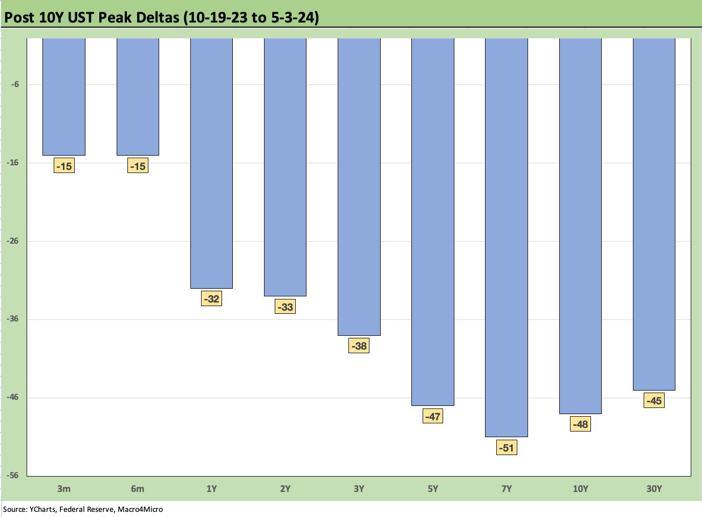
The above chart provides another visual angle on the UST shift lower since the peak 10Y UST date of 10-19-23. The Nov-Dec rally in UST had its share of setbacks in 2024 as we cover in the next chart.

The above chart updates the major shift higher in the UST curve YTD 2024. We see an old-fashioned duration beatdown as the market shifted into a steepening from 1Y. Overall, the UST move was a material shift across the board from the 2Y to 30Y UST.

The above chart updates the Freddie Mac 30Y mortgage benchmark which ticked higher yet again in its weekly Thursday pricing from 7.17% last week to 7.22% this week. We also include the Freddie benchmark from the end of 2005 and mid 2006 in the horizontal lines along with the UST curve from those same dates. We see higher mortgage rates today despite much lower UST curves. That is true even with a higher quality mortgage mix today in the overall market.
Those two dates (2005, 2006) mark the peak year for homebuilding (2005) and the peak period of RMBS excess when the market started to get nervous around midyear 2006 on the way to serious trouble in 2007 and a financial system cataclysm in 2008 (see Credit Cycles: Historical Lightning Round 4-8-24).
We include those mortgage rates and UST curve to give a sense that those mortgage rates still saw a very robust housing market even if driven by reckless easy credit. The current housing market is very different in too many ways to break out here, but demographic and work force demand is the key driver.
The supply factor is that the constraints of low mortgage rates in the homeowner/borrower base is hindering mobility and preventing existing home inventory from bringing down housing prices. The story is still supply and demand, but the “riches” of this market are the low contract rates from pre-2022 refinancing at low rates. That created conditions where the market faces high home prices and high mortgage rates. We cover these topics in detail in our housing sector and single name work.
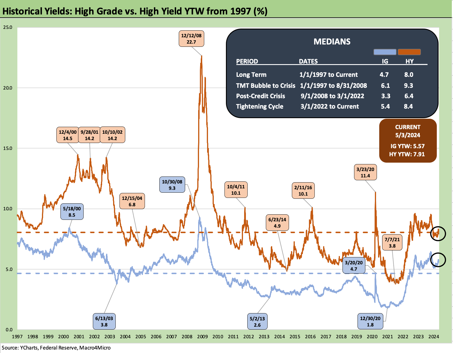
The above chart updates the IG index yields vs. the HY index yields. The relevant frames of reference are now the pre-crisis medians since we are in a post-ZIRP world again. What is “normal” should include the 9.3% HY median and the 6.1% IG median. The challenge today is tight spreads and the trade-off of cyclical peak credit pricing set against the risk of a downturn that hurts credit quality, maims HY spreads, but rewards duration. That helps underpin the choice of IG for many in this market vs. HY. That said, HY has been the total return and excess return winner.

The above chart on the IG Corporate bond market does a similar version of a historical lookback like we did with mortgages except we use the credit cycle peak in late 1997 and the midyear 2007 credit cycle peak. We plot the UST curve for 12-31-97 and 6-30-07 and plot the IG index yields for the ICE IG index on the horizontal line.
The intermediate to long UST yields are much lower today than 1997 and 2007, and the IG index yield is also below Dec 1997 and June 2007. For this past week, there was minimal action in IG spreads at -1 bps tighter. The Friday close on the IG index spreads at +89bps (5-3-24) which are inside those seen at the end of June 2007.
The current IG OAS is below the +93 bps average of 1H04 to 1H07. The 1H07 period alone averaged +86 bps. The all-time low for IG was +53 bps in Oct 1997 before reaching +70 bps at the end of 1997 and averaging +95 bps for 1997-1998. Current IG spreads are quite tight right now even if well above the Oct 1997 lows.
In other words, these spreads are not without plenty of precedent in prior cycles. The IG index was able to hold onto such tight spreads for protracted periods and fundamentals are solid right now.

The above chart does the same exercise as IG but for the HY index. The 7.91% HY index yield has been moving around with the UST curve. The 8% handle line had been crossed but then the US HY YTW levels dipped back below the 8% line with tight spreads and low UST yields.
Current levels are a long way from the low HY index yields seen during prior periods of the post-crisis cycle with 2% and 3% BB tier new issue and 4% B tier names. BB and B tier names were routinely below the current 3M UST of over 5.3%. The market saw more than a few CCC deals printed at 5% handle levels or around current cash yields.
The 1997 HY index yield of 8.6% is above the Friday HY index close of 7.9%, but June 2007 closed out at just under 8% at 7.96%. The yields today are thus right there around notable peak HY markets where HY OAS was tighter at the lows of those bygone years (sub-250 bps for the low index tick in the months of Oct 1997 and June 2007). For the past week, HY OAS tightened by -8 bps to +308 bps for ICE HY.

The above chart updates the long-term UST slope for 2Y to 10Y. We see a current inverted slope of -31 bps which is well inside the peak inversion of -108 bps. The long-term median across the cycles is +95 bps or +126 bps away from the current inversion. We break out all the UST curve slopes that we like to track inside the box above.
The steepest inversions are found when framed against the 3M UST, which has consistently made cash as much of an asset allocation decision as it is simply “savings.” Cash can be deployed very quickly in the push-button age of investing. Over 5% with no duration risk (other than a few days of foregone duration winnings if you are late) is a defensive strategy in fixed income unless the investor has conviction on the shift in the slope or expects an asset allocation price dislocation. If you have a view that long rates will plunge, you better put that in portfolio context in equities and credit as well.
Simply put, cash is an asset allocation decision even if it’s cast as “only saving” and not “investing.”

The above chart shifts the time horizons to track the 2Y to 10Y slope from the start of 2021. We see a material swing across that period as inflation kicked into gear and the Fed belatedly stepped into the fray in March 2022. We see a peak slope of +159 bps in March 2021 on the way to inverting and then bouncing back and forth before finally crossing into inversion to stay in late 2022. The median across 2021 to the close of this past Friday was a -22 bps inversion.
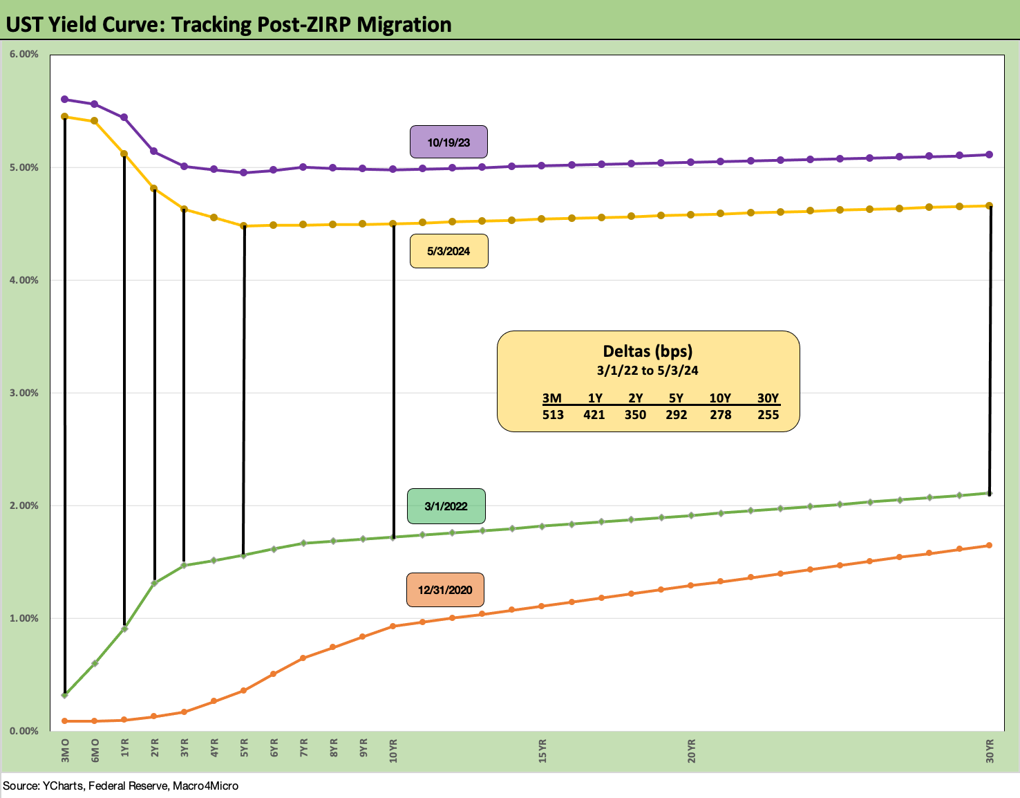
We wrap with our usual final chart that tracks the migration from March 1, 2022, which is the month ZIRP ended (effective March 17, 2022), through this past Friday. We post the differentials in the box to detail the moves across a bear flattener into a bear inversion. We also plot the UST curve on the peak date of the 10Y UST (10-19-23) as well as the 12-31-20 UST curve as frames of reference.
The next leg of the journey from here will stay on the “data dependence” addiction that has been fed steadily by the volatility of the early fall, in the late year rally, and then into the YTD 2024 UST shift higher. The consumer has been the focal point more than domestic fixed investment but it all factors into the virtuous cycle (“virtuous” for growth) of consumer spending and companies reinvesting and hiring. That sort of good news is hard to fight when it can happen despite this yield curve.
See also:
Footnotes & Flashbacks: Asset Returns 5-5-24
April Payroll: Occupational Breakdown 5-3-24
Payroll April 2024: Market Dons the Rally Hat 5-3-24
JOLTS March 2024: Slower Lane, Not a Breakdown 5-1-24
Employment Cost Index March 2024: Sticky is as Sticky Does 4-30-24
Footnotes & Flashbacks: State of Yields 4-28-24
Footnotes & Flashbacks: Asset Returns 4-28-24
PCE, Income, and Outlays: The Challenge of Constructive 4-26-24
1Q24 GDP: Too Much Drama 4-25-24
1Q24 GDP: Looking into the Investment Layers 4-25-24
Durable Goods: Back to Business as Usual? 4-24-24
Systemic Corporate and Consumer Debt Metrics: Z.1 Update 4-22-24