


More tariffs and some additional bombing should work…
The “seller pays tariff” fiction now combines with the “escalate, there is no substitute for victory” foreign policy school to assure upward pressure on the UST curve until Iran, the election, and still-justified concerns around Fed independence can get sorted out.
The most recent CPI and PPI marked a sequential improvement to levels still well above target and outside the comfort zone for those who are looking for an excuse to ignore the need for all-time high demand for UST on a global scale.
We look at the 3M to 10Y slope across the cycles with the current +82 bps well inside the long-term median from 1984 of +152 bps. The current slope is still materially steeper than the post-2020 median of +12 bps.
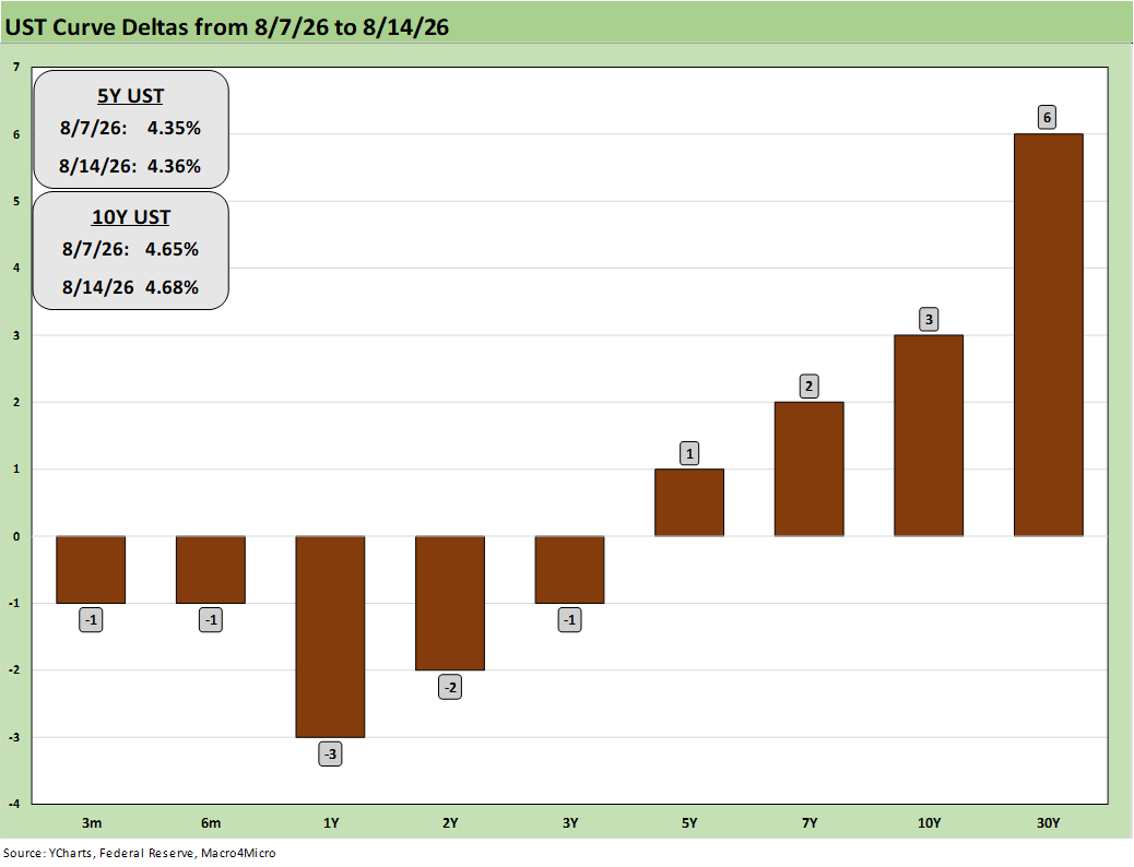
The 1-week UST deltas show a modest bear steepener from 5Y to 30Y as the front end drifts with the guesswork around FOMC plans and was unmoved by the CPI and PPI numbers this week. Jobs were also weak in early August and Retail Sales did not tell much of a story. This week brings a wave of major retailer earnings to help sort out the consumer picture with Walmart and BJ’s always offering a helpful view on the value consumer and the lower half of the K.
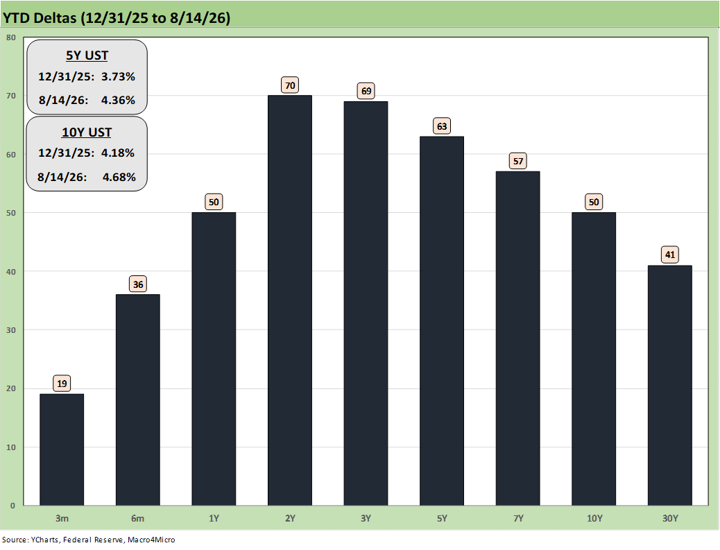
We update the YTD UST deltas which still tells the story of the Iran setbacks after the bombing closed the Strait (Feb 28 start). The bear flattener from 2Y to 30Y hit bonds across the curve.
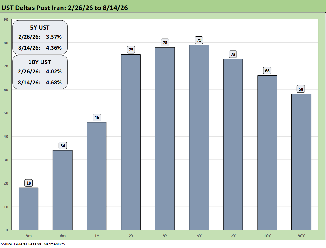
This chart updates the post-Iran bad news for bond returns, mortgage rates, and the rising cost of record deficits that have pushed interest expense to $1.2 trillion.
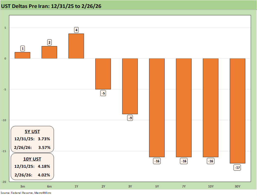
This UST delta chart offers a view on the “before Iran” with the market telling you their view of the “after Iran” as noted in the earlier chart. This is the “woulda coulda” chart for geopolitical decisions with the Iran War going under the heading of “should not have.”
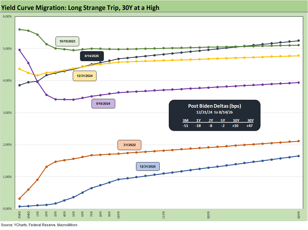
The chart above and those that follow are for memory lane purposes. The UST history can be framed against today’s curve and other notable credit market timelines during the economic and monetary cycles of bygone years. The charts are essentially “roll-forward” replay charts to offer context on absolute yields and UST curve shape. We will occasionally drop in new transition periods.
The move from 12-31-20 and ZIRP across the inflation and tightening cycle is clear enough in the move from 12-31-20 to 3-1-22 just ahead of the mid-March 2022 start of the tightening cycle and end of ZIRP. The long end is driven by the market, and their vote is obvious.
We like to highlight 9-16-24 UST curve to time stamp what was unfolding immediately before the easing cycle kicked into gear in Sept 2024 through Dec 2024 (see Footnotes & Flashbacks: State of Yields 12-29-24 ). That was around 7 weeks before Trump won the election to take his role in Jan 2025 in a peaceful, uncontested transfer of power (i.e., light on violence and Capitol sackings).
As noted in the above chart, the bear steepening on the long end was a force during 2024, and it has been hard to resist across time into 2026 with the economy steady and inflation back on the rise from the end of Dec 2024. The 10Y and 30Y UST deltas have not been moving in the right direction even though mortgages are not back to fall 2023 levels.
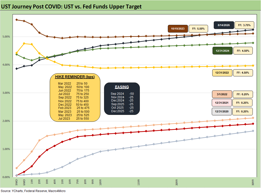
The above chart is one we include as a memory jogger on the troubled journey from COVID and ZIRP across the tightening and easing cycles. We detail the easing and tightening actions across time.
We see the shift after March 2022 to year end 2022 on the tightening and inflation pressures. That was a major move. This timeline cuts across the easing in 2024 and 2025.
The FOMC oddsmakers (CME FedWatch) are calling for fed funds tightening by year end with the “steep vs. flat” outcome to be heavily influenced by views on oil and new trade clashes and tariffs.
Many eyes are also looking out for any hint of wage pressure that has not shown up at all at this point (see Payroll Deltas July: Mixed Bag, Mediocre Numbers 8-9-26). Negative real wages in a steady economic cycle are supposed to move the needle higher, and that affordability discontent can show up in politics (election year) and policy decisions.
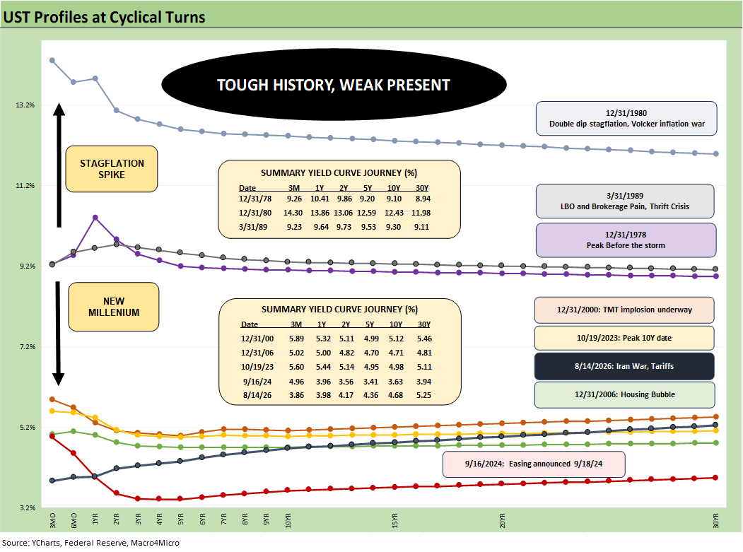
The above UST history revisits the shift from the Carter inversion and peak of 1978 across the stagflationary 1980-1982 double dip that kicked off with an Iranian oil crisis in 1979.
We see the 9-16-24 UST curve sitting on the bottom, but we suspect Trump, Hassett, and Bessent will not be flagging that memory. After all, the UST curve has sent mortgage rates higher after team Trump were put in office.
One of the key takeaways from history is that flat curves that arrive after some FOMC tightening in a cyclical peak can lead to trouble. The question will get louder if the Fed tightens by year end.
Worries get worse if we start to see an inversion. Credit market peaks such as the transition across 1989 into 1990, the move into 2000 after a +86% NASDAQ year in 1999, and the tail end of 2006 on the way into 2007 all make for some interesting compare-and-contrast drills.
We look at some of these histories in the links at the end of this commentary.
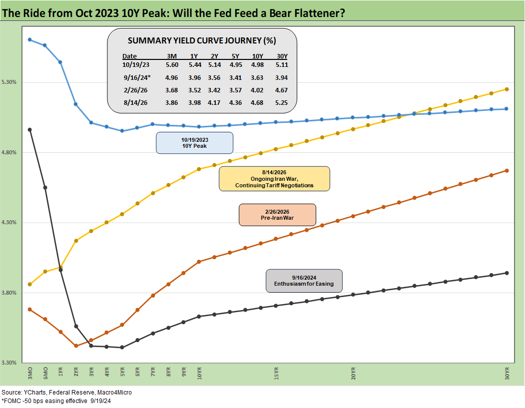
The above offers some more granularity on the migration from 9-16-24, across the pre-Iran war period and then to the current post-Iran Friday close. We include the UST curve from the peak 10Y date (10-19-23) when the 10Y hit 5.0% intraday.
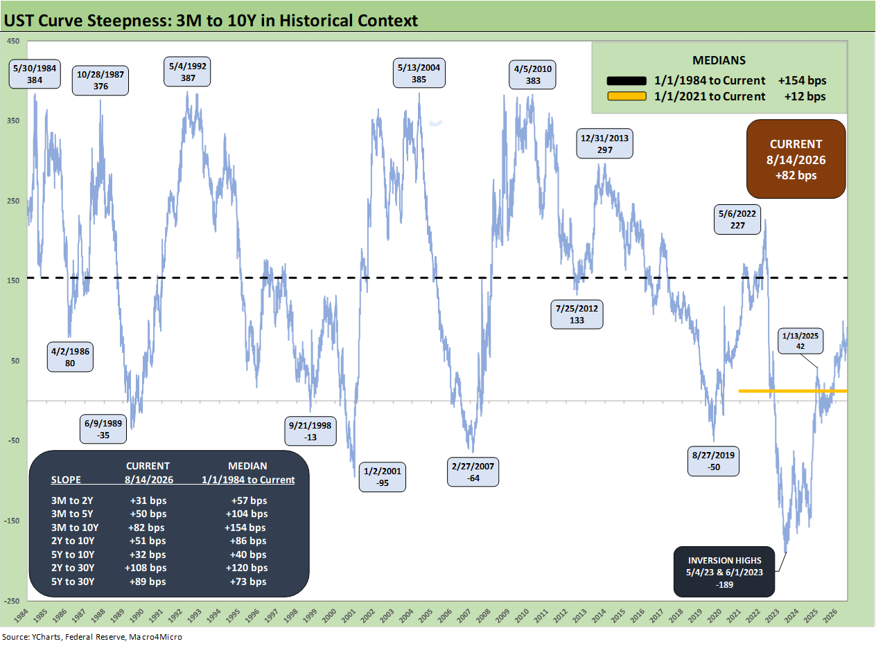
The above chart updates the 3M to 10Y UST slope across the cycles. The current +82 bps is well below the long-term median from 1984 of +154 bps.
One big question from here is whether an FOMC tightening will send the curve flatter or whether an upward shift and even a steepener on the long end will be in play.
We have been more biased toward the steepener scenario on the combination of stubborn inflation and a UST supply that will require record global demand. We are inclined to label Trump as the worst long UST bond salesmen since the primordial soup.
That foreign demand could matter, and the EU and Canada are among the largest holders across various entities. A declaration of economic war on Canada, attacks on the EU, and a threatened invasion of Greenland are bad sales practices. As we saw today, Trump could always threaten to bomb Oman.
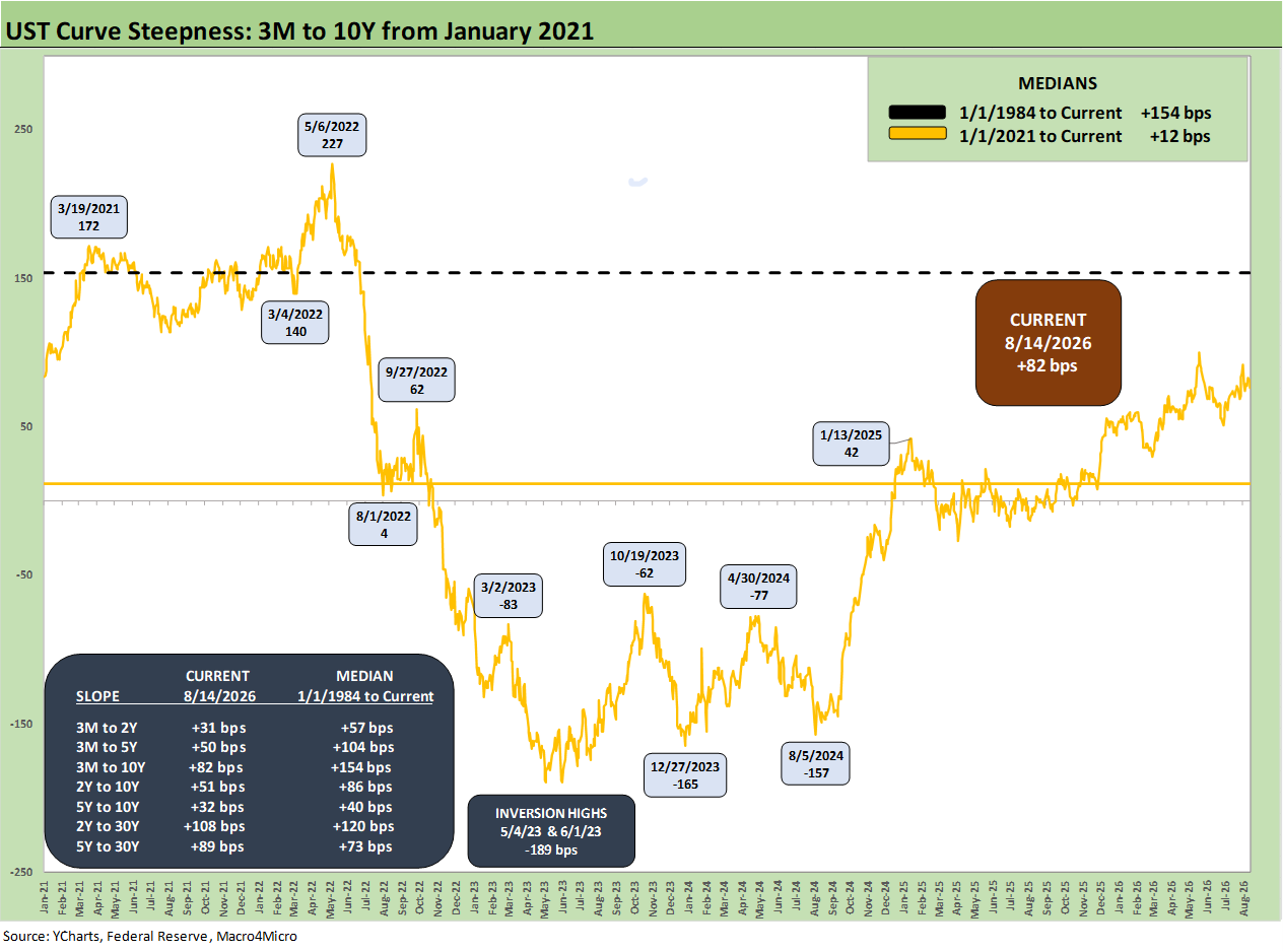
The above chart shortens up the time horizon to a start date of January 2021 with ZIRP and pent-up COVID demand that sent the curve steeper and higher and GDP soaring in 2021. We have covered the 2021-2022 supply-demand imbalances and Ukraine invasion nonstop over the years, so we will leave that for the links at the end.
The inversion of the tightening cycle and move back to a bear steepener leaves a lot of scenarios ahead. The current backdrop with stubborn inflation and 4% handle unemployment has little in common with past stagflation bouts. The scale of inflation and unemployment from later 1973 to early 1975 and the 1979 inflation move into the 1980-1982 double dip were in a very different zone. Even the brief oil-driven spike of late 1990 came during an unfolding recession.
The current backdrop is clearly a tricky one to frame in the context of history. The median 3M to 10Y slope from from the start of 2021 is +12 bps; that leaves a lot of room for material changes.
Some UST curve histories:
Business Cycles: The Recession Dating Game 10-10-22
UST Curve History: Credit Cycle Peaks 10-12-22
Bear Flattener: Today vs. 1994 and Aftermath 10-18-22
Fed Funds, CPI, and the Stairway to Where? 10-20-22
Greenspan’s First Cyclical Ride: 1987-1992 10-24-22
UST Curves: Slope Matters 10-25-22
Greenspan’s Last Hurrah: His Wild Finish Before the Crisis 10-30-22
Wild Transition Year: The Chaos of 2007 11-01-22
UST Slope Update: Some New Inversion Highs 12-8-22
Yield Curve Lookbacks: UST Shifts at Cyclical Turns 10-16-23
UST Moves 1978-1982: The Inflation and Stagflation Years 10-18-23