
JOLTS July 2024: Mixed Bag, Hires Up, Layoffs/Discharges Up, Quits Flat
With all eyes on Aug payroll this week, we dig into the JOLTS numbers (1-month lag) for July with a mixed picture of openings, hires, and layoffs/discharges.


Not much of a recession JOLT yet…
We saw a downward revision in job openings for last month’s numbers from 8.1 million to 7.9 million (see JOLTS June 2024: Countdown to FOMC, Ticking Clock to Mass Deportation? 7-30-24) on the way to another downtick this month to 7.67 million.
The steady downward trend line from the 12 million handle peak will be the takeaway for the FOMC debate and recession handicapping exercise, but from a wide angle view the openings total is still a very lofty number.
For some context, the July 2024 openings of 7.67 million is above the Nov 2018 peak of 7.5 million in the “Trump cycle” (the “greatest economic cycle in the history of the world”) with the July 2024 numbers showing a mixture of openings down, hires up, separations up, and layoffs/discharges up.
The increase in Leisure and Hospitality layoffs was the highest delta at 94K (mostly Accommodation and Food Services) but a rise in Construction layoffs of 39K (+27% from June numbers) will flash some yellow lights when construction has been one of the more bullish payroll stories of this cycle.

With the early August turmoil heavily tied to jobs data (see Payroll July 2024: Ready, Set, Don’t Panic 8-2-24), the dual mandate priorities shift to jobs (for now) and Friday will bring August data as opposed to the 1-month lag for July JOLTs.
The above chart plots the time series for job openings across the cycles from the 2007 credit bubble peak and onset of the recession (Dec 2007) as the systemic credit crisis and ZIRP response unfolded in 2008. The first peak of Nov 2018 was the pre-COVID high of 7.5 million on the way to a post-COVID peak of 12.1 million in March 2022 as ZIRP ended and the FOMC tightening cycle kicked into gear.
The 7.67 million job openings number certainly does not scream recession in historical context, but the trend more than arms the FOMC to take action. The FOMC was paying a lot of attention with Powell talking about JOLTS in the early stages of this monetary cycle when many were screaming “pause” (see Jobs and the Fed: JOLTS Gets Heavy Powell Focus11-30-22), so there is every reason for them to ponder it on the way into the easing cycle.
The “VU ratio” (jobs openings/total unemployed from the household survey) was getting a lot of airtime on the financial news this morning, and all historical relationships are helpful to weigh. That said, 7.67 million openings vs. 7.16 million unemployed (Household Survey) only offers so much to consider. The occupational mix and quality mix across services and goods is the more logical focal point from our vantage point in looking for signals. The limitations of many time series in the markets often revolves around “mix shifts” that add a lot of asterisks. The JOLTS release at least gives you granularity to gut check the industry groups just as the payroll data gives you a lot of occupation detail.
The occupation mix changes materially across the decades and the cycles, so we always take those metrics as more the spice rack and not the main course. Right now, that vacancy ratio is declining as the total of unemployed rises and job openings decline. Sort of obvious. Professional and business services are an eclectic blur of lines while “health care and social assistance” and “leisure and hospitality” can swing the numbers materially.
On mix shifts, those of us who came of age and worked through some cycles remember the regional meltdowns and how manufacturing regions were slammed, an oil patch crisis unfolded, the tech bubble fallout, and financial system meltdown hit some regions especially hard. That took disproportionate tolls on some regions and metro areas more than others.
A national level job openings number matters, but it comes with the qualification that employment shifts can be quite uneven across industries and regions. That makes the 30,000-foot VU ratio of limited value in framing trends in some markets. In the end, the consumer is still the main direct driver of some of the industries with the biggest moving parts such as retail and leisure/hospitality. Demographics is a bigger factor in health care and social assistance. That latter relationship would change dramatically if ACA was repealed by Trump. Health care payroll would get slammed.
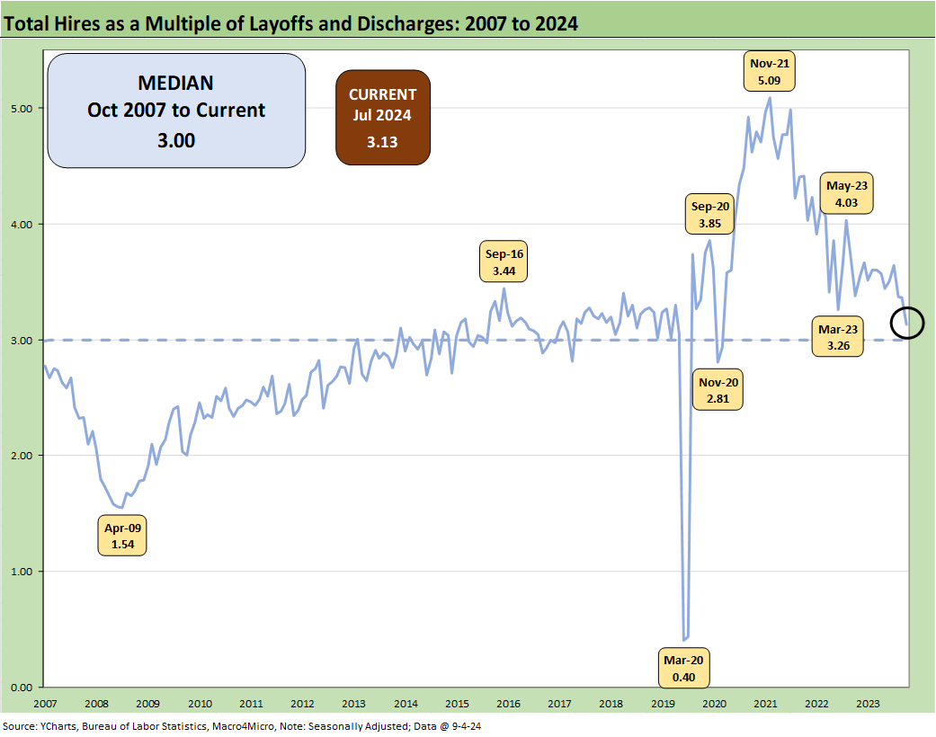
Hires vs. layoffs/discharges is an easy relationship to grasp without a lot of debate even if you still need to pull back some layers by industry. The ratio of hires to layoffs/discharges of 3.1x is just above the median but on a downward trajectory. We see 1.5x back at the 2009 low point. COVID clearly was a distinctive case at 0.4x. We look at the COVID distortion further below.

The above chart gives gross numbers used to derive the prior ratio, and the decline in job openings is obviously related to hires (i.e. if you hired someone, then you filled an opening). Economic growth brings more hiring (in theory) unless you have generated more growth through automation (the “AI ate my career” fear). Layoffs also can have mixed explanations around “Why?” that can run from the macro level to regional exposure to industry trends and major employer restructurings.
Note: We adjust this chart for COVID to improve the visuals. We address those dramatic COVID numbers in the boxed text further below.

The above chart adjusts for COVID to tell a cleaner historical story visually. We see hires running ahead of total separations, which includes quits, layoffs/discharges, and “other separations” (retirement, death, relocation, disability, etc.). We detail Quits further below, and those rose very slightly to 3.28 million from 3.21 million (SAAR).

Above is a repeat box text from earlier publications as a reminder of the COVID experience. Separations of 16.3 million in March 2020 and another 11.6 million in April 2020 is an easy reminder of the severity of the death count and economic disruptions.
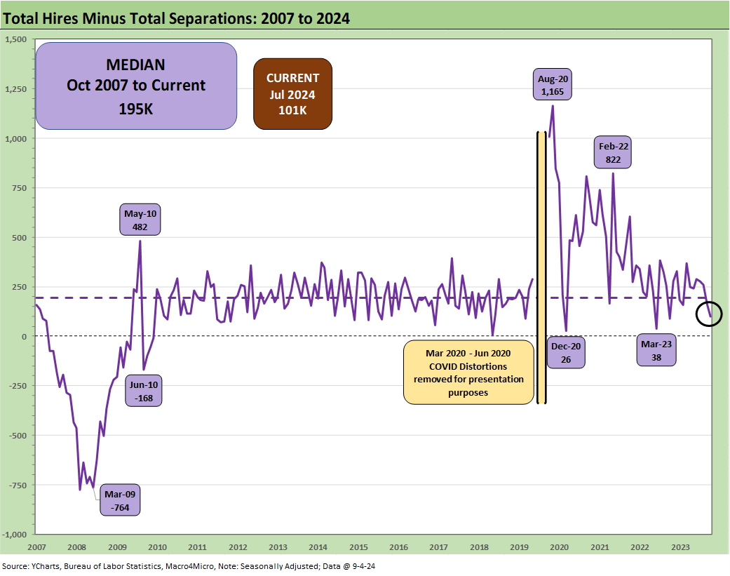
The above chart plots the “Hires minus Total Separations” differential time series. The differential is tightening down to 101K from a 195K long term median. This speaks to slowing trends, but contraction needs more trouble in more industries.

The above chart details the time series for Quits in the overall mix of separations. We see that part of the mix at 60.1%, above the long-term median of 57.4%.
The “Quits rate” (Quits as a % of Total Employment) ticked slightly higher to 2.1% from 2.0% in June. One theory is that the Quits rate is a sign of relative confidence that signals when workers fear they will not get another job. There has not been much movement there, but it stood at 2.3% one year ago when Quits hit 3.6 million in July 2023 vs. 3.28 million in July 2024.
See also:
PCE July 2024: Inflation, Income and Outlays 8-30-24
2Q24 GDP 2nd Estimate: The Power of 3 and Cutting 8-29-24
Harris Housing Plan: The South’s Gonna Do It Again!? 8-28-24
Footnotes & Flashbacks: Credit Markets 8-26-24
Footnotes & Flashbacks: Asset Returns 8-25-24
Footnotes & Flashbacks: State of Yields 8-25-24
Payroll: A Little Context Music 8-22-24
All the President’s Stocks 8-21-24
Total Return Quilt: Annual Lookback to 2008 8-14-24
CPI July 2024: The Fall Campaign Begins 8-14-24
HY Industry Mix: Damage Report 8-7-24
Volatility and the VIX Vapors: A Lookback from 1997 8-6-24
HY Pain: A 2018 Lookback to Ponder 8-3-24
Payroll July 2024: Ready, Set, Don’t Panic 8-2-24
JOLTS June 2024: Countdown to FOMC, Ticking Clock to Mass Deportation? 7-30-24)
Presidential GDP Dance Off: Clinton vs. Trump 7-27-24
Presidential GDP Dance Off: Reagan vs. Trump 7-27-24
PCE June 2024: Inflation, Income, and Outlays 7-26-24
2Q24 GDP: Into the Investment Weeds 7-25-24
GDP 2Q24: Banking a Strong Quarter for Election Season 7-25-24