Jobs and the Fed: JOLTS Gets Heavy Powell Focus
Powell gives a lot of air time to jobs with tight labor and services inflation a tough challenge to address with fed funds.
The JOLTs (Job Openings and Labor Turnover) report the new high priority metric for the Fed, so I dig into the data.
The Job Openings tally still ranks higher than total unemployed by a healthy margin and is a multiple of layoffs, making it hard to conclude weakening labor demand even if Openings are off the peaks.
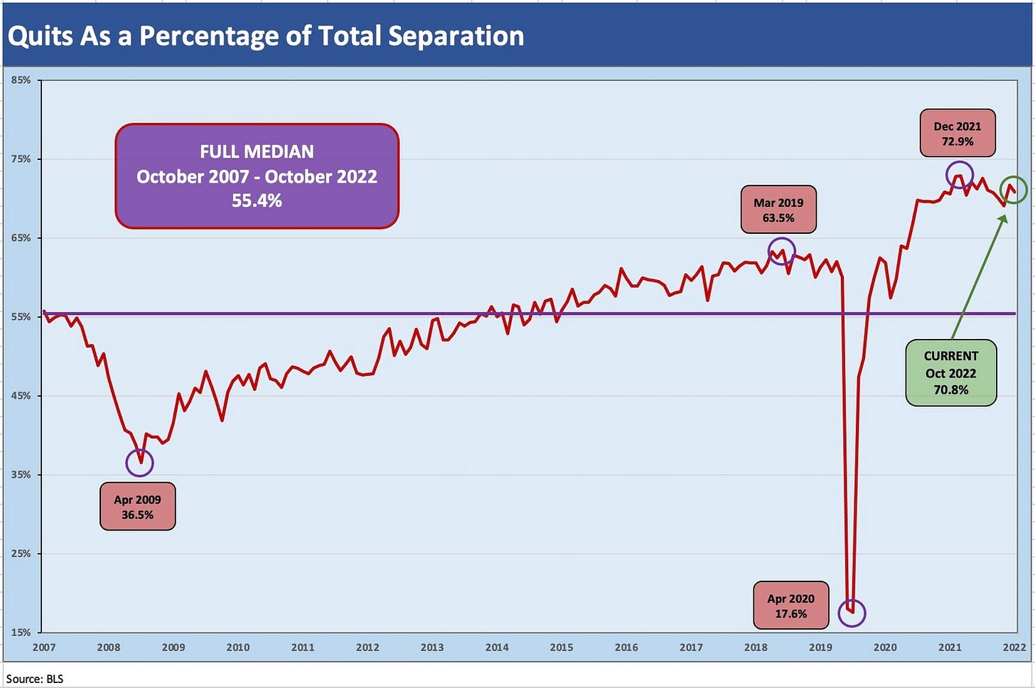
The Quit mix in Total Separations is over 70% in a phenomenon that has labor economists consulting a shrink.
Labor market trends dominated the commentary by Chairman Powell today with the moving parts of the JOLTS report very much on his mind. In the past, the JOLTS report tended to be one of those reports I would glance at quickly and wait for the main event with the total payroll numbers. Inflation fear has instead made the JOLTS report the principle focus for a while. The JOLTS numbers are critical as investors (and FOMC members) look for hints of where hiring is headed and what that might mean for wage inflation and the accompanying passthrough of costs into goods and service inflation.
The scale of the numbers is quite impressive in the JOLTS report with the headline details in millions of workers and not hundreds of thousands (except in the industry-by-industry breakdowns). If someone had never looked at an economics release before (pick a random English major just graduating), a discussion or Q&A of this month’s JOLTS report might go like this:
Q. There are 6 million people unemployed at the end of October but there are 10.3 million job openings. What do you think?
A. That is great news! Not much to worry about there!
Q. Did you see 1.4 million people were laid off last month?
A. They can get those job openings. Sounds like a layup!
Q. Did you see 4 million people quit their jobs?
A. Wow, if a recession is really coming next year, that is crazy. Maybe they read the JOLTS report. They must like the looks of those 10.3 million openings. Maybe they expect a raise at the new job?!
Q. Did you see that 6 million people were hired last month?
A. Wow. No wonder those 4 million who quit aren’t worried.
The reality is obviously much more complicated across occupations, industries, geographic regions, experience, and skill sets, but the fixation on job openings and the rationale/desires of those workers who quit will be a big part of the forward handicapping. A lot more job openings than people to fill them undermines much confidence in shaking wage inflation. Wage stagnation would seem to be the cart to the horse on the other side of the Fed’s monetary tightening. The question is how much horsepower the Fed will need? One economist on cable today made reference to Powell’s desire for an “immaculate disinflation” (that term has been making the rounds of late). The idea is Fed tightening and the ensuing demand destruction can happen while still keeping jobs strong (if a bit weaker) and the economy out of recession.
The JOLTS moving parts don’t say “recession” either…
I plot several of the key time series below that include levels for job openings, hires, and the mix of separations (Quits the lead factor). The main takeaway is that there is very little to panic about in these numbers around material retrenchment at this point even if the number are showing some tapping of the brakes on hiring plans. The “Quits” part of the JOLTS equation always leads to a wide range of opinions on what it might all mean (about the economy, the society, the workers individual needs and desires, etc.). To say that last part is highly subjective is a fair statement.
Job Openings tell a story of sustained high demand for labor. At 10.3 million Openings, that is 7.5x the numbers of layoffs. While those line items (especially Openings) can shift quickly, the numbers today vs. the long-term median makes clear that we are in a rarefied zone.
A useful part of the monthly JOLTS review exercise includes the details by broad industry group for each of the moving parts across Openings, Hires, and Separations (Layoffs/Discharges, Quits). The major moves tend to mirror the largest industry categories in the services industries such as Retail, Professional Services, Leisure/Hospitality (notably in the Accommodation and Food Services subcategory), and Healthcare and Social Assistance. You can toggle back and forth across hires and quits and see many of the same leaders by industry line item. The reality in such fields is high turnover.
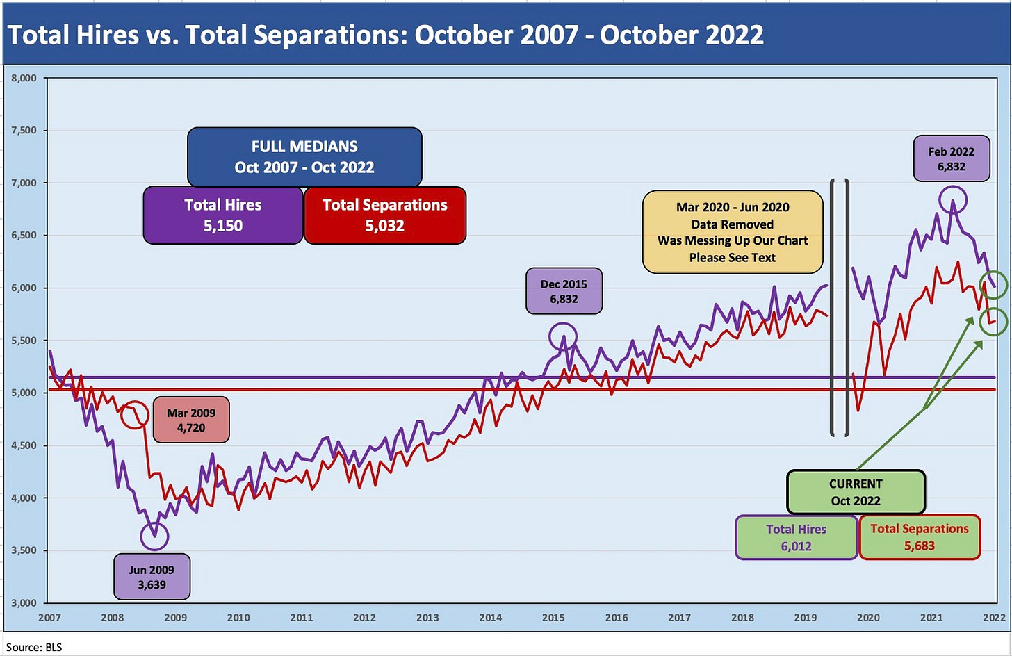
The Hires vs. Separations time series make for interesting numbers but a tough chart to plot visually given how much the spike in separations/hiring during COVID distorted the number from March 2020 to June 2020. The swings literally were off the charts. For presentation purposes, I adjusted the chart above to exclude the raw data for those months to get a better vantage point on somewhat more normal times. Compared to COVID, the credit crisis seems “normal” in terms of the job count moves.
For disclosure purposes, Separations across March 2020 (16.3 million), April 2020 (11.6 million), May (4.7 million), and June (5.2 million) were running against Hires in March (5.2 million), April (4.0 million), May (8.1 million), and June (7.4 million). I remove those from the chart to get better scale visuals on the periods that preceded it and followed as the market saw 50-year lows in unemployment in 2022. Wild swings were had by all as industries saw shutdowns and layoffs in the COVID recession. The long-term medians from 2007 to 2022 for Hires and Separations were very close.
The chart above shows the differentials between Hires and Separations (“Hires minus Separations”). The long-term median differential (using every month from Oct 2007 to Oct 2022) was a differential of +181K. The band is relatively tight between the two across most periods with a handful of outliers outside the dramatic swings in the peak COVID months.
As with the prior chart on Hires and Separations, the differential chart goes off the rails in the March 2020 to June 2020 period, so we exclude those months from the times series plotted to give more visual impact to the other 14+ years of months on the chart. The disclosure for the COVID peak moves is better provided in text with a differential in March 2020 of -11.1 million, April 2020 at -7.6 million, May 2020 at +3.4 million, and +2.3 million in June 2020. The chart then picks up the time series again in July at +1.0 million. The closest data point to the July 2020 month in magnitude across the time series was -862K in March 2009. That month marked the low in the stock markets.
The chart has a systemic banking crisis and housing bubble in the timeline as well as a pandemic recovery period, so those should be considered outliers in history. The four months of COVID hell for employers in making staffing decisions were “beyond outliers” and a few more standard deviations removed from old fashioned cyclical meltdowns and bank system crises. We have changed our definitions of normal as the cycles go by.
The amazing aspect of the JOLTS charts includes the very high demand for labor even with high interest rates and growth stalling. The very high quit rates make the labor market that much harder for the Fed to chart a course. The Quit phenomenon has grabbed a lot of coverage in the media and in business, but interpreting that trend clearly needs a different lens than what might have been used in past cyclical recoveries. I don’t have that lens at this point. Whether the shift to services-heavy sectors with low pay and minimal benefits, the secular trends of workforce dropouts, or simply demographics and early retirements, there is a lot for labor economists to sort through. For now, the simple takeaway of high demand and not enough labor supply is not reassuring to the FOMC’s ambitions. It implies wage inflation to reduce the erosion of purchasing power.
The mix of Quits in the Total Separations is near a record even if ticking down from the Dec 2021 highs of just under 73%. The mix of Quits remains well above the median as noted in the above chart. For October 2022, Quits were 71% of Separations while “Layoffs/Discharges” were 24% and “Other” was 5%. The chart shows a spike in the layoffs mix as the credit crisis unfolded in 2009 (i.e., a decline in the relative share of Quits), and then an upward slope in the Quits mix as layoffs subsided and hiring ticked higher during a very slow jobs recovery.


