
Footnotes & Flashbacks: State of Yields 2-18-24
A packed week of economic releases did not make life easier for UST and FOMC handicapping, but spreads remain tight and yield appetites strong.


The upward UST migration continued again this past week with the 10Y UST still around -68 bps lower from late Oct 2023 but ended the past week +42 bps higher on a YTD basis as rates drove a mixed return profile across asset classes.
For credit, the UST curve has pushed yields higher with the past month showing spread compression with a muted move this past week.
With HY yields a shade under 8% and IG just under 5.5%, the demand for bonds seems unshaken for asset allocators despite spreads being in line with some past credit peaks.
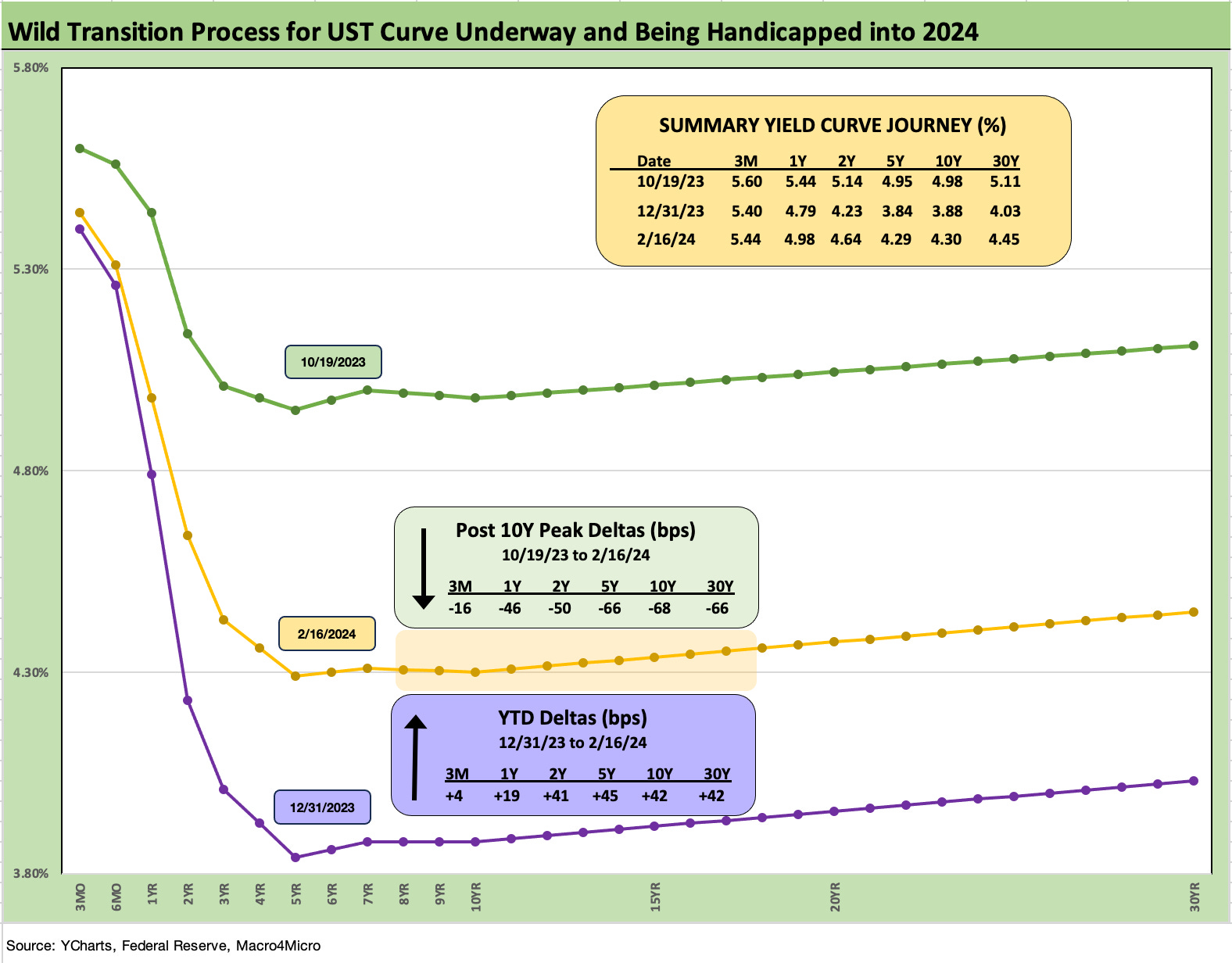
The above chart shows the downward shift from late October. We plot the high UST curve on the date of the 10Y UST peak (we used 10-19 from that week but a couple of other days would have worked just as well). We break out the UST deltas from that 10-19-23 date through Friday (2-16-24). We then plot the running UST deltas from 12-31-23 through Friday for a YTD UST delta.
The downward shift of the UST curve from late Oct 2023 was quite bullish, but we are now in a bearish upward shift of 2Y to 30Y for the YTD 2024 period. That has been a wrestling match for investors after such a heady run for risky assets in Nov-Dec 2023. The 10Y UST is -68 bps lower as the crow flies from 10-19-23, but for the YTD period the 10Y is +42 bps higher.
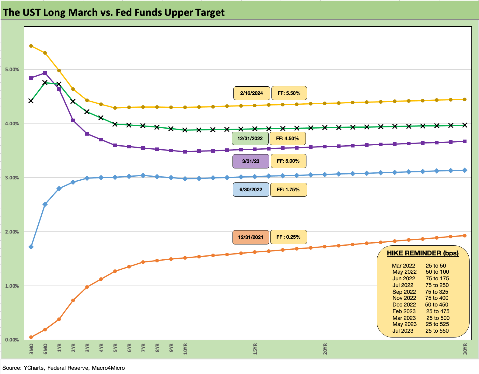
The above chart posts the migration since the end of 2021 across the bear flattener into a bear inversion before the gyrations of recent months. The UST curve from 2Y to 30Y has lately bounced around from a “steepening toward a flattening” into a more pronounced inversion again with smaller moves back and forth as the inflation watch and Fed handicapping dominates the price action.
We routinely look at the shapeshifting across the UST segments, and there has been no escaping the anchored front end as the inflation signals of late prove mixed for the Fed game plan (see Fed Funds vs. PCE Inflation: Peaks and Valleys Across Time 2-7-23). We include a memory jogger on past Fed moves in the box within the chart. More recently, the timing of potential easing has been a moving target with the new questions leading the debate of whether easing will even happen in 1H24.
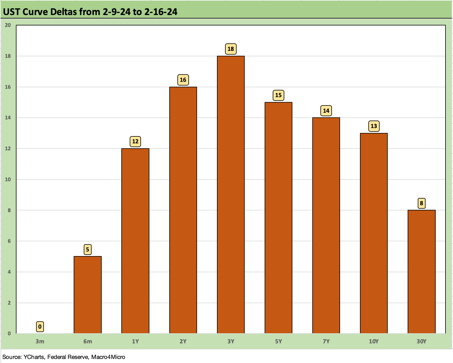
The above chart frames last week’s UST deltas as the market notches another bearish move with 1Y to 10Y out by double digits.

The above chart frames the UST curve deltas for the YTD period with a +40 bps handle move higher from 2Y to 30Y. That move wider has come with tighter credit spreads in both IG and HY. We look at IG and HY yields in context further below. Mortgage rates have also struggled to offer any relief to the housing market even if well below the 8% highs of 2023.
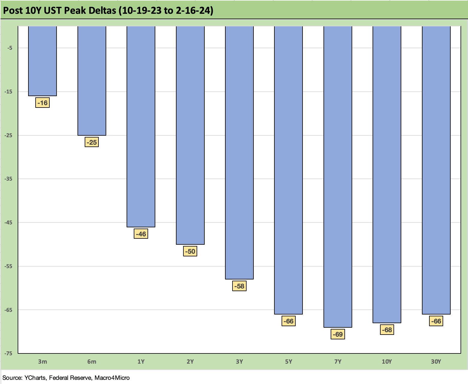
The above chart frames where the market stands now vs. the late Oct 2023 highs. The chart just gives a different vantage point on what we already broke out in the first chart above. The deltas still tell a solid story on duration returns from the post-tightening cycle highs.
The curve deltas also tell a story of what a full retracement might look like if inflation metrics start to erode for some reason such as a more impressive recovery in the growth trajectory than expected, energy setbacks, or supplier chain disruptions.
Such deviations from the expected would need to be put in portfolio context for what they would mean in terms of recession expectations. The problems with stress in the Middle East (escalation risk), tension in Asia (supplier chain threats), uncertain geopolitics broadly (Ukraine, Russia), or complete dysfunction in Washington in an election year can all shape changes in hiring and investment plans.
If threats of a universal tariff and trade war with China get louder for domestic political purposes, GDP can be impacted along multiple lines. Then the Fed can react as they did back in 2019 when fixed investment weakened on Trump trade battles.
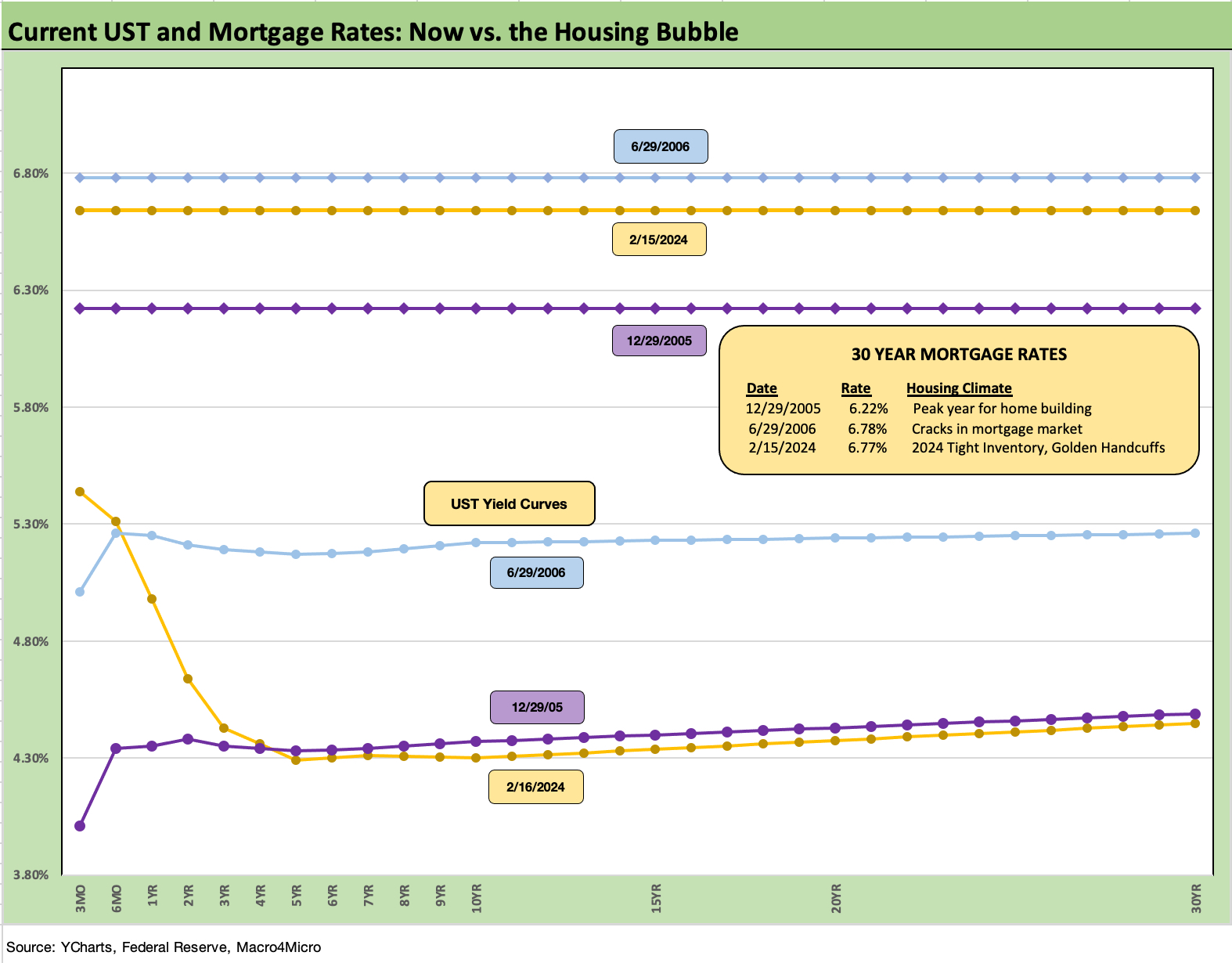
The above chart updates our recurring comparison of current Freddie Mac 30Y mortgage rates and the current UST curve with those seen in the peak homebuilding year (2005) and as the mortgage market started to crack (mid 2006). As of last week, we had more setbacks in the mortgage market with no signs of relief for the golden handcuff challenges we write about in our housing sector research.
The past week, we saw a fade in starts (see Housing Starts Jan 2024; Slow…Curve Ahead? 2-16-24). This coming week we will get a fresh update on existing home sales. The economics of the mortgage gap from homeowners with sub-4% mortgages and current refinancing alternatives on the other side of a sale (e.g., in a move-up transaction) remain a tough barrier that the homebuilders have been able to navigate through the creative use of incentives. We frequently detail those moving parts in our housing research.

The above chart updates our running yield history for IG corporates vs. HY. We frame current levels vs. a range of medians including long term, pre-credit-crisis (i.e., before the ZIRP years), post-crisis to just before the tightening cycles, and then post-tightening cycle (March 2022 to current).
The current 5.45% yield for IG is above the long-term median of 4.6% but below the pre-crisis median (1-1-97 to 8-31-08) of 6.1%. The protracted period of financial repression (that term has gone out of style since COVID) shows the post-crisis median through the start of tightening at 3.3%.
The mid-5% handle in the market today has to cheer an asset allocator after that many years of ZIRP and such protracted painfully low corporate yields. The post-tightening median of 5.3% only has 2 years of data at this point. For pension plans with 6% assumed plan asset returns, the IG index is in the neighborhood and the HY index above it.
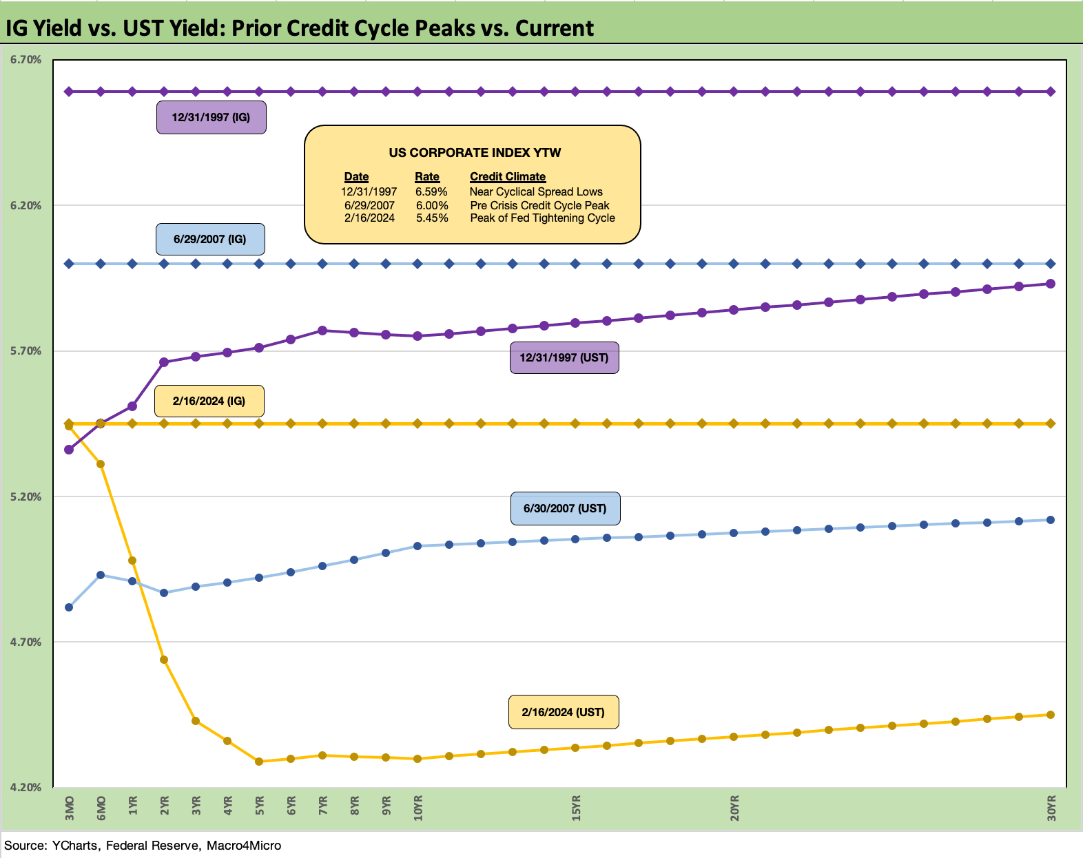
The above chart continues what we have been doing for a number of months as we plot the current UST vs. those of prior credit cyclical peaks and spread lows in June 2007 and late 1997. On the horizontal line we plot the IG index yield of that period for a frame of reference with details in the box within the chart.
We looked at spread histories in detail for those earlier periods in the year end recap (see Footnotes & Flashbacks: State of Yields 1-1-24). The past week saw IG spreads wrap at +96 bps, which is in line with the 1997-1998 averages and just inside those of late 1997 with the exception of an anomalous low of +53 bps in Oct 1997. Current spreads are also very near June 2007 levels. In other words, current spreads are at or near historical credit peaks.
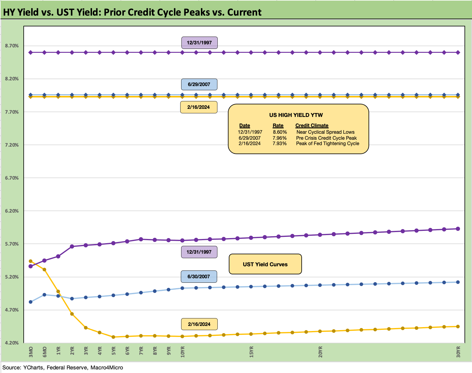
The above chart does the same exercise for HY that we did for IG in that we frame Friday’s close for the UST curve and HY YTW vs. the cyclical peaks of late 1997 and June 2007. Once again, the UST curve is much lower today, but the spreads were much tighter for HY at the 1997 peaks and during the June 2007 credit bubble.
We reviewed the histories of the HY benchmarks in the year end recap (see Footnotes & Flashbacks: State of Yields 1-1-24) for 2007 and 1997 and also the less “bubbly” OAS lows in June 2014 and Oct 2018. The current HY OAS of +334 bps is in line with the June 2014 lows (+335 bps on 6-23-14). For the credit peak and cyclical lows of June 2007, HY OAS dipped below the +250 threshold. That was a very different world in HY that we detailed in the year end recap.
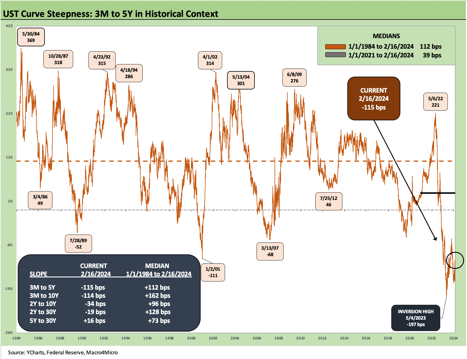
The above chart updates the long term UST slope for the 3M to 5Y UST with the current inversion of -115 bps well inside the peak inversion of -197 bps on 5-4-23. The long-term UST slopes across the various key UST segments are detailed in the box embedded in the chart. For 3M to 5Y UST, the long-term median is upward sloping at +112 bps. We are clearly a long way from that point.
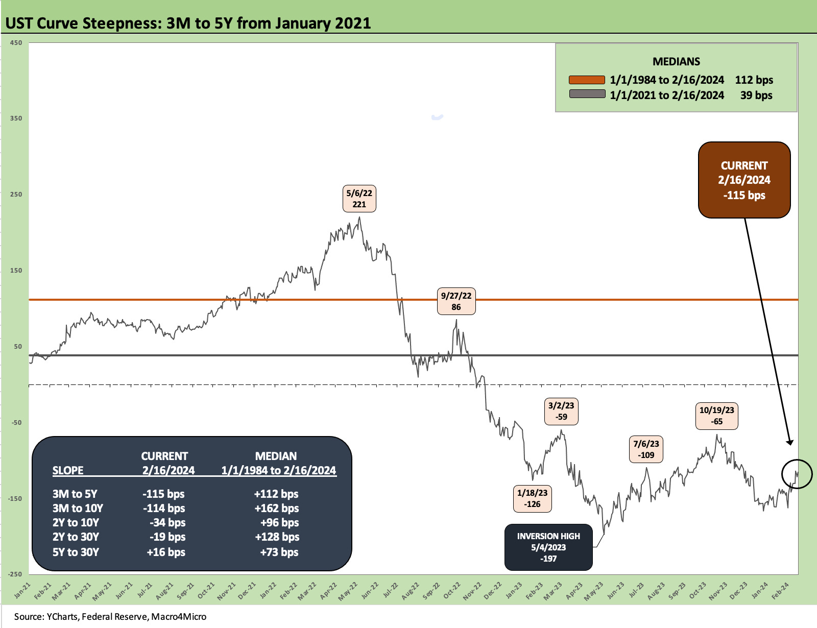
The above chart zeroed in on a shorter timeline from the start of Jan 2021 from ZIRP to tightening. The median across that time frame is +39 bps as that shape was left in the dust of the aggressive Fed tightening across 2022.
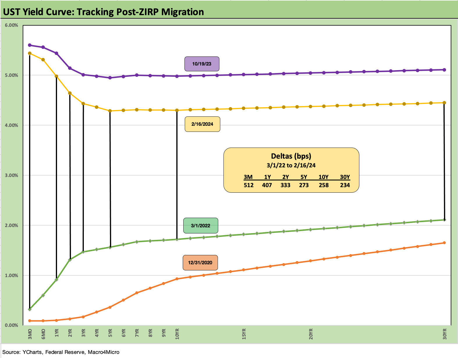
We wrap with our usual final chart that shows the running UST migration from the March 2022 start of the tightening cycle (ZIRP officially ended from a March 17 implementation date). We also include a 12-31-20 yield curve as a frame of reference. With ZIRP still in place and vaccinations getting underway after the Nov 2020 announcement of the vaccine (Nov 9, 2020), we break out the UST deltas from 3-1-22 to this past Friday close. The bear inversion pattern is self-evident.
As we get into the next round of inflation metrics this month with PCE and then new job numbers to start March, the ability to make the call on near term FOMC cuts is not getting easier. We have covered the FOMC dilemmas regularly, so we await the minutes this coming week for more signals on the tone. CPI and PPI did not help this past week. The earlier payroll numbers most certainly did not either. Retail sales and industrial Production helped a little.
See also:
Housing Starts Jan 2024; Slow…Curve Ahead? 2-16-24
Industrial Production: Capacity Utilization Limps Along 2-15-24
Retail Sales Jan 2024: Balancing Act Continues 2-15-24
Jan 2024 CPI: The Big 5, Add-ons, and Favorite “CPI-ex” Indexes 2-13-24
Trade Flows 2023: Trade Partners, Imports/Exports, and Deficits in a Troubled World 2-10-24
Fed Funds vs. PCE Inflation: Peaks and Valleys Across Time 2-7-23
HY vs. IG: Quality Spread Differentials and Comparative Returns 2-6-24
BBB vs. BB: Revisiting the Speculative Grade Divide Differentials 2-5-24
Payroll Jan 2024: Big Swing 2-2-24
Productivity: Takes the Edge off the 4% Handle YoY ECI 2-1-24