
Industrial Production: Capacity Utilization Limps Along
We look at the latest capacity utilization trend with a slight downtick for Industry and modestly more in Manufacturing.


Headline Manufacturing capacity utilization is staying within a narrow range seen since 4Q23 with Jan 2024 down by -0.5% sequentially and down by -0.4% vs. the 4Q23 average.
Nondurables was the softest of the mix with Utilities up the most and Mining down by the most across the major buckets.
Industrial sector concerns across 2024 will remain about how to balance the rising cost of labor and remaining tariff drags with fresh threats of more universal tariffs by Trump and how to factor that into their capex and capacity planning into 2025.
Industrial production and capacity utilization trends have been on a slightly weaker trend line in 2H23 and are set to muddle along into 1Q24 after the weaker 4Q23 data points vs. earlier in 2023. The data has not been weak enough to signal recession.
The metrics coming out of industry have been enough to mitigate some (not all) of the consumer sector strength and inflation anxiety generated from that side of the ledger as seen in monthly consumption numbers (see PCE Release Dec 2023: Consumption Strong, Inflation Favorable 1-26-24) and the 3Q23 GDP (see 3Q23 GDP Final Cut: Swing and a Miss on 5%, Good Contact on PCE Prices 12-21-23) and the 4Q23 advance GDP release (see 4Q23 GDP: Strong Run, Next Question is Stamina 1-25-24). We get a second estimate for 4Q23 GDP the week after next (Feb 28) just ahead of the next round of PCE and Income and Outlays data.
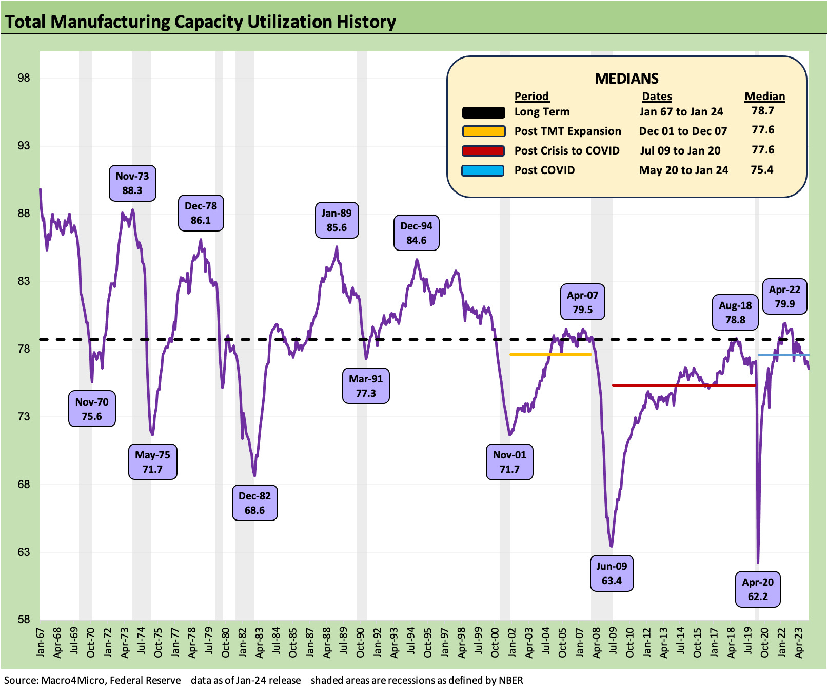
The chart above gives historical context to the peaks and valleys of capacity utilization across the cycles. The time series covers a slightly longer timeline than the two tables below in that they include the cyclical peak period on the way into the 1969-1970 recession (see Expansion Checklist: Recoveries Lined Up by Height 10-10-22).
In the ensuing recovery from the Nov 1970 trough, that cycle ended hard with the oil crisis and the start of the stagflation years that we all need to look back at for what did and did not work in terms of monetary policies (see Fed Funds vs. PCE Inflation: Peaks and Valleys Across Time 2-7-24).
For some industries such as autos and steel, the 1973 peak was the last great peak before some brutal bouts of structural change that sent some of the industry leaders (notably the integrated steelmakers) into junk status, financial stress, bankruptcies for some, and liquidation for others.
As we look at the chart above, the post-COVID median for capacity utilization at a 75% area is a pretty grim backdrop. As a reminder, we liked to use capacity utilization as somewhat of a proxy for where pricing power kicks in. It is easy to argue that COVID-related supplier chain disruptions threw that concept out the window since pricing power was a systemically inflicted reality of severe shortages and strains along the tiers of suppliers as well as the freight and logistics chain that spiked freight costs. Disruptions in China made the effects worse well into the post-COVID recovery period. The term “post-COVID” is somewhat in the eye of the beholder (post-Vaccine? Post Washington relief and stimulus?). For cyclical calendar purposes, post COVID is after May 2020 for recession dating.
The nature of the supplier chain fallout varied materially across industries with auto production essentially at recession volume levels in 2022 (semiconductors were a big part of that) while some industries such as homebuilding demonstrated material pricing power as the flight to the suburbs effects and demographic supply-demand imbalances combined with record low mortgage rates to inflame the effects of supply issues in pricing. Some industries were bigger winners on price more than on volume and some were hamstrung by input costs. It was case by case.
As we return somewhat back to normalcy for many industries, the more traditional relationship of capacity utilization and pricing power can return for many. As we detail below in some other charts, “cap ute” is well below some earlier periods including recessions, but leaner cost structures since the credit crisis and some lingering supply dislocation allow many operators to post strong profits and margins even at lower utilization levels. That advantage is getting tested now by higher labor costs and tariff-driven increases in costs. Those tariffs could get much worse in the future subject to Washington policy actions.
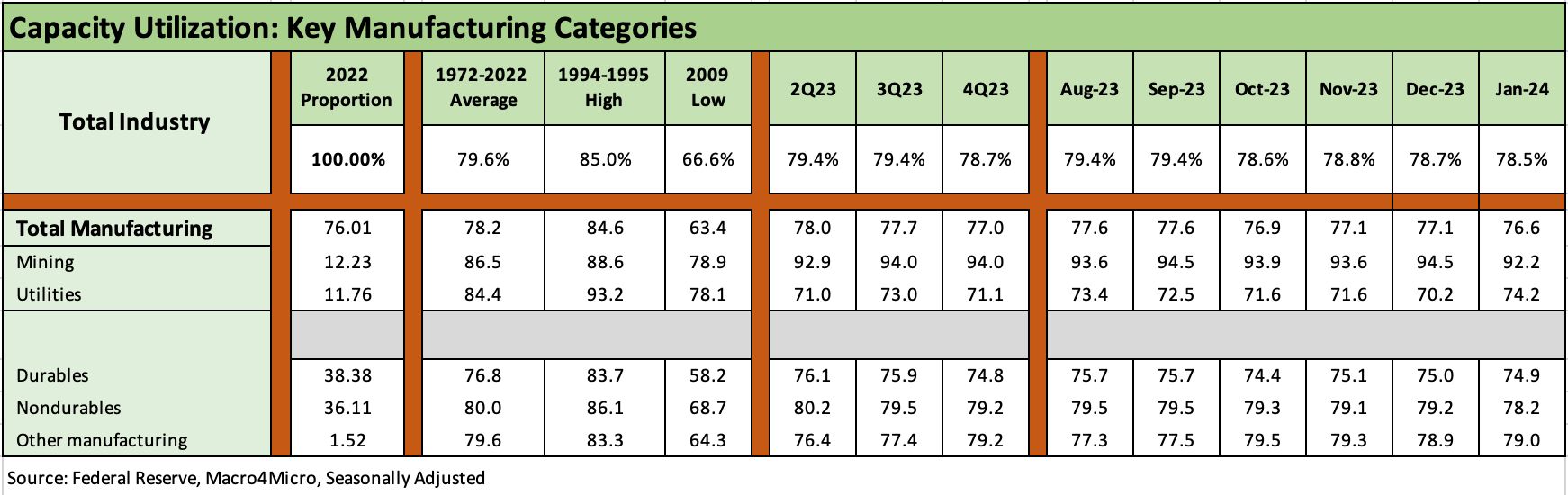
The above chart breaks out the latest release across the main buckets. The sequential trends in the cap ute numbers were negative in trend line but very mild overall. We see a minor downtick in Total Industry from 78.7% to 78.5% from Dec 2023. Total Manufacturing declined from 77.1% to 76.6%. The chart shows the weightings on the left along with the long-term averages and past highs and lows.
We tend to focus in on Durables for the economic multiplier effects and direct ties back onto supplier chains and materials, but that was a small move of -0.1% for Durables. The bigger moves in Mining and Utilities were somewhat of a wash. Nondurables took the bigger hit vs. Durables with Chemicals weaker in Nondurables along with Plastics/Rubber and Petroleum/Coal.
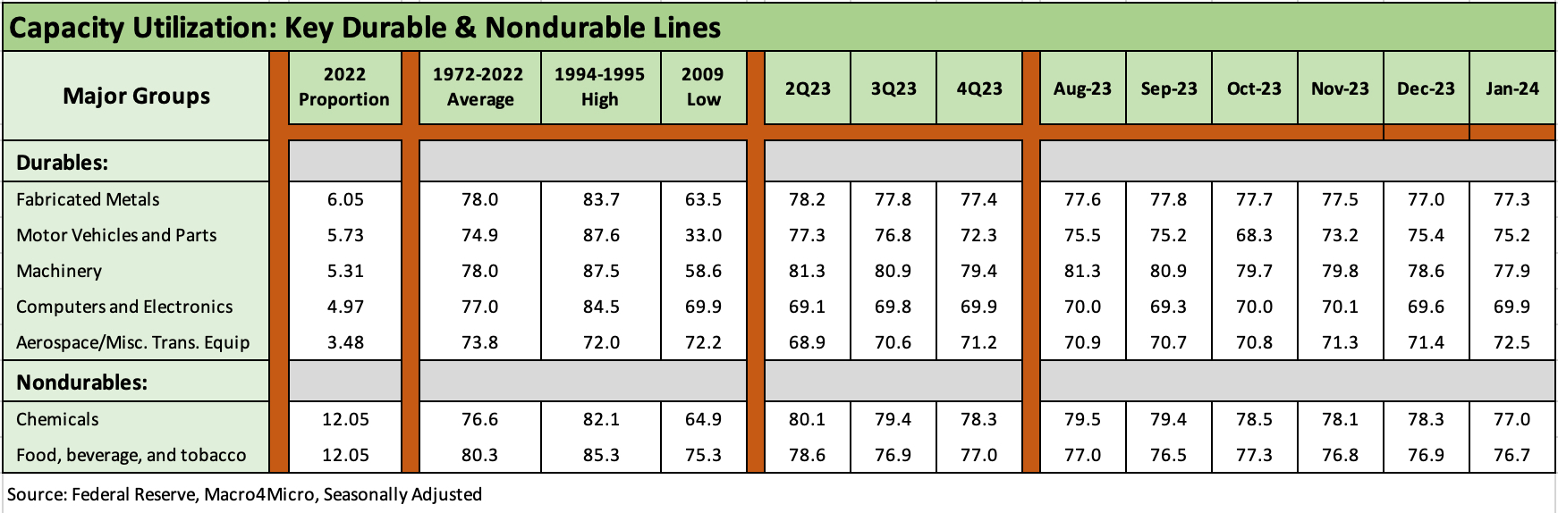
The above chart updates some of the largest industry groups by weighting in Durables and Nondurables. We see 3 of the 5 leaders in Durables higher and 2 lower. The two largest in Nondurables were both lower. The net effects are weaker but not flashing red.
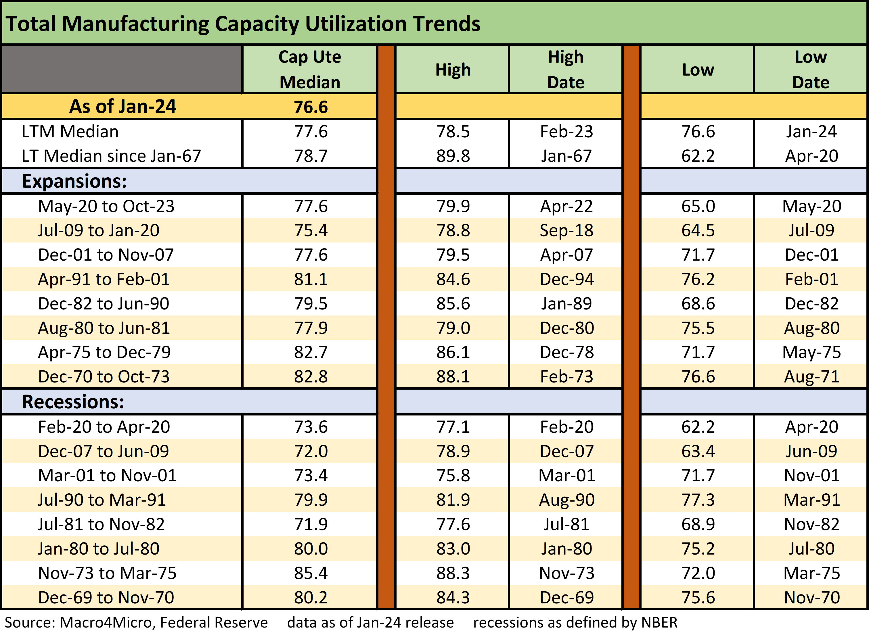
The above chart offers some cyclical histories to ponder. The much lower capacity utilization levels in more recent cycles highlight how much more efficient many operators are today. On the other hand, the trend does not scream “pricing power” as the deflation in many categories of goods hammers home. There are a lot of war stories that flow into these cyclical histories but those are for other commentaries.
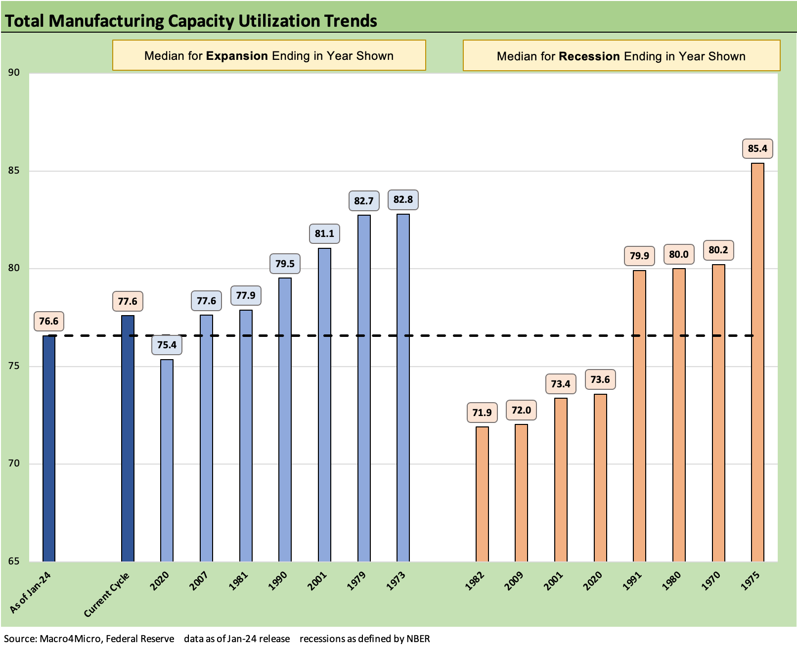
The above chart needs a quick explanation since the labels might be confusing. We plot a mix of median capacity utilization metrics for past expansions and recessions, and we line them up lowest to highest rather than chronologically. We plot a horizontal line at the current cap ute for Total Manufacturing.
We use the dates from NBER. The official cyclical peak is Feb 2020, but as far as we are concerned COVID arrived in Feb 2020 (the month we put “sells” on Hertz and Avis for that very reason in prior research lives). Jan 2020 was the last clean month ahead of COVID. The ensuing recession was only two months (March, April), but we dropped Feb 2020 in that one for this purpose.
Another important point in reading the chart is that the phrase “median for recessions (or expansion) in year ending” means we include the median for the entire expansion or recession that ended in that year. For example, the 1975 recession (ended March 1975) includes the median for the full recession that started in Nov 1973 – shortly after the Oct 1973 Arab Oil Embargo and the Yom Kippur War was in full battle mode.
We include these as frames of reference. Those histories are for other commentaries. The fact that stagflation periods of the 1970s and early 1980s are on the right side in the recession periods is not surprising.
Contributors:
Glenn Reynolds, CFA glenn@macro4micro.com
Kevin Chun, CFA kevin@macro4micro.com