
Footnotes & Flashbacks: State of Yields 1-21-24
We look at another UST swing as duration undermines bond returns this month and the “good is bad complex” is still hanging around.


We update the adverse move in the UST curve for the week that is holding back fixed income returns so far in 2024, but the general tone of credit and mortgage rate impacts is still operating in a narrow range.
We update the 3M to 5Y UST slope along with the 2Y to 10Y UST as inversions diminish a bit with the UST move more weighted to the front end.
The standoff continues between those of the school that “inversion = recession” and those who see “a full UST rally and bull flattening means Goldilocks will become Miss America.”
There is also the mixed bull/bear steepening school on funding the world’s largest deficit as more UST forecast splinter groups keep making their case.
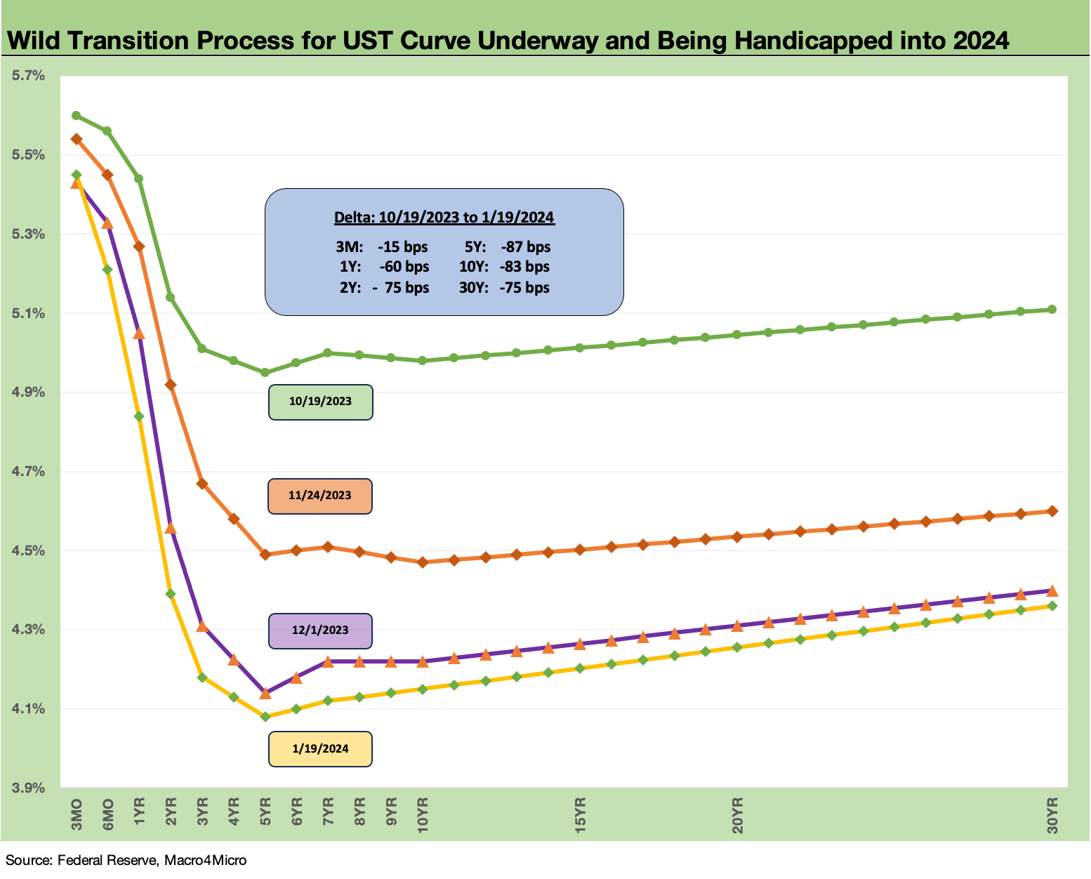
The above chart shows the recent migration from the peak UST rate periods of Oct 2023 when the 10Y UST was flirting with 5.0% over a few days. We chose Oct 19 as a day when the UST was near its highs (there were several such days to choose from). The chart highlights the rapid downward shift that rewarded duration for the 4Q23 period.
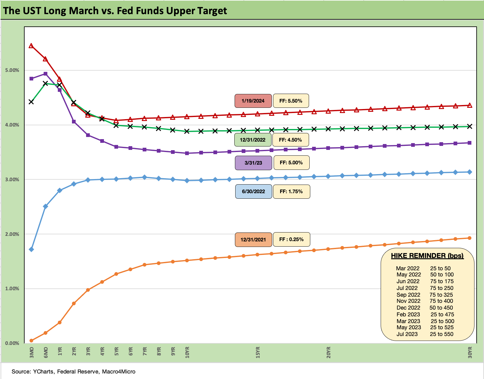
The above chart updates the UST migration across 2022 and into early 2024 since the end of ZIRP in Mar 2022. We also include a memory box for the FOMC dates and magnitude of tightening across the periods. We see the long path taken and how the UST curve remains above year end 2022 and the post-regional banks crisis 1Q23 period. We have had a nice rally from Oct 2023 but remain materially elevated.
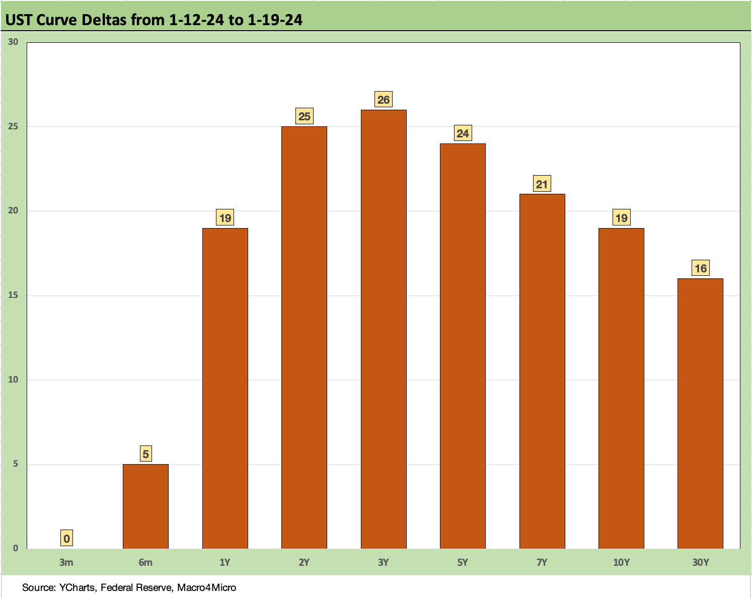
The above chart runs through the UST deltas for the week. The moves show the market jitters after any econ releases that call into question the heavily discounted rate of easing and UST expectations for 2024 along the curve. Anything that rattles those married to March cuts will keep the market on edge. A few weeks like this flow into bond asset class performance. More talking heads are pushing the market to think second half cuts. After a good week for retail sales and consumer sentiment, the super bulls are feeling some pressure.
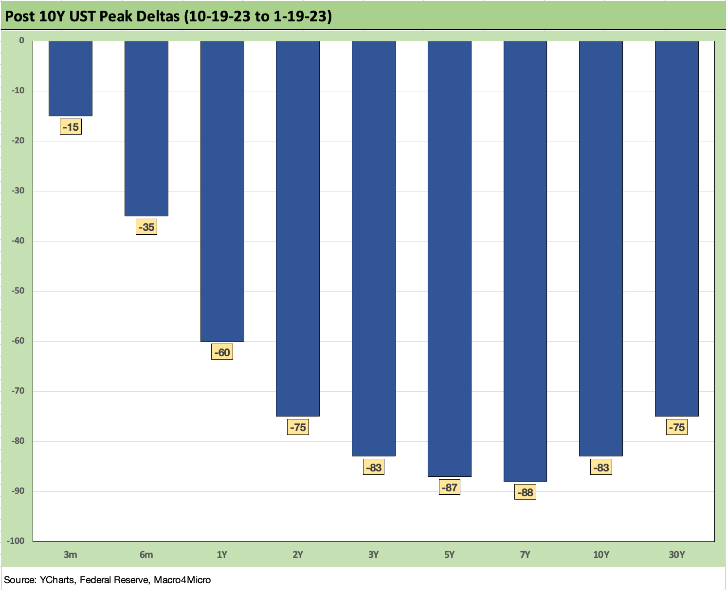
The above chart updates the UST curve deltas from the Oct 19 date we chose as our peak UST curve. Duration has still been rewarded since then. This was a meaningful move lower that sets a bar on what a reversal could look like if the fundamental news stays strong and industry and company guidance surprises for some major sectors as we get close to spring. That is a lot of data ahead.
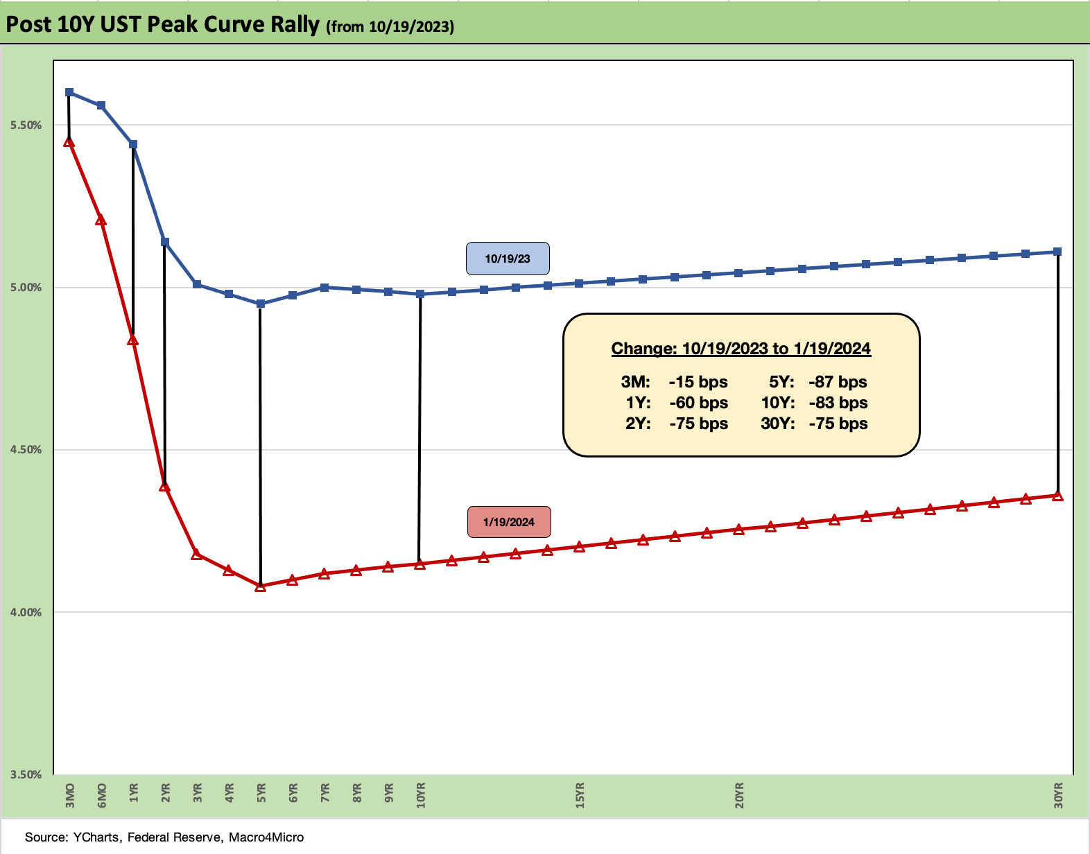
The above chart takes the post-Oct 19 UST deltas and puts them in yield curve format. We also detail the UST deltas in the box. The 2Y to 10Y segment of the curve shows a material downshift. In theory, that can benefit the short duration borrowers (consumers or the finance companies serving them) while also supporting the mortgage all-in rate.
Such a shift could also convince some HY refi and extension planning to move more quickly while demand is high and spreads tight. Current coupons would certainly be popular with investors but dilutive to earnings via interest expense. In a way, it is a game of chicken with the market and the Fed.
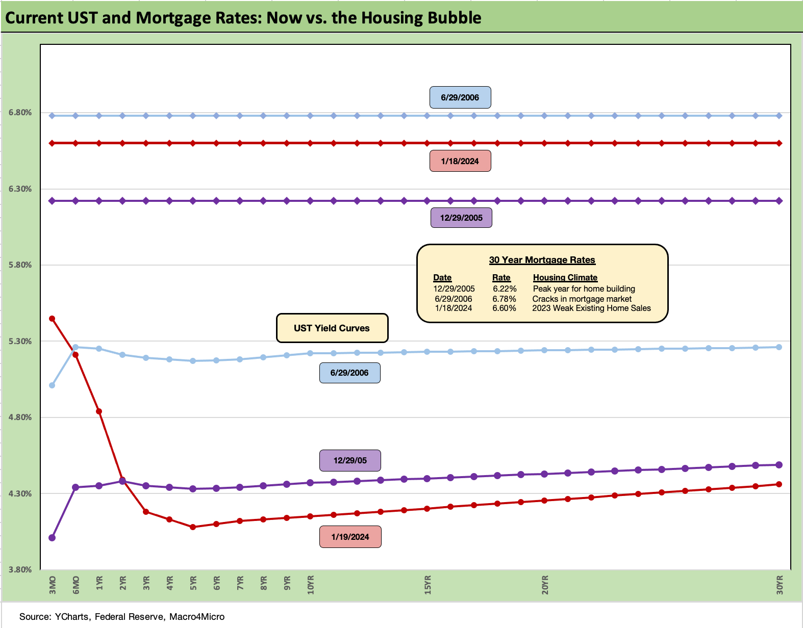
The above chart updates our “before vs. now” chart that plots the UST curve and Freddie Mac 30Y mortgage rate as of this past week vs. the peak homebuilding year (we use the end of 2005). We also plot the period when mortgages were still booming but there was a growing sense that the subprime RMBS period was getting out of control and cracking (mid 2006).
The chart offers a reminder of how high the demand was for mortgage credit at these levels back in those peak housing booms with current mortgage rates sitting between the June 2006 and Dec 2005 levels. The complicating variable in current monthly payments is how much higher home prices are now.
Monthly payments are most sensitive to mortgage rates (not price), so the sensitivity of demand for housing and transaction activity will be one to watch closely if the UST curve does shift as predicted. As we have covered in our housing research, there is a lot of room for the builders to keep booming, but it will take a much lower mortgage rate to shake out a lot more existing home sales inventory.
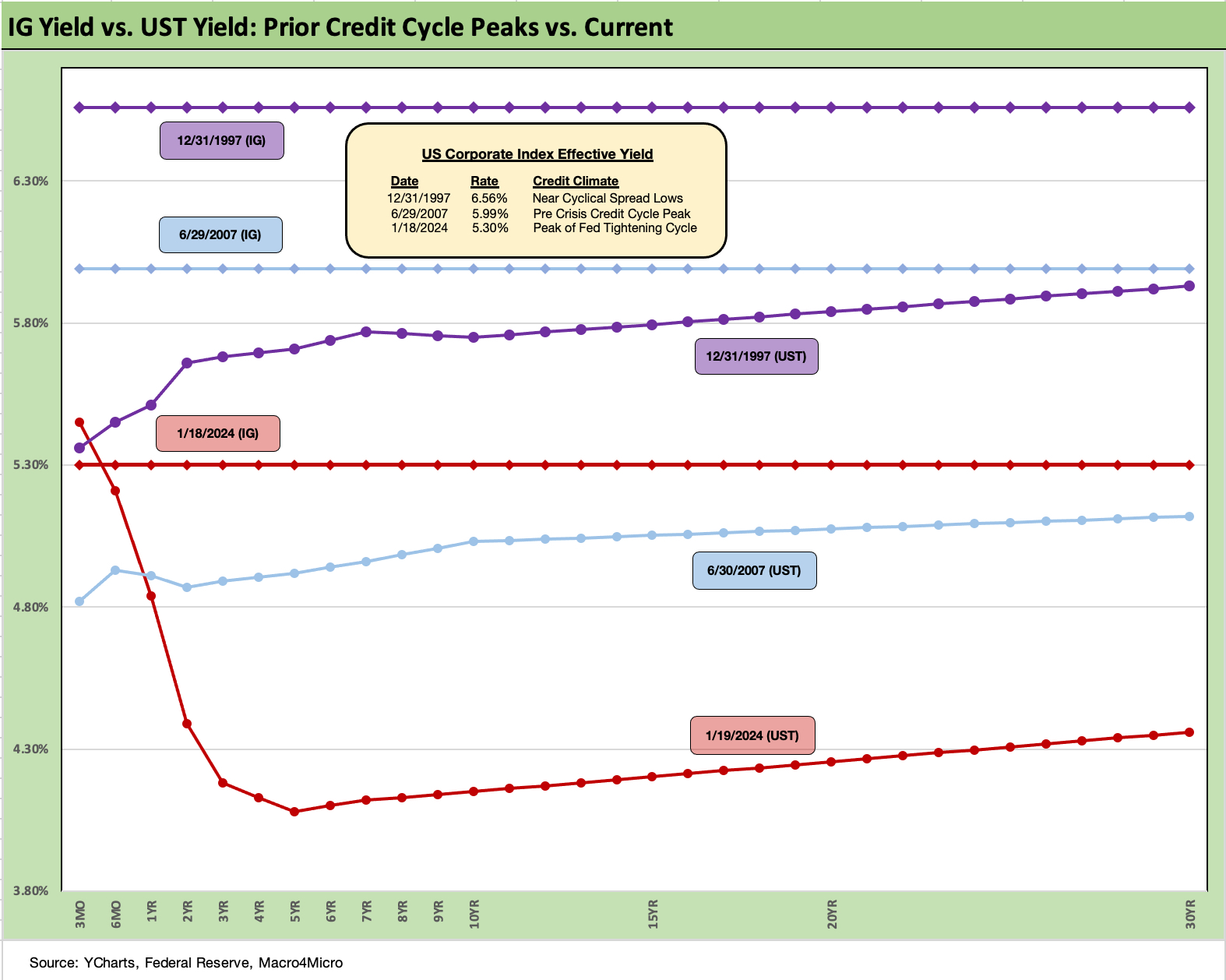
The above chart updates the current UST curve vs. those posted in the peak corporate credit market periods of 1997 and 2007. We also post the IG index yields on the horizontal line for the end of 1997 and the end of June 2007 when the credit cycles were near their spread lows. We look at those periods in more detail in our year end commentary (see Footnotes & Flashbacks: State of Yields 1-1-24 ).
The IG lows of bygone years include 1997s +53 bps in Oct 1997 while 1H07 saw an average for the first half of the year at +86 bps with a few years from 1H04 to 1H07 at +93 bps. Basically, the IG OAS backdrop can stay compressed for long periods of time even when HY can swing around across the same time period. The much-enlarged mix of BB tier in the HY mix can occasionally make life more anxious for borderline cusp BBB tier credits.
The main takeaway is that the current spread of+101 bps is not far from those earlier frothy periods with a much higher mix of BBB tier exposure than those years. In other words, spreads are tight but demand at these all-in yields for the IG index is quite high after the “financial repression” of the post-crisis period from 2008. More refinancing and coupon repricing is likely to keep demand high with 5% handles in IG bonds.
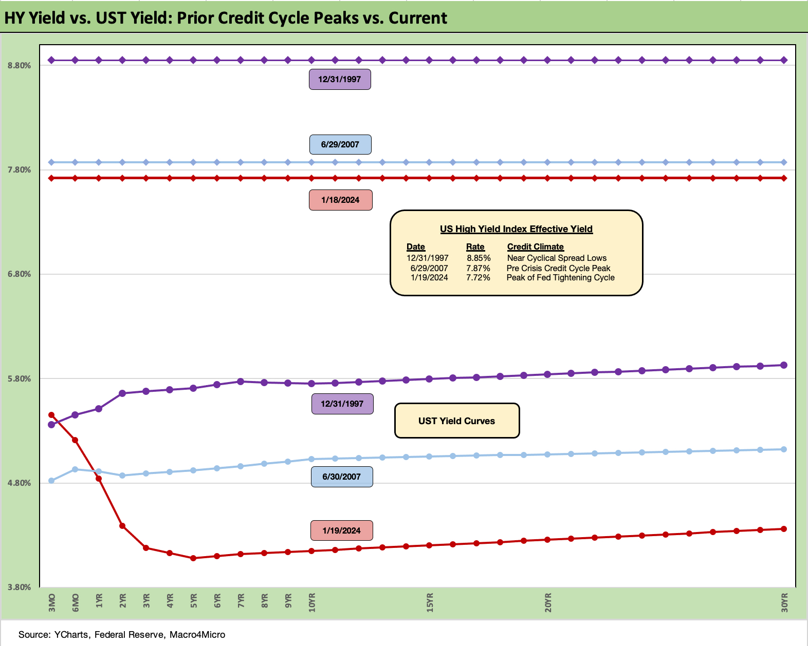
The above chart breaks out the HY index yield for Friday close and the and UST curve. We plot that against the UST curves and HY index yields for the credit cycle peaks of 1997 and 2007. We discuss the spread histories at length in our year end commentary (see Footnotes & Flashbacks: State of Yields 1-1-24 ). The all-in HY index posted at 7.72% using Fed data on effective yield and 7.93% YTW and HY OAS (ICE) of +354 bps at Friday close.
The market is now around 1 very good month from the 2014 low (6-23-14 at +335 bps) and 2-3 good months from the early Oct 2018 low (10-3-18 at +316 bps). To chase the lows of Oct 1997 or June 2007, the HY target spread would need to get below +250 bps (to +244 bps). That is a long way off and would take a groundswell of asset allocation into HY bond credit assets when there is a growing base of alternatives in private credit and direct lending.
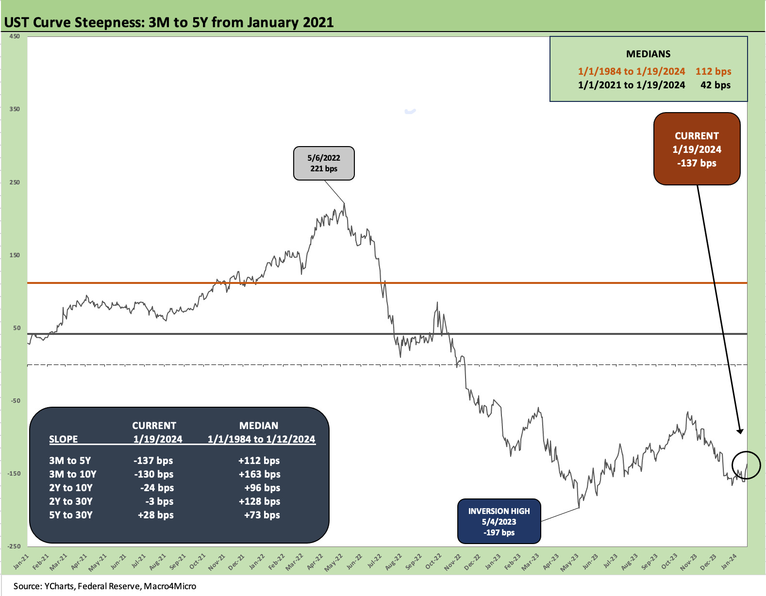
The above chart updates the cash yield vs. short/intermediate bond yield trade-off as the 3M to 5Y remain deeply inverted at -137 bps. That is well inside the -197 bps of May 2023 and is a reminder of the lack of term premium for taking duration risk. Many see that duration risk as low, but the Fed controls the short end and the market the long end. There is still a lot of voting to be done in both directions if numbers come in too strong on growth or too high on inflation.
We include a box in this chart and the next one which breaks out current slopes for various UST segments and the long term median for each from the beginning of 1984 when Volcker had won the bulk of his inflation fighting war and the distortions of 1980-1982 had diminished. The bond boom and issuance waves of the 1980s were just getting underway. Inflation hit 1% handles in 1986.
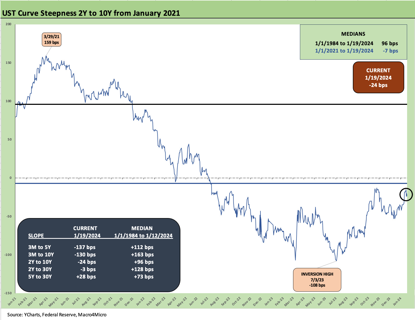
The above chart breaks out the slope from 2Y to 10Y as perhaps the most popular metric (more than the 2Y to 30Y) given how it cuts across so much of both IG and almost all of HY. After the inversion peak of July 2023 at -108 bps, the steepening move has gotten us back to -24 bps vs the post Jan 2021 median of -7 bps. The steeper long term upward slope median is +96 bps.

The above chart is the usual wrap-up chart where we frame the post 3-1-22 UST deltas from the start of the month when ZIRP was ended by the Fed and the inflation battle began. We include a 12-31-20 UST curve for a frame of reference.
With the Fed still holding firm but the UST running ahead of the Fed with its view of the market, the inversion is clear enough in the actual numbers as well as the visual. With the 3M UST delta of +513 bps since March 2022 and the 10Y at +243 bps for the delta, the term bear inversion for UST has been the story line.
The inversion remains the source of the tension between those who see inversion as an assured recession and those who see the inversion as something that will translate into a sustained bull flattening and “no landing” economic outcome – or a soft landing at worst.
As we noted in the mortgage, IG, and HY charts earlier in this piece, there is no changing the reality that UST rates are very low in historical context, and now inflation is coming down sharply from the 2022 peak north of 9% to a level the consumer expects to be in 2% handles short term and 2 handles looking out 5 years. Those inflation expectations were released on Friday for the first 2% handle dueling expectations (2% handle for both short term and longer term) since 2020. For a more detailed discussion of these sentiment indicators, see Consumer Sentiment: Multiple Personalities 1-19-24.
The Fed takes data seriously in general, but the inflation expectation numbers help on the easing front while the bullish spending appetites hurt. Dead ahead this week is the PCE price inflation release. That will be a big one.
See also:
Footnotes & Flashbacks: State of Yields 1-1-24
Footnotes & Flashbacks: Asset Returns 1-1-24
Credit Performance: Excess Return Differentials in 2023 1-1-24
Return Quilts: Resilience from the Bottom Up 12-30-23
HY Refi Risks: The Maturity Challenge 12-20-23
Coupon Climb: Phasing into Reality 12-12-23
HY vs. IG Excess and Total Returns Across Cycles: The UST Kicker 12-11-23
HY Multicycle Spreads, Excess Returns, Total Returns 12-5-23
HY Credit Spreads, Migration, Medians, and Misdirection 11-6-23
Quality Spread Trends: Treacherous Path, Watch Your Footing 10-25-23