
Footnotes & Flashbacks: State of Yields 3-24-24
A friendly curve move on the dot plot and Powell’s friendly tone on 3 cuts made for a good week.


We saw a bullish week for the UST and risk as the FOMC sent positive vibes with a collective dot plot at 3 cuts even if that is a very long way from the 5 to 6 cuts chatter on the way into 2024.
Equity performance posted a series of record highs in a positive week while the HY bond index saw spreads drop below the early Oct 2018 cyclical lows.
The IG index OAS is hanging in around near 90 bps handle lows seen in earlier strong credit markets such as 1H04 to 1H07 and 1997-1998 with the IG index only posting all-in yields slightly above 3M UST.
We update the 2Y to 10Y UST slope history as inversion longevity works on its own set of records supported by the FOMC anchor on the front end while the longer segments of the UST curve remain well below some famous cyclical credit peaks of bygone years.

The above chart updates the move in the UST curve from the Oct 2023 highs on the way into the wild year-end rally. We also break out the adverse UST curve YTD and post the deltas for each of the moves. We cover asset returns in our separate Footnotes publication, but the YTD hit to IG total returns on duration has trumped the positive excess return move from tighter spreads. In contrast HY coupons and HY spread compression more than offset the UST curve in the shorter duration HY subsector.

The above chart updates the tightening cycle journey and includes a memory jogger box on the timing and magnitude of the FOMC actions. We include a 12-31-21 UST curve as a frame of reference.
The peak inflation of over 9% for CPI in June 2022 underscores the late start to the tightening cycle as inflation soared and the fed funds upper bound was sitting at 1.75%. The fact that markets were calling for a pause in the fall of 2022 when real fed funds rates were still distinctly negative and essentially in accommodation mode was part of the strange journey (see Fed Funds-CPI Differentials: Reversion Time? 10-11-22, Fed Funds vs. PCE Price Index: What is Normal? 10-31-22).
The fed funds vs. PCE differentials are back in rational relationship in 2024 based on the numbers under Volcker and what he was able to achieve. Fed funds and inflation started to get close in early 2023 (see PCE Inflation Ticks Lower, So Does Spending 1-27-23).
The questions from here include “How high will real fed funds need to stay and for how long and what action will the FOMC take if PCE does not cooperate?” We get the latest PCE inflation numbers this coming week along with Income and Outlays and the final GDP print.
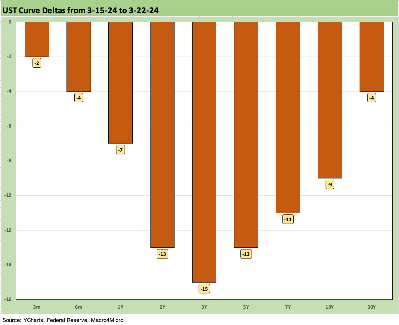
The above chart updates the weekly UST delta as the curve rallied again on what was perceived to be a supportive, dovish tone from the Fed (see FOMC: Hail Powell the Consistent 3-20-24). The 2Y to 5Y segment of the UST curve rallied more. We look at the 2Y to 10Y UST slope in some charts further below.
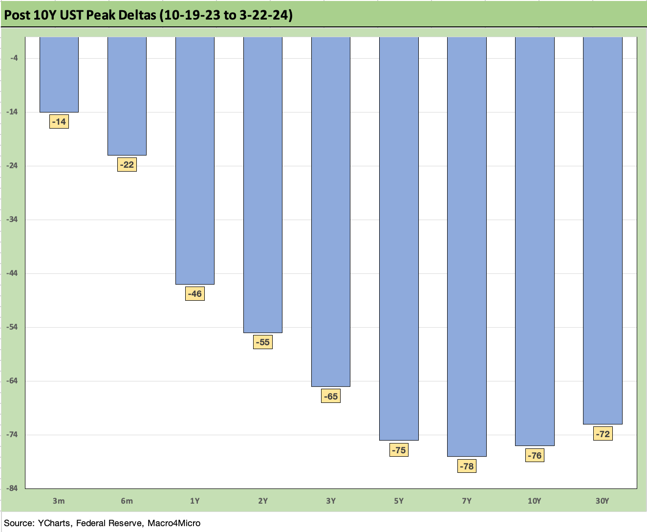
The above chart updates the running UST curve delta from the week the UST curve peaked in the third week of Oct. We use Oct 19, 2023 as the start date for the differentials given the closing yield on the 10Y. This chart captures a material shift lower despite the Fed holding the line and a constructive balance of economic fundamentals and tepid support from the Jan and Feb inflation releases.

The above chart offers another angle on the YTD upward shift in the UST curve. Duration has taken some lumps while credit spreads tighten in IG and HY bonds.

The above chart updates the mortgage rates using the Freddie 30Y benchmark and UST curve using some historical comparison to two key periods in the housing bubble years. We use the end of Dec 2005, which was the peak homebuilder year, and we also use mid-2006 around when RMBS and subprime were making the markets nervous.
We note that all three periods posted 6% handle Freddie Mac 30Y level, but the current UST curve is lower than 2005 in the 10Y area and much lower than 2006. Despite that UST relationship, the current mortgage rates are higher.
The past week saw the Freddie benchmark (released on Thursday) tick higher sequentially from the prior week. Away from Freddie, the mortgage trade rags were showing numerous indications well below the Freddie numbers by Friday (those come with asterisks on fees and LTVs and quality).
An important real world indicator for housing was the rise in Existing Home Sales for Feb 2024 (see Existing Home Sales Feb 2024: Surrendering to Mortgage Market Reality 3-21-24). While builders can navigate around mortgage rates to a certain extent with incentives and buy-downs, the golden handcuff barriers have kept existing home inventories and sales lower. The existing home market has been showing signs of a recovery in recent months and notably in the mid to upper price tiers. That said, existing home sales and inventory have a very long way to go.

The above chart updates the running timeline for IG and HY yields (YTW). As we have covered in prior commentaries, the pre-crisis medians (9.3% for HY, 6.1% for IG) as posted present the best frame of reference after the protracted periods of ZIRP and QE seen since the credit crisis and later the pandemic.
Yields now remain well inside the pre-crisis medians, but the painfully low yields of the post-crisis period from 2008 had the effect of making IG and HY attractive to many asset allocators. The effects of the yield starvation and low coupons and the need for income and a better diversification across funds is a tailwind for demand even at very tight spreads. That is notably the case in pension funds (see Pension Profiles: Benefit Drain Rates and Returns 3-22-24).

The above chart uses the same approach in framing some historical comps as we did with mortgages vs. 2005-2006 during the housing bubble years. Above we plot IG index yields vs two notable credit cycle peaks during 1997 (as TMT was starting to soar) and 2007 (the credit bubble, record LBOs, structured credit boom, leveraged counterparty roulette). As in the mortgage charts, we plot the UST curves for current levels, 2007, and 1997. We plot the IG index yields along the horizontal lines for each period covered.
The UST yields today are much lower than the 2007 and 1997 credit peaks. All these periods posted tight spreads, so the UST curve is the main driver of the IG Corp index differentials. This past week saw the rally in UST take all-in yield lower with a minimal tightening of -1 bps for the IG benchmark to +92 bps OAS to get to 5.33%.
As a frame of reference, the Friday close on the IG index spreads are inside those seen at the end of June 2007. The IG OAS is on top of the +93 bps average of 1H04 to 1H07. The 1H07 period alone averaged +86 bps. The all-time low for IG was +53 bps in Oct 1997 before reaching +70 bps at the end of 1997 and averaging +95 bps for 1997-1998. Current IG spreads are quite tight right now even if well above the 1997 lows. Those timelines of tight spreads speak to how spreads can remain compressed for a long stretch absent a major catalyst to rattle them.

The above chart does the same drill as we did with IG. The yield to end last week for the HY index is lower than 1997 and 2007 on a materially lower UST curve but with spreads wider today than the sub-250 bps lows of June 2007 and Oct 1997.
The -8 bps OAS tightening last week to +308 bps is now below the June 2014 lows of +335 bps (6-23-14) and below the Oct 2018 lows of +316 bps (10-3-18). As with IG, history shows that spreads can stay compressed for a long stretch of time. The +270 bps average of 2H97 and +298 bps in 1H98 tell a story of resilience.
That period also offers a reminder of how it can get ugly when the market turns. Spreads can turn with a vengeance as we saw in 2000-2002. That gets back to the same old challenge of deal quality and chasing spreads in a compressed market.
The biggest threats ahead could be an inflation resurgence and fear of no cuts in 2024 and worries around trade wars and global economic dislocations coming in 2025. The long-tailed bear scenarios spinning is easy enough to do, but the economic backdrop is holding up well in an asset class that could see very strong demand fundamentals from investors waiting for repriced coupons in both IG and HY and the pull to par on HY refinancing/redemptions over time for a sector with a higher quality mix of BB tier than in prior credit cycle sell-offs.
We do a more detailed review of HY spread histories in the 2023 recap (see Footnotes & Flashbacks: State of Yields 1-1-24).

The above chart updates the long-term trend line for the 2Y to 10Y UST segment. We also plot the medians for the UST curve segments we watch in the embedded box. All UST segments we look at are currently inverted except the 5Y to 30Y. The long-term medians are all materially upward sloping UST curves.
As of 3-22-24, the 2Y to 10Y inversion posted -37 bps in from the peak inversion of -108 bps. That is well inside the long-term, post-1984 (starting 1-1-84) upward sloping median of +96 bps.

The above chart offers a closeup on the slope trend from the start of 2021 for a more granular read on the journey across the tightening cycle. After a high slope of +159 bps in March 2021, we see the plunge into negative across the mid-2022 inflation peak on the way to the -108 bps inversion peak of July 2023. The recent migrations have shaved 71 bps off the peak inversion to -37 bps.
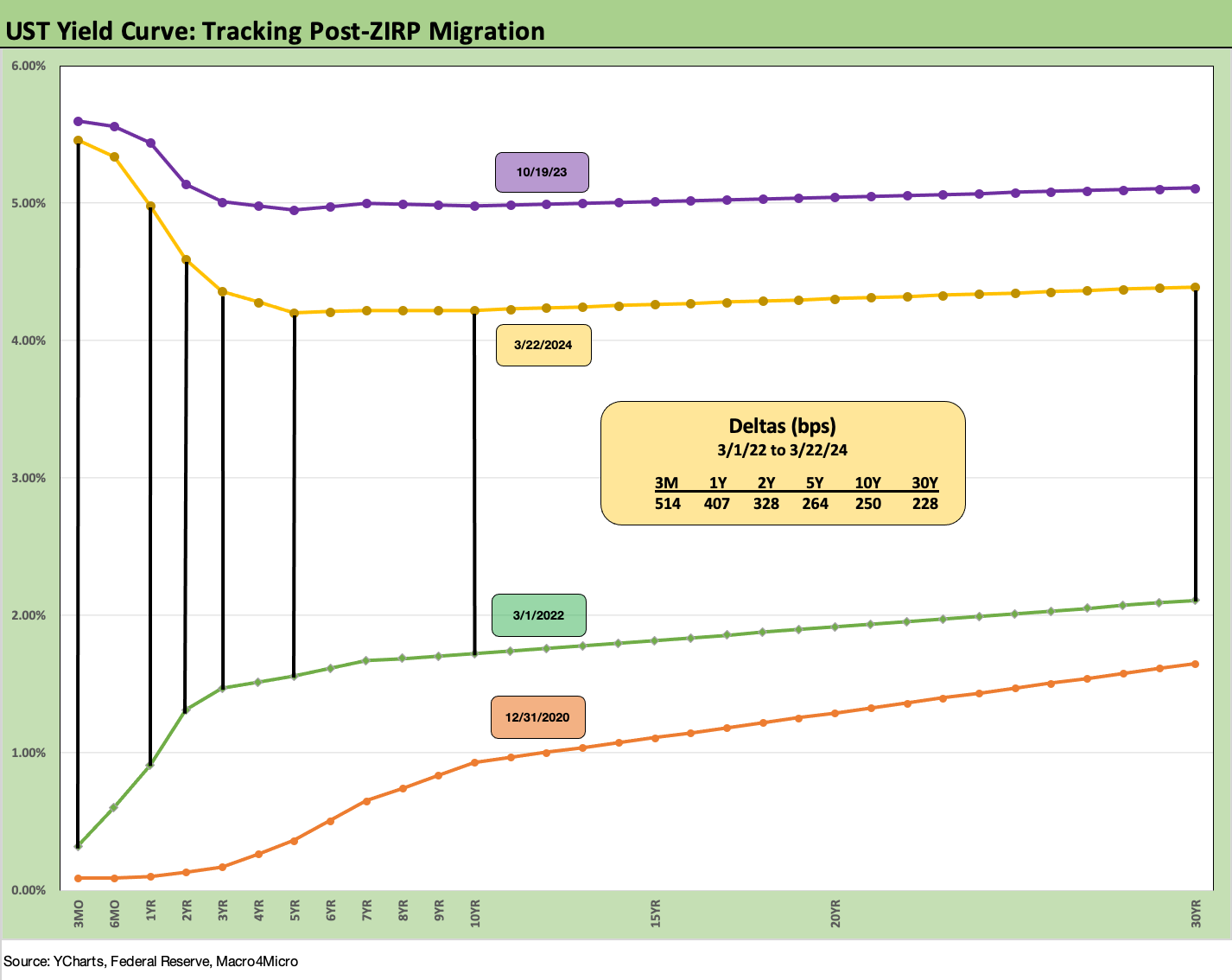
We wrap with our usual chart showing the running differential across the UST curve from 3-1-22, the month ZIRP came to an end (effective implementation 3-17-22). We plot a 12-31-20 UST curve and a 10-19-23 UST curve (peak 10Y date) as frames of reference.
As we look ahead to price action this week, the hope for UST bulls is that PCE inflation offers enough support that will keep Powell in the camp putting Jan-Feb 2024 inflation releases in the anomaly bucket. That Oct 2019 curve is in the chart as a reminder of what could go wrong if economic trends stay hot and inflation hiccups.
There are still mixed signals with the top of the worry list more tied to the steady and bullish employment numbers (see Payroll Feb 2024: Record, Revisions, Reality 3-8-24, Employment: Real Numbers vs. Fictitious Dystopian Hellscapes 3-9-24).
See also:
Pension Profiles: Benefit Drain Rates and Returns 3-22-24
Existing Home Sales Feb 2024: Surrendering to Mortgage Market Reality 3-21-24
FOMC: Hail Powell the Consistent 3-20-24
Housing Starts Feb 2024: Rites of Spring on the Doorstep 3-19-24
Industrial Production: Capacity Utilization Shows Manufacturing Edging Higher 3-15-24
Retail Sales: Consumers Will Stop Shopping…Someday 3-14-24
CPI Feb 2024: Extra Innings 3-12-24
Employment: Real Numbers vs. Fictitious Dystopian Hellscapes 3-9-24
Payroll Feb 2024: Record, Revisions, Reality 3-8-24
JOLTS Jan 2024: Holding at “High” Even if Well Down from the Peak 3-6-34
Inflation Gut Check Jan 2024: PCE Prices, Income, and Outlays Help the Story 2-29-24