
JOLTS Jan 2024: Holding at “High” Even if Well Down from Peak
We look at the Jan 2024 JOLTS data for another solid signal on employment. We consider the “Hormel Test.”


The 8.86 million in Job Openings is just slightly down from 8.88 million posted for Dec 2023 on the 1-month lag and down from 10.43 million in Jan 2023.
The 8.86 million in openings is above the 6.1 million people unemployed at the start of Feb 2024 and a multiple of the 1.57 million in Layoffs and Discharges level over in the Separations bucket.
With every payroll number (next one on Friday) now scrutinized more than ever, the expectation is for another total payroll headcount that hits record levels again as the market still awaits a decline in job count.
Overall, we see minimal declines in Job Openings along with small declines in Hires, a decline in Separations, a decline in Quits, and a decline in Layoffs/Discharges in what overall is easy enough to frame as a “holding pattern” biased toward favorable hiring trends.

The month of Jan 2024 in JOLTS was not much different than Dec 2023 (see JOLTS Dec 2023: “Little Changed” on Replay 1-30-24). The above chart plots the time series for Job Openings from the cyclical peak (start of recession) at the end of 2007 across the crisis and ZIRP years, into the longest expansion in history (peak Feb 2020). The timeline then moves into the COVID pain and economic rebound years while an inflation battle heated up in 2022.
We have covered the employment trends in detail across other pieces (see Payroll Jan 2024: Big Swing 2-2-24) and will update with the Friday payroll report. Jobs are solid and the market is still trying to handicap when there will be a contraction in the total payroll count.
The Job Openings number peaked in March 2022 at 12.2 million when the tightening cycle began. Since then, the Job Openings number has substantially exceeded the median level of 5.5 mn and continues to exceed the peak openings number under Trump, which was 7.5 million in Nov 2018. Looking back to Obama, we see the years of slow recovery from the crisis during Obama’s first term.
As covered in other commentaries, the average monthly payroll additions during Obama’s second term exceeded the average for Trump during the first 3 years of his one term (that is, pre-COVID). COVID then led to job contraction for the only Presidential term of 4 years that we looked at back to Nixon/Ford. We give recognition to the realities of COVID (2020) as an outlier, but there are 3 other years to consider.
We have covered employment histories across administrations back to the 1970s (see Employment Across the Presidents 8-15-23) to hammer home the obvious point that record numbers of jobs have been generated under Biden, and that is a simple fact. Interestingly, the highest % increase in jobs came under Carter, who was drowned by inflation and oil spikes and interest rates that make today’s rate look more like a ZIRP year.
Jobs are tied to economic performance since companies hire for a reason, and US GDP has shown solid growth and breadth despite the pain of inflation. Those issues will see the usual range of disinformation tactics, but the jobs tally come every month while GDP numbers see 3 cuts of the metrics each quarter (see 4Q23 GDP: Second Estimate, Moving Parts 2-28-24).
GDP performance across Trump vs. Biden are always a good exercise whether across GDP line items (see Tale of the Tape in GDP: Trump vs. Biden 12-4-23) or employment. We are due for an update commentary soon on both. Facts are good in research even if they seldom apply in partisan politics.
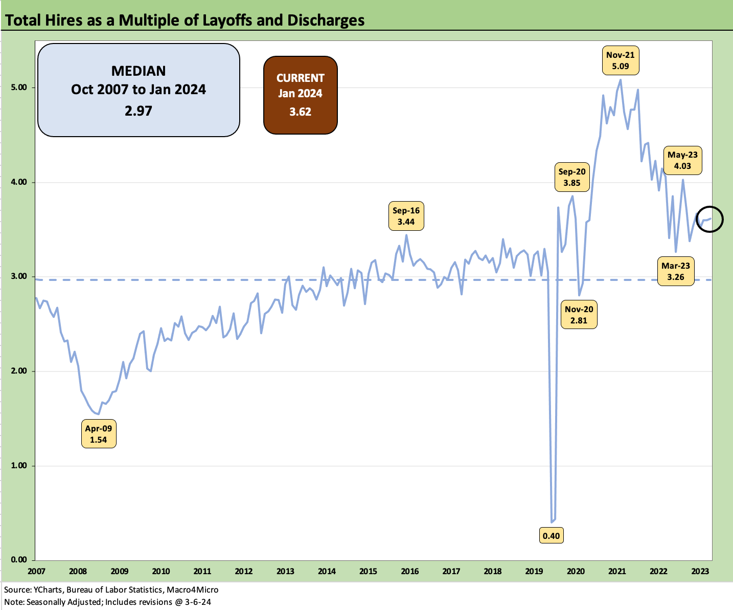
The above chart is a new one this month where we look at “Hires as a Multiple of Layoffs and Discharges.” While the Separations as a bucket (see below) are murky given the mix of Quits, Layoff/Discharges, and “Other,” this ratio above is more intuitive: “Who’s hiring? Who’s firing?”
We see the post-crisis economic grind during the expansion that started after the June 2009 economic trough on through the Obama and Trump recovery years to the Feb 2020 peak as COVID exploded in March 2020. With a timeline median of 2.97x, the last few years have been strong and remain solid on the way to record payroll numbers. Along the way, wages have climbed and are now running ahead of inflation after a painful period of inflationary pressures from supplier chain disruptions, tariffs, and supply-demand imbalances that sent inflation soaring.

The above chart plots the total Hires vs. Layoffs and Discharges. We used these to derive the Hires to Layoffs/Discharges ratio plotted earlier.

The above chart updates Hires vs. Separations with Separations heavily weighted towards Quits as we detail below at over 63% of total Separations. We address the COVID period in a separate chart /comment below since the pandemic numbers would distort the visual effects of more cyclical and rational moves in the JOLTS numbers. Basically, the numbers were so big during COVID that it needs its own text and would screw up our chart optics.
The above comment is a recurring cut-and-paste that serves as a memory jogger of the first pandemic in over a century. The Separations number of over 16 million in March 2020 and over 11 million in April 2020 defy adjectives.

The above chart plots the excess of Hires over Separations. At +346K, the differential is a positive signal at well above the +193K median.

The above chart plots the trend in Quits in the mix of total Separations. While down from the highs of 71% in Dec 2021, Quits remains above the median of 57.2% and dramatically above the COVID panic lows of 17.6% and April 2009 crisis era 39% handle. Quits as a % total employment (the Quits Rate) was 2.1% seasonally adjusted, down from 2.2% in Dec 2023.
Summary
The JOLTS numbers show sustained strength in the jobs market even if off the peak. One would expect some declines as jobs started getting filled on the path to a record payroll count, but Job Openings that are well in excess of total unemployed are a good thing by definition. Similarly, Hires posting levels at a multiple of Layoffs and Discharges is healthy enough. The Quits numbers are always in the eye of the beholder on the relative motives and causes of the turnover.
Mix shifts and regional patterns along the occupational price tiers are the next layers below the headline releases. That is where the payroll report helps in terms of being more current and more reliably granular. Moving the needle on Manufacturing in the Goods-Producing categories has always been the biggest challenge in a services economy. Construction employment has been a blessing in the Goods categories. That is tied in part to policy and legislation (just a fact).
The Hormel Test: Trump vs. Biden

In the interest of being a wise guy, we would highlight that Hormel stock (ticker HRL) and its wide selection of canned meats (think Spam) had a very strong performance under Trump even before the pandemic at +27% for his first 3 years and across his 4 years (+32%). Hormel has generated negative returns under Biden’s term (-24%) but just had a good quarter. I recall some stock watchers highlight HRL every time things got lean in the economy. Record payroll helps as does real wage growth for the bottom quartile earners.
The point-counterpoint from the extremist disinformation artists is that no one can afford to eat anymore because of inflation. I assume that means they are all dead, dying, or don’t have enough energy to attend their record number of jobs. The consumption numbers and payroll details released each month seem to indicate otherwise.
Inflation has in fact been ugly across all developed markets but is getting less so in the US each month. “Food at home” CPI weighed in at +1.2% for Jan 2024, so we are down from 13.0% in Sept 2022. The unfortunate history is that Food almost never deflates in contrast to Energy (see Inflation Timelines: Cyclical Histories, Key CPI Buckets 11-20-23).
Now if anyone can get either Trump or Biden to admit that tariffs are inflationary, it would be a major conceptual and factual breakthrough. The buyer pays. Period. At least Biden knows that fact, but Trump repeats the opposite and has never backed down from the idea that he has collected billions and billions from China.
In defense of Hormel…
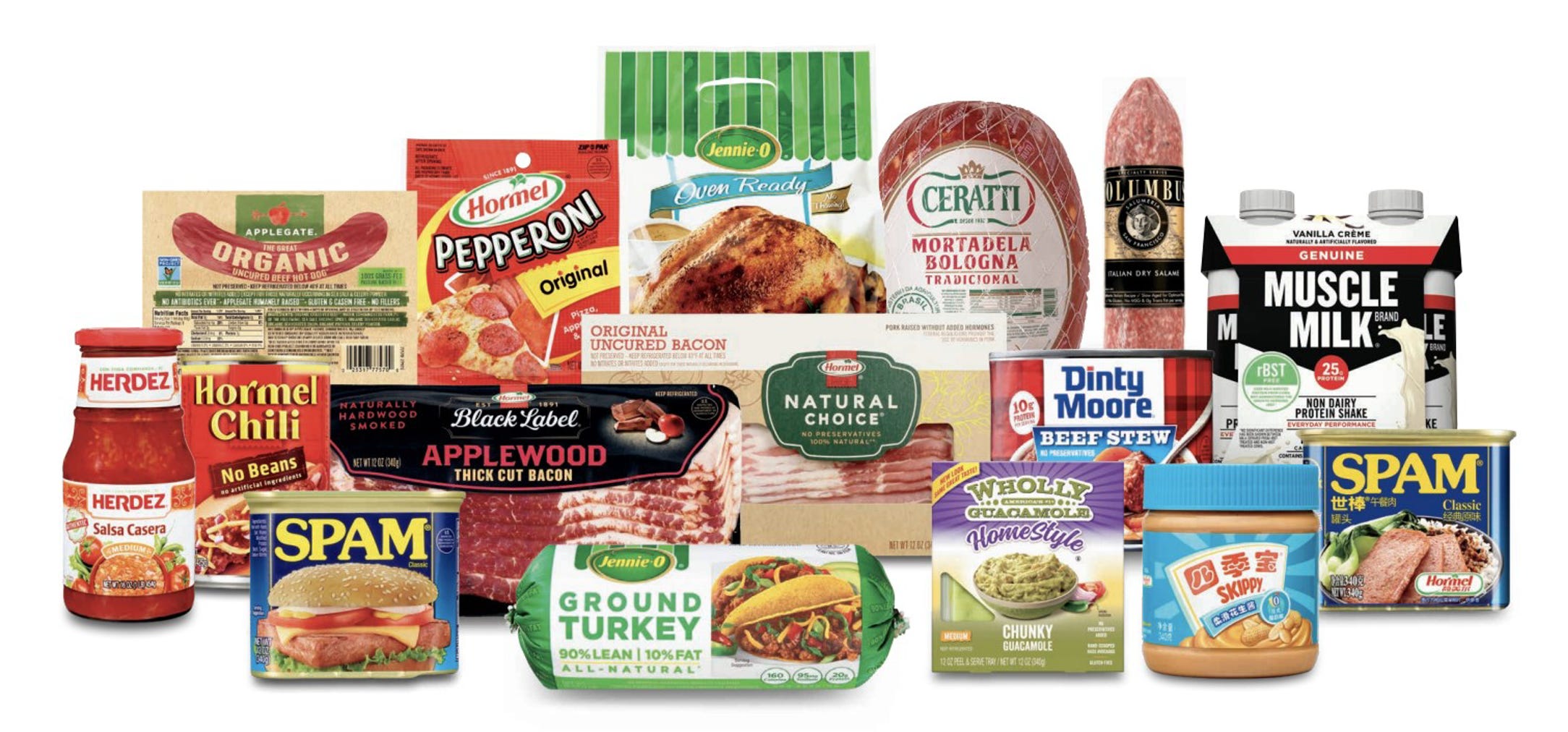
Just to be clear, I am not picking on Hormel, but “economic uncertainty” shows up as a term in their product mix presentations. Moving to more affordable branded food products is time honored whether Hormel or Kraft “Mac and Cheese.” I have fond memories of the Hormel collection.
As a connoisseur of fine canned meats during my formative years, I preferred fried Spam over the congealed and gelatinous presentation (My father’s choice was freshly keyed and served directly from the can—it was a Marine thing). The canned corned beef was pretty damned good also, and corned beef hash is always a go-to game plan for latchkey kids. Dinty Moore was a treat. Skippy Peanut Butter remains a great source of protein. No complaints here.
All that being said, I suspect based on Hormel stock, one might argue that the consumer has more options today and real wages are now rising again. That may show up in some household dining habits.
On a political note, I can see Biden eating Spam when he was young. Any takers on the odds that Fred was serving Spam to Prince Donny? (McDonald’s yes, Spam no.)