


This is not getting easier!
The market sees another round of similar trends with a slight change in volume at higher YoY prices. Mortgage rates and onerous refinancing costs and higher monthly payments remain a headwind.
The sequential sales decrease of -1.7% MoM and +0.7% YoY came with a +2.0% YoY median price increase to $434.1K.
Single family sales posted -1.9% MoM and +0.8% YoY with a +1.9% YoY median sales price rise to $440.3K (down sequentially MoM from $448.8K)
The critical South region at 46% of total existing sales was flat YoY and declined by -3.1% sequentially as prices rose by +0.9% to $371.7K. All 4 regions saw higher YoY median prices with the West as always the highest at $622.2K and Midwest the lowest at $342.9K. The Northeast stood at $563.8K.
With respect to UST curve risk, the odds from CME FedWatch as we go to print show the probability of a Fed easing by the Dec 2026 FOMC meeting at 21.5% for no action, 44.5% chance of 1 hike, 28.5% chance of 2 hikes, and 5.5% chance of 3 hikes. How that flows out the curve into the 10Y UST that drives 30Y mortgages has its own set of additional variables (see Market Commentary: The Curve 8-10-26, The Curve: Steeper, Inflation Anxiety Remains 8-2-26).
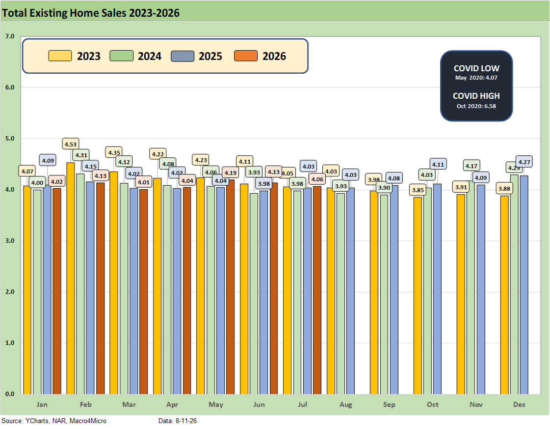
The above chart details existing home sales SAAR run rates by month from January 2023 to July 2026 with 4.06 million in July, down from 4.13 million in June. As a frame of reference, in 2022 the market was posting 6 million and 5 million handle sales volumes in the first half of that year.
The recent existing home sales totals look more like the late 2023 period when mortgages had peaked (see Existing Home Sales Dec 2023: Rerun of Multi-Decade Low 1-19-24). That makes sense given where current mortgage rates are now around 6.8%. The 30Y mortgage rate has moved within a 200 bps range since the Oct 2023 peak when Freddie Mac 30Y hit 7.8% and many mortgage offerings were near 8%.
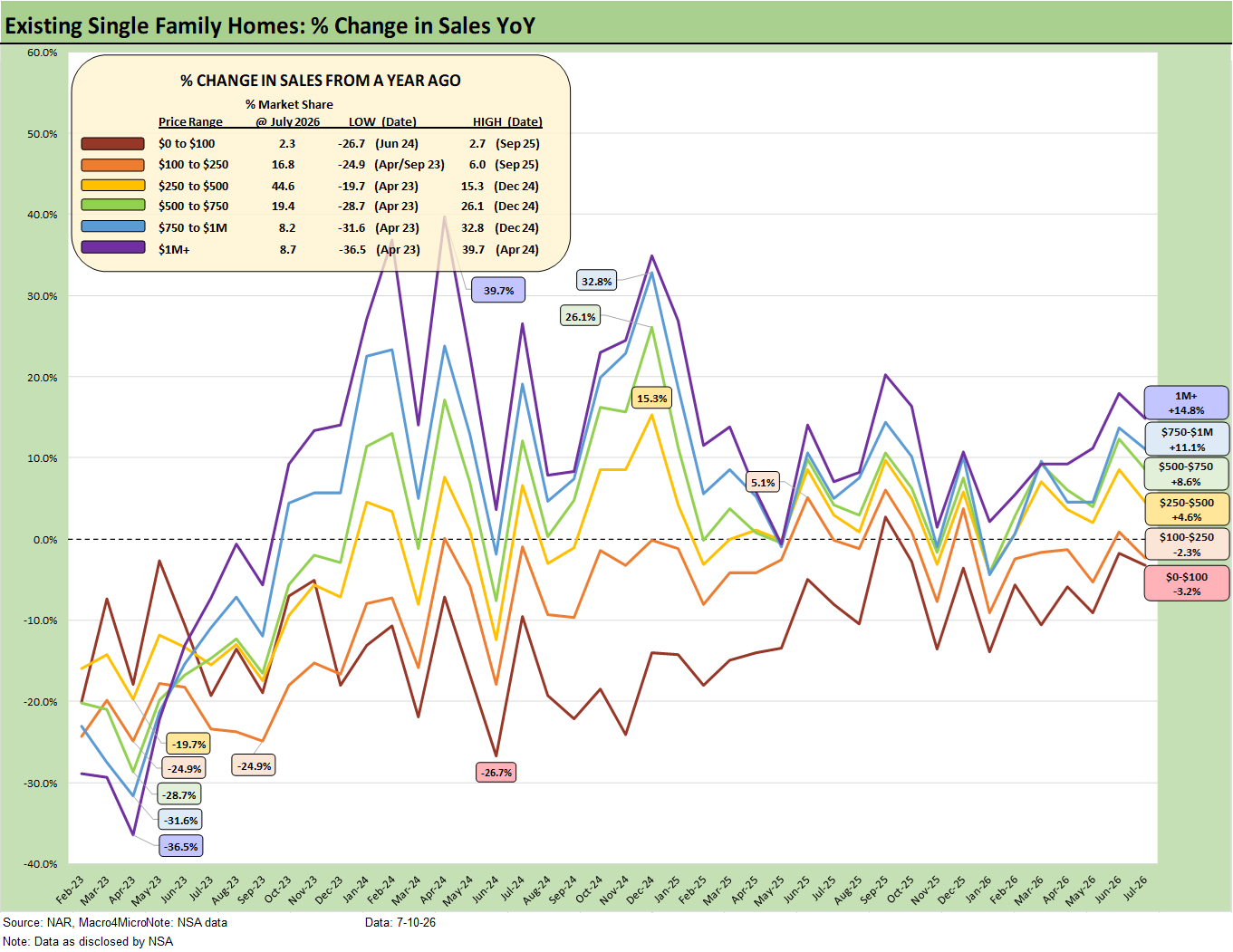
The above chart shows the sales volume deltas by price tier for July 2026, and we see 4 of the 6 price tiers posting positive growth with the lowest price tiers posting declines. Note: We use “not seasonally adjusted data” for this chart.
For existing home sales, the monthly payment math is still unfavorable for those looking to cash out, move up, or simply relocate. Expectations for a bull flattener in the UST market that would translate into low to mid 5% mortgage rates have been crushed at this point for 2026 after major setbacks for that same scenario in 2025.
The curve has steepened and could steepen more if oil and tariffs and steady demand take inflation metrics higher. While the market is pricing in tightening risk as highlighted in the bullets above, the long end of the curve (notably the 10Y UST that drives mortgage rates) has ample room to steepen based on history even if the FOMC holds the line on the short end. A Fed easing scenario would require a macro backdrop that hits payrolls and homebuyer confidence to make the FOMC take such action.
The oil spike and price swings since Iran plus the documented inflation pressures in May and June will make life a challenge for Warsh. We get more CPI and PPI data this week (see June 2026 PCE: Inflation, Income, and Outlays 7-30-26, CPI June 2026: Eye of the Storm? 7-14-26).
The years of “repricing of the household basket” under Biden and again under Trump have made life a struggle for many and now we are looking at negative real wage growth (see Employment Cost Index June 2026: Inflation > Wage Growth 7-31-26).
We recently read a comment in HousingWire that highlighted slower home price growth vs. wages, but the funding costs (mortgages) and broader expense base that comes with home ownership and relocating undermines such a household budget assessment. The cash-in, cash-out analysis still says home ownership is mired in an affordability crisis in terms of the cost of ownership when considering financing and operating costs.
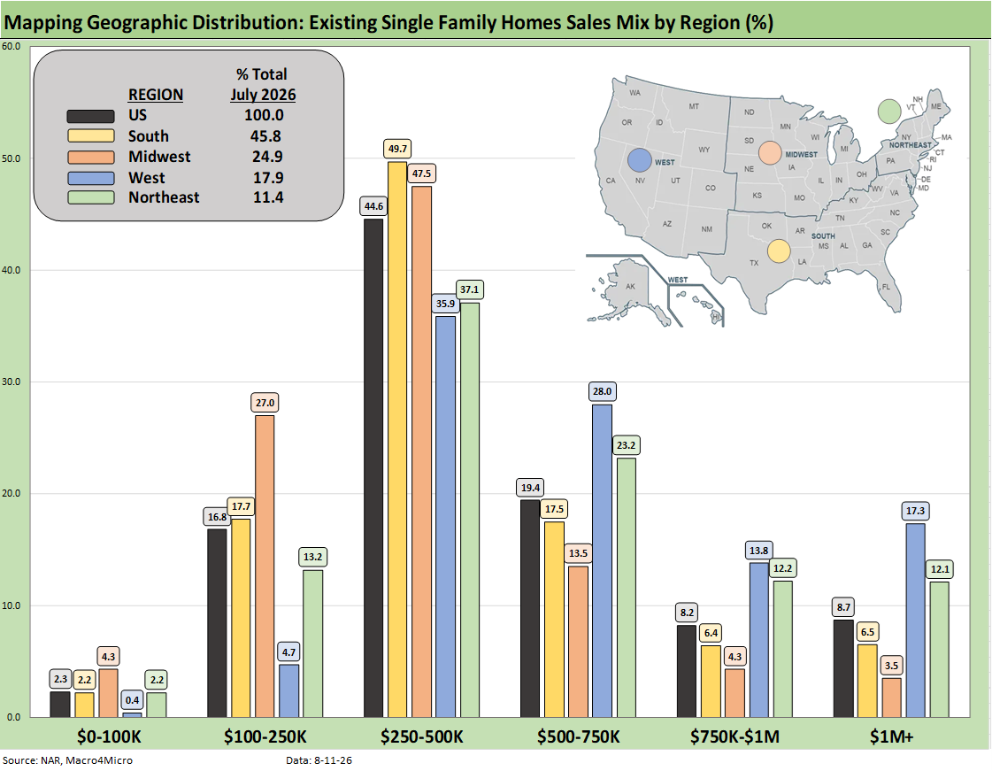
The above chart shows the geographic mix of volumes and details on price mix by region. The South is the main event in single family volumes whether new or existing at around 46% of total volumes.
For the bar chart, we break out the mix for each region by price tier. For example, the South shows almost 50% of its existing home sales volume in the $250K to $500K range and almost 18% of its sales in the $100K to $250K bucket.
The high cost of homes in the West (notably California) is clear enough just by glancing at the bar chart with over 17% at prices over $1 million. The second highest in the $1 million club is the Northeast at over 12%.
We see a major concentration across the regions in the $250K to $500K range although the $100K to $250K bracket for the Midwest stands at 27%. The West shows a high share of 28% in the $500 to $750K bracket, which again underscores how expensive the West region price tags remain in national context.
The map explains what states are in each Census region. There is a very wide range of home price profiles in the West and Midwest states.
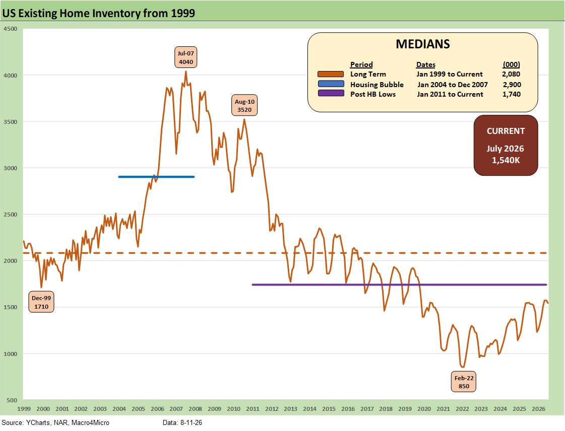
Inventory for total existing homes ticked lower MoM to 1.54 million units for -1.9% MoM and -0.6% YoY. Current inventory is well below longer term medians including 2.08 million for the post-1998 median. The median from Jan 2011 (homebuilding low) to current times is 1.74 million. In other words, existing home sales inventory remains low even if the level is materially higher than the stunning low of 850K of Feb 2022 ahead of the end of ZIRP and start of the tightening cycle in March 2022.
The existing home inventory balance had shown a steady rise off the sub-1 million lows of 2022. Inventory had risen to the 1.3 million handle range in 2024 before dipping back down to a low of 1.14 million to close out 2024. We bounced off those numbers in 2025 to get back above 1.5 million handles before the move lower to 1.2 and 1.3 million handles and then back to current levels above 1.5 million
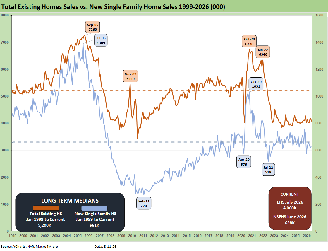
.The above two-sided chart updates the trend line in total existing home sales vs. new single family homes. After some material disruptions in the data updates during the 2025 shutdown, the new home sales data is back on line (see New Home Sales June 2026: Soft Pricing, Tepid Volumes 7-25-26). It’s clear that both are low in historical context. A notable exception is the post bubble housing crisis plunge as highlighted in the time series.
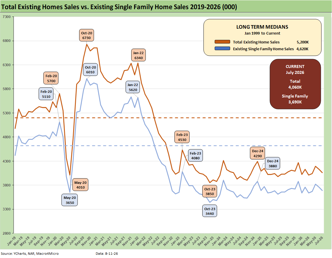
The above chart breaks out the timeline for July existing single family only of 3.69 million vs. total existing home sales of 4.06 million. The 4.06 million total is well below the long-term median (from Jan 1999) of 5.2 million. The total of 3.69 million for single family is well below the long-term median of 4.62 million.
Existing single family growth was -5.7% sequentially and +2.8% YoY (SAAR). The lower line is ex-condo/ex-coops. We saw 370K in condo and coop sales in July 2026, flat to 370K YoY and flat to 370K MoM.
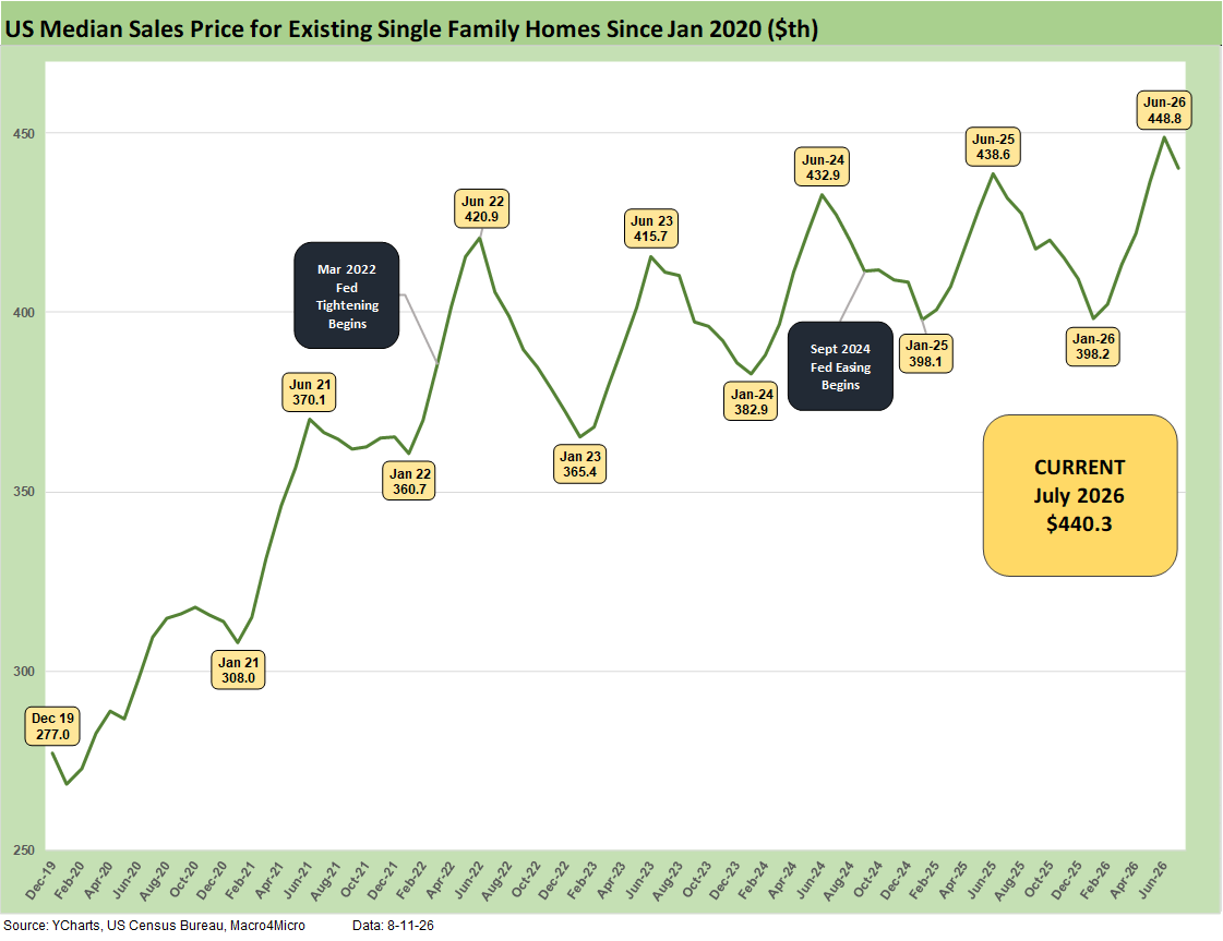
The above chart updates the median price for existing single-family homes at $440.3K (vs. $434.1K for total existing). That is above the July 2025 level of $432.0K for single family. The median price in July 2026 is dramatically above the $308K level back in Jan 2021 and $277K in Dec 2019. Mortgage rates were in a different zip code in Jan 2021 and were below 3%.
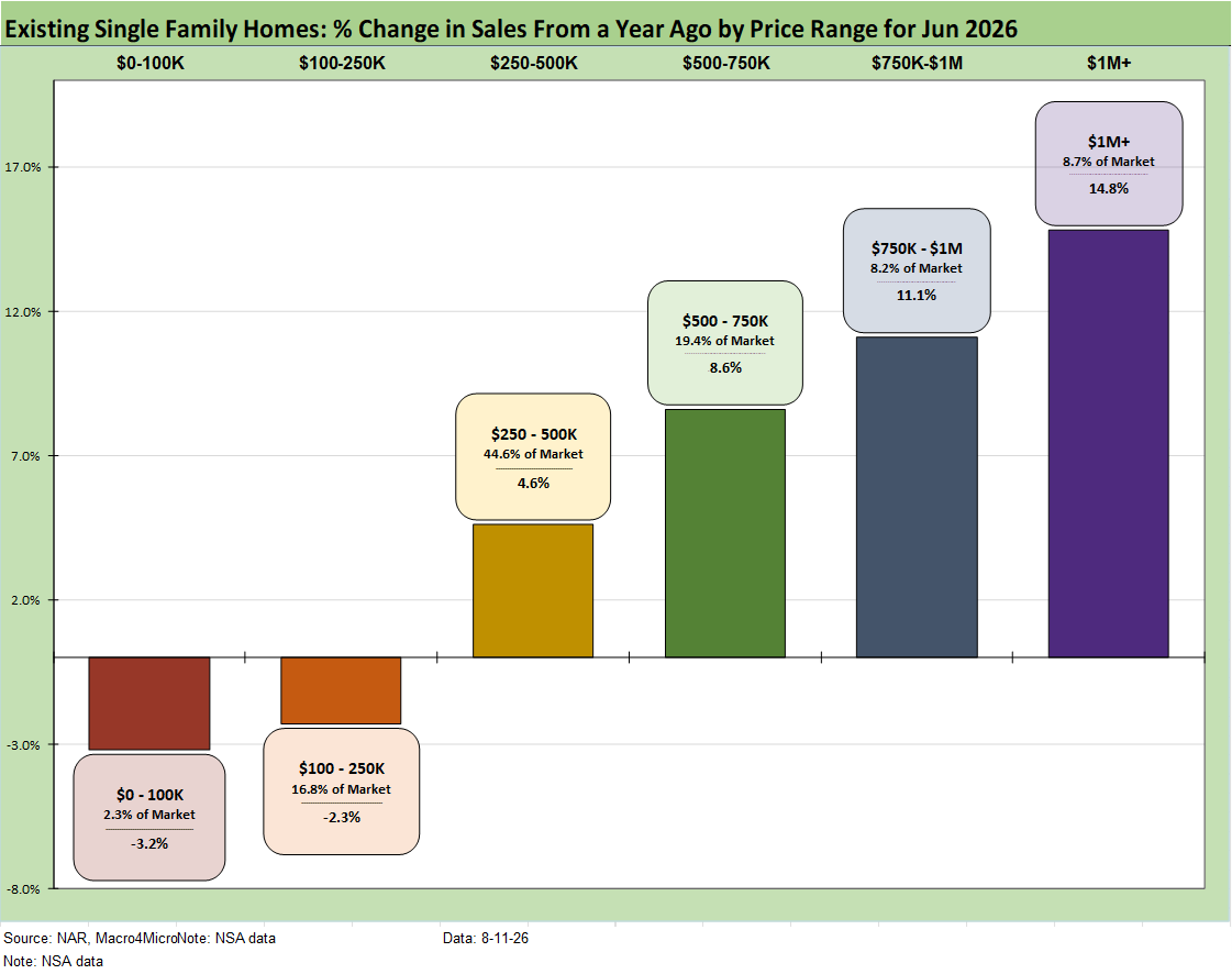
The above chart shows another angle on the sales mix across the price tiers. We just lift the numbers off the monthly handout for single family homes released by the NAR each month. Higher price homes and wealthier buyers have had a better time across this cycle. The “K recovery” certainly applies in housing given the mortgage pressure on monthly payments.
This pattern feeds the dynamic of builders targeting higher price homes vs. starter homes. Meanwhile, the funding costs of a home purchase (new or existing) are a deterrent to “move-up” sales by existing homeowners facing much higher refinancing costs if they are sitting on 3% and 4% handle mortgages. That remains a major headwind for existing home sales volumes as well as new building of move up homes.
The $250K to $750K range is comprised of two tiers that add up to almost 2/3 of the market with the $100K to $250K showing a big share in some of the Midwest states as detailed in an earlier chart.
We looked at the growth trends for each tier earlier. The two lowest price tiers saw volumes decline while the top 4 tiers rose. The lower price tiers are more on the cusp of where affordability and mortgage eligibility could be strained in the 6.8% area handle mortgage rates (based on Friday’s close in the Mortgage News Daily survey).
The existing home sales trends make for overall unfavorable news in 2026 for the housing sector in terms of volumes and prices.
See also:
Market Commentary: Asset Returns 8-11-26
Market Commentary: The Curve 8-10-26
Payroll Deltas July: Mixed Bag, Mediocre Numbers 8-9-26
The Curve: Steeper, Inflation Anxiety Remains 8-2-26
Employment Cost Index June 2026: Inflation > Wage Growth 7-31-26
June 2026 PCE: Inflation, Income, and Outlays 7-30-26
2Q26 GDP: Good Underlying Numbers Despite Headline 1.5% 7-30-26
Producer Price Index June: Still Hurts…Just Less. 7-15-26
CPI June 2026: Eye of the Storm? 7-14-26