
BB vs. CCC: Quality Spread Differentials, Yield Relationships, Relative Returns
We look at the BB to CCC quality spread differentials and YTW relationships in historical context.


We run across the “Hi-Lo” relationship of the BB vs. CCC tiers in the HY bond asset class and look back at incremental spreads over time.
We frame the long-term relative yield ratio for CCC YTW vs. BB YTW and how that has morphed across the tightening cycle relative to history.
The golden rule in credit is you should get paid more for taking more credit risk, and the CCC tier makes a weak case by only posting positive excess returns in 14 of the past 27 calendar years with 13 years in the red before even considering how much more you should get paid in positive returns for the risk.
For now, the BB vs. CCC yield relationship is back to the long-term median area after the big CCC rally of 2023, but the quality spread differential is still materially above the historical median.

In this commentary we provide some context on the relative Hi-Lo gap for risk compensation between the high quality end of the HY credit tiers (the BB tier) and highest risk end of the spectrum (CCC tier). The CCC tier is only slightly over 13% of the index face value and 11.2% of market value, so it is still a smaller slice of the speculative grade pie.
The 13% share is way down the list of relative weight since the post-TMT cycle years (after 1997). As a frame of reference, the CCC mix unsurprisingly peaked during the aftermath of the credit crisis in 2009 at near 30% by mid-2009 and the credit cycle peak of 1997 saw the share just below 10%.
For a few more data points, the last HY OAS cyclical lows in 2018 saw the CCC mix at around 13% after being in the upper teens (~18%) during the earlier credit cycle OAS lows in June 2014. The default cycles remind us how quickly the mix can move in transition from around 11% in mid-2000 to 22% in mid-2001.
The chart above plots the recent spread history across the tightening cycle and related medians for the BB and CCC tier OAS. Even just from the start of 2022, we see a Hi-Lo range of +630 bps within the volatile year of 2022. We have looked at the long-term history of the BB vs. CCC OAS relationship since 1997 in prior commentaries (see BB vs. CCC Spreads: Choose Wisely 1-8-23). Please link to that commentary for the multi-cycle history and a more detailed recap across the cycles.
As of now, the CCC tier OAS is near the long-term median and the differentials are wide to the median as we note below. The CCC tier is always about name-picking, but the overall aggregates as of the end of last week are not out of line in spread relationship. Yields in the CCC tier are priced in the zone of equity-like returns at over 13%, but that is across a universe with dramatic divergence between the higher quality CCC names and the weakest names.
The relative risk is reflected in the dramatically different long term defaults across the tiers. While the post-ZIRP years leaves my old rule of thumb somewhat dated, I used to use the “1-4-16” rule based on long term default rates across tiers. That is, 1% default rates for BB longer term, 4% for the B tier, and 16% for the CCC tier. While those are out of date (consult with your friendly neighborhood default rate data police for updates and defined time horizons), they capture the exponential increase in default risk as you move down the speculative grade tiers.
The idea that around 84% of CCCs do not default each year goes into the bucket of “hope springs eternal” that an investor can pick 100% of those that will not default or that they can hold onto those that are dramatically mispriced even ahead of a potential distressed debt exchange or Chapter 11 filing.
The top-down view from research over the years is that the CCC tier posts very unfavorable risk-adjusted returns (Sharpe Ratios, etc.), but that does not change the fact that opportunistic investors in the market have proven their ability to exploit pricing inefficiencies and dislocations along the way and take positions at levels below realistic recovery values, but that is a discipline that is not for everybody.
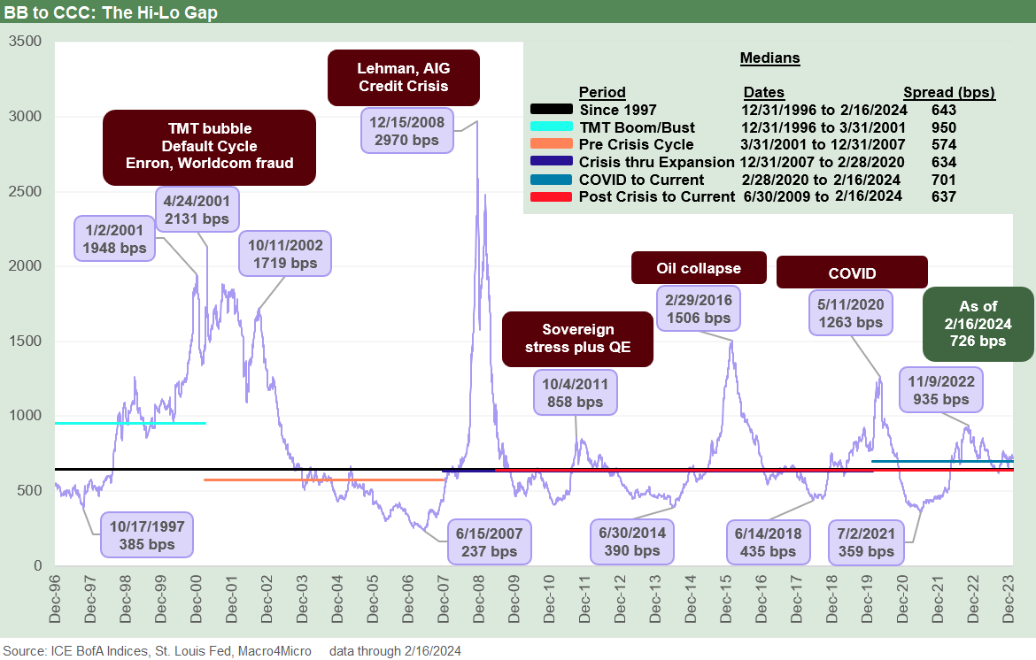
The above chart plots the long-term differentials of BB vs. CCC tier OAS. At the current +726 bps, that is wide to the +643 bps long-term median. The pre-crisis cycle (2001-2007) was a very hot credit market that eventually reached bubble status by mid-2007.
The median across those post-TMT years was +574 bps that included a +237 bps low in June 2007. The Oct 1997 credit cycle peak saw compression to +385 bps In Oct 1997. For both 1997 and 2007, HY OAS lows dipped under +250 bps. Those are the credit cycle peaks we feature in our weekly Footnotes publications on yields. We did a detailed lookback in our annual recap (see Footnotes & Flashbacks: State of Yields 1-1-24 1-1-24).
For some of the milder mini-bubbles, the June 2014 period saw differential lows of +390 bps. June 2014 saw an incredibly rare par level on the CCC tier when it crossed a 100 dollar price for the first time. That soon gave way to the HY oil crisis and upstream crash later in the summer. By the post-crisis HY credit cycle spread lows of 2018, the HY market still had a lot of noise in the CCC tier, so that “low” at +435 bps was higher than the other timeline low points.
The symmetry of Hi-Lo spread differentials are what drive the quality spread decompression waves that investors closely watch in the broader asset class pricing for IG vs HY (see HY vs. IG Quality Spread Differentials and Comparative Returns 2-6-24) trends as well as along the speculative grade divide (see BBB vs. BB: Revisiting the Speculative Grade Divide Differentials 2-5-24 ). The typical quality spread waves start from below, but the banking systemic crisis of 2008 reminded us it can start from the IG tiers as well. The biggest dollar price meltdown eventually hits the lowest tier regardless of what lit the match.
We see the other lows broken out on the chart that are reassuring for current differentials. The unfavorable symmetry that is also evident raises more difficult questions. Most of the highs in OAS differentials took place during down markets with a lot of default risk being priced in (2001-2002, 2008 COVID peak in May 2020).
The Oct 2011 spike was swept up in systemic anxiety so soon after the credit crisis while Feb 2016 was distinctive in that the upstream energy sector was in freefall. The HY oil crisis of late 2015/early 2016 also fed HY fund redemption fears in a secondary liquidity vacuum for so many leveraged E&P borrowers generally driven by the same risk (oil and gas prices).

The above chart covers a shorter time horizon for the differential. The time series starts in Jan 2022 to current. We plot the BB vs. CCC OAS differential from just before the end of ZIRP and the onset of tightening through Friday close (2-16-24). The ride from lows of +447 bps to a wide of +935 bps back to +621 bps lows in Sept 2023 highlights the volatility.
The CCC tier OAS levels are always susceptible to distortions from index exits and new constituents as the OAS moves into or out of the CCC tier index. The use of distressed exchange “judgement calls” on what constitutes default and which issues fall out of the index adds a subjective element on the low end. The rule for indexes and credit derivatives have not been on the same page over the years.

The above chart frames the ratio of yields using the long-term yield ratios of CCC tier YTW/BB YTW. The basic concept of more yield for more risk cannot be ignored in all of its simplicity.
The current 2.04x is hanging around the long-term median at this point. The Oct 1997 (1.46x) and June 2007 (1.34x) lows are in the extreme bubble band. The medians across the time horizons noted are within a modestly narrow range. The lows are found in the TMT bubble years and then during the years of excess that led to record LBOs, subprime RMBS, and excess in structured credit (and counterparty lines).
The TMT cycle kept going for a while with the NASDAQ boom and tight spreads before it all came crashing down with the default cycle underway in 1999 in the fall even with NASDAQ soaring. Then the 2001-2002 TMT crash brought a lot of pain as evident in the chart. June 2007 saw the credit markets go catatonic in the summer and the crisis was off to the races by the fall 2007 even before the term “crisis” was redefined on a new scale a year later.
The July 2014 lows and June 2018 low ticks look a lot like the Oct 2023 market levels. The oil crash of fall 2014 had some unique attributes around industry concentration on the way to the 2016 spread spike and a 3.47x high. The late 2018 meltdown remains very difficult to exactly define the cause-and-effect mechanism that led to the CCC tier pounding of Dec 2018. An oil mini-crash mattered late in 2018 as did the last FOMC hike, but the sell-off was somewhat irrational and self-inflicted before a 2019, Fed-fueled rally.
A few dollar-price differential frames of reference…
Spreads are important as the risk premium metric of choice while all-in yields are good proxies for expected returns at any given point in time. Since CCC tier bonds can often behave more like “high risk equities with coupons,” the dollar price differentials can offer some perspective also. We offer a few examples on the dollar price side to fill in some histories.
The current differential in the dollar price of the recent BB composite (94.4) vs. the CCC tier composite (78.5) is just under 16 points (15.9). For some frames of reference, the June 2014 HY credit cycle saw the price differential at 7.2 points while the early Oct 2018 cyclical low in HY OAS was 7.9 points. By the end of the sharp sell-off in Dec 2018, that number had widened to 14.7 points or almost doubling for BB vs. CCC.
In darker and stormier markets, the 12-31-08 market crisis peak just after the official arrival of ZIRP saw the BB vs. CCC gap at just under 30 points when the overall HY index was around a 61 price. During the euro sovereign and systemic swoon that saw spreads whipsaw to a mini-peak on 10-4-11, the BB-CCC gap was 20.5 points in a ZIRP world.
That 2011 sovereign anxiety reminded some investors of the recent bank nightmares of 2008-2009, but the Oct 2011 wave occurred well into the “official” economic expansion period. Oct 2011 was seeing eurozone sovereign noise that had infected confidence in banking systemic risk and flashed to fears of credit contraction. That strain was not really done until the summer of 2012 with the “Whatever it takes” moment in July 2012 by Mario Draghi that drove a monster rally in structurally subordinated bank paper and eased fears of a new credit crunch.
The 2-11-16 HY market lows (highs in OAS) during the oil crash saw a BB vs. CCC price differential of over 34 points. That 2-11-16 date was a wild one that reminded us that ratings are still not the main event with the E&P industry and its B2 composite rating sitting at a 38 dollar price and the BB3 composite Oilfield Service subsector at a 49 handle. The March 2020 COVID lows for HY (3-23-20) brought a BB vs. CCC dollar price differential of just under 25 points. Man cannot live on ratings alone.
The CCC tier has always been volatile to the downside at cyclical turns and generally features a very sophisticated investor base with high credit risk appetites. The median-type relationship we see today across pricing can be viewed as a reflection of strong risk appetites right now and at a time when higher risk and less liquid investment alternatives will be trending higher in outstanding with the private credit wave.

The above chart condenses the timeline again to zero in on the tightening cycle from early 2022. The median for this shorter-term view is in line with the long-term median. We see lows just after the tightening cycle in April 2022 and another low in Oct 2023.

The above chart plots the monthly total return for BB vs. CCC for each month over the past year. Sharp moves in total return for the CCC tier are tied mostly to spreads for the short duration CCC tier while the BB tier feels the curve moves and duration effects more meaningfully.
The theory on the CCC tier is it will naturally correlate more with the equity markets over time than UST. That makes sense, but that gets back to how equities can get wagged by the UST in a market such as we have seen across the tightening cycle. BB duration was posted at 3.7 to end the week while CCC was 2.8.

The above chart recaps the trend line in comparative excess returns for BB vs. CCC. In this market, the total and excess return profiles for BB vs. CCC still signal that the HY lite strategy is the more prudent game plan based on past risk-reward symmetry.
While distressed debt investing is a somewhat distinct discipline with a heavy legal element in the handbook, the problem with the CCC history is that a mainstream credit investor often gets swept up in the “smoke filled distressed debt rooms” more by circumstance, issuer or industry surprises, a miss on fundamental assumptions (e.g. price of oil, consumer cycle, etc.), or just plain bad luck.
Contributors:
Glenn Reynolds, CFA glenn@macro4micro.com
Kevin Chun, CFA kevin@macro4micro.com
See also:
HY vs. IG Quality Spread Differentials and Comparative Returns 2-6-24
BBB vs. BB: Revisiting the Speculative Grade Divide Differentials 2-5-24
PCE Release Dec 2023: Consumption Strong, Inflation Favorable 1-26-24
Histories: Asset Returns from 2016 to 2023 1-21-24
Credit Performance: Excess Return Differentials in 2023 1-1-24
Return Quilts: Resilience from the Bottom Up 12-30-23
HY Refi Risks: The Maturity Challenge 12-20-23
Coupon Climb: Phasing into Reality 12-12-23
HY vs. IG Excess and Total Returns Across Cycles: The UST Kicker 12-11-23
HY Multicycle Spreads, Excess Returns, Total Returns 12-5-23