
Those Were the Days: HY Relative Yields, HY Relative Risk Premiums
Whether a buyer of yield, spread, or income, the analytical process and moving parts are the same after a UST curve shock.


Whether an investor sees their core strategy as being a yield buyer or the priority is on cash flow generation to service pension/retirement payments, the moving parts come out of the same bucket of variables.
While the duration pain of 2022 was very real, the 5Y UST is only modestly above the fall 2018 highs of 3.1% and still well below the June 2007 highs of 5.2% the last time HY spreads hit cyclical lows in the post-crisis cycle.
The spreads and repriced UST curve still present an uphill battle in making the case for risk-adjusted returns in US HY.
As we look back across the all-in yields of bygone years from the 1997 credit cycle peak (without even going back to the 1980s), the pre-crisis UST rates at 5% handles at least allowed for a healthier starting point from which to debate spreads. After the crisis, the proper valuation of the credit risk premiums often got lost in the debates around ZIRP and reach-for-yield as asset-class constrained investors did not have much room to navigate.
With such slow yields, those with more flexibility could seek income and chase risk elsewhere. Thus, the rise of private credit and various credit risk alternative investments became a trend as eyes wandered for opportunities and pensions and private equity firms innovated.
After the credit crisis, the reach-for-yield and income desperation made relative yields the main event for asset allocation. It would often come down to “How do I get some cash flow?” without taking unbridled risks. It was not an easy decision.
Pension funds needing to pay beneficiaries had a cash generation requirement that is often unusually high. That is true of defined benefit corporate plans as well as massive public sector plans. That cash flow need led many to reassess the use “HY lite” and crossover strategies on parts of their portfolio that were traditionally defensive.
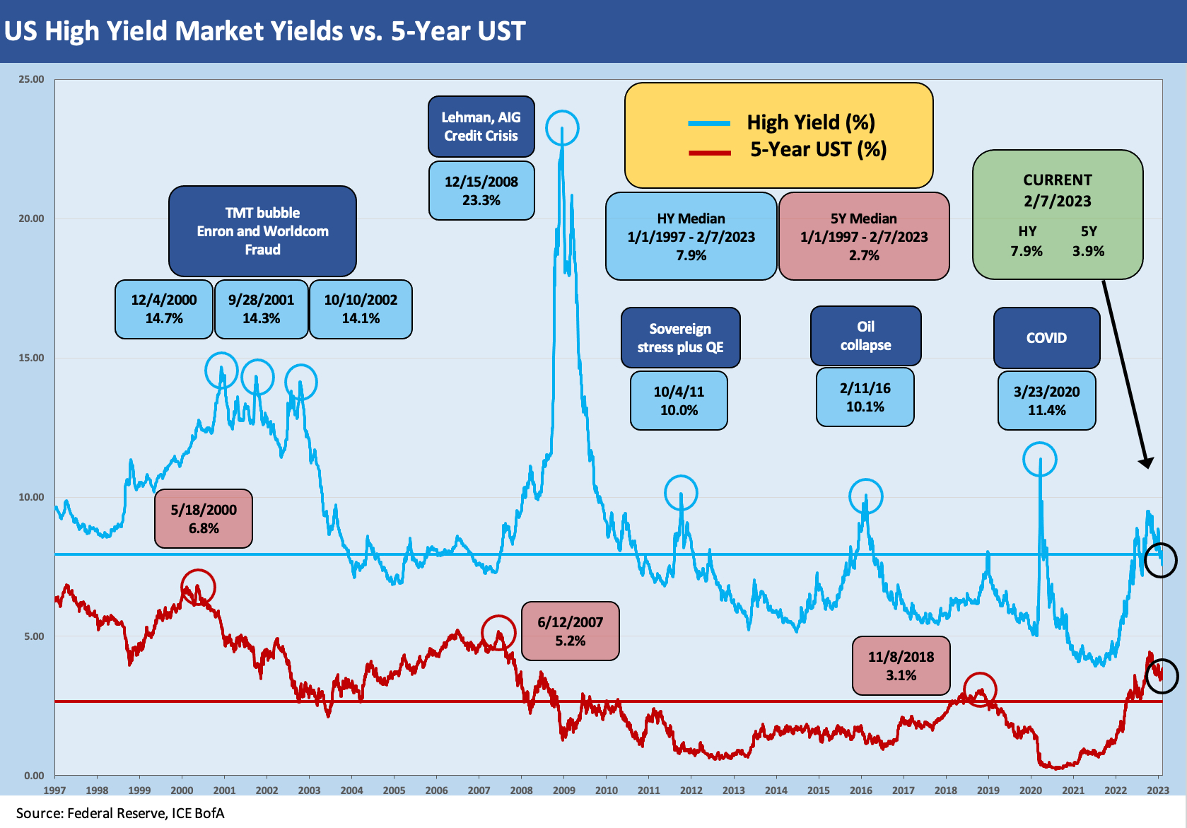
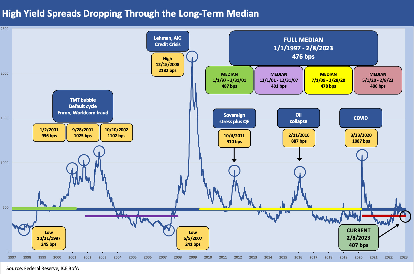
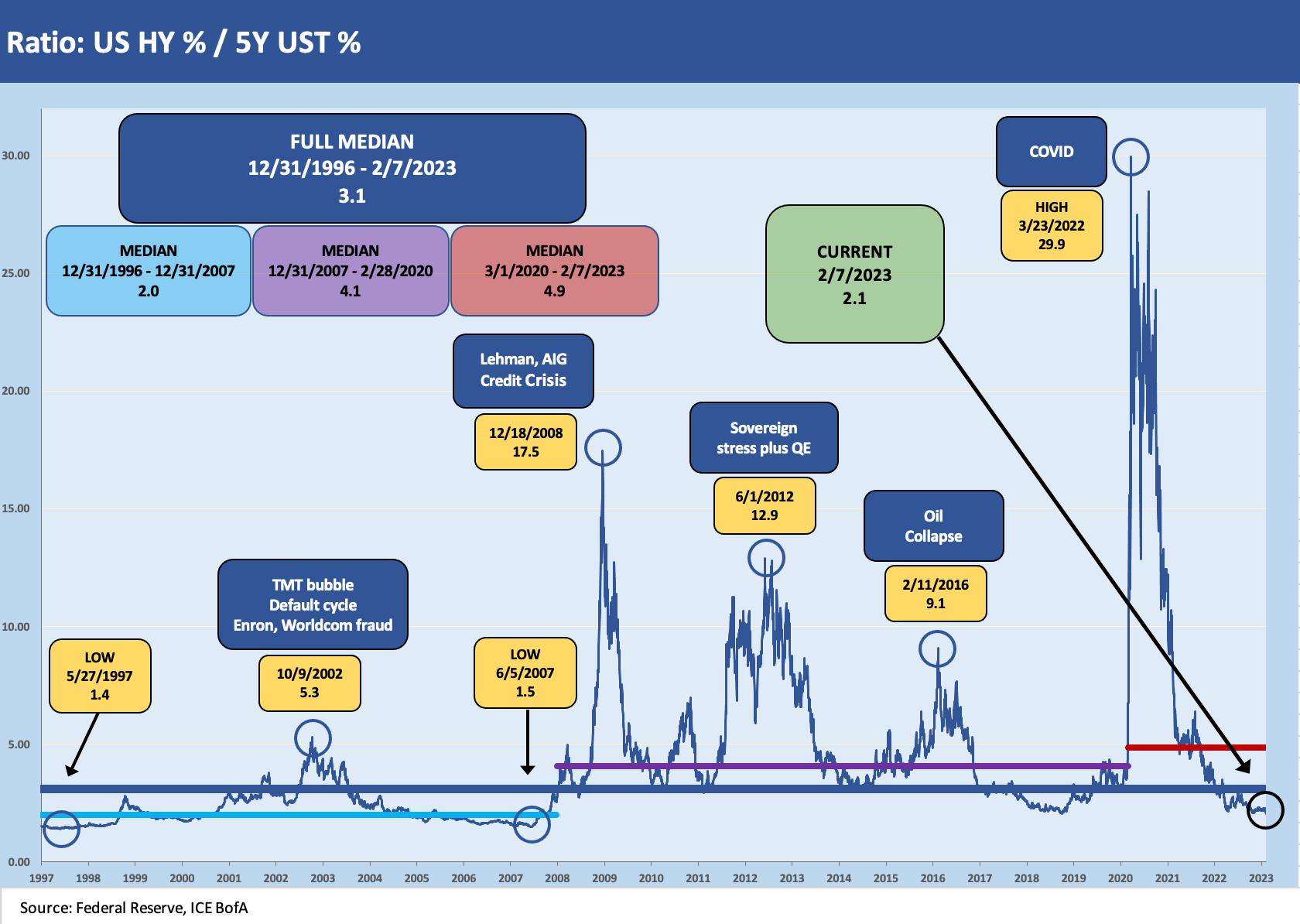
In the chart above and in those that follow, we update a few long-term metrics that capture the history across the cycles from 1997 to today. We look at the following:
The HY index vs. the 5Y UST yield across the cycles: for all of the damage done to duration returns in 2022, the inverted UST still shows the 5Y UST well below the June 2007 credit cycle peak even if above the fall 2018 period when HY cyclical spread lows were seen.
HY index OAS time series: We are running below the long-term median in gross HY index OAS (+476 bps) but slightly above the median during the credit boom from late 2001 to late 2007 (+401 bps). US HY is well below the post-crisis expansion median running through the start of COVID (+478 bps). We are still hanging around the median of the post-COVID expansion period (+406 bps).
The relative incremental yield of the US HY index vs. the UST 5Y: This one always comes with the challenge of the distortions of the “small denominator effect” during the times of ZIRP and QE. A low denominator is not an excuse to exclude the relevance of a metric when the denominator is your investment alternative (i.e., the UST market). If anything, it just quantifies the need for reaching for yield and taking risk to find income.
The HY index OAS vs. the 5Y UST: HY OAS % 5Y UST revolves around the idea of a proportionate risk premium vs. the risk-free asset. Such a ratio rings the conceptual bell but sure does not roll off the tongue. It captures the reach for yield well enough and, by definition, frames how bad the lower risk alternative is by comparison. As a reminder, we use the 5Y UST as a reasonable frame of reference on duration to hold up against the US HY index.
We start with the timeline of the 5Y UST during the TMT years (1997-2001) and how the 5Y UST looked running alongside the HY index during those years. The chart offers a stark reminder of the volatility of the US HY Index which is underscored by the 2000 to 2002 period. It also drives home what a different world we live in now in absolute rates along the UST curve.
The 3.8% area yield on 5Y UST to wind down this week is still a long way from the 30 bps and 40 bps handle 5Y UST of Jan 2021 and Feb 2021. The Aug 2020 5Y UST had even dipped into the teens. The 5% handle of June 2007 on 5Y UST and high 6% for 5Y UST in Oct 1997 seem like a long time ago. The late 1980s had 90-day bills with 8% handles in a hot US HY market. A very different world indeed.
The market in 2023 still posts low all-in yields in absolute terms in the higher quality end of the BB tier. The HY index is just under 8% but we see a low 5% dividend yield on the HYG when the selection criteria filter out smaller or illiquid HY names. Cash could have 5% handles at some point in 2023 on a broader basis.
As we plotted the all-in yields of US HY back across time and framed it vs. the 5Y UST as a relatively useful duration comp for US HY, we could hear the words from “Those Were the Days” playing (“Mister we could use a man like Herbert Hoover Again…etc.”). The same goes for spreads plotted above.
We don’t want to break into that theme song from the All In the Family introduction but we listened again anyway. All in the Family was an iconic TV series from 1971-1979 known for its portrayal of Archie Bunker adjusting to change in America from his wing chair in Queens (that chair is now in the Smithsonian … seriously). The themes of change and “it ain’t what it used to be” dominate the market dynamics as well as the policy and political discourse these days. One thing is the same, however, and that is inflation and tight monetary policy.
The chart above revisits spreads across the cycles. We break out the lows as well as medians for the long-term run across the decades and during some interesting expansion periods. As we have covered regularly in other pieces, the Oct 1997 period was the cyclical low in HY OAS in the TMT boom years, and June 2007 marked the lows in spreads and the top of the credit cycle. The Oct 2018 post-crisis cyclical spread low in US HY saw low 3% handle 5Y UST. We are now at least back above 2018 for a starting point in tacking on spreads.
For now, US HY still falls short on spreads and coupons as an asset class as many issuers have locked in low coupons that they will mostly have to worry about in later years. Term loans and revolvers are of course a different matter with the inverted curve in a tightening environment and cost of debt repricing higher. The view on the value in US HY in 2023 comes down to a cyclical view and monetary policy view – like most decisions on investing these days. HY is off to great start YTD (see Footnotes and Flashbacks: Week Ending Feb 3, 2023).
The direction of corporate fundamentals from here and the ability of the Fed to make progress in trimming inflation without too many more hikes or triggering a recession is a tricky balancing act. So far, the sentiment has shifted towards a soft landing (whether that technically gets tagged a recession is a separate debate even with modest GDP contraction such as 2001). The need for some yield and the relief of a newly repriced curve with some relative stability has helped flows and demand for credit. We are still voting for IG as the better return story for 2023.
When we consider variables across the UST curve, coupons, dollar prices and all-in yields, the value story for US HY is tough to find compelling even before the YTD rally. Below median spreads with above median risks are at much higher all-in yields than we have seen in more recent years outside of the COVID spike and 4Q18 sell-off. That will naturally draw interest. That said, it is going to be a long year with the Fed on inflation policies and with Congress on the debt ceiling. The spreads time series from earlier offers a reminder of the waves.
We are not very bearish on fundamentals, but we do question the ability of US HY to avoid a material spread wave in 2023. We own some BDC stocks with small cap/microcap leveraged loan exposure with high dividend rates, so we don’t mind riding out volatility. For US HY bonds, the mix of low coupons (and cash income returns) and sub-median OAS tips the scales for us into a more negative view for 2023. That view has been consistent across 2022 and into 2023. Rates were the enemy in 2022 and now the cyclical questions and event risk (think debt ceiling) still leave us leery on the direction of spreads.
Relative Yields vs. expected return for risks is a time-honored debate in the post-crisis and post-ZIRP world. The situation for income seekers in 2023 is much better than in most of the post-crisis years of the yield curve plunge, but the pre-crisis history provides a sobering comparison. There is no hiding from the lingering reach-for-yield effects that drove many to take more risk than they typically would for a given unit of return. It is still a driving force in fixed income asset allocation for many.
As wild as the UST curve action and duration pain has been off the COVID recovery lows and the end of ZIRP in March 2022, the history is still a reminder of how relative yields trumps “minimum expected yield for the risks taken.” The higher quality mix of the US HY index plays a role in squeezing the yield with the BB tier up around half the HY market.
The long-term median for the relationship of the US HY index vs. the UST 5Y is 3.1x vs. the current 2.1x. The pre-crisis median (Jan 1997 to Dec 2007) was 2.0, so in that regard the current market has an element of normalcy relative to a period that saw the longest default cycles (not the highest) in history after the TMT market imploded.
The median from the Dec 2007 cyclical peak through the start of COVID in Feb 2020 was 4.1x. The off the chart spikes in this relationship in COVID and with the credit crisis was a function of monetary policy. The Fed drove investors to look for UST surrogates in the IG market or just to take the plunge in risk to get any income at all.
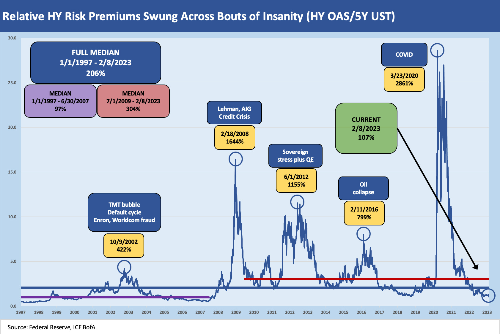
The last chart tries to put the risk premiums into a timeline context by framing HY OAS as a % of 5Y UST. OAS in proportion to the UST market has relevance in the context of the time series even if you don’t get out of bed in the morning asking “What is the relative risk premium in percentage terms?” The comparison shows the incremental risk premium against the risk free asset alternative. Like anything else, it is a number worth considering across the various periods while also thinking through what the distortions are on the way to a market clearing level.
The current 107% is dramatically below the long term median and looks more like the pre-crisis median from 1997 to 2007. As always, the call from here gets to a view on quality mix, cyclical timing, the value of income in a portfolio, and a time horizon call on potential repricing events. If you think a recession is coming, that takes the luster off the rally. That would signal the compression wave as being more about a massive equity rebound and risk-on shift in the hope-springs-eternal seasonal action. There will be drama ahead. The challenge is how to price it.