


Inventory is not that bad yet, but mortgages are heading the wrong way…
Declining existing home sales saw declines in 3 of 4 regions MoM on mortgage rate headwinds. We also saw 3 of 4 down YoY. Weak volumes are now a trend with affordability getting worse on monthly payment stress.
The swing factor to drive volumes higher would necessarily need lower prices but even then the mortgage rate factor is more pressing for those who need financing.
Another sub-4 million headline number for total existing sales is a threshold last crossed in June 2025.
Higher inventories combined with higher prices always seem like an anomaly, but that has been a common feature of existing home sales releases in a market where the ability to refinance is a very costly one for sellers on the next mortgage. Sellers want a good sales price to take that refinancing plunge, while buyers appear to have a different view on value. We see tight affordable supply as a recurring constraint on higher volumes in lower price tiers.
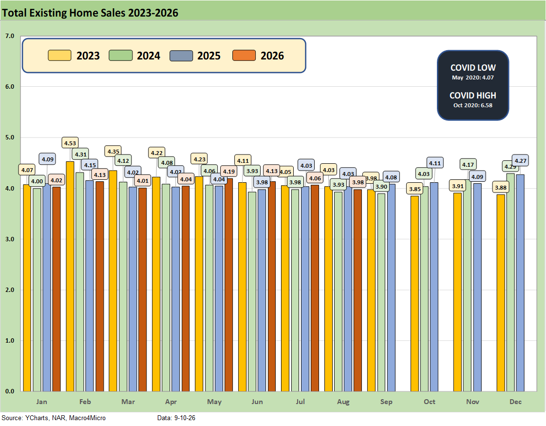
The above chart details existing home sales SAAR run rates by month from January 2023 to August 2026 with 3.98 million in August, down from 4.06 million in July and 4.13 million in June. As a frame of reference, during 2022 the market was posting 6 million and 5 million handle sales volumes in the first half of that year.
The recent existing home sales totals are starting to look more like the late 2023 period when mortgages had peaked (see Existing Home Sales Dec 2023: Rerun of Multi-Decade Low 1-19-24). That makes sense given current mortgage rates now above 7% (7.07% per Mortgage News Daily survey today). The 30Y mortgage rate has moved within a 200 bps range since the Oct 2023 peak when Freddie Mac 30Y hit 7.8% and many mortgage offerings were near 8%.
The painful reality is that housing will be heading into the “off season” with a very unfriendly UST backdrop (see Duration Daze: Post-ZIRP Bond Returns 9-7-26, UST Market: Curve Meets Knuckler 9-7-26).
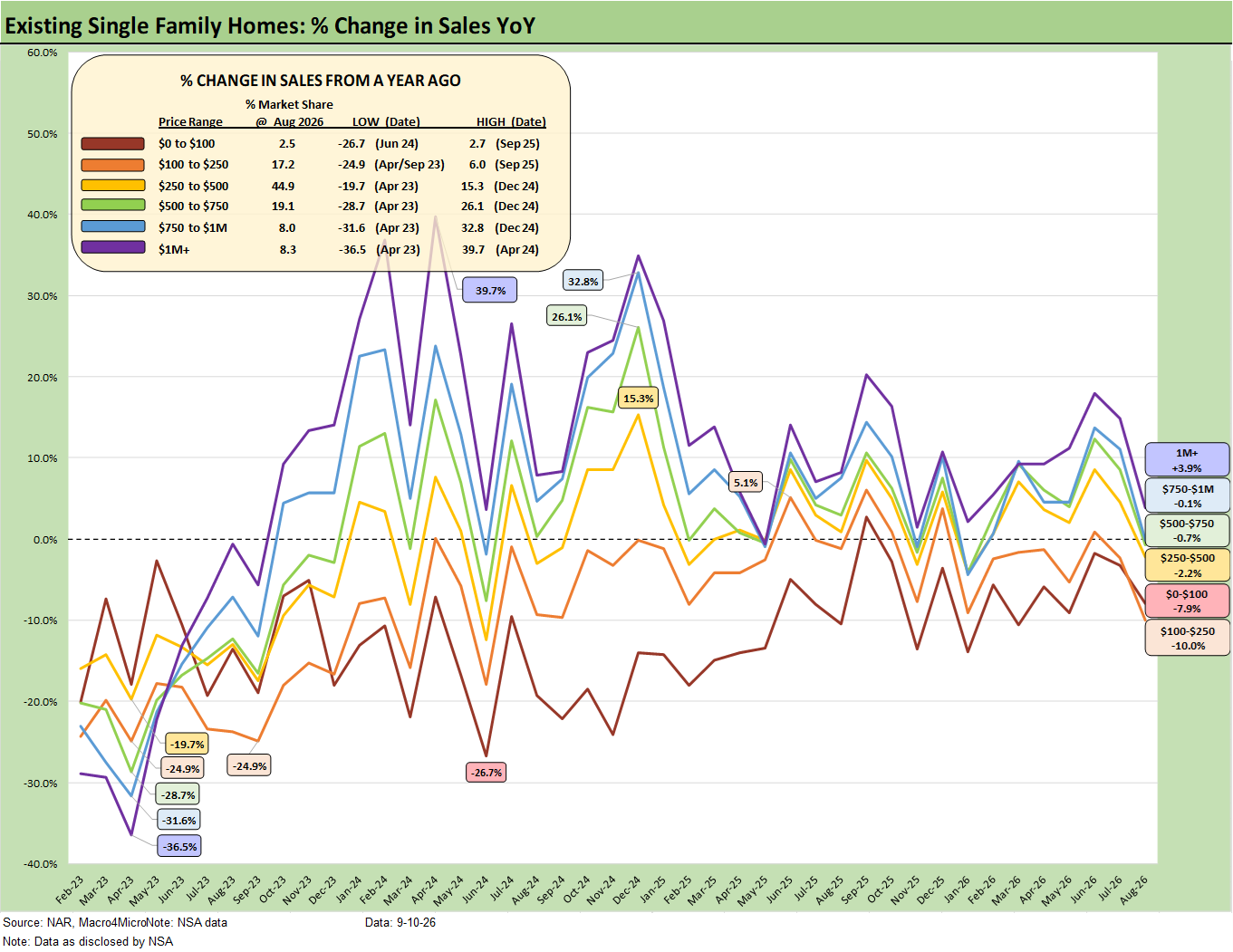
The above chart shows the sales volume deltas by price tier for August 2026, and we see 5 of the 6 price tiers posting negative trends with the $1 million plus bucket the only one in positive range. The lower price tiers did worse. Note: We use “not seasonally adjusted data” for this chart.
For existing home sales, the monthly payment math is still unfavorable for those looking to cash out, move up, or simply relocate. Expectations for a bull flattener in the UST market that would translate into low to mid 5% mortgage rates have been crushed at this point for 2026 (and most likely for 2027) after major setbacks for that same scenario in 2025.
If the UST curve does eventually flatten, it would more likely be a bear flattener with the rising odds of tightening. With all due respect to Bessent’s liability management gambit to manage down the long end of the curve, the 10Y UST market that drives the 30Y mortgage rate is currently a fraction below the cyclical highs of Oct 2023 (4.95% now vs 4.99% 10-23).
The UST market has rejected the low-level Jedi Mind Trick by Bessent as an attempt at short term window dressing. The national debt levels keep rising along with the interest rate bill, and there is no hiding from it. The UST market sees it, the builders see it, and home buyers and sellers see it. Those most exposed are in the lower price tiers, and the real affordability crisis is tied more to the monthly mortgage payment and not the price of the house even if both matter.
The curve has steepened since 2024 and could steepen more if oil and tariffs and steady demand take inflation metrics higher. WTI crossed into $102+ and is nearing $104 today while Trump was kind enough to offer well over $1 trillion to voters if they put the GOP in charge in the election. Even if Trump could deliver that check (he can’t and he won’t just as with the DOGE and tariffs dividends), that would still be just one more UST supply threat.
The oil spike and price swings since Iran plus the documented inflation pressures from March to August will make life a challenge for Warsh with FOMC voters potentially stacking up against his preferences. We get more CPI data tomorrow with today’s PPI data being fairly grim (see PPI August 2026: Leading Indicator Signaling Struggling 9-10-26).
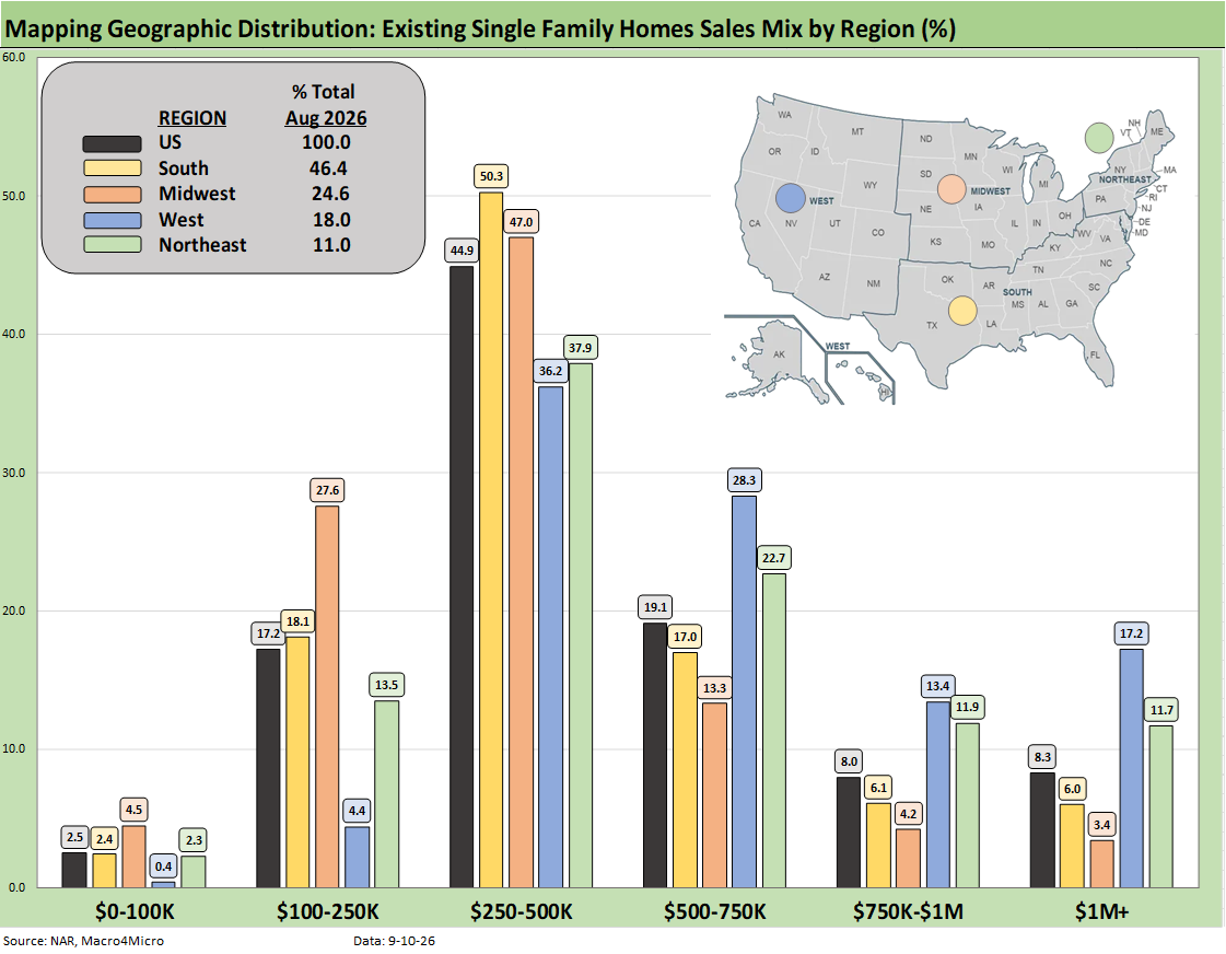
The above chart shows the geographic mix of volumes and details on price mix by region. The South is the main event in single family volumes whether new or existing at around 46% of total volumes.
For the bar chart, we break out the mix for each region by price tier. For example, the South shows around 50% of its existing home sales volume in the $250K to $500K range and around 18% of its sales in the $100K to $250K bucket.
The high cost of homes in the West (notably California) is clear enough just by glancing at the bar chart with over 17% at prices over $1 million. The second highest region in the $1 million club is the Northeast at almost 12%.
We see a major concentration across the regions in the $250K to $500K range although the $100K to $250K bracket for the Midwest stands at over 27%. The West shows a high share of over 28% in the $500 to $750K bracket, which again underscores how expensive the West region price tags remain in national context.
The map explains what states are in each Census region. There is a very wide range of home price profiles in the West and Midwest states.
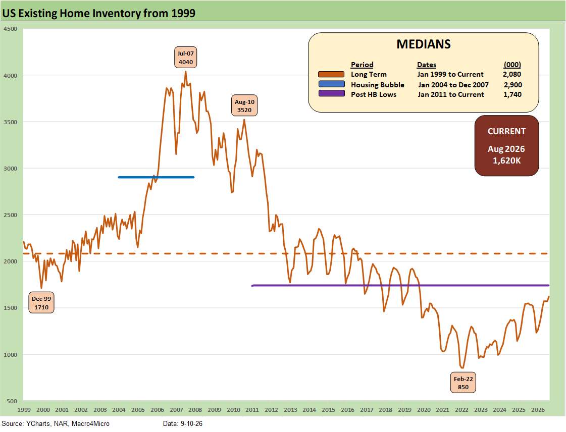
Inventory for total existing homes ticked higher MoM to 1.62 million units for +3.2% MoM and +5.9% YoY. Current inventory is well below longer term medians including 2.08 million for the post-1998 median. The median from Jan 2011 (homebuilding low) to current times is 1.74 million.
In other words, existing home sales inventory remains low even if the level is materially higher than the stunning low of 850K of Feb 2022 ahead of the end of ZIRP and start of the tightening cycle in March 2022.
The existing home inventory balance had shown a steady rise off the sub-1 million lows of 2022. Inventory had risen to the 1.3 million handle range in 2024 before dipping back down to a low of 1.14 million to close out 2024. We bounced off those numbers in 2025 to get back above 1.5 million handles before the move lower to 1.2 and 1.3 million handles and then back to current levels above 1.6 million.
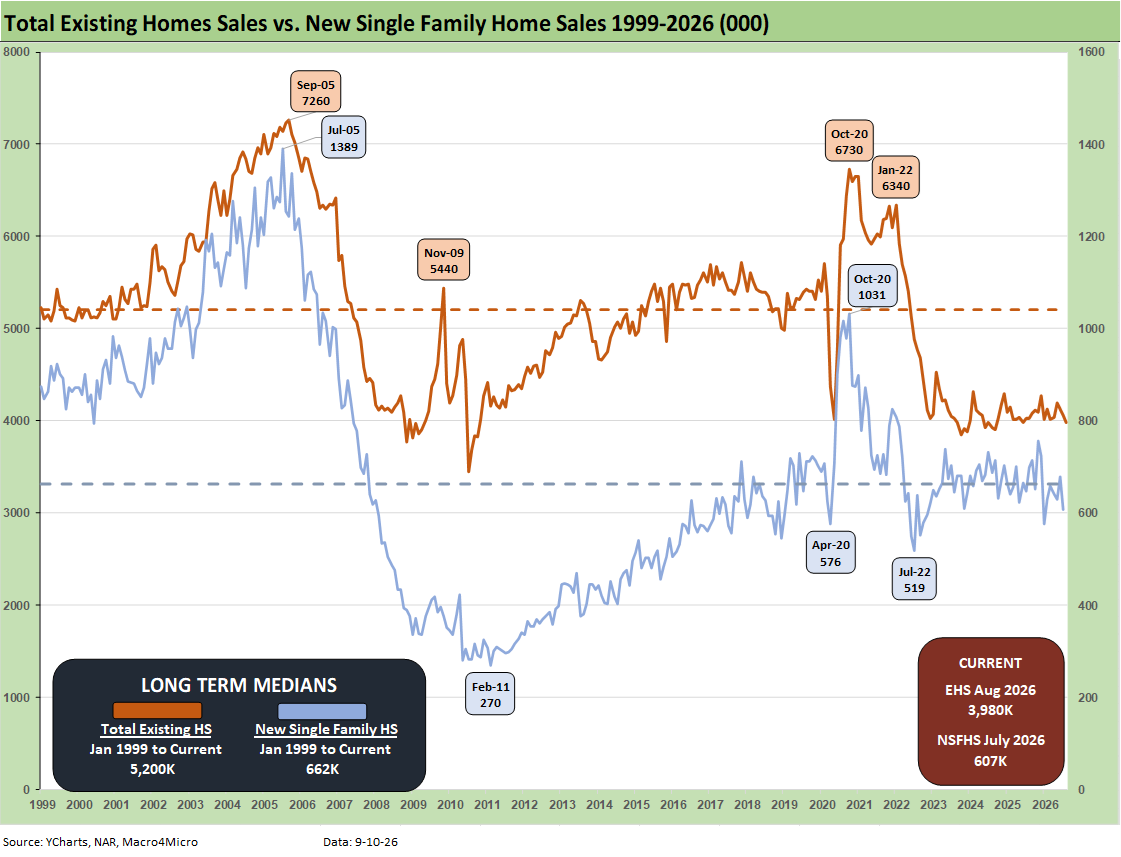
The above two-sided chart updates the trend line in total existing home sales vs. new single family homes. It’s clear that both are low in historical context even if new home sales are well above the post-bubble collapse. The notable exception is the post housing crisis plunge as highlighted in the time series shows a low of 270K. That was one for the ages.
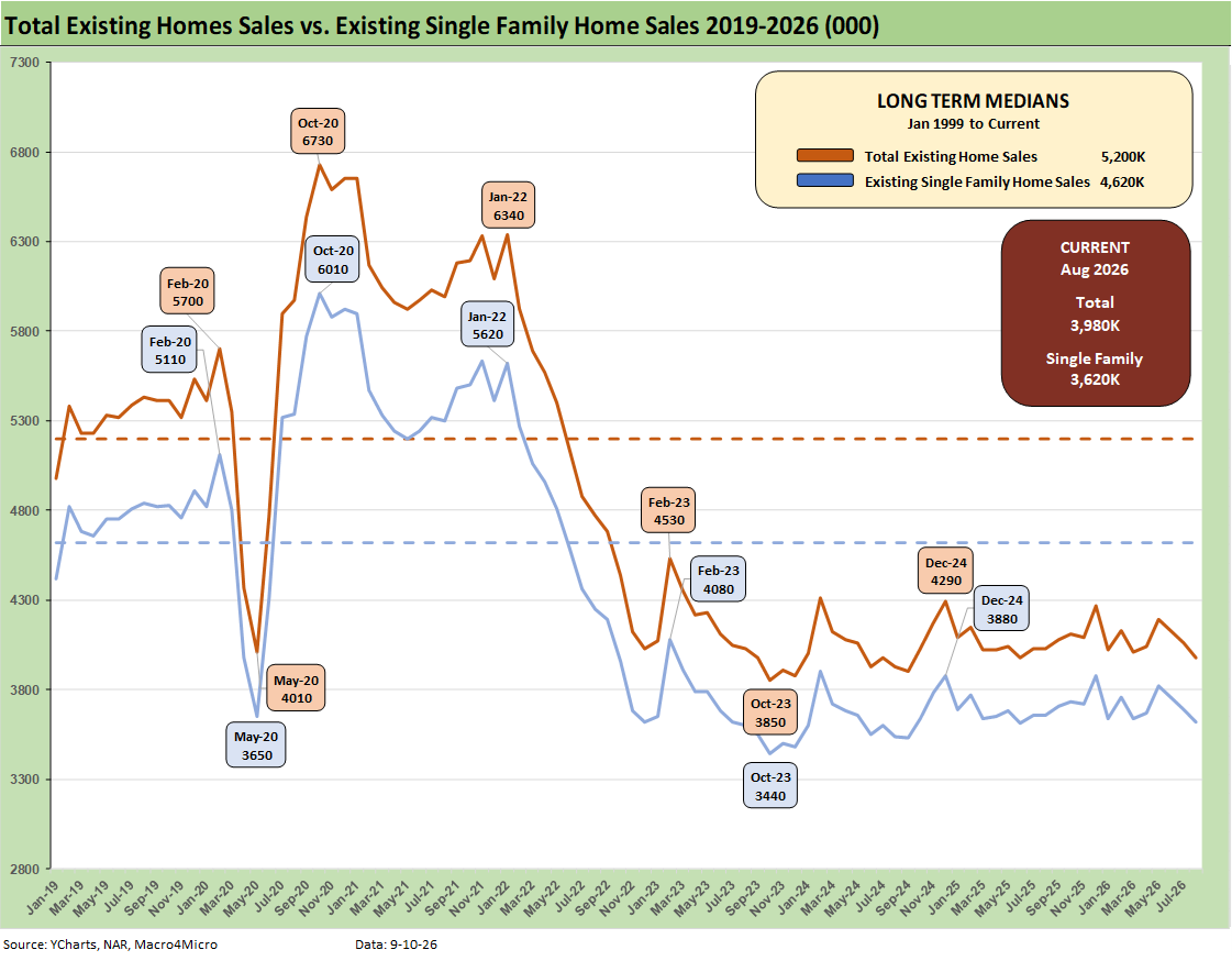
The above chart breaks out the timeline for August existing single family only of 3.62 million vs. total existing home sales of 3.98 million. The 3.98 million total is well below the long-term median (from Jan 1999) of 5.2 million. The total of 3.62 million for single family is well below the long-term median of 4.62 million.
Existing single family decline was -1.9% sequentially and -1.1% YoY (SAAR). The lower line is ex-condo/ex-coops. We saw 360K in condo and coop sales in August 2026, down from 370K YoY and 370K MoM.
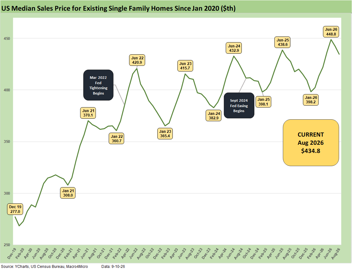
The above chart updates the median price for existing single-family homes at $434.8K (vs. $429.1K for total existing). That is above the August 2025 level of $427.7K for single family. The median price in August 2026 is dramatically above the $308K level back in Jan 2021 and $277K in Dec 2019. Mortgage rates were in a different zip code in Jan 2021 and were below 3%.
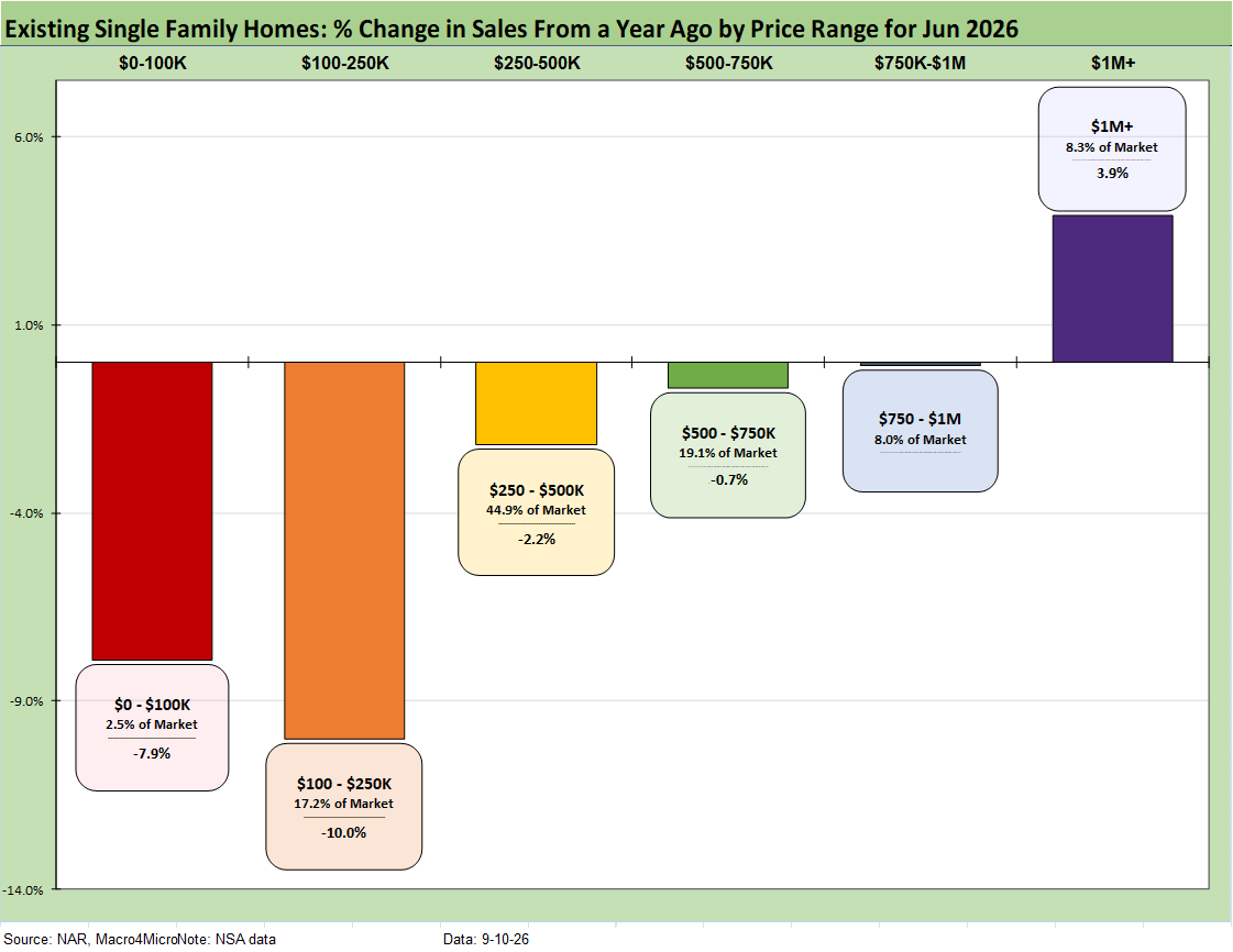
The above chart shows another angle on the sales mix across the price tiers. We just lift the numbers off the monthly handout for single family homes released by the NAR each month. We highlight the decline of -10.0% in the $100-$250K tier.
Higher price homes and wealthier buyers have had a better time across this cycle. The “K recovery” certainly applies in housing given the mortgage pressure on monthly payments. The medium and select higher price tiers are starting to show some wear and tear.
The general pattern (better heeled buyers are still in the hunt) has fed the dynamic of builders targeting higher price homes vs. starter homes. Meanwhile, the funding costs of a home purchase (new or existing) are a deterrent to “move-up” sales by existing homeowners facing much higher refinancing costs if they are sitting on 3% and 4% handle mortgages. That remains a major headwind for existing home sales volumes as well as new building of move up homes.
The $250K to $750K range is comprised of two tiers that add up to almost 2/3 of the market with the $100K to $250K showing a big share in some of the Midwest states as detailed in an earlier chart.
We looked at the growth trends for each tier earlier. This month was a rough one with 5 of 6 price tiers seeing volumes decline. The lower price tiers are more on the cusp of where affordability and mortgage eligibility could be strained with 7% area handle mortgage rates.
The existing home sales trends in August continue the unfavorable news in 2026 for the housing sector in terms of volumes and prices.
See also:
PPI August 2026: Leading Indicator Signaling Struggling 9-10-26
Weekly Tech Check: Semis vs. Software Push-Pull 9-7-26
Weekly Returns: Benchmarks and ETFs 9-7-26
Duration Daze: Post-ZIRP Bond Returns 9-7-26
UST Market: Curve Meets Knuckler 9-7-26
Payroll Aug 2026: Trouncing Low Expectations is “Positive” with an Asterisk 9-5-26
Market Commentary: The Curve 8-30-26
PCE July 2026: Mixed Consumption, Stubborn Inflation 8-26-26
2Q26 GDP: 2nd Estimate 8-26-26