

These babies are all tariff free!
PCE inflation metrics remain stubborn and well above target with +3.7% YoY headline PCE and 3.3% core. Both were flat to last month in YoY metrics, but both were higher MoM vs. June. Thet signals no relief yet at the high-level metrics.
Among interesting YoY comps in critical lines, we see +15.3% on “energy goods and services” (down from +15.8% in June and +24.1% in May), “durable goods” at +3.4% (up from +2.9% in June), “nondurable goods” at +3.9% (down from 4.1% in June and +5.5% in May). Services inflation was flat sequentially from June at +3.7%.
With current dollar and real DPI (disposable personal income) running ahead of consumption, the demand side of the consumer remains steady and the savings rate ticked higher this month from 2.6% to 3.0%.
Financing costs and monthly payment pressures do not show up in the inflation numbers, but tariffs are part of the equation to the extent the tariff (a de facto border tax) flows into the cost of the product and gets passed through in price. The affordability question is easier to answer with any one-time price move. The recurring inflation theories are separate. Products get pricier, margins get squeezed, or some offset unfolds (cost reduction, etc.).
Note: In this commentary we took out the section where we replay the COVID and stimulus history. It eats up some pages and does not change much. Anyone interested in framing the reality of the DPI and PCE numbers back then (in contrast to what the political ax grinders and revisionists call history, please check out one of the old links.)
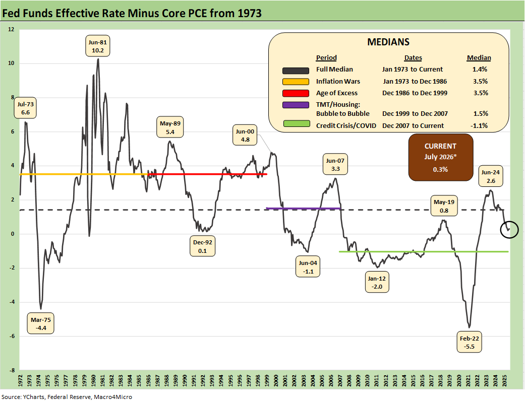
The above chart frames the timeline for “Effective Fed Funds minus Core PCE.” For this latest July measure, we see the differential at +0.3% vs. the long-term median of 1.4%. The current differential is not much of an inflation deterrent. A slight uptick in inflation with an easing demanded by Trump would take the market back to negative real fed funds.
If one sees inflation moving higher and demands from the White House to take rates lower, history is tossed and inflation discipline abandoned. Fed funds minus the headline PCE price index could be seen as negative real fed funds in May with PCE above 4%. It is now very close. Core PCE is the favorite comp, and that sits at 3.3% for July. The odds per FedWatch of 1 FOMC hike by the Dec 2026 FOMC meeting is 45.3% late today and odds of 2 hikes stand at 23.7%.
The market awaits Warsh and Jackson Hole this week for more commentary on Friday. Expectations are low for material color on market views.
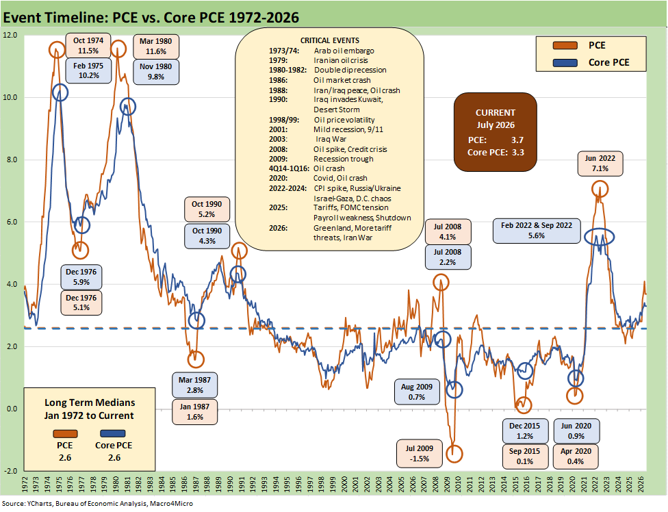
The above chart updates the long-term time series from 1972 for PCE vs. Core PCE across the decades and cycles. We see the 2.6% headline PCE long-term median in the lower left (well below the current 3.7%) and the 2.6% Core PCE median (vs. current 3.3%).
That peak 4.1% PCE headline in May 2026 was dramatically better than where we came from in July 2022 at 7.1% PCE. The current 3.7% headline is still well above the 2.0% target and has been stubbornly high/higher in 2026.
In the context of 2025-2026, the headline PCE price index was 2.6% in Jan 2025 to start Trump 2.0 before the ensuing moves higher. Iran was the dagger in the lower inflation story and is flowing into a range of PPI, Goods, and Services lines as the effects reverberate. Oil and downstream effects are pervasive across the economy.
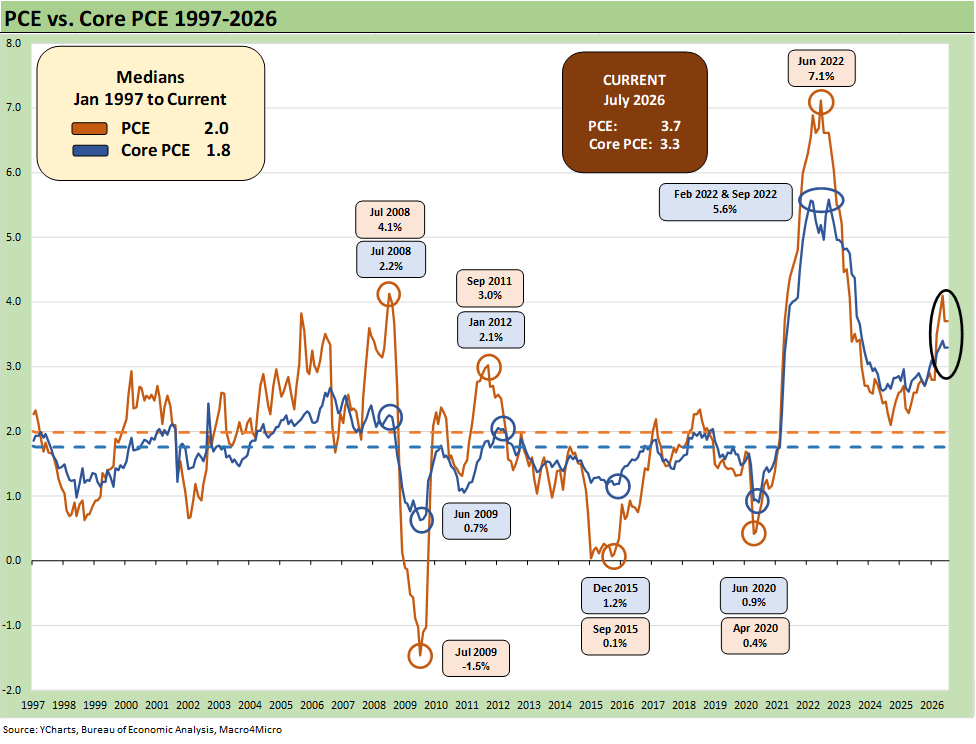
This is a replay slide that we use as a reminder on how the 2.0% target inflation rate frames up across more recent cycles.
We include the 1997-2026 timeline above as it offers a useful frame of reference on the PCE target of 2.0% that is routinely discussed by the Fed and in the markets. The shorter timeline from 1997 offers a better visual scale separate from the wild 1970s and 1980s. We will see what comes out of the Warsh working groups in their reviews of Fed policy.
The “1997 to 2026” period presents a rare stretch at or below the 2.0% PCE line and Core PCE median as noted in the chart. It took a lot to go wrong in that time horizon at the systemic level and in terms of macro shocks to cross below or at that 2.0% threshold. The events along the way included tech bubbles bursting in 2000-2001; oil crashes in the late 1990s and in the late 2014 to early 2016 period; and a bank system crisis from 2008 to 2011 (including sovereign stress) to get us there. The COVID pandemic in 2020 was a new one for the modern capital markets.
That gets us back to the debate over what is the correct formal inflation target or the “closet target” somewhere above 2%. There is not likely to be a formal change in the target, but the current backdrop would be missing it regardless. Warsh cites what is “to the left of the decimal” (i.e. “2” or “3”) matters the most. As of May, he was at a “4.” Warsh is leaving himself a lot of room even as he buys time with his working groups. The market has reflected some dissatisfaction with that approach. Even if he does not give guidance, he should at least offer views on the moving parts of the curve given Bessent’s recent activities (see Market Commentary: The Curve 8-24-26).
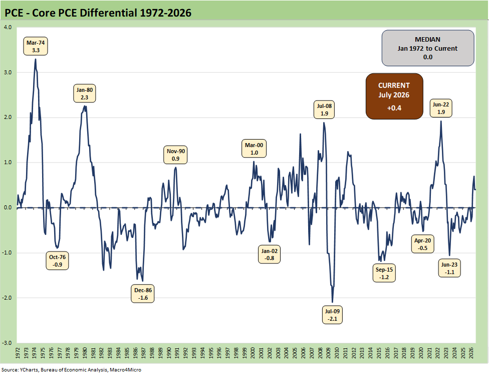
The above chart frames the long-term differential history between PCE and Core PCE since 1972. The long-term median differential is zero and we are currently at +0.4%. The volatility around that compressed long-term median ties into the energy wildcard with some food distortions also back in the 1970s.
We look at some of the CPI energy and food inflation moves in separate commentaries (see Inflation: The Grocery Price Thing vs. Energy 12-16-24, Inflation Timelines: Cyclical Histories, Key CPI Buckets11-20-23). Food and electricity inflation have been near the top of the affordability political rage-fest in this cycle. Households have been hit hard by energy costs (gasoline and electric bills and indirect impact of freight and operating costs rising in just about everything across food, goods and services).
The power demands of data centers are going to keep that energy and power line item in the headlines and notably as data centers get pushback in the states given power needs/costs and environmental effects. Life will get sticky in AI and the related ecosystem if the electricity topic cannot be addressed. The phrase “infrastructure bottlenecks” is getting tossed around a lot. That will impact AI valuation assumptions and pricing power questions.
After an oil spike and uncertain direction of the Mideast war, we are reminded that the inflation history on the other side of such events is a very bad one. All we need to do is look back at late 1973-1974 (Arab Oil Embargo) and again in 1979 (the original “Iran oil crisis”) on the way into the 1980-1982 double dip. Much of what unfolded after 1979 was closely tied to refined product inventory management. That period crushed many mature manufacturing industries and led to wholesale restructuring alongside wide deregulation. The industrial and services diversity and credit profiles now are much different and much healthier than the Volcker period.
As of today, the news flow around an Iran-Oman deal offers some hope of a rational outcome even if it is not the desired one on free travel in the strait. WTI posted an $81 handle today vs. $87 last Friday. Trump and Bessent are hyping an Economic D-Day to crush Iran, but some allies are pushing back and China rejected it outright. That is likely to fail also.
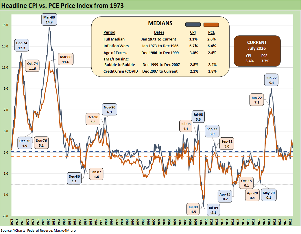
The above time series plots headline CPI vs. PCE across time. The debates around which inflation metric is the best is something more for the faculty club types, but the above chart drives home how each has behaved across time. The consumer tends to lock in on affordability and purchasing power – as in the “cash in, cash out” impacts on daily life.
“Higher or lower or stable?” is a good place to start regardless. Any investor should be aware of the line-item trends by product groupings. Relative weights are also useful to help guide the strategic reaction to headline and core inflation metrics.
Food and Energy (i.e. not “Core”) are crucial for the consumer even if the monetary ideologues will carry on their views around inflation as narrowly defined in academic terms. The household experience with prices underscores that consumers care about discretionary cash flow and how their take-home pay frames up vs. their household basket. “Derived metrics” used by benchmarks such as CPI often do not match up with their own checkbook experience (owners’ equivalent rent, health insurance CPI, etc.). Such metrics matter less to many. They care about the reality of increasing health insurance premiums or loss of health insurance, as well as the financing costs for their big-ticket purchases (e.g. autos, homes, boats, appliances, etc.).
Financing costs also are not captured in CPI metrics for Goods. The best example is monthly car payments and monthly mortgages, and the UST curve is not helping at this point. Despite that reality, autos are doing well and home prices are only gradually starting to feel downward pressure after a big post-COVID spike.
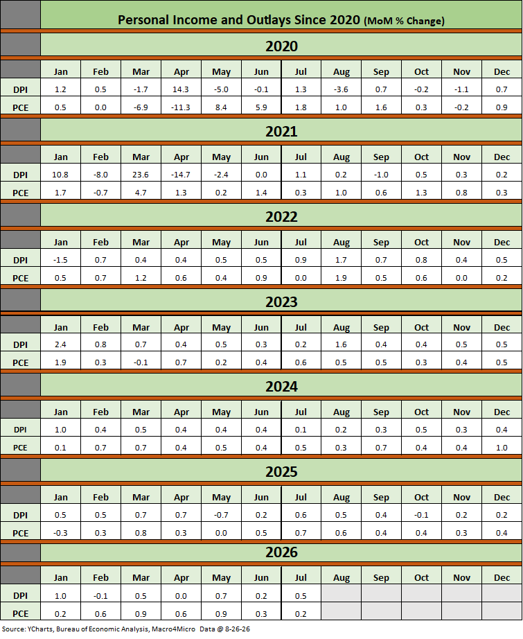
The above table plots the monthly Disposable Personal Income MoM change numbers vs. the Personal Consumption Expenditure MoM numbers across the years from 2020 through July 2026. It is an easy scan across key time periods for a look at turning points in DPI (e.g. stimulus payments) or PCE. July posted a solid move in DPI vs. Consumption.
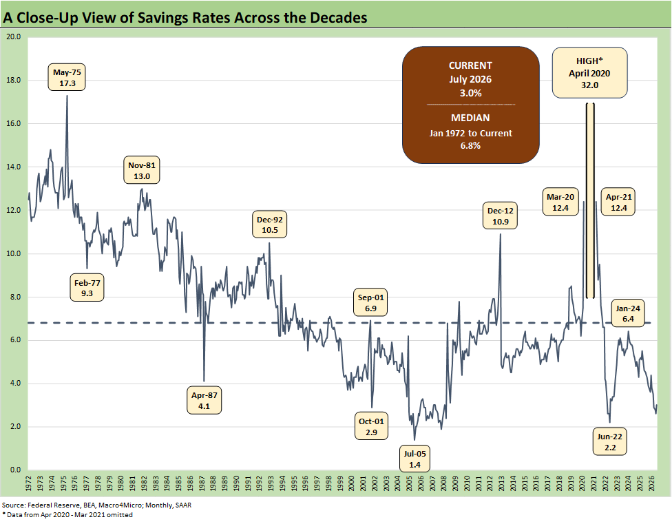
The above chart updates the running savings rate reconciliation that comes with the Personal Income and Outlays each month. We saw a fresh low in June of 2.6% while July 2026 just ticked higher to 3.0% in solid income growth. June was the lowest savings rate during the Trump Administration.
The “Why?” of generally declining savings rates can be like a political Rorschach test on “buying on happiness” or “getting slammed on the prices of the household basket, tariffs and financing costs.” That is, some consumers may need to borrow to meet basic bills in the realm of the nondiscretionary.
The savings rate dipped below the 4% line in Oct 2025 and posted 3% handles and edged back above 4% for one month (Jan 2026). That savings rate decline can be a function of various forces, but the inflation trends (health care premiums, gasoline, home heating, and financing costs) and related household cash drain are eating more into real wages and the household bottom line.