
Footnotes & Flashbacks: State of Yields 6-16-24
We look back at a busy week where good CPI numbers outweighed the thematically hawkish “one cut” median from the FOMC as duration was a clear winner.


"Gearing up for a tricky curve..."
We look back at a week where CPI brought some good news that looked even better when you got into the MoM weeds for some key line items.
CPI trumped the seemingly hawkish dot plot calling for one cut, but Powell’s somewhat less organized message and mixed tone on his conference call gave the market room to roll their own expectation on how one cut could become two (it is still not 5 or 6!).
There is no hiding from the reality that data dependency still rules with consumer sector trends serving as the main event even if post-election policy speculation will matter more with each passing week to Election Day.

The above chart updates the historical yield curve across various monetary regimes and credit cycles outside the post-crisis ZIRP years. The chart plots the curve with the UST rates also detailed in the box embedded in the chart. The goal is to give some context to today’s yield curve and notably when framed against the later stages of the housing boom years and the late TMT cycle.
The comparisons to the 1980s and late 1970s is a somewhat easier visual since those periods are on a different planet than the later yield curves. The 3M UST as late as 1989 was substantially above the current HY index yields. We show the 1978 front end mini-inversion heading into the 1979 inflation spike and Iranian oil crisis. We then roll into the wild double dip recession and stagflation period.
The 1990s to the 2000 cyclical stall (2001 recession) and the backdrop of the mid-2000s make for the most interesting direct comparisons. The 6-14-24 UST curve is the lowest in the collection.

The swing from a powerful late year rally in 2023 into a YTD adverse shift of the UST curve gave more than a few UST bulls a shock. The UST curve is now closer to where the year started with the UST YTD rise starting to get dialed back. The 10Y UST is +32 bps now YTD 2024 and the running YTD deltas on the 10Y UST from 10-19-23 is at -78 bps. Four weeklies ago (Footnotes edition of 5-27-24), the 10Y UST delta was at +58 bps YTD and -52 bps from 10-19. That was a good multi-week run into mid-June for duration.

The migration of the UST curve across the tightening cycle is captured above, and we include a memory box for the FOMC actions along the way across the tightening cycle. In the question around FOMC tightening and nerves around how the inversion eventually goes away (Will it be cyclical weakness? Inflation declines? Combination of both?), a big unknown in the UST shapeshifting is whether a cut or two can pull down the long end as well.
The convergence of the 12-31-22 and 12-31-23 UST curve out in the longer end of the curve unfolded despite 100 bps differential in fed funds. That makes for a tough data point to look at when you translate fed funds cuts into more declines in 10Y UST. The “bull flattener” could in theory just be on the front end and turn into a bull steepener with static longer rates for a while. There is much to play out.

The weekly UST deltas are broken out above, and the story is a good one for those long duration. As we cover in the Footnotes for Asset Returns (see Footnotes and Flashbacks: Asset Returns 6-16-24), the bond ETFs were all in positive range with the long duration UST ETF (TLT) holding down a strong #2 for the week. For the trailing 1-month period, bond ETFs are holding down 4 spots in the top quartile of the 31 benchmarks and ETFs we track.

The running UST downshift captured above offers another visual on the move from 10-19-23. Most of that was obviously in Nov-Dec, but the tide might be turning with a few more supportive data points. The balance of consumer releases are mixed now, but the steady stream of payroll adds has kept the UST bulls on anxiety row.

As discussed, the YTD duration pain across 2024 has had some relief this past month and notably this past week. The above chart offers another visual on the shape of the UST moves YTD.

Mortgage rates have been a headwind buffeting affordability with home prices much higher, but even there the market got some schooling on the ability of the homebuilders to navigate such a market. The above chart shows the Freddie Mac 30Y mortgage (released on Thursday) hanging in a similarly narrow range with a minor tick down to 6.95% from 6.99%.
We also plot the Freddie 30Y mortgage rates from the peak of the homebuilding boom (2005) and the period when RMBS excess was starting to rattle the markets (mid-2006). Current mortgage rates are higher now even with the lower 10Y UST, so there is more to the story than just the UST curve.
These mortgage rates are not a major anomaly relative to a period when there was very strong demand for mortgages and high housing activity in 2005-2006. The wildcard now is of course the Fed but also the demographics and inventory for sale and what that means for home prices. The housing market is waiting for something to give, and the hope is that it is not an unemployment spike and recession driving lower mortgage rates.
For those homeowners and mortgage holders with low mortgage rates booked during COVID or ZIRP, the ‘handcuff” and “locked-in” terms are getting old by now as we cover in our housing research and single name analysis on builders. This coming week, we get fresh data on housing starts and existing home sales while Lennar and KB Homes also report earnings.

The historical timeline for IG Corporate yields vs. HY index yields is detailed above. The current 5.36% for IG Corporate yields and 7.88% for the HY index should be framed against the long-term median of 6.1% for IG and 9.3% for HY since those medians reflect the history outside a ZIRP and systemically low UST curve engineered by the Fed.
Using this frame of reference and giving weight to the very tight spreads in this market, the cost of funding and the economics of capex and M&A will just need to adjust back the reality of all-in yields that are hardly alien.

The IG yields across credit cyclical peaks also need the UST comparison for a frame of reference. The above chart looks back at IG yields in the current market vs. the credit peaks of 1997 and 2007. We have been routinely updating this comparison in each weekly, and the point in IG is the UST dictates the history of relative yields with today’s lower yield curve being the main event in the IG comparison today since all these markets above had tight spreads.
The 1997 credit peak had a few years to run while the June 2007 credit markets were marching toward an IG crisis rooted in the interconnectedness of the bank and brokerage system, asset quality risks, derivatives excess, and unbridled (and largely undisclosed and scarcely measured) counterparty risk exposure.
The protracted inversion is the most distinctive feature in this chart and is a story unto itself in the modern credit markets as the first inflation war since the early Volcker years. The tightening cycle on the heels of a pandemic is a strange enough combination of events, but the fiscal dysfunction, reckless inability to prudently compromise, and record borrowing needs are not helping to frame the mix of structural risks.
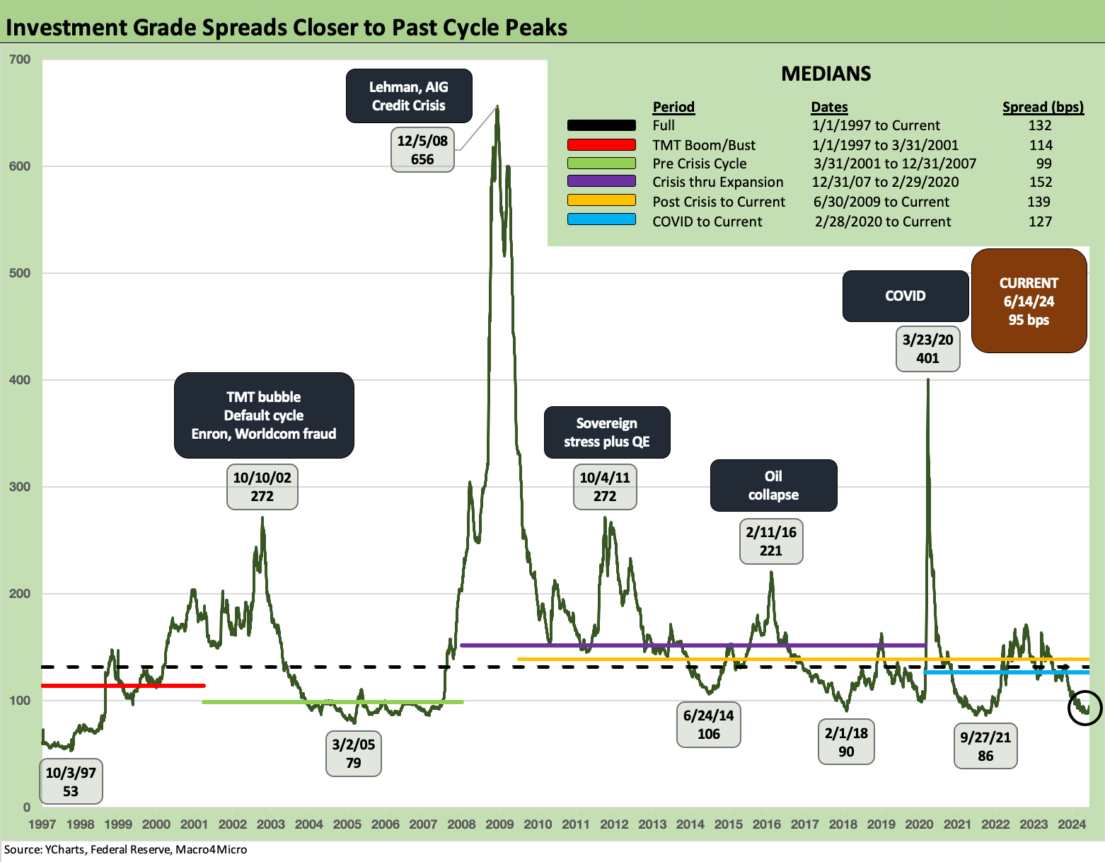
IG Corporate index spreads across time are framed above. We saw a +5 bps widening on the week as corporate bonds lagged the sharp UST rally. The current +95 bps IG OAS is in line with the spreads seen in 1997-1998 and 1H04 to 1H07 averages even if well above the bottom ticks of Oct 1997 and March 2005 (just ahead of the “great auto widening”).

For HY index yields, we do a similar drill as we did with IG for the same time periods. We detail the UST curves in the bottom of the chart and plot the HY index yields from those dates at the top of the chart on the horizontal line.
The 1997 and 2007 periods had tighter spreads but higher yield curves. The HY index yield today weighs in lower than those peaks despite wider spreads now. The UST curve at the end of last week carried the day on the all-in yield comparison.

HY spreads are detailed above after a mini-swing this week wrapped around the rapid UST shift. After hitting a post-2021 low at mid-week (see HY Spreads: Celebrating Tumultuous Times at a Credit Peak 6-13-24), OAS failed to follow the UST lower and cleared the week +14 bps wider at +329 bps. These are still tight by historical standards with a long-term median of +468 bps and a pre-crisis median of +418 bps.

The spread differential between the IG and HY benchmarks offers a useful proxy on the compensation for moving down the credit tiers to take more risk in speculative grade vs. investment grade. “HY OAS minus IG OAS” is fairly intuitive and ended last week at +234 bps vs. the long-term median of +329 bps and +309 bps for the pre-crisis median. The TMT boom/bust period noted in the median box was +369 bps. Credit compensation is skinny these days.

The proportionate risk premium of HY OAS vs. the 5Y UST offers another angle on relative credit risk compensation. We have covered this topic enough in the past, but we simply plot “HY OAS divided by the 5Y UST” (for its proximity to HY index duration). The current 0.78x is well inside the long-term median of 1.96x. The lows and highs across time are detailed in the chart. We see the June 2007 and May 1997 lows were well below current pricing.

This week we zero in on the 2Y to 30Y UST slope. The above chart updates the long-term timeline from 1984. The current inversion of -33 bps is a very long way from the median of an upward sloping UST of +126 bps. That sure does not offer a healthy amount of term premium for extension out the curve.
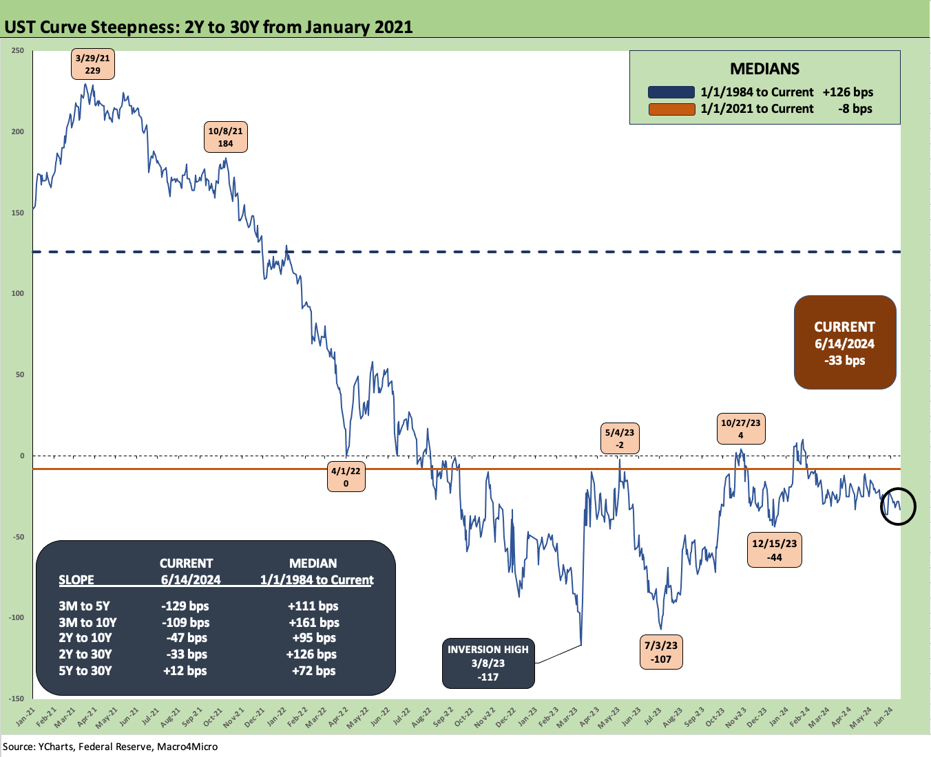
The above chart shortens the timeline to a period starting at the beginning of 2021 to better zero in on the tightening cycle whipsaw. We see the steepness peak at +229 bps in March 2021 on the way down to the peak inversion of -117 bps in March 2023 before a flattening move to -2 bps and then plunge back to -107 bps in July 2023 and then a move to +4 bps and back to -44 bps. That’s a wild ride.
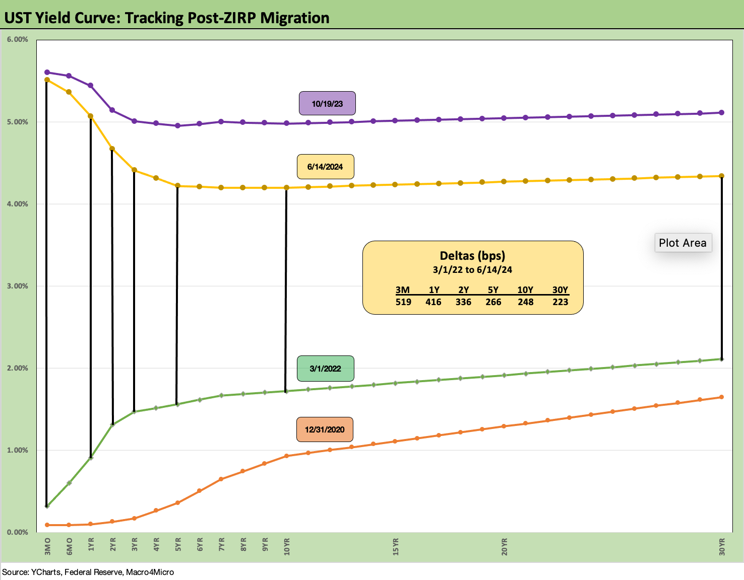
We wrap with our usual chart that frames the UST deltas from the start of the tightening cycle in March 2022 to this past Friday. The deltas run from March 1, 2022 even though the end of ZIRP was officially effective March 17, 2022. We also include UST curves from the end of 2020 and the date of the peak 10Y UST curve (10-19-23) as frames of reference.
The bear inversion captured in the chart will be one for the ages given the very low inflation relative to the monetary cycles and inflation rates seen from 1979 to 1982 (see UST Moves 1978-1982: The Inflation and Stagflation Years 10-18-23).
The year 2024 is a very distinctive year in terms of UST curve shape and the absolute rates compared to earlier pre-crisis cycles (see chart at beginning of the commentary). Rates are very different compared to the last bout of serious inflation and eventual stagflation. It is always a good exercise to go back and look at how both CPI and PCE tracked across the cycles (see May 2024 CPI: I Feel Good, Not Sure That I Should 6-12-24, PCE, Income and Outlays: Lower Income and Consumption, Sideways Inflation 5-31-24).
This is going to be an extra innings game in a long series…

See also:
Footnotes and Flashbacks: Asset Returns 6-16-24
Consumer Sentiment: Summer Blues or Election Vibecession 6-14-24
Income Taxes for Tariffs: Dollars to Donuts 6-14-24
HY Spreads: The BB vs. BBB Spread Compression 6-13-24
HY Spreads: Celebrating Tumultuous Times at a Credit Peak 6-13-24
FOMC: There Can Be Only One 6-12-24
May 2024 CPI: I Feel Good, Not Sure That I Should 6-12-24
Trade Flows: More Clarity Needed to Handicap Major Trade Risks 6-11-24